


 本文介绍了如何在SwiftUI中创建一个自定义的颜色选择器,ColorSwatchView,以适应不同设备和设置的需求。通过在Assets文件中添加颜色集并创建替代颜色,可以实现针对深色模式等场景的变体。此外,文章还展示了如何利用SwiftUI的自动布局功能来展示颜色样本,并实现选择颜色时的实时反馈。
Color pickers are used frequently in both iOS and Mac apps to differentiate folders/lists/items in Apple’s own app’s like Shortcuts and Reminders and many indie app’s offer similar functionality.
拾色器在iOS和Mac应用程序中经常使用,以区分Apple自己的应用程序(如快捷方式和提醒)中的文件夹/列表/项目,许多独立应用程序提供类似的功能。
With SwiftUI 2 Apple added the ColorPicker control and you think great, one quick line of code and I have a color picker, but this isn’t constrained, users can pick any color imaginable, great for paint apps, not so great where we are trying to maintain a style to our app and deal with overlaid text or graphics.
借助SwiftUI 2,Apple添加了ColorPicker控件,您认为很棒,只需一行代码,并且我有了一个颜色选择器,但这不受限制,用户可以选择任何可以想象的颜色,非常适合绘画应用程序,而不是我们想要的颜色尝试保持我们的应用程序的样式并处理覆盖的文本或图形。
Recently watching a non-tech family member discover they can customize their messaging app and the awful contrast choices made you really don’t want to let users have this much power. Even Apple don’t use the generic full palette picker in their apps, instead providing a curated palette to choose from, colors that they know will look good.
最近,一个非技术家庭成员发现他们可以自定义其消息传递应用程序,而糟糕的对比选择使您真的不想让用户拥有如此强大的功能。 甚至苹果公司也没有在他们的应用程序中使用通用的全调色板选择器,而是提供了精选的调色板供他们选择,他们知道这些颜色看起来不错。
When thinking of a solution to this I first started with throwing some RGB colored circles in a list and storing the value. That gets you part of the way but doesn’t allow for colors that adapt well between dark/light mode, high contrast or platform variations for iPhone, iPad, Mac, Apple Watch, TV and CarPlay which all have their own subtle requirements.
当想到解决方案时,我首先将一些RGB彩色圆圈放入列表中并存储值。 这使您成为问题的一部分,但不允许在暗/亮模式,高对比度或适用于iPhone,iPad,Mac,Apple Watch,TV和CarPlay的平台变化之间很好地适应颜色,这些都有自己的微妙要求。
In this article I’ll walk you through how I solved this and create a color picker, which I’ve called ColorSwatchView, that can cope with all these different requirements and always present the user with a pleasing color scheme. That’s as long as we can create a pleasing palette for them to choose from in the first place!
在本文中,我将向您介绍如何解决此问题并创建一个颜色选择器,我将其称为ColorSwatchView,它可以满足所有这些不同的要求,并始终为用户提供令人愉悦的配色方案。 只要我们能够创建一个令人愉悦的调色板供他们首先选择!
创造色彩 (Creating the colors)
Within Xcode’s Assets file where we usually add our app icon we can also add other assets, one of these being Colors. Adding an asset color allows us to give a name to a color and then add variants for all the different devices/settings we want to cater for. This way we can have varying RGB values but if we always refer to it by name we will get the appropriate variant for the current scenario.
在Xcode的Assets文件中,我们通常会添加应用程序图标,我们还可以添加其他资产,其中之一就是Colors。 添加资产颜色允许我们为颜色命名,然后为我们要满足的所有不同设备/设置添加变体。 这样,我们可以具有变化的RGB值,但是如果我们始终按名称引用它,我们将获得适用于当前方案的变体。
为我们的资产添加颜色集。 (Adding a Color Set to our assets.)
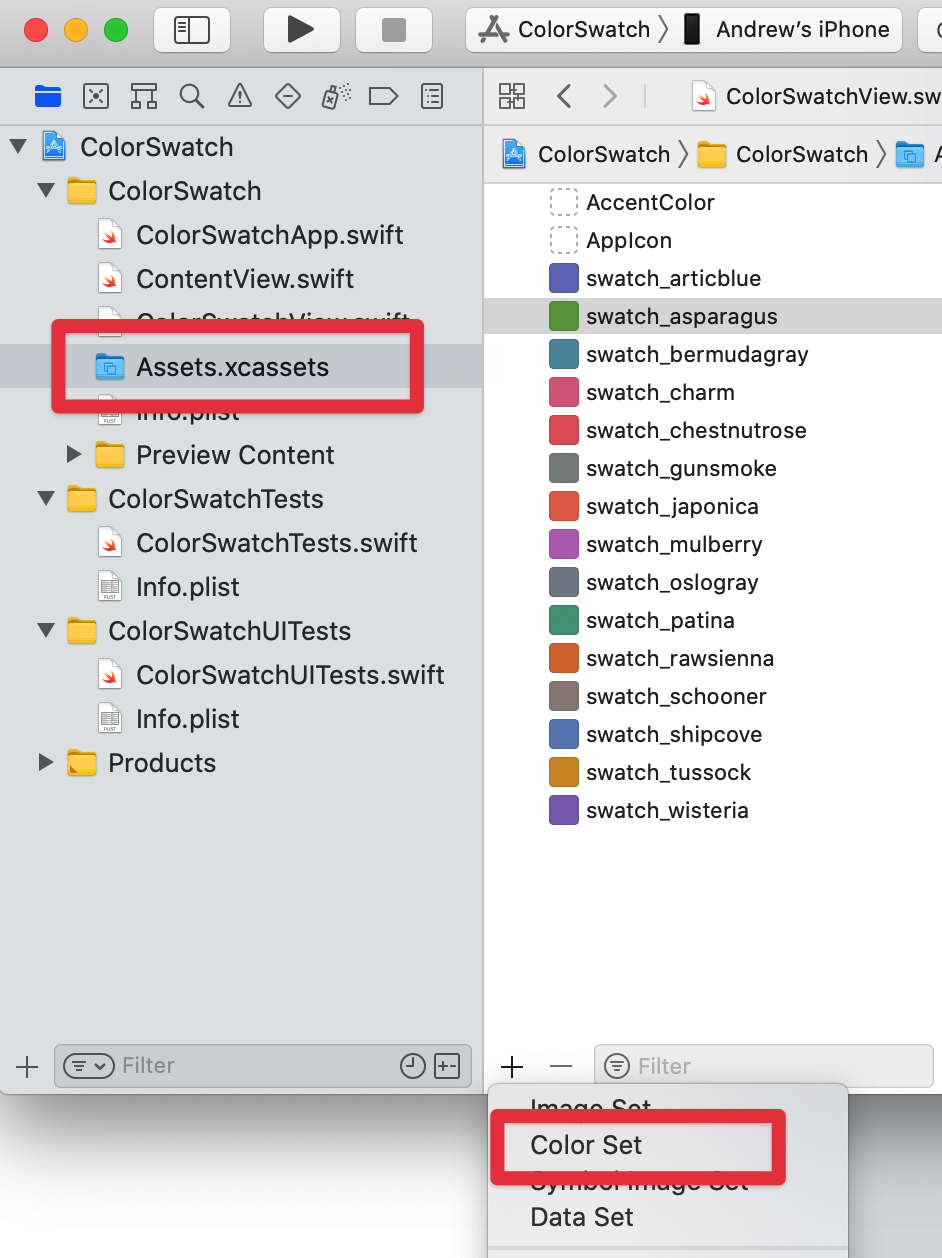
Within our project open the Assets.xcassets file and then use the + button at the bottom of the asset list and select add Color Set, then give our new color set a name, here I have chosen to prefix all my color sets with swatch_ so I can easily tell which I’m using for my swatch view.
在我们的项目中,打开Assets.xcassets文件,然后使用资产列表底部的+按钮,然后选择添加颜色集,然后给我们的新颜色集起一个名字,这里我选择为所有颜色集添加swatch_作为前缀我可以很容易地看出我正在使用哪个样本视图。
Once we’ve created our color set we get a single universal color which we can set using the standard color pickers.
创建颜色集后,我们将获得一种通用颜色,可以使用标准颜色选择器进行设置。
When I first started with Xcode I was confused as to why a single color was called a Color Set. It’s to allow us to create alternative colors for different scenarios which we’ll do now.
当我刚开始使用Xcode时,我对为什么将一种颜色称为颜色集感到困惑。 这是为了让我们能够为不同的场景创建替代颜色,现在我们将进行操作。
创建替代颜色 (Creating alternative colors)
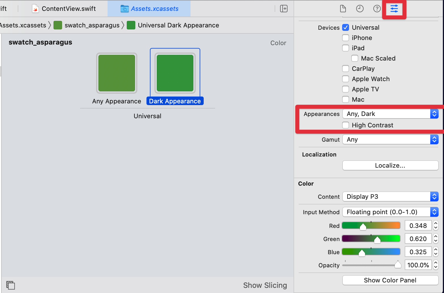
Whilst a single universal color is a good starting point we will probably want to create variants at least for dark mode. To do this we can use the Attribute Inspector button at the top right to get on this pane where we can choose what color variants we want to add. Here I have used the Appearances section to add a dark color but we can use as many combinations of Devices and Appearances as we need to give the best colors for the particular device/setting.
尽管单一通用颜色是一个很好的起点,但我们可能希望至少在暗模式下创建变体。 为此,我们可以使用右上角的“属性检查器”按钮进入此窗格,在此我们可以选择要添加的颜色变体。 在这里,我使用外观部分添加了深色,但是我们可以根据需要为特定的设备/设置提供最佳颜色的设备和外观组合使用。
创建色样视图 (Creating the Color Swatch View)
Now we understand why we should use named color assets and not native colors this part is pretty easy.
现在我们了解了为什么我们应该使用命名的颜色资产而不是本机颜色,这部分非常简单。
We define our color assets as an array of strings, in the order we want them displayed in the swatch grid.
我们将颜色资产定义为字符串数组,并按照我们希望它们在色板网格中显示的顺序排列。
The @binding property is used to set/hold the currently selected color asset name.
@binding属性用于设置/保留当前选定的颜色资产名称。
We’re using a LazyVGrid introduced in SwiftUI 2 to automatically layout our color swatch circles, automatically adjusting for the width of the view. We do that by defining our Columns to be adaptive with a minimum width and let LazyVGrid do all the work, it’s not called Lazy for nothing 😀
我们使用一个LazyVGrid在SwiftUI 2引入了自动布局我们的色板圈,自动调整角度的宽度。 为此,我们将Columns定义为具有最小宽度的自适应方法,然后让LazyVGrid完成所有工作,这就是所谓的Lazy什么都不做😀
Within the LazyVGrid we iterate round our named swatches and create a filled circle, colouring the circle by creating a color from our current swatch name. We add an onTapGesture to this to set the selection to be this swatch name.
在LazyVGrid我们遍历命名的色板并创建一个实心圆,通过从当前色板名称创建颜色来为该圆着色。 我们向其添加一个onTapGesture ,以将选择设置为该样本名称。
To show the current selection we conditionally add a slightly larger circle, this time we just want an outline rather than filled. We conditionally show this based on whether the current swatch we are iterating round is equal to the selection.
为了显示当前选择,我们有条件地添加了一个稍大的圆圈,这一次,我们只需要轮廓而不是填充。 我们有条件地根据要迭代的当前样本是否等于所选样本来显示该样本。
Because both circles are wrapped in a ZStack they’ll appear on top of each other giving us a nice outlined circle for the current selection.
因为两个圆圈都包裹在ZStack所以它们将彼此ZStack显示,从而为我们的当前选择提供了一个漂亮的轮廓圆圈。
使用色板视图 (Using the Color Swatch View)
To use our newly created ColorSwatchView control we just add it to our view, assign it a @state and for demo purposes I’ve put a rectangle beneath that reflects the currently selected color by setting a fill and creating a Color with our stored asset name. In a real world scenario we’d save this asset name away in our user defaults or other preferred persistent storage.
要使用我们新创建的ColorSwatchView控件,我们只需将其添加到视图中,为其分配一个@state,出于演示目的,我在下方放置了一个矩形,该矩形可以通过设置fill并使用我们存储的资产名称创建Color来反映当前选择的颜色。 在现实世界中,我们会将资产名称保存在用户默认设置或其他首选的持久性存储中。
结语 (Wrap Up)
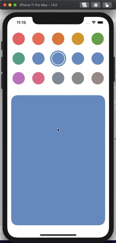
When we run the app we’ll see the Color Swatches displayed in a grid that automatically accommodates the horizontal space available. Choosing a color will change the sample rectangle view below and changing to dark mode will use the slightly more vibrant green color we set.
当我们运行该应用程序时,我们会看到在一个网格中显示的色板会自动容纳可用的水平空间。 选择一种颜色将更改下面的示例矩形视图,而更改为深色模式将使用我们设置的稍微鲜艳的绿色。
This is purely a sample and I’m not an expert in color theory so I’ll leave it up to you to decide what variants you need for your particular use cases.
这纯粹是一个示例,我不是色彩理论方面的专家,因此我将由您自己决定特定用例需要哪些变体。
I hope you found this article useful in both how to use Color Sets and also creating a view control for selecting your curated colors.
我希望您发现本文对于如何使用颜色集以及创建用于选择策展颜色的视图控件都很有用。
翻译自: https://medium.com/@codechimp_org/creating-a-curated-color-picker-in-swiftui-18a9a86f7721


 扫一扫
扫一扫


 870
870

 被折叠的 条评论
为什么被折叠?
被折叠的 条评论
为什么被折叠?
 到【灌水乐园】发言


