


swiftui
Styling makes your product recognizable.
样式使您的产品易于识别。
Styling makes your brand stronger.
造型使您的品牌更强大。
Styling is key.
样式是关键。
But when apps grow in size, styling gets harder and harder. That’s why centralize styling becomes a must.
但是,随着应用大小的增加,样式变得越来越难。 这就是为什么必须集中样式。
In this article, you will understand why styling schemes are necessary and how to create and apply a styling scheme using SwiftUI.
在本文中,您将了解为什么需要样式设计方案以及如何使用SwiftUI创建和应用样式设计方案。
Check out this code about three different buttons:
查看有关以下三个不同按钮的代码:
struct StylingView: View {


	var body: some View {
		VStack {
			Button(action: {}){
				Text("Primary button")
			}
				.padding(20)
				.foregroundColor(Color.white)
				.background(Color.blue)
				.cornerRadius(5)


			Button(action: {}){
				Text("Secondary button")
			}
				.padding(10)
				.foregroundColor(Color.white)
				.background(Color.blue)
				.cornerRadius(5)


			Button(action: {}){
				Text("Destructive button")
			}
				.padding(20)
				.foregroundColor(Color.white)
				.background(Color.red)
				.cornerRadius(5)
		}
	}
}
This code works and looks good, but also has some problems.
该代码可以正常工作,看起来不错,但是也有一些问题。
Repetitive code on every button will bring in the end to issues and failures.
每个按钮上的重复代码将最终解决问题和失败。
Hardcoded values: Colors, paddings, etc. are set directly on the view. If in the future color palette changes are needed, for example, due to a brand update, this will provoke modifying one by one every single element that needs to be changed.
硬编码值:直接在视图上设置颜色,填充等。 如果将来由于(例如)品牌更新而需要更改调色板,则会激起每个需要更改的元素的修改。
These problems can be mitigated by the creation of a styling scheme.
这些问题可以通过创建样式方案来缓解。
1.创建样式方案 (1. Creating a styling scheme)
A visual styling scheme is a structure that defines the visual aspects of the app: colors, fonts, and some other aspects of the interface elements.
视觉样式方案是一种定义应用程序视觉方面的结构:颜色,字体以及界面元素的其他某些方面。
Our sample styling scheme will include:
我们的示例样式方案将包括:
- A palette of colors to be used through the app. 通过应用程序使用的调色板。
- A palette of button styles to be used through the app, based on the color palette. 基于调色板,将通过应用程序使用的按钮样式调色板。
色彩调色板 (Color palette)
The color palette will be the unique point to access the colors in the app.
调色板将是访问应用程序中颜色的唯一点。
Color changes must be made only within the color palette and will be automatically reflected in every element that uses it.
颜色更改只能在调色板内进行,并且会自动反映在使用它的每个元素中。
The color palette for our app will be composed of three main colors and another one for destructive actions.
我们应用的调色板将由三种主要颜色组成,另外一种则具有破坏性。
enum ColorPalette {
	case primary
	case secondary
	case tertiary
	case destructive
	var color: Color {
		switch self {
		case .primary: return Color.green
		case .secondary: return Color.blue
		case .tertiary: return Color.gray
		case .destructive: return Color.red
		}
	}
}按钮方案(Button scheme)
A button style palette is a structure that generates button styles restricted to the buttons cases needed.
按钮样式调色板是一种生成受限于所需按钮情况的按钮样式的结构。
Every button needed for our app will be created using this ButtonStylePalette enumeration.
使用此ButtonStylePalette枚举将创建应用程序所需的每个按钮。
In this case, we need to display three different buttons: A primary button, a secondary, and a destructive one.
在这种情况下,我们需要显示三个不同的按钮:一个主按钮,一个辅助按钮和一个破坏性按钮。
enum ButtonStylePalette: ButtonStyle {
   case primary
   case secondary
   case destructive
	func makeBody(configuration: Configuration) -> some View {
		switch self {
		case .primary:
			// To fill
		case .secondary:
			// To fill
		case .destructive:
			// To fill
		}
	}
}
As the ButtonStylePalette enumeration implements the protocol ButtonStyle, func makeBody() needs to be implemented. This function will have the responsibility to configure a view with all the attributes related to the corresponding button style.
作为ButtonStylePalette 枚举实现了协议ButtonStyle ,需要实现func makeBody() 。 该功能将负责配置具有与相应按钮样式相关的所有属性的视图。
We will come back to this function later.
稍后我们将返回此功能。
2.创建一个按钮样式 (2. Create a button style)
A button style defines visual appearance, animations, and other aspects of the button.
按钮样式定义按钮的视觉外观,动画和其他方面。
We can check some styles that Apple provides: PlainButtonStyle() , BorderlessButtonStyle() , and DefaultButtonStyle() .
我们可以检查Apple提供的一些样式: PlainButtonStyle() , BorderlessButtonStyle()和DefaultButtonStyle() 。
Button(action: {}){
   Text("Plain button style")
}
.buttonStyle(PlainButtonStyle())


Button(action: {}){
    Text("Borderless button style")
}
.buttonStyle(BorderlessButtonStyle())


Button(action: {}){
    Text("Default button style")
}
.buttonStyle(DefaultButtonStyle())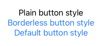
Plain, borderless and default Apple's button styles
Plain, borderless and default Apple's button styles
Let’s create our custom style for the primary button:
让我们为主按钮创建自定义样式:
struct PrimaryButtonStyle: ButtonStyle {
	var color: Color = ColorPalette.primary.color
	func makeBody(configuration: Configuration) -> some View {
		PrimaryButton(configuration: configuration, color: color)
	}
}


struct PrimaryButton: View {
	let configuration: PrimaryButtonStyle.Configuration
	let color: Color
	var body: some View {
		return configuration.label
		.padding(20)
		.foregroundColor(Color.white)
		.background(color)
		.cornerRadius(5)
	}
}
Create a button style struct called
PrimaryButtonStyle, that returns the view needed for the button. The chosen color is taken from our color palette case.primary.创建一个名为
PrimaryButtonStyle的按钮样式结构,该结构返回按钮所需的视图。 选择的颜色是从我们的调色板案例.primary。Create a
PrimaryButtonview. This view will include every visual aspect (foreground and background colors, padding, corner radius, etc.), and will be called from thePrimaryButtonStylestruct.创建一个
PrimaryButton视图。 该视图将包括每个视觉方面(前景和背景颜色,填充,拐角半径等),并将从PrimaryButtonStyle结构体中调用。
We could integrate the
PrimaryButtoncontent intofunc makeBody(), but dividing the functionality into two different structs allows the flexibility to return a view or another, depending on the button state configuration, or any other environment property.我们可以将
PrimaryButton内容集成到func makeBody(),但是将功能分为两个不同的结构可以根据按钮状态配置或任何其他环境属性灵活地返回一个视图或另一个视图。
3.配置方案 (3. Configure the scheme)
Back in our palette, now we can add the resultant views in func makeBody().
回到我们的调色板中,现在我们可以将结果视图添加到func makeBody() 。
Button views are wrapped inside an
AnyView(), so the function can return different views按钮视图包装在
AnyView(),因此该函数可以返回不同的视图
enum ButtonStylePalette: ButtonStyle {
	case primary
	case secondary
	case destructive

	func makeBody(configuration: Configuration) -> some View {
		switch self {
		case .primary:
			return AnyView(PrimaryButtonStyle(color: ColorsPalette.primary.color)
						.makeBody(configuration: configuration))
		case .secondary:
			// Return button styled view for secondary case
		case .destructive:
			// Return button styled view for destructive case
		}
	}
}4.使用样式(4. Use the styles)
Apply the desired style to every button using the modifier .buttonStyle().
使用修饰符.buttonStyle()将所需的样式应用于每个按钮。
Button(action: {}){
	Text("Primary button")
}
.buttonStyle(ButtonStylePalette.primary)


Button(action: {}){
	Text("Secondary button")
}
.buttonStyle(ButtonStylePalette.secondary)


Button(action: {}){
	Text("Destructive button")
}
.buttonStyle(ButtonStylePalette.destructive)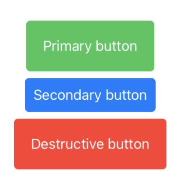
结论(Conclusion)
Styling an app can be simple and easy to do when you use a styling scheme. It’s a clean way to avoid repetitive code and allows us to avoid a mess when escalating the app or just maintaining it.
使用样式方案时,对应用程序进行样式化可以很容易。 这是避免重复代码的一种干净方法,它使我们可以在升级应用程序或仅对其进行维护时避免混乱。
然后去哪儿? (Where to go from here?)
The scheme created can evolve into a more powerful one, as you can integrate fonts, sizes, animations, etc. Anything that you can imagine about the visual appearance can get a place into the styling scheme.
创建的方案可以演变为功能更强大的方案,因为您可以集成字体,大小,动画等。您可以想到的关于外观的任何内容都可以放在样式方案中。
翻译自: https://medium.com/the-innovation/how-to-style-your-app-in-swiftui-7266e3b74dd0
swiftui


 2758
2758


 被折叠的 条评论
为什么被折叠?
被折叠的 条评论
为什么被折叠?
 到【灌水乐园】发言


