


android和ios适配
Before going on, I would like to say that everything you read is only based on my UI/UX design knowledge, experience, and conducted user tests. Somethings could not work for you but in my case, it turned out good.
在继续之前,我想说的是,您阅读的所有内容仅基于我的UI / UX设计知识,经验和进行的用户测试。 有些事情对您不起作用,但就我而言,结果很好。
Many examples that I will bring I took from an enormous medical app that stakeholders wanted to fit into a small screen (I felt like an IMF agent considering how big the application was). I decided to go with that exact application because it had many problems and challenges as stakeholders wanted almost all functionalities of a hospital plus features of doctor kitchen.
我将带给我的很多例子是从一个巨大的医疗应用程序中获取的,利益相关者希望将其安装到一个小屏幕上(考虑到应用程序的大小,我感觉像是IMF的代理商)。 我决定采用该确切的应用程序,因为它存在许多问题和挑战,因为利益相关者想要医院的几乎所有功能以及医生厨房的功能。
1.并非总是点击次数越少越好。 (1. Not always fewer clicks are better.)
When making a page of certain functionality, that has too many exits, sometimes it is better to add more clicks (in my case taps), make additional pages rather than fit everything in one small screen.
在制作具有某些功能的页面时,如果退出页面过多,有时最好增加更多的点击次数(以我的情况为例),创建更多页面而不是将所有内容都放在一个小屏幕上。
- On a small screen, everything stacked together can mislead the user. 在小屏幕上,堆叠在一起的所有内容都可能误导用户。
- Key functions become more noticeable and easier to access. 关键功能变得更加引人注目并且更易于使用。
- Visually more appealing. 在视觉上更具吸引力。
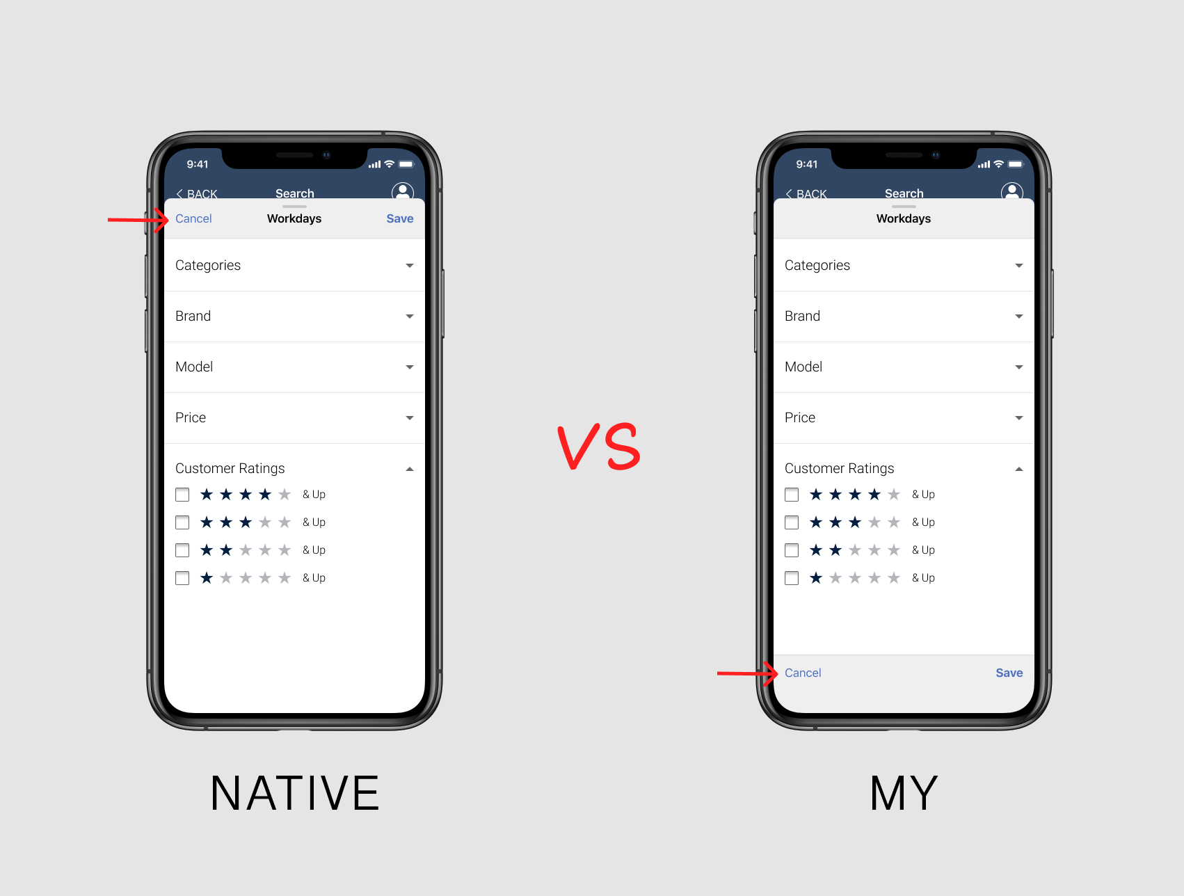
When we check the case with add workday section, the first time I added two more buttons on the top as stakeholders and POs didn’t even want to listen to any argument. They wanted quick access from the first page.
当我们在“添加工作日”部分检查案件时,我第一次在顶部添加了两个按钮,因为涉众和采购订单甚至都不想听任何论点。 他们希望从首页快速访问。
But as potential users pointed out, they often tapped on the user profile menu instead of the edit button underneath it.
但是正如潜在用户指出的那样,他们经常轻按用户个人资料菜单,而不是其下方的编辑按钮。
2.并非总是本机解决方案是最好的。 (2. Not always native solutions are the best.)
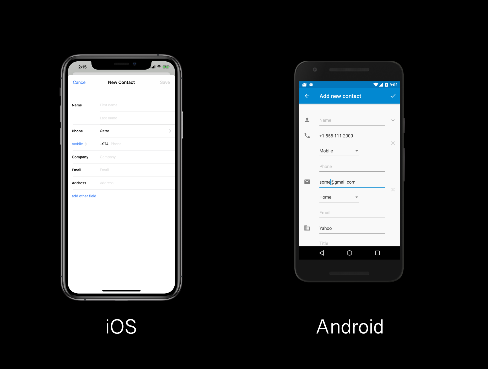
When I was designing a native iOS ‘cancel’ and ‘done’ actions on the Modals, I decided to improvise and put the same section on the bottom.
当我在Modals上设计本机iOS的“取消”和“完成”操作时,我决定即兴创作,并将同一部分放在底部。
- It’s easier to access with the thumb. 用拇指更容易接触。
- The native version is too high, and on newer devices often impossible to reach without rearranging the phone in hand or using second. 本机版本太高,在较新的设备上,如果不重新放置手机或不使用第二个手机,通常是无法访问的。
I did the native version too, and after AB testing results were on my side. I can’t even tell you how happy I was with that.
我也做了本机版本,经过AB测试后,结果就在我这一边。 我什至不能告诉你我对此有多高兴。
IOS, do you read this? 1 point for me :)
iOS,您读过吗? 给我1分:)
3.并非总是针对同一操作系统坚持相同的解决方案 (3. Not always stick to the same solution for the same OS)
I’m not talking about Gmail that uses Material Design for iOS and Android or Instagram that used iOS style on both platforms. I am talking about using a feature of one in the other, while most components stay native to each platform.
我不是在谈论在iOS和Android上使用Material Design的Gmail,还是在两个平台上都使用iOS风格的Instagram。 我说的是使用一种功能,而大多数组件仍是每个平台固有的。
Before going on with this one, I must say that I absolutely adore both solutions for text fields iOS (Human Interface) and Android (Material Design).
在继续之前,我必须说我绝对喜欢iOS(人机界面)和Android(材料设计)文本字段的两种解决方案。
- Forms of iOS are just so simple yet elegant, and they have great UX. iOS的形式是如此简单而优雅,它们具有出色的UX。
- Material design’s popping titles are so mindblowing and again have great UX. You always know what fields you are filling. Material Design的爆破标题是如此令人着迷,并再次拥有出色的UX。 您总是知道您要填写哪些字段。
In the case of the app, I used popping Material Design forms for both platforms. All three groups (stakeholders, users, and our team) unanimously preferred the popping animation fields.
对于该应用程序,我在两个平台上都使用了弹出的Material Design表单。 所有这三个组(利益相关者,用户和我们的团队)都一致喜欢弹出的动画字段。
4.并非总是完美就意味着好。 (4. Not always perfect means good.)
This one goes for the stakeholders. I respect them a lot, and working with them was so much fun. The thing is that they aimed at perfect. And the project lasted for a very long time because every week they came up with new ideas that will “work better”. And we, constantly came back to do changes and the project lasted even longer.
这是针对利益相关者的。 我非常尊重他们,与他们合作非常有趣。 问题是他们追求完美。 该项目持续了很长时间,因为他们每周都会提出新的想法,这些想法将“更好地工作”。 而且,我们不断回来进行更改,并且该项目持续了更长的时间。
The first time I saw the phrase “Done is better than perfect!” on a MacBook sticker, I fell in love with that phrase. At the same time, I was designing my personal website and I did the same perfect thing every day. New ideas, new changes, new inspirations, that all led to a new schedule which delayed the success for me. When you aim for perfect each imperfection keeps delaying the project. Our minds can’t project the perfect thus we will never be able to form that as a goal. On the other hand, good is formed, it’s stable, and it has “measurements.”
我第一次看到“完成胜于完美!”这句话。 在MacBook贴纸上,我爱上了这个短语。 同时,我正在设计自己的个人网站,并且每天都做同样完美的事情。 新的想法,新的变化,新的灵感都导致了新的时间表,这对我来说是成功的延误。 当您追求完美时,每个缺陷都会延迟项目。 我们的思想无法投射完美,因此我们将永远无法将其作为目标。 另一方面,形成了良好的事物,它是稳定的,并且具有“度量”。
By no means, I am saying that you have to rush your project for sooner results. I am just saying that there is no absolute perfect, and by chasing it, you may never finish the project.
我绝不是说您必须赶紧项目才能取得更快的结果。 我只是说没有绝对的完美,通过追求它,您可能永远无法完成项目。
Remember this, and I am saying as a huge perfectionist — there is never a perfect, just like in physics. Repeat that to yourself! It’s like trying to catch the junkie dragon in South Park 11.14 episode. You can never catch it. For me, closest to perfect is Apple’s website design, especially the iPhone 11 pro page. And they keep updating. Because there is always better.
记住这一点,我是说作为一个巨大的完美主义者-从来没有一个完美的事物,就像物理学中一样。 对自己重复一遍! 这就像试图在南方公园11.14集中捉住瘾君子一样。 您永远无法抓住它。 对我而言,最接近完美的是苹果的网站设计,尤其是iPhone 11专业版页面。 并且他们不断更新。 因为总有更好的。
My advice is to look at your design after some time away from the screen. If you think it is good, then it’s already better than perfect. Trust me. If stakeholders say it’s good, and sugar on top — users approve it, there is no better perfect than that.
我的建议是离开屏幕一段时间后再查看您的设计。 如果您认为这很好,那么它已经比完美更好。 相信我。 如果利益相关者说这很好,并且糖是最高的—用户认可,那么没有比这更好的完美了。
5.并非总是对您更简单的事情对他人更简单。 (5. Not always what is simpler for you simpler for others.)
I really love iOS data pickers, and I use them as often as I get the chance. But user testing showed that most users easier navigated in android data pickers.
我真的很喜欢iOS数据选择器,并在有机会的情况下经常使用它们。 但是用户测试表明,大多数用户更容易在android数据选择器中导航。
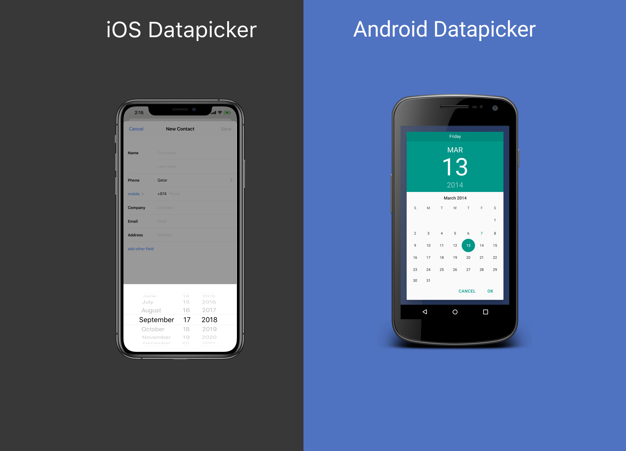
Everyone agreed that iOS looked cooler, but it’s the famous problem where UI and UX are going against each other. In some cases, there is no sweet middle spot. And you ALWAYS want to go with the users.
每个人都同意iOS看起来更酷,但这是UI和UX相互冲突的著名问题。 在某些情况下,没有甜蜜的中间点。 而且您总是想和用户一起去。
6.并非总是与用户同行会为您带来最佳结果。 (6. Not always going with the users will have the best outcome for YOU.)
We know the phrase ‘Client is Always Right!’ Thankfully, in web design, thanks to many kinds of researches, including user testings, they often admit that it’s not the case.
我们知道“客户永远是对的!”这句话。 值得庆幸的是,在网页设计中,由于进行了许多研究,包括用户测试,他们经常承认事实并非如此。
But in some cases, stakeholders want to stick with something they love, and whatever you do, whatever UX research proves them wrong — they won’t agree to take it away. In some rare cases, you might even lose the project if you keep insisting to take away the thing they love so much. Here comes a delicate spot where you have to choose for yourself what’s more important; do the wrong UX, and in some severe cases, lose your rating or lose the project.
但是在某些情况下,利益相关者希望坚持自己喜欢的事情,无论您做什么,无论UX研究证明他们错了,他们都不会同意将其删除。 在极少数情况下,如果您坚持要拿走他们非常喜欢的东西,甚至可能会失去项目。 这是一个微妙的地方,您必须自己选择更重要的地方; 做错了用户体验,在某些严重的情况下,可能会失去您的评价或项目。
I’m afraid it’s all up to you. It depends on how important you think that feature is, how much it will impact other’s opinion of your professionalism. And how much do you need that project. I’m afraid each case is unique, and you have to decide for yourself.
恐怕一切都取决于你。 这取决于您认为该功能的重要性,它会影响他人对您专业水平的看法。 您需要多少项目。 恐怕每种情况都是唯一的,您必须自己决定。
In my case, it was a user icon that worked by Hamburger menu logic. It opened when tapping on the user icon. I didn’t like that profile pic button opened the hamburger menu. But the Client is Always Right.
就我而言,这是一个汉堡菜单逻辑起作用的用户图标。 点击用户图标时它会打开。 我不喜欢个人资料图片按钮打开汉堡菜单。 但是客户永远是对的。
7.用户体验并不总是比营销更好。 (7. Not always User Experience is better than Marketing.)
To my shame, I have to admit that I am worse at marketing skills than I should have been. Marketing is a big part of UX and vice versa.
令我感到羞耻的是,我不得不承认,我在营销技巧上比应该做的要差。 市场营销是用户体验的重要组成部分,反之亦然。
On the app, there were pages where the Marketing department, along with stakeholders, ingeminated to use their big brand symbol on a small screen (not a logo) on pages where the right thing would be to use more functional assets.
在该应用程序上,有一些页面,市场营销部门和利益相关者一起在页面上使用大品牌符号(而不是徽标)使用页面,在这些页面上正确的做法是使用更多的功能资产。
And the thing is that we both were right. From the UX perspective, it would be friendlier for users to have some functions there. And I was forced to fit it on other pages.
事实是我们俩都是正确的。 从UX的角度来看,用户在那里拥有一些功能会更友好。 我被迫将其放在其他页面上。
But from a Marketing perspective, the brand was new, and they needed to make people see the symbol in as many places as possible. Marketing department won, and the outcome was good. Though I don’t know what would happen if we did it my way. The goal of the marketing department was achieved, and sacrificed pages didn’t even impact users.
但是从市场营销的角度来看,品牌是一个新品牌,他们需要让人们在尽可能多的地方看到该符号。 市场部获胜,结果很好。 虽然我不知道如果我们按照自己的方式去做会怎样。 市场部门的目标得以实现,牺牲的页面甚至没有影响用户。
8.并非总是如此-我有8个提示。 (8. Not always — I have 8 tips.)
I’m sorry, just kidding :)
对不起,开个玩笑:)
8.1。 并非总是人们知道他们习惯了什么。 (8.1. Not always people know what they are used to.)
I know, it’s a bit odd. I’ll explain it. In one test, I crossed users and platforms. I gave the iOS version to Android users and vice versa. Many Android users navigated easier in some iOS features even though they never held an iPhone in their hands. It was most noticeable when they navigated through modals (popups). And vice versa; iOS user group navigated easier in the Android calendar.
我知道,这有点奇怪。 我会解释的。 在一项测试中,我跨越了用户和平台。 我将iOS版本提供给了Android用户,反之亦然。 许多Android用户即使从未使用过iPhone,也可以轻松使用某些iOS功能。 当他们在模式(弹出窗口)中导航时,这最为明显。 反之亦然; iOS用户组可以在Android日历中轻松导航。
结论: (In conclusion:)
Not always — you have to stick to the right UX, Native solutions, etc. Use Your Skills, Experience, and most of all, a common sense. It’s a big UX design world out there, and everything is constantly changing. What was right before is wrong now, and what is wrong now might someday be considered the best UX. Trust your gut and keep going. I’m sure if you made it so far with this boring article :), you’ll make it in the big league and you’ll make it really good. Which is better than perfect! (See what I did there?!)
并非总是如此-您必须坚持正确的UX,本机解决方案等。使用您的技能,经验,尤其是常识。 这是一个很大的UX设计世界,一切都在不断变化。 以前做对的事情现在是错的,而现在做错的事情有一天可能被认为是最好的用户体验。 相信自己的直觉,继续前进。 我敢肯定,如果您到目前为止在这篇无聊的文章中做到了:),您将在大联盟中获得成功,并且一定会非常出色。 哪个比完美更好! (看看我在那里做什么?!)
Thank you for reading.
感谢您的阅读。
If you have any questions or thoughts about the article feel free to leave a comment.
如果您对本文有任何疑问或想法,请随时发表评论。
Wish you Best User Experience in real life!
祝您在现实生活中获得最佳用户体验!
android和ios适配


 1540
1540


 被折叠的 条评论
为什么被折叠?
被折叠的 条评论
为什么被折叠?
 到【灌水乐园】发言


