


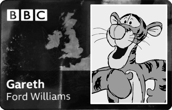
Today I gave a presentation at #ID24 2020 called ‘The Wonderful Thing About Tiggers’ which is a personal trundle through what the inside of my brain is like, using random stuff I found on the internet and unrelated anecdotes, followed by a few actual barriers I experience when it comes to the UX Design and digital products.
今天,我在#ID24 2020上做了一个名为“关于跳跳虎的奇妙事物”的演讲,这是我脑海中的真实经历,使用的是我在互联网上发现的随机信息和无关的轶事,然后是一些实际的事。我在体验UX设计和数字产品时遇到的障碍。
It’s a bit loose, with little structure, quite a lot of improvisation and tangents all over the place, which is on purpose because that what my mind is like. But it got me thinking that really, I should be giving a bit more, so I’m publishing this little article to compliment the talk as best I can.
它有点松散,几乎没有结构,到处都是即兴创作和切线,这是故意的,因为我的想法是这样。 但是,这让我真正想到,我应该付出更多,所以我发布这篇小文章,以尽最大可能赞美这次演讲。
I started with the notion of explaining barriers in the talk, but then I thought that because so much of what neurodivergent people need is rooted in a mixture of usability best practices and accessibility considerations, I would propose a set of Cognitive UX Design Principles and link them to relevant guidelines and resources.
我从解释谈话中的障碍的概念开始,但是后来我认为,由于神经异质性人们需要的很多东西都源于可用性最佳实践和可访问性考虑因素的混合,因此我将提出一套认知UX设计原则和链接他们获得相关指导方针和资源。
This is nothing new as there are Universal Design Principles, Inclusive Design Principles, NN Groups Usability Heuristics, Web Aim’s Cognitive Disability Design Considerations, etc.
这并不是什么新鲜事物,因为有通用设计原则,包容性设计原则, NN组可用性启发法, Web Aim的认知障碍设计注意事项等。
These are all very useful resources, but they did not feel like they were quite what I was after. So what I did was to turn the clock back a bit further and had a look at Cognitive Product Design from the 1970s and 80s. Most of what is in those principles is still relevant today, so all I’ve done is updated it a bit and re-contextualised the content from physical to digital products (changing a couple of them on the way). Not rocket science, still just a draft, just my perspective and probably a bit ropey in places, but I’ve done it because I had a look and couldn’t find anything out there that fitted.
这些都是非常有用的资源,但它们并不像我追求的那样。 因此,我要做的是使时光倒流,回顾一下1970年代和80年代的认知产品设计。 这些原则中的大部分内容在今天仍然适用,因此我所做的只是对其进行了一些更新,并将内容从物理产品转换为数字产品(将其中的几个更改)。 不是火箭科学,还是草稿,只是我的观点,也许在某些地方有些粗略,但我之所以这样做,是因为我看了一下,却找不到合适的东西。
Please Tweet me if I’m wrong @garethfw as my search might not have been as thorough as it could have been, but when you can’t find something you need, ‘make it yourself’ wins every time for me.
如果我写错了,请发给我 @garethfw的搜索范围可能不尽如人意,但是当您找不到所需的内容时,“为自己动手做”对我来说总是很成功。
Cognitive design as a practice came out of studies in user interaction with consumer products in the 1970s, and by the 80s their use was commonplace in the product design industry. Parts of these principles have transferred into the digital space as “Usability Heuristics” but they have an issue. They are like all the other aforementioned principle frameworks, they are relevant but only from a rather neurotypical perspective. Why? Because they preceded the recent upsurge in interest in neurodiversity, so I thought it was time for a re-think.
认知设计是一种实践,它是在1970年代与用户与消费产品进行用户交互的研究中得出的,到80年代,它们在产品设计行业中的使用已很普遍。 这些原则的一部分已作为“可用性启发法”转移到数字领域,但它们存在问题。 它们与其他所有上述原理框架一样,都是相关的,但仅从相当典型的角度来看。 为什么? 因为它们是在最近人们对神经多样性产生兴趣之前出现的,所以我认为是时候重新考虑了。
The following list comprises of 10 principles re-imagined from a neurodivergent perspective, focusing on most of the barriers I can face when accessing the websites. So this is just a personal perspective, plus the years of observation I have had as Head of Accessibility, UX Design and Design Research, at the BBC.
以下列表包含从神经发散的角度重新构想的10条原则,重点介绍了我在访问网站时可能遇到的大多数障碍。 因此,这只是个人观点,再加上我在BBC UX设计与设计研究无障碍负责人的多年观察。
These are in no way a replacement for COGA or other programmes focusing on cognitive accessibility, but a way of re-contextualised a proven design framework from a single neurodivergent person’s perspective (me).
这些绝不能替代COGA或专注于认知可及性的其他程序,而是一种从单个神经发散的人的角度(我)重新验证经过验证的设计框架的方法。
For a second person’s perspective, much better articulated than mine, then I’d recommend you have a watch of Jamie Knight’s Cognitive Accessibility 107 Beta, 103 Gaming Addition talks and blogposts Cognitive Accessibility Part 1 and Part 2.
从第二个人的角度出发,比我的观点要清晰得多,那么我建议您观看Jamie Knight的Cognitive Accessibility 107 Beta , 103 Gaming Addition Talks和Blogposts Cognitive Accessibility Part 1和Part 2 。
BTW is you want to see where the really interesting work that is happening in Cognitive Accessibility you need to check out the work that is ongoing from the WCAG COGA Task Force. There are lots of useful links at the end of this article too.
BTW是您要查看“认知可访问性”中真正有趣的工作在哪里,您需要检查WCAG COGA任务组正在进行的工作。 本文结尾处也有许多有用的链接。
If you’ve got this far without wandering off, then well done. My ADHD brain would have clicked on one of those links and I’d probably forget to come back. So, for those of you with a less easily distracted brain than mine, here are the draft principles for Cognitive UX Design. After each one there are links to NN Group for anything paralleled in their Usability Heuristics as well as the related BBC Accessibility Guidelines for websites and native mobile applications. If you are after something for Cognitive Accessibility for Video Games then check out the NN Group Heuristics for Video Games, Games Accessibility Guidelines cognitive accessibility section and the BBC GEL Games Accessibility for Children.
如果您已经走了那么远,那就做得很好。 我的ADHD大脑会点击这些链接之一,而我可能会忘记回来。 因此,对于那些比我的大脑更不易分心的人,这里是认知UX设计的原则草案。 每次发布之后,都可以链接到NN Group,以获取其可用性启发法中与之平行的任何内容,以及相关的针对网站和本机移动应用程序的BBC无障碍指南。 如果您对视频游戏的认知可及性感兴趣,请查看NN组视频游戏的启发式方法,游戏可及性指南的认知可及性部分和BBC GEL儿童游戏的可及性。
After each of the following principles are some links to relevant BBC Guidelines that are relevant to Cognitive Accessibility.
遵循以下每条原则后,都有一些与认知无障碍相关的BBC相关指南的链接。
1.标准元素(1. Standard Elements)
Many user errors are actually caused by design inconsistencies in how things work, so ensure that similar elements work the same way. Standard design patterns help prevent errors which is why design systems, design conventions and web standards are so important.
实际上,许多用户错误是由工作方式上的设计不一致引起的,因此请确保相似的元素以相同的方式工作。 标准设计模式有助于防止错误,这就是设计系统,设计约定和Web标准如此重要的原因。
Users should not have to re-learn the interactions of common tasks locally when they have already learned them universally.
当用户已经普遍学习通用任务后,不必在本地重新学习通用任务的交互。
All functional design should have audio and visual consistency from both interactive and informational perspectives.
从交互和信息的角度来看,所有功能设计都应具有音频和视觉上的一致性。
See related NN Group articles on Do Interface Standards Stifle Design Creativity? and Usability Heuristic Consistency Standards
参见有关NN组有关接口标准是否窒息设计创新的文章。 和可用性启发式一致性标准
2.服务和指示符(2. Affordances and Signifiers)
An affordance is the way in which an element is expected to behave when interacted with. Not all affordances are intentionally designed.
承受能力是元素与之交互时预期表现的方式。 并非所有津贴都是有意设计的。
A signifier is a commonly held reasonable expectation of what a person thinks is an affordance when they see an object.
指称者是人们通常认为的一个合理的期望,即当他们看到一个物体时,他认为是可承受的。
Affordances and Signifiers enable a designer to take advantage of perceptions and expectations.
负担和指示符使设计师能够利用感知和期望。
The concept of both affordances and Signifiers are closely related to that of a standard, but much less consciously determined. Whereas a standard is a formal agreement to eliminate inconsistencies, affordances and signifiers can also be based on an informal convention that has evolved through time.
供给和指示符的概念与标准的概念紧密相关,但是却很少有意识地确定。 尽管标准是消除不一致的正式协议,但优惠和表示者也可以基于随时间演变的非正式公约。
There should always be a strong relationship between the perception of the need to take an action and the action itself.
在对需要采取行动的看法与行动本身之间应该始终保持紧密的联系。
See related NN Group article Match Between the System and the Real World
请参阅相关的NN Group文章“系统与现实之间的匹配”
3.简单性(3. Simplicity)
There is such a thing as too much information and this can either be an issue of volume, or information provided in too complex a fashion. In general, visual and UX design best practice strives to simplify both presentation and interactions.
信息太多了,这可能是一个问题,或者是以太复杂的方式提供的信息。 通常,视觉和UX设计最佳实践会努力简化表示和交互。
Clutter divides attention and increases cognitive load reducing user response time and accuracy.
混乱会分散注意力并增加认知负担,从而降低用户的响应时间和准确性。
See NN Group article on Aesthetic and Minimalist Design
参见NN Group关于美学和简约设计的文章
4.清晰的沟通(4. Clear Communication)
Another common problem is caused by a user not being able to identify or interpret a message.
另一个常见的问题是由用户无法识别或解释消息引起的。
There are issues in presenting clear images and messages: noticeable, distinguishable, and interpretable.
呈现清晰的图像和消息时存在一些问题:明显,可区分和可解释。
Important messages must be noticeable. They should contrast with their surroundings and be given appropriate priority.
重要消息必须引人注目。 他们应与周围环境形成对比,并给予适当的重视。
Important messages should be distinguishable from surrounding information. Unrelated messages should be easy to distinguish from one another, so the degree of their relationship is clear.
重要消息应与周围信息区分开。 无关的消息应该易于区分,因此它们之间的关联程度很明显。
All messages should be interpretable. An example of one type of issue is avoiding use of characters that look alike e.g. 1lI, B8, QOCD and try to break up long strings in phone numbers e.g. (000) 000–0000
所有消息均应可解释。 一种类型的问题的一个示例是避免使用看起来相似的字符,例如1lI,B8,QOCD,并尝试分解电话号码中的长字符串,例如(000)000–0000
Interpretation is key when displaying errors. The technical information is important but non-technical advice should also be included so the user knows what they should do to resolve the issue.
显示错误时,解释是关键。 技术信息很重要,但也应包括非技术建议,以便用户知道他们应该采取什么措施解决问题。
Choose an accessible typeface too… not one that says it is “accessible”. For more information see my previous article on Choosing an Accessible Typeface.
还要选择一种易于使用的字体……而不是说它是“可使用的”字体。 有关更多信息,请参见我以前的文章“选择可访问的字体” 。
See NN Group article on Help and Documentation
请参阅有关帮助和文档的NN组文章
5.裁员(5. Redundancies)
Sometimes one message or mode of interaction is insufficient. Because mistakes are easy to make and humans have many limitations, it is important to consider the provision of the same information in more than one way and in more than one place. If the user misses or cannot access one cue, they pick up on another.
有时,一种消息或交互方式是不够的。 由于容易犯错误,并且人有很多局限性,因此重要的是要考虑以一种以上的方式在多个地方提供相同的信息。 如果用户错过或无法访问一个提示,他们会接听另一个提示。
This can sometimes mean there is duplication of effort (consumption or interaction) on behalf of the user and this needs to be considered by the designer against any risk of error.
有时这可能意味着代表用户有重复的工作(消耗或交互作用),设计者必须考虑到这一点,以防出现任何错误风险。
Redundancy is not just information but also interaction modes such as point, speak, touch or tab are cognitively more accessible to different users.
冗余不仅是信息,而且在交互上,例如说,说,触摸或制表符也更容易为不同用户所用。
Every system needs the flexibility to support the needs of both novice and expert users, but flexibility should also extend to users with different cognitive requirements such as styles of learning, communication and control.
每个系统都需要灵活性来支持新手和专家用户的需求,但是灵活性还应该扩展到具有不同认知要求的用户,例如学习方式,沟通方式和控制方式。
See related NN Group articles on Flexibility and Efficiency of Use and Accelerators Allow Experts to Increase Efficiency
参见相关的NN Group文章,有关使用的灵活性和效率,以及加速器可让专家提高效率
6.模式(6. Patterns)
Humans can be pretty good at spotting and grasping the purpose of patterns. Information presented as a pattern can be understood quickly and accurately whereas if there is no obvious structure or hierarchy people can become confused. In this way grouping information, content or controls in related outcomes, subject or function aids user engagement. Similarly, placing elements in patterns or in a specific context will help indicate to the user what to do.
人类可以很好地发现并掌握模式的目的。 可以快速,准确地理解以模式表示的信息,而如果没有明显的结构或层次结构,人们可能会感到困惑。 这样,将信息,内容或控制以相关结果,主题或功能进行分组有助于用户参与。 同样,将元素放置在模式中或特定的上下文中将有助于向用户指示要做什么。
Patterns enable people to learn, relate and engage as their comprehension is built upon all previous interactions with a particular products or services.
模式使人们能够通过与特定产品或服务的所有先前交互来建立理解力,从而学习,联系和参与。
7.认可而不是召回(7. Recognition Rather than Recall)
Most users can build up a mental map and understanding of a system to enable them to use it ever more efficiently however some users neither have the short or long-term memory to be able to support this. Make objects, actions, and options obvious and persistent so the user is not dependant on having to remember information from. Help and instruction should be easily identifiable, contextual and easily retrievable, and if user error is persistent a system should be able to detect when a user needs help or advancement.
大多数用户可以建立心理图和对系统的了解,以使他们能够更有效地使用它,但是有些用户既没有短期记忆也没有长期记忆来支持这一点。 使对象,动作和选项变得明显且持久,因此用户不必依赖于必须记住信息。 帮助和说明应该易于识别,上下文相关并且易于检索,并且如果用户错误持续存在,则系统应该能够检测用户何时需要帮助或提升。
See NN Group article on Recognition Rather Than Recall and the video on the same subject.
参见NN Group关于识别而不是召回的文章,以及有关同一主题的视频。
8.可变刺激和弹跳效应(8. Variable Stimuli and the Pop Out Effect)
All humans detect an occasional novel stimulus more readily than a constant one because our senses fatigue easily with continuous exposure.
与持续不断的刺激相比,所有人类都更容易检测到偶然的新颖刺激,因为我们不断地接触容易感觉到疲劳。
Terms and Conditions or warnings are notorious for being overlooked since they quickly become part of the background and simply are not noticed. This filtration process is something that is generally seen as a benefit as it is a sign that people are developing strategies from ongoing interactions however in some instances it is important to avoid excessive use of a single way of presenting information, especially when it comes to user commitment or safety.
术语和条件或警告因被忽视而臭名昭著,因为它们Swift成为背景的一部分,并且根本不会被注意到。 这种过滤过程通常被认为是有益的,因为这表明人们正在通过持续的交互来制定策略,但是在某些情况下,避免过度使用单一的信息呈现方式非常重要,尤其是在涉及用户时承诺或安全性。
This is also important to consider when introducing a new proposition or an extension to the provision of an existing service. Unearthing and exposing underused functionality that adds benefit to a user is also important if people bypass something that could be of use to them later.
在引入新的主张或对现有服务的提供进行扩展时,考虑这一点也很重要。 如果人们绕开了以后可能对他们有用的功能,发掘和暴露那些未使用的功能会给用户带来好处,这也很重要。
9.反馈和通知(9. Feedback and Notification)
As a general rule the sooner and clearer feedback is given, the easier it is to determine if an error has been made or not.
通常,给出的反馈越早越明确,则越容易确定是否出错。
The total absence of feedback prevents a user knowing if an action has been successful and if a mistake has been made. It’s also greatly increases the likelihood that user error will be repeated.
完全没有反馈会阻止用户知道操作是否成功以及是否犯了错误。 这也大大增加了重复用户错误的可能性。
As products and platforms can have multiple background applications running, notifications have become a key part of any user experience. These should always be a mixture of visual, audible and haptic with the user being able to control the individual level of persistence.
由于产品和平台可以运行多个后台应用程序,因此通知已成为任何用户体验的关键部分。 这些应该始终是视觉,听觉和触觉的结合,并且用户能够控制个人的持久性水平。
Notifications shouldn’t compete with each other for attention but instead should uniquely identify themselves in each communication mode.
通知不应相互争夺注意力,而应在每种通信模式下唯一标识自己。
See NN Group articles Visibility of System Status, Help and Documentation, Avoiding Unconscious Slips and Help Users Recognize, Diagnose, and Recover from Errors
请参阅NN组文章系统状态的可见性,帮助和文档,避免无意识的滑倒并帮助用户识别,诊断和从错误中恢复
10.用户控制和选择(10. User Control and Choice)
Products should always be designed in a way that enables users to choose how they control the interface and what mode they wish to consume content.
产品的设计始终应使用户能够选择如何控制界面以及希望使用哪种模式来消费内容。
From a control perspective this covers all standard modes of user input: pointing device, keyboard, touch screen and voice command.
从控制角度来看,它涵盖了用户输入的所有标准模式:定点设备,键盘,触摸屏和语音命令。
As well as all modes of output: Static Text, Video, Audio, Timed Text or Braille.
以及所有输出模式:静态文本,视频,音频,定时文本或盲文。
All text must be able to be heard, all dialogue should be able to be read and complex interactions such as games should be able to be re-configured.
必须能够听到所有文本,应该能够阅读所有对话,并且应该能够重新配置复杂的交互(例如游戏)。
See NN Group articles User Control and Freedom and Visibility of System Status
I’m hoping that this article will get others thinking about UX Design from different cognitive models and to take the cognitive design principles, maybe these or others, and usability heuristics and explore this further from neurdivergent perspectives.
我希望本文能使其他人从不同的认知模型中思考UX设计,并采用认知设计原则(可能是这些原则或其他原则)以及可用性启发式方法,并从不同角度进一步探讨这一点。
有关的影片 (Related Videos)
有用的链接:(Useful links:)
Are You A Cognitive Designer? Don Norman
A Customer Experience Is Not A Journey
BBC Accessibility for Digital Products
Design for the way People Think. Don Norman
Games Accessibility Guidelines
How to use the psychology principle of confirmation bias in UX design
Nielsen Norman Group 10 Usability Heuristics
Nielsen Norman Group 10 Usability Heuristics Applied to Video Games
Nielsen Norman Group 10可用性启发式技术应用于视频游戏
Principles of Human Centred Design. Don Norman
The Dawn of the Cognitive Design Experience
WCAG Cognitive Accessibility Issues Paper
WCAG Cognitive Accessibility User Research
WCAG Cognitive Accessibility Gap Analysis
Web Aim Cognitive Disability Design Considerations


 839
839


 被折叠的 条评论
为什么被折叠?
被折叠的 条评论
为什么被折叠?
 到【灌水乐园】发言


