


react 动画轮播图组件
Have you ever looked at data visualizations and be wowed by all the effects and animations?
您是否曾经看过数据可视化并被所有效果和动画所震撼?
Have you ever wondered how to integrate visualizations with react?
您是否想过如何将可视化与React集成在一起?
In this article, we will talk about how to make an animating bar chart using d3 in react.
在本文中,我们将讨论如何在react中使用d3制作动画条形图。
To understand how to create the bar chart, let’s understand what d3 is and how it works.
要了解如何创建条形图,让我们了解d3是什么以及它如何工作。
D3 is an open-source javascript library that is used to create custom interactive data visualizations. It is data-driven and generates visualizations from data that can come from arrays, objects, jsons, or data from a CSV or XML file.
D3是一个开放源代码javascript库,用于创建自定义的交互式数据可视化。 它是数据驱动的,并根据可能来自数组,对象,json的数据或来自CSV或XML文件的数据生成可视化效果。
It allows direct selection of elements/nodes in the DOM and attach styles and attributes to generate visualizations.
它允许直接选择DOM中的元素/节点,并附加样式和属性以生成可视化。
Here is an example of a d3 bar chart:
这是d3条形图的示例:
import * as d3 from "d3";
import React, { useRef, useEffect } from "react";


const duration = 500;
function BarChart({ width, height, data, yAxisTitle }) {
  const margin = {
    top: 60,
    bottom: 100,
    left: 80,
    right: 40,
  };
  const innerWidth = width - margin.left - margin.right;
  const innerHeight = height - margin.top - margin.bottom;
  const ref = useRef();


  useEffect(() => {
    d3.select(ref.current)
      .attr("width", width)
      .attr("height", height)
      .append("g")
      .attr("transform", `translate(${margin.left}, ${margin.top})`);
  }, []); // eslint-disable-line react-hooks/exhaustive-deps


  useEffect(() => {
    draw();
  }, [data]); // eslint-disable-line react-hooks/exhaustive-deps


  const draw = () => {
    const xScale = d3
      .scaleBand()
      .domain(data.map((d) => d.year))
      .range([0, innerWidth]);


    const yScale = d3
      .scaleLinear()
      .domain([0, d3.max(data, (d) => d.value)])
      .range([innerHeight, 0]);


    const colorScale = d3.scaleOrdinal(d3.schemeCategory10);


    const svg = d3.select(ref.current);
    const chart = svg.select("g");


    chart
      .selectAll(".bar")
      .data(data)
      .join((enter) =>
        enter
          .append("rect")
          .classed("bar", true)
          .attr("y", (d) => yScale(0))
          .attr("height", 0)
      )
      .attr("x", (d) => xScale(d.year))
      .style("fill", (d, i) => colorScale(i))
      .attr("width", (d) => xScale.bandwidth())
      .transition()
      .duration(duration)
      .delay((d, i) => (i * duration) / 10)
      .attr("height", (d) => innerHeight - yScale(d.value))
      .attr("y", (d) => yScale(d.value));


    chart
      .selectAll(".bar-label")
      .data(data)
      .join((enter) =>
        enter
          .append("text")
          .classed("bar-label", true)
          .attr("text-anchor", "middle")
          .attr("dx", 0)
          .attr("y", yScale(0))
          .attr("dy", -6)
          .attr("opacity", 0)
      )
      .attr("x", (d) => xScale(d.year) + xScale.bandwidth() / 2)
      .text((d) => d.value)
      .transition()
      .duration(duration)
      .delay((d, i) => (i * duration) / 10)
      .attr("opacity", 1)
      .attr("y", (d) => yScale(d.value));


    const xAxis = d3.axisBottom().scale(xScale);


    chart
      .selectAll(".x.axis")
      .data([null])
      .join("g")
      .classed("x axis", true)
      .attr("transform", `translate(0,${innerHeight})`)
      .transition()
      .duration(duration)
      .call(xAxis);


    const yAxis = d3.axisLeft().ticks(5).scale(yScale);


    chart
      .selectAll(".y.axis")
      .data([null])
      .join("g")
      .classed("y axis", true)
      .attr("transform", "translate(0,0)")
      .transition()
      .duration(duration)
      .call(yAxis);


    chart
      .selectAll(".x-axis-title")
      .data(["Year"])
      .join("text")
      .classed("x-axis-title", true)
      .attr("x", innerWidth / 2)
      .attr("y", innerHeight + 60)
      .attr("fill", "#000")
      .style("font-size", "20px")
      .style("text-anchor", "middle")
      .text((d) => d);


    chart
      .selectAll(".y-axis-title")
      .data([yAxisTitle])
      .join("text")
      .classed("y-axis-title", true)
      .attr("x", 0)
      .attr("y", 0)
      .attr("transform", `translate(-50, ${innerHeight / 2}) rotate(-90)`)
      .attr("fill", "#000")
      .style("font-size", "20px")
      .style("text-anchor", "middle")
      .text((d) => d);
  };


  return (
    <div className="chart">
      <svg ref={ref}></svg>
    </div>
  );
}


export default BarChart;
I know this is a bit long so let me break this down.
我知道这有点长,所以让我分解一下。
Above we set the margins for the graph and on line 28/29, you would see there is an xscale and yscale. The xscale determines our range on the x-axis and in our case, that would be the range of the years(1993, 1994, etc).
在上面我们为图表设置边距,并在28/29行上,您将看到xscale和yscale。 xscale决定了我们在x轴上的范围,在我们的例子中,这就是年份的范围(1993、1994等)。
On the other hand, the yscale determines the scale depending on the height of the values.
另一方面,yscale根据值的高度确定比例。
Afterward, we select the current ref and initializes a bar this way:
之后,我们选择当前参考并以这种方式初始化一个小节:
const colorScale = d3.scaleOrdinal(d3.schemeCategory10);


    const svg = d3.select(ref.current);
    const chart = svg.select("g");


    chart
      .selectAll(".bar")
      .data(data)
      .join((enter) =>
        enter
          .append("rect")
          .classed("bar", true)
          .attr("y", (d) => yScale(0))
          .attr("height", 0)
      )
      .attr("x", (d) => xScale(d.year))
      .style("fill", (d, i) => colorScale(i))
      .attr("width", (d) => xScale.bandwidth())
      .transition()
      .duration(duration)
      .delay((d, i) => (i * duration) / 10)
      .attr("height", (d) => innerHeight - yScale(d.value))
      .attr("y", (d) => yScale(d.value));
we select the “g” element of the current SVG, which is the bar chart itself.
我们选择当前SVG的“ g”元素,即条形图本身。
Over here, we start joining the data we get from another file. Normally, this will be data from a CSV or JSON file. Afterward, we initialize the chart.
在这里,我们开始加入从另一个文件获得的数据。 通常,这将是来自CSV或JSON文件的数据。 然后,我们初始化图表。
Here is where it gets interesting. After I set the attr of width, a call to make duration and delay how fast the bars show up.
这是有趣的地方。 设置宽度的attr后,将进行一次呼叫以延长持续时间并延迟条形显示的速度。
Let’s look at how the rest of the chart is setup:
让我们看看如何设置其余图表:
chart
      .selectAll(".bar-label")
      .data(data)
      .join((enter) =>
        enter
          .append("text")
          .classed("bar-label", true)
          .attr("text-anchor", "middle")
          .attr("dx", 0)
          .attr("y", yScale(0))
          .attr("dy", -6)
          .attr("opacity", 0)
      )
      .attr("x", (d) => xScale(d.year) + xScale.bandwidth() / 2)
      .text((d) => d.value)
      .transition()
      .duration(duration)
      .delay((d, i) => (i * duration) / 10)
      .attr("opacity", 1)
      .attr("y", (d) => yScale(d.value));


    const xAxis = d3.axisBottom().scale(xScale);


    chart
      .selectAll(".x.axis")
      .data([null])
      .join("g")
      .classed("x axis", true)
      .attr("transform", `translate(0,${innerHeight})`)
      .transition()
      .duration(duration)
      .call(xAxis);


    const yAxis = d3.axisLeft().ticks(5).scale(yScale);


    chart
      .selectAll(".y.axis")
      .data([null])
      .join("g")
      .classed("y axis", true)
      .attr("transform", "translate(0,0)")
      .transition()
      .duration(duration)
      .call(yAxis);


    chart
      .selectAll(".x-axis-title")
      .data(["Year"])
      .join("text")
      .classed("x-axis-title", true)
      .attr("x", innerWidth / 2)
      .attr("y", innerHeight + 60)
      .attr("fill", "#000")
      .style("font-size", "20px")
      .style("text-anchor", "middle")
      .text((d) => d);


    chart
      .selectAll(".y-axis-title")
      .data([yAxisTitle])
      .join("text")
      .classed("y-axis-title", true)
      .attr("x", 0)
      .attr("y", 0)
      .attr("transform", `translate(-50, ${innerHeight / 2}) rotate(-90)`)
      .attr("fill", "#000")
      .style("font-size", "20px")
      .style("text-anchor", "middle")
      .text((d) => d);
Over here, we set up the bar labels first. Afterward, we determine the location of the x-axis and y-axis labels, which we attach to the element “g”. “g” is our master node for the whole barChart.
在这里,我们首先设置条形标签。 然后,我们确定x轴和y轴标签的位置,将它们附加到元素“ g”上。 “ g”是整个条形图的主节点。
We also select x-axis-title and y-axis-title and bind its data attribute to the respective fields of year and yAxisTitle. We also dictate other attributes that come along with it, such as x, y position, transform, and its font-size.
我们还选择x-axis-title和y-axis-title,并将其data属性绑定到year和yAxisTitle的相应字段。 我们还规定了随之而来的其他属性,例如x,y位置,变换及其字体大小。
Pretty straightforward, right? Let’s take a look at how it’s being utilized inside App.js:
很简单吧? 让我们看一下如何在App.js中使用它:
import React, { Component } from "react";
import Radio from "@material-ui/core/Radio";
import "./App.css";
import data from "./utils/constant";
import BarChart from "./components/BarChart";
class App extends Component {
constructor(props) {
super(props);
this.state = {
selectedValue: "US",
};
}
handleChange = (e) => {
this.setState({ selectedValue: e.target.value });
};
render() {
const { selectedValue } = this.state;
return (
<React.Fragment>
<BarChart
width={800}
height={450}
data={
this.state.selectedValue === "US" ? data.USData : data.JapanData
}
yAxisTitle={`${this.state.selectedValue} GDP growth`}
/>
<div style={{ marginLeft: "calc(100% - 950px" }}>
<Radio
checked={selectedValue === "US"}
onChange={this.handleChange}
value="US"
name="radio-button-demo"
inputProps={{ "aria-label": "US" }}
/>
US
<Radio
checked={selectedValue === "Japan"}
onChange={this.handleChange}
value="Japan"
name="radio-button-demo"
inputProps={{ "aria-label": "Japan" }}
/>
Japan
</div>
</React.Fragment>
);
}
}
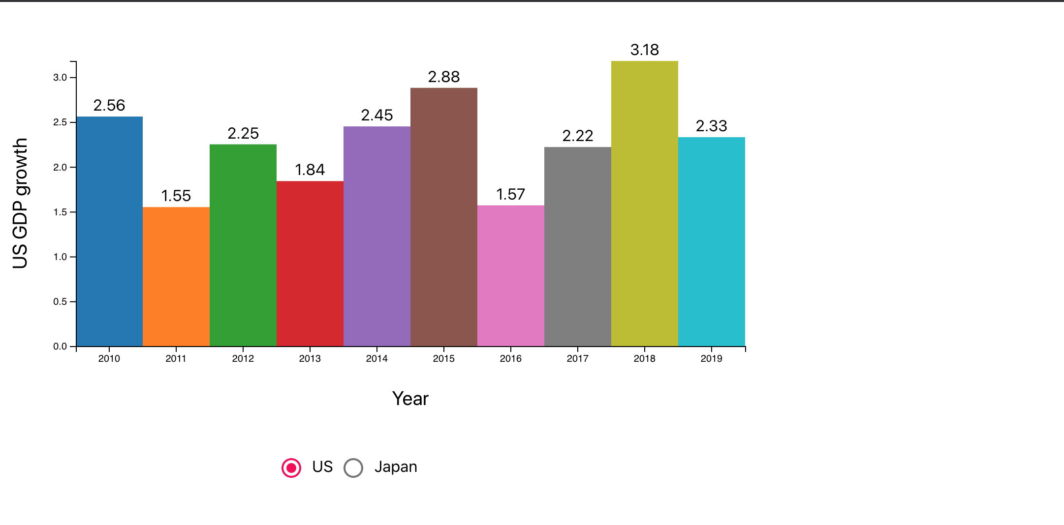
export default App;Over here, we have a bar chart, where we set the width and the height as well as the y-axis title. We also give radio options for users to select between us and japan data, which maps to a different set of values from the data JSON under ‘./utils/constant’.
在这里,我们有一个条形图,我们在其中设置宽度和高度以及y轴标题。 我们还为用户提供单选选项,供用户在我们和日本的数据之间进行选择,这些数据映射到“ ./utils/constant”下的数据JSON的另一组值。
It’s hard to show the graph with the animation here but here is a brief overview of how it would actually look like:
很难在此处显示带有动画的图形,但是这里是其实际外观的简要概述:
That’s it! I know I talked a lot about the visualization but I will also provide the steps to set this out from scratch.
而已! 我知道我谈论了很多有关可视化的内容,但我还将提供从头开始进行设置的步骤。
Step 1: install node on your machine and run the following command:
步骤1 :在您的机器上安装节点并运行以下命令:
curl “https://nodejs.org/dist/latest/node-${VERSION:-$(wget -qO- https://nodejs.org/dist/latest/ | sed -nE ‘s|.*>node-(.*)\.pkg</a>.*|\1|p’)}.pkg” > “$HOME/Downloads/node-latest.pkg” && sudo installer -store -pkg “$HOME/Downloads/node-latest.pkg” -target “/”
卷曲“ https://nodejs.org/dist/latest/node-${VERSION:-$(wget -qO- https://nodejs.org/dist/latest/ | sed -nE's |。*> node -(。*)\。pkg </a>。* | \ 1 | p')}。pkg”>“ $ HOME / Downloads / node-latest.pkg” && sudo安装程序-store -pkg“ $ HOME / Downloads /node-latest.pkg”-目标“ /”
Step 2: run the following command:
步骤2 :执行以下命令:
- npx create-react-app economic-growth-chart npx create-react-app经济增长图
Step 3: go to app.js and replace with the following content:(already shown once in this article)
步骤3 :转到app.js并替换为以下内容:(已在本文中显示一次)
import React, { Component } from "react";
import Radio from "@material-ui/core/Radio";
import "./App.css";
import data from "./utils/constant";
import BarChart from "./components/BarChart";


class App extends Component {
  constructor(props) {
    super(props);
    this.state = {
      selectedValue: "US",
    };
  }


  handleChange = (e) => {
    this.setState({ selectedValue: e.target.value });
  };


  render() {
    const { selectedValue } = this.state;
    return (
      <React.Fragment>
        <BarChart
          width={800}
          height={450}
          data={
            this.state.selectedValue === "US" ? data.USData : data.JapanData
          }
          yAxisTitle={`${this.state.selectedValue} GDP growth`}
        />
        <div style={{ marginLeft: "calc(100% - 950px" }}>
          <Radio
            checked={selectedValue === "US"}
            onChange={this.handleChange}
            value="US"
            name="radio-button-demo"
            inputProps={{ "aria-label": "US" }}
          />
          US
          <Radio
            checked={selectedValue === "Japan"}
            onChange={this.handleChange}
            value="Japan"
            name="radio-button-demo"
            inputProps={{ "aria-label": "Japan" }}
          />
          Japan
        </div>
      </React.Fragment>
    );
  }
}


export default App;
Step 4: run the following command:
步骤4 :运行以下命令:
- npm install -- save d3 @material-ui/core npm install-保存d3 @ material-ui / core
Step 5: Creates a utils folder under the src folder and create constant.js with the following content:
步骤5 :在src文件夹下创建一个utils文件夹,并创建具有以下内容的constant.js:
const usData = [
  {
    year: 2010,
    value: 2.56,
  },
  {
    year: 2011,
    value: 1.55,
  },
  {
    year: 2012,
    value: 2.25,
  },
  {
    year: 2013,
    value: 1.84,
  },
  {
    year: 2014,
    value: 2.45,
  },
  {
    year: 2015,
    value: 2.88,
  },
  {
    year: 2016,
    value: 1.57,
  },
  {
    year: 2017,
    value: 2.22,
  },
  {
    year: 2018,
    value: 3.18,
  },
  {
    year: 2019,
    value: 2.33,
  },
];


const japanData = [
  {
    year: 2010,
    value: 4.19,
  },
  {
    year: 2011,
    value: 0.12,
  },
  {
    year: 2012,
    value: 1.5,
  },
  {
    year: 2013,
    value: 2.0,
  },
  {
    year: 2014,
    value: 0.37,
  },
  {
    year: 2015,
    value: 1.22,
  },
  {
    year: 2016,
    value: 0.52,
  },
  {
    year: 2017,
    value: 2.17,
  },
  {
    year: 2018,
    value: 0.32,
  },
  {
    year: 2019,
    value: 0.65,
  },
];


const data = {
  USData: usData,
  JapanData: japanData,
};


export default data;
Step 6: under the src folder, create a folder called components and create a class called BarChart.js(this is also mentioned in this article already):
步骤6 :在src文件夹下,创建一个名为components的文件夹,并创建一个名为BarChart.js的类(本文中也已提到):
import * as d3 from "d3";
import React, { useRef, useEffect } from "react";


const duration = 500;
function BarChart({ width, height, data, yAxisTitle }) {
  const margin = {
    top: 60,
    bottom: 100,
    left: 80,
    right: 40,
  };
  const innerWidth = width - margin.left - margin.right;
  const innerHeight = height - margin.top - margin.bottom;
  const ref = useRef();


  useEffect(() => {
    d3.select(ref.current)
      .attr("width", width)
      .attr("height", height)
      .append("g")
      .attr("transform", `translate(${margin.left}, ${margin.top})`);
  }, []); // eslint-disable-line react-hooks/exhaustive-deps


  useEffect(() => {
    draw();
  }, [data]); // eslint-disable-line react-hooks/exhaustive-deps


  const draw = () => {
    const xScale = d3
      .scaleBand()
      .domain(data.map((d) => d.year))
      .range([0, innerWidth]);


    const yScale = d3
      .scaleLinear()
      .domain([0, d3.max(data, (d) => d.value)])
      .range([innerHeight, 0]);


    const colorScale = d3.scaleOrdinal(d3.schemeCategory10);


    const svg = d3.select(ref.current);
    const chart = svg.select("g");


    chart
      .selectAll(".bar")
      .data(data)
      .join((enter) =>
        enter
          .append("rect")
          .classed("bar", true)
          .attr("y", (d) => yScale(0))
          .attr("height", 0)
      )
      .attr("x", (d) => xScale(d.year))
      .style("fill", (d, i) => colorScale(i))
      .attr("width", (d) => xScale.bandwidth())
      .transition()
      .duration(duration)
      .delay((d, i) => (i * duration) / 10)
      .attr("height", (d) => innerHeight - yScale(d.value))
      .attr("y", (d) => yScale(d.value));


    chart
      .selectAll(".bar-label")
      .data(data)
      .join((enter) =>
        enter
          .append("text")
          .classed("bar-label", true)
          .attr("text-anchor", "middle")
          .attr("dx", 0)
          .attr("y", yScale(0))
          .attr("dy", -6)
          .attr("opacity", 0)
      )
      .attr("x", (d) => xScale(d.year) + xScale.bandwidth() / 2)
      .text((d) => d.value)
      .transition()
      .duration(duration)
      .delay((d, i) => (i * duration) / 10)
      .attr("opacity", 1)
      .attr("y", (d) => yScale(d.value));


    const xAxis = d3.axisBottom().scale(xScale);


    chart
      .selectAll(".x.axis")
      .data([null])
      .join("g")
      .classed("x axis", true)
      .attr("transform", `translate(0,${innerHeight})`)
      .transition()
      .duration(duration)
      .call(xAxis);


    const yAxis = d3.axisLeft().ticks(5).scale(yScale);


    chart
      .selectAll(".y.axis")
      .data([null])
      .join("g")
      .classed("y axis", true)
      .attr("transform", "translate(0,0)")
      .transition()
      .duration(duration)
      .call(yAxis);


    chart
      .selectAll(".x-axis-title")
      .data(["Year"])
      .join("text")
      .classed("x-axis-title", true)
      .attr("x", innerWidth / 2)
      .attr("y", innerHeight + 60)
      .attr("fill", "#000")
      .style("font-size", "20px")
      .style("text-anchor", "middle")
      .text((d) => d);


    chart
      .selectAll(".y-axis-title")
      .data([yAxisTitle])
      .join("text")
      .classed("y-axis-title", true)
      .attr("x", 0)
      .attr("y", 0)
      .attr("transform", `translate(-50, ${innerHeight / 2}) rotate(-90)`)
      .attr("fill", "#000")
      .style("font-size", "20px")
      .style("text-anchor", "middle")
      .text((d) => d);
  };


  return (
    <div className="chart">
      <svg ref={ref}></svg>
    </div>
  );
}


export default BarChart;
Now go into your terminal and run npm start! Your project is all set up.
现在进入您的终端并运行npm start! 您的项目已设置完毕。
翻译自: https://medium.com/weekly-webtips/how-to-create-an-animated-barchart-with-react-and-d3-b4fd3662633f
react 动画轮播图组件


 1334
1334

 被折叠的 条评论
为什么被折叠?
被折叠的 条评论
为什么被折叠?
 到【灌水乐园】发言


