


消费者洞察案例分析
We’re in the midst of a worldwide pandemic and could all use a few moments of peace. Enter
我们正处于全球大流行之中,所有人都可以使用片刻的和平。 输入
Insight Timer, the #1 meditation app in the world, boasting over 17 million users and 55,000 free guided meditations. Unique from other meditations apps, Insight Timer is less curated, functioning as a platform that brings together Listeners and meditation Guides, who create and upload their own content. Insight Timer是全球排名第一的冥想应用程序,拥有超过1700万用户和55,000个免费的冥想向导。 Insight Timer与其他冥想应用程序不同,它的策划性较差,它是一个平台,可将创建和上传自己内容的侦听器和冥想指南聚集在一起。However, for its users, the huge collection of content on Insight Timer is both its advantage and its downfall.
但是,对于其用户而言,Insight Timer上大量的内容既是其优势,也是其劣势。
问题 (The Problem)
Through initial user research, we discovered that Listeners on Insight Timer are often overwhelmed by the number of meditations available in the app. The variety of styles and techniques available on the platform is appealing to Listeners, but sifting through the thousands of options feels so taxing that, in many cases, they just opt to use the simple Timer feature.
通过初步的用户研究,我们发现Insight Timer上的侦听器通常被应用程序中可用的冥想次数淹没。 平台上可用的各种样式和技术吸引了Listener,但是筛选成千上万的选项感觉太麻烦了,在许多情况下,他们只是选择使用简单的Timer功能。
“I just use the Timer. Finding guided meditations on Insight Timer feels so overwhelming. I haven’t really taken the time to browse, so I’m not even sure what my options are.”
“我只是使用计时器。 在Insight Timer上找到有指导的冥想实在令人难以承受。 我并没有花时间浏览,所以我什至不确定我的选择是什么。”
These users were turning to meditation apps to find a sense of calm and relaxation and browsing the 55,000 free guided meditations on Insight Timer was causing enough frustration that they were opting for a less fulfilling option. So, I asked…
这些用户转向冥想应用程序以找到平静和放松的感觉,并且在Insight Timer上浏览55,000个免费的冥想冥想正引起足够的挫败感,以至于他们选择了一个不太令人满意的选择。 所以,我问...
How might we make desired content more discoverable for Listeners?
我们如何使所需的内容对于侦听器来说更容易被发现?
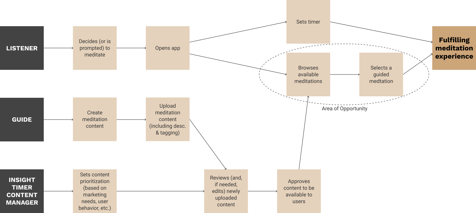
谁是听众? (Who Are The Listeners?)
User types and personas were defined during our initial user research, which was conducted in a small group along with three other UX designers. We determined Insight Timer has two user types:
用户类型和角色是在我们最初的用户研究期间定义的,该研究是与其他三名UX设计人员组成的小组进行的。 我们确定Insight Timer具有两种用户类型:
Guides: mindfulness experts who create and upload guided meditations, seeking to share their knowledge with others
指南:正念专家,他们创建并上传引导的冥想,并寻求与他人共享知识
Listeners: users seeking to improve their mental health and/or sense of inner peace through learning and practicing mindfulness and meditation
听众:寻求通过学习和练习正念和冥想来改善自己的心理健康和/或内心平静感的用户
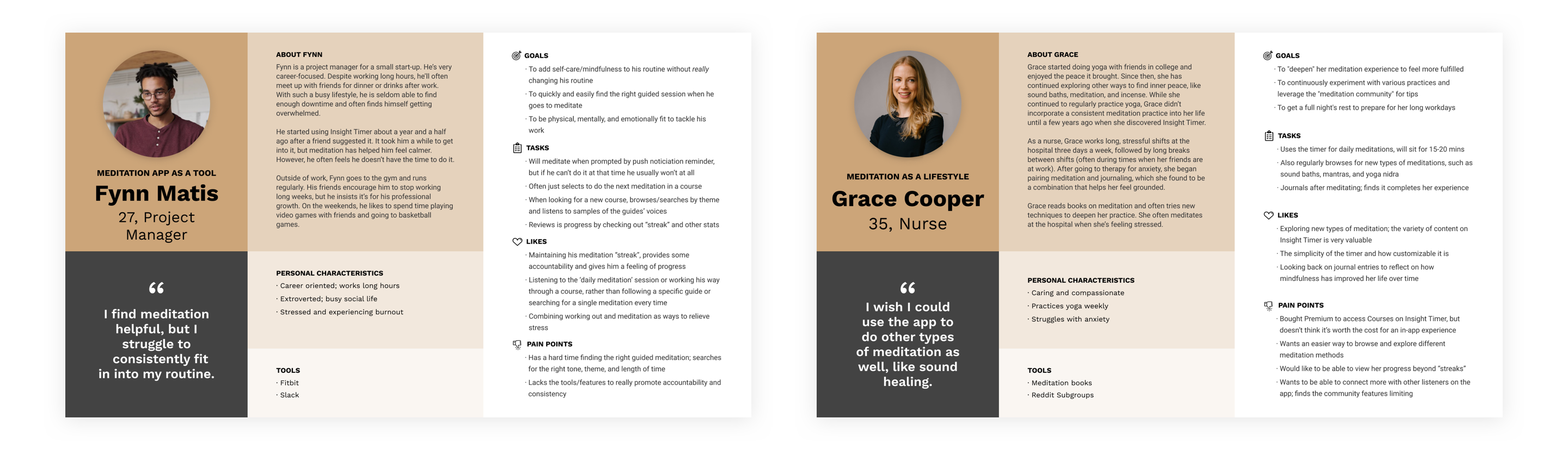
For this project, I am focusing on the Listeners. Based off user interviews, we created two Listener personas. While each persona’s goals were different — Grace uses Insight Timer as a part of a more holistic lifestyle, while Fynn uses it as tool to optimize his wellbeing — they both had issues with finding the right guided meditation in a given moment.
对于这个项目,我专注于Listeners 。 基于用户访谈,我们创建了两个侦听器角色。 尽管每个人的目标都不同-格雷斯(Grace)将Insight Timer用作更全面的生活方式的一部分,而芬恩(Fynn)将其用作优化自己的健康的工具-他们俩在给定的时间找到正确的冥想冥想都存在问题。
范围与约束(Scope & Constraints)
This project was executed during an 8-week design class, based on previously conducted user research. While the user research was done in a small group, the design phase presented here—from problem statement to the usability report—was carried out by solely by me.
根据先前进行的用户研究,该项目在为期8周的设计课程中执行。 尽管用户研究是在一个小组中完成的,但这里介绍的设计阶段(从问题陈述到可用性报告)完全由我自己完成。
The schedule of the class limited the timeline and therefore the scope of the project. It also meant that discussions around technical and business requirements were not had with those who would otherwise be key stakeholders.
上课的时间表限制了时间表,因此限制了项目的范围。 这也意味着没有与那些原本将是关键利益相关者的人讨论技术和业务需求。
处理 (Process)
Now that we have defined the problem and know who we are designing for, let’s figure out a solution. To work through the design, I followed the following process:
现在我们已经定义了问题,并且知道我们要为谁设计,现在让我们找出一个解决方案。 为了完成设计,我遵循以下过程:
- Lightning Demos & Crazy 8 闪电演示与疯狂8
- Wireframe 线框
- Prototype原型
- Usability Testing可用性测试
Lightning Demos & Crazy 8
闪电演示与疯狂8
I conducting three Lightning Demos, examining Calm’s mood check-in feature, Spotify’s hyper-personalized home screen, and Netflix’s “Because You Watched…” recommendations. Calm’s mood check-in was the most intriguing to me because it also addressed another popular user task: pairing journaling with meditation.
我进行了三个闪电演示,研究了Calm的心情检查功能,Spotify的超个性化主屏幕以及Netflix的“ Because You Watch…”建议。 平静的心情检查对我来说最有趣,因为它还解决了另一个受欢迎的用户任务:将日记与冥想配对。
Discovering content based on the user’s mood was the “big idea” going into my Crazy 8, where I explored different ways to organize or browse for content by mood.
根据用户的心情发现内容是进入Crazy 8的“大主意”,在那里,我探索了不同的方式来按心情组织或浏览内容。
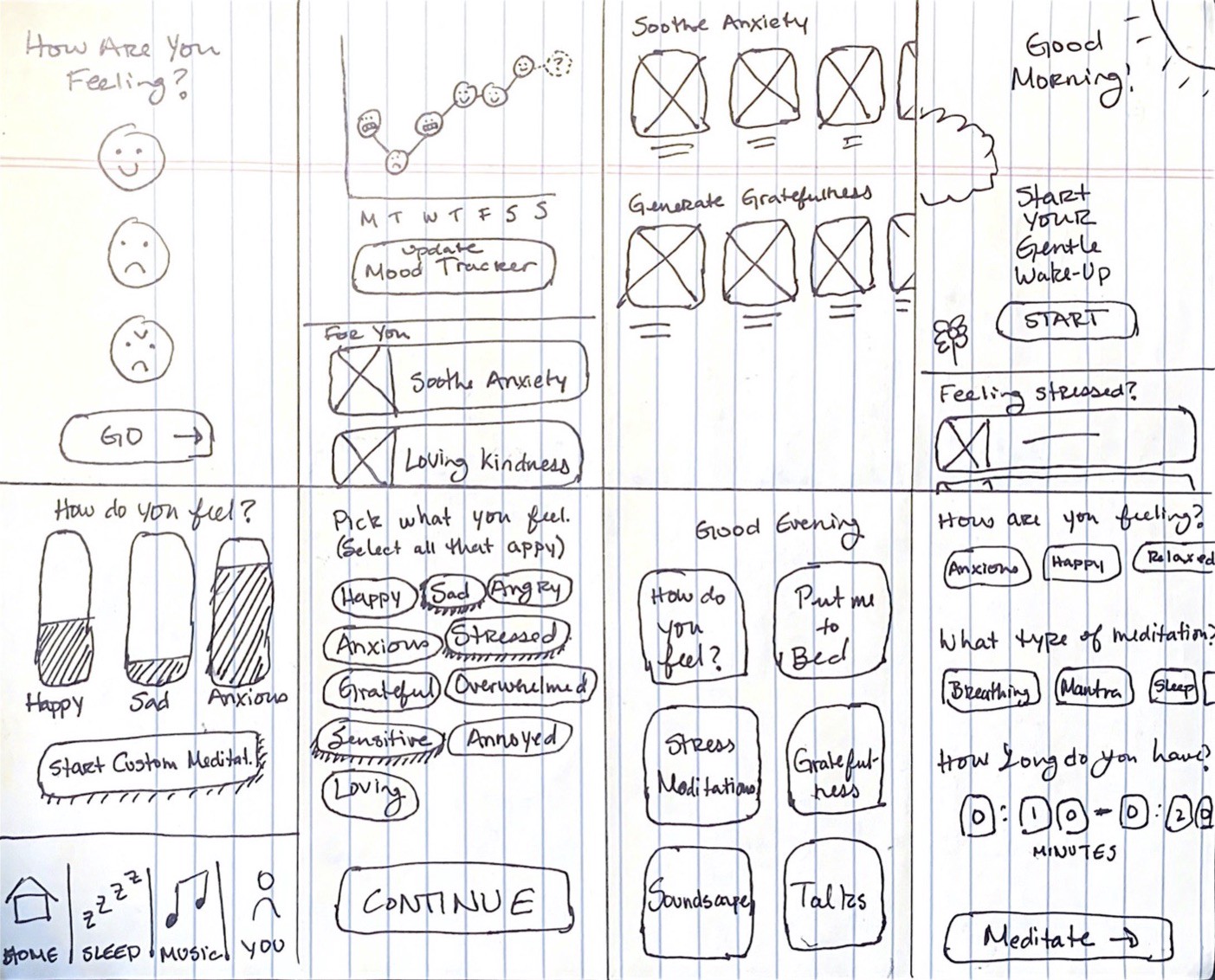
Wireframes
线框
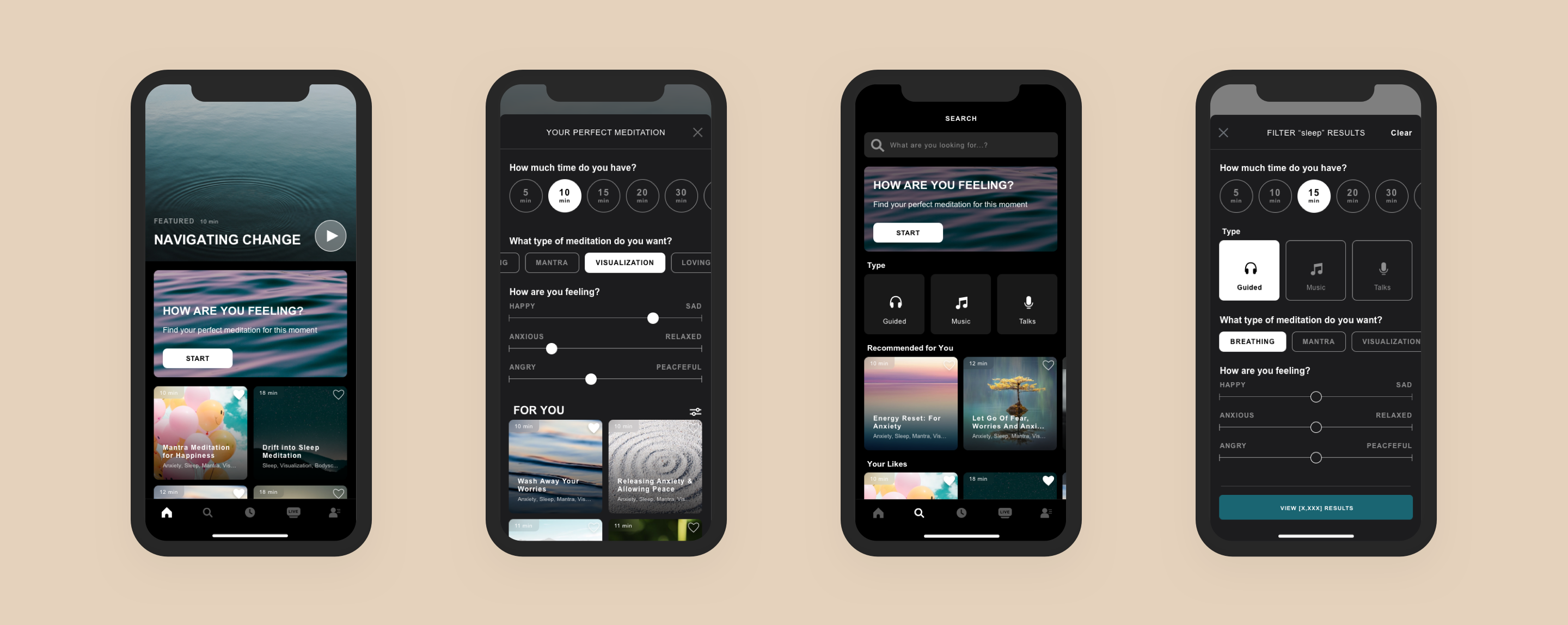
Inspired by the Lightning Demos and Crazy 8, I began flushing out a concept that allowed Listeners to browse for a meditation based on how they feel at that moment. Styled as a short “quiz”, Listeners could quickly find the “perfect” meditation for them by answering three simple questions.
受《闪电演示》和《疯狂8》的启发,我开始提出一个概念,使听众可以根据当时的感受浏览冥想。 聆听者被称为简短的“测验”,可以通过回答三个简单的问题来快速找到“完美”的冥想。
Starting with the length and style of meditation, each selection the Listener makes would change the content options displayed in the “For You” section. Calm’s mood feature provides a very definite list of definitive feelings (using emojis). To make our mood search even more personal, I wanted to allow users to enter their mood on a scale, from happy to sad, calm to anxious. Feelings are not binary and I wanted to provide more flexibility to generate more customized results.
从冥想的长度和方式开始,听众的每次选择都会改变“为您”部分中显示的内容选项。 冷静的情绪功能提供了非常明确的确定感觉列表(使用表情符号)。 为了使我们的心情搜索更加个性化,我希望允许用户以从开心到悲伤,从平静到焦虑的比例输入自己的心情。 感觉不是二进制的,我想提供更多的灵活性来生成更多的自定义结果。
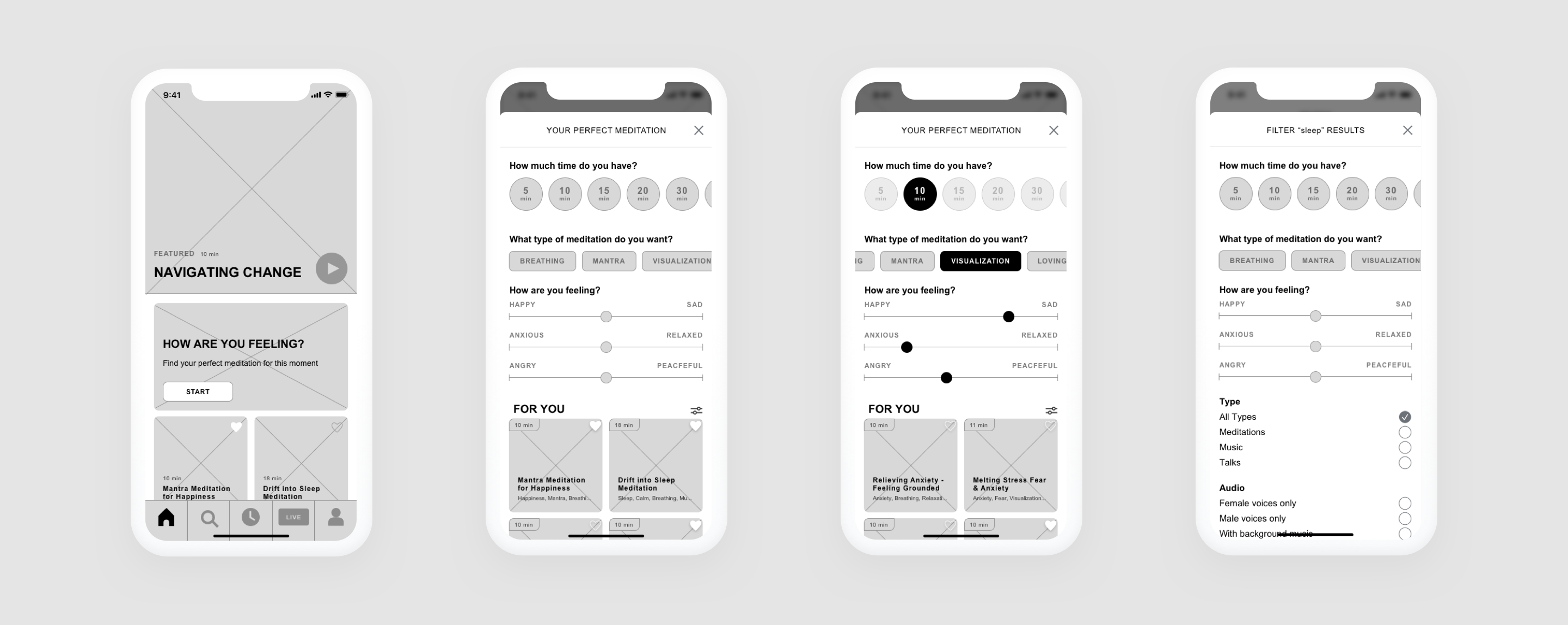
Prototype
原型
Bringing the wireframes to life in the prototype, my main goal was to keep the interface as minimal as possible. The life of Insight Timer is created by the content provided by its Guides.
使线框在原型中栩栩如生,我的主要目标是使接口尽可能少。 Insight Timer的寿命由其指南提供的内容确定。
I also included functional paths outside of my intended tasks, so I would be able to observe how users explored the app as naturally as possible.
我还包括了预期任务之外的功能路径,因此我将能够观察用户如何尽可能自然地浏览该应用程序。
它会起作用吗? (Is It Going To Work?)
Was filtering by mood something Listeners would even use? Moving into usability testing, my goal was to understand how users are actually finding a meditation when they open the app with the intention of meditating.
听众甚至会用情绪过滤吗? 进行可用性测试时,我的目标是了解用户在打坐时打开应用程序时实际上是如何找到冥想的。
The following assumptions were made entering the study:
进行以下假设进入研究:
- Listeners are overwhelmed with the amount of content available to them in Insight Timer 侦听器对Insight Timer中可用的内容量不知所措
- Listeners are not able to efficiently find a suitable meditation听众无法有效地找到合适的冥想
- Looking for content causes frustration and/or stress that is working against the user’s goals in meditating寻找内容会导致挫败感和/或压力,这不利于用户冥想
I spoke with six users who ranged in age from 19 to 32 years old. I would have liked to get a broader demographic range of users, but these six participants did nicely represent our two personas.
我与六个年龄在19至32岁之间的用户进行了交谈。 我希望获得更大范围的用户群体,但是这六个参与者确实很好地代表了我们的两个角色。
After learning a bit about each Listener’s experience with meditation and discussing how they have used the app in their own practice, I put my prototype in front of them and gave them the following scenarios:
在了解了每个听众在冥想中的经历并讨论了他们如何在自己的实践中使用该应用程序之后,我将我的原型放在他们面前,并给出了以下几种情况:
Scenario #1: You just got a push notification to remind you to meditate today. You’re feeling a little anxious and down so figure now is a great time to meditate. Please open the app and find a guided meditation that best suits your needs right now.
方案1:您刚收到一个推送通知,提醒您今天进行冥想。 您会感到有些焦虑和沮丧,因此,现在是冥想的好时机。 请打开该应用,然后立即找到最适合您需求的指导冥想。
Scenario #2: You completed your meditation earlier and now it’s time for bed. You’re still not feeling great and you are going to meditate to help you fall asleep. Please search for a SLEEP meditation and find the best one for you right now.
场景2:您较早完成了冥想,现在该睡觉了。 您仍然感觉不舒服,您将进行冥想以帮助您入睡。 请搜索“ SLEEP”冥想并立即找到最适合您的冥想。
The goal was to test if they would use the “How Are Feeling?” option on the home tab and if, after searching, they would turn to filters to narrow the options presented to them.
目的是测试他们是否会使用“感觉如何?” 选项卡,然后在搜索后将其转换为过滤器以缩小显示给他们的选项。
结果与教训 (Outcomes & Lessons)
After running through these scenarios, I realized there were three main categories of behavior.
在经历了这些场景之后,我意识到行为主要分为三类。
#1: Users wanted to just pick something from the home tab
#1:用户只想从主页选项卡中选择
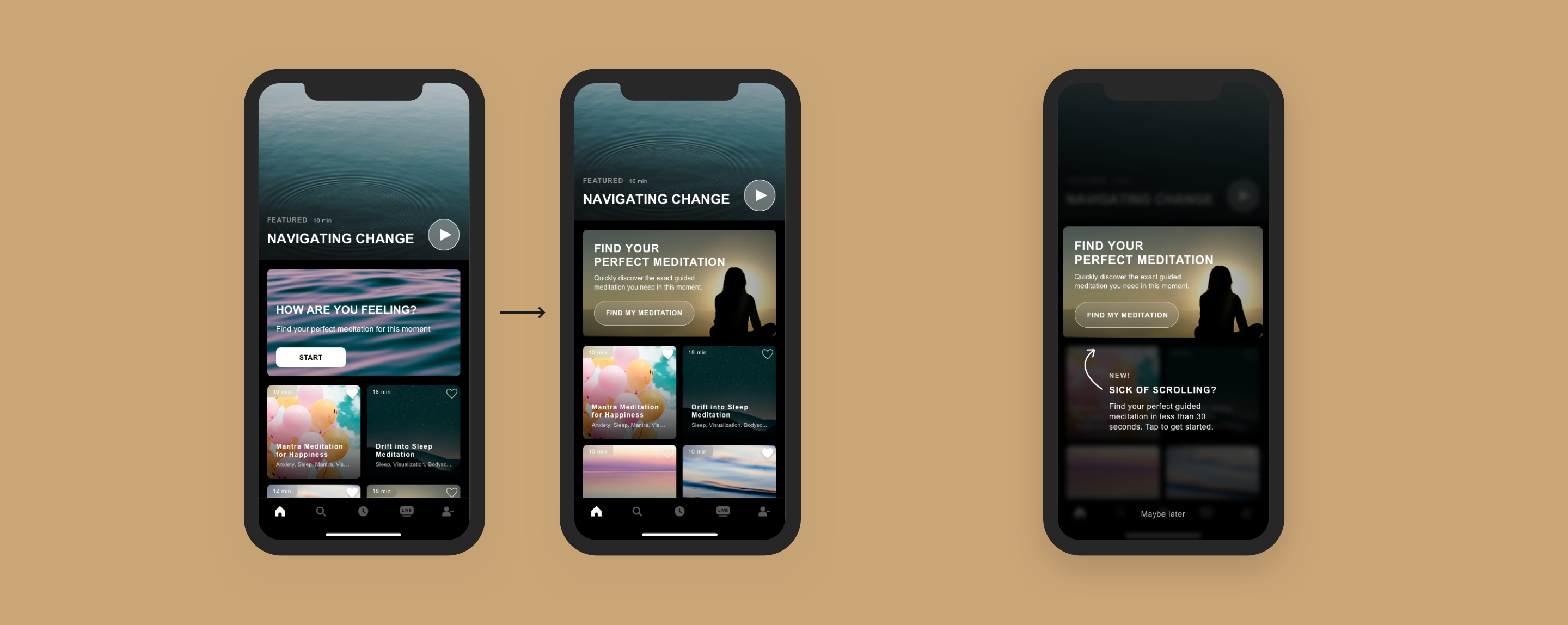
Nearly every user said something along the lines of “I would probably just choose this one because I like the picture.” The good news here is if one of the meditations on the home tab fits their needs, then the Listener is able to quickly begin meditating and have a fulfilling meditation experience. This definitely suggests that creating a strong recommendation algorithm will be an important part of building a fulfilling experience for Listeners.
几乎每个用户都说“我可能会选择这是因为我喜欢这张照片”。 这里的好消息是,如果“主页”选项卡上的冥想之一符合他们的需求,那么侦听器便能够快速开始冥想并获得充实的冥想体验。 这无疑表明,创建强大的推荐算法将是为听众建立充实体验的重要组成部分。
Because users were looking for a meditation right away, the “How Are You Feeling” banner often went initially unnoticed or, at least, unused. There was some feedback that the background image blended in (however, others liked its tranquility). However, after being prompted to go through the mood selections, nearly every participant said it was much simpler and faster than they were expecting. Many said they did not click on it because they thought it would take too long, but after experiencing it themselves, they said they would use it again.
由于用户立即在寻找冥想,因此,“您的感觉如何”标语通常最初没有被注意到,或者至少没有被使用。 有一些反馈意见将背景图像混入其中(但是,其他人喜欢它的宁静性)。 但是,在被提示进行情绪选择之后,几乎每个参与者都说这比他们期望的要简单得多且更快。 许多人说他们没有点击它是因为他们认为它会花费太长时间,但是他们自己体验之后,表示会再次使用它。
Ultimately, based on these results, I updated the design of the mood search banner and added a call-out to the new feature.
最终,基于这些结果,我更新了心情搜索横幅的设计,并向新功能添加了标注。
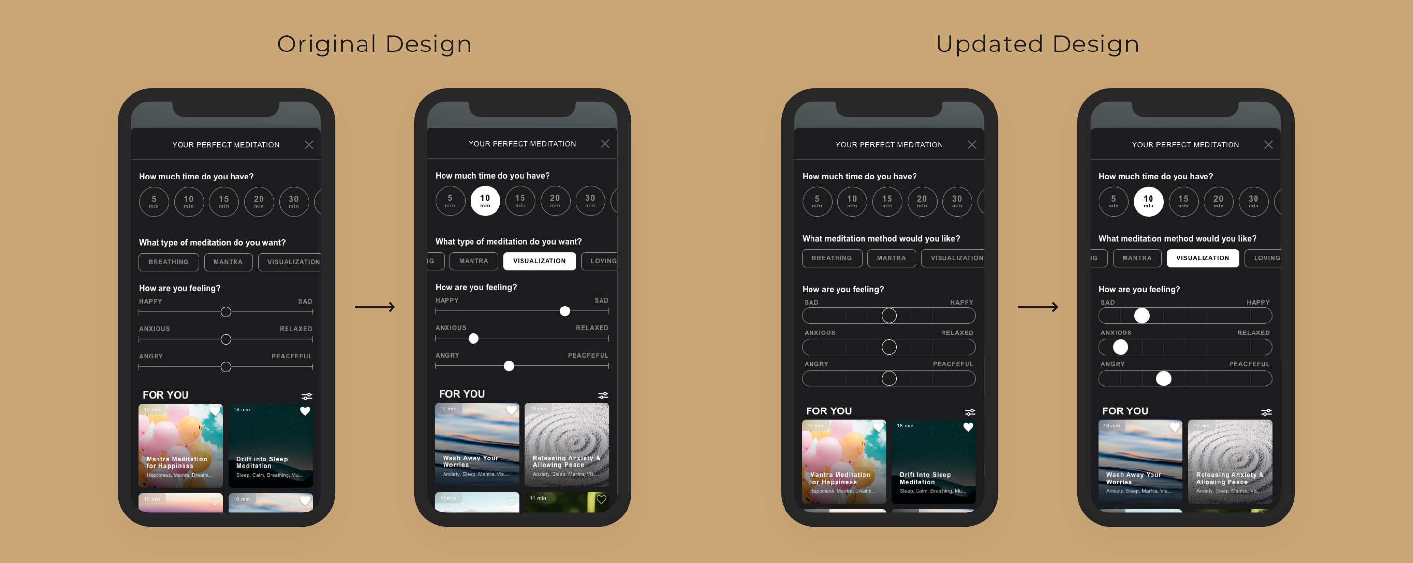
#2: Opinions were mixed on the format of the mood selector
#2:对情绪选择器的格式意见不一
Overall, the notion of searching/filtering by mood was well-received. Some participants liked the flexibility the slider provided; that they did not have to just select “sad” but could choose on a scale. They felt like mood was a more relatable method than the “By Benefit” options currently available in Insight Timer’s “Advanced Filters”.
总体而言,按情绪进行搜索/过滤的概念已广为接受。 一些参与者喜欢滑块提供的灵活性。 他们不必仅仅选择“悲伤”,而是可以选择一个规模。 他们认为,与Insight Insight的“高级过滤器”中当前提供的“按受益”选项相比,情绪是一种更相关的方法。
However, there were some users who found the ambiguity of the sliders stressful, and would have preferred more binary options.
但是,有些用户发现滑块的含糊不清,并希望使用更多的二进制选项。
“The sliders kind of stress me out a bit actually. I’m like ‘I know I’m sad, but am I WAY sad or just a little sad?’ If it were just four options or just ‘happy’, ‘middle’ or ‘sad’, it would seem like clicking one would be less of a commitment.”
“滑块实际上使我有点压力。 我就像“我知道我很伤心,但我是很难过还是有些难过?” 如果只是四个选项,或者只是“快乐”,“中间”或“悲伤”,那么单击一个选项似乎就不那么一项承诺了。”
To address both groups, I maintained the more flexible scale design, but added tick marks to remove some degree of ambiguity. Listeners could still include a “level of feeling” in their search, but the more limited placement options would decrease their cognitive load, and hopefully level of stress.
为了解决这两个问题,我维护了更灵活的秤设计,但是添加了对号以消除一定程度的歧义。 听众在搜索中仍然可以包含“感觉水平”,但是更有限的放置选项将减轻他们的认知负担,并希望减轻压力。
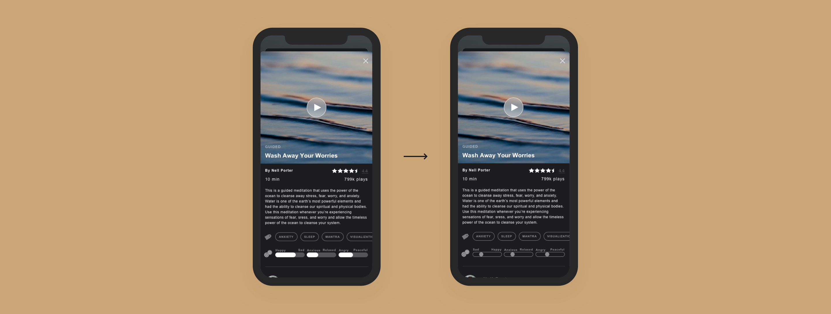
#3: Mood indicators on the detail screen were confusing
#3:详细信息屏幕上的情绪指示器令人困惑
The way the “mood rating” was presented caused a lot of confusion. Where was is coming from? Was it showing the user’s preference? Did it indicate how the user felt going into the meditation? Or how they should feel after completing it? Did the white bar indicate it was more sad or more happy? Could the user adjust these to get a different version of this meditation? There was confusion.
提出“情绪评价”的方式引起了很多混乱。 哪里来的? 是否显示了用户的偏好? 它是否表明用户对冥想的感觉? 或完成后的感受如何? 白色栏是否表明它更悲伤或更快乐? 用户可以调整这些以获取此冥想的其他版本吗? 有混乱。
Yet, for the users who understood these indicators were more akin to tags, it was validating. These users reported feeling confident that the results had taken their mood into account and that they were choosing the right meditation for their needs.
但是,对于了解这些指标更类似于标签的用户而言,它正在验证。 这些用户报告说,他们对结果已经考虑到他们的心情充满信心,并且他们正在根据自己的需要选择正确的冥想。
To resolve the sources confusion, I changed the design of the indicators to mirror the design of the selectors themselves and changed the opacity to match the style of the tags above, making them look like a less interactive element of the page.
为了解决源代码的混乱,我更改了指示器的设计以反映选择器本身的设计,并更改了不透明度以匹配上面的标签样式,使它们看起来像页面中交互性较低的元素。
结论与后续步骤(Conclusions & Next Steps)
Based on the learnings from usability testing, my assumptions and personas were validated.
基于可用性测试的经验,我的假设和角色得到了验证。
Listeners are overwhelmed by the amount of content available and not willing to filter through it all in a “traditional” way. Users want a quick, accurate way to find what they want at that moment. Filters did not do that for them. While at first glance, Listeners believed that the ‘How Are You Feeling?’ option was going to take too much time, after using it, they liked it. They reported that searching by mood allowed them to self-reflect a bit before meditating, thus working towards their goal of a fulfilling meditation experience.
可用内容的数量使听众不知所措,并且不愿意以“传统”方式对其进行筛选。 用户想要一种快速,准确的方式来找到他们当时想要的东西。 过滤器没有为他们做。 乍一看,听众相信“你感觉如何?” 使用该选项会花费太多时间,他们喜欢它。 他们报告说,通过情绪搜索可以使他们在冥想之前能够自我反省,从而朝着实现充实冥想体验的目标努力。
From here, I would recommend continuing to iterate on the design of the Mood Search banner to better communicate its ease and increase conversion. I would also run more research to understand how people perceive their mood, the mood scales, and what moods prompt meditation (Anxiety? Anger? Restlessness?).
从这里开始,我建议您继续迭代Mood Search标语的设计,以更好地传达其易用性并提高转化率。 我还将进行更多的研究,以了解人们如何看待自己的情绪,情绪等级以及哪些情绪促使冥想(焦虑,愤怒或躁动不安)。
BONUS: Many Listeners highlighted the importance of the audio to their selection. The voice of the Guide, background noise or music, and pace of the meditation were all very importance factors. I want to explore the concept of an “audio preview” as a new feature, providing Listeners with another method to quickly assess if a particular guided meditation is right for them.
奖金:许多听众都强调了音频对他们选择的重要性。 指南的声音,背景噪音或音乐以及冥想的节奏都是非常重要的因素。 我想探索“音频预览”这一新功能的概念,为听众提供另一种方法来快速评估特定的指导冥想是否适合他们。

翻译自: https://uxdesign.cc/the-mood-search-an-insight-timer-case-study-22b86899c1a2
消费者洞察案例分析


 1735
1735

 被折叠的 条评论
为什么被折叠?
被折叠的 条评论
为什么被折叠?
 到【灌水乐园】发言


