


Bottom navigation bars make it simple for users to access and shift between main views with a single tap. They’re recommended when an application has three to five top-level destinations.
底部导航栏使用户只需单击一下即可轻松访问和在主视图之间切换。 当应用程序具有三到五个顶级目标时,建议使用它们。
There are many bottom bar libraries that we can use to include advanced features in our apps without coding. But using native libraries is the most effective way — third-party libraries can increase your app size, may not support advanced features like dark mode, and can deprecate the library whenever they want. I recommend you use the standard Google martial navigation view.
我们可以使用许多底栏库来在应用中包含高级功能而无需编写代码。 但是使用本机库是最有效的方法-第三方库会增加您的应用程序大小,可能不支持暗模式等高级功能,并且可以在需要时弃用该库。 我建议您使用标准的Google武术导航视图。
积分 (Integration)
To use the Google material bottom navigation bar, we first need to include the martial library in the project. For that, you need to include the following line under the dependencies node in the app-level build.gradle file.
要使用Google材料底部导航栏,我们首先需要在项目中包含武术库。 为此,您需要在应用程序级build.gradle文件的“ dependencies节点下包括以下行。
implementation 'com.google.android.material:material:1.0.0'如何使用 (How to Use)
First, you need to include the bottom navigation-view into your layout file, as shown below:
首先,您需要在布局文件中包含底部导航视图,如下所示:
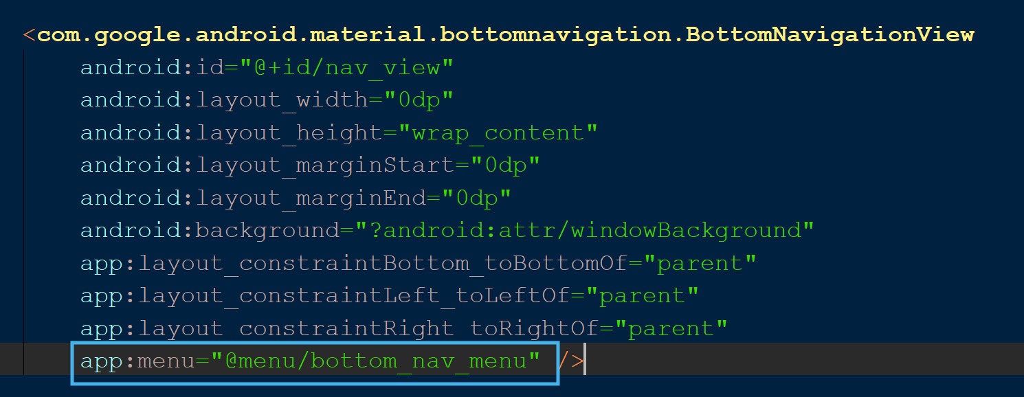
<com.google.android.material.bottomnavigation.BottomNavigationView
    android:id="@+id/nav_view"
    android:layout_width="0dp"
    android:layout_height="wrap_content"
    android:layout_marginStart="0dp"
    android:layout_marginEnd="0dp"
    android:background="?android:attr/windowBackground"
    app:layout_constraintBottom_toBottomOf="parent"
    app:layout_constraintLeft_toLeftOf="parent"
    app:layout_constraintRight_toRightOf="parent"
    />
Here we added bottom navigation view to the layout with constraints to show it at the bottom. Then to show items in the navigation-view, we need to create a menu with all the items to be shown in the bottom bar and assign that menu to the navigation view. First, let’s create a menu with three items, as shown:
在这里,我们将底部导航视图添加到具有约束的布局中,以在底部显示它。 然后,要在导航视图中显示项目,我们需要创建一个菜单,其中所有项目都显示在底部栏中,并将该菜单分配给导航视图。 首先,让我们创建一个包含三个项目的菜单,如下所示:
<?xml version="1.0" encoding="utf-8"?>
<menu xmlns:android="http://schemas.android.com/apk/res/android">


    <item
        android:id="@+id/navigation_home"
        android:icon="@drawable/ic_home_black_24dp"
        android:title="@string/title_home" />


    <item
        android:id="@+id/navigation_notifications"
        android:icon="@drawable/ic_notifications_black_24dp"
        android:title="@string/title_notifications" />


    <item
        android:id="@+id/navigation_profile"
        android:icon="@drawable/ic_profile_black_24dp"
        android:title="@string/title_profile" />


</menu>
Now, let’s include this menu in the bottom navigation-view using the menu attribute. Have a look:
现在,让我们使用菜单属性在底部导航视图中包含此菜单。 看一看:
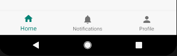
That’s all we need to do. Simple, right? Take a look at the output:
这就是我们要做的。 简单吧? 看一下输出:
如何显示徽章 (How to Show Badges)
We’ve implemented an icon and text for the items in the bottom bar. At some point in the future line-up of your product, it would seem reasonable to show the notifications count in the bottom bar, so users can quickly identify that they have unread notifications.
我们已经为底部栏中的项目实现了图标和文本。 在将来产品的某个时候,在底部栏中显示通知计数似乎是合理的,因此用户可以快速识别出他们有未读的通知。
That’s when badges come handy. In version 1.0.0, the material bottom bar doesn’t support badges by default, but there are tactics we can use to use to add them.
到那时徽章就派上用场了。 在1.0.0版中,默认情况下,材质底部栏不支持徽章,但是我们可以使用一些策略来添加徽章。
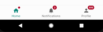
Before we get started, let’s see what we’re trying to achieve:
在开始之前,让我们看看我们要实现的目标:

The notification badge that’s showing a count of three is the custom layout I created and programmatically added to the menu item notification.
显示三位的通知标志是我创建并以编程方式添加到菜单项通知中的自定义布局。
Let’s do this step by step. We need to create a round drawable to be shown behind the count with the help of the shape node. Take a look:
让我们一步一步地做。 我们需要创建一个可绘制的圆形,以便在形状节点的帮助下显示在计数后面。 看一看:
<?xml version="1.0" encoding="utf-8"?>
<shape xmlns:android="http://schemas.android.com/apk/res/android"
    android:shape="oval">
    <solid android:color="@color/colorAccent"/>
    <size android:width="40dp" android:height="40dp" />
</shape>
Now, we need to create our custom layout where we’ve textview to show the count and assign the above created drawable as background:
现在,我们需要在自定义布局中创建textview以显示计数并将上述创建的drawable分配为背景:
<?xml version="1.0" encoding="utf-8"?>
<FrameLayout xmlns:android="http://schemas.android.com/apk/res/android"
    android:layout_width="match_parent"
    android:layout_height="match_parent"
    xmlns:tools="http://schemas.android.com/tools">


    <TextView
        android:id="@+id/notifications_badge"
        android:layout_width="@dimen/space_18"
        android:layout_height="@dimen/space_18"
        android:layout_gravity="top|center_horizontal"
        android:layout_marginLeft="@dimen/space_9"
        android:background="@drawable/badge_view"
        android:backgroundTint="@color/colorAccent"
        android:gravity="center"
        tools:text="1"
        android:textColor="@android:color/white"
        android:textSize="12sp" />


</FrameLayout>
Now we’ve created our custom layout, it’s time to add the view to the bottom navigation-view item.
现在,我们已经创建了自定义布局,是时候将视图添加到底部的navigation-view项中了。
First, we need to create a view and inflate the custom_badge_layout into the view, as shown below:
首先,我们需要创建一个视图,并将custom_badge_layout到该视图中,如下所示:
var notificationsBadge : View?  = null
private fun getBadge() : View {
    if (notificationsBadge != null){
        return notificationsBadge!!
    }
    val mbottomNavigationMenuView = nav_view.getChildAt(0) as BottomNavigationMenuView
    notificationsBadge = LayoutInflater.from(this).inflate(R.layout.custom_badge_layout,
        mbottomNavigationMenuView,false)
    return notificationsBadge!!
}
Here we’ve created a view with name notificationsBadge and inflated cutom_badge_layout into the view using LayoutInflater.
在这里,我们创建了一个名称为notificationsBadge的视图,并使用LayoutInflater将cutom_badge_layout到该视图中。
The only thing left is to add the view to the bottom navigation-view. This is straightforward:
剩下的唯一事情就是将视图添加到底部的navigation-view 。 这很简单:
private fun addBadge(count : String) {
    getBadge()
    notificationsBadge?.notifications_badge?.text = count
    nav_view?.addView(notificationsBadge)
}
Now that we know how to add a badge, it’s time to learn how to remove them. As you can see in the above code, we did nothing but add a view to a viewGroup using the addView function. In the same way, we use the removeView function on nav_view to remove the badge:
现在我们知道了如何添加徽章,是时候学习如何删除徽章了。 如您在上面的代码中看到的,我们除了使用addView函数将视图添加到viewGroup ,什么也没有做。 以同样的方式,我们使用removeView上功能nav_view删除徽章:
private fun removeBadge() {
    nav_view.removeView(notificationsBadge)
}
如何使用材料设计库1.1.0创建徽章? (How to Create Badges With the Material Design Library 1.1.0?)
Google recently released the next version of the material design library(1.1.0). With the upgrade, we can create the badges directly without any custom layouts. Take a look at how to add the badge to the bottom navigation-view when using the upgraded version of the library:
Google最近发布了材料设计库的下一个版本(1.1.0)。 通过升级,我们可以直接创建徽章,而无需任何自定义布局。 看一下在使用库的升级版本时如何将徽标添加到底部navigation-view :
private fun addBadge(count : String) {
    val badge: BadgeDrawable = nav_view.getOrCreateBadge(
        R.id.navigation_notifications)
    badge.number = 3
    badge.isVisible = true
}
To remove the badge, we need to call the removeBadge function with menuItemId on which the badge should be removed.
要删除徽章,我们需要调用带有menuItemId的removeBadge函数,在该removeBadge上应该删除徽章。
nav_view?.removeBadge(R.id.navigation_notifications)We can create both dot and number badges with the upgraded library. If you didn’t mention the count, then it will is shown as a dot, otherwise, it will show the number you assigned:
我们可以使用升级的库创建点和数字徽章。 如果您未提及计数,则它将显示为点,否则将显示您分配的数字:
升级库的问题 (Problem with Upgraded Library)
The material design of the 1.1.0 library is fantastic, but the app I was developing had multiple crashes for various reasons when I upgraded to the material library to 1.1.0. It’s not like the library had bugs, but we needed to make many changes in the code.
1.1.0库的材质设计很棒,但是当我将材质库升级到1.1.0时,由于各种原因,我正在开发的应用程序发生了多次崩溃。 并不是说库中有bug,但是我们需要对代码进行许多更改。
One reason it crashed is I was using the non-material theme for my root activity in which material bottom navigation-view is inflated. To resolve this crash, we needed to update the theme of the root activity to the material theme.
崩溃的原因之一是,我在我的根活动中使用了non-material主题,其中物质底部navigation-view被夸大了。 为了解决此崩溃,我们需要将根活动的主题更新为实际主题。
This might be easy if you’re an application developer, but what if you’re a library developer? It’s highly unlikely that app developers will change the theme correctly to use your library!
如果您是应用程序开发人员,这可能很容易,但是如果您是库开发人员,该怎么办? 应用程序开发人员极不可能正确地更改主题以使用您的库!
结论 (Conclusion)
The two solutions I explained here are perfect to use but be pragmatic and use whatever suits your situation. I’d recommend upgrading your material design library and using native code. On the other hand, if you’re in a hypothetical situation like the one I mentioned above, use the old version and create your own badges, as shown above.
我在这里解释的两个解决方案非常适合使用,但务实,并使用适合您情况的任何方法。 我建议您升级材料设计库并使用本机代码。 另一方面,如果您处于我上面提到的那种假设情况,请使用旧版本并创建自己的徽章,如上所示。
Thank you for reading.
感谢您的阅读。


 5660
5660

 被折叠的 条评论
为什么被折叠?
被折叠的 条评论
为什么被折叠?
 到【灌水乐园】发言


