标记偏见
Data is important — it is the logical justification for world-changing decisions. Unfortunately, arrays of numbers don’t tell as interpretable a story as a picture does, providing an insatiable need for data visualizations.
数据很重要-这是改变世界的决策的逻辑依据。 不幸的是,数字数组不能像图片那样讲述一个故事,这提供了对数据可视化的无限需求。
Visualizations will always be used to tell a story with the data, but unfortunately can be distorted in many ways to give a false impression. What once was regarded as the golden truth — data — can be just as trustworthy and credible as an anecdote when it falls into several visualization pitfalls.
可视化将始终用于通过数据讲述故事,但不幸的是,可视化可以通过多种方式失真以产生错误的印象。 曾经被视为黄金真理的东西-数据-当它陷入多个可视化陷阱时,可以像轶事一样值得信赖和可信。
In this article, we’ll explore eight charts that demonstrate the ability to bias the data towards your narrative. Each chart will be structured in the format:
在本文中,我们将探索八个图表,这些图表展示了将数据偏向您的叙述的能力。 每个图表的格式如下:
- Chart context and information. 图表上下文和信息。
- Objections to the integrity of the chart. 反对图表的完整性。
- A statistically honest version of the chart (if applicable). 图表的统计真实版本(如果适用)。
- Tips for using the chart to distort all contexts of data (generalizing the method). 使用图表扭曲数据的所有上下文的提示(概括该方法)。
气泡大小| 面积还是半径? 哪种适合您的叙述 (Bubble Size | Area or Radius? Whichever suits your narrative)
This State of the Union Address gives the impression that the United State’s GDP is much higher than other countries.
国情咨文给人的印象是美国的GDP远远高于其他国家。

In this chart, the value determined the radius of the circle. Because the radius is squared in the area of a circle, setting the radius as a differentiating factor misleads the reader. Setting the area of the circle, instead, to be proportionate to the value it represents reveals a more honest comparison.
在此图表中,该值确定了圆的半径。 由于半径在一个圆的区域内平方,因此将半径设置为微分因子会误导读者。 相反,将圆的面积设置为与其所代表的值成比例,可以显示出更真实的比较。

The United States doesn’t seem to have as dramatic a difference in GDP with second place now, more representative of the real numbers.
美国的GDP似乎与第二名没有太大的区别,更能代表实际数字。
If you need to emphasize a drastic difference, you should use radius as the proportionate factor. However, if you are a country like China whose political motive is to de-emphasize America’s GDP, use area as the proportionate factor.
如果需要强调巨大差异,则应使用“半径”作为比例因子。 但是,如果您是一个像中国这样的国家,其政治动机是不重视美国的GDP,请使用面积作为比例因子。
用颜色作弊| 利用读者的不耐烦 (Cheating with Colors | Take advantage of readers’ impatience)
Clearly purposely chosen, this and more charts than you realize will cheat with colors. In this graph, the 41% — the minority — is shaded grey, whereas the other 59% is shaded with a vibrant, noticeable green.
明确选择的目的是,此图表以及比您想象的更多的图表都会用颜色作弊。 在此图中,占41%(少数)的阴影为灰色,而其他59%为充满活力的,明显的绿色。

It’s important to be conscious of corporate and political interests deliberately cheating with colors. Of course, since one graph hidden in a forest of others draws little attention, cheating with colors is a clever and defensible way of forcing the reader to draw biased conclusions as the result of their rush.
重要的是要意识到故意欺骗公司和政治利益的色彩。 当然,由于隐藏在其他人的森林中的一个图形很少引起注意,因此用颜色作弊是迫使读者由于匆忙而得出有偏见的结论的聪明而合理的方法。
箱线图| 如何隐藏发行版 (Boxplots | How to hide a distribution)
Boxplots can often conceal a distribution. Consisting of five statistical measures of the data:
箱线图通常可以隐藏分布。 由五种统计数据组成:
- The minimum (non-outlier) data point 最小(非异常)数据点
- The 25th percentile (first quartile) 第25个百分点(第一个四分位数)
- The median (50th percentile, second quartile) 中位数(第50个百分点,第二个四分位数)
- The 75th percentile (third quartile) 第75个百分点(第三四分位数)
- The maximum (non-outlier) data point 最大(非异常)数据点
Statistical outliers are marked as such and excluded from the boxplot itself.
统计异常值被标记为此类,并从箱线图本身中排除。

Unfortunately, these five statistical measures are not as representative of a distribution as one would hope — certainty not worthy of being graphed.
不幸的是,这五种统计指标不能像人们希望的那样代表分布-确定性不值得绘制。

These boxplots are somewhat misleading of a distribution. The boxplot assumes that a distribution has only one hump and is some variation of Bell curve with adjustable parameters.
这些箱线图在某种程度上误导了发行。 箱线图假定分布只有一个驼峰,并且是具有可调参数的Bell曲线的某些变化。
Using a violin plot on top of a boxplot displays the true distribution of a data over its boxplot. Adding data points or a distribution can be referred to as ‘jitter’.
在箱图的顶部使用小提琴图可以显示其箱图上数据的真实分布。 添加数据点或分布可以称为“抖动”。
- Boxplot A is nowhere representative of the large range of its distribution. 箱线图A不能代表其广泛分布。
- Boxplot B has two peaks, but the median assumes that a valley is really the peak of a singular-peak distribution. 箱线图B有两个峰,但中位数假设一个谷实际上是奇峰分布的峰。

Many different distributions will have the same boxplots. They should only be used if they are verifiably representative of the real distribution. However, if you wanted to, you could definitely obscure the real distribution of data with a boxplot to support your narrative.
许多不同的发行版将具有相同的箱型图。 仅当它们可证实地代表实际分布时才应使用它们。 但是,如果您愿意,您肯定可以使用箱形图来掩盖数据的真实分布以支持您的叙述。
切断Y轴| 规模无所谓 (Chopping off the Y-Axis | Scale never mattered)
This Fox news bar plot is irresponsible in not displaying the full scale of deaths. Granted, the numbers are not concealed, but humans instinctively set the zero baseline even when there are y-axis tick marks. Additionally, the gradient from orange to yellow further accents the idea of a zero baseline.
福克斯新闻栏的情节是不负责任的,不显示全部死亡人数。 当然,这些数字并没有被隐藏,但是即使有y轴刻度线,人类本能地将基线设置为零。 此外,从橙色到黄色的渐变进一步强调了零基准的想法。

This chart dramatizes an increase in southwest border apprehensions by not showing the full scale. Yes, the increase is large — a 20,000 increase from 2012 to 2013 — but compared to the complete scale, it is visually less ginormous.
此图表通过不显示完整比例来生动体现西南边境忧虑的增加。 是的,增长幅度很大-从2012年到2013年增加了20,000,但与整个规模相比,它在视觉上没有那么巨大。
A zero baseline makes any human draw numerical conclusions, such as two times the number of border apprehensions in 2013. Even though numerically it is made obvious this is not true, the bar lengths are suggestive of the opposite.
基线为零会得出任何人类得出的数字结论,例如是2013年边界忧虑次数的两倍。尽管从数字上可以明显看出这是不正确的,但条形长度却暗示了相反的情况。
Plotting the bars on a complete scale with a baseline of 0 shows the increase against a more complete scale.
在基线为0的完整比例尺上绘制条形显示相对于更完整比例尺的增加。

If it’s not in your narrative, however, you can adjust the y-intercept as much as you want. If you choose, you don’t even need to be as gracious at Fox News and label only the y-axis, not the individual bars. Removing background lines makes comparison more difficult.
但是,如果不在您的叙述中,则可以根据需要调整y截距。 如果您选择的话,您甚至不必在Fox News上那么客气,只标记y轴,而不用标记单个条。 删除背景线会使比较更加困难。
饼图| 将百分比置于360°刻度上以使比较更加困难 (Pie Charts | Put percentages on a 360° scale to make comparison harder)
Pie charts have always been criticized for putting an intuitive base 10 scale, percentages, on a completely unintuitive 360° scale.
饼图一直被批评将直观的10级刻度(百分比)放在完全不直观的360°刻度上。

Comparing categories entails measuring the angle of a slice. Humans generally are unfamiliar with circles, and comparing slices doesn’t tell an accurate story. Pie charts are usually bottom-heavy, meaning that if it is not very skinny it will seem larger than the other slices.
比较类别需要测量切片的角度。 人们通常不熟悉圈子,并且比较切片并不能说出准确的故事。 饼图通常较重,这意味着如果它不是很紧的话,它将看起来比其他切片大。
Combine a fundamentally flawed idea with special three-dimensional effects, legends, several pie slices, and exploded slices, pie charts are often ineffective.
将根本有缺陷的想法与特殊的三维效果,图例,几个饼图和爆炸图结合起来,饼图通常无效。
Compare the pie chart with the bar chart, which provides much more clean and easy comparison, even if the idea of everything summing to a whole is lost.
将饼形图与条形图进行比较,即使丢失了所有内容求和的想法,该条形图也可以提供更加清晰和轻松的比较。

Pie charts can be used when the comparison of groups is discouraged — for example, when a political group wants to suggest that all groups are relatively equal, instead of highlighting differences. Pie charts, naturally difficult to compare, are a good choice for these motives.
当不鼓励对团体进行比较时,例如,当一个政治团体希望暗示所有团体相对平等,而不是强调差异时,可以使用饼图。 自然很难比较的饼图是这些动机的不错选择。
意大利面条 用更多信息模糊信息 (Spaghetti Plots | Obscure information with more information)
Spaghetti plots are plots generally with five or more lines. Trying to follow a specific line is difficult, especially when lines of similar colors reach the same point and diverge.
意大利面条图通常是具有五行或更多行的图。 试图遵循一条特定的线是困难的,特别是当相似颜色的线到达同一点并发散时。

It can be argued that there should be no more than third lines in a line plot, not to mention five. The issue with multiple line plots is the inability for easily distinguishable colors to be assigned. Using different symbols like a circle or a cross for each line not only clutters the space but also doesn’t work with many data points.
可以说,线图中不应多于第三条线,更不用说五条线了。 多个线图的问题是无法分配易于区分的颜色。 为每条线使用不同的符号(例如圆形或十字形)不仅会使空间混乱,而且不适用于许多数据点。
Instead, highlight at most three particular name of interests’ evolution throughout time. Not only can they be compared to a general trend in the background, it tells a more clear story.
取而代之的是,在整个时间内最多突出显示利益演变的三个特定名称。 不仅可以将它们与背景中的总体趋势进行比较,而且还可以讲述一个更清晰的故事。

However, you should always use spaghetti charts when you want individual attention to one line to be masked with vast swathes of data, or when you want to obscure the pattern of a particular line that may discredit your narrative.
但是,当您希望个人注意一条线被大量数据掩盖时,或者当您希望掩盖可能损害您的叙述的特定线的图案时,您应该始终使用意大利面条图。
双轴图表| 变形者 (Dual Axis Charts | The Shapeshifter)
Putting two y-axes — one on the left and one on the right of a chart — is a common way to compare two variables of different units, such as gross domestic product against life expectancy.
将两个y轴(一个在图表的左侧,另一个在图表的右侧)放置是比较不同单位的两个变量(例如国内生产总值与预期寿命)的一种常用方法。
For instance, this chart graphs the global GDP against the German GDP.
例如,此图表将全球GDP与德国GDP对比。

There are several issues with using dual axis plots. One issue with dual axis plots is the ability to manipulate where the y-axis baseline is. Continuing the baseline yields a different result:
使用双轴图有几个问题。 双轴绘图的一个问题是能够操纵y轴基线的位置。 继续基线会产生不同的结果:

While the chart looks like the German GDP and the global GDP go up at roughly the same rate (at least until 2014), they don’t. The global GDP increased by 80% until 2014; the GDP of Germany by 40%.
虽然该图表看起来德国的GDP和全球GDP的增长速度大致相同(至少到2014年为止),但事实并非如此。 到2014年,全球GDP增长了80%; 德国的GDP增长了40%。
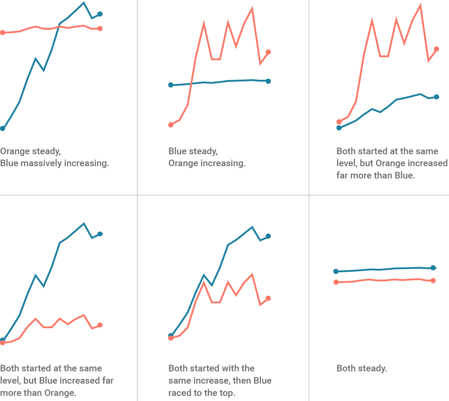
Tweaking the y-axis zero base line and the scale is the equivalent of changing the data itself. Especially with no coordinate lines, y-axis scales mean little and can be used to make any statement about the data you want it to.
调整y轴零基线和小数位数等同于更改数据本身。 尤其是在没有坐标线的情况下, y轴刻度几乎没有什么意义,可以用于对所需数据进行任何声明。

This and many other plots don’t suck because they violate the data’s integrity, but because they make the relationship and main point, if any, is not as obvious to the reader as it should be. A reader who is good at math and has a strong sense of numbers may be able to develop a strong image of the real relationship after a few minutes of staring, but the goal of visualization is to do the math and make the message clear to the reader.
该图和其他许多图不会因为它们破坏了数据的完整性而使它们无法正常运行,而是因为它们使关系和要点(如果有的话)对读者而言不如应有的明显。 精通数学并具有较强数字意识的读者也许可以在凝视了几分钟后就可以建立出真实关系的强烈印象,但是可视化的目的是进行数学运算,并使信息清晰易懂。读者。
A 2011 study conducted by Petra Isenberg, Anastasia Bezerianos, Pierre Dragicevic and Jean-Daniel Fekete showed 15 people four different charts that all showed values in different magnitudes, and observed how well these people could read the charts. One of them was a chart with a dual axis, which the researchers call “superimposed chart”.
Petra Isenberg,Anastasia Bezerianos,Pierre Dragicevic和Jean-Daniel Fekete于2011年进行的一项研究向15个人展示了四个不同的图表,均显示了不同的数值,并观察了这些人对图表的理解程度。 其中之一是带有双轴的图表,研究人员称其为“叠加图表”。
We found across the board that the superimposed chart performed poorly both in terms of accuracy and time. Participants’ feedback from the questionnaire was also clearly against the superimposed chart and it was ranked lowest by all but one participant. Participants called it very confusing and demanding too much concentration or reflection to decipher the non-monotonic and discontinuous nature of the two scales. — A Study on Dual-Scale Data Charts
我们发现,叠加图表在准确性和时间方面均表现不佳。 参与者从问卷中得到的反馈也明显与叠加图相对,除一名参与者外,其他所有参与者的反馈均名列最低。 与会者称此举非常令人困惑,需要过多的专注或反思才能破译这两个音阶的非单调和不连续的本质。 —双尺度数据图表研究
Alternatives include two separate charts…
备选方案包括两个单独的图表…

…or charts that show an increase metric on one scale, such as % increase.
…或显示一个指标的增长指标的图表,例如增长百分比。

Since dual axis plots give you complete control over the shape of the line, to distort the data to fit your narrative, stretch and move the axes vertically as much as you please.
由于双轴图使您可以完全控制线条的形状,因此为了使数据变形以适合您的叙述,请尽可能多地垂直拉伸和移动轴。
径向杆图| 周罪 (Radial Bar Plots | A Circumference Sin)
Radial bar plots are often used because they are eye-catching, unique, and can be animated in a sleek way. The radial bar plot below shows the quantity of weapons exported by the top six largest exporters in 2017.
经常使用径向条形图,因为它们引人注目,独特且可以以流畅的方式进行动画处理。 下面的径向条形图显示了2017年排名前六的最大出口商出口的武器数量。

Radial bar plots are not based by length of bar but by, like the pie chart, angle. The plots are based on a circular degree system, meaning that bars on the outside will always inevitably seem longer than ones closer to the center.
径向条形图不是基于条形的长度,而是基于饼形图的角度。 这些图基于圆度系统,这意味着外侧的条形图总是不可避免地要比靠近中心的条形图更长。
A standard bar plot is a good alternative, but a lollipop plot may be suitable for the need of uniqueness and style in some plots that don’t distort the data.
标准条形图是一个很好的选择,但在某些不使数据失真的图中,棒棒糖图可能适合满足唯一性和样式的需要。
Naturally, if you needed to emphasize a particular group’s length, you can use a radial bar plot to make that group seem particularly larger. Put a group you want to de-emphasize at the center.
自然地,如果您需要强调特定组的长度,则可以使用径向条形图使该组显得特别大。 将要取消强调的组放在中间。
Now, you’re set to distort data to fit whatever narrative you please! Just hope your readers don’t look too closely.
现在,您可以对数据进行变形以适合您所需要的任何叙述! 只是希望您的读者不要看起来太近。
Plots from data to viz.
从数据绘制到可视化。
标记偏见


 150
150

 被折叠的 条评论
为什么被折叠?


