


ux和ui
At face value, this meme appears to be a quick and easy tool for educating the general public about what the differences are between UI and UX. You might look at the attractive glass bottle labeled “UI” and understand that UI might have to do more with aesthetics. The less attractive but easier to use plastic bottle labeled “UX” is meant to be stored upside down, making it easier for the user to squirt out ketchup, rather than having to smack the bottom of the glass version. This gives the average person the impression that UX might be more about the actual functionality of a product.
从表面上看,这个模因似乎是一种快速简便的工具,用于向公众宣传UI和UX之间的区别。 您可能会看到标有“ UI”的有吸引力的玻璃瓶,并了解UI可能在美学方面需要做更多的事情。 吸引力较小但更易于使用的标有“ UX”的塑料瓶可以倒置存放,从而使用户更容易喷出番茄酱,而不必打玻璃杯的底部。 这给普通人一个印象,即UX可能更多地与产品的实际功能有关。
The most obvious issue with this meme is that it boils down an entire field of study down to a simple image. UX and UI are complex and multifaceted, with a lot more nuance than this image suggests.
这个模因最明显的问题是它将整个研究领域简化为一个简单的图像。 UX和UI复杂且多面,比此图像所暗示的要细腻得多。
If we then start to look into the history of Heinz ketchup and their packaging design, we can start to see how the UX vs. UI meme starts to fall apart even more.
然后,如果我们开始研究亨氏番茄酱及其包装设计的历史,就可以开始了解UX vs. UI模因是如何崩溃的。
亨氏包装设计简史 (A brief history of Heinz packaging design)
The glass bottle labeled “UI” was created at a much earlier point in history than the upside-down ketchup bottle. As Heinz has grown and developed as a company over the years, so too has its packaging design and the ketchup product itself.
标有“ UI”的玻璃瓶创建于历史上比倒置的番茄酱瓶要早得多。 随着亨氏作为一家公司的发展壮大,其包装设计和番茄酱产品本身也是如此。
In 1890, the first iconic Heinz glass ketchup bottle was designed and released to the public. The most innovative thing about the attractive glass container was that it allowed consumers to see through the packaging and look at the product inside.
1890年,设计了第一个标志性的亨氏玻璃番茄酱瓶,并向公众发布。 吸引人的玻璃容器最具创新性的一点是,它使消费者可以透视包装并查看内部产品。
Over the next century, the ketchup bottle went through several rounds of innovation. In 1970, Heinz created a 32-ounce ketchup bottle which contained much more product than its predecessors.
在下一世纪,番茄酱瓶经历了几轮创新。 1970年,亨氏(Heinz)创建了一个32盎司的番茄酱瓶,其中的产品比以前的产品多得多。

The first squeeze tube from Heinz came out in 1983 when the company created a funny green ketchup marketed towards kids.
1983年,亨氏推出了第一支挤压管,当时该公司制造了一种面向儿童的有趣的绿色番茄酱。

It was the popularity of this easy-to-use packaging that lead Heinz to create the upside-down, plastic, easy-squeeze regular ketchup bottle. It didn’t hit shelves until 2001, over a century since the introduction of the glass bottle design.
正是由于这种易于使用的包装的流行,亨氏才开始生产上下颠倒的塑料易挤压普通番茄酱瓶。 自从玻璃瓶设计问世以来,它一直没有上架,直到2001年。
超越UX和UI的产品设计因素 (Factors in product design beyond UX and UI)
Both the 1890 bottle design and the 2001 bottle design are iconic and important parts of the history of Heinz ketchup. They are both excellent representations of good product design for their time. However, many of the decisions Heinz makes in regards to packaging design doesn’t have much to do with UI or UX at all.
1890年的瓶子设计和2001年的瓶子设计都是亨氏番茄酱历史上的标志性和重要组成部分。 它们都是当下良好产品设计的出色代表。 但是,亨氏在包装设计方面做出的许多决定与UI或UX无关。
For example, in 2012, Heinz created an eco-friendly version of their packaging. This packaging was not only easier and cheaper to produce, but also appealed to eco-conscious consumers.
例如,2012年,亨氏(Heinz)创建了包装的环保版本。 这种包装不仅生产起来更容易,更便宜,而且还吸引了注重生态的消费者。

Even the concept of this easy squeeze tube isn’t entirely just about improving the user’s experience. By making it so easy to squeeze a ton of product out of the ketchup bottle, consumers may go through a bottle of ketchup much faster, and will need to go back to the store to buy more Heinz.
甚至这种易于挤压的管的概念也并不完全是为了改善用户的体验。 通过如此轻松地将一吨产品从番茄酱瓶中挤出来,消费者可以更快地通过一瓶番茄酱,并且需要回到商店购买更多的亨氏。
我们可以“修复”这个模因吗? (Can we “fix” this meme?)
What you see in this image are two containers containing a product. The product is ketchup — not the bottle itself. Both containers are the User Interface, or UI. With this in mind, I have seen an attempt to update the image with more accuracy.
在此图像中看到的是包含一个产品的两个容器。 产品是番茄酱,而不是瓶子本身。 这两个容器都是用户界面或UI。 考虑到这一点,我看到了尝试更精确地更新图像的尝试。
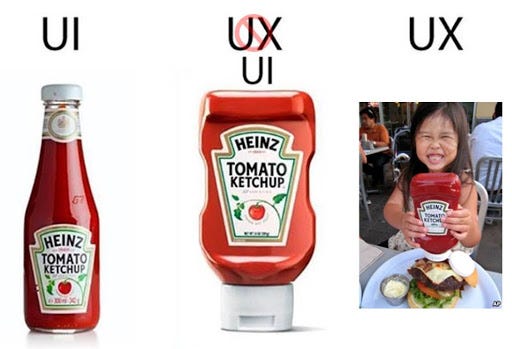
This update to the meme drives the point home that both containers are the User Interface of the ketchup-containing bottle, and adds an image of a user actually squeezing ketchup onto a burger. However, the update to this meme does not account for nuance in either UI or UX.
对模因的此更新使人们意识到两个容器都是装有番茄酱的瓶子的用户界面,并向用户添加了将番茄酱实际挤压到汉堡的用户图像。 但是,此模因的更新未考虑UI或UX中的细微差别。
While the ketchup meme does not dig into the complexity of either field of study, many people do not know what UX or UI are at all unless they are in the tech industry. Memes like this one can serve as a good tool to introduce the general public to the concepts of UX and UI. In my opinion, anything that educates more people about the work UI and UX designers do helps to give the field the recognition it deserves.
尽管番茄酱模因并没有深入探讨这两个研究领域的复杂性,但除非有人从事于技术行业,否则许多人根本不知道什么是UX或UI。 像这样的模因可以作为向公众介绍UX和UI概念的好工具。 我认为,任何可以使更多人了解UI和UX设计器工作的知识,都有助于使该领域得到应有的认可。
ux和ui


 445
445

 被折叠的 条评论
为什么被折叠?
被折叠的 条评论
为什么被折叠?
 到【灌水乐园】发言


