


交互规则
重点 (Top highlight)
In life, there are certain rules you must never break. If you do there will be hell to pay. In User Interface design there are also rules to live by. They are called “heuristics” or general principles that improve usability in user interfaces. These are repeatable patterns that have been tested over time and help users navigate an interface. A well-designed interface will always contemplate the following principles. A not so well designed interface will surely lack one or more of these principles. You’re a UI designer so why would you break one of these rules and cause your users such headache?
在生活中,有些规则是您绝不能打破的。 如果您这样做,将要付出地狱的代价。 在用户界面设计中,还存在一些规则。 它们被称为“启发式”或提高用户界面可用性的一般原则。 这些是经过反复测试的可重复模式,可以帮助用户浏览界面。 精心设计的界面将始终考虑以下原则。 设计不当的界面肯定会缺少这些原则中的一项或多项。 您是UI设计师,那么为什么要违反这些规则之一,并让用户感到头疼?
This list was adapted from Norman Neilsen’s 10 Heuristics for User Interface design.
此列表改编自Norman Neilsen的 10种 用户界面 启发式 设计。
1.系统状态的可见性 (1. Visibility of System Status)
The system should always keep users informed about what is going on, through appropriate feedback within reasonable time.
系统应始终在合理的时间内通过适当的反馈使用户知道发生了什么。
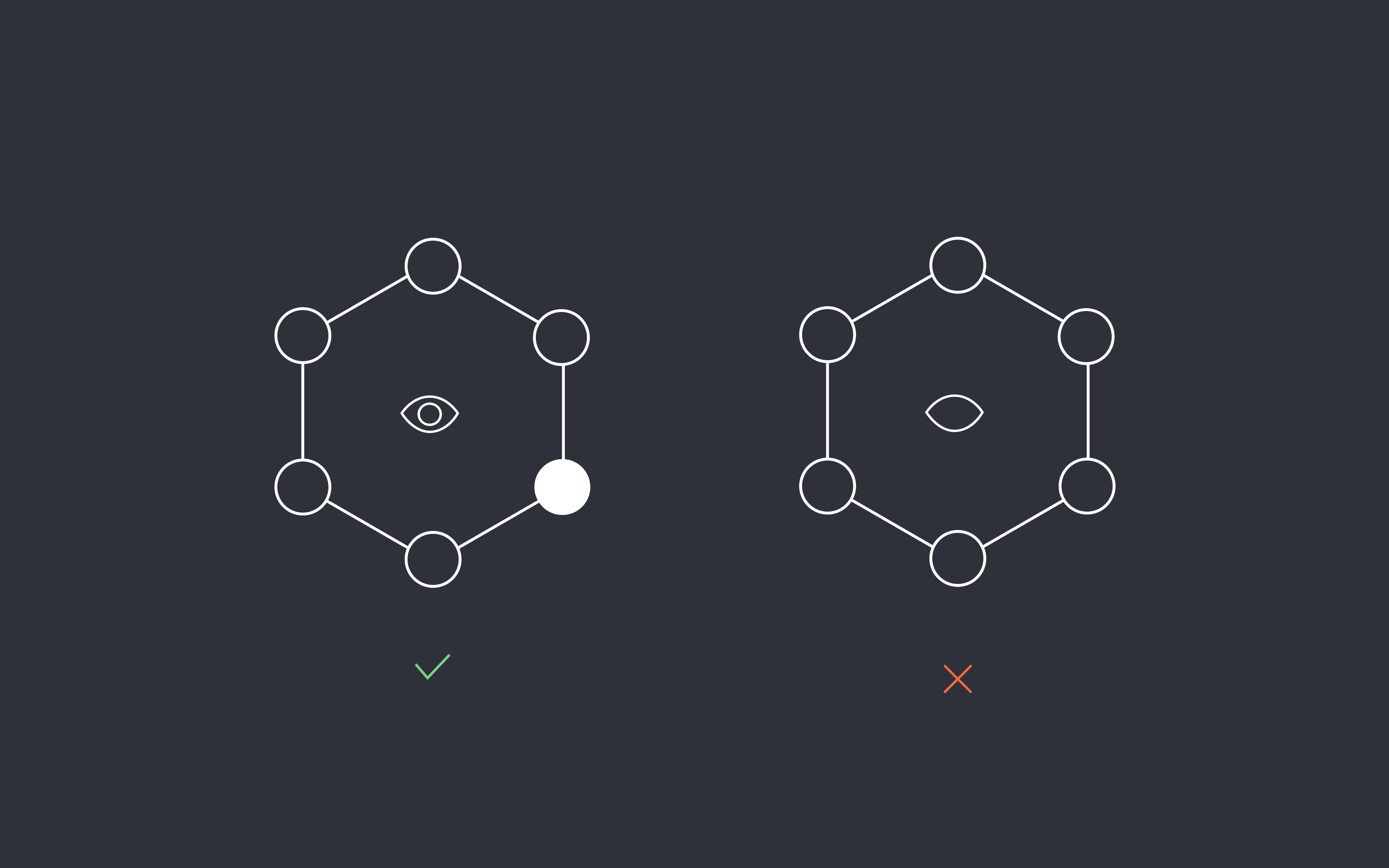
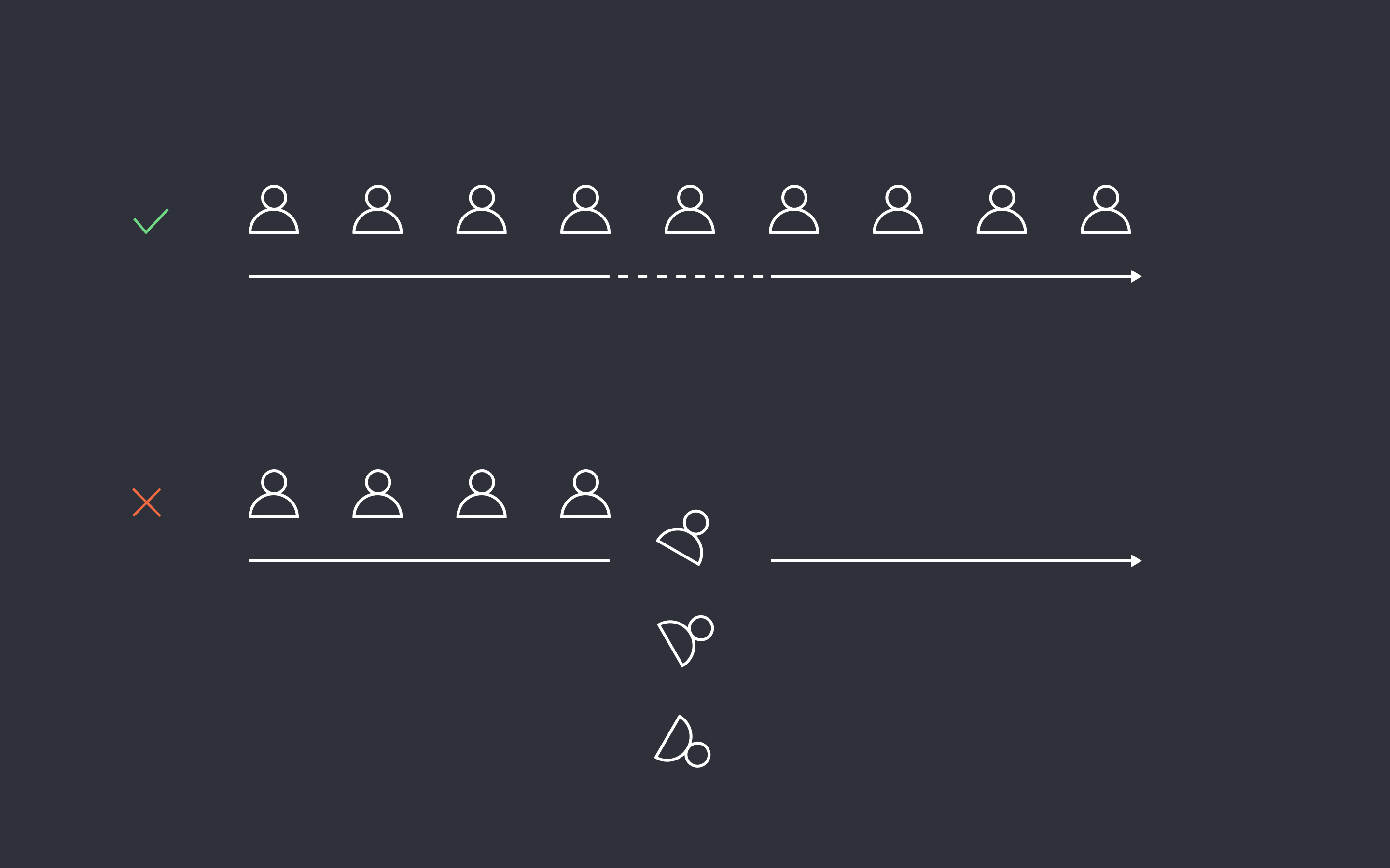
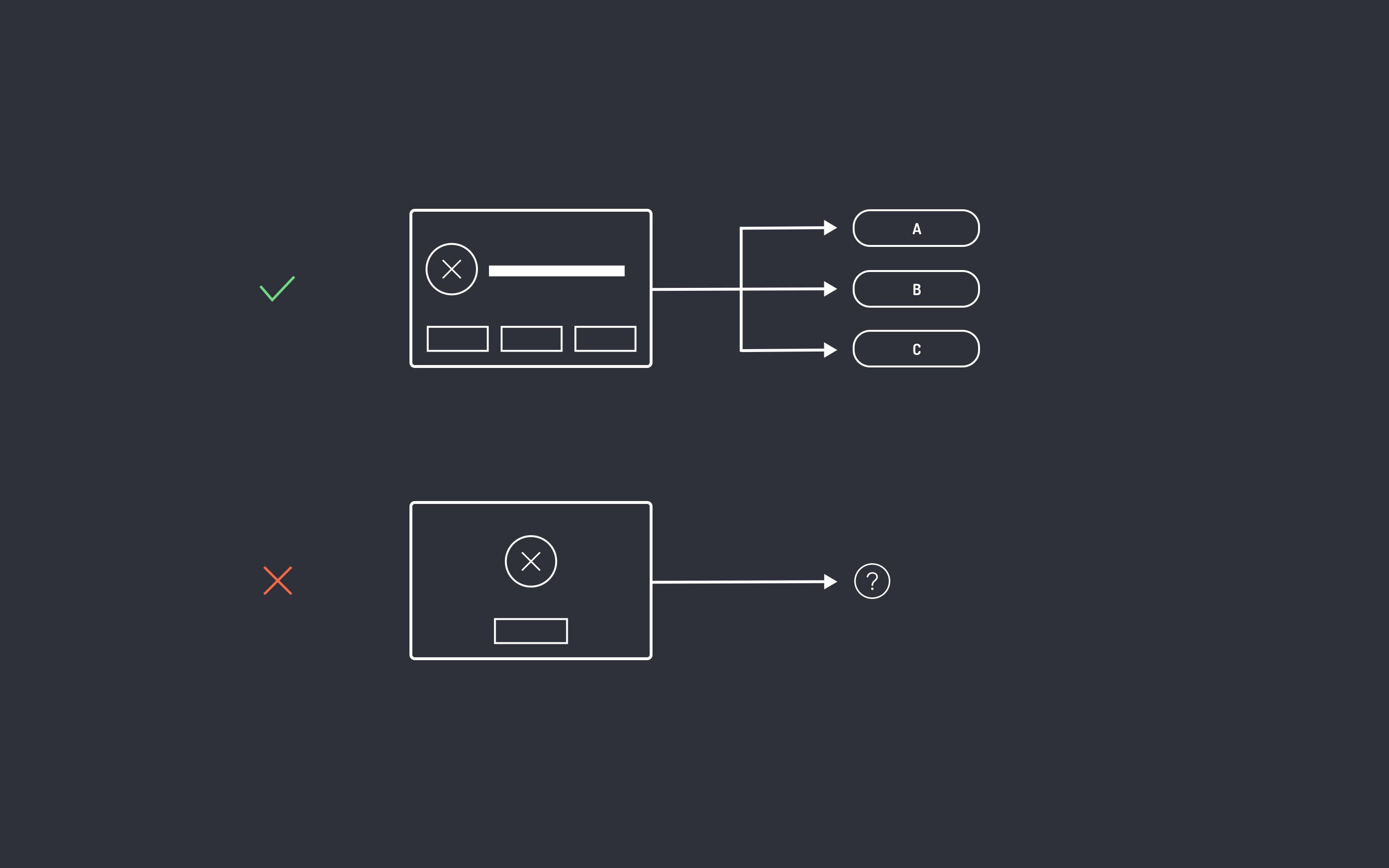
Always give your users appropriate information, hints and context so they know where they are within the system at all times. This allows the user to feel in control and know what to do next. Did the item get added to the cart? Did the edit get saved? How long will this process take? What is the status of my order? What is happening right now? Always be answering questions like these for users and never keep them guessing or in the dark.
始终为您的用户提供适当的信息,提示和上下文,以便他们始终知道自己在系统中的位置。 这使用户可以掌控一切,并知道下一步该怎么做。 该商品是否已添加到购物车? 修改保存了吗? 此过程需要多长时间? 我的订单状态如何? 现在发生了什么? 始终为用户回答此类问题,切勿让他们猜测或在黑暗中。
2.系统与现实世界之间的匹配 (2. Match between System and Real World)
The system should speak the users’ language, with words, phrases and concepts familiar to the user, rather than system-oriented terms. Follow real-world conventions, making information appear in a natural and logical order.
系统应该使用用户熟悉的单词,短语和概念来讲用户的语言,而不是面向系统的术语。 遵循现实世界的惯例,使信息以自然和逻辑的顺序出现。
Use familiar words and language. Don’t overcomplicate the wording for the user. The meaning of a word or an icon on the screen should be clear and understandable for your target audience. People also come with mental models and experiences that allow them to interpret patterns.
使用熟悉的单词和语言。 不要使用户的用语过于复杂。 屏幕上的单词或图标的含义应清晰易懂,以供目标受众理解。 人们还带有心理模型和经验,使他们能够解释模式。
One of the greatest advancements in technology came about when the Graphical User Interface was introduced. Before the GUI the computer screen was limited to obscure textual commands to memorize and repeat every time you wanted to execute an action. Then everything changed. The screen displayed little images of folders and files and a hand cursor. These were all visual symbols people understood instantly. No need to explain because it referenced real-world mental models.
当引入图形用户界面时,技术上的最大进步之一就出现了。 在GUI之前,计算机屏幕仅限于模糊的文本命令以记住和重复您每次要执行的操作。 然后一切都变了。 屏幕上几乎没有显示文件夹和文件以及手形光标的图像。 这些都是人们立即理解的视觉符号。 无需解释,因为它引用了现实世界中的心理模型。
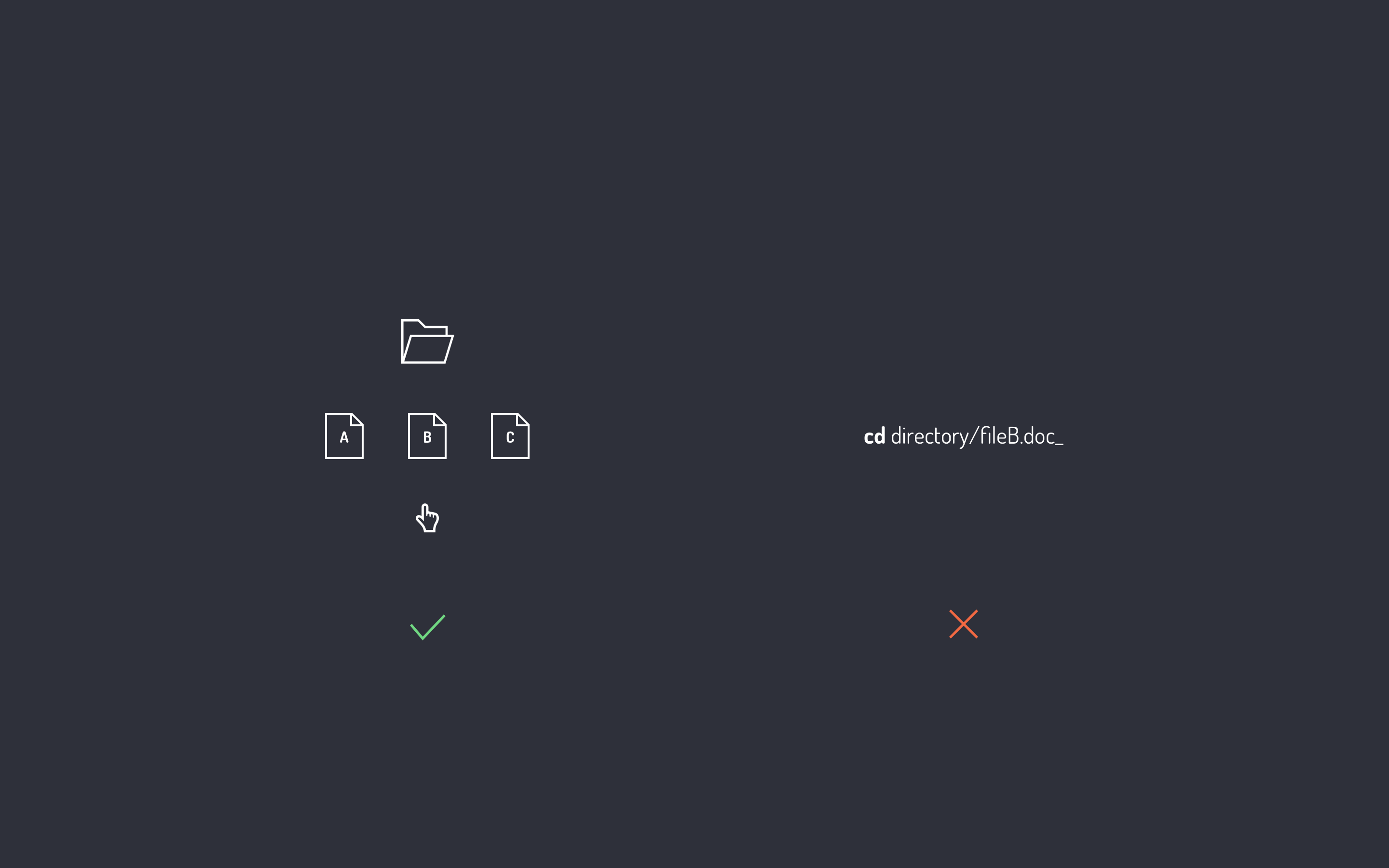
3.一致性和标准 (3. Consistency and Standards)
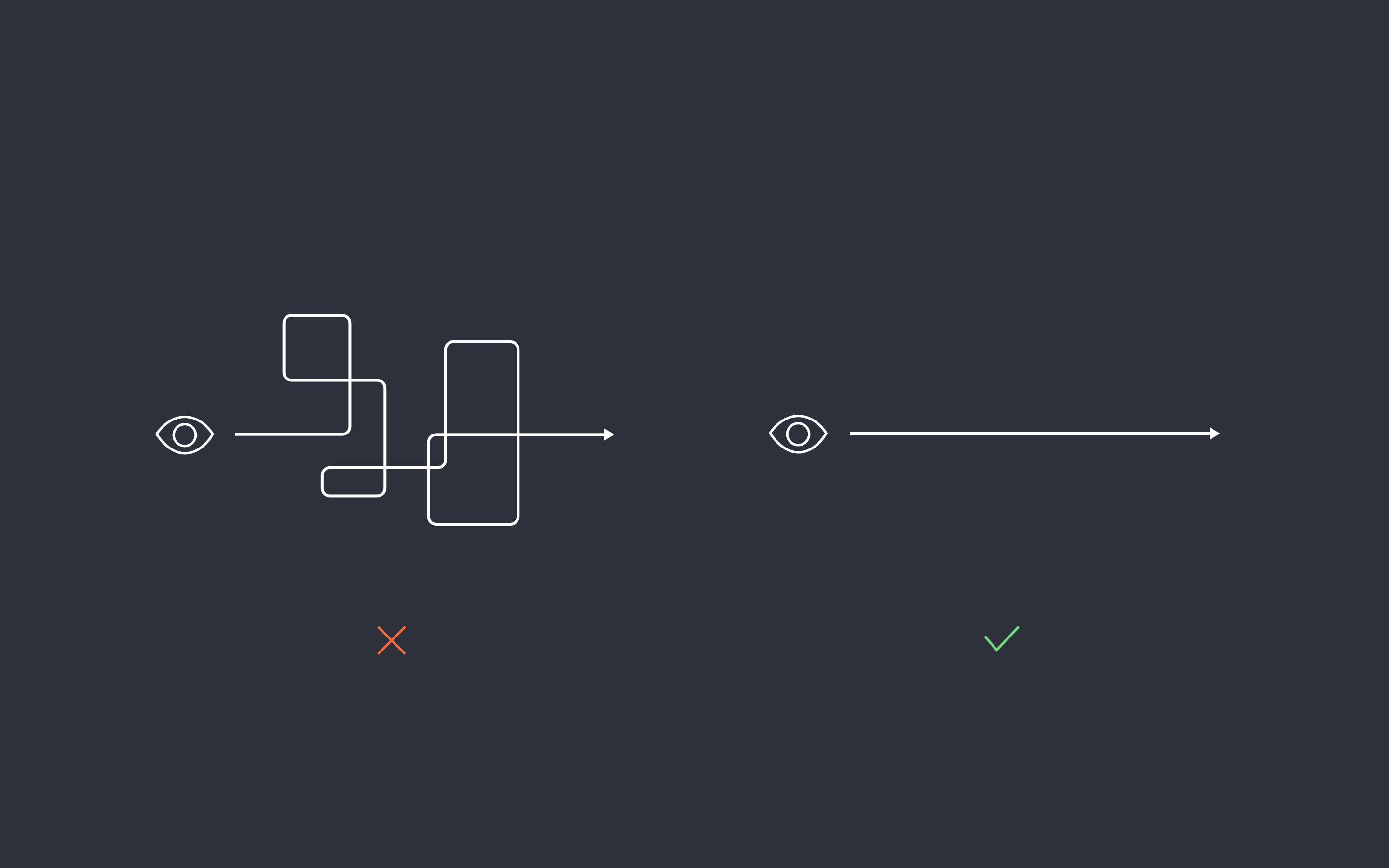
Users should not have to wonder whether different words, situations, or actions mean the same thing.
用户不必怀疑不同的词语,情况或动作是否意味着同一件事。
There are two types of consistency: internal and external. Internal consistency refers to the patterns within your site or app. This can be simple like keeping links the same color on all pages or using the same icon for the same concept, say HOME, on every screen. External consistency refers to conventions used in other software and systems that most people use, such as a shopping cart. Most people are familiar with how a shopping cart works. You don’t need to reinvent the wheel. If you do you might make it harder for your users to learn how your shopping cart works. Keep it consistent and save users unnecessary confusion.
有两种类型的一致性:内部和外部。 内部一致性是指您网站或应用内的模式。 这很简单,例如在所有页面上使链接保持相同的颜色,或对同一概念使用相同的图标表示相同的概念,例如HOME。 外部一致性是指大多数人使用的其他软件和系统中使用的约定,例如购物车。 大多数人都熟悉购物车的工作方式。 您不需要重新发明轮子。 如果这样做,可能会使用户更难了解购物车的工作方式。 保持一致并避免用户不必要的混乱。
4.用户控制与自由 (4. User Control & Freedom)
Users often choose system functions by mistake and will need a clearly marked “emergency exit” to leave the unwanted state without having to go through an extended dialogue. Support undo and redo.
用户经常错误地选择系统功能,并且需要明确标记的“紧急出口”以离开不需要的状态,而无需进行长时间的对话。 支持撤消和重做。
Always provide a way out. Never force users to execute a function they don’t require or lead them to a dead end. If you’re designing a checkout flow for example, let the users continue shopping if they wish. If they tried to execute an action on an app, let the users cancel out if they’re unsure they want to proceed at the last minute.
始终提供出路。 切勿强迫用户执行不需要的功能或使他们陷入僵局。 例如,如果您正在设计结帐流程,请让用户根据需要继续购物。 如果他们尝试在应用上执行操作,请让不确定的用户取消操作,直到最后一分钟。
5.错误预防 (5. Error Prevention)
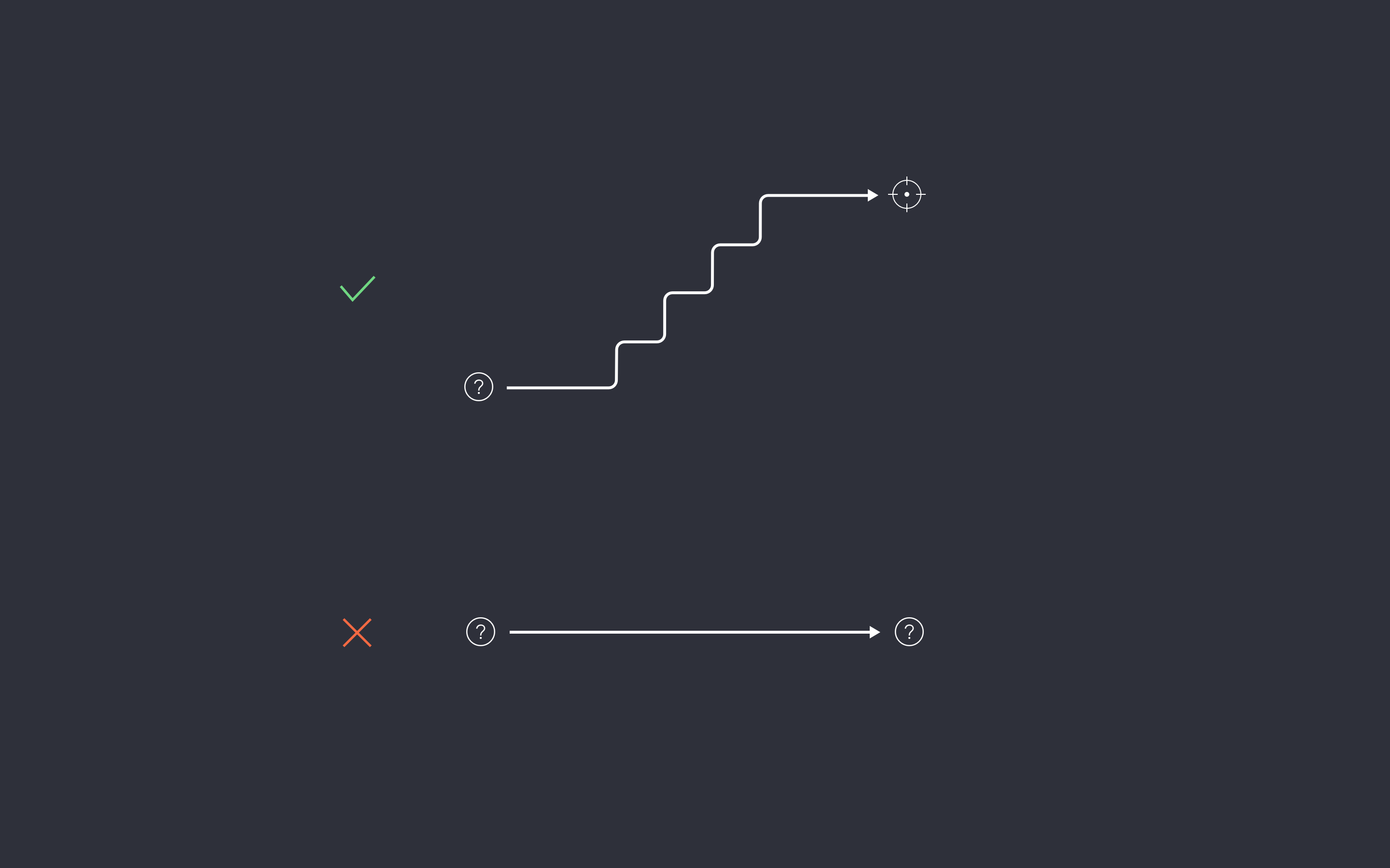
Even better than good error messages is a careful design which prevents a problem from occurring in the first place. Either eliminate error-prone conditions or check for them and present users with a confirmation option before they commit to the action.
精心设计的系统甚至比良好的错误消息更好,它可以防止问题从一开始就发生。 消除容易出错的条件,或者检查条件,并在用户执行操作之前向其提供确认选项。
When system operations are critical, such as deleting files or sending an email campaign to 1,000 recipients, make sure the users know they will do something major. Show them a confirmation dialogue or provide additional information clearly defining what will happen before committing to the action. This will prevent them from going further if unsure of their action. It will also save them a great deal of regret.
当系统操作很关键时,例如删除文件或向1,000个收件人发送电子邮件活动,请确保用户知道他们将做一些重要的事情。 向他们显示确认对话或提供其他信息,以明确定义在执行该操作之前将要发生的情况。 如果不确定自己的行动,这将阻止他们走得更远。 这也将使他们免于后悔。
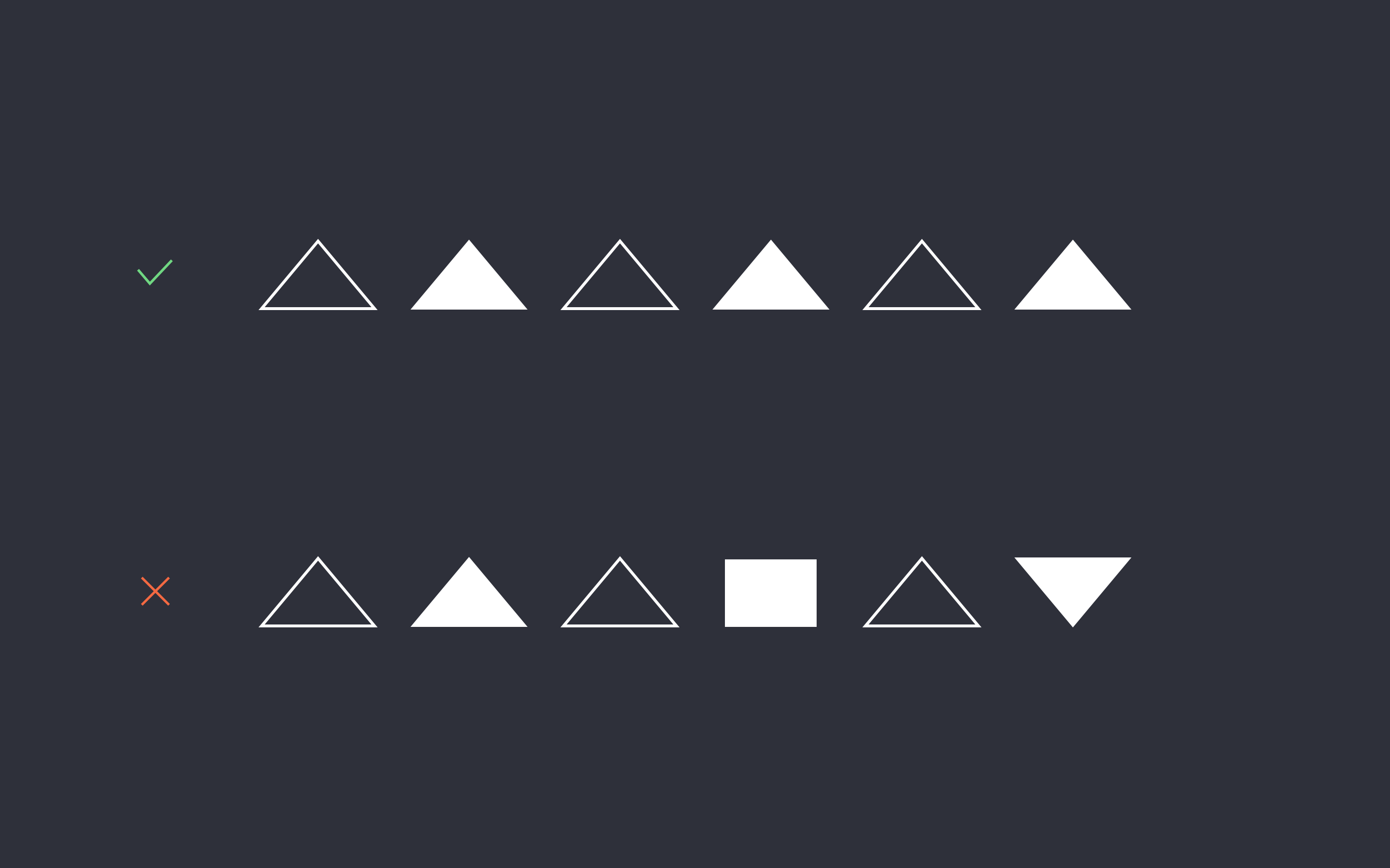
6.识别而不是回忆 (6. Recognition rather than Recall)
Minimize the user’s memory load by making objects, actions, and options visible. The user should not have to remember information from one part of the dialogue to another. Instructions for use of the system should be visible or easily retrievable whenever appropriate.
通过使对象,操作和选项可见,最大程度地减少用户的内存负载。 用户不必记住从对话的一部分到另一部分的信息。 该系统的使用说明应适当可见或易于检索。
As UI designers one of our goals is to reduce cognitive load for users. Mental memory is a huge resource hog. Memory works in two ways: recognition and recall. Recognition is what’s familiar to you instantly. Like a person’s face. You look at a friend’s face and you know instantly you’ve seen them before. Recall works differently. It’s something that you have to retrieve from memory, like a person’s name. Recall usually takes more time and work because your mind has to process more information to decipher what it’s looking at. Recognition, on the other hand, is instant. We want more recognition in our UI’s and less recall. A good UI example for this principle is using universally recognizable buttons and icons for features, such as a house for HOME or a pencil for EDIT. And if you must design new icons for your UI that most people have never seen before, use a text descriptor to clarify and lessen the cognitive load.
作为UI设计师,我们的目标之一是减少用户的认知负担。 心理记忆是一项巨大的资源消耗。 记忆以两种方式起作用:识别和记忆。 识别是您立即熟悉的。 像一个人的脸。 您看着朋友的脸,就知道自己曾经见过他们。 召回的工作方式有所不同。 这是您必须从内存中检索的东西,例如一个人的名字。 召回通常会花费更多的时间和精力,因为您的大脑必须处理更多的信息才能解读其内容。 另一方面,识别是即时的。 我们希望在用户界面中获得更多认可,并减少召回。 遵循此原则的一个很好的UI示例是为功能使用通用的按钮和图标,例如用于房屋的房屋或用于编辑的铅笔。 并且,如果您必须为UI设计大多数人以前从未见过的新图标,请使用文本描述符来阐明和减轻认知负担。
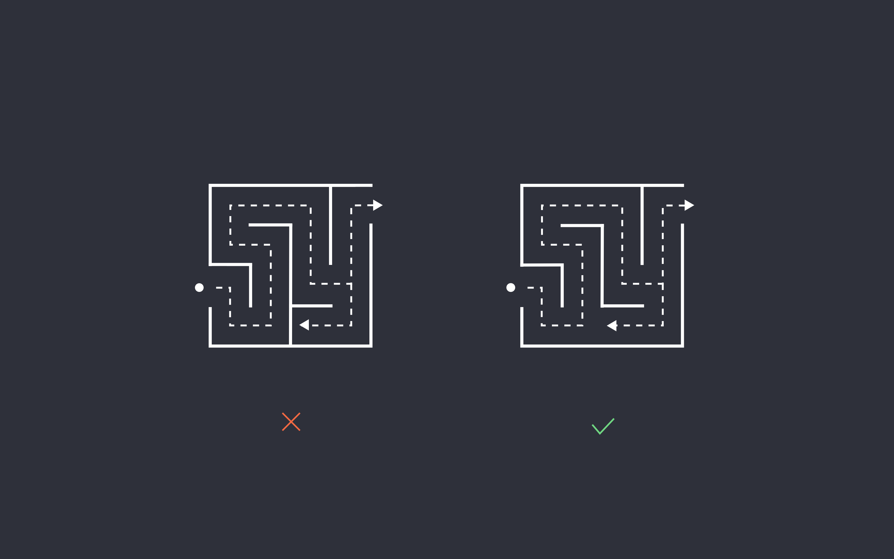
7.灵活性和使用效率 (7. Flexibility & Efficiency of Use)
Accelerators — unseen by the novice user — may often speed up the interaction for the expert user such that the system can cater to both inexperienced and experienced users. Allow users to tailor frequent actions.
新手用户看不见的加速器通常可以加快专家用户的交互速度,从而使系统可以同时满足没有经验的用户和有经验的用户。 允许用户调整频繁的操作。
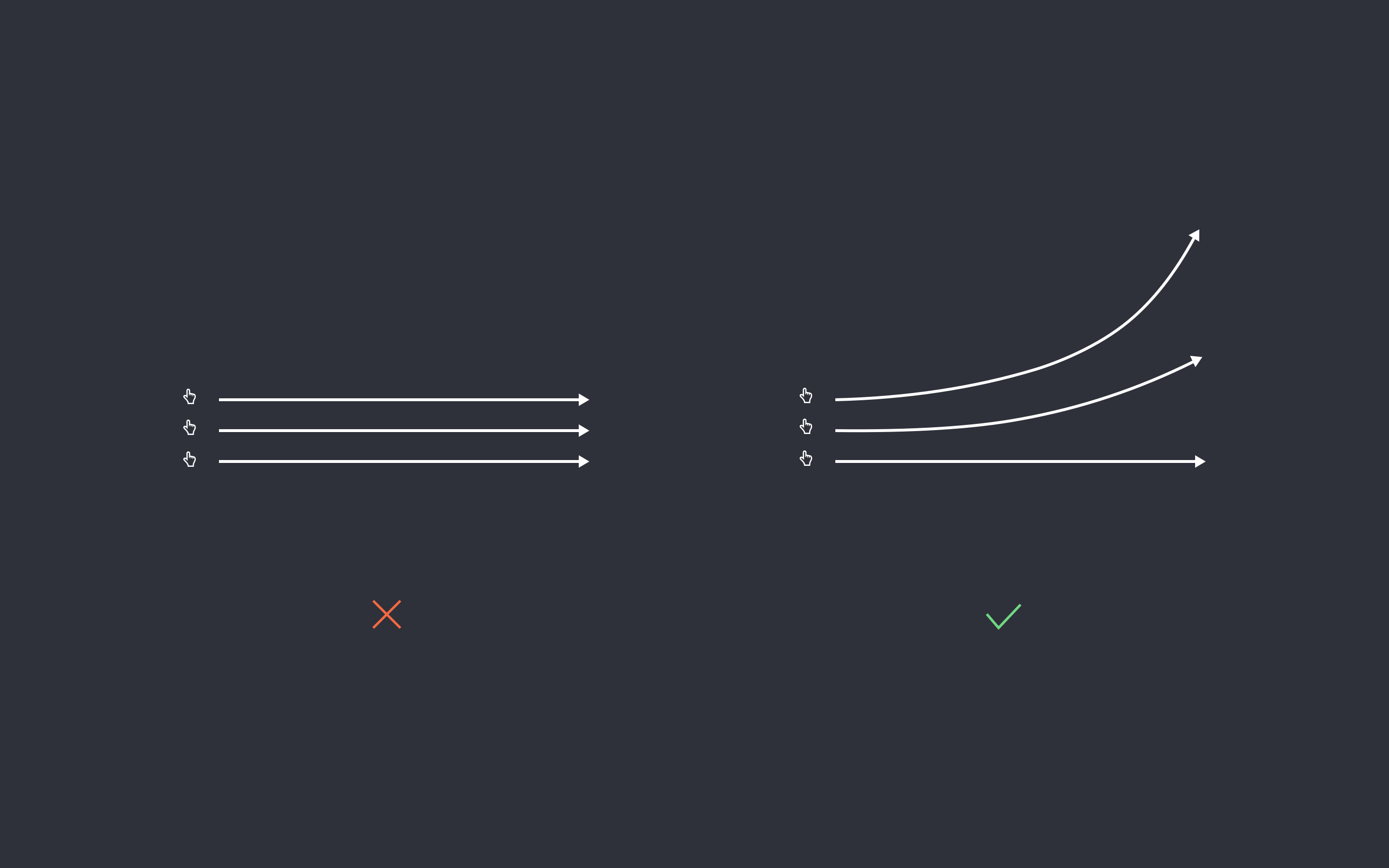
When certain tasks are repeated over and over in your app or system you might want to make the interaction more efficient for the users. For example, use a swipe gesture to save or delete items from a list on a mobile app. The normal way to delete an item is by opening an item and then pressing the delete button. The expert way (and more efficient way) is by simply swiping and instantly deleting and item from a list.
在您的应用程序或系统中一遍又一遍地重复某些任务时,您可能希望使用户的交互更加有效。 例如,使用滑动手势在移动应用程序上的列表中保存或删除项目。 删除项目的通常方法是打开一个项目,然后按Delete键。 专家方式(更高效的方式)是只需滑动并立即从列表中删除和项目。
8.极简设计与美学 (8. Minimalist Design & Aesthetic)
Dialogues should not contain information which is irrelevant or rarely needed. Every extra unit of information in a dialogue competes with the relevant units of information and diminishes their relative visibility.
对话中不应包含无关紧要或很少需要的信息。 对话中每增加一个信息单元都会与相关信息单元竞争,从而降低其相对可见度。
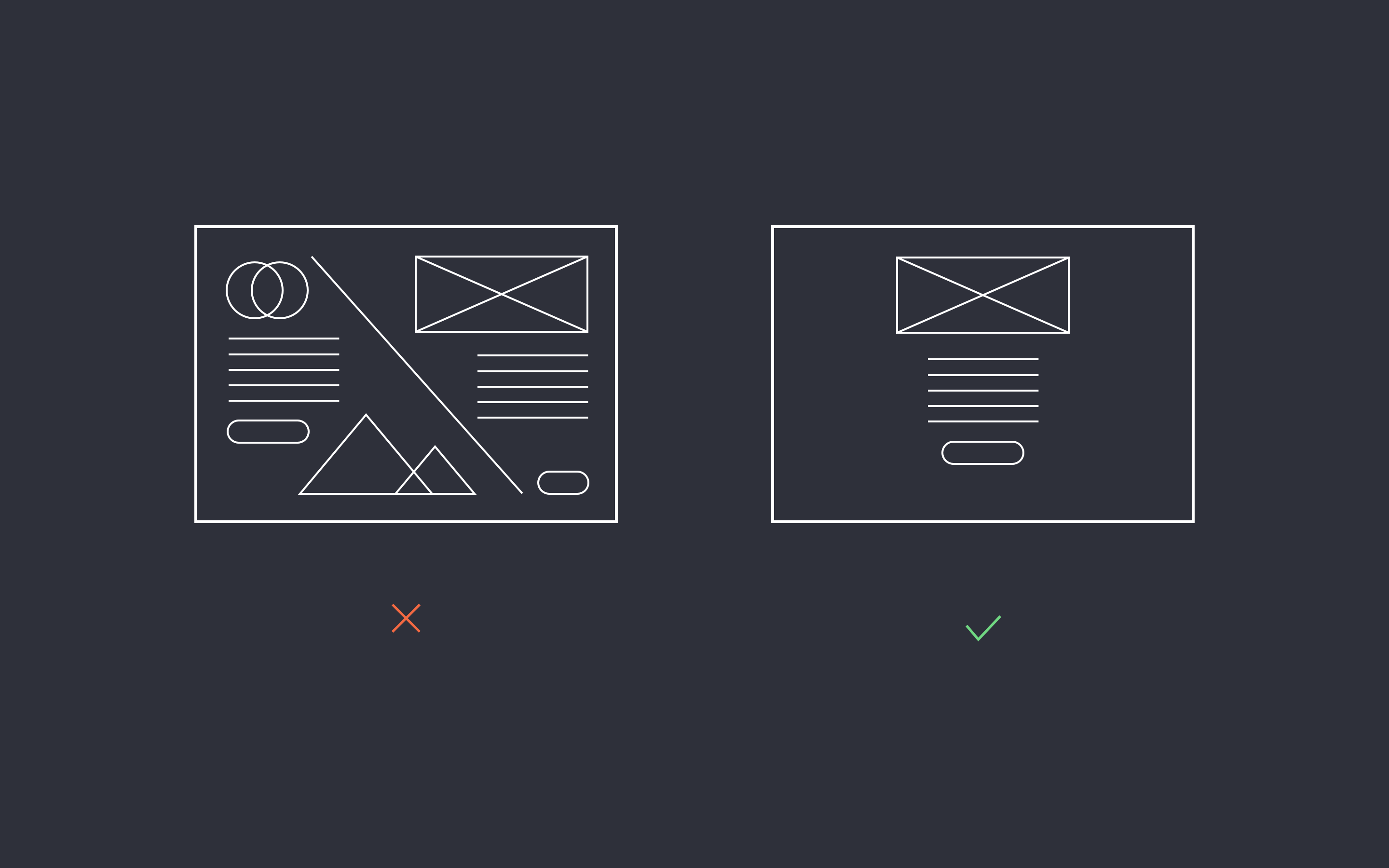
When designing for art’s sake it doesn’t matter if we go baroque and fill the screen with artifacts, textures, and images. But when designing for interaction we aim to reduce signal-to-noise ratio. Doing this makes our interface more comprehensible for users. You can apply this principle by simply reducing to a bare minimum content displayed on a screen, be it imagery or text, so the user can focus on the task at hand without distraction.
为艺术而设计时,我们是否要巴洛克式地在屏幕上填充伪影,纹理和图像并不重要。 但是,在设计交互时,我们的目标是降低信噪比。 这样做使我们的界面更易于用户理解。 您可以通过简单地将屏幕上显示的最少内容(图像或文本)减少到最小来应用此原理,从而使用户可以专注于手头的任务而不会分散注意力。
9.帮助用户识别,诊断和从错误中恢复 (9. Help Users Recognize, Diagnose, & Recover from errors)
Error messages should be expressed in plain language (no codes), precisely indicate the problem, and constructively suggest a solution.
错误消息应使用简单的语言(无代码)表示,准确指示问题并建设性地提出解决方案。
Errors will happen. That’s inevitable. What happens after a user encounters an error is the UI designer’s responsibility. So lets help users by designing error pages and alerts that are understandable and provide options or solutions to the problem. For instance, let’s examine the ubiquitous 404 page. We as designers know what an error 404 page means, but users generally don’t. In order to help users we have to translate 404 into plain English by adding some copy that makes it clear what just happened like “Sorry, but we couldn’t find the page you’re looking for. Here are some suggestions of pages with similar content…”.
错误会发生。 那是不可避免的。 用户遇到错误后发生的事情是UI设计者的责任。 因此,通过设计可理解的错误页面和警报并为问题提供选项或解决方案,可以帮助用户。 例如,让我们检查无处不在的404页面。 作为设计人员,我们知道404错误页面的含义,但用户通常不会。 为了帮助用户,我们必须通过添加一些副本来将404转换为简单的英语,以便清楚地说明发生了什么,例如“对不起,但我们找不到您要查找的页面。 这是内容相似的网页的一些建议……”。
10.帮助和文档 (10. Help & Documentation)
Even though it is better if the system can be used without documentation, it may be necessary to provide help and documentation. Any such information should be easy to search, focused on the user’s task, list concrete steps to be carried out, and not be too large.
即使可以在没有文档的情况下使用系统会更好,但可能仍需要提供帮助和文档。 任何此类信息都应该易于搜索,着眼于用户的任务,列出要执行的具体步骤,并且不要太大。
Always have help clearly accessible. Place it prominently in the top bar or main navigation area. When users run into problems and can’t find a solution easily, they must be directed to a section where they can. This could take the form of a FAQ page with a search box providing possible suggestions and answers. In the event that there is no answer available, the system must have an option to contact support directly for additional assistance, either by a support ticketing system or direct email or phone.
始终获得明确的帮助。 将其突出显示在顶部栏或主导航区域中。 当用户遇到问题而无法轻松找到解决方案时,必须将他们定向到可以找到的部分。 这可以采用常见问题解答页面的形式,带有一个提供可能建议和答案的搜索框。 如果没有可用答案,则系统必须可以选择通过支持票务系统或直接电子邮件或电话直接与支持人员联系以获得更多帮助。
翻译自: https://uxdesign.cc/10-interaction-design-rules-you-must-never-break-82a048b0240e
交互规则


 9083
9083

 被折叠的 条评论
为什么被折叠?
被折叠的 条评论
为什么被折叠?
 到【灌水乐园】发言


