


ux体验网站 英国
As the saying goes —
俗话说 -
“A picture is worth a thousand words.”
“一张图片胜过千言万语。”
When creating content on the web, it’s often recommended to be using high-quality imageries and making sure that the images serve its purpose for the message that the company/organization is trying to convey. I mean, look at the amazing platforms like Unsplash that have been helping many content creators.
在网络上创建内容时,通常建议使用高质量的图像,并确保图像符合公司/组织试图传达的信息的目的。 我的意思是,看看像Unsplash这样令人惊叹的平台,这些平台已经在帮助许多内容创作者。
Recently, I’ve been doing some research on best UX practices/tips for web imageries. Surprisingly, as I’ve tried to research around Medium and other parts of the internet, I haven’t really come across many articles that put all of the information together.
最近,我一直在研究有关Web图像的最佳UX做法/技巧。 出乎意料的是,当我尝试研究媒体和互联网的其他部分时,我并没有真正看到过将所有信息汇总在一起的许多文章。
There is one though that I’ve come across and I want to echo it on here too:
虽然我遇到过一个,但我也想在这里回应:
I wanted to share my research with all the designers out there (or anyone really) who wonders about UX best practices and recommendations on using web imageries.
我想与所有的设计师(或真正的人)分享我的研究成果,他们对UX最佳实践和使用Web图像的建议感到疑惑。
I hope this can serve as a starting point for you in whatever project you’re working on that or if you’re just wondering about the impact of using imageries on websites in general.
我希望这可以作为您从事任何项目的起点,或者您只是想知道使用图像对一般网站的影响。
1.在页面上识别,确定优先级,定义和分配视觉权重。 (1. Identify, prioritize, define, and assign visual weight on the page.)
Identify & Prioritize all goals of the page: Business goal(s) User goal(s), Brand goal(s).⁵
确定并优先考虑页面的所有目标:业务目标用户目标,品牌目标。 ⁵
Ex. Is showing the brand the most important? Or, the product the most important?
例如 展示品牌最重要吗? 还是产品最重要?
Once you have established all goals of the page mentioned above, they will be your north star ⭐ to keep you focused and guide you in:
一旦确定了上述页面的所有目标,它们就会成为您的北极星⭐ ,让您专注并指导您:
Defining how each design element are related to the goals stated above. This includes assessing what kind of imageries or illustrations would relate to the goals you have established above.⁵
定义每个设计元素如何与上述目标相关。 这包括评估与您在上面建立的目标有关的图像或插图。 ⁵
An example of a question to ask is: What information value does this image provide? Is adding an image even necessary here?²
一个要问的问题的例子是:该图像提供什么信息价值? 在这里甚至需要添加图像吗? ²
Assigning visual weight based on goal importance.⁵ As stated in the article, it’s important to be clear on the goals of the pages in order to determine whether the visuals/images should be particularly emphasized rather than just filling up space.
根据目标的重要性分配视觉权重。stated如文章所述,重要的是要明确页面的目标,以确定是否应特别强调视觉/图像而不是仅仅占用空间。
➡️ You can follow all the other steps from Nielsen Norman Article here.
You️您可以在此处执行Nielsen Norman Article中的所有其他步骤。
2.考虑内容和讲故事。 (2. Consider content & storytelling.)
首先设计内容 并考虑布局¹。 (Design Content First & Consider layouts¹.)
When wireframing, the most efficient way in dealing with visual hierarchies is to simply put an image placeholder on the layout itself. (Don’t worry, I’m guilty of this too).
在进行线框图绘制时,处理视觉层次结构的最有效方法是将图像占位符简单地放在布局本身上。 (不用担心,我也对此感到内)) 。

As the article suggests — being specific with images is best when wireframing from the start. To me, it means that I should be annotating and considering the type of imagery that would best match with the content being laid out on the wireframe if possible. This way, it can open a conversation with clients/stakeholders of what types of imageries they have that could work with the content, or you can decide to not have it at all. This can save all of us as we move forward.
正如文章所暗示的那样 ,从一开始就进行线框图制作时最好对图像进行特定处理。 对我来说,这意味着我应该进行注释,并考虑尽可能与在线框上布置的内容最匹配的图像类型。 这样,它可以与客户/利益相关者展开对话,讨论他们拥有哪些类型的图像可以处理内容,或者您可以决定完全不使用图像。 这可以在前进过程中拯救我们所有人。
However, another way that I look at this is to design with actual content first rather than placing lorem ipsum everywhere. Even if the copy would change later, any specific copy that is as close as possible, I’ve found that it helps everyone to look at the page differently and weigh the options of imageries/visual elements better.
但是,我看待此问题的另一种方法是先设计实际内容,而不是将lorem ipsum放在各处。 即使以后要更改副本,也要尽可能接近任何特定的副本,我发现它可以帮助每个人以不同的方式查看页面并更好地权衡图像/视觉元素的选项。
I find that when I don’t design with actual content first, I often have to circle back to the wireframes after, and then I get lost whether placing imageries here is appropriate or if it’s even necessary altogether.
我发现,当我不首先使用实际内容进行设计时,之后我经常不得不绕回线框,然后迷失在此处放置图像是否合适或什至完全必要的时候。
评书 (Storytelling)
Looking at the UI/UX design trends in 2020³, it’s no surprise that storytelling still remains to be something that is important for websites (and presentations). Our brains are wired for storytelling.
2020年综观UI / UX设计趋势³,这是毫不奇怪的是讲故事仍然是东西是为网站(和演示文稿)重要。 我们的大脑被用来讲故事。
“ Storytelling is all about transferring data to the users in the best possible informative and creative way. This could be achieved by copyrighting mixed with strong and balanced visual hierarchy (typography, illustrations, high-quality photos, bold colours, animations and interactive elements).”³
“讲故事就是以最佳的信息和创意方式将数据传输给用户。 这可以通过版权保护与强大而平衡的视觉等级(印刷术,插图,高质量照片,大胆的色彩,动画和交互式元素)混合来实现。”³
I want to emphasize here again the importance of designing the content with specific content first (as specific as you can, I know most of us are not copywriters). I believe if we are able to do this from the start, it would really help the whole team and clients/stakeholders to really look at the goal of the page and give us a better sense of how to balance visual hierarchy.
我想在此再次强调必须首先设计具有特定内容的内容的重要性(就您所能达到的特定程度,我知道我们大多数人都不是撰稿人)。 我相信,如果我们能够从一开始就做到这一点,那将真正帮助整个团队和客户/利益相关者真正了解页面的目标,并使我们更好地了解如何平衡视觉层次。
You can get a better angle of things like: So what is this page really trying to convey? Are we laying it out in a way that makes sense to the user? Is there a story that we can tell for users to resonate more with the company/organizations?
您可以从以下角度获得更好的视角:那么,此页面真正传达的是什么? 我们是否以对用户有意义的方式进行布局? 有什么故事可以说服用户与公司/组织产生更多共鸣吗?
3.其他考虑。 (3. Other considerations.)
清晰对焦的图像。¹ (Clear Focus imagery.¹)

“Use images as a visual communication tool and reinforce your message…a lack of focus makes the image meaningless and confusing. The most powerful iconic images consist of a few meaningful elements, with minimal disturbance.”¹
“将图像用作视觉交流工具并增强您的信息……缺乏重点会使图像变得毫无意义和混乱。 最强大的标志性图像由一些有意义的元素组成,并且干扰最小。”¹
I will just let that quote speak for you itself.
我只想让那句话为你自己说话。
辅助功能。 (Accessibility.)
Some common mistakes I’ve seen is that people don’t consider the text overlay on images. (I think it’s probably best to not use text on imageries overall anyway).
我见过的一些常见错误是,人们不认为文字覆盖在图像上。 (我认为,最好不要在图像上整体使用文字)。
Best rule of thumb that I’ve learned is to make sure you do an overall image contrast⁴. All of the following tips below and screenshots are from the Refactoring UI book so I highly recommend you check it out! —
我学到的最佳经验法则是确保您进行整体图像对比。 以下所有以下提示和屏幕截图均来自“ 重构UI”书,因此,我强烈建议您检查一下! -
Adding a semi-transparent filter/overlay
添加半透明滤镜/叠加层
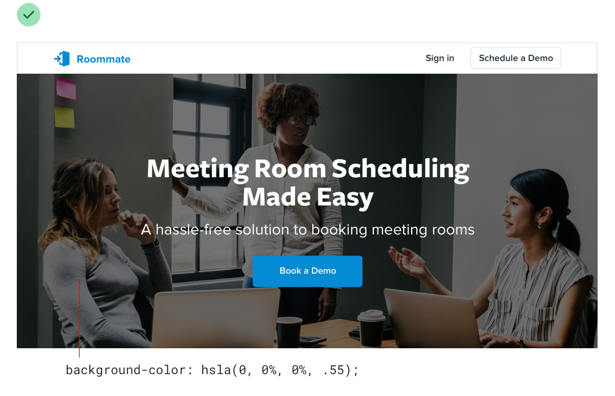
Lowering the image contrast and make the texts stand out more
降低图像对比度,使文本更加突出

Adding a colorized filter on the image that fits the brand
在图像上添加适合品牌的彩色滤镜

页面加载时间。 (Page Loading Times.)
You probably have found yourself waiting for an image to load for like more than 5 seconds. This, in fact, does impact the user’s experience overall².
您可能已经发现自己在等待图像加载超过5秒钟。 实际上,这确实会影响用户的整体体验² 。
So, for designers, ensure to optimize images to help with performance¹.
因此,对于设计师来说,请确保优化图像以提高性能¹。
Or, alternatively, you can think back to your goals as mentioned in the beginning to assess whether it’s even necessary to have an image there anyway².
或者,您也可以回想起初提到的目标,以评估是否有必要在那里摆放图片² 。
That is all I have so far.
到目前为止,这就是我所拥有的。
Let me know if this has helped you at all or if you have any other tips that should be added on here.
让我知道这是否对您有帮助,或者您是否应该在此处添加其他提示。
Footnotes:
脚注:
Kaul, E. (2017, July 4). 101 — Using Images to enhance UX. Medium. https://medium.com/@syskaul/101-using-images-to-enhance-ux-ead46239c318
Kaul,E.(2017年7月4日)。 101-使用图像增强UX。 中。 https://medium.com/@syskaul/101-using-images-to-enhance-ux-ead46239c318
Schade, A. (2017, May 21). Big Pictures on Small Screens: Remove, Resize or Reorganize.Nielsen Norman Group. https://www.nngroup.com/articles/big-pictures-small-screens
Schade,A.(2017年5月21日)。 小屏幕上的大图片:删除,调整大小或重新组织 .Nielsen Norman Group。 https://www.nngroup.com/articles/big-pictures-small-screens
Tomczyk, D. (2020, January 16). 8 UI design trends for 2020. https://uxdesign.cc/8-ui-ux-design-trends-for-2020-68e37b0278f6
Tomczyk,D.(2020年1月16日)。 2020年的8种UI设计趋势 。 https://uxdesign.cc/8-ui-ux-design-trends-for-2020-68e37b0278f6
Wathan A., Schoger S. (2018). Refactoring UI. Gumroad.
Wathan A.,Schoger S.(2018年)。 重构UI。 Gumroad。
Whitenton, K. (2014, September 28). Image-Focused Design: Is Bigger Better? Nielsen Norman Group. https://www.nngroup.com/articles/image-focused-design/
怀特顿,K。(2014年9月28日)。 以图像为中心的设计:更大更好吗? 尼尔森·诺曼集团。 https://www.nngroup.com/articles/image-focused-design/
翻译自: https://uxdesign.cc/ux-considerations-when-defining-your-website-imagery-2055bda527ef
ux体验网站 英国


 801
801

 被折叠的 条评论
为什么被折叠?
被折叠的 条评论
为什么被折叠?
 到【灌水乐园】发言


