


大屏设计的视觉统一
视觉设计的统一性是什么? (What is unity in visual design?)
The concept of unity in visual design means a group of elements working together to create a greater whole. It means, as the cliché goes: A whole that is greater than the sum of its parts.
视觉设计中的统一概念意味着一组元素协同工作以创建更大的整体。 正如陈词滥调所说,它的意思是: 大于其各部分之和的整体。
To illustrate this concept, let’s consider some components of a web page:
为了说明这个概念,让我们考虑网页的一些组件:
- brand logo 品牌标志
- navigation menu 导航菜单
- main content 主要内容
- sidebar 侧边栏
- footer 页脚
- images 图片
- search box 搜索框
These components, before they’re brought together to form a web page, are like pieces of a jigsaw puzzle.
这些组件在组合在一起形成网页之前,就像拼图游戏一样。

- Each piece represents one part of a picture. 每一张代表一张图片的一部分。
- We need to get these pieces to interlock. 我们需要使这些零件互锁。
- When all pieces are neatly connected, the picture emerges. 当所有部件都整齐地连接在一起时,图片就出现了。
- Unity is achieved. 实现团结。
A web page works the same way.
网页的工作方式相同。
- Each element represents one part of a page. 每个元素代表页面的一部分。
- We need to get these pieces to work together. 我们需要使这些部分协同工作。
- When all elements are working together, the page is complete. 当所有元素都一起工作时,页面就完成了。
- Unity is achieved. 实现团结。
Here are a few more ideas to note about unity in visual design:
以下是有关视觉设计中的统一性的更多注意事项:
Unity can be visual and conceptual. Visual unity is achieved when all design elements are supporting the same visual theme. Conceptual unity is achieved when all content elements support the same subject matter.
团结可以是视觉上的和概念上的。 当所有设计元素都支持相同的视觉主题时,将实现视觉统一 。 当所有内容元素都支持相同主题时,可以实现概念上的统一 。
All elements have a role to play. There are no gratuitous elements in unified design. Removing elements that don’t contribute to the whole strengthens unity. Removing elements that are essential to the whole weakens unity (breaking the design).
所有元素都可以发挥作用。 统一设计中没有多余的要素。 删除对整体没有帮助的元素会增强统一性。 删除整体上必不可少的元素会削弱整体性(破坏设计)。
No elements are placed arbitrarily. All elements are placed thoughtfully and strategically in unified design.
没有任意放置元素。 所有元素都在统一设计中进行了周到和战略性的考虑。
在视觉设计中实现统一的方法 (Methods for Achieving Unity in Visual Design)
The most common and effective methods for achieving unity in visual design are the Gestalt principles of visual perception. These principles, originally documented in the 1920s by German psychologists, are based on the human tendency to see things in groups and patterns.
在视觉设计中实现统一的最常见,最有效的方法是格式塔的视觉感知原理 。 这些原则最初是由德国心理学家在1920年代记录的,其依据是人类倾向于以群体和形式看待事物。
Here are some of the more powerful Gestalt grouping principles:
以下是一些更强大的格式塔分组原则:
Proximity
接近
Similarity
相似
Uniform Connectedness
统一的联系
Good Continuation
良好的延续性
Common Fate
共同的命运
Below is a general introduction to each one.
以下是每个内容的一般介绍。
接近 (Proximity)
Proximity refers to grouping by closeness. Elements that are closer to each other appear more related to each other.
接近是指按亲密关系分组。 彼此更接近的元素看起来彼此之间更相关。

The image above is a collection of 72 circles, but they don’t appear as a single group. Instead, through the use of proximity, they appear in four groups.
上图是72个圆圈的集合,但它们并没有作为一个整体出现。 相反,通过使用接近性,它们以四个组出现。
Proximity also works with elements that don’t look alike. Any assortment of objects — having different shapes, sizes, colors, dimensions, orientations, textures or other visual characteristics — can be made to appear related when grouped closely together.
邻近也可以处理看起来不太相似的元素。 紧密组合在一起时,可以使具有各种形状,大小,颜色,尺寸,方向,纹理或其他视觉特征的各种对象看起来相互关联。
In the real world, the use of proximity can be seen everywhere, working to unify all sorts of objects.
在现实世界中,无处不在的使用无处不在,以统一各种对象。
For example, look at this paragraph. It can be read because you know the language (obviously), but also because the letters, words and sentences are grouped closely together. Without proximity everything would be in disarray. Proximity is essential in written communication.
例如,查看此段。 之所以可以阅读它,是因为您(显然)知道该语言,而且 因为字母,单词和句子紧密地组合在一起。 没有距离,一切都会混乱。 接近在书面交流中至关重要。
In web design, think of a navigation menu. For the site user to know that all links are part of the menu group, they only need to be placed close together.
在网页设计中,请考虑导航菜单。 为了使站点用户知道所有链接都是菜单组的一部分,只需要将它们紧密放置在一起即可。
相似 (Similarity)
Similarity refers to grouping by repetition. Elements that look alike appear more related to each other.
相似性是指通过重复分组。 看起来相似的元素相互之间看起来更相关。
Similarity can be achieved by repeating any visual characteristic, such as shape, size and color.
可以通过重复任何视觉特征(例如形状,大小和颜色)来实现相似性。

In the image above, proximity is in play, unifying all circles in one group. But similarity is also in play, dividing the group in two sets of circles — dark and light. Also, we see a matrix composed of rows and columns, but the rows get the most attention because of similarity.
在上图中,邻近性正在发挥作用,将一组中的所有圈子统一在一起。 但是相似性也在发挥作用,将小组分为两组,即黑暗和明亮。 另外,我们看到由行和列组成的矩阵,但是由于相似性,行得到了最多的关注。
Let’s look at actual use cases. On a website:
让我们看一下实际的用例。 在网站上:
- Why are all h2 elements styled to look the same throughout the site? 为什么所有h2元素的样式在整个网站上看起来都一样?
- Why does the navigation menu look the same throughout the site? 为什么整个站点的导航菜单看起来都一样?
- Why is the design template the same throughout the site? 为什么整个站点的设计模板都一样?
The short answer to all these questions is: Because repetition and consistency (i.e., similarity, in this context) enhance communication and understanding. Here are more detailed explanations:
对所有这些问题的简短回答是: 因为重复和一致(即,在这种情况下,相似性)可以增进沟通和理解。 这里是更详细的说明:
Why are all h2 elements styled to look the same throughout the site? Because that indicates to the user that those sections of content are on the same level in the content hierarchy.
为什么所有h2元素的样式在整个网站上看起来都一样? 因为这向用户指示内容的那些部分在内容层次结构中处于同一级别。
Why does the navigation menu look the same throughout the site? Because that indicates to the user that the links are identical, and that there’s no need to review them again for new information during a browsing session.
为什么整个站点的导航菜单看起来都一样? 因为这向用户指示链接是相同的,并且在浏览会话期间无需再次查看它们以获取新信息。
Why is the design template the same throughout the site? Because that indicates to the user that they’re still on the same website.
为什么整个站点的设计模板都一样? 因为那向用户表明他们仍然在同一个网站上。
统一的联系 (Uniform Connectedness)
Uniform connectedness refers to grouping elements with common areas or connecting lines.
均匀连接是指将具有公共区域或连接线的元素分组。
Elements assembled over a common background color or pattern, or enclosed in a frame, or connected by lines, appear more related than elements not connected in the same manner.
与没有以相同方式连接的元素相比,在常见的背景颜色或图案上组装的元素或封闭在框架中或通过线条连接的元素显得更加相关。

In the image above, uniform connectedness — by wrapping circles in a box — creates a group (within the larger group unified by proximity and similarity).
在上图中,统一的连通性(通过将圆括在一个盒子中)创建了一个组(在较大的组中,通过接近度和相似度统一)。
There are two general methods for applying uniform connectedness:
应用统一连接有两种通用方法:
- common regions, and 共同区域,以及
- connecting lines. 连接线。
Common regions create groups by enclosing visual areas. For example, if you draw a box around a group of elements (like in the image above), you’re indicating that those elements are related. Background colors and patterns can also form a common area.
公用区域通过封闭视觉区域来创建组。 例如,如果您围绕一组元素绘制一个框(如上图所示),则表示这些元素是相关的。 背景颜色和图案也可以形成公共区域。
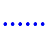
Connecting lines create groups by connecting individual elements with lines or a sequence of objects that form lines (e.g., dots, arrows and bubbles).
连接线通过将单个元素与线或形成线的对象序列(例如,点,箭头和气泡) 连接来创建组。

In the matrix above, three circles, already related to the other circles by proximity and similarity, form their own group with connecting lines.
在上面的矩阵中,已经通过邻近度和相似度与其他圆相关的三个圆通过连接线形成了自己的组。
In the example below, uniform connectedness is the visual concept linking the people to their thought and speech bubbles.
在下面的示例中,统一的连通性是将人们与他们的思想和言语泡沫联系在一起的视觉概念。

Without the linear connection, the illustration above wouldn’t be as clear.
如果没有线性连接,上面的插图将不太清楚。
An important feature of uniform connectedness is its ability to complement other Gestalt principles, such as proximity and similarity.
统一连接的一个重要特征是它能够完善格式塔其他原则,例如邻近性和相似性。
This feature is particularly useful when dealing with limited spaces. Consider, for example, a cockpit dashboard. There’s only so much space to put all the indicators and controls.
当处理有限的空间时,此功能特别有用。 例如,考虑一个驾驶舱仪表板。 放置所有指标和控件的空间很小。

In the image above, proximity and similarity bring everything together. But those methods alone don’t deliver optimal usability. To make the dash more clear — eliminating more risk of error and confusion — there need to be stronger associations between more related items (i.e., clusters). That’s where uniform connectedness can help.
在上图中,接近度和相似度将所有事物融合在一起。 但是,仅靠这些方法并不能提供最佳的可用性。 为了使破折号更清晰-消除更多的错误和混乱风险-需要在更多相关项目(即群集)之间建立更强的关联。 这就是统一连接可以提供帮助的地方。
Common areas and connecting lines can also be seen on remote controls, computer keyboards, software UIs, and even menus and maps.
公用区域和连接线也可以在遥控器,计算机键盘,软件UI甚至菜单和地图上看到。

Note that the menu features both connecting lines and a common area.
请注意,菜单同时具有连接线和公共区域。
良好的延续性 (Good Continuation)
Good continuation refers to grouping by alignment, whether straight or curved.
良好的连续性是指通过对齐进行分组,无论是笔直还是弯曲。
Elements aligned on a line or curve appear more related than elements not on the line or curve.
与不在直线或曲线上的元素相比,在直线或曲线上对齐的元素看起来更相关。
Good continuation can be seen on a car’s instrument cluster.
在汽车的仪表盘上可以看到良好的延续性。

In the image above, the tachometer, fuel gauge, temperature gauge and odometer all use good continuation. The markings for each indicator are aligned on a circular path, making them easy to understand.
在上图中,转速表,燃油表,温度表和里程表都具有良好的延续性。 每个指示器的标记在圆形路径上对齐,因此易于理解。
Another example of good continuation, which is very common in web design, is the grid. By placing elements in grid tracks (the space between grid lines), they are grouped by alignment.
良好延续性的另一个例子是网格,这在Web设计中非常常见。 通过将元素放置在网格轨道(网格线之间的空间)中,可以按对齐方式对它们进行分组。

In the image above a series of otherwise unrelated symbols are group together with good continuation.
在上面的图像中,一系列其他不相关的符号以良好的连续性组合在一起。
共同的命运 (Common Fate)
Common fate refers to grouping by similar motion and direction.
共同的命运是指按照相似的运动和方向分组。
Elements that move in the same direction, or just point in the same direction, appear more related to each other.
朝相同方向移动或指向相同方向的元素看起来彼此之间的关联性更高。
In the image above, the dots moving in the same direction appear more related to each other than to the dots moving in the opposite direction.
在上图中,在相同方向上移动的点看上去与在相反方向上移动的点之间的相关性更高。
For real world examples of common fate, think of a school of fish, a flock of birds, highway traffic, or a marching band. Because the individual units all share a common direction and speed, they appear as a group.
对于现实世界中常见命运的例子,想像一下鱼群,一群鸟,公路交通或游行乐队。 由于各个单元都具有相同的方向和速度,因此它们作为一个组出现。

In the image above, a Blue Angels squadron of the United States Navy flies in Delta Formation. Because each plane is flying in the same direction and at the same speed, they are seen as one group, brought together by common fate.
在上图中,美国海军的蓝色天使中队在三角洲编队飞行。 因为每架飞机都以相同的方向和速度飞行,所以它们被视为一组,由共同的命运聚集在一起。
As mentioned earlier, however, common fate doesn’t require movement. Elements that simply give the impression of motion also create groups.
但是,如前所述,共同的命运并不需要运动。 简单地给人以运动印象的元素也会创建组。

There’s no movement in the circles above, but the arrows create two distinct groups. This happens because common fate is, at its core, less about movement and more about a common destination.
上面的圆圈中没有移动,但是箭头创建了两个不同的组。 之所以发生这种情况,是因为共同命运的核心在于,与运动无关,而与共同目标有关。
Common fate thrives on conflict.
共同的命运因冲突而繁荣。
A powerful and unique characteristic of common fate, which sets it apart from other Gestalt principles, is the effect it generates when its normal function is disrupted.
当它的正常功能被破坏时,它会产生的效果是共同命运的强大而独特的特征,这使其不同于其他格式塔原理。
We know that common fate involves multiple objects moving together in harmony. This is a common phenomenon in daily life that most of us never even notice. We just take it for granted.
我们知道,共同的命运涉及多个物体和谐共处。 这是日常生活中常见的现象,我们大多数人甚至都没有注意到。 我们只是认为这是理所当然的。
But a disruption to that flow captures our attention instantly.
但是中断流程会立即吸引我们的注意力。
Here are two examples:
这是两个示例:
- A herd of zebras running. A lion coming in from an angle. 一群斑马奔跑。 一只狮子从一个角度进来。
- Cars moving on a highway. A car changing lanes, or merging in, or especially, going in the opposite direction. 在高速公路上行驶的汽车。 汽车改变车道,或合并,或特别是朝相反的方向行驶。
Contrast. That’s the true power of common fate. No other Gestalt principle can generate such a powerful visual cue.
对比。 这就是共同命运的真正力量。 格式塔的其他原理无法产生如此强大的视觉提示。
In Web Design
在网页设计中
In web design, common fate is a useful grouping strategy for elements that move in the same direction, at the same speed, and at the same time.
在网页设计中,共同命运是对以相同方向,相同速度和时间移动的元素的有用分组策略。
A good example is the drop down menu. On hovering a menu link, a series of sub-menu links slide into view at the same speed and in the same direction. Common fate (along with proximity and possibly other Gestalt principles) tells the user that these links are related.
下拉菜单就是一个很好的例子。 悬停菜单链接时,一系列子菜单链接以相同的速度和相同的方向滑入视图。 共同的命运(以及邻近性和其他格式塔原理)告诉用户这些链接是相关的。
Other examples of common fate in web design include swiping actions (like in dating apps) and tooltips (where a hovering motion leads to a pop-up notice).
网页设计中常见命运的其他示例包括滑动动作(例如在约会应用程序中)和工具提示(悬停动作会导致弹出通知)。
Of course, disruptions to this flow can also be powerful visual cues.
当然,中断此流程也可能是强大的视觉提示。
In the first part of this article we discussed the importance of unity in visual design. We talked about the whole being greater than the sum of its parts.
在本文的第一部分中,我们讨论了视觉设计中统一性的重要性。 我们谈论的是整体大于部分之和。
In the second part we discussed methods for achieving this whole. In particular, we covered the Gestalt principles of Proximity, Similarity, Uniform Connectedness, Good Continuation and Common Fate. These principles represent time-tested methods for achieving unity in visual design.
在第二部分中,我们讨论了实现整体的方法。 特别是,我们涵盖了邻近,相似,统一连接,良好延续和共同命运的格式塔原则。 这些原则代表了经过时间考验的方法,可以在视觉设计中实现统一。
But this article is just an introduction to Gestalt. There’s a lot more to know. I encourage you to delve deeper for a better understanding of their power and versatility. While you’re doing that, you’ll inevitably run into a whole series of other Gestalt principles, such as Closure, Figure/Ground, Past Experience, and Focal Point.
但是本文只是对格式塔的介绍。 还有很多要知道的。 我鼓励您深入研究,以更好地了解它们的功能和多功能性。 在执行此操作时,您不可避免地会遇到其他一系列格式塔原理,例如闭合,图形/背景,过去经验和联络点。
翻译自: https://uxdesign.cc/unity-in-visual-design-cba546d1fb2b
大屏设计的视觉统一


 1478
1478


 被折叠的 条评论
为什么被折叠?
被折叠的 条评论
为什么被折叠?
 到【灌水乐园】发言


