


视觉工程师面试指南
When it comes to effective data visualization, the very first and also the most critical step is to select the right graph/visual for the data that you want to present. With a wide range of visualization software that is available offering a large number of chart varieties, it’s often a challenging task to pick the right one, which explains the data and insights in the simplest possible manner. I recently read a very famous book on data visualization — “Storytelling With Data: A Data Visualization Guide for Business Professionals” by Cole Nussbaumer Knaflic. This book is the best resource that I’ve seen till date on data visualization, and in this article, I’ll explain a topic from the book — Choosing an Effective Visual.
当涉及有效的数据可视化时,最重要也是最关键的一步是为要呈现的数据选择正确的图形/视觉。 借助提供大量图表品种的广泛可视化软件,选择合适的可视化软件通常是一项艰巨的任务,它以最简单的方式解释数据和见解。 我最近读了一本关于数据可视化的非常著名的书— Cole Nussbaumer Knaflic撰写的“用数据讲故事:业务专业人员的数据可视化指南”。 本书是迄今为止我所见过的有关数据可视化的最佳资源,在本文中,我将解释本书中的一个主题-选择有效的视觉。
Most of the data can be visualized using any one of the 12 kinds of visuals that I’ll be discussing in this article. The visuals can be classified into:
我将在本文中讨论的12种视觉方式中的任何一种都可以可视化大多数数据。 视觉效果可分为:
- Simple Text 简单文字
- Table (table, heatmap) 表格(表格,热图)
- Points (scatterplot) 点(散点图)
- Line (line graph, slope graph) 线(线图,斜率图)
- Bar (horizontal, vertical, stacked, waterfall) 酒吧(水平,垂直,堆叠,瀑布式)
- Area 区
Note:
注意:
All the graphs shown are made using Google Sheets. Link to the document.
显示的所有图形都是使用Google表格制作的。 链接到文档 。
Data used for generating graphs are entirely imaginary and not taken from any source.
用于生成图形的数据完全是虚构的,不能从任何来源获取 。
So let’s start exploring each one on the list.
因此,让我们开始探索列表中的每一个。
Simple Text
简单文字
You don’t have to always use a graph for showing numbers. If there are just a few numbers with some supporting text, directly showing the numbers might be the best way out. Let’s look at an example to understand better.
您不必总是使用图形来显示数字。 如果只有几个数字带有一些支持文字,则直接显示数字可能是最好的选择。 让我们看一个例子以更好地理解。

In the above case, the graph doesn’t provide much aid in interpretation and only ends up occupying a lot of space. So, when you only have a few numbers, show them directly.
在上述情况下,图形在解释方面并没有提供太多帮助,最终仅占用了大量空间。 因此,当您只有几个数字时,请直接显示它们。
Table
表
If you’re looking to communicate multiple units of measure, a table might be the right visual to use. Creating a table is pretty easy, but always make sure that the design fades into the background and data is the main focus. Here’s an example of fading the design to the background and focusing on the data:
如果您要传达多个度量单位,则表可能是使用的正确视觉效果。 创建表格非常容易,但是始终要确保设计淡入背景并且数据是主要重点。 这是一个将设计淡化为背景并着重于数据的示例:

Can you observe the improvement after every iteration? This is why it’s so important.
每次迭代后您都能观察到改进吗? 这就是为什么它如此重要的原因。
Heatmap
热图
Heatmap is simply an upgraded version of a table where we add colors to interpret the data or numbers better. In a plain table, the reader has to scan every element to get a sense of what’s there. By adding colors, we are making the reader to directly focus on the area of interest, which results in a better understanding of data.
Heatmap只是表格的升级版本,我们在表格中添加了颜色以更好地解释数据或数字。 在普通表中,读者必须扫描每个元素以了解其中的内容。 通过添加颜色,我们使读者可以直接关注感兴趣的区域,从而可以更好地理解数据。

Graphing applications like Excel have conditional formatting options to create heatmaps. And it’s also a good practice to include a legend for better understanding.
诸如Excel之类的制图应用程序具有条件格式选项来创建热图。 包括图例以更好地理解也是一种很好的做法。
Scatterplot
散点图
Scatterplots are useful for showing relationships between 2 variables where each variable is encoded in X-axis and Y-axis, respectively. It’s especially useful while explaining correlations.
散点图可用于显示两个变量之间的关系,其中每个变量分别在X轴和Y轴上编码。 在解释相关性时特别有用。

Line Graph
线形图
Line graphs are best when it comes to plotting continuous data like date and time. Since all the points are connected using a line, it’s easy to interpret continuous data, but at the same time, it doesn’t make sense for plotting categorical variables. Line graphs can be used to show a single series or multiple series of data, as shown in the figure.
折线图最好用于绘制连续数据,例如日期和时间。 由于所有的点都用一条线连接,因此很容易解释连续的数据,但是同时绘制分类变量也没有意义。 折线图可用于显示一个或多个数据系列,如图所示。

Slope Graph
斜率图
Slope graph is simply a special case of line graph which is ideal for comparing change in metrics over two different points or time periods. This is really good to intuitively show the rate of change (increase or decrease rate is indicated by the slope of lines) along with the absolute values.
斜率图只是线图的一种特殊情况,非常适合比较两个不同点或时间段上度量的变化。 这对于直观地显示变化率(直线的斜率表示上升或下降的速度)以及绝对值非常好。

Next, we’ll look at a few variations of the bar chart, which is ideal for categorical variables. Bar charts tend to be avoided because they are common, but since they are common, it’s very easy for the readers to understand bar charts compared to other types of visuals. This makes bar charts one of the most important forms of visuals.
接下来,我们将看一下条形图的一些变体,它是分类变量的理想选择。 由于条形图很常见,因此倾向于避免使用条形图,但是由于它们很常见,因此与其他类型的视觉效果相比,读者很容易理解条形图。 这使条形图成为最重要的视觉形式之一。
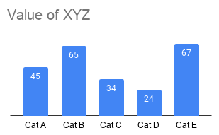
Vertical Bar
竖条
This is the plain bar chart where each column represents a category. Similar to line graphs, bar charts can also hold multiple series.
这是简单的条形图,其中每列代表一个类别。 与折线图相似,条形图也可以容纳多个系列。
Stacked Vertical Bar
堆叠竖条
Stacked bar charts can be used to compare subcomponent pieces across different categories. It can hold either actual numbers or percentages using a 100% stacked chart.
堆叠的条形图可用于比较不同类别的子组件。 它可以使用100%堆积图来保存实际数字或百分比。

Again you mustn’t stuff the categories with too many subcomponents as it becomes difficult to understand and compare.
同样,您也不能用太多子组件来填充类别,因为这将变得难以理解和比较。
Waterfall
瀑布
A waterfall chart is another special case of a vertical bar that can be used to either pull subcomponents of a stacked bar to focus one at a time, or to show a starting point, increases and decreases, and the resulting ending point.
瀑布图是垂直条的另一种特殊情况,可用于拉动堆叠条的子组件一次集中焦点,或显示起点,增加和减少以及最终的终点。

Horizontal bar
单杠
A horizontal bar is often the go-to option for categorical data because it’s easy to read than the vertical bar and can also accommodate large category names. Similar to vertical bars, it can also have single or multiple series of data.
水平条通常是分类数据的首选选项,因为它比垂直条更易于阅读,并且还可以容纳较大的类别名称。 类似于竖线,它也可以具有单个或多个系列的数据。

Stacked Horizontal Bar
堆积单杠
This is similar to the stacked vertical bar chart but comparatively better because of the reasons discussed for the horizontal bar.
这类似于堆叠的垂直条形图,但是相对更好,因为讨论了水平条形图的原因。
Area Graph
面积图
Area graphs should be avoided whenever possible because human eyes are not so good at comparing values in two-dimensional space. But if you badly want to include multiple metrics, then the area graph might work out.
应尽可能避免使用面积图,因为人眼不太擅长在二维空间中比较值。 但是,如果您非常想包含多个指标,则面积图可能会适用。
With this, I’ve covered graphs that can be used to visualize a majority of data available out there. So choose a graph that can clearly explain the message that you’re trying to convey.
到此为止,我已经介绍了可用于可视化大部分可用数据的图表。 因此,选择一个可以清楚地解释您要传达的信息的图表。
As we’ve gone through the best practices, now it’s time to look at some of the practices to be avoided.
当我们经历了最佳实践时,现在该考虑一些应避免的实践了。
Visual Practices to be Avoided
避免视觉行为
Avoid using pie charts because the readers have to compare areas of the arc, which becomes very difficult and is not intuitive. Using a standard bar chart makes it much easier to interpret. Look at the example below to understand better.
避免使用饼图,因为读者必须比较弧的区域,这变得非常困难且不直观。 使用标准条形图使解释变得更加容易。 查看下面的示例以更好地理解。

Never use 3D charts. 3D charts create unnecessary distractions and make it difficult to interpret. So never use 3D.
切勿使用3D图表。 3D图表会造成不必要的干扰,并使其难以解释。 因此,切勿使用3D 。
Conclusion
结论
I hope this article would have given you a good understanding of different visuals and the right place to use each visual. So always choose a visual that adequately conveys the information you are looking to present. And, coming to the application/software that you can use, it’s entirely up to you. Excel, Tableau, Power BI, Google Sheets are some available applications, and you can use anything that you are comfortable with. Remember that the graphing application does not know the actual purpose of the visual, and it’s on you to customize it according to the need. I hope it helped.
我希望本文能使您对不同的视觉效果有很好的理解,并能正确使用每种视觉效果。 因此,请始终选择能够充分传达您要呈现的信息的视觉效果。 而且,使用您可以使用的应用程序/软件,完全取决于您。 Excel,Tableau,Power BI,Google表格是一些可用的应用程序,您可以使用任何您喜欢的东西。 请记住,制图应用程序不知道视觉效果的实际用途,您可以根据需要自定义视觉效果。 希望对您有所帮助。
翻译自: https://towardsdatascience.com/ultimate-guide-to-choosing-the-right-visual-2a77aa8eec08
视觉工程师面试指南


 4065
4065

 被折叠的 条评论
为什么被折叠?
被折叠的 条评论
为什么被折叠?
 到【灌水乐园】发言


