


精通css和css权威指南
Original Article: Stroke Text CSS — The Definitive Guide
原始文章: 描边文本CSS —权威指南
In this tutorial, I will show you how to create the stroke text CSS effect.
在本教程中,我将向您展示如何创建笔触文本CSS效果。
Before we go into the HTML and CSS code, if you only need to create a stroke text image, check out this tutorial and learn how to outline text in Photoshop.
在进入HTML和CSS代码之前,如果您只需要创建笔触文本图像,请查看本教程并学习如何在Photoshop中为文本加轮廓 。
Or, if you don’t have Photoshop, you can use the free online tool MockoFun which even has a dedicated stroke text tutorial.
或者,如果您没有Photoshop,则可以使用免费的在线工具MockoFun ,该工具甚至具有专门的笔触文本教程。

使用CSS将笔划添加到文本-webkit-text-stroke (Add Stroke To Text Using CSS -webkit-text-stroke)
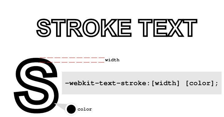
As an example, let’s add a black stroke to a text. I will start with some HTML code:
例如,让我们在文本上添加黑色笔触。 我将从一些HTML代码开始:
<span class="stroke-text">STROKE TEXT</span>And the CSS code:
和CSS代码:
.stroke-text{
  -webkit-text-stroke:5px black;
  -webkit-text-fill-color:transparent;
}
Pretty straight forward, we make the text transparent — though this is not necessary, but I only want to the outline of the text to be visible and not the body of the letters. Then, the -webkit-text-stroke property adds a black outline stroke 5px thick. You can change this to get thicker outline text or a thinner outline, depending on what effect you want to obtain.
很简单,我们使文本透明-尽管这不是必需的,但我只希望文本的轮廓可见,而不是字母的正文。 然后, -webkit-text-stroke属性添加一个5px厚的黑色轮廓描边。 您可以更改此选项以获取更粗的轮廓文本或更细的轮廓,具体取决于您想要获得的效果。
The good news:
好消息:
You can use this to stroke text in CSS on all Webkit based browsers (like Chrome or Edge) and Firefox too.
您也可以使用它在所有基于Webkit的浏览器(例如Chrome或Edge)和Firefox上CSS中描边文本。
The bad news:
坏消息:
This is a non-standard feature, so not something you can rely 100%.
这是一项非标准功能,因此不能100%依靠。
It’s not supported on all browsers and according to CanIUse.com: this property does not yet appear in any W3C specification. Was briefly included in a spec as the text-outline property, but this was removed.
根据CanIUse.com,并非所有浏览器都支持它:此属性尚未出现在任何W3C规范中。 在规范中已短暂地包含为text-outline属性,但已将其删除。
Just to give you a hint of what you can create with this text stroke CSS property, here’s my Cyber Space text effect part of the 80s fonts text effects gallery.
只是为了提示您可以使用此文本笔触CSS属性创建的内容,这是80年代字体文本效果库中我的Cyber Space文本效果部分。

使用text-shadow将笔划添加到文本 (Adding Stroke To Text Using text-shadow)
Another method to outline text in CSS is by using shadows. CSS allows adding multiple shadows to a text element via the property text-shadow.
在CSS中概述文本的另一种方法是使用阴影。 CSS允许通过text-shadow属性将多个阴影添加到文本元素。
So, let’s make a white on white text and add 4 red shadows to it. Offset the 4 shadows by 1px up, left, down and right. Here’s the HTML code:
因此,让我们在白色文本上添加白色,并为其添加4个红色阴影。 向上,向左,向下和向右偏移4个阴影1px。 这是HTML代码:
<span class="stroke-text">STROKE TEXT</span>and the CSS code:
和CSS代码:
.stroke-text{
  color:white;
  text-shadow:1px 0 0 red,0 1px 0 red,-1px 0 0 red,0 -1px 0 red;
}
Here’s a graphical representation of what’s going on and how the CSS text stroke effect is achieved using text shadows:
这是正在发生的事情的图形表示,以及如何使用文本阴影实现CSS文本笔触效果:

Perfect, isn’t it?
完美,不是吗?
Well, not exactly, but pretty damn good. Let’s point out some draw backs and solutions for it.
好吧,不完全是,但是非常好。 让我们指出一些缺点和解决方案。
First, if we need to modify the text outline thickness or color we need to change it in multiple places, and this can be tedious.
首先,如果需要修改文本轮廓的粗细或颜色,则需要在多个位置进行更改,这可能很乏味。
CSS offers us quite an elegant solution which I use quite often for convenience and that is CSS variables. You can read more about CSS variable here, but what you need to know is that if you in your CSS you have to repeat values over and over again, CSS variables are a tremendous help.
CSS为我们提供了一个非常优雅的解决方案,为了方便起见,我经常使用它,这就是CSS变量。 您可以在此处阅读有关CSS变量的更多信息,但是您需要知道的是,如果您在CSS中必须一遍又一遍地重复值,那么CSS变量将为您带来巨大的帮助。
使用CSS变量配置文本笔触的颜色和粗细 (Using CSS Variables To Configure The Text Stroke Color And Thickness)
Basically you define a CSS variable like this: --my-variable:value. Then, throughout your CSS code if you need that value simply use property:var(--my-variable);
基本上,您可以这样定义CSS变量:-- --my-variable:value 。 然后,在整个CSS代码中,如果需要该值,只需使用property:var(--my-variable);
So, change the CSS code above like this:
因此,像这样更改上面CSS代码:
.stroke-text{
  --stroke-color:red;
  --stroke-width:1px;
  color:white;
  text-shadow: var(--stroke-width)  0 0 var(--stroke-color),
    calc(var(--stroke-width) * -1) 0 0 var(--stroke-color),
    0 var(--stroke-width) 0 var(--stroke-color),
    0 calc(var(--stroke-width) * -1) 0 var(--stroke-color);
}
The --stroke-color variable stores the color for the text stroke and --stroke-width stores the width of the stroke. Then in the text shadow we use those variables. This allows making changes only in one place if we were to modify the color or the width of the text stroke.
--stroke-color变量存储文本笔触的颜色,而--stroke-width变量存储笔触的宽度。 然后在文本阴影中使用这些变量。 如果我们要修改文本笔触的颜色或宽度,则只能在一个地方进行更改。
Pretty neat, isn’t it?
很整洁,不是吗?
In the text-shadow property, I’ve made use of the CSS calc function to allow me to multiply the text stroke width by -1 for the up and left shadow directions.
在text-shadow属性中,我利用CSS calc函数将上下笔划方向的文本笔触宽度乘以-1。
If you start playing around with this and change the thickness of the text stroke you will notice that for larger values, something is wrong at the corner of the letters.
如果您开始使用它并更改文本笔触的粗细,您会发现对于较大的值,字母的角处出了问题。
And so we come to our second draw back:
因此,我们来进行第二次回扣:

We see some breaks in the text stroke because we are only using 4 shadows that we shift on 4 directions.
我们看到了文字笔划的一些中断,因为我们仅使用了在4个方向上移动的4个阴影。
So, what should we do to fix this?
那么,我们应该怎么做才能解决这个问题?
The answer is simple: add more shadows!
答案很简单:添加更多阴影!
Hang on to your hats kids and take out your math notebooks. This is a “Definitive Guide to Stroke Text” after all, so we need to be thorough.
挂在帽子上的孩子身上,拿出数学笔记本。 毕竟,这是“描边文本的权威指南”,因此我们需要彻底。
If we add more shadows to our text, we need to figure out how to shift those shadows around our text to cover all the gaps in the text outline. Intuition says that we should spread them evenly on a circle with a radius equal to the width of the text stroke.
如果我们在文本中添加更多阴影,则需要弄清楚如何在文本周围移动这些阴影以覆盖文本轮廓中的所有空白。 直觉说,我们应该将它们均匀地分布在半径等于文字笔划宽度的圆上。
And, intuition is right!
而且,直觉是对的!
To calculate the offsets of the shadows we use the polar coordinates formulas:
要计算阴影的偏移量,我们使用极坐标公式:
x = r * cos(alpha)
y = r * sin(alpha)
Where x and y are the offset values, r is the radius of the circle (actual amount that we want to offset by which translates into the thickness of the text stroke) and alpha is the angle by which we want to divide the circle into.
其中x和y是偏移值, r是圆的半径(我们要偏移的实际量,它转换为文本笔触的粗细),而alpha是我们要将圆划分成的角度。
We can assign values to alpha depending on how many shadows we want to add to create our text stroke.
我们可以根据要添加多少阴影来创建文本笔划,将值分配给alpha 。
For example, for 8 shadows we divide 2*PI (the full circle) by 8 and we get an angle of PI/4. Then if we assign values to alpha with a step of PI/4 like 0, PI/4, PI/2, … until we complete the circle, we should get our 8 shadows offsets perfectly aligned on a circle.
例如,对于8个阴影,我们将2 * PI(整个圆)除以8,得到的角度为PI / 4。 然后,如果我们使用PI / 4的步长(例如0,PI / 4,PI / 2等)将值分配给alpha ,直到完成圆,我们应该使8个阴影偏移在圆上完全对齐。

The more shadows we add, the smoother the CSS text stroke becomes for larger values of the stroke width. There are no trigonometric function in CSS yet, so we need to calculate the values ourselves.
我们添加的阴影越多,则笔划宽度的值越大,CSS文本笔划就越平滑。 CSS中还没有三角函数,因此我们需要自己计算值。
Let’s modify the HTML and CSS code to add a smooth text stroke with 16 shadows:
让我们修改HTML和CSS代码以添加带有16个阴影的平滑文本笔划:
<span class="stroke-text smooth-16">STROKE TEXT</span>and add the CSS for the smooth text stroke:
并添加用于平滑文本笔触CSS:
.smooth-16 {
  text-shadow: calc(var(--stroke-width) * 1) calc(var(--stroke-width) * 0) 0
      var(--stroke-color),
    calc(var(--stroke-width) * 0.9239) calc(var(--stroke-width) * 0.3827) 0
      var(--stroke-color),
    calc(var(--stroke-width) * 0.7071) calc(var(--stroke-width) * 0.7071) 0
      var(--stroke-color),
    calc(var(--stroke-width) * 0.3827) calc(var(--stroke-width) * 0.9239) 0
      var(--stroke-color),
    calc(var(--stroke-width) * 0) calc(var(--stroke-width) * 1) 0
      var(--stroke-color),
    calc(var(--stroke-width) * -0.3827) calc(var(--stroke-width) * 0.9239) 0
      var(--stroke-color),
    calc(var(--stroke-width) * -0.7071) calc(var(--stroke-width) * 0.7071) 0
      var(--stroke-color),
    calc(var(--stroke-width) * -0.9239) calc(var(--stroke-width) * 0.3827) 0
      var(--stroke-color),
    calc(var(--stroke-width) * -1) calc(var(--stroke-width) * 0) 0
      var(--stroke-color),
    calc(var(--stroke-width) * -0.9239) calc(var(--stroke-width) * -0.3827) 0
      var(--stroke-color),
    calc(var(--stroke-width) * -0.7071) calc(var(--stroke-width) * -0.7071) 0
      var(--stroke-color),
    calc(var(--stroke-width) * -0.3827) calc(var(--stroke-width) * -0.9239) 0
      var(--stroke-color),
    calc(var(--stroke-width) * 0) calc(var(--stroke-width) * -1) 0
      var(--stroke-color),
    calc(var(--stroke-width) * 0.3827) calc(var(--stroke-width) * -0.9239) 0
      var(--stroke-color),
    calc(var(--stroke-width) * 0.7071) calc(var(--stroke-width) * -0.7071) 0
      var(--stroke-color),
    calc(var(--stroke-width) * 0.9239) calc(var(--stroke-width) * -0.3827) 0
      var(--stroke-color);
}
For convenience, I’ve created a JS function that generates the stroke text CSS code depending on how many shadows you want to have. Here’s the code:
为了方便起见,我创建了一个JS函数,该函数根据想要的阴影数量生成笔划文本CSS代码。 这是代码:
/*
text-shadow from smooth-16 was created with steps = 16
*/
function calculateStrokeTextCSS(steps) {
  var css = "";
  for (var i = 0; i < steps; i++) {
    var angle = (i * 2 * Math.PI) / steps;
    var cos = Math.round(10000 * Math.cos(angle)) / 10000;
    var sin = Math.round(10000 * Math.sin(angle)) / 10000;
    css +=
      "calc(var(--stroke-width) * " +
      cos +
      ") calc(var(--stroke-width) * " +
      sin +
      ") 0 var(--stroke-color),";
  }  return css;
}
Run this function with steps=16 and you will get the CSS value for the text-shadow property. Please note that this JS code does not have to be part of the page where you display the CSS stroke text. Here’s the Codepen snippet with where you can play with the code:
使用steps=16运行此函数,您将获得text-shadow属性CSS值。 请注意,此JS代码不一定必须是显示CSS笔划文本的页面的一部分。 这是Codepen代码段,您可以在其中使用代码:
Now we have two perfectly valid methods for creating CSS stroke text, but since this is a definitive guide I will not stop here and I will show you a couple of extra alternatives for creating a text outline with CSS shadows.
现在,我们有两种完全有效的方法来创建CSS笔触文本,但是由于这是权威指南,因此我将不止于此,我将向您展示一些其他方法来创建带有CSS阴影的文本轮廓。
QUICK TIP: This exact same method works for creating outline images from PNG images for example.
快速提示: 这种完全相同的方法适用于从PNG图像创建轮廓图像。
使用CSS SVG过滤器将笔划添加到文本 (Add Stroke To Text Using CSS SVG Filters)
If you don’t know about SVG filters or what you can do with them I strongly suggest you read this article about 80s fonts and SVG filter text retro effects. WARNING: prepare to be amazed 😎
如果您不了解SVG过滤器或如何使用它们,我强烈建议您阅读这篇有关80年代字体和SVG过滤器文本复古效果的文章。 警告:准备惊讶maz
Basically, you can define SVG filters that you can then use in CSS with the filter property. In one of my recent articles I’ve made heavy use of CSS filters to create CSS image effects. But, in our case we will use SVG / CSS filters to add stroke to a text.
基本上,您可以定义SVG过滤器,然后通过filter属性在CSS中使用。 在最近的一篇文章中,我大量使用CSS滤镜来创建CSS图像效果 。 但是,在本例中,我们将使用SVG / CSS过滤器将笔画添加到文本中。
Here’s the HTML code along with the SVG filter definition:
这是HTML代码以及SVG过滤器定义:
<span class="stroke-text">STROKE TEXT</span><svg version="1.1" xmlns="//www.w3.org/2000/svg" xmlns:xlink="//www.w3.org/1999/xlink" style="display:none;">
  <defs>
    <filter id="stroke-text-svg-filter">
      <feMorphology operator="dilate" radius="2"></feMorphology>
      <feComposite operator="xor" in="SourceGraphic"/>
    </filter>
  </defs>
</svg>
and the CSS code:
和CSS代码:
.stroke-text{
  color:dodgerblue;
  filter:url(#stroke-text-svg-filter);
}
which renders a blue outlined text like this:
呈现蓝色轮廓文本,如下所示:

So, how does this work?
那么,这是如何工作的呢?
Well, the stroke-text-svg-filter SVG filter we apply to our text has two steps:
好吧,我们应用于stroke-text-svg-filter的stroke-text-svg-filter SVG过滤器有两个步骤:
feMorphologywithdilatetakes the original text and “dilates” or enlarges the text in all directions by aradiusof 2 pixelsfeMorphology与dilate将原始文本和“瞳Kong会放大”或通过放大在所有方向上的文本radius的2个像素feCompositewith theoperator="xor"performs a XOR operation which actually subtracts from the enlarged text the original text, such that we are left with a hollow text or outlined text具有
operator="xor"feComposite执行XOR操作,该操作实际上是从扩大的文本中减去原始文本,这样我们剩下的是空心文本或轮廓文本
Change the thickness of the text stroke you have to modify the radius attribute in the SVG filter. To change the color of the text stroke, simply change the color CSS property in the stroke-text class.
更改文本笔触的粗细,您必须在SVG过滤器中修改radius属性。 要改变color的文字笔画的,简单地更改颜色CSS属性stroke-text类。
This SVG filter also works for PNG images.
该SVG过滤器也适用于PNG图像。
The only downside for this method of adding stroke to text is that the end result looks a bit coarse for bigger values of the radius. This is because the dilation algorithm tries to expand the letters in all directions which means that it might not render a true outline which should be equally sized in all directions.
这种将笔划添加到文本的方法的唯一缺点是,对于较大的radius值,最终结果看起来有些粗糙。 这是因为扩张算法会尝试在所有方向上扩展字母,这意味着它可能不会呈现在所有方向上均应具有相同大小的真实轮廓。
Here’s the Codepen for adding stroke to text with SVG filters:
这是使用SVG过滤器向文本添加笔划的Codepen:
SVG文字大纲 (SVG Text Outline)
Besides SVG filters, we can create the text outline using SVG text and CSS specific for SVG.
除了SVG过滤器外,我们还可以使用SVG文本和特定于SVGCSS创建文本轮廓。
Though not exactly an HTML and CSS only solution, this solution probably creates the best looking text outline effect.
尽管不完全是仅HTML和CSS的解决方案,但此解决方案可能会创建外观最好的文本轮廓效果。

To create a text outline with SVG and CSS here’s the SVG code that you add in your HTML page:
要使用SVG和CSS创建文本轮廓,以下是您在HTML页面中添加的SVG代码:
<svg version="1.1" xmlns="//www.w3.org/2000/svg" xmlns:xlink="//www.w3.org/1999/xlink" width="100%">
  <text class="stroke-text" x="50%" y="50%">SVG STROKE TEXT</text>
</svg>
and the CSS code:
和CSS代码:
.stroke-text{
  font-size:100px;
  text-align:center;
  text-anchor:middle;
  stroke:dodgerblue;
  stroke-width:3px;
  fill:none;
}
To quickly go over the code, the text SVG STROKE TEXT is added as an SVG text right in the middle of the SVG object (therefore the 50% set for the x and y).
为了快速遍历代码,将文本SVG STROKE TEXT作为SVG文本添加到SVG对象的中间(因此将x和y设置为50%)。
The CSS code that actually controls the color and width of the text stroke or the text outline are the 2 CSS properties stroke and stroke-width. Please note that these properties will only work on SVG elements and NOT on HTML elements.
实际控制文本笔触或文本轮廓的颜色和宽度CSS代码是2个CSS属性stroke和stroke-width 。 请注意,这些属性仅适用于SVG元素,不适用于HTML元素。
To create the multiple text stroke effect, just add a couple of extra <text> elements, offset them a bit and change the stroke color.
要创建多文本笔触效果,只需添加几个额外的<text>元素,将它们稍微偏移并更改stroke颜色。
使用SVG笔触创建双轮廓字体效果或多个轮廓字体效果 (Create Double Outline Font Effect Or Multiple Outline Font Effect With SVG Stroke)
While you’re on it, you should know that can also create some really cool double or multiple outline font effect with just a couple of modifications to the code above.
在使用它时,您应该知道,只需对上面的代码进行一些修改,就可以创建一些非常酷的双倍字体或多轮廓字体效果。

Simply add multiple text elements in the SVG with different stroke values in the CSS. Be careful to start with the thickest stroke and go on with thinner and thinner stroke values because the text elements will be placed on top of each other to form the multiple outline font effect.
只需在SVG中添加多个text元素,并在CSS中添加不同的stroke值即可。 请注意,从最粗的笔画开始,然后使用越来越细的笔画值,因为文本元素将相互叠加以形成多个轮廓字体效果。
Here’s the HTML code for the double font effect and the multiple font effect:
这是双重字体效果和多重字体效果HTML代码:
<svg version="1.1" xmlns="//www.w3.org/2000/svg" xmlns:xlink="//www.w3.org/1999/xlink" width="100%" height="200">
  <text class="stroke-text thick color1" x="50%" y="50%">DOUBLE OUTLINE FONT</text>
  <text class="stroke-text" x="50%" y="50%">DOUBLE OUTLINE FONT</text>
</svg><svg version="1.1" xmlns="//www.w3.org/2000/svg" xmlns:xlink="//www.w3.org/1999/xlink" width="100%" height="200">
  <text class="stroke-text thicker color1" x="50%" y="50%">MULTIPLE OUTLINE FONT</text>
  <text class="stroke-text thick color2" x="50%" y="50%">MULTIPLE OUTLINE FONT</text>
  <text class="stroke-text color3" x="50%" y="50%">MULTIPLE OUTLINE FONT</text>
</svg>
As you see I’ve added each effect in it’s own <svg> element. And the CSS code goes like this:
如您所见,我已经在其自己的<svg>元素中添加了每种效果。 CSS代码如下所示:
.stroke-text{
  font-size:80px;
  text-align:center;
  text-anchor:middle;
  stroke:dodgerblue;
  stroke-width:4px;
  fill:none;
}.thick{
  stroke-width:8px;
}.thicker{
  stroke-width:12px;
}.color1{
  stroke:magenta;
}.color2{
  stroke:yellow;
}.color3{
  stroke:red;
}
If you’ve reached this far, congrats! You’re now a CSS stroke text Jedi!
如果您已经到此为止,恭喜! 您现在是CSS笔触文字Jedi !
Want to be a Jedi master and know everything about CSS stroke text? Continue reading.
想要成为绝地大师并了解CSS笔触文字的所有知识吗? 继续阅读。
HTML5画布文字轮廓 (HTML5 Canvas Text Outline)
I know I’ve said this before, but this article is meant to be a definitive guide to stroke text. That is why I decided to include ALL methods for creating stroke text or text outline in HTML, even without CSS.
我知道我之前已经说过这一点,但是本文旨在作为笔触文本的权威指南。 这就是为什么我决定包括所有方法来创建笔划文本或HTML中的文本轮廓的方法,即使没有CSS也是如此。
Yes, it is possible to create outlined text using the HMTL5 canvas.
是的,可以使用HMTL5画布创建轮廓文本。
Let me show you how to do it!
让我告诉你如何做!

First, let’s setup the canvas with the following HTML code:
首先,让我们使用以下HTML代码设置画布:
<canvas id="myCanvas" width="850" height="300"></canvas>Then, using JavaScript let’s draw the outlined text like this:
然后,使用JavaScript绘制如下轮廓文字:
var myCanvas = document.querySelector("#myCanvas");
var ctx = myCanvas.getContext("2d");ctx.strokeStyle = "red";
ctx.lineWidth = 3;
ctx.font = "70px sans-serif";
ctx.textBaseline = "middle";
ctx.textAlign = "center";
ctx.strokeText("CANVAS TEXT OUTLINE", myCanvas.width / 2, myCanvas.height / 2);
The important parts here are the strokeStyle and lineWidth settings that set the color and the thickness of the text outline. The strokeText() function does the actual drawing of the outlined text.
这里重要的部分是strokeStyle和lineWidth设置,这些设置可设置文本轮廓的颜色和粗细。 strokeText()函数可实际绘制轮廓文本。
Here is the Codepen worksheet:
这是Codepen工作表:
I hope you found this article useful and worthy of being a true definitive guide to stroke text in CSS and not only. You now know more than one way to create stroke text or outline text in HTML, CSS and even HTML5 canvas.
我希望您发现本文有用且值得,不仅是真正CSS中笔画指南。 您现在知道了在HTML,CSS甚至HTML5画布中创建笔划文本或轮廓文本的多种方法。
If you know of alternative methods for creating stroke text in HTML and CSS please drop me a message and I’ll be happy to include it in this awesome and definitive guide!
如果您知道用于在HTML和CSS中创建笔划文本的其他方法,请给我留言,我很乐意将其包含在此功能强大的权威指南中!
精通css和css权威指南


 5553
5553

 被折叠的 条评论
为什么被折叠?
被折叠的 条评论
为什么被折叠?
 到【灌水乐园】发言


