


Being able to create visualizations or graphical representations of data at hand is a key step in being able to communicate information and findings to others from a non-technical background.
能够创建手头数据的可视化或图形表示形式是从非技术背景向其他人传达信息和发现的关键步骤。
In this story, you will learn to use the ggplot2 library in R to declaratively make beautiful plots or charts of your data.
在这个故事中,您将学习如何使用R中的ggplot2库来声明性地绘制数据的漂亮图形或图表。
什么是数据可视化? (What is Data Visualization?)
Wiki says “Data visualization is the graphic representation of data. It involves producing images that communicate relationships among the represented data to viewers of the images.”
Wiki说: “数据可视化是数据的图形表示。 它涉及制作图像,以将表示的数据之间的关系传达给图像的查看者。”
什么是ggplot2? (What is ggplot2?)
ggplot2 is a system for declaratively creating graphics, based on The Grammar of Graphics. You provide the data, tell ggplot2 how to map variables to aesthetics, what graphical primitives to use, and it takes care of the details.- Tidyverse.org
ggplot2是一个基于图形语法的声明式创建图形的系统。 您提供数据,告诉ggplot2如何将变量映射到美学,使用哪些图形基元以及如何处理细节。- Tidyverse.org
The inputs we are interested in are:
我们感兴趣的输入是:
Call the
ggplot(df)function which creates a blank canvas with the dataset(df) of interest调用
ggplot(df)函数,该函数将使用感兴趣的数据集(df)创建一个空白画布- Specify aesthetic mappings, which specifies how you want to map variables to visual aspects. In this case, we are simply mapping the variables to the x- and y-axes. 指定美学映射,这指定了如何将变量映射到视觉方面。 在这种情况下,我们只是将变量映射到x轴和y轴。
- You then add new layers that are geometric objects which will show up on the plot and additional layers as required. 然后添加作为几何对象的新图层,这些图层将显示在图形上,并根据需要添加其他图层。
搭建环境 (Setting up the environment)
Because ggplot2 package isn’t part of the standard distribution of R or R Base, you have to download the package from CRAN(Comprehensive R Archive Network) repository and install it.
由于ggplot2软件包不是R或R Base的标准发行版的一部分,因此您必须从CRAN(综合R存档网络)存储库下载该软件包并进行安装。
Here is how to install a package for the first time with theinstall.packages() function and to load the package at the start of each R session with the library() function.
这是第一次使用install.packages()函数安装软件包,并在每个R会话开始时使用library()函数加载软件包的方法。
To install the ggplot2 package, use the following:
要安装ggplot2软件包,请使用以下命令:
install.packages("ggplot2")And then to load it, use the following:
然后使用以下命令加载它:
library(ggplot2)虹膜数据集 (The Iris Dataset)
The Iris Dataset contains four features (length and width of sepals and petals) of 50 samples of three species of Iris (Iris setosa, Iris virginica and Iris versicolor). Four features were measured from each sample: the length and the width of the sepals and petals, in centimetres.
鸢尾花数据集包含三种鸢尾花(鸢尾花,鸢尾花和鸢尾花)的50个样本的四个特征(萼片和花瓣的长度和宽度)。 从每个样品中测量出四个特征:萼片和花瓣的长度和宽度,以厘米为单位。
The data is already available in the datasets package of R. We can simply access the data using the following:
R中的datasets包中已经有可用的datasets 。我们可以使用以下命令简单地访问数据:
library(datasets)
data("iris")
以下是ggplot2下的常用图形 (The following are the frequently used graphs under ggplot2)
1.条形图 (1. Bar Graphs)
A Bar Graph (or a Bar Chart) is a graphical display of data using bars of different heights. They are good if you to want to visualize the data of different categories that are being compared with each other.
条形图(或条形图)是使用不同高度的条形图的数据图形显示。 如果您要可视化正在相互比较的不同类别的数据,那么它们很好。
The following code is used to create a bar graph using the geom_bar() function that contains “Species” on the x-axis and count of each category on the y-axis:
以下代码用于使用geom_bar()函数创建条形图,该函数在x轴上包含“ Species”,在y轴上包含每个类别的计数:
ggplot(data=iris, aes(x=Species, fill = Species)) +
geom_bar() +
  xlab("Species") +
  ylab("Count") +
  ggtitle("Bar plot of Sepal Length")
2.直方图 (2. Histograms)
A Histogram is a graphical display of continuous data using bars of different heights. It is similar to a bar graph, except histograms group the data into bins. The height of each bar shows the number of elements in the bin.
直方图是使用不同高度的条形图的连续数据的图形显示。 它类似于条形图,不同之处在于直方图将数据分组到箱中。 每个条形图的高度显示箱中元素的数量。
In R, you can create a histogram using the geom_histogram() function and specify required arguments as follows:
在R中,您可以使用geom_histogram()函数创建直方图, geom_histogram()如下所示指定所需的参数:
ggplot(data=iris, aes(x=Sepal.Width)) +
  geom_histogram(binwidth=0.2, color="black", aes(fill=Species)) +
  xlab("Sepal Width") +
  ylab("Frequency") +
  ggtitle("Histogram of Sepal Width")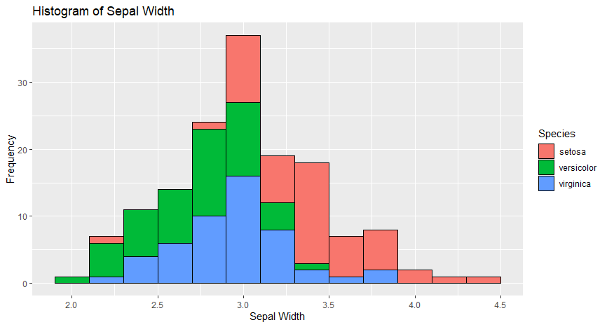
3.箱形图 (3. Boxplots)
The box-whisker plot (or a boxplot) is a quick and easy way to visualize complex data where you have multiple samples. A box plot is a good way to get an overall picture of the data set in a compact manner.
箱须图(或箱图)是一种快速简便的方法,可在您有多个样本的情况下可视化复杂数据。 箱形图是一种以紧凑的方式获得数据集的整体图的好方法。
To create a box plot, usegeom_boxplot() and specify what variables you want on the X and Y axes and add different colours to the plot using the following code:
要创建箱形图,请使用geom_boxplot()并在X和Y轴上指定所需的变量,然后使用以下代码向图中添加不同的颜色:
ggplot(data=iris, aes(x=Species, y=Sepal.Length)) +
  geom_boxplot(aes(fill=Species)) +
  ylab("Sepal Length") + ggtitle("Iris Boxplot")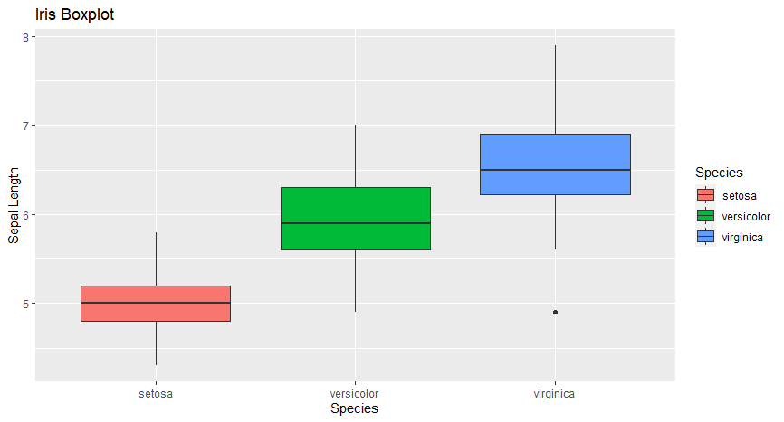
4.散点图 (4. Scatter Plots)
A scatter plot is a graphical display of the relationship between two sets of data. They are good if you to want to visualize how two variables are correlated. That’s why they are also called correlation plot.
散点图是两组数据之间关系的图形显示。 如果您想可视化两个变量之间的关系,则它们非常有用。 这就是为什么它们也称为相关图。
To create a scatter plot, use ggplot() with geom_point() and specify what variables you want on the X and Y axes as shown below:
要创建散点图, ggplot()与geom_point()并在X和Y轴上指定所需的变量,如下所示:
ggplot(data=iris, aes(x = Sepal.Length, y = Sepal.Width)) + geom_point(aes(color=Species, shape=Species)) +
  xlab("Sepal Length") +  ylab("Sepal Width") +
  ggtitle("Sepal Length-Width")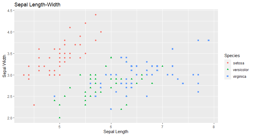
5.密度图 (5. Density Plots)
A density plot is a representation of the distribution of a numeric variable. It is a smoothed version of the histogram and is used in the same kind of situation. Density plots are used to study the distribution of one or a few variables.
密度图表示数字变量的分布。 它是直方图的平滑版本,在相同情况下使用。 密度图用于研究一个或几个变量的分布。
Density plots are built-in ggplot2 thanks to the geom_density geom. Only one numeric variable is needed as input as shown below:
由于使用了geom_density geom,密度图是内置的geom_density 。 只需一个数字变量作为输入,如下所示:
ggplot(iris, aes(x=Sepal.Length,
                 colour=Species, fill=Species)) +
  geom_density(alpha=.3) +
  xlab("Petal Length (cm)") +
  ylab("Density") +
  ggtitle("Iris Density Plot")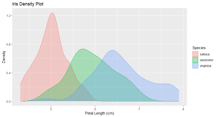
6.小提琴图 (6. Violin Plot)
Violin plots are similar to box plots, except that they also show the kernel probability density of the data at different values. Typically, violin plots will include a marker for the median of the data and a box indicating the interquartile range, as in standard box plots.
小提琴图类似于箱形图,不同之处在于它们还显示了不同值的数据的核概率密度。 通常,小提琴图将包括数据中位数的标记和指示四分位数范围的框,如在标准框图中一样。
The function geom_violin() is used to produce a violin plot as shown below:
函数geom_violin()用于产生小提琴图,如下所示:
ggplot(iris, aes(Species, Sepal.Length, fill=Species)) +
  geom_violin(aes(color = Species), trim = T)+
  geom_boxplot(width=0.1) +
  ggtitle("Iris Violin Plot")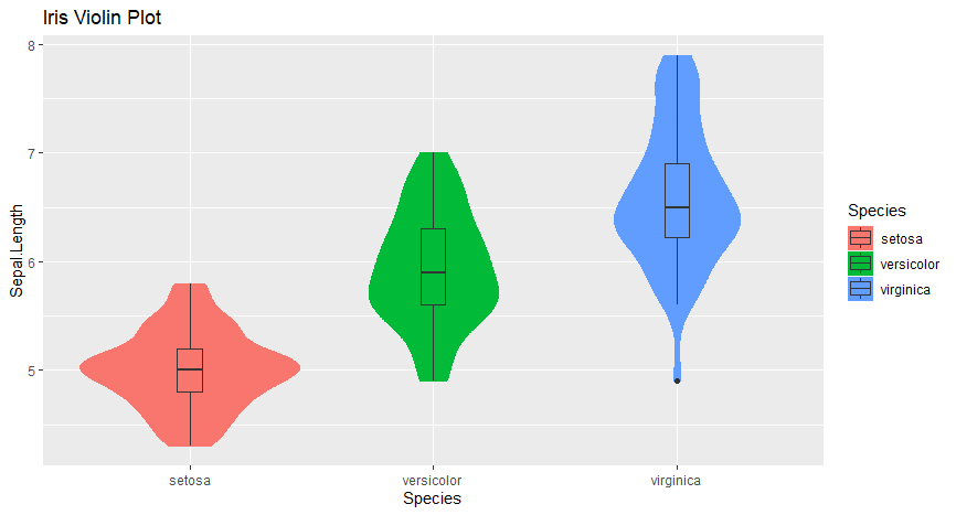
结论 (Conclusion)
I hope you liked this introductory explanation about visualizing the iris dataset with ggplot2 package in R. You can run these examples yourself an improve on them. You can also apply these visualization methods to other datasets as well.
我希望您喜欢这个介绍性的说明,它涉及使用R中的ggplot2包可视化虹膜数据集。您可以自己运行这些示例,以对其进行改进。 您还可以将这些可视化方法也应用于其他数据集。
Check out this book if you’re interested in learning more and for any future references — Data Visualization in R With ggplot2, ggplot2
如果您有兴趣了解更多信息以及将来的参考资料,请查看本书-R的ggplot2和ggplot2中的 数据可视化
There are more advanced graphs that can be created with the ggplot2 package. Let me know your thoughts on this one and stay tuned for more such stories.
可以使用ggplot2软件包创建更高级的图形。 让我知道您对此的想法,请继续关注更多这样的故事。
翻译自: https://medium.com/@namithadeshpande/plotting-data-using-ggplot2-in-r-578d29275b84


 660
660


 被折叠的 条评论
为什么被折叠?
被折叠的 条评论
为什么被折叠?
 到【灌水乐园】发言


