


微信小程序可视化ui
I have been practicing programmatic UI constraints and decided to test my current abilities by building something familiar from scratch. Two coffees later, I landed on the iOS Discord app.
我一直在练习程序化UI约束,并决定通过从头开始构建一些熟悉的东西来测试我目前的能力。 两杯咖啡之后,我登陆了iOS Discord应用。
Full project source code can be found on my github
完整的项目源代码可以在我的github上找到
分解 (Breakdown)
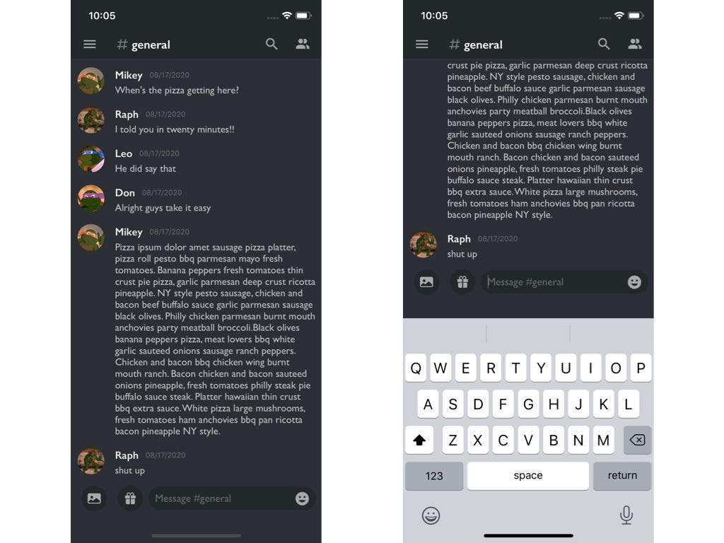
The messaging screen of Discord can be broken down into three sections.
Discord的消息屏幕可以分为三个部分。
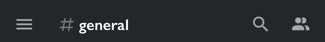
1。 顶视图 (1 . Top View)
Contains the status bar and a row of custom buttons.
包含状态栏和一行自定义按钮。
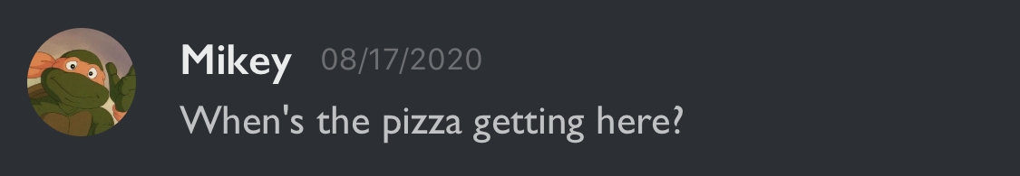
2. TableView (2. TableView)
The main component of the screen. A UITableView with a custom cell.
屏幕的主要组成部分。 具有自定义单元格的UITableView。
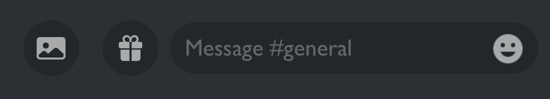
3.底视图 (3. Bottom View)
Contains two custom buttons and a UITextField with a button inside.
包含两个自定义按钮和一个内部带有按钮的UITextField。
初步想法 (Initial Thoughts)
The biggest chunk of the screen is the tableview so that piece fits nicely in the middle. Which leaves the top and bottom pieces. The top view would a navigation controller and the bottom view would be a custom view that is constraint between the tableview bottom to the superview bottom.
屏幕上最大的一块是表格视图,因此该块恰好位于中间。 剩下顶部和底部。 顶视图将是导航控制器,而底视图将是自定义视图,该自定义视图是tableview底部与superview底部之间的约束。
顶视图 (Top View)
Embedding a ViewController in a Navigation Controller programmatically can easily be accomplished in the Scene Delegate.
以编程方式将ViewController嵌入导航控制器中,可以在Scene Delegate中轻松实现。
func scene(_ scene: UIScene, willConnectTo session: UISceneSession, options connectionOptions: UIScene.ConnectionOptions){
    guard let windowScene = (scene as? UIWindowScene) else { return }
    window = UIWindow(windowScene: windowScene)
    window?.rootViewController = UINavigationController(rootViewController: ViewController())
    window?.makeKeyAndVisible()
}
Creating the row of buttons on the Top View now just require bar button properties and setup.
在顶视图上创建按钮行现在仅需要条形按钮的属性和设置。
Initialize generic UIBarButtonItems and a spacer.
初始化通用UIBarButtonItems和一个分隔符。
var userButton = UIBarButtonItem()
var searchButton = UIBarButtonItem()
var serverTabButton = UIBarButtonItem()
var spacer = UIBarButtonItem(barButtonSystemItem: .flexibleSpace, target: nil, action: nil)
var chatButton = UIBarButtonItem()
Setting attributes and placing the buttons on the right bar side and left bar side.
设置属性并将按钮放置在右侧栏和左侧栏上。
func setupView(){
    bottomBarView.messageField.delegate = self
    userButton = makeButtonImage(name: "account-multiple", view: self)
    searchButton = makeButtonImage(name: "magnify", view: self)
    searchButton.imageInsets = UIEdgeInsets(top: 0, left: 16, bottom: 0, right: 0)
    serverTabButton = makeButtonImage(name: "menu", view: self)
    chatButton = UIBarButtonItem(customView: hashTagChatView)
    navigationController?.navigationBar.barStyle = .black
    navigationController?.navigationBar.barTintColor = .darkBackground
    navigationController?.navigationBar.isTranslucent = false
    navigationItem.rightBarButtonItems = [userButton, searchButton]
    navigationItem.leftBarButtonItems = [serverTabButton, spacer, spacer, chatButton]
    navigationController?.navigationBar.tintColor = .lightText
    bottomBarView.backgroundColor = .defaultBackground
}
The #general button was unique to make since it involves an image and text. I solved this by making the label and image a seperate view, combining the components, and then adding the view to the bar button item.
#general按钮的独特之处在于它涉及图像和文本。 我通过使标签和图像成为单独的视图,组合了各个组件,然后将该视图添加到条形按钮项来解决了这个问题。
class HashTagChatView: UIButton {
    let hashImage = UIImageView()
    override init(frame: CGRect) {
        super.init(frame: .zero)
        setup()
    }
    func setup(){
        hashImage.image = UIImage(named: "pound")?.withRenderingMode(.alwaysTemplate)
        imageView?.tintColor = .init(white: 0.8, alpha: 0.5)
        setImage(hashImage.image, for: .normal)
        setTitle("general", for: .normal)
        titleLabel?.font = UIFont(name: "GillSans-SemiBold", size: 18)
        imageView?.contentMode = .scaleAspectFit
        setTitleColor(.init(white: 1, alpha: 0.5), for: .highlighted)
        imageEdgeInsets = UIEdgeInsets(top: 2, left: -2, bottom: 2, right: 2)
    }
}
表格检视 (Table View)
Initialize a tableview, conform to the UITableViewdelegate and Datasource, and configure the tableview. UITableView.automaticDimension and keyboardDismissMode are essential with a messaging style tableview.
初始化表格视图,遵循UITableViewdelegate和Datasource,然后配置表格视图。 UITableView.automaticDimension和keyboardDismissMode 对于消息传递样式表视图至关重要 。
func setupTableView(){
    tableView.register(ChatTableViewCell.self, forCellReuseIdentifier: "messageCell")
    tableView.delegate = self
    tableView.dataSource = self
    tableView.separatorStyle = .none
    tableView.estimatedRowHeight = 60
    tableView.rowHeight = UITableView.automaticDimension
    tableView.allowsSelection = false
    tableView.keyboardDismissMode = .onDrag
    tableView.backgroundColor = .defaultBackground
}
底视图 (Bottom View)
The fun part. Everything in this section is custom.
有趣的部分。 本节中的所有内容都是自定义的。
func setup(){
    messageField.translatesAutoresizingMaskIntoConstraints = false
    emojiButton.translatesAutoresizingMaskIntoConstraints = false


    messageField.layer.cornerRadius = 17
    messageField.backgroundColor = .darkBackground
    messageField.tintColor = .lightText
    messageField.font = UIFont(name: "GillSans", size: 16)
    // Add Padding
    messageField.leftView = UIView(frame: CGRect(x: 0, y: 0, width: 10, height: messageField.frame.height))
    messageField.leftViewMode = .always
    messageField.textColor = .init(white: 1, alpha: 0.7)
    messageField.attributedPlaceholder = NSAttributedString(string: "Message #general", attributes: [NSAttributedString.Key.foregroundColor : UIColor.init(white: 1, alpha: 0.3)])
    // Set emoticon Image
    let smileImage = UIImage(named: "emoticon")
    let tintedImage = smileImage?.withRenderingMode(.alwaysTemplate)
    emojiButton.setImage(tintedImage, for: .normal)
    emojiButton.tintColor = .lightText
    emojiButton.imageEdgeInsets = UIEdgeInsets(top: 0, left: -17, bottom: 0, right: 0)
    /// add right emoji button
    messageField.rightView = emojiButton
    messageField.rightViewMode = .always
    //
    addImageButton = makeRoundButton(name: "photo.fill")
    addImageButton.backgroundColor = .darkBackground


    cameraButton = makeRoundButton(name: "gift.fill")
    cameraButton.backgroundColor = .darkBackground
    }
自动版面 (Auto Layout)
Autolayout is a big aspect of programmatic UI and takes repeated practice to figure out. Trial and error is the way to go.Three steps that helped me when learning autolayout:
自动布局是编程UI的重要方面,需要反复练习才能弄清楚。 反复试验是必经之路,学习自动排版的三个步骤对我有帮助:
- To use auto layout we first have to disable autoresize: 要使用自动布局,我们首先必须禁用自动调整大小:
messageField.translatesAutoresizingMaskIntoConstraints = false2. Add the new initialize view to the superview
2.将新的初始化视图添加到超级视图
addSubView(messageField)3. Finally you have to activate the constraint. You can do it one by one or all at once like this
3.最后,您必须激活约束。 您可以像这样一次或一次完成
NSLayoutConstraint.activate([
messageField.topAnchor.constraint(equalTo: topAnchor, constant: 16),
])
All Together
全部一起
func addLayout(){
    addSubview(messageField)
    addSubview(addImageButton)
    addSubview(cameraButton)
    addSubview(emojiButton)
    NSLayoutConstraint.activate([
        messageField.topAnchor.constraint(equalTo: topAnchor, constant: 16),
        messageField.heightAnchor.constraint(equalToConstant: 35),
        trailingAnchor.constraint(equalToSystemSpacingAfter: messageField.trailingAnchor, multiplier: 1),
        messageField.leadingAnchor.constraint(equalToSystemSpacingAfter: cameraButton.trailingAnchor, multiplier: 1),
        addImageButton.centerYAnchor.constraint(equalTo: messageField.centerYAnchor),
        addImageButton.leadingAnchor.constraint(equalTo: leadingAnchor, constant: 16),
        addImageButton.heightAnchor.constraint(equalToConstant: BottomViewButton.height),
        addImageButton.widthAnchor.constraint(equalToConstant: BottomViewButton.height),
        cameraButton.leadingAnchor.constraint(equalToSystemSpacingAfter: addImageButton.trailingAnchor, multiplier: 2),
        cameraButton.centerYAnchor.constraint(equalTo: messageField.centerYAnchor),
        cameraButton.widthAnchor.constraint(equalToConstant: BottomViewButton.height),
        cameraButton.heightAnchor.constraint(equalToConstant: BottomViewButton.height)
    ])
}
通知中心 (Notification Center)
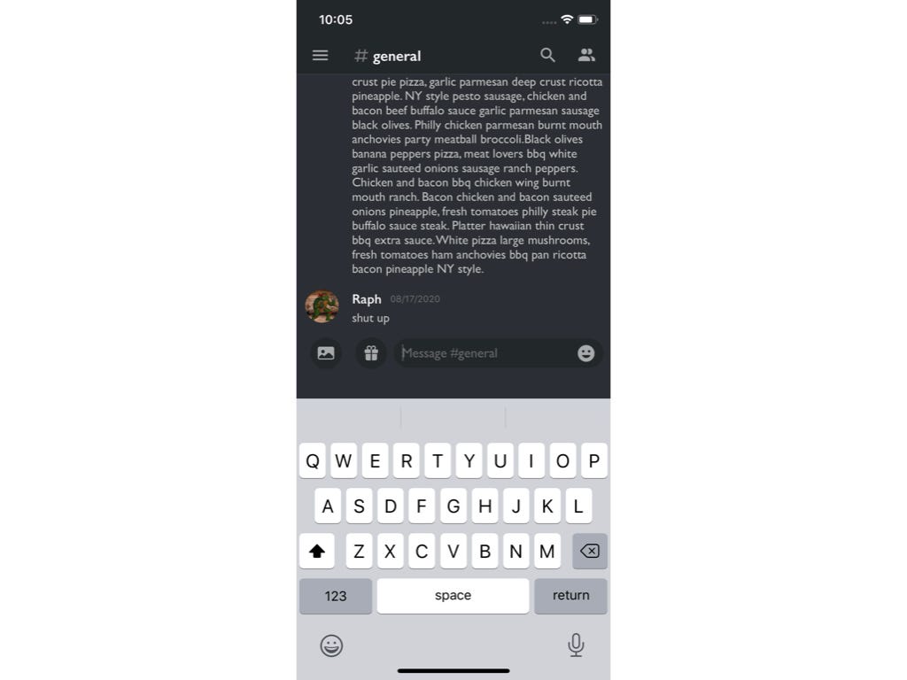
An additional component I added for fun was being able to use the keyboard on the textField. The textfield is all the way at the bottom so bringing up the keyboard would cover it entirely… unless you move the screen up!
我添加的另一个有趣的组件是能够使用textField上的键盘。 文本字段一直位于底部,因此抬起键盘会完全覆盖它……除非您向上移动屏幕!
There are several third party libraries that make this seemless. However, I decided to implement it manually with Notification Center. (a.k.a. The second cup of coffee was still in effect. ☕️)
有几个第三方库使这一点变得不明显。 但是,我决定通过Notification Center手动实施它。 (又名第二杯咖啡仍然有效。.️)
Hacking With Swift has a fantastic article covering this in detail.
Hacking With Swift有一篇很棒的文章详细介绍了这一点。
func notificationConfig(){
    let notificationCenter = NotificationCenter.default
    notificationCenter.addObserver(self, selector: #selector(adjustForKeyboard), name: UIResponder.keyboardWillHideNotification, object: nil)
    notificationCenter.addObserver(self, selector: #selector(adjustForKeyboard), name: UIResponder.keyboardWillShowNotification, object: nil)
    notificationCenter.addObserver(self, selector: #selector(adjustForKeyboard), name: UIResponder.keyboardWillChangeFrameNotification, object: nil)
}

@objc func adjustForKeyboard(notification: Notification){
    // print(self.view.frame.origin.y) --> Where 88 came from
    // 88 on 11 Pro
    guard let keyboardReact = (notification.userInfo?[UIResponder.keyboardFrameEndUserInfoKey] as? NSValue)?.cgRectValue else { return }
    if notification.name == UIResponder.keyboardWillShowNotification ||  notification.name == UIResponder.keyboardWillChangeFrameNotification {
        self.view.frame.origin.y = -keyboardReact.height + bottomBarView.frame.size.height
    } else {
        self.view.frame.origin.y = 88
    }
}
最后说明 (Final Notes)
This is an overview of my thought process and execution on building this UI. I only covered the key points in this article so feel free to peruse the source code or clone it. The icon assets are included in theproject and are provided by Material Design and SF Symbols
这是我在构建此UI时的思考过程和执行的概述。 我只介绍了本文的要点,因此可以随意阅读或克隆源代码。 图标资产包含在项目中,由Material Design和SF Symbols提供
翻译自: https://medium.com/@leonardoidiaz/programmatic-ui-discord-de1e59b3c2be
微信小程序可视化ui


 456
456


 被折叠的 条评论
为什么被折叠?
被折叠的 条评论
为什么被折叠?
 到【灌水乐园】发言


