


 本文介绍了如何使用SwiftUI创建一个自定义的分段控件,该控件具有多个可选选项,每个选项触发不同行为。通过使用Binding和State变量,实现了在不同视图间传递和更新选定选项。示例代码展示了如何创建和使用这个控件,包括使用HStack和ForEach创建水平布局的按钮,并根据选择改变颜色。
swift ui控件
Last week I published a social network application created using Swift-UI. For this post, I’m going to elaborate on the custom segmented control that I implemented.
上周,我发布了使用Swift-UI创建的社交网络应用程序 。 在本文中,我将详细介绍我实现的自定义分段控件。
Just before we start, a Segmented Control it’s a UIComponent that is composed of 2 or more segments. Segments can contain images, text, buttons etc. And each of the segments allows users to select different options. Each of the options should trigger a different behavior.
在我们开始之前,一个分段控件是一个由2个或更多分段组成的UIComponent。 段可以包含图像,文本,按钮等。每个段都允许用户选择不同的选项。 每个选项应触发不同的行为。
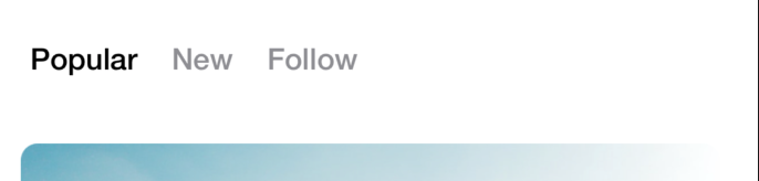
The image below shows the custom segmented control including 3 different segments; “Popular”, “New” and “Follow”. By default, the custom segmented control selects the first option which is “Popular”, but the user can select the other 3 options and different behaviours will occur.
下图显示了包含3个不同细分的自定义细分控件; “热门”,“新”和“关注”。 默认情况下,自定义分段控件选择第一个选项“ Popular”,但用户可以选择其他3个选项,并且会发生不同的行为。
Now that we understand what’s a Segmented Control, let’s get into the code…
现在我们了解什么是分段控件,让我们进入代码...
To get started, you can find the Source Code here
首先,您可以在此处找到源代码
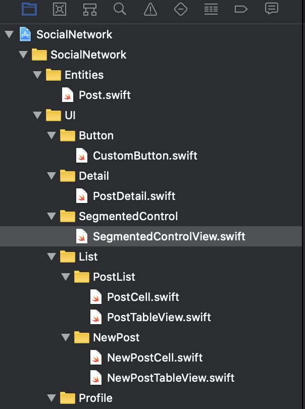
Inside the project, you will find a folder named SementedControl which contains the class named SegmentedControlView.Swfit
在项目内部,您将找到一个名为SementedControl的文件夹,其中包含名为SegmentedControlView.Swfit的类。
The code below shows the struct named SegmentedControlView that conforms the View Protocol. There is also an array of Segment named segments(a struct that contains the Id of the segment and the segment name to be displayed). Every time the SegmentedControl is created, you will need to specify the array of segments. Since it is dynamic, you can create the segmented control with N number of segments.
下面的代码显示了符合View协议的名为SegmentedControlView的结构。 还有一个名为Segments的Segment数组(一个包含细分ID和要显示的细分名称的结构)。 每次创建SegmentedControl时,您都需要指定细分数组。 由于它是动态的,因此可以创建具有N个段的分段控件。
struct Segment: Identifiable {var id: Intvar segmentName: String}struct SegmentedControlView: View {@Binding var selected : Intvar segments: [Segment]捆绑 (Binding)
You can also find a Binding var named selected, it is an integer. Using Binding will let us mutate the value inside the view and it can be updated or retrieved in real-time elsewhere, even outside the context of the SegmentedControlView. Binding it’s a really powerful tool that I found for communicating the state of a Custom UI View with any other View or Element of the App.
您还可以找到一个名为selected的Binding var ,它 是一个整数。 通过使用Binding,我们可以在视图内部更改值,并且可以在其他地方(甚至在SegmentedControlView上下文之外)实时更新或检索该值。 绑定是一个非常强大的工具,我发现它可以将自定义UI视图的状态与应用程序的任何其他视图或元素进行通信。
In addition, this means that every time you are using the custom segmented control, you will need to send the Binding Var as a parameter, the following snippet shows how the SegmentedControlView is created inside a different View named ProfileView.
此外,这意味着每次使用自定义分段控件时,都需要将Binding Var作为参数发送,以下代码段显示了SegmentedControlView是如何 在另一个名为ProfileView的视图中创建的。
@State var selected = 0SegmentedControlView(selected: self.$selected, segments: [Segment(id: 0, segmentName: "Popular"), Segment(id: 1, segmentName: "New"), Segment(id: 2, segmentName: "Follow")])州 (State)
The State var shown above, also named selected helps us to read the property selected inside the PostsTableView. In other words, everytime the Binding value it’s updated from the SegmentedControlView, it updates and displays the correct selection from the User inside the context of the PostsTableView.
上面显示的State var(也称为selected)可以帮助我们读取PostsTableView内部选择的属性。 换句话说,每次从SegmentedControlView 更新 Binding值时,它都会在PostsTableView上下文内更新并显示来自User的正确选择。
For example, right now we have 3 options from the SegmentedControlView displayed on the PostsTableView: “Popular”, “New” and “Follow”. The PostsTableView is creating a SegmentedControlview with those 3 options. The State var from the PostsTableView is modifying the value of the Binding SegmentedControlView, so every time an option is tapped, the Binding var from the SegmentedControlView gets notified and the selected option changes.
例如,现在我们在PostsTableView上显示来自SegmentedControlView的 3个选项:“受欢迎”,“新建”和“跟随”。 PostsTableView正在使用创建一个SegmentedControlview 这三个选项。 PostsTableView中的State 变量正在修改Binding SegmentedControlView的值,因此每次 点击一个选项,来自SegmentedControlView的Binding 变量将得到通知,并且所选选项将更改。
As a matter of fact, a State value knows the context inside a single view in this case the PostsTableView and Binding allow us to communicate our values with different views for this case the SegmentedControlView.
事实上,在这种情况下, State值知道单个视图中的上下文,在这种情况下, PostsTableView和Binding允许我们在此情况下通过SegmentedControlView与不同的视图传递值。
UICustom组件 (UICustom Component)
Now that we reviewed how the Binding and State variables are used, we can proceed with the rest of the UI implementation.
现在,我们回顾了如何使用Binding和State变量,我们可以继续执行UI的其余部分。
To begin with, I used a HStack, since our segmented control is a horizontal View. Then I used a ForEach which is going to iterate through the list of segments, and for each of the segments it is going to create a Button.
首先,我使用了HStack ,因为我们的分段控件是水平视图。 然后,我使用了一个ForEach ,它将遍历段列表 ,并为每个段创建一个Button。
The Button it’s simply composed of a Text that comes from the segmentName.
Button只是由来自segmentName的Text组成。
Consequently, the button has an action, every time the button is tapped, it saves the selected option from the segment Id.
因此,该按钮有一个动作,每当轻按该按钮时,它将保存从段ID中选择的选项。
The button includes a foregroundColor attribute that based on the selection it will color either Black if the option is selected or gray if it isn’t.
该按钮包括一个foregroundColor属性,该属性基于所选内容将为黑色(如果选中该选项)或为灰色(如果未选中)。
var body: some View {    HStack {        ForEach(segments) { segment in            Button(action: {                self.selected = segment.id            })            {                VStack {                    Text(segment.segmentName)                        .padding(.horizontal, 5)                        .padding(.vertical, 0)                        .font(.custom("HelveticaNeue-Medium", size: 16))                }            }.foregroundColor(self.selected == segment.id ? .black : .gray)        }   }.padding(20)        .clipShape(Capsule())        .animation(.default)
}
To sum up, this segmented control can be used for showing different options to the user using a horizontal distribution, but of course it can be modified and not only use a simple button as an option but also include Text, Images, animations, etc.
综上所述,此分段控件可用于通过水平分布向用户显示不同的选项,但是当然可以对其进行修改,不仅使用简单的按钮作为选项,还包括文本,图像,动画等。
翻译自: https://medium.com/@ivanchemical/swift-ui-custom-segmented-control-d06bd2d71f75
swift ui控件


 7063
7063

 被折叠的 条评论
为什么被折叠?
被折叠的 条评论
为什么被折叠?
 到【灌水乐园】发言


