


表板图建失败
Plotly Dash应用(Plotly Dash App)
So far we have created a free, user-friendly data store and connected to it through the Google Python API.
到目前为止,我们已经创建了一个免费的,用户友好的数据存储,并通过Google Python API与之连接。
Part 1 — Design and ETL Process using Google and code.gs
第1部分-使用Google和code.gs进行设计和ETL流程
Next, we will use the data to build our dashboard for the field marketing team to track their activities and progress toward a bonus.
接下来,我们将使用这些数据为现场营销团队构建仪表板,以跟踪他们的活动并获得奖金。
生成Plotly Dash应用 (Build the Plotly Dash app)
Dash is an open source tool from Plotly to allow data scientists and other front-end-ignorant folks like myself the opportunity to put together an interactive web app to show off their Plotly charts with just a few lines of python.
Dash是Plotly的开源工具,它使数据科学家和其他像我这样的前端无知者有机会组合一个交互式Web应用程序,仅用几行python即可展示其Plotly图表。
The docs on Plotly Dash are fantastic and get right to the point with great examples.
Plotly Dash上的文档非常棒,并提供了许多很好的例子。
Dash基础 (Dash Basics)
Open a terminal and create a new environment for our project.
打开一个终端并为我们的项目创建一个新的环境。
conda create -n <yourEnvironmentName>
conda create -n <yourEnvironmentName>
conda activate <yourEnvironmentName>
conda activate <yourEnvironmentName>
conda install plotly dash pandas numpy flask
conda install plotly dash pandas numpy flask
And from Part 1, we will need the Google API libraries:
从第1部分开始,我们将需要Google API库:
conda install -c conda-forge google-api-python-client google-auth-httplib2 google-auth-oauthlib
conda install -c conda-forge google-api-python-client google-auth-httplib2 google-auth-oauthlib
Start a new project folder and create a file named app.py. We’re ready to build our Dash app.
启动一个新的项目文件夹并创建一个名为app.py的文件。 我们已经准备好构建Dash应用程序。
from flask import Flask
from dash import Dash
import dash_html_components as html


server = Flask(__name__)


app = Dash(name=__name__,
           server=server)


app.layout = html.Div(
    html.H2('The basic Dash APP',
            style={
                'font-family': 'plain',
                'font-weight': 'light',
                'color': 'grey',
                'text-align': 'center',
                'font-size': 24,
            })
)


if __name__ == '__main__':
    app.run_server(debug=True)
[line 5] Start Flask
[第5行]开始烧瓶
[line 7–8] Create a Dash object with the server you just created
[第7-8行]使用刚创建的服务器创建Dash对象
[line 10–20] Use the layout method to add the components and styles to that Dash object.
[10-20行]使用布局方法将组件和样式添加到该Dash对象。
[line 23] Run server
[第23行]运行服务器
That’s it. With those 4 core pieces, you now have a working app.
而已。 有了这4个核心组件,您现在就可以使用一个应用程序。
The core of Dash is that all of the visual components of the app are Python classes. There are specific libraries to import for the types of components you might use, such as the HTML library for the basic HTML items such as div and image, the user friendly Dash Core Components library, with classes for pre-built dropdowns, lists, buttons, graphs(!), and many other typical web components, and finally the Dash Data Table library to display and manipulate a large table of data on the page.
Dash的核心是该应用程序的所有可视组件都是Python类。 对于要使用的组件类型,有一些特定的库可以导入,例如用于基本HTML项(例如div和image)的HTML库,用户友好的Dash Core Components库,以及用于预建下拉列表,列表,按钮的类。 , graphs(!)和许多其他典型的Web组件,最后是Dash Data Table库,用于显示和处理页面上的大数据表。
Run python app.py from the working directory in your terminal.
从终端的工作目录运行python app.py 。
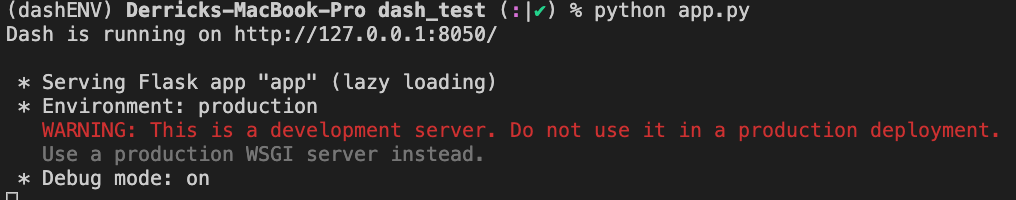
If there are no errors you should see the above. This means your computer is now running the app. Open a browser and go to http://127.0.0.1:8050/ (or whatever the response is for you above). You’ll see the app running and displaying the <h2> message from your layout. Also notice the blue circle that will appear in your browser in the lower right. This will be handy for debugging and following callbacks in the future.
如果没有错误,您应该看到上面的内容。 这意味着您的计算机正在运行该应用程序。 打开浏览器,然后转到http://127.0.0.1:8050/ (或上面提供给您的任何响应)。 您将看到该应用程序正在运行,并显示来自布局的<h2>消息。 另请注意,将在浏览器右下方显示一个蓝色圆圈。 这对于将来调试和跟踪回调非常有用。
回呼 (Callbacks)
Another very important step in understanding how our app will function is the callback. After we start Flask, create a Dash object, and design the layout our app can respond to changes such as selecting a value in a dropdown, clicking a button or sorting a table.
了解我们的应用程序如何运行的另一个非常重要的步骤是回调。 启动Flask,创建Dash对象并设计布局后,我们的应用可以响应更改,例如在下拉列表中选择值,单击按钮或对表格进行排序。
The basic structure of a callback in Dash looks like this:
Dash中回调的基本结构如下所示:
@ app.callback(
    Output(component_id='graph', component_property='figure'),
    [Input(component_id='dropdown', component_property='value')]
)
def build_graph(selection):    The first arguement in our function is the first item in the
    list of Inputs above. Name it as you like    Do something here with the input.
    In this case it is the values from the dropdown.    return the property needed for the output
            (in this case it is a plotly figure object)
Dash will now listen for any changes in our component named “dropdown”. It will run the function connected to the callback when something has changed. Then return the output of the function to the component listed. Thus, updating the page with our selection.
达世币现在将监听名为“下拉列表”的组件中的所有更改。 更改后,它将运行连接到回调的函数。 然后将函数的输出返回到列出的组件。 因此,使用我们的选择更新页面。
Fast Forward
快进
Plotly has incredible docs for it’s Dash app and visualization library. So, I’ll let you find the particular tools you would like to use and move ahead to discuss how we will connect our Google Sheet to be used in the dashboard.
Plotly的Dash应用程序和可视化库具有令人难以置信的文档。 因此,我将让您找到您想要使用的特定工具,然后继续讨论如何连接Google表格以在仪表板中使用。
我们的构建 (Our Build)
First we need to add our two functions to get Google Data from Part 1 to our app.py script. This will fetch the data from our Google Sheet and convert it into a Pandas DataFrame.
首先,我们需要添加两个函数以将第1部分中的Google数据获取到我们的app.py脚本中。 这将从我们的Google表格中获取数据,并将其转换为Pandas DataFrame。
# The ID and range of a google spreadsheet.
SPREADSHEET_ID = os.environ['SPREADSHEET_ID']
RANGE_NAME = os.environ['RANGE_NAME']
CREDS = os.environ['GDRIVE_AUTH']


def get_google_sheet():
    """
    Returns all values from the target google sheet.
    Prints values from a sample spreadsheet.
    """
    service_account_info = json.loads(CREDS)
    creds = service_account.Credentials.from_service_account_info(
        service_account_info)


    service = build('sheets', 'v4', credentials=creds)


    # Call the Sheets API
    sheet = service.spreadsheets()
    result = sheet.values().get(spreadsheetId=SPREADSHEET_ID,
                                range=RANGE_NAME).execute()
    values = result.get('values', [])


    if not values:
        print('No data found.')
    else:
        return values
def gsheet_to_df(values):
"""
Converts Google sheet API data to Pandas DataFrame
Input: Google API service.spreadsheets().get() values
Output: Pandas DataFrame with all data from Google Sheet
"""
header = values[0]
rows = values[1:]
if not rows:
print('No data found.')
else:
df = pd.DataFrame(columns=header, data=rows)
return df布局(The Layout)
Next we will build the layout of our Dash App. The idea of Dash is that it is a tool for folks who know very little about front-end development, React, or Javacript. There are two points I will highlight below for other beginners like myself.
接下来,我们将构建Dash App的布局。 Dash的想法是,它是一个对前端开发,React或Javacript知之甚少的人的工具。 我将在下面针对像我这样的其他初学者强调两点。
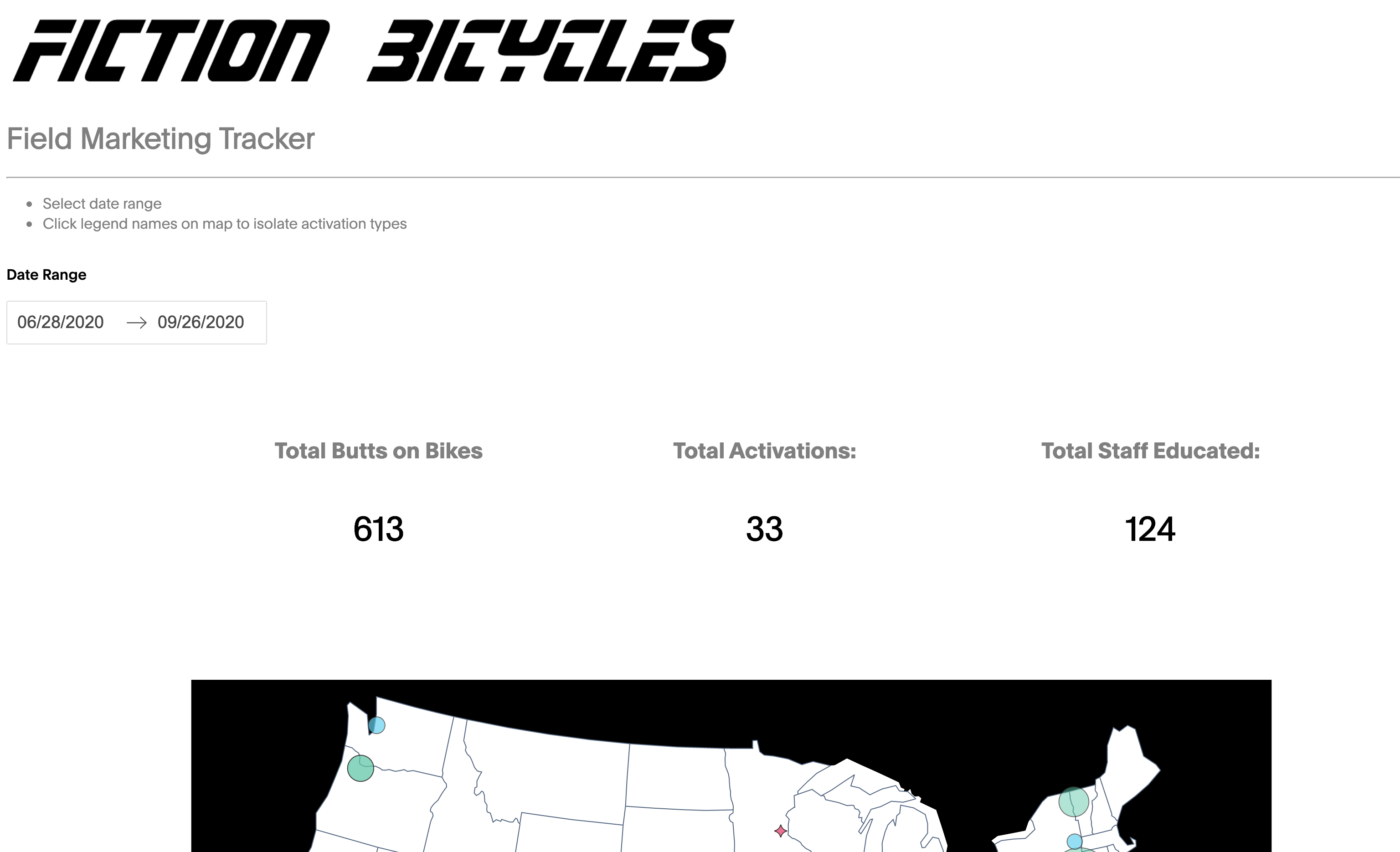
app.layout = html.Div(
    html.Div([
        dbc.Row(
            dbc.Col([
                html.Img(id="wordmark",
                         src="./assets/fiction_bicycles.png",
                         alt="Fictional Bicycle company logo",
                         style={
                             'width': '100%',
                             'padding left': "0px"
                         })
            ],  width={"size": 6, "offest": 0}), justify="left"
        ),
        dcc.Markdown("""
                # Field Marketing Tracker
                ---
                -  Select date range
                -  Click legend names on map to isolate activation types
                """,
                     style={
                         'font-family': 'plain light',
                         'color': 'grey',
                         'font-weight': 'light'
                     }),
        html.Br(),
        html.Label('Date Range',
                   style={
                       'font-family': 'plain',
                       'font-weight': 'light'
                   }),
        html.Br(),
        html.Br(),
        dcc.DatePickerRange(id='dt-picker-range',
                            start_date=datetime.now() - timedelta(days=90),
                            end_date=datetime.now()),
        html.Br(),
        dbc.Row([
                dbc.Col(
                    html.H2('Total Butts on Bikes',
                            style={
                                'font-family': 'plain',
                                'font-weight': 'light',
                                'color': 'grey',
                                'text-align': 'center',
                                'font-size': 24,
                            }),
                    align="center", width=3),
                dbc.Col(
                    html.H2('Total Activations:',
                            style={
                                'font-family': 'plain',
                                'font-weight': 'light',
                                'color': 'grey',
                                'font-size': 24,
                                'textAlign': 'center'
                            }),
                    align="center", width=3),
                dbc.Col(
                    html.H2('Total Staff Educated:',
                            style={
                                'font-family': 'plain',
                                'font-weight': 'light',
                                'color': 'grey',
                                'font-size': 24,
                                'text-align': 'center'
                            }),
                    align="center", width=3),
                ], justify='center', align='center', style={'padding-top': 80}),
        dbc.Row([
                dbc.Col(
                    html.H1(id='label_total_bob',
                               style={
                                   'font-family': 'plain light',
                                   'font-weight': 'light',
                                   'font-size': 36,
                                   'padding': 0,
                                   'textAlign': 'center'
                               }), align="center", width=3),
                dbc.Col(
                    html.H1(id='label_total_activations',
                               style={
                                   'font-family': 'plain light',
                                   'font-weight': 'light',
                                   'font-size': 36,
                                   'padding': 0,
                                   'textAlign': 'center'
                               }), align="center", width=3),
                dbc.Col(
                    html.H1(id='label_total_staff',
                               style={
                                   'font-family': 'plain light',
                                   'font-weight': 'light',
                                   'font-size': 36,
                                   'padding': 0,
                                   'textAlign': 'center'
                               }), align="center", width=3),
                ], justify='center'),
        html.Br(),
        dbc.Row([
                dbc.Col([
                    dcc.Graph(id='main_map', style={'height': '800px'})
                ])
                ]),
        dcc.Markdown("""
                # Bonus Tracker
                ---
                -  Choose Quarter from dropdown
                -  Highlighted cells have met bonus criteria
                -  Select BD in table to see individual bar charts
                """,
                     style={
                         'font-family': 'plain light',
                         'color': 'grey',
                         'font-weight': 'light'
                     }),
        html.Br(),
        html.Br(),
        dbc.Row(
            dbc.Col([
                    html.Label("Quarter:",
                               style={
                                   'font-family': 'plain',
                                   'font-weight': 'light'
                               }),
                    dcc.Dropdown(id='quarter_dropdown',
                                 options=[
                                     {'label': '2020 Q3', 'value': '2020 Q3'}],
                                 value='2020 Q3',
                                 multi=False,
                                 style={
                                     'font-family': 'plain light',
                                     'font-weight': 'light',
                                     'padding': 2
                                 })
                    ], width=4)
        ),
        html.Br(),
        dbc.Row(
            dbc.Col(
                dash_table.DataTable(
                    id='bonus_table',
                    columns=bonus_col,
                    data=[],
                    virtualization=False,
                    page_action='none',
                    # filter_action="native",
                    sort_action="native",
                    sort_mode="single",
                    row_selectable='multi',
                    row_deletable=False,
                    style_cell={
                        # 'minWidth': 10,
                        # 'maxWidth': 65,
                        'fontSize': FONTSIZE,
                        'padding': CELL_PADDING,
                    },
                    style_header={
                        'backgroundColor': 'white',
                        'fontWeight': 'bold',
                        'font-family': 'plain',
                        # 'maxWidth': 65,
                        # 'minWidth': 10,
                        'textAlign': 'center',
                        'padding': CELL_PADDING,
                    },
                    style_cell_conditional=bonus_cell_cond,
                    style_data={
                        'whiteSpace': 'normal',
                        # 'height': 'auto',
                        'font-family': 'plain light',
                        'font-weight': 'light',
                        'color': 'grey',
                        'padding': DATA_PADDING,
                        # 'minWidth': 10,
                    },
                    style_data_conditional=bonus_data_cond,
                    style_table={
                        # 'overflowX': 'scroll',
                        # 'height': '1000px',
                        # 'width': '90%',
                        'page_size': 10,
                        'minWidth': 10,
                        'padding': TABLE_PADDING
                    },
                    # fixed_rows={'headers': True},
                    style_as_list_view=True,
                    export_columns='visible',
                    export_format='csv'
                )
            )
        ),
        dbc.Row([
                dbc.Col([
                    dcc.Graph(
                        id='total_bob_bar',
                    )
                ], width=6),
                dbc.Col([
                    dcc.Graph(
                        id='activations_bar',
                    )
                ], width=6)
                ]),
        dbc.Row([
                dbc.Col([
                    dcc.Graph(
                        id='clinics_bar',
                    )
                ], width=6),
                dbc.Col([
                    dcc.Graph(
                        id='trail_bar',
                    )
                ], width=6)
                ]),
        html.Div(id='intermediate_value_main',
                 children=clean_main_data(),
                 style={'display': 'none'}),
        html.Div(id='intermediate_value_date', style={'display': 'none'}),
        html.Div(id='intermediate_value_quarter',
                 style={'display': 'none'}),
    ]))
Dash Bootstrap Components
短跑引导组件
Bootstrap is popular CSS framework for responsive sites viewed on mobile and other screens.
Bootstrap是流行CSS框架,用于在移动设备和其他屏幕上查看的自适应网站。
In building my first few Dash Apps, I struggled to make adjustments to the layout. Simple tasks such as centering a piece of text or adding margins was difficult and rarely had the results I wanted.
在构建最初的几个Dash应用程序时,我努力调整了布局。 诸如居中放置文本或增加页边距之类的简单任务很困难,而且很少获得我想要的结果。
Dash Bootstrap Components is third party library to incorporate bootstrap CSS into dash. The documentation is wonderful and I learned much of how the layout works from their visuals. Take a look:
Dash Bootstrap组件是第三方库,用于将Bootstrap CSS合并到破折号中。 该文档很棒,我从他们的视觉中学到了很多布局工作原理。 看一看:
https://dash-bootstrap-components.opensource.faculty.ai
https://dash-bootstrap-components.opensource.faculty.ai
The library adds Python classes for Containers, Rows and Columns to the layout of the page. Using this structure with your components will allow for the site to respond much better to other screens. For me the Python classes made it simple to adjust sizing and justification
该库将用于容器,行和列的Python类添加到页面的布局。 将这种结构与您的组件一起使用将使站点对其他屏幕的响应更好。 对我来说,Python类使调整大小和对齐方式变得简单
Install Dash Bootstrap Components in your environment:
在您的环境中安装Dash Bootstrap组件:
conda install -c condo-forge dash-bootstrap-components
conda install -c condo-forge dash-bootstrap-components
2. Data Tables
2.数据表
Data Tables are a component of Dash for viewing, editing, and exploring large datasets. The tables allow for our app users to filter, sort and select data that can be directly inputed into our visualizations.
数据表是Dash的组件,用于查看,编辑和浏览大型数据集。 这些表允许我们的应用程序用户筛选,排序和选择可以直接输入到我们的可视化文件中的数据。
They are incredibly powerful, but finicky. Building tables, columns and headers is straight foward, but understanding how each style setting interacts with others can take some time to understand and cause unexpected layouts.
他们非常强大,但是挑剔。 构建表,列和标题很容易,但是了解每种样式设置如何与其他样式交互可能会花费一些时间来理解并导致意外的布局。
I had trouble with the fixed row headers matching the cells below, as well as certain CSS settings cutting off the left and right most pixels of the data.
我遇到了与下面的单元格相匹配的固定行标题,以及某些CSS设置切断了数据的最左边和最右边像素的麻烦。
First tip, is to understand the order of priority for all of the style settings:
第一个技巧是了解所有样式设置的优先级顺序:
style_data_conditional
样式_data_有条件的
- style_datastyle_data
style_filter_conditional
样式_filter_有条件
- style_filterstyle_filter
style_header_conditional
风格_header_条件
- style_headerstyle_header
style_cell_conditional
样式_cell_有条件的
- style_cellstyle_cell
This means adjusting a setting like minWidth=60 to “style_data”, will override any overlapping setting of maxWidth=50 in “style_cell”.
这意味着将minWidth=60类的设置调整为“ style_data”,将覆盖“ style_cell”中maxWidth=50任何重叠设置。
The next tip I have when using a Dash Data Table is to build a separate file for all the style settings. In many examples and tutorials I found online, each column of data is added using a for loop, even some of the conditionally formatted columns and data. While it’s not the most efficient, using a separate file and building each column manually allowed me to debug, test, and adjust data quickly and easily. So, while learning to build Dash Apps with tables, it’s a good idea to be explicit. You can test and learn how to change data formats, colors, and columns widths. Here is the example I used with this dashboard:
使用Dash数据表时,我的下一个技巧是为所有样式设置构建一个单独的文件。 在我在线上找到的许多示例和教程中,每条数据列都是使用for循环添加的,甚至包括一些条件格式的列和数据。 尽管效率不是最高,但是使用单独的文件并手动构建每个列可以使我快速,轻松地调试,测试和调整数据。 因此,在学习使用表格构建Dash应用程序时,明确一点是一个好主意。 您可以测试并了解如何更改数据格式,颜色和列宽。 这是我与此仪表板一起使用的示例:
import dash_table.FormatTemplate as FormatTemplate


bonus_col = [
    {'name': 'Brand Developer','id': 'brand_developer','selectable': False,'hideable': False},
    {'name': 'Total B.O.B.','id': 'total_bob','selectable': False,'hideable': False, 'type': 'numeric'},
    {'name': 'Total Activations','id': 'activation','selectable': False,'hideable': False, 'type': 'numeric'},
    {'name': 'Total Clinics','id': 'clinics','selectable': False,'hideable': False, 'type': 'numeric'},
    {'name': 'Trail Building Days','id': 'trail_day','selectable': False,'hideable': False, 'type': 'numeric'}
    ]


bonus_cell_cond = [
    {'if': {'column_id':'brand_developer'},'width':60, 'textAlign':'center', 'margin-center':1},
    {'if': {'column_id':'total_bob'},'width':55, 'textAlign':'center'},
    {'if': {'column_id':'activation'},'width':60, 'textAlign':'center'},
    {'if': {'column_id':'clinics'},'width':60, 'textAlign':'center'},
    {'if': {'column_id':'trail_day'},'width':60, 'textAlign':'center'},
    ]


bonus_data_cond = [
    {'if': {'filter_query': "{total_bob} > 150", 'column_id': 'total_bob'}, 'backgroundColor': '#d2f8d2'},
    {'if': {'filter_query': "{activation} > 6", 'column_id': 'activation'}, 'backgroundColor': '#d2f8d2'},
    {'if': {'filter_query': "{clinics} > 12", 'column_id': 'clinics'}, 'backgroundColor': '#d2f8d2'},
    {'if': {'filter_query': "{trail_day} > 1", 'column_id': 'trail_day'}, 'backgroundColor': '#d2f8d2'},
    ]
Notice in the third list “bonus_data_cond”, I can set a conditional style to check if our employees have exceed their bonus goals. The script then sets the background color accordingly.
注意,在第三个列表“ bonus_data_cond”中,我可以设置条件样式来检查我们的员工是否超过了他们的奖金目标。 然后,脚本将相应地设置背景色。
I import all of these variables in our main script, app.py, and assign them in the table layout above like so: style_cell_conditional=bonus_cell_cond
我将所有这些变量导入到我们的主脚本app.py ,并在上面的表布局中分配它们,如下所示: style_cell_conditional=bonus_cell_cond
回调 (The Callbacks)
Next we will add callbacks for each visualization and interactive component. We’re going to build:
接下来,我们将为每个可视化和交互式组件添加回调。 我们将构建:
- Responsive summary statistics 响应式摘要统计
- An interactive map互动地图
- A data table with corresponding bar chart responding to data selections.具有响应数据选择的相应条形图的数据表。
特殊数据回调 (A Special Data Callback)
We’ll start with something interesting that I did not find in many tutorials. While testing the app, commonly the data would not refresh when loading the page. Additionally, I found several sources which mention a best practice of creating a callback which stores the data to an html.Div() as a string instead of letting the python script just store the data in a Pandas DataFrame as a global variable that each function could use. For this data store html.Div() we will set style={'display':'none'}
我们将从一些我在许多教程中找不到的有趣的东西开始。 在测试应用程序时,通常在加载页面时数据不会刷新。 此外,我发现了一些资料,其中提到了创建回调的最佳实践,该回调将数据存储为字符串形式的html.Div() ,而不是让python脚本仅将数据作为每个函数的全局变量存储在Pandas DataFrame中。可以用。 对于此数据存储html.Div()我们将设置style={'display':'none'}
But why?
但为什么?
This does a few things for us. First, it forces the page to update the data on each load. Secondly, each visual component will be built using the data stored in this hidden component. The API call and some of the more computationally expensive data transformation will happen just once. Changes to the visualizations happen quicker as the data is already clean an only needs to be filtered. Finally, I read this practice has a slightly security beenfit if the data is not intended to be seen or read.
这为我们做了一些事情。 首先,它强制页面在每次加载时更新数据。 其次,将使用存储在此隐藏组件中的数据来构建每个可视组件。 API调用和一些计算量更大的数据转换将只发生一次。 可视化的更改发生得更快,因为数据已经干净了,只需要过滤即可。 最后,如果不希望看到或读取数据,则我认为这种做法在安全性上略有提高。
So, during our first page load this function will be run by the hidden html.Div(). The primary data transformation will happen here, dates converted and numbers stored as integers. Then 2 responsive Callbacks will use this clean data to filter for their purposes. All data is stored in string format inside a .Div() component instead of in memory on the server. Fortunatly, this project will never work with very large data sets. If that is your scenario you should find a alternative that keeps the memory usage low.
所以,我们的第一个页面加载过程中,此功能将被隐藏运行html.Div() 主要数据转换将在此处进行,日期转换并将数字存储为整数。 然后,2个响应式回调将使用此干净数据对其进行过滤。 所有数据都以字符串格式存储在.Div()组件内,而不是存储在服务器上的内存中。 幸运的是,该项目永远无法处理非常大的数据集。 如果您的情况是这样,则应该找到一种使内存使用率保持较低的替代方法。
def clean_main_data():
    """
    Data call to google sheets api.
    Function will handle initial cleaning steps to reduce duplication
    during other callbacks
    """
    gsheet = get_google_sheet()
    df = gsheet_to_df(gsheet)
    df.columns = ['timestamp',
                  'brand_developer',
                  'event_name',
                  'date',
                  'Location City (closest)',
                  'Location State',
                  'Location Zip Code',
                  'activation_type',
                  'discipline',
                  'demo_retailer',
                  'demo_bob',
                  'clinic_retailer',
                  'clinic_shop_level',
                  'clinic_staff_count',
                  'festival_retail_partner',
                  'festival_total_attendance',
                  'festival_bob',
                  'vip_retailer',
                  'vip_total_attendance',
                  'vip_bob',
                  'trail_building_retailer',
                  'trail_building_total_attendance',
                  'shop_assist_retailer',
                  'shop_assist_description',
                  'other_activation_retailer',
                  'other_activation_description',
                  'other_activation_bob',
                  'latitude',
                  'longitude']
    df['date'] = pd.to_datetime(df.date)
    df['Week'] = df['date'].dt.isocalendar().week
    df['quarter'] = df['date'].dt.quarter.astype(str)
    df['year'] = df['date'].dt.year.astype(str)
    df['year_quarter'] = df['year'] + " Q" + df['quarter']
    integers = ['demo_bob', 'festival_bob', 'vip_bob',
                'other_activation_bob', 'clinic_staff_count',
                'festival_total_attendance',
                'vip_total_attendance',
                'trail_building_total_attendance']
    df[integers] = df[integers].replace(
        '', 0).replace('None', 0).astype(int)
    df = df.replace('', np.nan).replace('None', np.nan)
    return df.to_json(date_format='iso', orient='split')


@ app.callback(
    Output('intermediate_value_date', 'children'),
    [Input('intermediate_value_main', 'children'),
     Input('dt-picker-range', 'start_date'),
     Input('dt-picker-range', 'end_date')])
def clean_date_data(jsonified_cleaned_data, start_date, end_date):
    """
    This function will use the main hidden data component as input.
    Then filter the data from the ranges specified in our date picker.

    Returns the new data in string format stored to another hidden
    to be reused in multiple locations.
    """
    df = pd.read_json(jsonified_cleaned_data, orient='split')
    temp = df.loc[(df['date'] > start_date)
                  & (df['date'] < end_date)].copy()
    return temp.to_json(date_format='iso', orient='split')


@ app.callback(
    Output('intermediate_value_quarter', 'children'),
    [Input('intermediate_value_main', 'children'),
     Input('quarter_dropdown', 'value')]
)
def clean_quarter_data(jsonified_cleaned_data, quarter):
    """
    This function will use the main hidden data component as input.
    Then filter the data from the ranges specified in our dropdown
    menu to chose a fixed date period of Quarter, the time period
    in which our field marketers are judge for a bonus.

    Returns the new data in string format stored to another hidden
    to be reused in multiple locations.
    """
    df = pd.read_json(jsonified_cleaned_data, orient='split')
    df = df.loc[df['year_quarter'] == quarter]
    return df.to_json(date_format='iso', orient='split')
I’m actually going to set up two of these data gathering Callbacks. The reason is to allow the Dashboard to independently set a time frame between the main map and the employee bonus table.
实际上,我将设置其中两个数据收集回调。 原因是允许仪表板在主地图和员工奖金表之间独立设置时间范围。
地图建筑回调 (The Map Building Callback)
Here we dive into some of Plotly’s core visualization strengths. We input the data from our hidden data component and convert it from a string back to a Pandas DF for some manipulation before we return a scatterGeo figure to be rendered in the app layout above.
在这里,我们将深入探讨Plotly的核心可视化优势。 我们从隐藏的数据组件中输入数据,然后将其从字符串转换回Pandas DF以进行一些操作,然后返回要在上面的应用布局中呈现的scatterGeo图形。
@ app.callback(
    Output('main_map', 'figure'),
    [Input('intermediate_value_date', 'children')]
)
def build_main_map(jsonified_cleaned_data):
    df = pd.read_json(jsonified_cleaned_data, orient='split')
    scale = .07
    main = [('demo_bob', "Demo"),
            ('clinic_staff_count', "Clinic"),
            ('festival_bob', 'Festival'),
            ('vip_bob', 'VIP Event'),
            ('trail_building_total_attendance', "Trail Day"),
            ('other_activation_bob', 'Other Test Rides')]
    fig = go.Figure()
    for i in main:
        key = i[0]
        name = i[1]
        fig.add_trace(go.Scattergeo(
            lon=df.loc[df[key] > 0, 'longitude'],
            lat=df.loc[df[key] > 0, 'latitude'],
            text=df.loc[df[key] > 0, 'brand_developer'],
            customdata=df[key].loc[df[key] > 0],
            marker=dict(
                size=df[key].loc[df[key] > 0]/scale,
                # color = colors[i],
                line_color='rgb(40,40,40)',
                line_width=0.9,
                sizemode='area'
            ),
            hovertemplate="BD: <b>%{text}</b><br><br>" +
            "Audience: %{customdata}<br>" +
            '<extra></extra>',
            name=name
        )
        )
    fig.add_trace(go.Scattergeo(
        lon=df.loc[~df['shop_assist_retailer'].isnull(),
                   'longitude'],
        lat=df.loc[~df['shop_assist_retailer'].isnull(), 'latitude'],
        text=df.loc[~df['shop_assist_retailer'].isnull(),
                    'brand_developer'],
        customdata=df['shop_assist_retailer'].loc[~df['shop_assist_retailer'].isnull()],
        marker=dict(
            symbol='star-diamond',
            size=10,
            # color = colors[i],
            line_color='rgb(40,40,40)',
            line_width=0.9,
            sizemode='area'
        ),
        hovertemplate="BD: <b>%{text}</b><br><br>" +
        "Shop Name: %{customdata}<br>" +
        '<extra></extra>',
        name="Shop Assist"
    )
    )
    fig.update_layout(
        plot_bgcolor='Black',
        showlegend=True,
        geo=dict(
            bgcolor='black',
            resolution=110,
            scope='usa',
            landcolor='white',
            showland=True,
            showocean=False,
            showcoastlines=True,
        )
    )
return fig数据表回调(The Data Table Callback)
Most of the tedious work setting up a Dash Data Table is done in the layout and styling, here we use Pandas to do some aggregations on each field marketing employee and return a data in string format to be read by the dash_table.DataTable() component in the layout.
设置Dash Data Table的大部分繁琐工作都是在布局和样式上完成的,这里我们使用Pandas对每个现场营销员工进行一些汇总,并以dash_table.DataTable()组件读取的字符串格式返回数据。在布局中。
@ app.callback(
    Output('bonus_table', 'data'),
    [Input('intermediate_value_quarter', 'children')]
)
def build_bonus_table(jsonified_cleaned_data):
    df = pd.read_json(jsonified_cleaned_data, orient='split')
    clinics = df.loc[df['activation_type'] == 'Clinic'].groupby(
        ['brand_developer']).agg({'event_name': 'count'})
    activations = df.loc[(df['activation_type'] != 'Clinic') & (
        df['activation_type'] != 'Trail Day')].groupby(['brand_developer']).agg({'event_name': 'count'})
    trail_day = df.loc[df['activation_type'] == 'Trail building day'].groupby(
        ['brand_developer']).agg({'event_name': 'count'})
    df = pd.DataFrame(data={'brand_developer': list(df.brand_developer),
                            'total_bob': list(df[['demo_bob', 'festival_bob', 'vip_bob', 'other_activation_bob']].sum(axis=1))
                            }
                      ).set_index('brand_developer')
    df = df.groupby('brand_developer').sum()
    df = df.join(clinics, rsuffix='clinics')
    df = df.join(activations, rsuffix='activation')
    df = df.join(trail_day, rsuffix='trail_day')
    df.columns = ['total_bob', 'clinics', 'activation', 'trail_day']
    df.reset_index(inplace=True)
    df = df.to_dict('records')
return df条形图回调(The Bar Charts Callback)
This is one of my favorite parts of many dashboard projects. Data Tables offer the flexibility of selecting rows, highlight, deleting, filtering. All of those adjustments to the table can be sent as input to resulting visualizations (or better… Machine Learning predictions!)
这是许多仪表板项目中我最喜欢的部分之一。 数据表提供了选择行,突出显示,删除,过滤的灵活性。 可以将对表的所有这些调整作为输入发送到所得的可视化效果(或更好的是……机器学习预测!)。
Why is this my favorite part? Because I like to give Dashboards as much flexibility as possible. The user may want to know the answer to a very specific question, “How many widgets were sold in the eastern region in April?” A good dashboard design gives the user that flexibility and Dash Data Tables do that inherently.
为什么这是我最喜欢的部分? 因为我喜欢给Dashboards尽可能多的灵活性。 用户可能想知道一个非常具体的问题的答案,即“ 4月在东部地区售出了多少小部件?” 良好的仪表板设计可为用户提供灵活性,而Dash Data Tables可以做到这一点。
Here we will take input from selected rows in the above table and build 4 bar charts.
在这里,我们将从上表中的选定行中获取输入,并构建4个条形图。
Important to highlight here that callbacks can not only take multiple inputs, but Outputs can also be set as a list and sent to multiple components.
在这里需要重点强调的是,回调不仅可以接受多个输入,而且还可以将输出设置为列表并发送到多个组件。
@app.callback([
    Output('total_bob_bar', 'figure'),
    Output('activations_bar', 'figure'),
    Output('clinics_bar', 'figure'),
    Output('trail_bar', 'figure')],
    [Input('intermediate_value_quarter', 'children'),
     Input('bonus_table', "derived_virtual_data"),
     Input('bonus_table', 'derived_virtual_selected_rows'),
     Input('bonus_table', 'selected_rows')]
)
def build_bar(jsonified_cleaned_data, all_rows_data, slctd_row_indices, slctd_rows):
    df = pd.read_json(jsonified_cleaned_data, orient='split')
    bd_name = "All"
    if slctd_row_indices:
        bd_name = (all_rows_data[slctd_row_indices[0]]['brand_developer'])
        df = df.loc[df['brand_developer'] == bd_name]
    clinics = df.loc[df['activation_type'] == 'Clinic'].groupby(
        ['Week']).agg({'event_name': 'count'})
    activations = df.loc[(df['activation_type'] != 'Clinic') & (
        df['activation_type'] != 'Trail Day')].groupby(['Week']).agg({'event_name': 'count'})
    trail_day = df.loc[df['activation_type'] == 'Trail building day'].groupby(
        ['Week']).agg({'event_name': 'count'})
    df = pd.DataFrame(data={'Week': list(df.Week),
                            'total_bob': list(df[['demo_bob', 'festival_bob', 'vip_bob', 'other_activation_bob']].sum(axis=1))
                            }
                      ).set_index('Week')
    df = df.groupby('Week').sum()
    df = df.join(clinics, rsuffix='clinics')
    df = df.join(activations, rsuffix='activation')
    df = df.join(trail_day, rsuffix='trail_day')
    df.columns = ['total_bob', 'clinics', 'activation', 'trail_day']
    df = df.fillna(0)


    fig1 = go.Figure()
    fig1.add_trace(
        go.Bar(
            x=df.index,
            y=df.total_bob,
            marker_color='rgba(168, 168, 168, 0.7)',
            name='Total B.O.B.',
            text=df.total_bob,
            textposition='auto',
            hovertemplate='<b>Week</b>:   %{x}' +
                          '<br>Count:  %{y}')
    )
    fig1.update_layout(title=f'Total Butts on Bikes - {bd_name}')
    fig1.update_xaxes(title='Week', showgrid=False, zeroline=False)
    fig1.update_yaxes(showgrid=False, showticklabels=False, zeroline=False)


    fig2 = go.Figure()
    fig2.add_trace(
        go.Bar(
            x=df.index,
            y=df.activation,
            name='Total Activations',
            marker_color='#19d3f3',
            text=df.activation,
            textposition='auto',
            hovertemplate='<b>Week</b>:   %{x}' +
                          '<br>Count:  %{y}')
    )
    fig2.update_layout(title=f'Total Activations - {bd_name}')
    fig2.update_xaxes(title='Week', showgrid=False, zeroline=False)
    fig2.update_yaxes(showgrid=False, showticklabels=False, zeroline=False)


    fig3 = go.Figure()
    fig3.add_trace(
        go.Bar(
            x=df.index,
            y=df.clinics,
            name='Total Activations',
            marker_color='#00cc96',
            text=df.clinics,
            textposition='auto',
            hovertemplate='<b>Week</b>:   %{x}' +
                          '<br>Count:  %{y}')
    )
    fig3.update_layout(title=f'Total Clinics - {bd_name}')
    fig3.update_xaxes(title='Week', showgrid=False, zeroline=False)
    fig3.update_yaxes(showgrid=False, showticklabels=False, zeroline=False)


    fig4 = go.Figure()
    fig4.add_trace(
        go.Bar(
            x=df.index,
            y=df.trail_day,
            name='Total Trail Days',
            marker_color='#ab63fa',
            text=df.trail_day,
            textposition='auto',
            hovertemplate='<b>Week</b>:   %{x}' +
                          '<br>Count:  %{y}')
    )
    fig4.update_layout(title=f'Total Trail Building Days - {bd_name}')
    fig4.update_xaxes(title='Week', showgrid=False, zeroline=False)
    fig4.update_yaxes(showgrid=False, showticklabels=False, zeroline=False)
return fig1, fig2, fig3, fig4摘要统计信息回调(The Summary Stats Callback)
Nice and simple, this callback reports the clear metrics given the time frame set in our initial Date Picker component. Most business users want rapid cognition. This reports the key numbers, with lots of room.
很简单,此回调报告给定在初始Date Picker组件中设置的时间范围内的清晰指标。 大多数企业用户都希望快速认知。 这报告了关键数字,还有很多空间。
@ app.callback([
    Output('label_total_bob', 'children'),
    Output('label_total_activations', 'children'),
    Output('label_total_staff', 'children')],
    [Input('intermediate_value_date', 'children')]
)
def label_totals(jsonified_cleaned_data):
    df = pd.read_json(jsonified_cleaned_data, orient='split')
    total_bob = df[['demo_bob', 'festival_bob', 'vip_bob',
                    'other_activation_bob']].sum().sum()
    total_bob_text = f'''{total_bob}'''
    total_activations = len(df)
    total_activations_text = f'''{total_activations}'''
    total_staff = df['clinic_staff_count'].sum()
    total_staff_text = f'''{total_staff}'''
return total_bob_text, total_activations_text, total_staff_text放在一起(Put It All Together)
All the pieces above combined into one Dash App.
以上所有内容组合成一个Dash App。
The Github repository below contains the core pieces above along with a few bonus maps, additional filters and a few images.
下面的Github存储库包含上面的核心部分,以及一些奖励地图,其他过滤器和一些图像。
结论 (Conclusion)
This was the big step that requires a lot of tedious trial and error in design, but is the place you can make your project stand out and add a lot of value to the users.
这是需要进行大量繁琐的试验和设计错误的重要步骤,但是却可以使您的项目脱颖而出并为用户增加很多价值。
第3部分-部署到Heroku (Part 3— Deploy to Heroku)
[coming soon]
[快来了]
表板图建失败


 1万+
1万+

 被折叠的 条评论
为什么被折叠?
被折叠的 条评论
为什么被折叠?
 到【灌水乐园】发言


