


折线图
数据使用基础安装中的Orange数据集为例,它包含五中橘树的树龄和年轮数据
 head(Orange)
Grouped Data: circumference ~ age | Tree
  Tree  age circumference
1    1  118            30
2    1  484            58
3    1  664            87
4    1 1004           115
5    1 1231           120
6    1 1372           142
示例
#创建散点图和折线图代码示例
opar <- par(no.readonly = TRUE)
par(mfrow=c(1,2))
t1 <- subset(Orange, Tree==1)
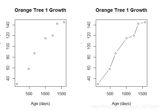
plot(t1$age,t1$circumference,
xlab="Age (days)",
ylab="Circumference (mm)",
main = "Orange Tree 1 Growth")
plot(t1$age,t1$circumference,type="b",
xlab="Age (days)",
ylab="Circumference (mm)",
main = "Orange Tree 1 Growth")
par(opar)
通过参数type选择折线图的类型
参数type的可选值如下
p:只有点
l: 只有线
o: 实心点和线(即线覆盖在点上)
b,c: 线连接点(c时不绘制点)
s,S 阶梯线
h: 直方图式的垂直线
n: 不生成任何点和线(通常用来为后面的命令创建坐标轴)
代码示例
par(mfrow=c(2,4))
t1 <- subset(Orange, Tree==1)
plot(t1$age,t1$circumference,type="p",
     xlab="x",
     ylab="y",
     main = "type=p")
plot(t1$age,t1$circumference,type="l",
     xlab="x",
     ylab="y",
     main = "type=l")
plot(t1$age,t1$circumference,type="o",
     xlab="x",
     ylab="y",
     main = "type=o")
plot(t1$age,t1$circumference,type="b",
     xlab="x",
     ylab="y",
     main = "type=b")
plot(t1$age,t1$circumference,type="c",
     xlab="x",
     ylab="y",
     main = "type=c")
plot(t1$age,t1$circumference,type="s",
     xlab="x",
     ylab="y",
     main = "type=s")
plot(t1$age,t1$circumference,type="S",
     xlab="x",
     ylab="y",
     main = "type=S")
plot(t1$age,t1$circumference,type="h",
     xlab="x",
     ylab="y",
     main = "type=h")
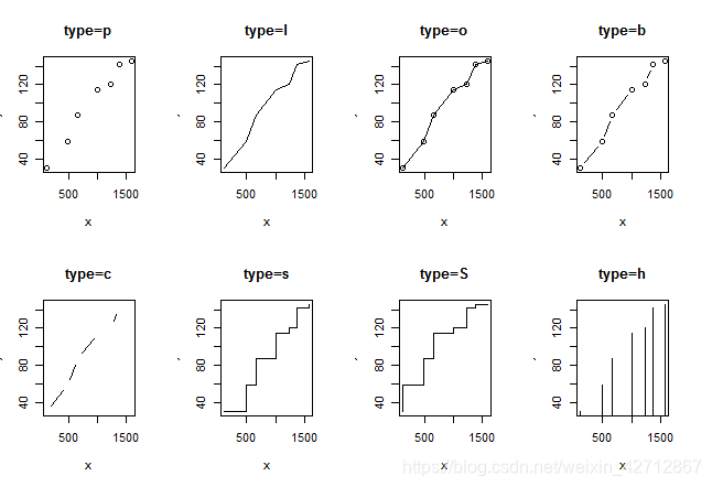
从图中可以看到,type="P"生成了典型的散点图,type="b"生成了最常见的折线图,b和c间的不同之处在于点是否出现或者线之间是否有空隙。
type="s"和type="S"都生成阶梯线,但是"s"是线横着画线,然后上升,“S"则是先上升,再横着画线,
通过type="n"可以用来创建坐标轴,标题和其他图形特征,然后再使用lines()等函数添加需要的各种曲线
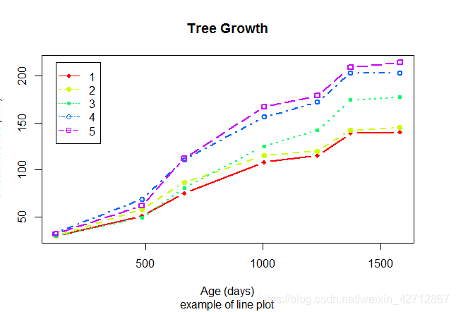
展示五中橘树随时间推移的生长图形
代码示例:
#为方便起见,将因子转换为数值型
par(opar)
Orange$Tree <- as.numeric(Orange$Tree)
ntrees <- max(Orange$Tree)

#range返回给定向量的最大值及最小值
xrange <- range(Orange$age)
yrange <- range(Orange$circumference)

#创建图形
plot(xrange,yrange,
     type="n",
     xlab="Age (days)",
     ylab="Circumference (mm)")
#设置线性颜色
colors <- rainbow(ntrees)
#设置线条类型
linetype <- c(1:ntrees)
#设置点的类型
plotchar <- seq(18, 18+ ntrees,1)

for (i in 1:ntrees) {
   tree <- subset(Orange,Tree==i)
   lines(tree$age,tree$circumference,
         type="b",
         lwd=2,
         lty=linetype[i],
         col=colors[i],
         pch=plotchar[i])
}

title("Tree Growth","example of line plot")

#添加图例
legend(xrange[1],yrange[2],legend = c(1,2,3,4,5),col=colors,lty=linetype,pch=plotchar)


 2224
2224

 被折叠的 条评论
为什么被折叠?
被折叠的 条评论
为什么被折叠?
 到【灌水乐园】发言


