<template>
<div style="padding: 140px">
<div style="position: relative">
<el-slider
v-model="sliderValue"
:min="0"
:max="timeArray.length - 1"
:show-tooltip="false"
@input="handleSliderChange"
></el-slider>
<el-button @click="togglePlayback">
{{ isPlaying ? '停止播放' : '开始播放' }}
</el-button>
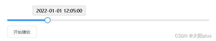
<div
class="custom-tooltip"
v-if="showCustomTooltip"
:style="{ left: customTooltipLeft }"
>
{{ customTooltipText }}
</div>
</div>
</div>
</template>
<script>
export default {
data() {
return {
sliderValue: 0,
timeArray: [
'2022-01-01 12:00:00',
'2022-01-01 12:05:00',
'2022-01-01 12:10:00',
'2022-01-01 13:10:00',
'2022-01-01 13:01:00',
'2022-01-01 14:10:00'
],
isPlaying: false,
intervalId: null,
showCustomTooltip: false,
customTooltipLeft: '0%'
}
},
mounted() {},
methods: {
togglePlayback() {
this.isPlaying = !this.isPlaying
if (this.isPlaying) {
this.intervalId = setInterval(() => {
if (this.sliderValue < this.timeArray.length - 1) {
this.sliderValue++
} else {
this.sliderValue = 0
}
}, 1500)
} else {
clearInterval(this.intervalId)
}
},
handleSliderChange(val) {
this.sliderValue = val
this.sliderPosition()
},
sliderPosition() {
const tooltipPosition =
(this.sliderValue / (this.timeArray.length - 1)) * 100
this.customTooltipLeft = `calc(${tooltipPosition}% - 50px)`
this.showCustomTooltip = true
}
},
computed: {
customTooltipText() {
return this.timeArray[this.sliderValue]
}
}
}
</script>
<style>
.custom-tooltip {
position: absolute;
top: -30px;
width: 165px;
background-color: #f0f0f0;
border: 1px solid #ccc;
border-radius: 4px;
padding: 5px;
text-align: center;
}
</style>


 1896
1896

 被折叠的 条评论
为什么被折叠?
被折叠的 条评论
为什么被折叠?
 到【灌水乐园】发言


