


1.Data Understanding
2.Data Exploration
3.Data Preparation
4.Training Models
5.Optimization Model
集成学习模型对比优化—银行业务
1.Data Understanding
import pandas as pd
from matplotlib import pyplot as plt
import seaborn as sns
df = pd.read_csv("D:\\课程学习\\机器学习\\银行客户开设定期存款账户情况预测\\banking.csv")
#Print the shape of the DataFrame
print("1.the shape of the DataFrame")
print(df.shape)

# Print the head of the DataFrame
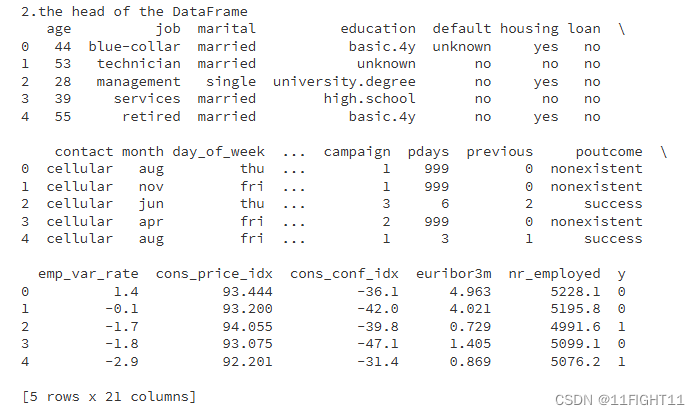
print("2.the head of the DataFrame")
print(df.head())
# Print info of the DataFrame
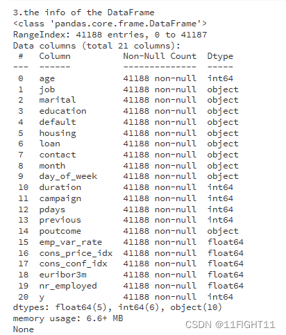
print("3.the info of the DataFrame")
print(df.info())
# Print statistical description of the DataFrame
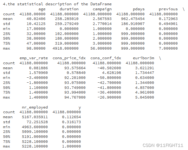
print("4.the statistical description of the DataFrame")
print(df.describe())
# Check for any null values in the DataFrame
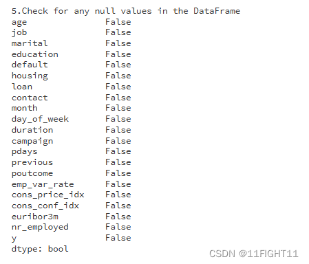
print("5.Check for any null values in the DataFrame")
datacheck = df.isnull().any()
print(datacheck)
# Check for duplicates
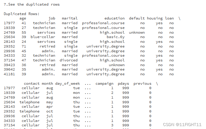
print("6.Check for duplicates")
duplicates = df.duplicated()
print(f"Number of duplicated rows: {duplicates.sum()}")

print("7.See the duplicated rows")
# See the duplicated rows:
if duplicates.sum() > 0:
    print("\nDuplicated Rows:")
    print(df[duplicates])
#pick out the non_numeric_columns
non_numeric_columns = df.select_dtypes(exclude=['number']).columns.to_list()
numeric_columns = df.select_dtypes(include=['number']).columns
print(non_numeric_columns)

2.Data Exploration
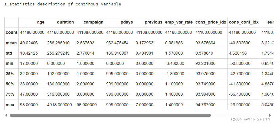
#statistics description of continous variable
print("1.statistics description of continous variable")
df.describe()
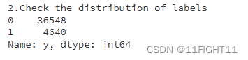
print("2.Check the distribution of labels")
print(df['y'].value_counts())
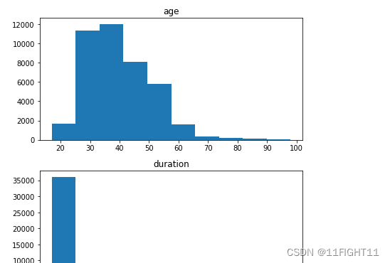
# histograms of continuous variables
print("3.histograms of continuous variables")
fig, axes = plt.subplots(nrows=len(df.select_dtypes(include=['int64', 'float64']).columns), figsize=(6, 3*len(df.select_dtypes(include=['int64', 'float64']).columns)))
df.select_dtypes(include=['int64', 'float64']).hist(ax=axes,grid=False)
plt.tight_layout()
plt.show()
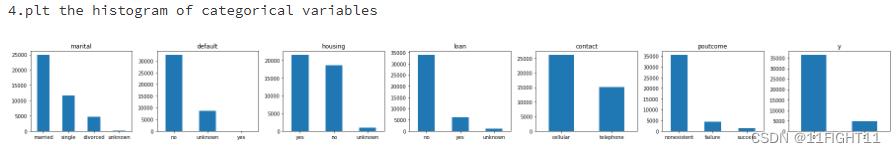
# histogram of categorical variables
print("4.plt the histogram of categorical variables")
#categorical_features = non_numeric_columns = df.select_dtypes(exclude=['number']).columns.to_list()
categorical_features = ["marital", "default", "housing","loan","contact","poutcome","y"]
fig, ax = plt.subplots(1, len(categorical_features), figsize=(25,3))

for i, categorical_feature in enumerate(df[categorical_features]):
    df[categorical_feature].value_counts().plot(kind="bar", ax=ax[i], rot=0).set_title(categorical_feature)

plt.tight_layout()
plt.show()
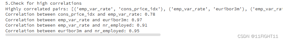
print("5.Check for high correlations")
import numpy as np

# Check for high correlations
correlation_matrix = df.corr().abs()

# Get pairs of highly correlated features
high_corr_var = np.where(correlation_matrix > 0.6)
high_corr_var = [(correlation_matrix.columns[x], correlation_matrix.columns[y])
                 for x, y in zip(*high_corr_var) if x != y and x < y]
print("Highly correlated pairs:", high_corr_var)

# Filter pairs by correlation threshold
threshold = 0.7
high_corr_pairs = {}
for column in correlation_matrix.columns:
    for index in correlation_matrix.index:
        # We'll only consider pairs of different columns and correlations above the threshold
        if column != index and abs(correlation_matrix[column][index]) > threshold:
            # We'll also ensure we don't duplicate pairs (i.e., A-B and B-A)
            sorted_pair = tuple(sorted([column, index]))
            if sorted_pair not in high_corr_pairs:
                high_corr_pairs[sorted_pair] = correlation_matrix[column][index]

# Display the high correlation pairs
for pair, corr_value in high_corr_pairs.items():
    print(f"Correlation between {pair[0]} and {pair[1]}: {corr_value:.2f}")
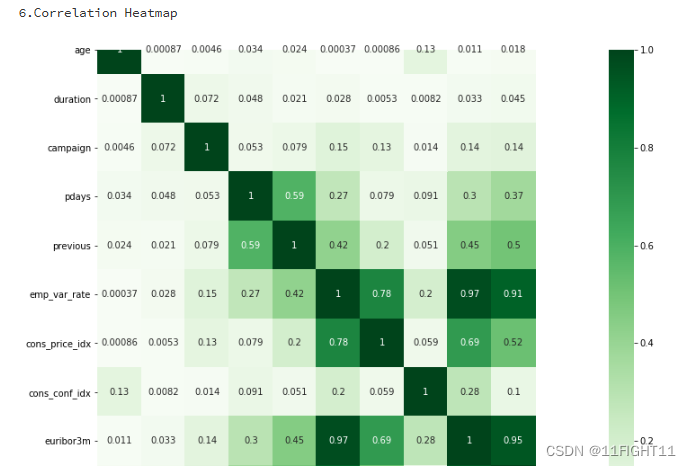
#Correlation Heatmap
print("6.Correlation Heatmap")
import seaborn as sns
df_duplicate = df.copy()
df_duplicate['y'] = df['y'].map({'no': 0, 'yes': 1})
correlation_matrix2 = df_duplicate.corr().abs()
plt.figure(figsize=(12, 10))
sns.heatmap(correlation_matrix2, cmap='Greens', annot=True)
plt.show()
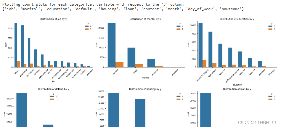
# Plotting count plots for each categorical variable with respect to the 'y' column
print("Plotting count plots for each categorical variable with respect to the 'y' column")
categorical_cols = df.select_dtypes(include=['object']).columns.tolist()
print(categorical_cols)
#categorical_cols.remove('y')

# Setting up the figure size
plt.figure(figsize=(20, 20))

for i, col in enumerate(categorical_cols, 1):
    plt.subplot(4, 3, i)
    sns.countplot(data=df, x=col, hue='y', order=df[col].value_counts().index)
    plt.title(f'Distribution of {col} by y')
    plt.xticks(rotation=45)
    plt.tight_layout()

plt.show()
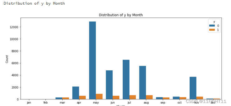
# Distribution of y by Month
print("Distribution of y by Month")
plt.figure(figsize=(11, 5))
sns.countplot(data=df, x='month', hue='y', order=['jan', 'feb', 'mar', 'apr', 'may', 'jun', 'jul', 'aug', 'sep', 'oct', 'nov', 'dec'])
plt.title('Distribution of y by Month')
plt.ylabel('Count')
plt.xlabel('Month')
plt.tight_layout()
plt.show()
3.Data Preparation
import pandas as pd
from sklearn.preprocessing import LabelEncoder
# Load the dataset and drop duplicates
df = pd.read_csv("D:\\课程学习\\机器学习\\银行客户开设定期存款账户情况预测\\banking.csv").drop_duplicates()
# Convert the 'y' column to dummy variables
#y = pd.get_dummies(df['y'], drop_first=True)
y = df.iloc[:, -1]
# Process client-related data
bank_client = df.iloc[:, 0:7]
labelencoder_X = LabelEncoder()
columns_to_encode = ['job', 'marital', 'education', 'default', 'housing', 'loan']
for col in columns_to_encode:
bank_client[col] = labelencoder_X.fit_transform(bank_client[col])
# Process bank-related data
bank_related = df.iloc[:, 7:11]
#columns_to_encode=df.select_dtypes(include=['object']).columns.tolist()
columns_to_encode = ['contact', 'month', 'day_of_week']
for col in columns_to_encode:
bank_related[col] = labelencoder_X.fit_transform(bank_related[col])
# Process sociol & economic data (se) and other bank data (others)
bank_se = df.loc[:, ['emp_var_rate', 'cons_price_idx', 'cons_conf_idx', 'euribor3m', 'nr_employed']]
bank_others = df.loc[:, ['campaign', 'pdays', 'previous', 'poutcome']]
bank_others['poutcome'].replace(['nonexistent', 'failure', 'success'], [1, 2, 3], inplace=True)
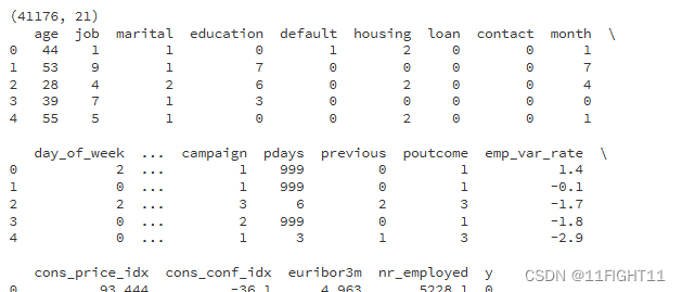
# Concatenate all the processed parts, reorder columns, and save to CSV
bank_final = pd.concat([bank_client, bank_related,bank_others, bank_se,y], axis=1)
columns_order = ['age', 'job', 'marital', 'education', 'default', 'housing', 'loan', 'contact', 'month',
'day_of_week', 'duration', 'campaign', 'pdays', 'previous', 'poutcome', 'emp_var_rate',
'cons_price_idx', 'cons_conf_idx', 'euribor3m', 'nr_employed', 'y']
bank_final = bank_final[columns_order]
bank_final.to_csv('bank_final.csv', index=False)
# Display basic information about the final dataframe
print(bank_final.shape)
print(bank_final.head())
print(bank_final.info())
print(bank_final.describe())
# Check for any null values in the DataFrame
datacheck = bank_final.isnull().any()
print(datacheck)
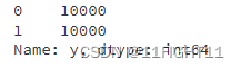
count = bank_final['y'].value_counts()
print(count)
4.Training Models
import warnings
warnings.filterwarnings("ignore")
import pandas as pd
from sklearn.model_selection import train_test_split


x = bank_final.drop('y', axis=1)
y = bank_final['y']

# Split bank_final into training and testing sets (80%-20%)
X_train, X_test, y_train, y_test = train_test_split(x, y, test_size=0.2, random_state=42)

print(X_train.shape)
print(X_test.shape)

import numpy as np
import pandas as pd
from sklearn.metrics import confusion_matrix
from sklearn.metrics import classification_report
from sklearn.metrics import cohen_kappa_score
#计算评价指标:用df_eval数据框装起来计算的评价指标数值
def evaluation(y_test, y_predict):
accuracy=classification_report(y_test, y_predict,output_dict=True)['accuracy']
s=classification_report(y_test, y_predict,output_dict=True)['weighted avg']
precision=s['precision']
recall=s['recall']
f1_score=s['f1-score']
#kappa=cohen_kappa_score(y_test, y_predict)
return accuracy,precision,recall,f1_score
import matplotlib.pyplot as plt
from sklearn.metrics import roc_auc_score, roc_curve,auc
def roc(y_test,y_proba):
gbm_auc = roc_auc_score(y_test, y_proba[:, 1]) # 计算auc
gbm_fpr, gbm_tpr, gbm_threasholds = roc_curve(y_test, y_proba[:, 1]) # 计算ROC的值
return gbm_auc,gbm_fpr, gbm_tpr
from sklearn.linear_model import LogisticRegression
from sklearn.ensemble import RandomForestClassifier
from sklearn.ensemble import AdaBoostClassifier
from sklearn.ensemble import GradientBoostingClassifier
from xgboost import XGBClassifier
from lightgbm import LGBMClassifier
from sklearn.model_selection import cross_val_score
import time
from sklearn.svm import SVC
from sklearn.neural_network import MLPClassifier
model0 = SVC(kernel="rbf", random_state=77,probability=True)
model1 = MLPClassifier(hidden_layer_sizes=(16,8), random_state=77, max_iter=10000)
model2 = LogisticRegression()
model3 = RandomForestClassifier()
model4 = AdaBoostClassifier()
model5 = GradientBoostingClassifier()
model6 = XGBClassifier()
model7 = LGBMClassifier()
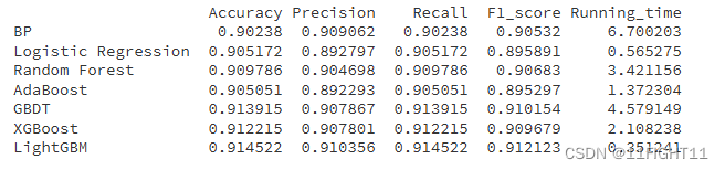
model_list=[model1,model2,model3,model4,model5,model6,model7]
model_name=['BP','Logistic Regression', 'Random Forest', 'AdaBoost', 'GBDT', 'XGBoost','LightGBM']
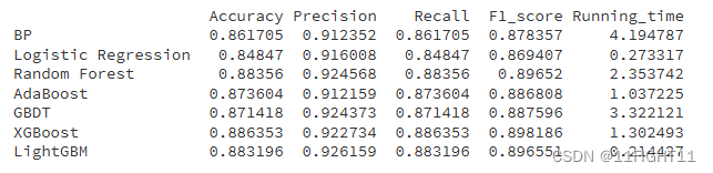
df_eval=pd.DataFrame(columns=['Accuracy','Precision','Recall','F1_score','Running_time'])
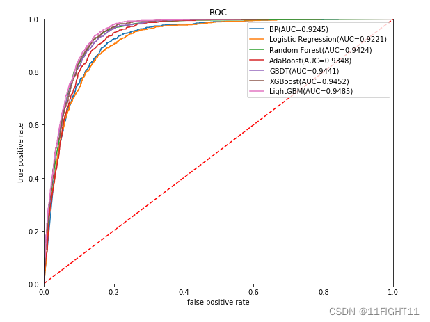
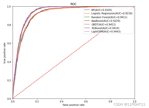
plt.figure(figsize=(9, 7))
plt.title("ROC")
plt.plot([0,1],[0,1],'r--')
plt.xlim([0,1])
plt.ylim([0,1])
plt.xlabel('false positive rate') # specificity = 1 - np.array(gbm_fpr))
plt.ylabel('true positive rate') # sensitivity = gbm_tpr
for i in range(7):
model_C=model_list[i]
name=model_name[i]
start = time.time()
model_C.fit(X_train, y_train)
end = time.time()
running_time = end - start
pred=model_C.predict(X_test)
pred_proba = model_C.predict_proba(X_test)
#s=classification_report(y_test, pred)
s=evaluation(y_test,pred)
s=list(s)
s.append(running_time)
df_eval.loc[name,:]=s
gbm_auc,gbm_fpr, gbm_tpr=roc(y_test,pred_proba)
plt.plot(list(np.array(gbm_fpr)), gbm_tpr, label="%s(AUC=%.4f)"% (name, gbm_auc))
print(df_eval)
plt.legend(loc='upper right')
plt.show()
# Confusion matrix graph
from lightgbm import LGBMClassifier
from sklearn.metrics import confusion_matrix
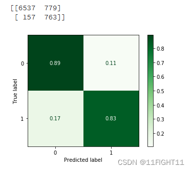
model=LGBMClassifier()
model.fit(X_train, y_train)
pred=model.predict(X_test)
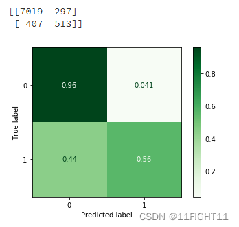
Confusion_Matrixn = confusion_matrix(y_test, pred)
Confusion_Matrix = confusion_matrix(y_test, pred,normalize='true')
print(Confusion_Matrixn)
from sklearn.metrics import ConfusionMatrixDisplay
#one way
disp = ConfusionMatrixDisplay(confusion_matrix=Confusion_Matrix)#display_labels=LR_model.classes_
disp.plot(cmap='Greens')#supported values are 'Accent', 'Accent_r', 'Blues', 'Blues_r', 'BrBG', 'BrBG_r', 'BuGn', 'BuGn_r', 'BuPu', 'BuPu_r', 'CMRmap', 'CMRmap_r', 'Dark2', 'Dark2_r', 'GnBu', 'GnBu_r', 'Greens', 'Greens_r', 'Greys', 'Greys_r', 'OrRd', 'OrRd_r', 'Oranges', 'Oranges_r', 'PRGn', 'PRGn_r', 'Paired', 'Paired_r', 'Pastel1', 'Pastel1_r', 'Pastel2', 'Pastel2_r', 'PiYG', 'PiYG_r', 'PuBu', 'PuBuGn', 'PuBuGn_r', 'PuBu_r', 'PuOr', 'PuOr_r', 'PuRd', 'PuRd_r', 'Purples', 'Purples_r', 'RdBu', 'RdBu_r', 'RdGy', 'RdGy_r', 'RdPu', 'RdPu_r', 'RdYlBu', 'RdYlBu_r', 'RdYlGn', 'RdYlGn_r', 'Reds', 'Reds_r', 'Set1', 'Set1_r', 'Set2', 'Set2_r', 'Set3', 'Set3_r', 'Spectral', 'Spectral_r', 'Wistia', 'Wistia_r', 'YlGn', 'YlGnBu', 'YlGnBu_r', 'YlGn_r', 'YlOrBr', 'YlOrBr_r', 'YlOrRd', 'YlOrRd_r', 'afmhot', 'afmhot_r', 'autumn', 'autumn_r', 'binary', 'binary_r', 'bone', 'bone_r', 'brg', 'brg_r', 'bwr', 'bwr_r', 'cividis', 'cividis_r', 'cool', 'cool_r', 'coolwarm', 'coolwarm_r', 'copper', 'copper_r', 'crest', 'crest_r', 'cubehelix', 'cubehelix_r', 'flag', 'flag_r', 'flare', 'flare_r', 'gist_earth', 'gist_earth_r', 'gist_gray', 'gist_gray_r', 'gist_heat', 'gist_heat_r', 'gist_ncar', 'gist_ncar_r', 'gist_rainbow', 'gist_rainbow_r', 'gist_stern', 'gist_stern_r', 'gist_yarg', 'gist_yarg_r', 'gnuplot', 'gnuplot2', 'gnuplot2_r', 'gnuplot_r', 'gray', 'gray_r', 'hot', 'hot_r', 'hsv', 'hsv_r', 'icefire', 'icefire_r', 'inferno', 'inferno_r', 'jet', 'jet_r', 'magma', 'magma_r', 'mako', 'mako_r', 'nipy_spectral', 'nipy_spectral_r', 'ocean', 'ocean_r', 'pink', 'pink_r', 'plasma', 'plasma_r', 'prism', 'prism_r', 'rainbow', 'rainbow_r', 'rocket', 'rocket_r', 'seismic', 'seismic_r', 'spring', 'spring_r', 'summer', 'summer_r', 'tab10', 'tab10_r', 'tab20', 'tab20_r', 'tab20b', 'tab20b_r', 'tab20c', 'tab20c_r', 'terrain', 'terrain_r', 'turbo', 'turbo_r', 'twilight', 'twilight_r', 'twilight_shifted', 'twilight_shifted_r', 'viridis', 'viridis_r', 'vlag', 'vlag_r', 'winter', 'winter_r'
#disp.color='blue'
plt.show()
5.Optimization Model
#Train Test split with Undersampling to bring 0 to 10,000 and Oversampling to bring 1 to 10,000
from sklearn.model_selection import train_test_split
from imblearn.over_sampling import SMOTE
from imblearn.under_sampling import RandomUnderSampler
from sklearn.preprocessing import StandardScaler
# Apply SMOTE to oversample class 1 to 10,000 samples
smote_strategy = {1: 10000}
smote = SMOTE(sampling_strategy=smote_strategy, random_state=42)
x_train_resampled, y_train_resampled = smote.fit_resample(X_train, y_train)

# Apply RandomUnderSampler to undersample class 0 to 10,000 samples
undersample_strategy = {0: 10000}
undersampler = RandomUnderSampler(sampling_strategy=undersample_strategy, random_state=42)
x_train_resampled, y_train_resampled = undersampler.fit_resample(x_train_resampled, y_train_resampled)


# Check the new class distribution
print(y_train_resampled.value_counts())
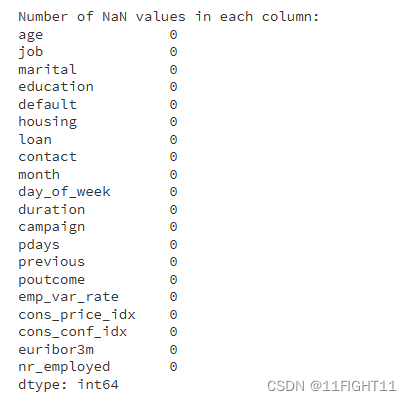
# Check for NaN values in x_train_resampled after resampling
nan_values = x_train_resampled.isnull().sum()
print("\nNumber of NaN values in each column:")
print(nan_values)
# If there are any NaN values, print the columns that contain them
nan_columns = nan_values[nan_values > 0].index.tolist()
if nan_columns:
    print("\nColumns with NaN values:", nan_columns)
else:
    print("\nThere are no NaN values in the resampled data.")

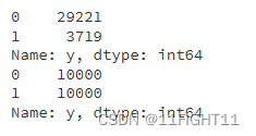
# Before resampling
print(y_train.value_counts())

# After resampling
print(y_train_resampled.value_counts())
from sklearn.linear_model import LogisticRegression
from sklearn.ensemble import RandomForestClassifier
from sklearn.ensemble import AdaBoostClassifier
from sklearn.ensemble import GradientBoostingClassifier
from xgboost import XGBClassifier
from lightgbm import LGBMClassifier
from sklearn.model_selection import cross_val_score
import time
from sklearn.svm import SVC
from sklearn.neural_network import MLPClassifier

model0 = SVC(kernel="rbf", random_state=77,probability=True)
model1 = MLPClassifier(hidden_layer_sizes=(16,8), random_state=77, max_iter=10000)
model2 = LogisticRegression()
model3 = RandomForestClassifier()
model4 = AdaBoostClassifier()
model5 = GradientBoostingClassifier()
model6 = XGBClassifier()
model7 = LGBMClassifier()


model_list=[model1,model2,model3,model4,model5,model6,model7]
model_name=['BP','Logistic Regression', 'Random Forest', 'AdaBoost', 'GBDT', 'XGBoost','LightGBM']

df_eval=pd.DataFrame(columns=['Accuracy','Precision','Recall','F1_score','Running_time'])
plt.figure(figsize=(9, 7))
plt.title("ROC")
plt.plot([0,1],[0,1],'r--')
plt.xlim([0,1])
plt.ylim([0,1])
plt.xlabel('false positive rate')  # specificity = 1 - np.array(gbm_fpr))
plt.ylabel('true positive rate')  # sensitivity = gbm_tpr
for i in range(7):
    model_C=model_list[i]
    name=model_name[i]

    start = time.time()
    model_C.fit(x_train_resampled, y_train_resampled)
    end = time.time()
    running_time = end - start

    pred=model_C.predict(X_test)
    pred_proba = model_C.predict_proba(X_test)
    #s=classification_report(y_test, pred)
    s=evaluation(y_test,pred)
    s=list(s)
    s.append(running_time)
    df_eval.loc[name,:]=s

    gbm_auc,gbm_fpr, gbm_tpr=roc(y_test,pred_proba)
    plt.plot(list(np.array(gbm_fpr)), gbm_tpr, label="%s(AUC=%.4f)"% (name, gbm_auc))

print(df_eval)
plt.legend(loc='upper right')
plt.show()
# Confusion matrix graph
from lightgbm import LGBMClassifier
from xgboost import XGBClassifier
from sklearn.metrics import confusion_matrix

model=XGBClassifier()
model.fit(x_train_resampled, y_train_resampled)
pred=model.predict(X_test)

Confusion_Matrixn = confusion_matrix(y_test, pred)
Confusion_Matrix = confusion_matrix(y_test, pred,normalize='true')
print(Confusion_Matrixn)

from sklearn.metrics import ConfusionMatrixDisplay

#one way
disp = ConfusionMatrixDisplay(confusion_matrix=Confusion_Matrix)#display_labels=LR_model.classes_
disp.plot(cmap='Greens')#supported values are 'Accent', 'Accent_r', 'Blues', 'Blues_r', 'BrBG', 'BrBG_r', 'BuGn', 'BuGn_r', 'BuPu', 'BuPu_r', 'CMRmap', 'CMRmap_r', 'Dark2', 'Dark2_r', 'GnBu', 'GnBu_r', 'Greens', 'Greens_r', 'Greys', 'Greys_r', 'OrRd', 'OrRd_r', 'Oranges', 'Oranges_r', 'PRGn', 'PRGn_r', 'Paired', 'Paired_r', 'Pastel1', 'Pastel1_r', 'Pastel2', 'Pastel2_r', 'PiYG', 'PiYG_r', 'PuBu', 'PuBuGn', 'PuBuGn_r', 'PuBu_r', 'PuOr', 'PuOr_r', 'PuRd', 'PuRd_r', 'Purples', 'Purples_r', 'RdBu', 'RdBu_r', 'RdGy', 'RdGy_r', 'RdPu', 'RdPu_r', 'RdYlBu', 'RdYlBu_r', 'RdYlGn', 'RdYlGn_r', 'Reds', 'Reds_r', 'Set1', 'Set1_r', 'Set2', 'Set2_r', 'Set3', 'Set3_r', 'Spectral', 'Spectral_r', 'Wistia', 'Wistia_r', 'YlGn', 'YlGnBu', 'YlGnBu_r', 'YlGn_r', 'YlOrBr', 'YlOrBr_r', 'YlOrRd', 'YlOrRd_r', 'afmhot', 'afmhot_r', 'autumn', 'autumn_r', 'binary', 'binary_r', 'bone', 'bone_r', 'brg', 'brg_r', 'bwr', 'bwr_r', 'cividis', 'cividis_r', 'cool', 'cool_r', 'coolwarm', 'coolwarm_r', 'copper', 'copper_r', 'crest', 'crest_r', 'cubehelix', 'cubehelix_r', 'flag', 'flag_r', 'flare', 'flare_r', 'gist_earth', 'gist_earth_r', 'gist_gray', 'gist_gray_r', 'gist_heat', 'gist_heat_r', 'gist_ncar', 'gist_ncar_r', 'gist_rainbow', 'gist_rainbow_r', 'gist_stern', 'gist_stern_r', 'gist_yarg', 'gist_yarg_r', 'gnuplot', 'gnuplot2', 'gnuplot2_r', 'gnuplot_r', 'gray', 'gray_r', 'hot', 'hot_r', 'hsv', 'hsv_r', 'icefire', 'icefire_r', 'inferno', 'inferno_r', 'jet', 'jet_r', 'magma', 'magma_r', 'mako', 'mako_r', 'nipy_spectral', 'nipy_spectral_r', 'ocean', 'ocean_r', 'pink', 'pink_r', 'plasma', 'plasma_r', 'prism', 'prism_r', 'rainbow', 'rainbow_r', 'rocket', 'rocket_r', 'seismic', 'seismic_r', 'spring', 'spring_r', 'summer', 'summer_r', 'tab10', 'tab10_r', 'tab20', 'tab20_r', 'tab20b', 'tab20b_r', 'tab20c', 'tab20c_r', 'terrain', 'terrain_r', 'turbo', 'turbo_r', 'twilight', 'twilight_r', 'twilight_shifted', 'twilight_shifted_r', 'viridis', 'viridis_r', 'vlag', 'vlag_r', 'winter', 'winter_r'

#disp.color='blue'
plt.show()
数据集来源:https://www.heywhale.com/home/user/profile/6535165d9217caa11b5ee5b3/overview


 3715
3715

 被折叠的 条评论
为什么被折叠?
被折叠的 条评论
为什么被折叠?
 到【灌水乐园】发言


