


Citation: Rougier NP, Droettboom M, Bourne PE (2014) Ten Simple Rules for Better Figures. PLoS Comput Biol 10(9): e1003833. https://doi.org/10.1371/journal.pcbi.1003833
This is an open-access article, free of all copyright, and may be freely reproduced, distributed, transmitted, modified, built upon, or otherwise used by anyone for any lawful purpose. The work is made available under the Creative Commons CC0 public domain dedication.
原文链接:Ten Simple Rules for Better Figures
文章目录
- Introdunction(引言)
- Rule 1: Know Your Audience(了解图像的受众)
- Rule 2: Identify your Message(确认信息)
- Rule 3: Adapt the Figure to the Support Medium(根据不同的媒体介质调整图像)
- Rule 4: Captions Are Not Optional(图像标题是必须的)
- Rule 5: Do not Trust the Defaults(不要盲目相信默认值)
- Rule 6: Use Color Effectively(有效使用色彩)
- Rule 7: Do Not Mislead the Reader(不要误导读者)
- Rule 8: Avoid "Chartjunk"(避免“图表垃圾”)
- Rule 9: Message Trumps Beauty(信息胜过美观)
- Rule 10: Get the Right Tool(使用合适的工具)
- Notes(注释)
- Reference(参考)
Introdunction(引言)
Scientific visualization is classically defined as the process of graphically displaying scientific data. However, this process is far from direct or automatic. There are so many different ways to represent the same data: scatter plots, linear plots, bar plots, and pie charts, to name just a few. Furthermore, the same data, using the same type of plot, may be perceived very differently depending on who is looking at the figure. A more accurate definition for scientific visualization would be a graphical interface between people and data. In this short article, we do not pretend to explain everything about this interface; rather, see [1], [2] for introductory work. Instead we aim to provide a basic set of rules to improve figure design and to explain some of the common pitfalls.
科学可视化的经典定义是以图形的方式显示科学数据的过程。然而,这一过程远非直接或自动的。相同的数据可以用很多不同的方式来呈现:比如散点图、线性图、条形图和饼图等等。此外,使用同类型绘图来展示相同的数据,也可能会被视为非常不同,这取决于图像的受众。科学可视化的更准确定义是人与数据之间的图形界面。在这篇短文中,我们并不试图去解释这个接口的所有内容;读者可以参见文献[1]、[2]进一步了解介绍性工作。相反,我们的目标是提供一组基本规则来改进图形设计,并解释一些在绘图时常见的陷阱。
Rule 1: Know Your Audience(了解图像的受众)
Given the definition above, problems arise when how a visual is perceived differs significantly from the intent of the conveyer. Consequently, it is important to identify, as early as possible in the design process, the audience and the message the visual is to convey. The graphical design of the visual should be informed by this intent. If you are making a figure for yourself and your direct collaborators, you can possibly skip a number of steps in the design process, because each of you knows what the figure is about. However, if you intend to publish a figure in a scientific journal, you should make sure your figure is correct and conveys all the relevant information to a broader audience. Student audiences require special care since the goal for that situation is to explain a concept. In that case, you may have to add extra information to make sure the concept is fully understood. Finally, the general public may be the most difficult audience of all since you need to design a simple, possibly approximated, figure that reveals only the most salient part of your research (Figure 1). This has proven to be a difficult exercise [3].
根据上述定义,当视觉感知方式的表达意图明显不同时,就会出现问题。因此,在设计过程中尽早确定受众和视觉传达的信息非常重要。图像的图形设计应以该意图为依据。如果你正在为自己和你的合作者制作一个图像,你可以跳过图像设计过程中的许多步骤,因为你们每个人都知道该图像是关于什么的。然而,如果你打算在科学杂志上发表一个图像,你应该确保你的图像是正确的,并将所有相关信息都传达给更广泛的读者了。学生受众需要特别注意,因为那种情况的目标是解释一个概念。在这种情况下,你可能需要添加额外的信息,以确保该概念被读者所完全理解。最后,普罗大众可能是所有受众中最难接受的,因为你需要设计一个简单的、可能近似的图像,只显示你研究中最突出的部分(图1)。事实证明,这是一项困难的工作。

Figure1. Know your audience. https://doi.org/10.1371/journal.pcbi.1003833.g001
This is a remake of a figure that was originally published in the New York Times (NYT) in 2007. This new figure was made with matplotlib using approximated data. The data is made of four series (men deaths/cases, women deaths/cases) that could have been displayed using classical double column (deaths/cases) bar plots. However, the layout used here is better for the intended audience. It exploits the fact that the number of new cases is always greater than the corresponding number of deaths to mix the two values. It also takes advantage of the reading direction (English [left-to-right] for NYT) in order to ease comparison between men and women while the central labels give an immediate access to the main message of the figure (cancer). This is a self-contained figure that delivers a clear message on cancer deaths. However, it is not precise. The chosen layout makes it actually difficult to estimate the number of kidney cancer deaths because of its bottom position and the location of the labelled ticks at the top. While this is acceptable for a general-audience publication, it would not be acceptable in a scientific publication if actual numerical values were not given elsewhere in the article.
这是对2007年《纽约时报》(NYT)上最初发表的一张图像的重新绘制。这个新图像是使用matplotlib使用近似数据绘制的。数据由四个系列(男性死亡/病例、女性死亡/病例)组成,可以使用经典的双栏(死亡/病例)条形图显示。然而,此处使用的布局更适合预期观众。它利用了新病例数总是大于相应死亡人数这一事实来混合这两个值。它还利用了阅读方向(纽约时报的英语[从左到右]),以便于男性和女性之间的比较,而通过中央标签则立即得知图像的主要信息——癌症。这是一个独立的图像,它传递了一个关于癌症死亡的明确信息。然而,这并不精确。实际上,这种图像布局方式使我们很难估计肾癌死亡人数,因为表示肾癌死亡人数的图形位于图像低端,而图像的坐标轴刻度标记在顶端。虽然这对于面向普通读者的出版物来说是可以接受的,但如果文章中其他地方没有给出实际的数值,则在科学出版物中是不可接受的。
Rule 2: Identify your Message(确认信息)
A figure is meant to express an idea or introduce some facts or a result that would be too long (or nearly impossible) to explain only with words, be it for an article or during a time-limited oral presentation. In this context, it is important to clearly identify the role of the figure, i.e., what is the underlying message and how can a figure best express this message? Once clearly identified, this message will be a strong guide for the design of the figure, as shown in Figure 2. Only after identifying the message will it be worth the time to develop your figure, just as you would take the time to craft your words and sentences when writing an article only after deciding on the main points of the text. If your figure is able to convey a striking message at first glance, chances are increased that your article will draw more attention from the community.
图像是用来表达一个想法或介绍一些事实或结果,无论是在文章中还是在有时间限制的口头陈述中,这些内容太长而无法(或几乎不可能)仅仅使用文字解释清楚。在这种情况下,重要的是要清楚地确定图像的作用,即什么是隐含信息,以及如何使用图像最好地表达这一信息?一旦确认,此信息将有力指南图像设计工作,如图2所示。只有在确定了传达的信息之后,才值得花时间制作并改进你的图像,这就像你只有在确定了文本的要点之后,才会在写文章时花时间精心设计单词和句子一样。如果你的图像能够让读者初看就印象深刻,那么你的文章就更有可能吸引更多的团体关注。
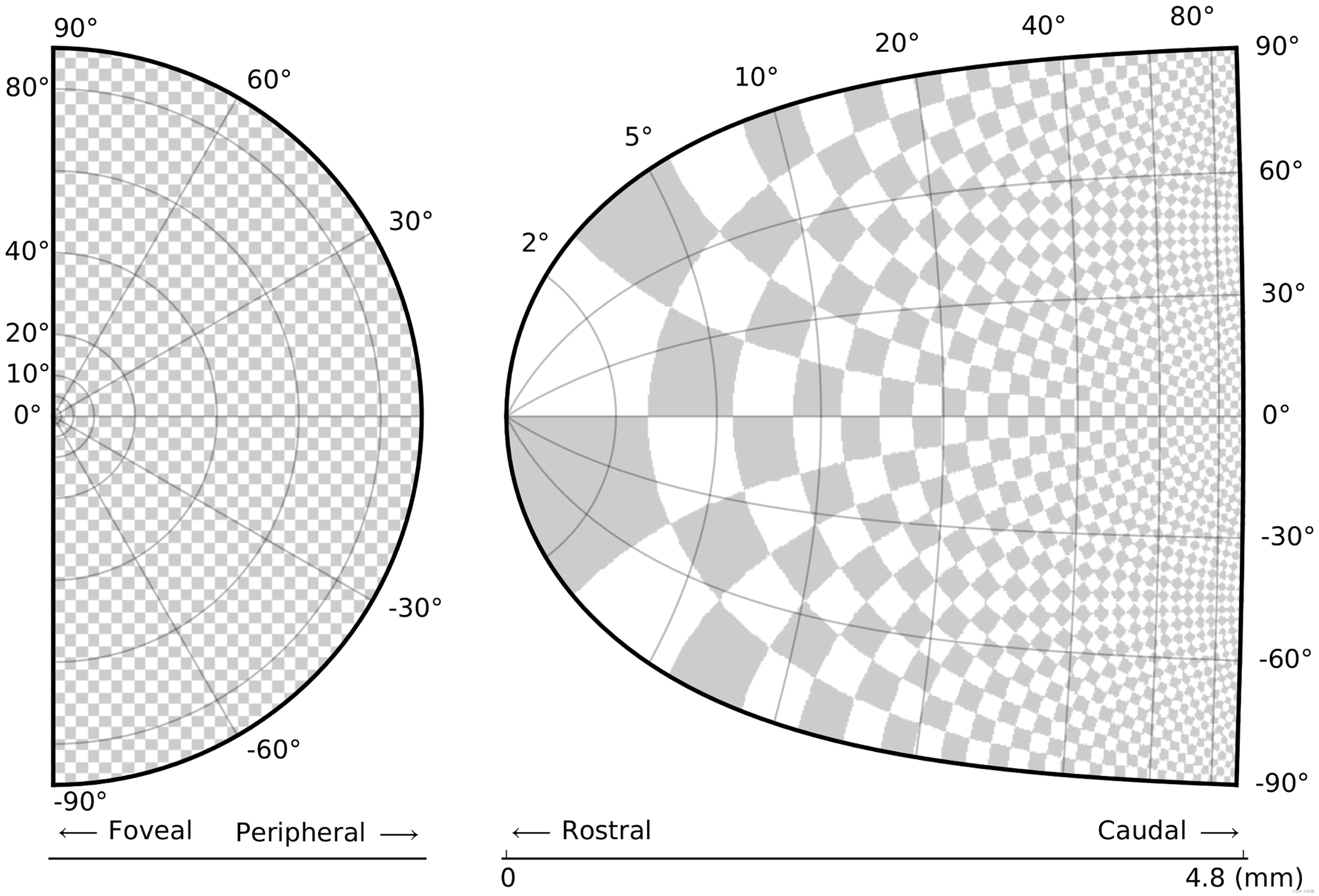
Figure 2. Identify your message. https://doi.org/10.1371/journal.pcbi.1003833.g002
The superior colliculus (SC) is a brainstem structure at the crossroads of multiple functional pathways. Several neurophysiological studies suggest that the population of active neurons in the SC encodes the location of a visual target that induces saccadic eye movement. The projection from the retina surface (on the left) to the collicular surface (on the right) is based on a standard and quantitative model in which a logarithmic mapping function ensures the projection from retinal coordinates to collicular coordinates. This logarithmic mapping plays a major role in saccade decision. To better illustrate this role, an artificial checkerboard pattern has been used, even though such a pattern is not used during experiments. This checkerboard pattern clearly demonstrates the extreme magnification of the foveal region, which is the main message of the figure.
上丘(superior colliculus, SC)是位于多种功能通道交叉点的脑干结构。多项神经生理学研究表明,SC中的激活神经元群编码视觉目标的位置,从而诱导眼球扫视运动。从视网膜表面(左侧)到丘状表面(右侧)的映射基于标准的和定量的模型,其中对数映射函数确保视网膜坐标到丘状坐标的投影。这种对数映射在扫视决策中起着重要作用。为了更好地说明这一作用,使用了一种人工黑白方格图案模式,即使在实验中并没有使用这种模式。这种黑白方格图案清楚地显示了中央凹区域的极端放大,这是该图像的主要信息。
Rule 3: Adapt the Figure to the Support Medium(根据不同的媒体介质调整图像)
A figure can be displayed on a variety of media, such as a poster, a computer monitor, a projection screen (as in an oral presentation), or a simple sheet of paper (as in a printed article). Each of these media represents different physical sizes for the figure, but more importantly, each of them also implies different ways of viewing and interacting with the figure. For example, during an oral presentation, a figure will be displayed for a limited time. Thus, the viewer must quickly understand what is displayed and what it represents while still listening to your explanation. In such a situation, the figure must be kept simple and the message must be visually salient in order to grab attention, as shown in Figure 3. It is also important to keep in mind that during oral presentations, figures will be video-projected and will be seen from a distance, and figure elements must consequently be made thicker (lines) or bigger (points, text), colors should have strong contrast, and vertical text should be avoided, etc. For a journal article, the situation is totally different, because the reader is able to view the figure as long as necessary. This means a lot of details can be added, along with complementary explanations in the caption. If we take into account the fact that more and more people now read articles on computer screens, they also have the possibility to zoom and drag the figure. Ideally, each type of support medium requires a different figure, and you should abandon the practice of extracting a figure from your article to be put, as is, in your oral presentation.
图像会被展示在各种各样的媒体介质上,比如海报、计算机显示器、投影屏幕(比如在做口头报告时)或一张简单的纸(如论文)。这些媒体介质的不同意味着图像的物理尺寸不同,更重要的是,这也暗示了观看图像的方式和与图像的交互方式的不同。例如,在做口头报告时,图像的展示时间就很有限,因此,观众必须能够在听你解释的同时,快速理解所图像展示的内容以及它所代表的含义。这种情况下,图像必须保持简单,必须在视觉上突出重要信息,以吸引观众注意力,如图3所示。同时还要牢记,在做口头报告时,图像将会被投影仪投影在屏幕上,观众是从较远的地方观看,因此图像的元素必须加粗(线)或放大(点、文本),颜色应具有强烈的对比度,并且应避免垂直文本等。而对于期刊文章,情况则完全不同,因为读者可以根据需要查看图像。这意味着我们可以添加许多细节,以及在标题中补充说明。考虑到现在越来越多的人在电脑屏幕上阅读文章,人们可能缩放和拖动图形。理想情况下,每种类型的媒体介质需要不同的图像,你应该放弃将论文中的图像直接用在口头报告中的做法。
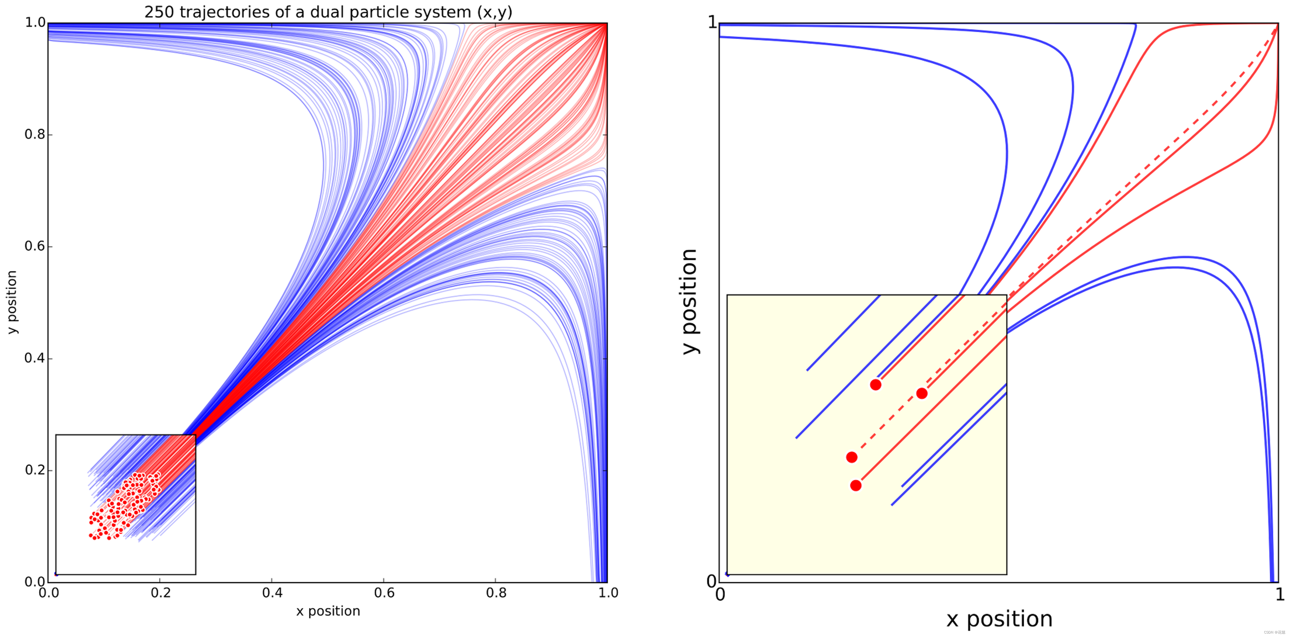
Figure 3. Adapt the figure to the support medium. https://doi.org/10.1371/journal.pcbi.1003833.g003
These two figures represent the same simulation of the trajectories of a dual-particle system d x d t = ( 1 / 4 + ( x − y ) ) ( 1 − x ) , x ≥ 0 \dfrac{dx}{dt}=(1/4+(x-y))(1-x), x\ge0 dtdx=(1/4+(x−y))(1−x),x≥0, d y d t = ( 1 / 4 + ( y − x ) ) ( 1 − y ) , y ≥ 0 \dfrac{dy}{dt}=(1/4+(y-x))(1-y),y\ge0 dtdy=(1/4+(y−x))(1−y),y≥0 where each particle interacts with the other. Depending on the initial conditions, the system may end up in three different states. The left figure has been prepared for a journal article where the reader is free to look at every detail. The red color has been used consistently to indicate both initial conditions (red dots in the zoomed panel) and trajectories (red lines). Line transparency has been increased in order to highlight regions where trajectories overlap (high color density). The right figure has been prepared for an oral presentation. Many details have been removed (reduced number of trajectories, no overlapping trajectories, reduced number of ticks, bigger axis and tick labels, no title, thicker lines) because the time-limited display of this figure would not allow for the audience to scrutinize every detail. Furthermore, since the figure will be described during the oral presentation, some parts have been modified to make them easier to reference (e.g., the yellow box, the red dashed line).
这两幅图像代表了对双粒子系统轨迹的相同模拟: d x d t = ( 1 / 4 + ( x − y ) ) ( 1 − x ) , x ≥ 0 \dfrac{dx}{dt}=(1/4+(x-y))(1-x), x\ge0 dtdx=(1/4+(x−y))(1−x),x≥0, d y d t = ( 1 / 4 + ( y − x ) ) ( 1 − y ) , y ≥ 0 \dfrac{dy}{dt}=(1/4+(y-x))(1-y),y\ge0 dtdy=(1/4+(y−x))(1−y),y≥0,在这个系统中,粒子之间会相互作用。根据初始条件,系统可能最终处于三种不同的状态。左图是为一篇期刊文章准备的,读者可以自由查看每一个细节。红色用于指示初始条件(缩放面板中的红点)和轨迹(红线)。在左图中,作者增加了增加了线透明度,以突出显示轨迹重叠的区域(高颜色密度)。右图则是为口头报告准备的。右图中,许多细节都被删除了(比如,减少了轨迹的数量,没有重叠的轨迹,减少了坐标刻度数量,轴和勾号坐标轴名称更大,没有标题,线条更粗),因为这个图像的展示时间有限,因此观众无法仔细查看每个细节。此外,由于该图用于口头报告,因此对一些部分进行了修改,以供参考(例如,黄色方框、红色虚线)。
Rule 4: Captions Are Not Optional(图像标题是必须的)
Whether describing an experimental setup, introducing a new model, or presenting new results, you cannot explain everything within the figure itself—a figure should be accompanied by a caption. The caption explains how to read the figure and provides additional precision for what cannot be graphically represented. This can be thought of as the explanation you would give during an oral presentation, or in front of a poster, but with the difference that you must think in advance about the questions people would ask. For example, if you have a bar plot, do not expect the reader to guess the value of the different bars by just looking and measuring relative heights on the figure. If the numeric values are important, they must be provided elsewhere in your article or be written very clearly on the figure. Similarly, if there is a point of interest in the figure (critical domain, specific point, etc.), make sure it is visually distinct but do not hesitate to point it out again in the caption.
无论是描述实验设计、介绍新模型,还是呈现新结果,都无法使用一张图像来解释所有信息——图像应附有标题。标题应当解释阅读图像的方式,并提供图像无法直观呈现的额外精确信息。这可以理解为在做口头报告或在介绍海报时所做的解释,但不同的是,你必须事先考虑人们会问的问题。例如,如果你绘制了一张条形图,就不要期望读者仅通过查看和度量图像上的相对高度来猜测不同条形图的值。如果条形图中的数据很重要,那么必须在文章中提供这些值,或者在图像中清晰地标注。同样,如果图像中有需要特别关注的点(关键域、特殊点等),则要确保它在视觉上清晰可见,同时在标题中再次指出它。
Rule 5: Do not Trust the Defaults(不要盲目相信默认值)
Any plotting library or software comes with a set of default settings. When the end-user does not specify anything, these default settings are used to specify size, font, colors, styles, ticks, markers, etc. (Figure 4). Virtually any setting can be specified, and you can usually recognize the specific style of each software package (Matlab, Excel, Keynote, etc.) or library (LaTeX, matplotlib, gnuplot, etc.) thanks to the choice of these default settings. Since these settings are to be used for virtually any type of plot, they are not fine-tuned for a specific type of plot. In other words, they are good enough for any plot but they are best for none. All plots require at least some manual tuning of the different settings to better express the message, be it for making a precise plot more salient to a broad audience, or to choose the best colormap for the nature of the data. For example, see [4] for how to go from the default settings to a nicer visual in the case of the matplotlib library.
任何绘图库或软件都带有一组默认设置。当用户没有指定任何内容时,这些默认设置用于指定大小、字体、颜色、样式、刻度、标记等信息(图4)。实际上,用户可以根据需要指定任何设置,也多亏这些默认设置,我们通常可以识别每个软件包(Matlab、Excel、Keynote等)或库(LaTeX、matplotlib、gnuplot等)的特定样式。由于这些设置几乎用于任何类型图像的绘制,因此不会针对特定类型的图像进行微调。换句话说,它们在所有情况下都表现得足够好,但在任何一种情况下都不是表现得最好的。所有绘图过程都至少需要对不同设置进行一些手动调整,以更好地表达信息,无论是使精确的绘图给广大观众留下深刻影响,还是依据数据的性质选择最佳的色卡。例如,参考 [4] 介绍了在matplotlib库中如何修改默认设置以改善视觉效果。

Figure 4. Do not trust the defaults. https://doi.org/10.1371/journal.pcbi.1003833.g004
The left panel shows the sine and cosine functions as rendered by matplotlib using default settings. While this figure is clear enough, it can be visually improved by tweaking the various available settings, as shown on the right panel.
左图展示了使用matplotlib默认设置渲染的正弦和余弦函数图像。虽然此图足够清晰,但可以通过调整各种可用设置来改善其视觉效果,如右图所示。
Rule 6: Use Color Effectively(有效使用色彩)
Color is an important dimension in human vision and is consequently equally important in the design of a scientific figure. However, as explained by Edward Tufte [1], color can be either your greatest ally or your worst enemy if not used properly. If you decide to use color, you should consider which colors to use and where to use them. For example, to highlight some element of a figure, you can use color for this element while keeping other elements gray or black. This provides an enhancing effect. However, if you have no such need, you need to ask yourself, “Is there any reason this plot is blue and not black?” If you don’t know the answer, just keep it black. The same holds true for colormaps. Do not use the default colormap (e.g., jet or rainbow) unless there is an explicit reason to do so (see Figure 5 and [5]). Colormaps are traditionally classified into three main categories:
色彩是人类视觉中的一个重要维度,因此在科学图像的设计中也同样重要。然而,正如Edward Tufte 所解释的那样,色彩可能是你最大的盟友,但如果使用不当,也可能是你最大的敌人。如果你决定使用颜色,你应该考虑使用哪种颜色以及在用在哪里。例如,要高亮显示图像的某个元素,可以对该元素使用颜色,同时将其他元素保持为灰色或黑色。这提供了增强效果。然而,如果你没有这样的需要,你需要问自己,“有什么理由这个情节是蓝色而不是黑色的吗?”如果说不出来为什么,那就保持黑色。这个方法同样适用于色卡的选择。除非有明确的原因(见图5和文献[5]),否则不要使用默认的颜色映射(例如jet或rainbow)。传统色卡主要分为三种类型:
- Sequential: one variation of a unique color, used for quantitative data varying from low to high.
- Diverging: variation from one color to another, used to highlight deviation from a median value.
- Qualitative: rapid variation of colors, used mainly for discrete or categorical data.
Sequential色卡:唯一颜色的一种变体,用于从低到高的定量数据。
Diverging色卡:从一种颜色变化到另一种颜色,用于突出显示与中值的偏差。
Qualitative色卡:颜色快速变化,主要用于离散或分类数据。
Use the colormap that is the most relevant to your data. Lastly, avoid using too many similar colors since color blindness may make it difficult to discern some color differences (see [6] for detailed explanation).
要使用与数据的性质最相关的色卡。最后,避免使用太多相似的颜色,因为患有色盲的读者可能会难以识别出颜色之间的差异(详细解释见文献[6])
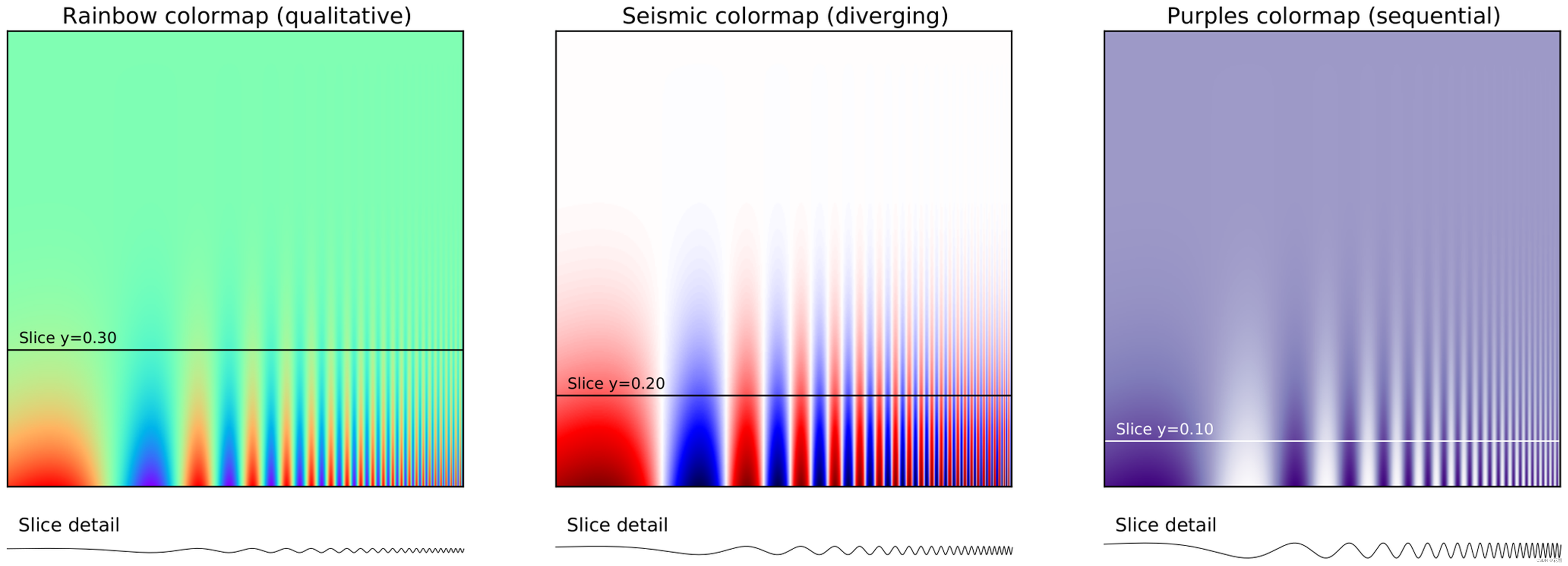
Figure 5. Use color effectively. https://doi.org/10.1371/journal.pcbi.1003833.g005
This figure represents the same signal, whose frequency increases to the right and intensity increases towards the bottom, using three different colormaps. The rainbow colormap (qualitative) and the seismic colormap (diverging) are equally bad for such a signal because they tend to hide details in the high frequency domain (bottom-right part). Using a sequential colormap such as the purple one, it is easier to see details in the high frequency domain. Adapted from [5].
该图中的三张图像表示相同的信号,只是使用了三种不同的色卡,信号频率从左至右依次增大,信号强度从上至下依次增强。rainbow色卡(定性的)和seismic色卡(逐渐发散的)都不利于展示这样一个信号,因为这两种色卡会隐藏高频区域(右下方部分)的细节。使用sequential色卡(如紫色),更容易看到高频区域的细节。图像改编自文献[5]。
Rule 7: Do Not Mislead the Reader(不要误导读者)
What distinguishes a scientific figure from other graphical artwork is the presence of data that needs to be shown as objectively as possible. A scientific figure is, by definition, tied to the data (be it an experimental setup, a model, or some results) and if you loosen this tie, you may unintentionally project a different message than intended. However, representing results objectively is not always straightforward. For example, a number of implicit choices made by the library or software you’re using that are meant to be accurate in most situations may also mislead the viewer under certain circumstances. If your software automatically re-scales values, you might obtain an objective representation of the data (because title, labels, and ticks indicate clearly what is actually displayed) that is nonetheless visually misleading (see bar plot in Figure 6); you have inadvertently misled your readers into visually believing something that does not exist in your data. You can also make explicit choices that are wrong by design, such as using pie charts or 3-D charts to compare quantities. These two kinds of plots are known to induce an incorrect perception of quantities and it requires some expertise to use them properly. As a rule of thumb, make sure to always use the simplest type of plots that can convey your message and make sure to use labels, ticks, title, and the full range of values when relevant. Lastly, do not hesitate to ask colleagues about their interpretation of your figures.
科学图像与其他图像艺术品的区别在于,科学图像需要尽可能客观地呈现出数据。根据定义,科学图像与数据(无论是实验装置、模型还是某些结果)息息相关,如果你忽略这种联系,就可能会无意中表达出与预期不同的信息。然而,客观地表示结果并不总是简单直接的。例如,在大多数情况下,你使用的库或软件所做的一些默认设置都是准确的,但是在某些情况下也可能误导观众。如果你的软件自动重新缩放值,你可能会获得数据的客观表示(因为标题、标签和坐标轴刻度清楚地传达出实际显示的内容),但这在视觉上会产生误导(参见图6中的条形图);你无意中从视觉上误导了读者,使他们相信了数据中不存在的东西。你也许会做出明确但是在设计上是错误的选择,例如使用饼图或三维图来比较数量。这两种图会导致对量的错误认识,正确使用它们需要一些专业知识。根据经验,始终确保使用最简单的类型的绘图传达出你的信息,并使用相关的标签、刻度、标题和完整范围的值。最后,请询问你的同事对你所绘制的图像的理解。
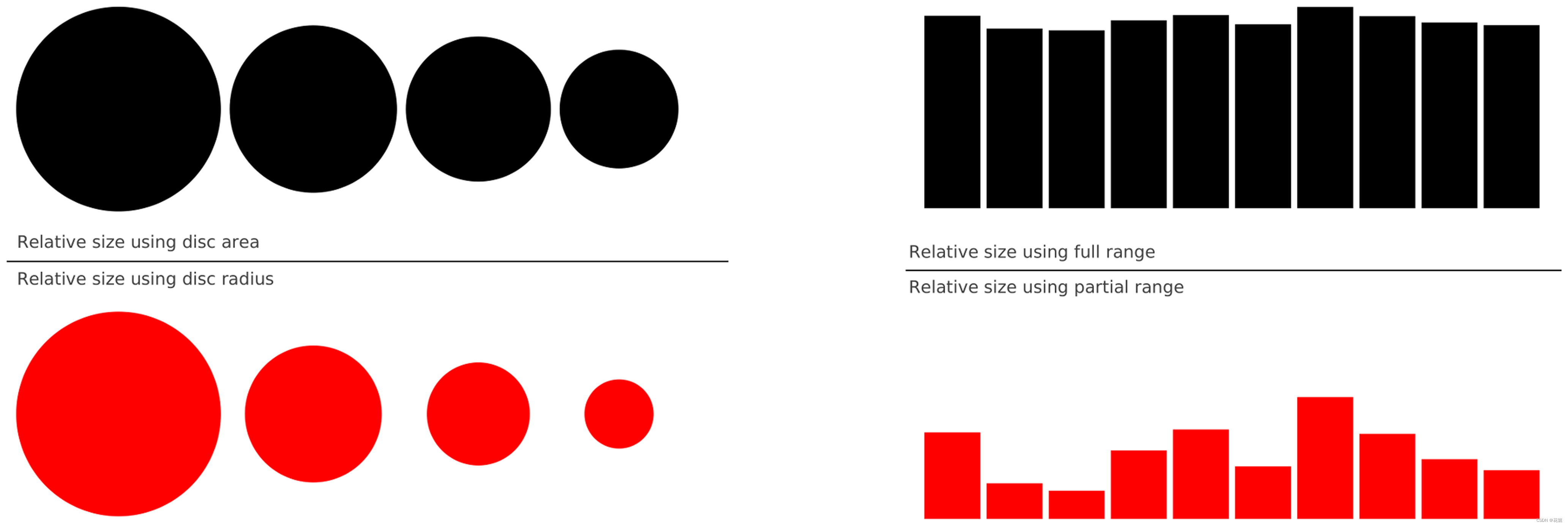
Figure 6. Do not mislead the reader. https://doi.org/10.1371/journal.pcbi.1003833.g006
On the left part of the figure, we represented a series of four values: 30, 20, 15, 10. On the upper left part, we used the disc area to represent the value, while in the bottom part we used the disc radius. Results are visually very different. In the latter case (red circles), the last value (10) appears very small compared to the first one (30), while the ratio between the two values is only 3∶1. This situation is actually very frequent in the literature because the command (or interface) used to produce circles or scatter plots (with varying point sizes) offers to use the radius as default to specify the disc size. It thus appears logical to use the value for the radius, but this is misleading. On the right part of the figure, we display a series of ten values using the full range for values on the top part (y axis goes from 0 to 100) or a partial range in the bottom part (y axis goes from 80 to 100), and we explicitly did not label the y-axis to enhance the confusion. The visual perception of the two series is totally different. In the top part (black series), we tend to interpret the values as very similar, while in the bottom part, we tend to believe there are significant differences. Even if we had used labels to indicate the actual range, the effect would persist because the bars are the most salient information on these figures.
在图像的左侧,我们表示了一系列的四个值:30、20、15、10。在左上部分,我们使用disc area来表示值,而在下部分使用disc radius来表示值得大小,结果在视觉上非常不同。在后一种情况下(红色圆圈),最后一个值(10)与第一个值(30)相比显得非常小,而两个值之间的比率仅为3∶1。这种情况实际上在文献中非常常见,因为用于生成圆或散点图(具有不同的点大小)的命令(或界面)提供使用半径作为默认值来指定disc大小。因此,使用半径值似乎合乎逻辑,但这会产生误导。在右上图和右下图中,我们使用全范围(y轴从0到100)或部分范围(y轴从80到100)显示了一系列十个值,我们明确地没有标记y轴以增强混淆。这两个系列的视觉感受完全不同。在顶部(黑色系列),我们倾向于将值解释为非常相似,而在底部,我们倾向于认为存在显著差异。即使我们使用标签来表示实际范围,这种影响也会持续下去,因为这些条形图是这些图像中最显著的信息。
Rule 8: Avoid “Chartjunk”(避免“图表垃圾”)
Chartjunk refers to all the unnecessary or confusing visual elements found in a figure that do not improve the message (in the best case) or add confusion (in the worst case). For example, chartjunk may include the use of too many colors, too many labels, gratuitously colored backgrounds, useless grid lines, etc. (see left part of Figure 7). The term was first coined by Edward Tutfe in [1], in which he argues that any decorations that do not tell the viewer something new must be banned: “Regardless of the cause, it is all non-data-ink or redundant data-ink, and it is often chartjunk.” Thus, in order to avoid chartjunk, try to save ink, or electrons in the computing era. Stephen Few reminds us in [7] that graphs should ideally “represent all the data that is needed to see and understand what’s meaningful.” However, an element that could be considered chartjunk in one figure can be justified in another. For example, the use of a background color in a regular plot is generally a bad idea because it does not bring useful information. However, in the right part of Figure 7, we use a gray background box to indicate the range [−1,+1] as described in the caption. If you’re in doubt, do not hesitate to consult the excellent blog of Kaiser Fung [8], which explains quite clearly the concept of chartjunk through the study of many examples.
图表垃圾是指在图像中所有不必要得或令人困惑的视觉元素,这些元素不利于传达信息(最好的情况下)或者只会增加混乱(最坏的情况下)。例如,图表垃圾可能包括使用太多的颜色、太多的标签、随意着色的背景、无用的网格线等(参见图7中左边的图像)。这个词最早由Edward Tutfe在[1]中提出,他认为任何不告诉观众新信息的装饰都必须被禁止:“无论原因如何,它都是non-data-ink或冗余的data-ink,通常是垃圾。” 因此,为了在计算时代尽量节省墨水或电子,应当尽量避免图表垃圾。Stephen Lew在文献[7]中提醒我们,理想情况下,图表应该“代表需要被看到的和理解有意义内容的所有数据”。然而,在一个图中可以被视为图表垃圾的元素可以在另一个图中被证明是合理的。例如,在常规绘图中使用背景色通常是一个坏主意,因为它不会带来有用的信息。然而,在图7的右半部分,正如标题所述,我们使用了一个灰色背景框来表示范围 [ − 1 , + 1 ] [−1,+1] [−1,+1]。如果你有疑问,请查阅冯的优秀博客(文献[8]),该博客通过研究许多例子,非常清楚地解释了图表垃圾的概念。
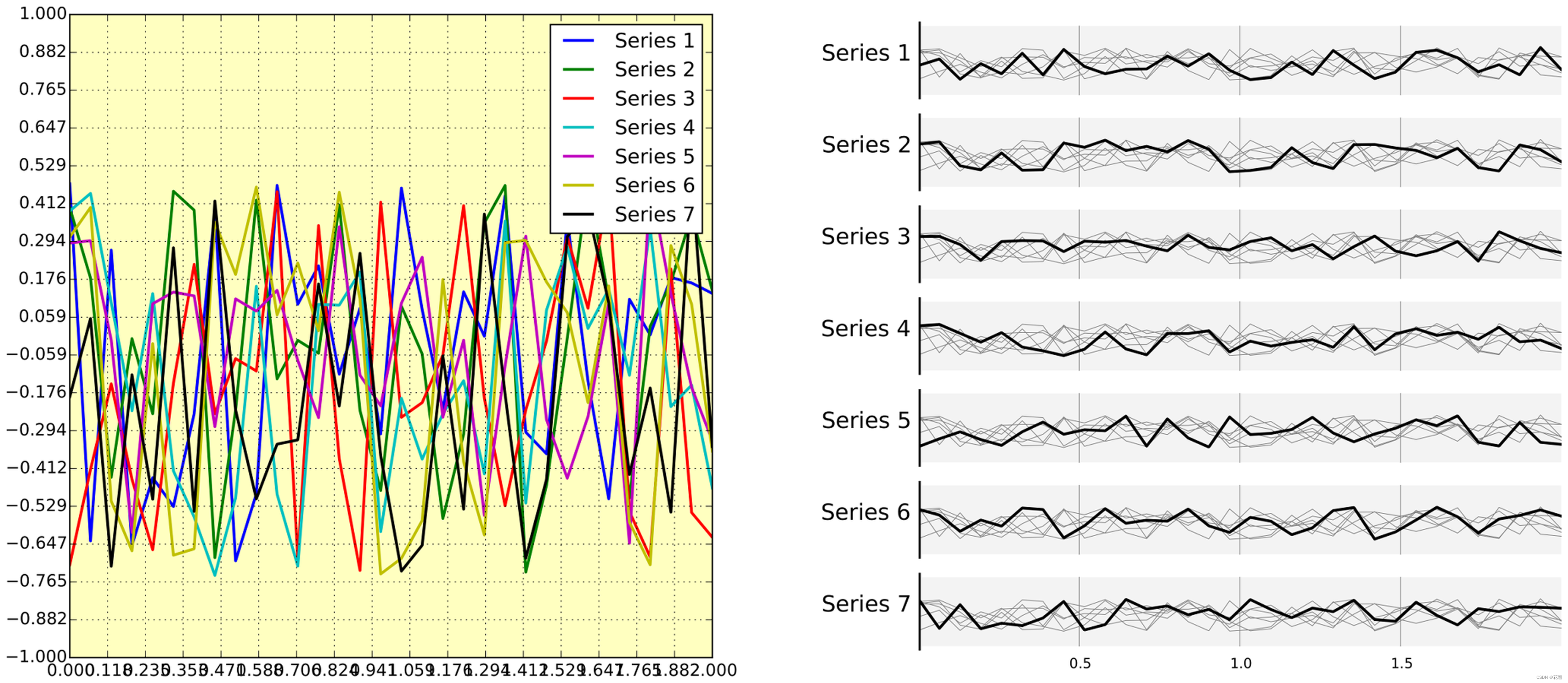
Figure 7. Avoid chartjunk. https://doi.org/10.1371/journal.pcbi.1003833.g007
We have seven series of samples that are equally important, and we would like to show them all in order to visually compare them (exact signal values are supposed to be given elsewhere). The left figure demonstrates what is certainly one of the worst possible designs. All the curves cover each other and the different colors (that have been badly and automatically chosen by the software) do not help to distinguish them. The legend box overlaps part of the graphic, making it impossible to check if there is any interesting information in this area. There are far too many ticks: x labels overlap each other, making them unreadable, and the three-digit precision does not seem to carry any significant information. Finally, the grid does not help because (among other criticisms) it is not aligned with the signal, which can be considered discrete given the small number of sample points. The right figure adopts a radically different layout while using the same area on the sheet of paper. Series have been split into seven plots, each of them showing one series, while other series are drawn very lightly behind the main one. Series labels have been put on the left of each plot, avoiding the use of colors and a legend box. The number of x ticks has been reduced to three, and a thin line indicates these three values for all plots. Finally, y ticks have been completely removed and the height of the gray background boxes indicate the [−1,+1] range (this should also be indicated in the figure caption if it were to be used in an article).
图7中我们有七个同样重要的信号样本,我们想展示它们,以便直观地比较它们(确切的信号值应该在别处给出)。左图展示了最糟糕的设计之一。所有曲线都相互覆盖,不同的颜色(还是软件的默认设置)无助于区分它们。图例框与图形的一部分重叠,因此无法检查该区域中是否有任何值得注意的信息。坐标轴刻度太多:x标签相互重叠,无法读取,三位数的精度似乎没有携带任何重要信息。最后,网格没有帮助,因为(除其他批评外)它没有与信号对齐,鉴于样本点数量较少,可以认为信号是离散的。右图采用了完全不同的布局,同时使用了纸张上的相同区域。该系列信号被分为七张绘图,每张绘图显示一个信号,而其他信号则在主系列后面轻轻绘制。信号的标签放在每张图像的左侧,避免使用颜色和图例框。x轴刻度的数量已减少到三个,一条细线表示所有绘图的这三个值。最后,y标签刻度已完全删除,灰色背景框的高度表示[−1,+1]范围(如果要在文章中使用,也应在图标题中注明)。
Rule 9: Message Trumps Beauty(信息胜过美观)
Figures have been used in scientific literature since antiquity. Over the years, a lot of progress has been made, and each scientific domain has developed its own set of best practices. It is important to know these standards, because they facilitate a more direct comparison between models, studies, or experiments. More importantly, they can help you to spot obvious errors in your results. However, most of the time, you may need to design a brand-new figure, because there is no standard way of describing your research. In such a case, browsing the scientific literature is a good starting point. If some article displays a stunning figure to introduce results similar to yours, you might want to try to adapt the figure for your own needs (note that we did not say copy; be careful with image copyright). If you turn to the web, you have to be very careful, because the frontiers between data visualization, infographics, design, and art are becoming thinner and thinner [9]. There exists a myriad of online graphics in which aesthetic is the first criterion and content comes in second place. Even if a lot of those graphics might be considered beautiful, most of them do not fit the scientific framework. Remember, in science, message and readability of the figure is the most important aspect while beauty is only an option, as dramatically shown in Figure 8.
自古以来,图像就被用于科学文献中,并且多年来,已经取得了很多进展,每个科学领域都发展出一套独特的最佳实践法则。了解这些标准很重要,因为它们有助于在模型、研究或实验之间进行更直接的比较。更重要的是,它们可以帮助你发现结果中的明显错误。然而,大多数时候,你可能需要设计一个全新的图像,因为没有已有的标准方式来描述你的研究。在这种情况下,浏览科学文献是一个很好的起点。如果某篇文章显示了一个惊人的图像来介绍与你类似的结果,你可能希望尝试根据自己的需要调整该图像(请注意,我们没有说复制;请注意图像版权)。如果你把目光转向网络,你必须非常小心,因为数据可视化、信息图形、设计和艺术之间的界限越来越窄[9]。存在着无数的在线图形,其中审美是第一标准,内容是第二位的。即使这些图形中有很多可能被认为是美丽的,但其中大多数并不符合科学框架。请记住,在科学中,图形的信息和可读性是最重要的方面,而美观只是一种选择,如图8所示。
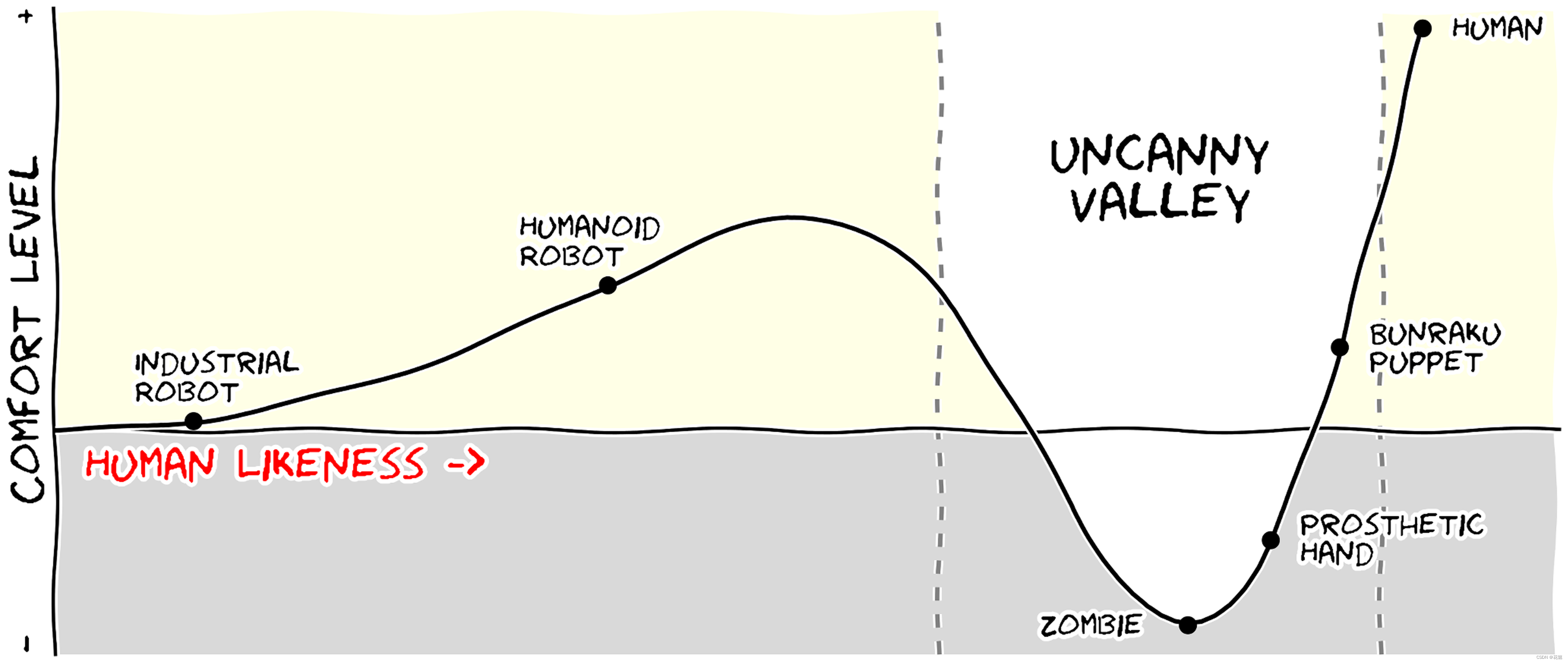
Figure 8. Message trumps beauty. https://doi.org/10.1371/journal.pcbi.1003833.g008
This figure is an extreme case where the message is particularly clear even if the aesthetic of the figure is questionable. The uncanny valley is a well-known hypothesis in the field of robotics that correlates our comfort level with the human-likeness of a robot. To express this hypothetical nature, hypothetical data were used ( y = x 2 − 5 e − 5 ( x − 2 ) 2 y=x^2-5e^{-5(x-2)^2} y=x2−5e−5(x−2)2) and the figure was given a sketched look (xkcd filter on matplotlib) associated with a cartoonish font that enhances the overall effect. Tick labels were also removed since only the overall shape of the curve matters. Using a sketch style conveys to the viewer that the data is approximate, and that it is the higher-level concepts rather than low-level details that are important [10].
这张图象是一个极端的情况,其中的信息是特别明确的,即使图像的美学是值得怀疑的。恐怖谷是机器人领域的一个众所周知的假设,它将我们的舒适度与机器人的人类相似性联系起来。为了表达这种假设性质,使用了函数 y = x 2 − 5 e − 5 ( x − 2 ) 2 y=x^2-5e ^{-5(x-2)^2} y=x2−5e−5(x−2)2生成了假设数据,并为图形提供了与卡通字体相关联的草图外观(matplotlib上的xkcd过滤器),以增强整体效果。坐标轴标签也被删除,因为只有曲线的整体形状才重要。使用草图样式可以向观众传达数据是近似的,重要的是更高层次的概念,而不是低层次的细节 [10]。
Rule 10: Get the Right Tool(使用合适的工具)
There exist many tools that can make your life easier when creating figures, and knowing a few of them can save you a lot of time. Depending on the type of visual you’re trying to create, there is generally a dedicated tool that will do what you’re trying to achieve. It is important to understand at this point that the software or library you’re using to make a visualization can be different from the software or library you’re using to conduct your research and/or analyze your data. You can always export data in order to use it in another tool. Whether drawing a graph, designing a schema of your experiment, or plotting some data, there are open-source tools for you. They’re just waiting to be found and used. Below is a small list of open-source tools.
有许多绘图工具可以让绘制图象的工作变得更轻松,了解其中的一些可以节省你很多时间。根据尝试创建的视觉类型,通常会有一个专用工具来完成你尝试实现的任务。在这一点上,重要的是要理解,你用于进行可视化的软件或库可能不同于你用于进行研究和/或分析数据的软件或库。你始终可以导出数据,在其他软件中使用。无论是绘制图形、设计实验模式还是绘制一些数据,都有一些开源工具可供你使用。它们就在那里,等待着你发现并使用。下面是一个开源工具的小列表。
Matplotlib is a python plotting library, primarily for 2-D plotting, but with some 3-D support, which produces publication-quality figures in a variety of hardcopy formats and interactive environments across platforms. It comes with a huge gallery of examples that cover virtually all scientific domains (http://matplotlib.org/gallery.html).
Matplotlib是一个python绘图库,主要用于二维绘图,但也支持一些三维图像的绘制,它能生成出版物质量的图像,这些图像可以是各种硬拷贝格式,也适应于跨平台的交互环境。它有一个巨大的示例库,几乎涵盖了所有科学领域。
R is a language and environment for statistical computing and graphics. R provides a wide variety of statistical (linear and nonlinear modeling, classical statistical tests, time-series analysis, classification, clustering, etc.) and graphical techniques, and is highly extensible.
R是一种用于统计计算和绘图的语言和环境。R提供了多种统计(线性和非线性建模、经典统计测试、时间序列分析、分类、聚类等)和图形技术,具有高度的可扩展性。
Inkscape is a professional vector graphics editor. It allows you to design complex figures and can be used, for example, to improve a script-generated figure or to read a PDF file in order to extract figures and transform them any way you like.
Inkscape是一款专业的矢量图形编辑器。它允许你设计复杂的图形,例如,可以用于改进脚本生成的图形,或者读取PDF文件以提取图像并以任何你希望的方式进行转换。
TikZ and PGF are TeX packages for creating graphics programmatically. TikZ is built on top of PGF and allows you to create sophisticated graphics in a rather intuitive and easy manner, as shown by the Tikz gallery (http://www.texample.net/tikz/examples/all/).
TikZ和PGF是用于以编程方式创建图像的TeX包。TikZ构建在PGF之上,允许相当直观和简单的方式创建复杂的图形,如TikZ示例库所示(http://www.texample.net/tikz/examples/all/)。
GIMP is the GNU Image Manipulation Program. It is an application for such tasks as photo retouching, image composition, and image authoring. If you need to quickly retouch an image or add some legends or labels, GIMP is the perfect tool.
GIMP是GNU图像处理程序。它是一个用于照片修饰、图像合成和图像创作等任务的应用程序。如果你需要快速润色图像或添加一些图例或标签,GIMP是一个完美的工具。
ImageMagick is a software suite to create, edit, compose, or convert bitmap images from the command line. It can be used to quickly convert an image into another format, and the huge script gallery (http://www.fmwconcepts.com/imagemagick/index.php) by Fred Weinhaus will provide virtually any effect you might want to achieve.
ImageMagick是一个软件套件,用于从命令行创建、编辑、合成或转换位图图像。它可以用于将图像快速转换为另一种格式,以及Fred Weinhaus提供的巨大的脚本库(http://www.fmwconcepts.com/imagemagick/index.php)几乎可以提供任何你想要达到的效果。
D3.js (or just D3 for Data-Driven Documents) is a JavaScript library that offers an easy way to create and control interactive data-based graphical forms which run in web browsers, as shown in the gallery at http://github.com/mbostock/d3/wiki/Gallery.
D3.js(或者只是数据驱动文档的D3)是一个JavaScript库,它提供了一种简单的方法来创建和控制在web浏览器中运行的基于数据的交互式图形表单,如下面的图库所示http://github.com/mbostock/d3/wiki/Gallery.
Cytoscape is a software platform for visualizing complex networks and integrating these with any type of attribute data. If your data or results are very complex, cytoscape may help you alleviate this complexity.
Cytoscape是一个用于可视化复杂网络并将其与任何类型属性的数据集成的软件平台。如果你的数据或结果非常复杂,cytoscape可能会帮助你减轻这种复杂性。
Circos was originally designed for visualizing genomic data but can create figures from data in any field. Circos is useful if you have data that describes relationships or multilayered annotations of one or more scales.
Circos最初是设计用于可视化基因组数据,但现在可以从任何领域的数据中创建图像。如果你有描述一个或多个比例的关系或多层注释的数据,Circos很有用。
Notes(注释)
All the figures for this article were produced using matplotlib, and figure scripts are available from https://github.com/rougier/ten-rules.
Reference(参考)
- Tufte EG (1983) The Visual Display of Quantitative Information. Cheshire, Connecticut: Graphics Press.
- Doumont JL (2009) Trees, maps, and theorems. Brussels: Principiae.
- Kosara R, Mackinlay J (2013) Storytelling: The next step for visualization. IEEE Comput 46: 44–50. View Article
- Rougier NP (2012) Scientific visualization and matplotlib tutorial. Euroscipy 2012 & 2013. Available: http://www.loria.fr/~rougier/teaching/matplotlib/matplotlib.html. Accessed 12 August 2014.
- Borland D, Taylor RM (2007) Rainbow color map (still) considered harmful. IEEE Comput Graph Appl 27: 14–17. View Article
- Okabe M, Ito K (2008). Color universal design (cud) - how to make figures and presentations that are friendly to colorblind people. Available: http://jfly.iam.u-tokyo.ac.jp/color/. Accessed 12 August 2014.
- Few S (2011) The chartjunk debate, a close examination of recent findings. Visual Business Intelligence Newsletter. Available: http://www.perceptualedge.com/articles/visual_business_intelligence/the_chartjunk_debate.pdf. Accessed 12 August 2014.
- Fung K (2005). Junk charts: Recycling chartjunk as junk art. Available: http://junkcharts.typepad.com. Accessed 12 August 2014.
- Borkin MA, Vo AA, Bylinskii Z, Isola P, Sunkavalli S, et al. (2013) What makes a visualization memorable? IEEE Trans Vis Comput Graph 19: 2306–2315.
View Article - Schumann J, Strothotte T, Raab A, Laser S (1996) Assessing the effect of non-photorealistic rendered images in cad. In: Proceedings of the SIGCHI Conference on Human Factors in Computing Systems; 13–18 April 1996; New York, New York, United States. CHI 96. New York: Association for Computing Machinery. pp.35–41.


 1261
1261

 被折叠的 条评论
为什么被折叠?
被折叠的 条评论
为什么被折叠?
 到【灌水乐园】发言


