


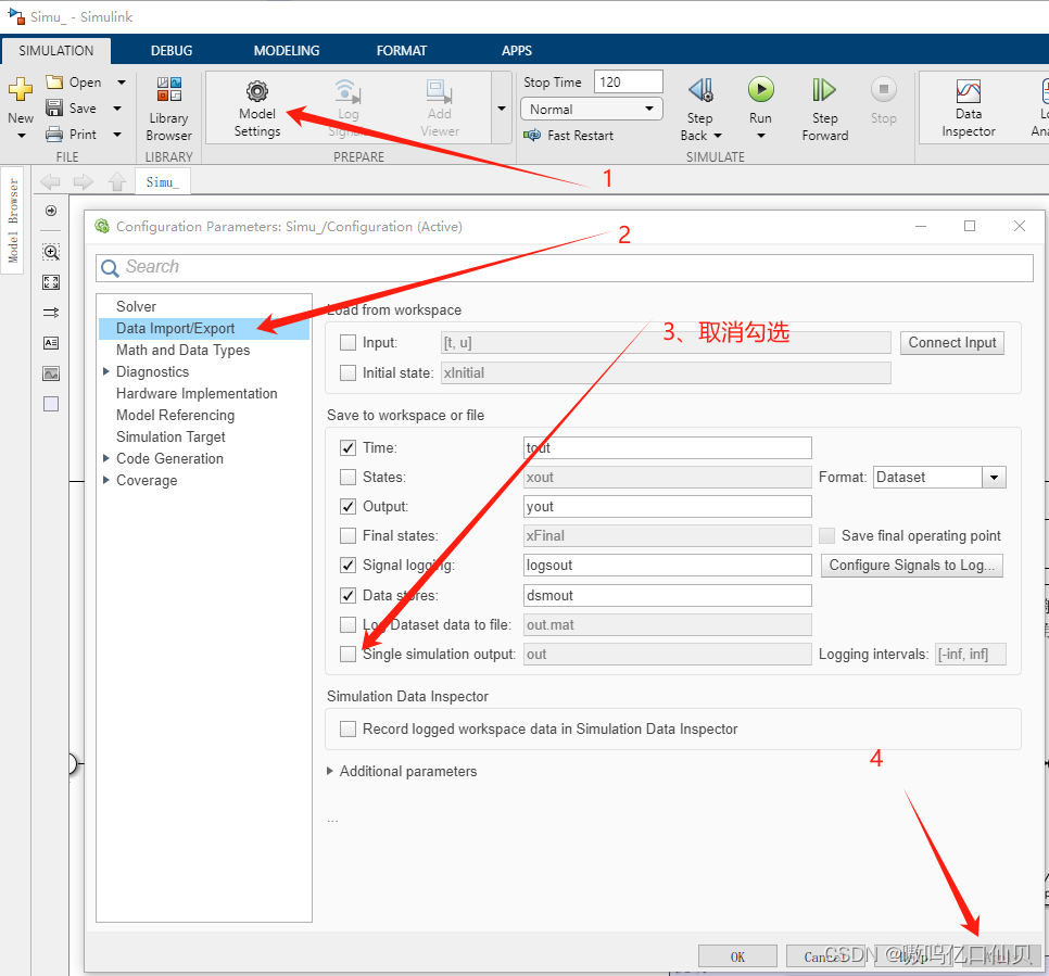
Simulink数据导入基础工作区
simulink中效果如下:
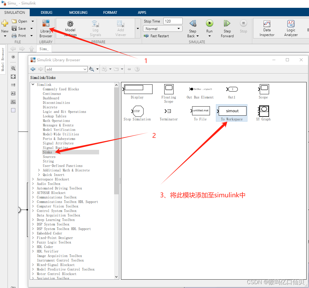
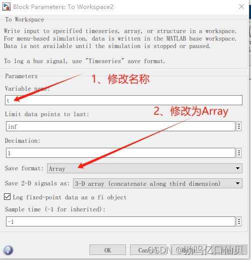
双击此模块
此时就能将需要绘图的信号通过to workspace模块输出到MATLAB的基础工作区了
MATLAB绘图命令
下面的代码为一个完整的绘图代码,能满足控制学科的大部分要求
flag = 0; % % flag = 0:不保存图

figure('Position', [500, 100, 700, 300]); % 建立图窗,并指定位置和大小 [x,y,宽,高]
set(gcf,'color','w'); % 设定图窗背景为白色
plot(x,y);   % 绘制线图
hold on;     % 保持,上一次绘图
plot(x1,y1); % 继续绘图
grid on;     % 打开网格
axis equal;         % 将横纵比例统一
axis([0 100 -9 9]); % 限定x范围和y范围 ,单独限制可用 ylim([-9 9]); xlim([0 100]);
legend([],{'实际值','期望值'});  % 图例
ylabel('角度/rad');          % y轴标签
xlabel('时间/s');
% 设置x轴和y轴的刻度标签, 一般不使用
% xticklabels([1 5 10]);
% yticklabels([-1 0 1]);
set(gca, 'Fontname', 'Times New Roman','FontSize',16,'linewidth',1,'Box','on');  % 设置新罗马字体,字号16,线宽1,边框打开

if flag
	fileName = "fig/uvr";  % 将图保存到本路径的fig文件夹中,名为uvr
	savefig       (gcf, fileName + '.fig');
	exportgraphics(gcf, fileName + '.eps');
	exportgraphics(gcf, fileName + '.pdf','ContentType', 'vector');
	exportgraphics(gcf, fileName + '.png', 'Resolution', 600);
	exportgraphics(gcf, fileName + '.emf','ContentType', 'vector');
	close();  % 关闭图窗
	disp('over!');
end
一些扩展
修改曲线、xy轴坐标和图例的属性
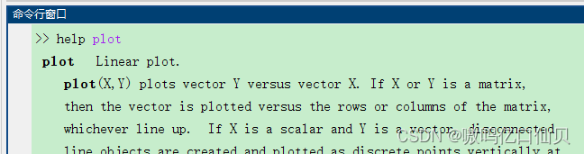
1、如果想深入学习绘图的一些操作,可以在命令区搜索help plot进行学习
2、属性一览
- plot属性:
'LineWidth'       % 线宽,默认为1
'Color'           % 线颜色,下面为默认的,也可用RGB颜色
	'y'  yellow
	'm'  magenta
	'c'  cyan
	'r'  red
	'g'  green
	'b'  blue
	'w'  white
	'k'  black
'LineStyle'       % 线形
	'-'	    Solid line (default)
	'--'	Dashed line
	':'	    Dotted line
	'-.'	Dash-dot line
'Marker'          % 标记
	'o'		Circle
	'+'		Plus sign
	'*'		Asterisk
	'.'		Point
	'x'		Cross
	's'		Square
	'd'		Diamond
	'^'		Upward-pointing triangle
	'v'		Downward-pointing triangle
	'>'		Right-pointing triangle
	'<'		Left-pointing triangle
	'p'		Pentagram
	'h'		Hexagram
举个栗子:
figure();
plot(x,y,  'LineWidth',1,  'Color','y',  'LineStyle','-');
- xy标签和图例属性
% % ----------------- 共 有 属 性 -----------------------
'FontSize'     % 字体大小,自己根据图窗大小进行设置,默认图窗大小12左右就行
'FontName'     % 字体样式名,可设置为 'Times New Roman'、'宋体' 等
'Interpreter'  % 字符解释器,分为tex,latex和none三类
	'tex'   — Interpret characters using a subset of TeX markup.
	'latex' — Interpret characters using LaTeX markup. (使用LaTeX标记对字符进行解释)
	'none'  — Display literal characters.
'FontWeight'   % 字体粗细设置,我没有用过,'bold'为加粗
'TextColor'    % 字体颜色设置,具体见plot属性

% % ----------------- 图 例 属 性 -----------------------
legend('boxoff');  % 关闭图例的box
'Location'         % 图例的位置
		'north'				Inside top of axes
		'south'				Inside bottom of axes
		'east'				Inside right of axes
		'west'				Inside left of axes
		'northeast'			Inside top-right of axes (default for 2-D axes)
		'northwest'			Inside top-left of axes
		'southeast'			Inside bottom-right of axes
		'southwest'			Inside bottom-left of axes
		'northoutside'		Above the axes
		'southoutside'		Below the axes
		'eastoutside'		To the right of the axes
		'westoutside'		To the left of the axes
		'northeastoutside'	Outside top-right corner of the axes (default for 3-D axes)
		'northwestoutside'	Outside top-left corner of the axes
		'southeastoutside'	Outside bottom-right corner of the axes
		'southwestoutside'	Outside bottom-left corner of the axes
		'best'				Inside axes where least conflict occurs with the plot data at the time that you create the legend. If the plot data changes, you might need to reset the location to 'best'.
		'bestoutside'		Outside top-right corner of the axes (when the legend has a vertical orientation) or below the axes (when the legend has a horizontal orientation)
		'none'				Determined by Position property. Use the Position property to display the legend in a custom location.
'NumColumns'    % 图例的列数
'Orientation'   % 图例为行或列
		'vertical'   — Stack the legend items vertically.将图例条目垂直堆叠(默认的)
		'horizontal' — List the legend items side-by-side.将图例一字排开
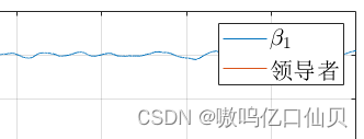
再举个栗子:
figure();
p1 = plot(x1,y1);
p2 = plot(x2,y2);
xlabel('$x[m]$','Interpreter','latex','FontSize',16);
legend([p1 p2],{'$\beta _1$','领导者'},'Interpreter','latex', 'FontSize',16);
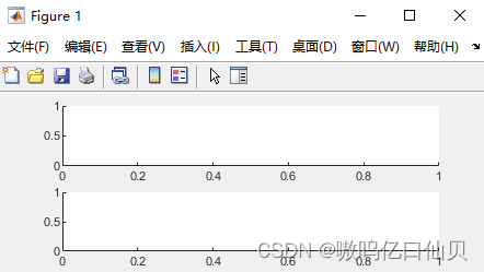
一图窗分多块绘图
figure();
subplot(2 1 1); % 将图窗分割成2行1列的两块,下面使用第一块
plot(x,y);      % 在第一块绘图
subplot(2 1 2); % 同理
plot(x1,y1);    % 在第二块绘图
效果如下:
在图窗对曲线进行局部放大
figure();
plot(x,y);  % 绘图代码

axes('Position', [0.5 0.5 0.4 0.4]); % 在图窗开辟一块新的区域用于绘制局部放大图,并指定位置和大小 [x,y,宽,高],四个值范围为0-1
plot(x,y);  % 绘制要放大的图的原图
axis([10 20 -3 3]); % 限定x范围和y范围, 此时就相当于对这部分进行放大
% 要是找不准区域的话,也可以用 xlim([10,20]); 这时放大了10-20的这块区域,y轴则自适应大小
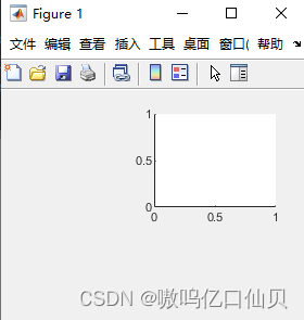
使用命令
figure();
axes(‘Position’, [0.5 0.5 0.4 0.4]);
效果如下,在图窗的 [0.5 0.5]处开辟了宽高均占0.4的新绘图区域
。


 6153
6153

 被折叠的 条评论
为什么被折叠?
被折叠的 条评论
为什么被折叠?
 到【灌水乐园】发言


