


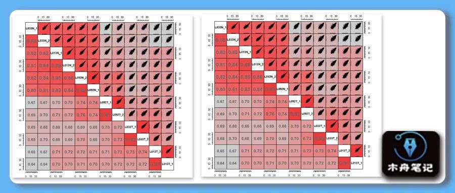
本期图片
❝Jiang, Y., Sun, A., Zhao, Y. et al. Proteomics identifies new therapeutic targets of early-stage hepatocellular carcinoma. Nature 「567」, 257–261 (2019). https://doi.org/10.1038/s41586-019-0987-8
❞
复现结果
示例数据和代码领取
木舟笔记永久VIP企划
「权益:」
「木舟笔记所有推文示例数据及代码(「在VIP群里」实时更新」)。

data+code 木舟笔记「科研交流群」。
「收费:」
「169¥/人」。可添加微信:mzbj0002 转账(或扫描下方二维码),或直接在文末打赏。木舟笔记「2022VIP」可直接支付「70¥」升级。
❝❞
点赞、在看本文,分享至朋友圈集赞30个并保留30分钟,可优惠20¥。

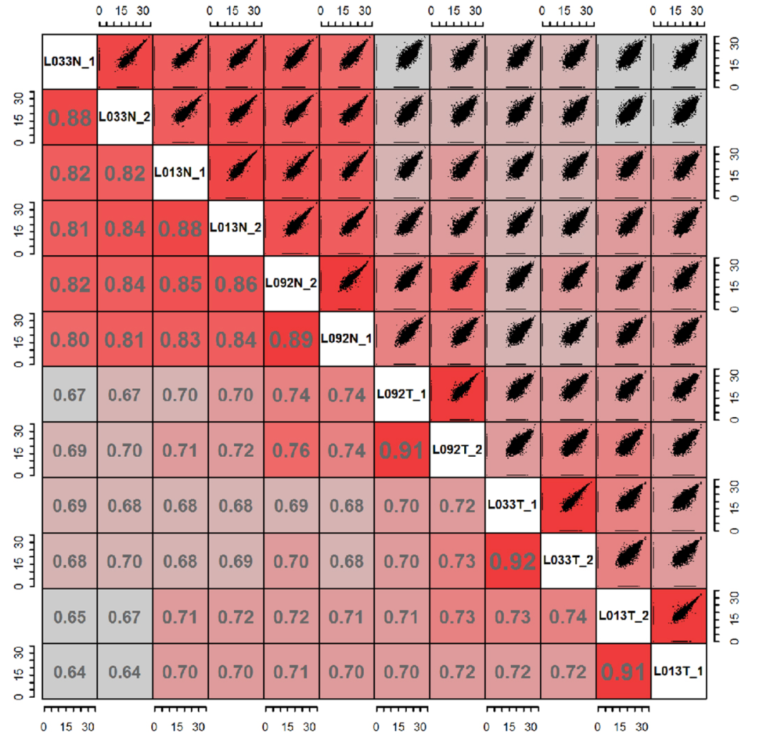
绘图
法一是用corrgram包内的pairs函数实现,包内没有纯色填充方式需要设置自定义函数。
setwd(dir = 'F:/MZBJ/Corrplot')
df = read.csv('sample_data.csv', row.names = 1)
df = log(df+1)
library(corrgram)
pairs(df)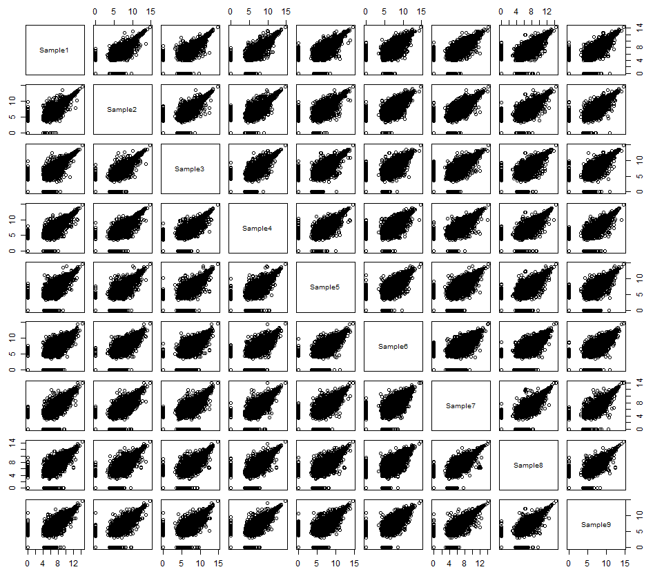
默认格式绘制已经接近了接下来我们自定义panel函数来绘制上下两部分
panel.fill<- function(x, y, digits = 2, prefix = "",col = "red", cex.cor, ...)
{
  par(usr = c(0, 1, 0, 1))#设置panel大小
  r <- abs(cor(x, y))#计算相关性,此处使用的绝对值
  txt <- format(r, digits = digits)[1]#相关性洗漱保留两位小数
  col <- colorRampPalette(c("grey",'grey','grey', 'red'))(100)#生成一组色阶用于相关性系数映射
  rect(0, 0, 1, 1, col = col[ceiling(r * 100)])#按相关性系数值从色阶中提取颜色
  text(0.5, 0.5, txt, cex = 1.5,col = '#77787b', font = 2 )#设置文本格式
}


pairs(df,
      lower.panel = panel.fill,
      gap = 0)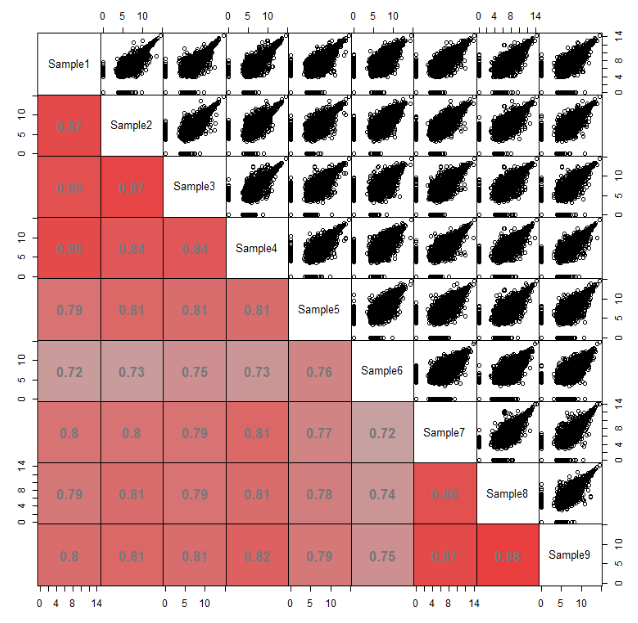
panel.point <- function(x, y, ...){
  r <- abs(cor(x, y))
  col <- colorRampPalette(c("grey",'grey','grey', 'red'))(100)
  rect(par("usr")[1], par("usr")[3], par("usr")[2], par("usr")[4], #将panel范围填充为对应颜色
       col = col[ceiling(r * 100)],lwd = 2)
  plot.xy(xy.coords(x, y), type = "p", #绘制散点图
          pch = 20,
          cex = .2,
          ...)
}

pairs(df,
      upper.panel = panel.point,
      lower.panel = panel.fill,
      gap = 0)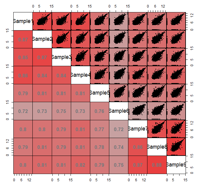
text.panel <- function(x, y, txt, cex, ...)
{ text(x, y, txt, cex = cex, font = 2)
  box(lwd = 1)
}

pairs(df,
      upper.panel = panel.point,
      lower.panel = panel.fill,
      text.panel = text.panel,
      gap = 0)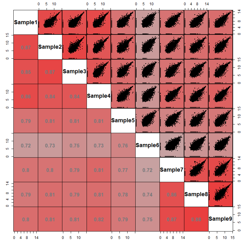
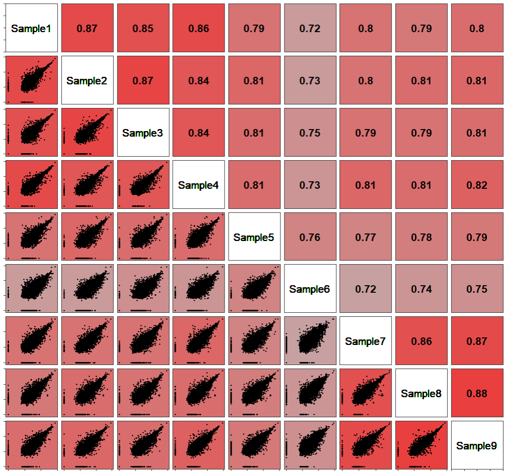
法二是尝试用GGally包来实现一下,ggplot的语法相对来说更易读。实现直接绘制一下看看是什么情况。
library(GGally)
library(ggplot2)
ggpairs(df,1:4)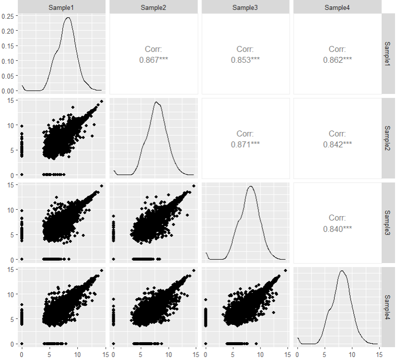
先绘制上三角部分
GGup <- function(data, mapping, ...,
                 method = "pearson") {

  x <- GGally::eval_data_col(data, mapping$x)#提取x,y值
  y <- GGally::eval_data_col(data, mapping$y)

  cor <- cor(x, y, method = method, use="pairwise.complete.obs")#计算相关系数
  df <- data.frame(x = x, y = y)
  df <- na.omit(df)
  col <- colorRampPalette(c("grey",'grey','grey', 'red'))(100) #生成色阶以便后面映射提取

  cor_col = col[ceiling(cor * 100)]#按照相关系数来提取色阶中的颜色
  pp <- ggplot(df) +
    geom_text(data = data.frame(
      xlabel = min(x,na.rm = T),
      ylabel = min(y,na.rm = T),
      labs = round(cor,2)),
      aes(x = xlabel, y = ylabel, label = labs),
      size = 10,
      fontface = "bold",
      inherit.aes = FALSE
    )+
    theme_bw()+
    theme(panel.background = element_rect(fill =  cor_col))
  return(pp)
}
ggpairs(df, 1:4, upper = list(continuous = wrap(GGup)))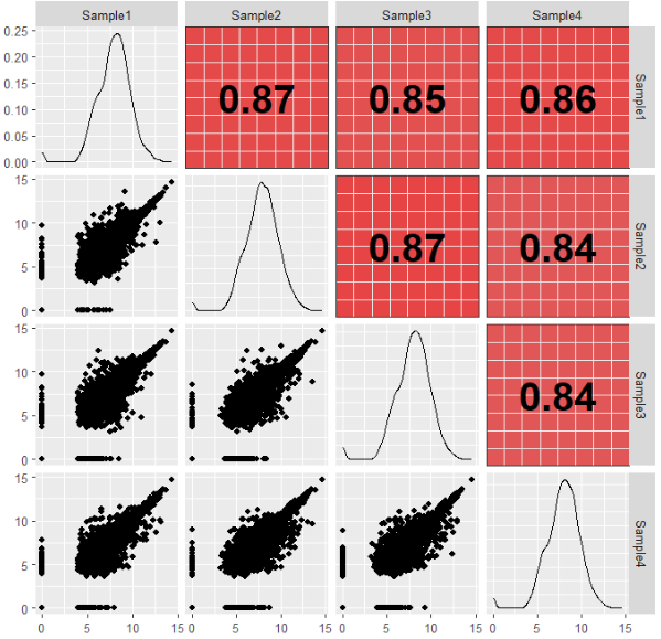
然后是下三角
GGdown <- function(data, mapping, ...,
                   method = "pearson") {
  x <- GGally::eval_data_col(data, mapping$x)
  y <- GGally::eval_data_col(data, mapping$y)
  col <- colorRampPalette(c("grey",'grey','grey', 'red'))(100)
  cor <- cor(x, y, method = method, use="pairwise.complete.obs")
  cor_col = col[ceiling(cor * 100)]

  df <- data.frame(x = x, y = y)
  df <- na.omit(df)

  pp <- ggplot(df, aes(x=x, y=y)) +
    ggplot2::geom_point( show.legend = FALSE, size = 1) +
    theme_bw()+
    theme(panel.background = element_rect(fill =  cor_col))
  return(pp)
}

ggpairs(df, 1:4,
        upper = list(continuous = wrap(GGup)),
        lower = list(continuous = wrap(GGdown)))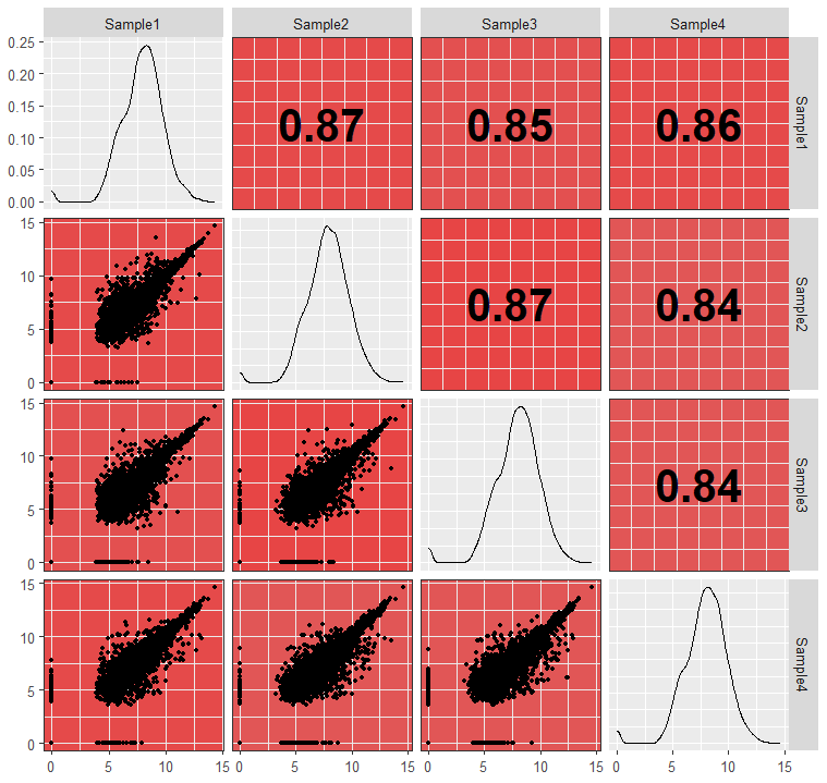
最后是对角线注释
GGdiag = function(data, mapping, ...){
  name= deparse(substitute(mapping))#提取出映射变量名(并非变量名本身,可用性尝试一下不进行下一步)
  name = str_extract(name, "x = ~(.*?)\\)", 1)#对变量名进行处理提取出变量名
  ggplot(data = data) +
    geom_text(aes(x = 0.5, y = 0.5, label = name), size = 5)+
    theme_bw()+
    theme(panel.background = element_blank())#将变量名绘制于图中央
}


ggpairs(df, 1:4,
        upper = list(continuous = wrap(GGup)),
        lower = list(continuous = wrap(GGdown)),
        diag = list(continuous = wrap(GGdiag)))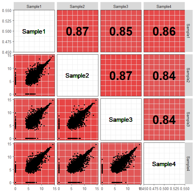
最后再调整一下风格,完成。
ggpairs(df,
        upper = list(continuous = wrap(GGup)),
        lower = list(continuous = wrap(GGdown)),
        diag = list(continuous = wrap(GGdiag)))+
  theme(panel.grid = element_blank(),
        axis.text =  element_blank(),
        strip.background = element_blank(),
        strip.text = element_blank())
往期内容


 1240
1240

 被折叠的 条评论
为什么被折叠?
被折叠的 条评论
为什么被折叠?
 到【灌水乐园】发言


