


1 什么是Matplotlib
\qquad Matplotlib 是一个 Python 的 2D绘图库。通过 Matplotlib,开发者可以仅需要几行代码,便可以生成绘图,直方图,功率谱,条形图,错误图,散点图等。官网https://matplotlib.org/
\qquad 学习Matplotlib 可让数据可视化,更直观的真实给用户。使数据更加客观、更具有说服力。Matplotlib是Python的库,又是开发中常用的库
1.1 Matplotlib的安装
pip install matplotlib
1.2 Matplotlib的基本使用
\qquad 在使用Matplotlib绘制图形时,其中有两个最为常用的场景。一个是画点,一个是画线。pyplot基本方法的使用如下表。
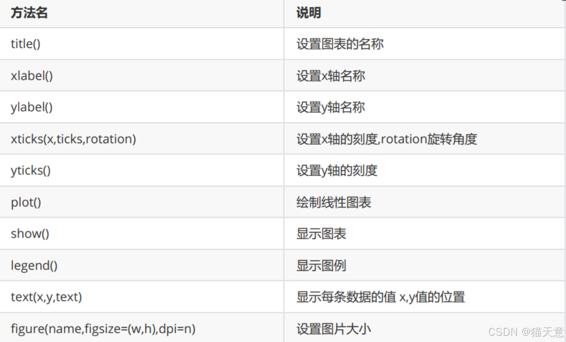
2 绘制直线
import matplotlib.pyplot as plt

# 将(0,1)点和(2,4)连起来
plt.plot([0, 2], [1, 4])
plt.show()
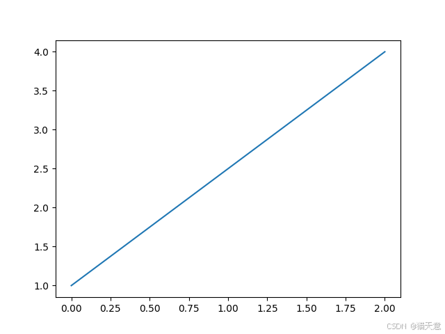
3 绘制折线
import matplotlib.pyplot as plt

x = [1, 2, 3, 4, 5]
squares = [1, 14, 39, 16, 25]
plt.plot(x, squares)
plt.show()
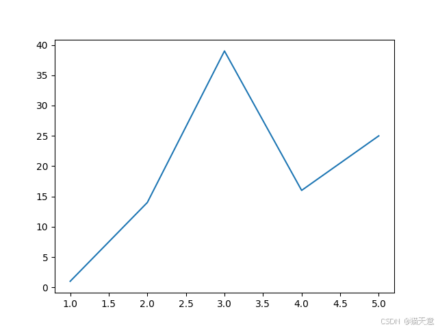
设置标签文字和线条粗细
import matplotlib.pyplot as plt
datas = [1, 2, 3, 4, 5]
squares = [1, 14, 39, 16, 25]
plt.plot(datas,squares,linewidth=5) #设置线条宽度
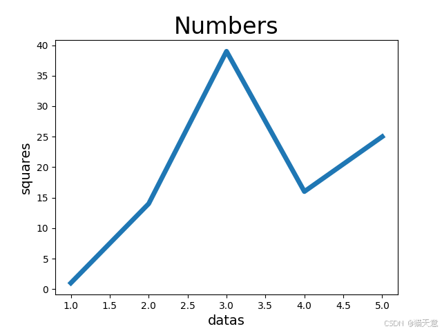
#设置图标标题,并在坐标轴上添加标签
plt.title('Numbers',fontsize=24)
plt.xlabel('datas',fontsize=14)
plt.ylabel('squares',fontsize=14)
plt.show()
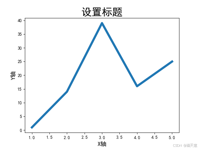
设置中文标题
Matplotlib 默认情况不支持中文,我们可以使用以下简单的方法来解决:
import matplotlib.pyplot as plt

# 准备数据
datas = [1, 2, 3, 4, 5]
squares = [1, 14, 39, 16, 25]
# 注意x和squares列表中元素个数要相同
plt.plot(datas, squares, linewidth=5)  # 设置线条宽度
plt.rcParams['font.sans-serif'] = ['SimHei']  # 用来正常显示中文标签
# 添加标题
plt.title('设置标题', fontsize=24)
# x轴添加标签
plt.xlabel('X轴', fontsize=14)
# y轴添加标签
plt.ylabel('Y轴', fontsize=14)
# 显示图形
plt.show()
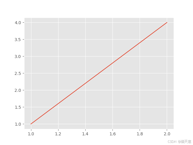
风格的设置
import matplotlib.pyplot as plt

# 查看matplotlib中有哪些风格
# print(plt.style.available)

# 设置风格
plt.style.use('ggplot')
plt.plot([1, 2], [1, 4])
plt.show()
某周最高温度和最低温度变化
import matplotlib.pyplot as plt

# 构造数据
max_temperature = [26, 30, 31, 32, 33]
min_temperature = [12, 16, 16, 17, 18]
x = range(5)
plt.rcParams['font.family'] = ['SimHei']
x_ticks = ['星期{}'.format(i) for i in
           range(1, 6)]
plt.title('某年某周第N周的温度')
plt.xlabel('周')
plt.ylabel('温度:单位(℃)')
# 设置x轴标签
plt.xticks(x, x_ticks)
# 填充数据
plt.plot(x, max_temperature, label='最高温')
plt.plot(x, min_temperature, label='最低温')
# 显示图例
plt.legend(loc=2)
plt.show()

4 绘制曲线
绘制曲线y=x^2
Matplotlib有很多函数用于绘制各种图形,其中plot函数用于曲线, 需要将200个点的x坐标和Y坐标分别以序列的形式传入plot函数,然后调用show函数显示绘制的图形。
【示例】一元二次方程的曲线
import matplotlib.pyplot as plt

# 准备数据 x是200个点
x = range(-100, 100)
# y = x**2
y = [i ** 2 for i in x]
# 设置风格
plt.style.use('ggplot')
# 调用plot
plt.plot(x, y)
# 保存图片
plt.savefig('y=x的平方.jpg')
plt.show()
 最低0.47元/天 解锁文章


 46
46

 被折叠的 条评论
为什么被折叠?
被折叠的 条评论
为什么被折叠?
 到【灌水乐园】发言


