


原创 IT小本本 IT小本本 2025年04月02日 20:15 北京
销售数据BI动态分析仪表板
本文将通过一个完整的代码示例,展示如何使用 Python 的 Pandas 和 Plotly 库构建一个动态销售数据仪表板。这个仪表板将帮助我们从多个维度分析销售数据,包括销售额、利润、客户数、地区和产品类别的分布情况。
1. 数据准备
首先,客户提供了一张类似下列的excel。为了确保数据的可重复性,我们使用固定的随机种子来生成数据。
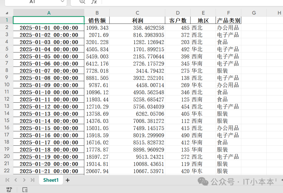
数据包括销售额、利润、客户数、地区和产品类别等字段,并以日期为索引。
2. 数据保存与读取
为了方便后续的分析,我们将读取 Excel 数据。
excel_filename = 'sales_data2.xlsx'
df.to_excel(excel_filename)
print(f"数据已保存到 {excel_filename}")

# 从 Excel 文件读取数据
if os.path.exists(excel_filename):
    print(f"正在从 {excel_filename} 读取数据...")
    df = pd.read_excel(excel_filename, index_col=0)
    df.index = pd.to_datetime(df.index)
    print("数据读取成功!")
else:
    print(f"错误:{excel_filename} 文件不存在")
3. 创建交互式图表
3.1 销售额和利润趋势分析
我们使用折线图来展示销售额和利润随时间的变化趋势。
import plotly.express as px
import plotly.graph_objects as go
from plotly.subplots import make_subplots
import plotly.io as pio

pio.templates.default = "plotly_dark"

fig1 = px.line(df, x=df.index, y=['销售额', '利润'],
              title='销售额和利润趋势分析',
              labels={'value': '金额(元)', 'variable': '指标类型'},
              line_shape='spline', render_mode='svg')
fig1.update_layout(hovermode='x unified')
fig1.update_xaxes(tickformat='%Y-%m')
3.2 月度销售和利润对比
我们使用柱状图来展示月度销售额和利润的对比。
monthly_data = df.resample('ME').sum()
fig2 = px.bar(monthly_data, x=monthly_data.index, y=['销售额', '利润'],
              title='月度销售额和利润对比',
              barmode='group',
              labels={'value': '金额(元)', 'variable': '指标类型'})
fig2.update_layout(xaxis_tickformat='%Y-%m')
3.3 地区-产品类别销售额热力图
我们使用热力图来展示不同地区和产品类别的销售额分布。
pivot_data = df.pivot_table(index='地区', columns='产品类别', values='销售额', aggfunc='sum')
fig4 = px.imshow(pivot_data, text_auto=True, aspect='auto',
                title='地区-产品类别销售额热力图',
                labels=dict(x='产品类别', y='地区', color='销售额'))
3.4 各产品类别销售额占比
我们使用饼图来展示各产品类别的销售额占比。
category_sales = df.groupby('产品类别')['销售额'].sum().reset_index()
fig5 = px.pie(category_sales, values='销售额', names='产品类别',
             title='各产品类别销售额占比',
             hole=0.4)
3.5 各地区销售额走势
我们使用动态折线图来展示各地区的销售额走势。
fig6 = go.Figure()
for region in df['地区'].unique():
    region_data = df[df['地区'] == region]
    fig6.add_trace(go.Scatter(
        x=region_data.index,
        y=region_data['销售额'],
        mode='lines',
        name=region,
        visible='legendonly' if region not in ['华东', '华南'] else True
    ))
fig6.update_layout(title='各地区销售额走势', xaxis_title='日期', yaxis_title='销售额')
fig6.update_xaxes(tickformat='%Y-%m-%d')
3.6 各地区产品类别销售额雷达图
我们使用雷达图来展示各地区在不同产品类别上的销售额分布。
categories = df['产品类别'].unique()
region_category = df.groupby(['地区', '产品类别'])['销售额'].sum().unstack()
region_category = region_category.fillna(0)

fig7 = go.Figure()
for region in region_category.index:
    values = region_category.loc[region].values.tolist()
    values.append(values[0])
    fig7.add_trace(go.Scatterpolar(
        r=values,
        theta=list(categories) + [categories[0]],
        fill='toself',
        name=region
    ))
fig7.update_layout(
    polar=dict(
        radialaxis=dict(visible=True, range=[0, region_category.values.max() * 1.2]),
        angularaxis=dict(tickfont=dict(size=9))
    ),
    title='各地区产品类别销售额雷达图',
    margin=dict(l=30, r=30, t=50, b=30)
)
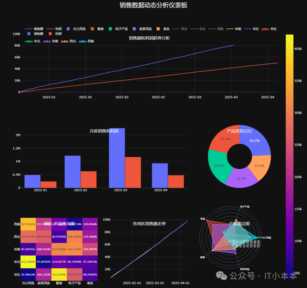
4. 构建仪表板
我们将上述图表组合成一个动态仪表板,以便于综合分析。
dashboard = make_subplots(
    rows=3, cols=3,
    specs=[
        [{"colspan": 3}, None, None],
        [{"colspan": 2}, None, {"type": "pie"}],
        [{"type": "heatmap"}, {"type": "scatter"}, {"type": "polar"}]
    ],
    subplot_titles=('销售额和利润趋势分析', '月度销售和利润', '产品类别占比',
                   '地区-产品热力图', '各地区销售额走势', '产品雷达图'),
    horizontal_spacing=0.05,
    vertical_spacing=0.12
)

# 添加图表数据
dashboard.add_trace(fig1.data[0], row=1, col=1)
dashboard.add_trace(fig1.data[1], row=1, col=1)
dashboard.add_trace(fig2.data[0], row=2, col=1)
dashboard.add_trace(fig2.data[1], row=2, col=1)
dashboard.add_trace(fig5.data[0], row=2, col=3)
dashboard.add_trace(fig4.data[0], row=3, col=1)

# 添加各地区销售额走势的所有线条
for trace in fig6.data:
    dashboard.add_trace(trace, row=3, col=2)

# 添加雷达图
for trace in fig7.data:
    dashboard.add_trace(trace, row=3, col=3)

# 更新布局
dashboard.update_layout(
    height=1050, width=1200,
    title_text="销售数据动态分析仪表板",
    title=dict(y=0.99, x=0.5, xanchor='center', yanchor='top', font=dict(size=24)),
    showlegend=True,
    legend=dict(orientation="h", yanchor="bottom", y=1.02, xanchor="right", x=1),
    margin=dict(t=100, b=20)
)

# 显示仪表板
dashboard.show()
5.最终效果
希望这篇文章能够帮助你更好地理解和应用 Plotly 进行数据分析和可视化!


 774
774

 被折叠的 条评论
为什么被折叠?
被折叠的 条评论
为什么被折叠?
 到【灌水乐园】发言


