


一、举个例子
总共有8个西瓜,有一个分类器,它的预测情况如下表
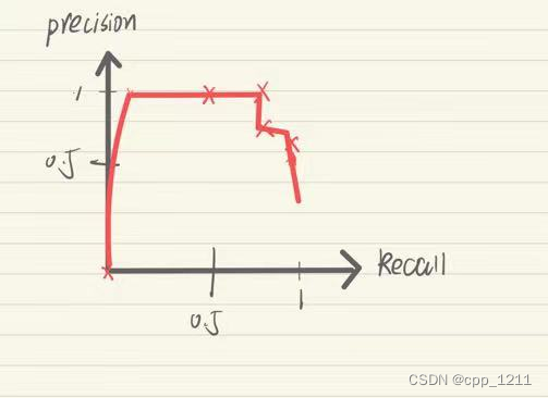
设置不同阈值时,将得到不同的P值(Precision,查准率)和R值(Recall,查全率)


二、解释
Precision-查准率-预测出来的正例中正确的比例---找得对
Recall-查全率-衡量正例被预测出来的比例---找得全
在机器学习中分类器往往输出的不是类别标号,而是属于某个类别的概率值,根据分类器的预测结果从大到小对样例进行排序,逐个把样例加入正例进行预测,算出此时的P、R值。

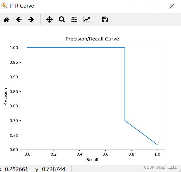
三、绘制pr图
模型训练好了之后,对于二分类问题,可以预测每个测试样本属于某个类别的概率。
当我们设置不同阈值时,将得到不同的P值(Precision,查准率)和R值(Recall,查全率)
基于此,可以绘制PR曲线,python绘制PR曲线比较方便。
首先,可以使用precision_recall_curve函数得import numpy as np import matplotlib.pyplot as plt from sklearn.metrics import precision_recall_curve import matplotlib.pyplot as plt import numpy as np from sklearn.metrics import precision_recall_curve plt.figure("P-R Curve") plt.title('Precision/Recall Curve') plt.xlabel('Recall') plt.ylabel('Precision') # y_true为样本实际的类别,y_scores为样本为正例的概率 # y_true = np.array([1, 1, 1, 1, 1, 0, 1, 1, 0, 1, 1, 1, 0, 0, 0, 0, 1, 0, 0, 0]) # y_scores = np.array( # [0.9, 0.75, 0.86, 0.47, 0.55, 0.56, 0.74, 0.62, 0.5, 0.86, 0.8, 0.47, 0.44, 0.67, 0.43, 0.4, 0.52, 0.4, 0.35, 0.1]) y_true = np.array([0, 0, 0, 1, 0, 1, 1, 1]) y_scores = np.array([0.1, 0.2, 0.3, 0.3, 0.6, 0.7, 0.8, 0.9]) precision, recall, thresholds = precision_recall_curve(y_true, y_scores) # print(precision) # print(recall) # print(thresholds) plt.plot(recall, precision) plt.show()


 4808
4808


 被折叠的 条评论
为什么被折叠?
被折叠的 条评论
为什么被折叠?
 到【灌水乐园】发言


