


四种基本布局
LinearLayout
线性布局,指的是要么垂直方向上布局,要么水平方向上布局。
由
android:orientation = "vettival"
android:orientation = "horizontal"这里要注意的点是:若排列方式为垂直,那么控件的高度边不能设置为match_parent,水平也一样的道理。
Android:layout_gravity是控件的对齐方式,与文本TestView不同,若排列方式为水平,则只能用垂直方向上的对其方式,垂直也是一样的道理。
android:layout_weight是比较重要的用法,按比例排列。
例子如下
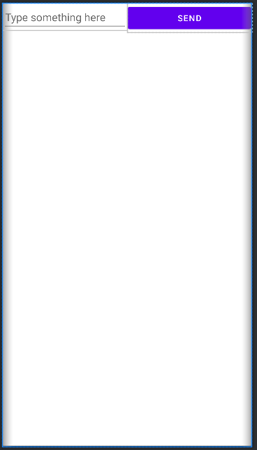
<EditText
    android:layout_width="0dp"
    android:layout_height="wrap_content"
    android:id="@+id/exitText"
    android:layout_weight="1"
    android:hint="Type something here"
    android:maxLines="2"
    />

    <Button
        android:layout_width="0dp"
        android:layout_height="wrap_content"
        android:layout_weight="1"
        android:id="@+id/button"
        android:text="send"
    />
这里宽度设置成0是因为已经按照比例占满了,因此不需要设置宽度,各自的比例是1:1,效果如图
还可以指定部分layout_weight的值来达到更好效果
<EditText
    android:layout_width="0dp"
    android:layout_height="wrap_content"
    android:id="@+id/exitText"
    android:layout_weight="1"
    android:hint="Type something here"
    android:maxLines="2"
    />

    <Button
        android:layout_width="wrap_content"
        android:layout_height="wrap_content"
        android:layout_weight="1"
        android:id="@+id/button"
        android:text="send"
    />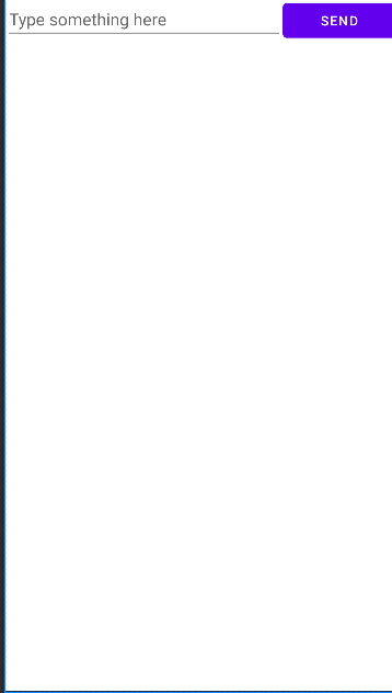
将button宽度改为自适应后,看起来更加美观。
RelativeLayout
相对布局,可以通过相对定位的方式让控件出现在布局的任何位置。
相对于父布局
<Button
    android:layout_width="wrap_content"
    android:layout_height="wrap_content"
    android:id="@+id/button1"
    android:layout_alignParentLeft="true"  //相对于父布局左对齐
    android:layout_alignParentTop="true"  //相对于父布局上对齐
    //合在一起就是左上角对齐
    android:text="Button 1"
    />
相对于控件
<Button
    android:id="@+id/button3"
    android:layout_width="wrap_content"
    android:layout_height="wrap_content"
    android:layout_centerInParent="true"
    android:text="Button 3" />
<Button
    android:layout_width="wrap_content"
    android:layout_height="wrap_content"
    android:id="@+id/button1"
    android:layout_above="@id/button3"  //让其位于控件3上面
    android:layout_toLeftOf="@id/button3"  //左边
    android:text="Button 1"
/>注意:当一个控件去引用另一个控件时,改控件一定要先定义,不然会找不到
还有其他定位
android:layout_alignLeft //让一个控件的左边缘和另一个控件的左边缘对齐其余的都是举一反三。
FrameLayout
帧布局,比较少用,功能也比较少,控件全部默认在左上角。
当然也可以通过gravity设置对齐。
ConstraintLayout
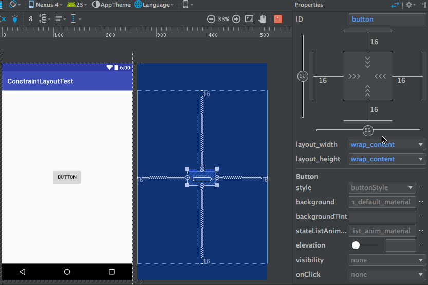
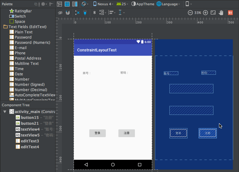
这个布局是2016年谷歌推出的,可视化布局。可以有效防止控件嵌套,接下来是一下基本操作.
添加约束
我们从菜单栏上拖动控件到屏幕上后,需要添加约束,不然控件不知道自己应该在什么位置。
添加约束非常简单,如图操作
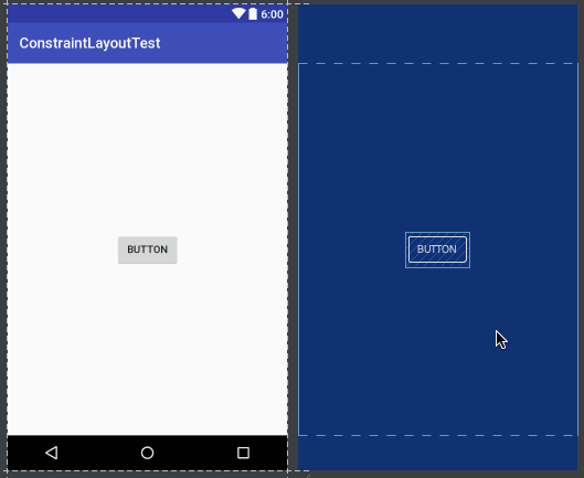
如上便添加右边和下边的约束。
控件之间的约束怎么添加呢?同样的方法
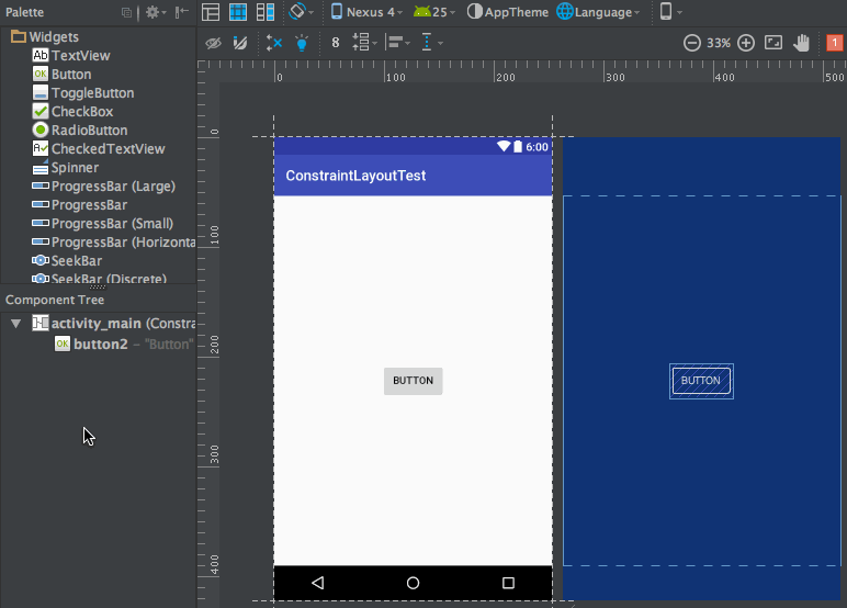
还可以调节控件之间的距离。
Inspector
点击旁边的Attributes
得到这么一个界面
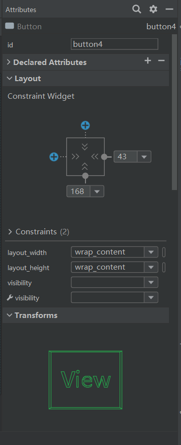
中间的正方形是用来控制控件的位置的。
如下
而上面的数字
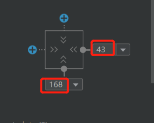
则是控制间距的,比如43,则是与右约束的距离。
在这里可以直接设置。
再来看一下正中间的这些符号
是用来控制控件大小的。
有三种符号
">>>" :这个是一般是默认,也就是我们熟悉的wrap_content

:是any size,会直接铺满约束布局,但是与match_parent不同, match_parent是匹配父布局,这个符号是匹配当前所在的约束布局。

:这个则是固定值,可以自己输入数据。
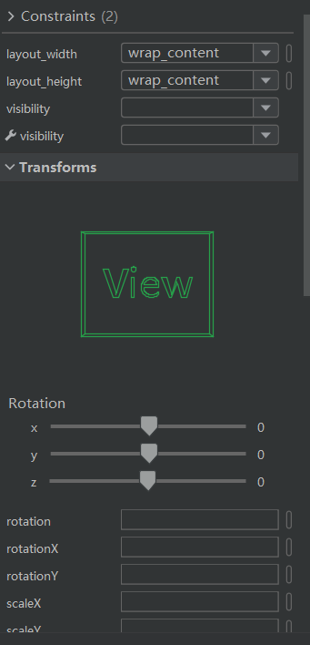
剩下的都是一眼可以知道干嘛用的,这里就不一一赘述。

Guidelines
可以认为是加一条线,控件可以在这条线上添加约束。
目前有两种Guidelines,一种是垂直方向上,一种是水平方向上。
一般用于控件添加约束。
自动添加约束
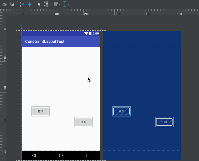
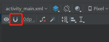
自动添加约束有两种方法,一种是Autoconnect
一般默认为关闭,开启后的效果如图
出现虚线即为控件添加约束。
另一种是infer Constraints,功能更加强大,能够一键生成约束。
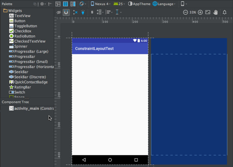
前提是我们需要将控件的位置差不多摆好先。
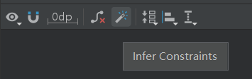
当我们将控件差不多摆好后,点击图标,便自动生成约束,十分方便。
图片与素材均来自文章 《最全面的ConstraintLayout教程》——郭霖
其余资料参考自《第一行代码》第三版——郭霖


 2499
2499


 被折叠的 条评论
为什么被折叠?
被折叠的 条评论
为什么被折叠?
 到【灌水乐园】发言


