


目录
一、项目整体流程
本项目实现了一个完整的机器学习项目,包含数据加载 → 数据分析 → 模型训练 → 结果评估 → 可视化展示的完整流程。最终目标是预测混凝土的抗压强度。

# coding:utf-8
import os
import pandas as pd
from sklearn.model_selection import train_test_split
from sklearn.ensemble import RandomForestRegressor
from sklearn.metrics import mean_squared_error, r2_score
import plotly.express as px
import plotly.graph_objects as go
# 创建输出目录
output_dir = "plotly_output"
os.makedirs(output_dir, exist_ok=True)
# 加载数据
url = "https://archive.ics.uci.edu/ml/machine-learning-databases/concrete/compressive/Concrete_Data.xls"
df = pd.read_excel(url, header=0)
df.columns = ['Cement', 'BlastFurnaceSlag', 'FlyAsh', 'Water', 'Superplasticizer',
'CoarseAggregate', 'FineAggregate', 'Age', 'CompressiveStrength']
# 数据保存
output_file = os.path.join(output_dir, "analysis_results.txt")
with open(output_file, 'w', encoding='utf-8') as f:
f.write("数据概览:\n")
df.head().to_string(buf=f)
f.write("\n\n数据描述:\n")
df.describe().to_string(buf=f)
# 目标变量分布可视化
fig_dist = px.histogram(df, x='CompressiveStrength',
nbins=30,
title='混凝土抗压强度分布',
labels={'CompressiveStrength': '抗压强度 (MPa)'},
color_discrete_sequence=['#FF6B6B'],
marginal='rug',
opacity=0.7)
fig_dist.update_layout(
font_family="SimSun, Times New Roman",
title_font_size=20,
xaxis_title_font_size=14,
yaxis_title_font_size=14,
template='plotly_white'
)
fig_dist.write_html(os.path.join(output_dir, 'strength_distribution.html'))
# 数据分割
X = df.drop('CompressiveStrength', axis=1)
y = df['CompressiveStrength']
X_train, X_test, y_train, y_test = train_test_split(X, y, test_size=0.2, random_state=42)
# 模型训练
model = RandomForestRegressor(n_estimators=100, random_state=42, max_depth=8, n_jobs=-1)
model.fit(X_train, y_train)
y_pred = model.predict(X_test)
# 评估结果保存
with open(output_file, 'a', encoding='utf-8') as f:
mse = mean_squared_error(y_test, y_pred)
r2 = r2_score(y_test, y_pred)
f.write(f"\n\n模型评估:\n均方误差(MSE): {mse:.2f}\n决定系数(R²): {r2:.2f}")
# 特征重要性可视化
importance_df = pd.DataFrame({
'特征': X.columns,
'重要性': model.feature_importances_
}).sort_values('重要性', ascending=True)
fig_importance = px.bar(importance_df,
x='重要性',
y='特征',
orientation='h',
title='特征重要性排序',
color='重要性',
color_continuous_scale='Viridis',
text_auto='.2f')
fig_importance.update_layout(
font_family="SimSun, Times New Roman",
title_font_size=20,
xaxis_title='重要性得分',
yaxis_title='',
height=500,
width=800,
template='plotly_white'
)
fig_importance.write_html(os.path.join(output_dir, 'feature_importance.html'))
# 预测结果对比可视化
fig_scatter = go.Figure()
fig_scatter.add_trace(go.Scatter(
x=y_test,
y=y_pred,
mode='markers',
marker=dict(
color='#4B9CD3',
size=8,
opacity=0.7,
line=dict(width=1, color='DarkSlateGrey')
),
name='预测值'
))
fig_scatter.add_trace(go.Scatter(
x=[y.min(), y.max()],
y=[y.min(), y.max()],
mode='lines',
line=dict(color='#FF6B6B', width=2, dash='dot'),
name='理想拟合线'
))
fig_scatter.update_layout(
title='实际值与预测值动态对比',
xaxis_title='实际抗压强度 (MPa)',
yaxis_title='预测抗压强度 (MPa)',
font=dict(family="SimSun, Times New Roman", size=12),
height=600,
width=800,
template='plotly_white'
)
fig_scatter.write_html(os.path.join(output_dir, 'prediction_comparison.html'))
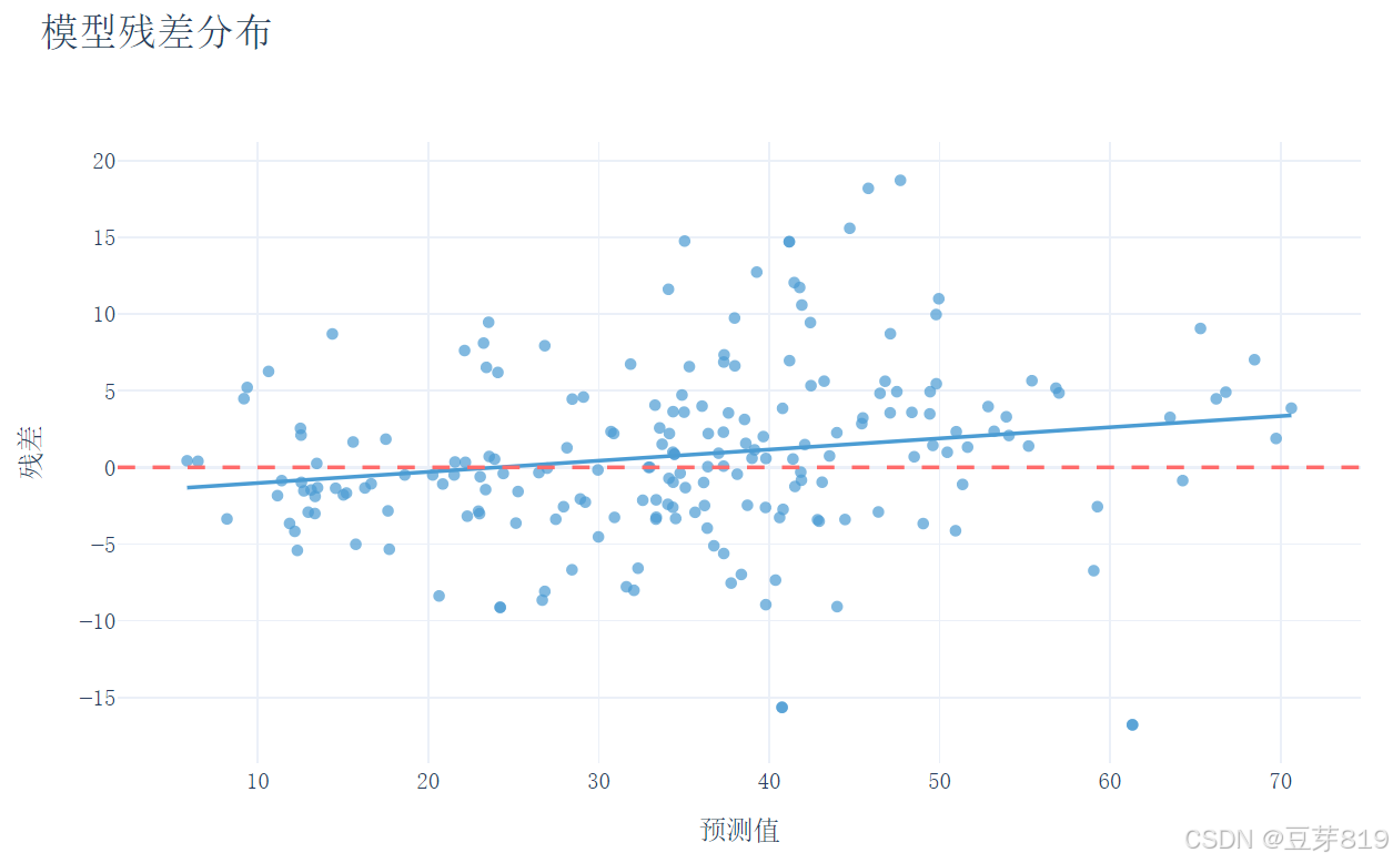
# 残差分析可视化
residuals = y_test - y_pred
fig_residual = px.scatter(
x=y_pred,
y=residuals,
trendline='ols',
labels={'x': '预测值', 'y': '残差'},
title='模型残差分布',
color_discrete_sequence=['#4B9CD3'],
opacity=0.7
)
fig_residual.add_hline(
y=0,
line_width=2,
line_dash="dash",
line_color="#FF6B6B"
)
fig_residual.update_layout(
font_family="SimSun, Times New Roman",
title_font_size=20,
xaxis_title_font_size=14,
yaxis_title_font_size=14,
height=500,
width=800,
template='plotly_white'
)
fig_residual.write_html(os.path.join(output_dir, 'residual_analysis.html'))
print(f"所有交互式可视化结果已保存至 {os.path.abspath(output_dir)} 目录")
二、代码模块解析
1. 准备工作
# 导入所需库
import os
import pandas as pd
from sklearn.model_selection import train_test_split
from sklearn.ensemble import RandomForestRegressor
from sklearn.metrics import mean_squared_error, r2_score
import plotly.express as px
import plotly.graph_objects as go

# 创建输出目录
output_dir = "plotly_output"
os.makedirs(output_dir, exist_ok=True)- 关键点:
os:用于操作系统相关功能(如创建文件夹)pandas:数据处理核心库sklearn:机器学习工具包(包含数据分割、模型、评估指标)plotly:交互式可视化库os.makedirs:创建保存结果的文件夹(exist_ok=True表示如果文件夹已存在不报错)
2. 数据加载与处理
# 加载数据
url = "https://archive.ics.uci.edu/ml/machine-learning-databases/concrete/compressive/Concrete_Data.xls"
df = pd.read_excel(url, header=0)
df.columns = ['Cement', 'BlastFurnaceSlag', 'FlyAsh', 'Water', 'Superplasticizer',
'CoarseAggregate', 'FineAggregate', 'Age', 'CompressiveStrength']- 关键点:
- 从网络地址读取Excel数据(实际工程中更常见的是CSV或数据库)
- 重命名列名:将原始列名改为易懂的英文名称
- 示例数据格式:
Cement Water Age CompressiveStrength 540 162 28 79.99
3. 数据探索与保存
# 保存数据概览
with open(output_file, 'w', encoding='utf-8') as f:
    f.write("数据概览:\n")
    df.head().to_string(buf=f)        # 保存前5行数据
    f.write("\n\n数据描述:\n")
df.describe().to_string(buf=f) # 保存统计描述- 关键函数:
df.head():显示数据前5行(默认)df.describe():生成统计信息(均值、标准差、分位数等)
- 输出示例:
CompressiveStrength
count    1030.00
mean       35.82
std        16.70
min         2.33
25%        23.71
...
4. 数据可视化(目标变量分布)
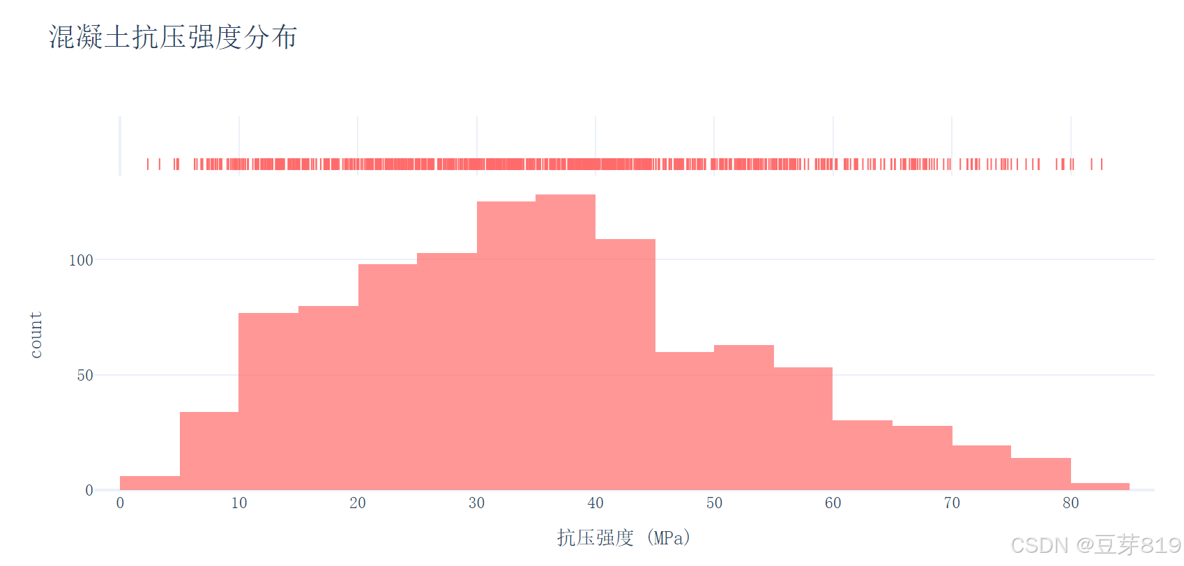
fig_dist = px.histogram(df, x='CompressiveStrength',
                       nbins=30,
                       title='混凝土抗压强度分布',
marginal='rug')- 可视化解读:
- 直方图(Histogram):显示抗压强度值的分布情况
- 边际地毯图(Rug Plot):在X轴上显示每个数据点的位置
- 作用:检查数据是否正态分布,是否存在异常值
5. 数据分割
X = df.drop('CompressiveStrength', axis=1)  # 特征矩阵
y = df['CompressiveStrength']               # 目标变量
X_train, X_test, y_train, y_test = train_test_split(X, y, test_size=0.2, random_state=42)- 关键参数:
test_size=0.2:20%数据作为测试集random_state=42:保证每次分割结果一致(便于复现)
- 数据维度示例:
- 原始数据:1030条样本
- 训练集:824条
- 测试集:206条
6. 模型训练(随机森林回归)
model = RandomForestRegressor(n_estimators=100, max_depth=8, n_jobs=-1)
model.fit(X_train, y_train)
y_pred = model.predict(X_test)- 参数解析:
n_estimators=100:使用100棵决策树max_depth=8:限制树的最大深度(防止过拟合)n_jobs=-1:使用全部CPU核心加速训练
- 类比理解:
- 随机森林就像多个专家共同决策,每个专家(决策树)从不同角度分析问题,最终综合所有意见得出结果
7. 模型评估
mse = mean_squared_error(y_test, y_pred)  # 均方误差
r2 = r2_score(y_test, y_pred) # 决定系数- 指标说明:
- MSE:预测值与真实值差的平方的均值(越小越好)
- R²:模型解释数据变化的能力(0-1之间,越大越好)
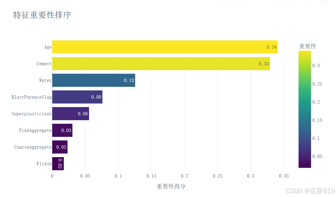
8. 特征重要性分析
importance_df = pd.DataFrame({
    '特征': X.columns,
    '重要性': model.feature_importances_
})- 实现原理:
- 通过计算每个特征在决策树中的分裂增益,评估其对预测结果的贡献度
- 典型结果:
特征 重要性 Cement 0.28 Age 0.22 Water 0.15 ... ...
9. 可视化分析
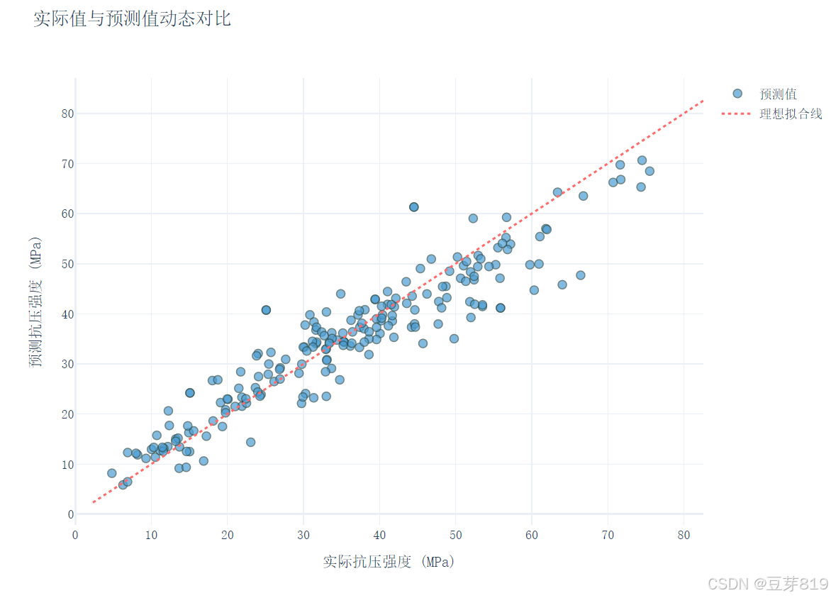
# 预测值对比图
fig_scatter.add_trace(go.Scatter(x=y_test, y=y_pred, mode='markers'))
fig_scatter.add_trace(go.Scatter(x=[y.min(), y.max()], y=[y.min(), y.max()]))

# 残差分析图
fig_residual = px.scatter(x=y_pred, y=residuals, trendline='ols')- 图形解读:
- 散点图:理想情况下点应分布在对角线附近
- 残差图:残差应随机分布在0线周围,无明显模式
三、代码解读
1. 导入必要的库
# coding:utf-8
import os
import pandas as pd
from sklearn.model_selection import train_test_split
from sklearn.ensemble import RandomForestRegressor
from sklearn.metrics import mean_squared_error, r2_score
import plotly.express as px
import plotly.graph_objects as go
# coding:utf-8:指定文件的编码格式为 UTF - 8。os:用于与操作系统交互,主要用于创建目录和文件路径操作。pandas:用于数据处理和分析,如读取数据、数据清洗等。train_test_split:从sklearn库导入,用于将数据集划分为训练集和测试集。RandomForestRegressor:随机森林回归模型,用于预测连续型变量。mean_squared_error和r2_score:用于评估回归模型的性能。plotly.express和plotly.graph_objects:用于创建交互式可视化图表。
2. 创建输出目录
# 创建输出目录
output_dir = "plotly_output"
os.makedirs(output_dir, exist_ok=True)
使用 os.makedirs 函数创建名为 plotly_output 的目录,exist_ok=True 表示如果目录已存在则不会抛出异常。
3. 加载数据
# 加载数据
url = "https://archive.ics.uci.edu/ml/machine-learning-databases/concrete/compressive/Concrete_Data.xls"
df = pd.read_excel(url, header=0)
df.columns = ['Cement', 'BlastFurnaceSlag', 'FlyAsh', 'Water', 'Superplasticizer',
              'CoarseAggregate', 'FineAggregate', 'Age', 'CompressiveStrength']
从指定的 URL 读取 Excel 格式的混凝土抗压强度数据,header=0 表示将第一行作为列名。然后为数据框的列设置自定义名称。
4. 数据保存
# 数据保存
output_file = os.path.join(output_dir, "analysis_results.txt")
with open(output_file, 'w', encoding='utf-8') as f:
    f.write("数据概览:\n")
    df.head().to_string(buf=f)
    f.write("\n\n数据描述:\n")
    df.describe().to_string(buf=f)
将数据的前几行和描述性统计信息保存到 plotly_output 目录下的 analysis_results.txt 文件中。
5. 目标变量分布可视化
# 目标变量分布可视化
fig_dist = px.histogram(df, x='CompressiveStrength',
                       nbins=30,
                       title='混凝土抗压强度分布',
                       labels={'CompressiveStrength': '抗压强度 (MPa)'},
                       color_discrete_sequence=['#FF6B6B'],
                       marginal='rug',
                       opacity=0.7)

fig_dist.update_layout(
    font_family="SimSun, Times New Roman",
    title_font_size=20,
    xaxis_title_font_size=14,
    yaxis_title_font_size=14,
    template='plotly_white'
)
fig_dist.write_html(os.path.join(output_dir, 'strength_distribution.html'))
使用 plotly.express 创建混凝土抗压强度的直方图,设置直方图的柱子数量、标题、标签等属性,然后更新图表布局,最后将图表保存为 HTML 文件。
6. 数据分割
# 数据分割
X = df.drop('CompressiveStrength', axis=1)
y = df['CompressiveStrength']
X_train, X_test, y_train, y_test = train_test_split(X, y, test_size=0.2, random_state=42)
将特征数据和目标变量分离,然后使用 train_test_split 函数将数据集按 80:20 的比例划分为训练集和测试集。
7. 模型训练与预测
# 模型训练
model = RandomForestRegressor(n_estimators=100, random_state=42, max_depth=8, n_jobs=-1)
model.fit(X_train, y_train)
y_pred = model.predict(X_test)
初始化一个随机森林回归模型,设置树的数量为 100,最大深度为 8,n_jobs=-1 表示使用所有可用的 CPU 核心进行训练。然后使用训练集数据训练模型,并对测试集进行预测。
8. 评估结果保存
# 评估结果保存
with open(output_file, 'a', encoding='utf-8') as f:
    mse = mean_squared_error(y_test, y_pred)
    r2 = r2_score(y_test, y_pred)
    f.write(f"\n\n模型评估:\n均方误差(MSE): {mse:.2f}\n决定系数(R²): {r2:.2f}")
计算模型的均方误差(MSE)和决定系数(R²),并将评估结果追加到之前创建的 analysis_results.txt 文件中。
9. 特征重要性可视化
# 特征重要性可视化
importance_df = pd.DataFrame({
    '特征': X.columns,
    '重要性': model.feature_importances_
}).sort_values('重要性', ascending=True)

fig_importance = px.bar(importance_df,
                        x='重要性',
                        y='特征',
                        orientation='h',
                        title='特征重要性排序',
                        color='重要性',
                        color_continuous_scale='Viridis',
                        text_auto='.2f')

fig_importance.update_layout(
    font_family="SimSun, Times New Roman",
    title_font_size=20,
    xaxis_title='重要性得分',
    yaxis_title='',
    height=500,
    width=800,
    template='plotly_white'
)
fig_importance.write_html(os.path.join(output_dir, 'feature_importance.html'))
计算每个特征的重要性,创建一个数据框并按重要性排序,然后使用 plotly.express 创建水平条形图展示特征重要性,最后将图表保存为 HTML 文件。
10. 预测结果对比可视化
# 预测结果对比可视化
fig_scatter = go.Figure()
fig_scatter.add_trace(go.Scatter(
    x=y_test,
    y=y_pred,
    mode='markers',
    marker=dict(
        color='#4B9CD3',
        size=8,
        opacity=0.7,
        line=dict(width=1, color='DarkSlateGrey')
    ),
    name='预测值'
))
fig_scatter.add_trace(go.Scatter(
    x=[y.min(), y.max()],
    y=[y.min(), y.max()],
    mode='lines',
    line=dict(color='#FF6B6B', width=2, dash='dot'),
    name='理想拟合线'
))

fig_scatter.update_layout(
    title='实际值与预测值动态对比',
    xaxis_title='实际抗压强度 (MPa)',
    yaxis_title='预测抗压强度 (MPa)',
    font=dict(family="SimSun, Times New Roman", size=12),
    height=600,
    width=800,
    template='plotly_white'
)
fig_scatter.write_html(os.path.join(output_dir, 'prediction_comparison.html'))
使用 plotly.graph_objects 创建散点图,展示实际值与预测值的对比,并添加一条理想拟合线,最后将图表保存为 HTML 文件。
11. 残差分析可视化
# 残差分析可视化
residuals = y_test - y_pred
fig_residual = px.scatter(
    x=y_pred,
    y=residuals,
    trendline='ols',
    labels={'x': '预测值', 'y': '残差'},
    title='模型残差分布',
    color_discrete_sequence=['#4B9CD3'],
    opacity=0.7
)

fig_residual.add_hline(
    y=0,
    line_width=2,
    line_dash="dash",
    line_color="#FF6B6B"
)

fig_residual.update_layout(
    font_family="SimSun, Times New Roman",
    title_font_size=20,
    xaxis_title_font_size=14,
    yaxis_title_font_size=14,
    height=500,
    width=800,
    template='plotly_white'
)
fig_residual.write_html(os.path.join(output_dir, 'residual_analysis.html'))
计算模型的残差,使用 plotly.express 创建散点图展示残差分布,并添加一条水平参考线,最后将图表保存为 HTML 文件。
四、思考
Q1:为什么要分割训练集和测试集?
A:防止模型在训练数据上表现过好(过拟合),无法适应新数据。
Q2:随机森林的树数量是不是越多越好?
A:并非如此,过多的树会导致计算资源浪费,通常100-500棵即可。
Q3:如何解释R²=0.85?
A:表示模型能解释85%的数据变化,剩下的15%由其他因素或噪声导致。
五、项目实战总结
一、项目核心流程
-
数据生命周期管理
完整实现了数据科学项目的标准流程:
数据获取 → 数据探索 → 模型构建 → 结果验证 → 知识沉淀
每个阶段产出明确(统计描述、可视化图表、评估指标),形成闭环验证 -
关键技术环节
- 数据理解:通过描述统计(均值、标准差)快速把握数据特征
- 模型选择:采用集成学习算法(随机森林),平衡预测性能与训练效率
- 验证方法:保留20%测试集保证模型泛化能力评估
- 结果解读:双重评估指标(MSE+R²)提供量化评判依据
-
工程化实践
- 自动创建输出目录,规范文件存储路径
- 使用
with open安全写入分析结果 - 参数化设置(random_state=42)保证结果可复现
二、关键学习收获
-
数据可视化思维
- 分布直方图揭示目标变量规律
- 特征重要性排序辅助业务决策
- 残差分析图诊断模型偏差
(示例:若残差呈现漏斗形,提示需要数据标准化处理)
-
机器学习核心概念
概念 本项目中的体现 现实意义 过拟合 设置max_depth=8控制树深度 避免模型死记硬背训练数据 特征工程 自动计算特征重要性 指导混凝土配比优化方向 交叉验证 通过测试集保留实现简易验证 预估模型在新数据上的表现 -
工程规范意识
- 模块化设计:数据处理、建模、可视化逻辑分离
- 文档完整性:分析结果.txt包含数据快照与评估指标
- 可视化交付:交互式HTML报告便于理解
三、项目扩展方向
-
模型优化
- 尝试梯度提升树(XGBoost)对比性能
- 加入特征交叉(如水泥用量×水灰比)
- 实施超参数网格搜索
-
工程增强
- 添加MLflow记录实验过程
- 构建Flask预测API接口
- 开发Streamlit交互式应用
-
业务应用
- 构建混凝土配比推荐系统
- 开发强度达标检测工具
- 建立材料成本优化模型
六、结语
本项目的核心价值在于展示了如何将机器学习理论转化为可落地的工程实践。通过标准化的流程设计、严谨的验证方法和直观的可视化呈现,构建了从数据到决策的完整链路。这种工程化思维正是企业级AI应用的基础,建议学习者在掌握技术细节的同时,特别注意培养文档规范、结果可解释性等工程素养,为向生产环境部署模型奠定基础。


 被折叠的 条评论
为什么被折叠?
被折叠的 条评论
为什么被折叠?
 到【灌水乐园】发言


