


详解第二组UI组件:TextView及其子类
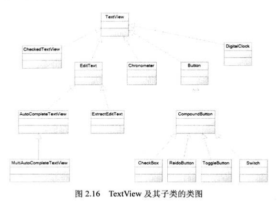
以下是TextView及其子类的层次结构:
TextView基本用法
TextView直接继承了View,它还是EditText和Button两个UI组件的子类。从功能上来看,TextView实质上就是一个可以编辑内容的文本框,只是Android关闭了它的文字编辑功能。(可以通过其子类EditView来进行文字编辑)。
关于TextView的详细特性可以参照其官方API。
以下通过一个具体的实例来说明介绍TextView以及CheckedTextView的用法:
不同颜色、字体、带链接的文本
首先设置字号为20pt,在文本框的结尾处绘制图片:
<TextView
    android:layout_width:"match_parent"
    android:layout_height:"wrap_content"
    android:text:"I love Android"
    android:textSize:"20pt"
    android:drawableEnd:"@drawable/picture"
接下来设置中间省略,并且所有字母都大写:
<TextView
        android:layout_width="wrap_content"
        android:layout_height="wrap_content"
        android:singleLine="true"
        android:text="@string/str2"
        android:ellipsize="middle"
        android:textAllCaps="true"/>
注意:
android:singleLine=”true” 表示的是设置该文本框为单行模式,其不会进行换行;
android:ellipsize=”none/middle/start/end/marquee” 表示的是当显示的文本超过了TextView的长度时处理文本内容的方式。none表示的是不对其进行任何处理,middle表示在文本中间处阶段并显示省略号,marquee表示使用marquee滚动动画显示文本;
android:textAllCaps=”true” 表示文本内容大写。
接着我们对邮件、电话增加链接:
<TextView
        android:layout_width="wrap_content"
        android:layout_height="wrap_content"
        android:text="@string/str3"
        android:autoLink="email|phone"/>
注意:
1. 我们一般将text文本中的信息统一存储在string.xml中;
2. autoLink可以为邮件、电话等信息设置链接。
接下来设置文字的颜色、大小,并使用阴影:
    <TextView
        android:layout_width="match_parent"
        android:layout_height="wrap_content"
        android:text="@string/str4"
        android:shadowColor="#00f"
        android:shadowDx="10.0"
        android:shadowDy="8.0"
        android:shadowRadius="3.0"
        android:textColor="#f00"
        android:textSize="18pt"/>
注意:
1. android:shadowRadius 表示的是设置阴影的模糊程度,其值越大表示越模糊;
2. android:shadowX/Y 表示的是设置文本框中的阴影在X/Y方向的偏移量;
3. android:shadowColor 表示的是阴影的颜色,#00f表示的是灰色
然后是测试密码框:
<TextView
        android:id="@+id/passwd"
        android:layout_width="match_parent"
        android:layout_height="wrap_content"
        android:text="@string/hello"
        android:password="true"/>
注意:
密码框将会将输入的值不进行显示
再则设置勾选文本:
<CheckedTextView
    android:layout_width="match_parent"
    android:layout_height="wrap_content"
    android:text="@string/str5"
    android:checkMark="@drawable/ok"/>
注意:
checkMark表示的是勾选文本框的勾选图标
在默认情况下,TextView是不带边框的,如果想为TextView添加边框,只能通过曲线救国的方式,也就是为其添加背景:
圆角边框、渐变背景的TextView
<!--通过android:background指定背景-->
    <TextView
        android:layout_width="match_parent"
        android:layout_height="wrap_content"
        android:text="带边框的文本"
        android:textSize="24pt"
        android:background="@drawable/bg_border"
        android:layout_marginBottom="2pt"/>
    <TextView
        android:layout_width="match_parent"
        android:layout_height="wrap_content"
        android:text="圆角边框、渐变背景的文本"
        android:textSize="24pt"
        android:background="@drawable/bg_border2"/>
注意:
我们可以使用background对文本框的背景进行设置
//bg_border.xml
<?xml version="1.0" encoding="utf-8"?>
<shape xmlns:android="http://schemas.android.com/apk/res/android">
    <!--设置背景色为透明色-->
    <solid android:color="#0000"/>
    <!--设置红色边框-->
    <stroke android:width="10px" android:color="#f00" />
</shape>
//bg_border2.xml
<?xml version="1.0" encoding="utf-8"?>
<shape xmlns:android="http://schemas.android.com/apk/res/android">
android:shape="rectangle"
<!--指定圆角矩形的四个圆角的半径-->
<corners android:topLeftRadius="100px"
android:topRightRadius="5px"
android:bottomLeftRadius="5px"
android:bottomRightRadius="100px" />
<!--指定边框线条的宽度与颜色-->
<stroke android:width="4px" android:color="#f0f"/>
<!--指定使用渐变背景色,使用sweep类型的渐变,颜色从红色->绿色->蓝色-->
<gradient android:startColor="#F00"
android:centerColor="#0f0"
android:endColor="#00f"
android:type="sweep"/>
</shape>EditView 的功能与用法
前面介绍过了,EditView与TextView相似,最大的不同在于EditText可以进行文本框的编辑。
以下通过一个实例来介绍EditView的用法。
用户友好的输入界面
<?xml version="1.0" encoding="utf-8"?>
<TableLayout xmlns:android="http://schemas.android.com/apk/res/android"
    xmlns:tools="http://schemas.android.com/tools"
    android:id="@+id/activity_main"
    android:layout_width="match_parent"
    android:layout_height="match_parent"
    android:stretchColumns="1"
    android:paddingBottom="@dimen/activity_vertical_margin"
    android:paddingLeft="@dimen/activity_horizontal_margin"
    android:paddingRight="@dimen/activity_horizontal_margin"
    android:paddingTop="@dimen/activity_vertical_margin"
    tools:context="com.example.dell1.inputui.MainActivity">

    <TableRow>
        <TextView
            android:layout_width="match_parent"
            android:layout_height="wrap_content"
            android:text="用户名"
            android:textSize="20sp"/>
        <EditText
            android:layout_width="match_parent"
            android:layout_height="wrap_content"
            android:hint="请输入登录账号"
            //当焦点聚集到该文本框之上时全选
            android:selectAllOnFocus="true"/>
    </TableRow>

    <TableRow>
        <TextView
            android:layout_width="match_parent"
            android:layout_height="wrap_content"
            android:text="密码"
            android:textSize="20sp"/>
        <EditText
            android:layout_width="match_parent"
            android:layout_height="wrap_content"
            //设置该文本框的类型(可以通过AS中的hint信息得到)
            android:inputType="textPassword"/>
    </TableRow>

    <TableRow>
        <TextView
            android:layout_width="match_parent"
            android:layout_height="wrap_content"
            android:text="年龄"
            android:textSize="20sp"/>
        <EditText
            android:layout_width="match_parent"
            android:layout_height="wrap_content"
            //此类型会直接将输入键盘转换到数字类型,下同
            android:inputType="number" />
    </TableRow>

    <TableRow>
        <TextView
            android:layout_width="match_parent"
            android:layout_height="wrap_content"
            android:text="生日"
            android:textSize="20sp"/>
        <EditText
            android:layout_width="match_parent"
            android:layout_height="wrap_content"
            android:inputType="date"/>
    </TableRow>

    <TableRow>
        <TextView
            android:layout_width="match_parent"
            android:layout_height="wrap_content"
            android:text="电话号码"
            android:textSize="20sp"/>
        <EditText
            android:layout_width="match_parent"
            android:layout_height="wrap_content"
            android:hint="请输入您的电话号码"
            android:selectAllOnFocus="true"
            android:inputType="phone"/>
    </TableRow>
    <!--如何上拉将输入键盘隐藏???-->
    <Button
        android:layout_width="wrap_content"
        android:layout_height="wrap_content"
        android:text="注册"/>

</TableLayout>
单选钮(RadioButton) 和复选框(CheckBox)的功能与用法
单选钮(RadioButton)、复选框(Checkbox)和状态开关按钮(ToggleButton)和开关(Switch)是用户界面中常用的UI,它们都继承了Button类,因此都可直接使用Button支持的各种属性和方法。
RadioButton、CheckBox与普通按钮的不同是他们多了一个可选中的功能,因此可以额外指定一个android:checked属性,用于指定RadioButton、CheckBox初始时是否被选中。
RadioButton和CheckBox不同在于,一组RadioButton只能选中其中一个,因此RadioButton通常要与RadioGroup一起使用,用于定义一组单选钮。
下面通过实例来介绍RadioButton和CheckBox的用法:
利用单选钮、复选框获取用户信息
首先是RadioButton的使用:
<TableRow>
        <TextView
            android:layout_width="match_parent"
            android:layout_height="wrap_content"
            android:text="性别"
            android:textSize="12pt"/>
        <!--定义一组单选钮-->
        <RadioGroup
            //为了实现单选功能,因此要将性别进行分组
            android:id="@+id/rg"
            //此步骤就此题的显示效果而言没有影响
            android:orientation="horizontal"
            android:layout_gravity="center_horizontal">
            <!--定义两个单选钮-->
            <RadioButton
                android:id="@+id/male"
                android:layout_width="wrap_content"
                android:layout_height="wrap_content"
                android:text="男"
                android:textSize="8pt"
                //设置性别男的单选框初始时选中
                android:checked="true"/>
            <RadioButton
                android:id="@+id/female"
                android:layout_width="wrap_content"
                android:layout_height="wrap_content"
                android:text="女"
                android:textSize="8pt"/>
        </RadioGroup>
    </TableRow>
接下来在定义一个复选框:
复选框的结构层次为最外层是一个TableRow,然后是一个LinearLayout布局(显示复选框的垂直效果并设置第一项被选中),最后是复选框的实际按钮。
<TableRow>
        <TextView
            android:layout_width="wrap_content"
            android:layout_height="wrap_content"
            android:text="喜欢的颜色"
            android:textSize="12pt"/>
        <!--定义一个垂直的线性布局-->
        <LinearLayout
            android:orientation="vertical"
            android:layout_gravity="center_horizontal"
            android:layout_width="wrap_content"
            android:layout_height="wrap_content">
            <!--定义三个复选框-->
            <CheckBox
                android:layout_width="wrap_content"
                android:layout_height="wrap_content"
                android:text="红色"
                android:checked="true"/>
            <CheckBox
                android:layout_width="wrap_content"
                android:layout_height="wrap_content"
                android:text="蓝色" />
            <CheckBox
                android:layout_width="wrap_content"
                android:layout_height="wrap_content"
                android:text="绿色" />
        </LinearLayout>
单选钮、复选框的定义基本完成,下面我们为单选钮设置事件响应机制:
接着再页面布局中添加以下TextView:
<TextView
            android:id="@+id/show"
            android:layout_width="wrap_content"
            android:layout_height="wrap_content" />
此部分将会展现单选钮所选中的内容。
然后是MainActivity.java文件的部分:
public class MainActivity extends AppCompatActivity {
    //表明rg是RadioGroup型的,但是为何一定要在此处声明,而不能在获取组件时再进行声明?
    RadioGroup rg;
    TextView show;

    @Override
    protected void onCreate(Bundle savedInstanceState) {
        super.onCreate(savedInstanceState);
        setContentView(R.layout.activity_main);

        //获取界面上的rg、show两个组件
        rg = (RadioGroup) findViewById(R.id.rg);
        show = (TextView) findViewById(R.id.show);

        //为RadioGroup组件的OnCheckedChanged事件绑定事件监听器
        rg.setOnCheckedChangeListener(new RadioGroup.OnCheckedChangeListener() {
            @Override
            public void onCheckedChanged(RadioGroup group, int checkedId) {
                //根据用户勾选的单选钮来动态改变tip字符串的值
                String tip = checkedId == R.id.male? "您的性别为男" : "您的性别为女";
                //修改show组件中的文本
                show.setText(tip);
            }
        });
    }
}
状态开关按钮(ToggleButton)和开关(Switch)的功能和用法
ToggleButton、Switch与CheckBox复选框非常相似,都可以提供两种状态,不过前者通常用于切换程序中的某种状态。
前者支持的属性参见Android官方文档,下面通过具体的实例使用其相关属性:
动态控制布局
首先是状态开关按钮以及开关的定义:
<!--定义一个ToggleButton按钮-->
    <ToggleButton
        android:id="@+id/toggle"
        android:layout_width="wrap_content"
        android:layout_height="wrap_content"
        android:textOff="横向排列"
        android:textOn="纵向排列"
        android:checked="true"/>
    <!--定义一个Switch开关-->
    <Switch
        android:id="@+id/switcher"
        android:layout_width="wrap_content"
        android:layout_height="wrap_content"
        android:textOff="横向排列"
        android:textOn="纵向排列"
        android:thumb="@drawable/check"
        android:checked="true"/>
注意:
TextOff表示的是该开关的状态关闭时显示的文本,同理,TextOn表示的是该开关打开时显示的文本;
android:thumb是指定使用drawable自定义绘制该开关的开关按钮(也就是按钮显示的图片)
然后我们定义一个可以动态改变方向的线性布局:
<LinearLayout
        android:id="@+id/test"
        android:orientation="vertical"
        android:layout_width="match_parent"
        android:layout_height="match_parent">

        <Button
            android:id="@+id/bn1"
            android:layout_width="wrap_content"
            android:layout_height="wrap_content"
            android:text="测试按钮1" />
        <Button
            android:id="@+id/bn2"
            android:layout_width="wrap_content"
            android:layout_height="wrap_content"
            android:text="测试按钮2"/>
        <Button
            android:id="@+id/bn3"
            android:layout_width="wrap_content"
            android:layout_height="wrap_content"
            android:text="测试按钮3"/>
    </LinearLayout>
接下来我们为相关的按钮添加事件响应:
首先是得到两个开关按钮以及可动态改变方向的线性布局
ToggleButton toggle;
Switch switcher;
...OnCreate
toggle = (ToggleButton) findViewById(R.id.toggle);
switcher = (Switch) findViewById(R.id.switcher);
final LinearLayout test = (LinearLayout)findViewById(R.id.test);
然后添加事件的响应:
CompoundButton.OnCheckedChangeListener listener = new CompoundButton.OnCheckedChangeListener() {
            @Override
            public void onCheckedChanged(CompoundButton compoundButton, boolean isChecked) {
                if (isChecked) {
                    //设置LinearLayout垂直布局
                    test.setOrientation(LinearLayout.VERTICAL);
                    toggle.setChecked(true);
                    switcher.setChecked(true);
                }
                else {
                    //设置LinearLayout水平布局
                    test.setOrientation(LinearLayout.HORIZONTAL);
                    toggle.setChecked(false);
                    switcher.setChecked(false);
                }
            }
        };
        toggle.setOnCheckedChangeListener(listener);
        switcher.setOnCheckedChangeListener(listener);
时钟(AnalogClock和TextClock)的功能与用法
时钟UI组件是两个非常简单而又实用的组件,TextClock由于继承自TextView,因此本身就是一个文本框,只是它里面显示的内容总是当前时间。
AnalogClock继承了View组件,它重写了View的OnDraw方法,它会在View上绘制模拟时钟。
TextClock和AnalogClock都会显示时钟,不同的是前者只能显示数字,且可以精确到秒,而后者只能精确到分。
下面通过一个实例来具体地了解相关属性使用:
手机里的“劳力士”
<!--定义模拟时钟(这是个普通的AnalogClock时钟模拟)-->
    <AnalogClock
        android:layout_width="wrap_content"
        android:layout_height="wrap_content" />
    <!--定义数字时钟-->
    <!--there are some mistakes about show the currentTime, because API is lower than 21-->
    <TextClock
        android:layout_width="wrap_content"
        android:layout_height="wrap_content"
        android:textSize="10pt"
        android:textColor="#f0f"
        android:format12Hour="2016年8月17日11:57" />
    <!--定义模拟时钟,并使用自定义表盘、时针图片-->
    <AnalogClock
        android:layout_width="wrap_content"
        android:layout_height="wrap_content"
        //此处是劳力士的图像
        android:dial="@drawable/watch"
        //此处是模拟分针使用的图片
        android:hand_minute="@drawable/hand"/>
计时器(Chronometer)
计时器的用法相对而言最为简单,因此在此处直接使用实例:
<Chronometer
        android:id="@+id/test"
        android:layout_width="wrap_content"
        android:layout_height="wrap_content" />

    <Button
        android:id="@+id/start"
        android:layout_width="wrap_content"
        android:layout_height="wrap_content" />
然后是Java程序代码:
public class MainActivity extends AppCompatActivity {
    Chronometer ch;
    Button start;

    @Override
    protected void onCreate(Bundle savedInstanceState) {
        super.onCreate(savedInstanceState);
        setContentView(R.layout.activity_main);
        //获取计时器组件
        ch = (Chronometer) findViewById(R.id.test);
        //获取开始按钮
        start = (Button) findViewById(R.id.start);
        start.setOnClickListener(new View.OnClickListener() {
            @Override
            public void onClick(View view) {
                //设置开始计时的时间
                ch.setBase(SystemClock.elapsedRealtime());
                //启动计时器
                start.setEnabled(false);
            }
        });
        //为Chronometer绑定事件监听器
        ch.setOnChronometerTickListener(new Chronometer.OnChronometerTickListener() {
            @Override
            public void onChronometerTick(Chronometer chronometer) {
                //如果从开始计时到现在超过了20s,则停止
                if (SystemClock.elapsedRealtime() - ch.getBase() > 20 * 1000) {
                    ch.stop();
                    start.setEnabled(true);
                }
            }
        });
    }
}
第二组组件TextView及其子类是极为重要的一组UI组件,值得在联系中进行深入理解与掌握。


 扫一扫
扫一扫
 2873
2873

 被折叠的 条评论
为什么被折叠?
被折叠的 条评论
为什么被折叠?
 到【灌水乐园】发言


