


难以置信,用 Python 绘制这样的数据可视化竟然如此简单
翻译:Make Your Python Data Visualisation Charts Well-“Rounded” | by Christopher Tao | Mar, 2024 | Towards Data Science | Towards Data Science[1]
如果你的工作包括将数据绘制到图表上以显示洞察力,那么你可能会听说圆环图的花哨表现形式。事实上,Circos 图表不仅美观,还能将复杂的关系可视化,例如基因组研究中基因之间的联系。当然,在一般的数据可视化使用案例中,它也有一些好处,如更有效地利用空间、用循环突出模式等。
你可能会认为绘制圆环图很难,但我想说不难。有了 PyCirclize 这个神奇的可视化工具,你就可以用 Python 非常轻松地完成这项工作。
在本文中,我将逐步向你展示如何绘制一个最基本的圆环图。在下一篇文章中,我将使用这个库添加一些实际用例和更复杂的图表。
我们不要在如何安装库上浪费太多时间。您可以使用 pip 将其轻松添加到 Python 环境中。
$ pip install pycirclize
1. 快速启动

图片由 Sekau67 提供,来自 Pixabay
在绘制第一张 Circos 图表之前,让我们先看看它是如何工作的。
当然,在此之前,我们需要
from pycirclize import Circos
通常,我们希望为圆设置多个扇形。我们需要用扇区元数据初始化一个 Circos 对象。扇形需要在字典 b 中定义。
# Initialize circos sectors sectors = {"A": 1, "B": 2, "C": 3, "D": 4} circos = Circos(sectors, space=5)
空格指定了我们要在扇形之间添加的填充量。如果设置为零,就会变成 “饼图”。
接下来,在扇形中循环,在每个扇形中显示我们想要显示的内容。
for sector in circos.sectors: sector.axis(lw=2) sector.text(f"Sector: {sector.name}={sector.size}", size=15)
sector.axis() 会告诉程序库绘制每个扇形的边界。lw=2 表示 "线宽 "设置为 2,比默认值要粗。然后,sector.text() 函数显示每个扇形的图例。sector.name 是我们之前定义的扇形字典的键,而 sector.size 则是定义扇形大小的字典值。我们传入的大小将被规范化,因此无需担心这个问题。
最后,我们需要绘制它。下面的代码就可以完成这项工作。
fig = circos.plotfig()
下面是效果图和完整的代码片段。

from pycirclize import Circos # Initialize circos sectors sectors = {"A": 1, "B": 2, "C": 3, "D": 4} circos = Circos(sectors, space=5) # Loop the sectors and generate the graph for sector in circos.sectors: sector.axis(lw=2) sector.text(f"Sector: {sector.name}={sector.size}", size=15) # Plot it fig = circos.plotfig()
2. 基本用例–可视化交通流量

图片由 Harut Movsisyan 提供,来自 Pixabay
现在,让我们来看看如何使用该库创建一个实用的 Circos 图表。我将模拟一个实际问题。
假设我们有一个十字路口的交通数据集。我们想直观地显示有多少车辆从各个方向进入了这个十字路口。
首先,我们需要从 PyCirclize 库中导入 Circos 图形类型。然后,我们还要导入 Numpy 来生成一些假数据。
from pycirclize import Circos import numpy as np
接下来,让我们创建四个方向和代表一天 24 小时的 x 轴。
# Sectors represent different directions of the intersection, # with the x-axis representing 24 hours of the day sectors = {"North": 24, "East": 24, "South": 24, "West": 24} circos = Circos(sectors, space=5)
然后,在每个扇区的循环中,对于 circos.sectors 中的扇区,我们需要模拟 x 轴(24 小时)和 y 轴(车辆数)。
### Please be advised that the code below needs to run in the sectors for-loop # Simulate x (24 hours) and y (number of vehicles) x = np.linspace(0, 24, 24) y = np.random.randint(10, 1000, 24) # Simulated hourly vehicle numbers
第一步,我们添加一个条形图如下。元组 (10, 50) 表示我们希望圆圈从距离中心的第 10 个像素开始,到第 50 个像素为止。在这个环形区域内,将呈现条形图。
# Plot bars for the number of vehicles passed the intersection bar_track = sector.add_track((10, 50)) bar_track.bar(x, y)
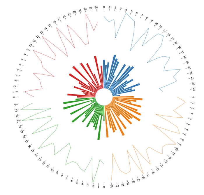
效果如下,非常酷。
请注意,代码需要放在 for 循环中。此外,最后还需要调用 circos 对象的 plotfig() 方法。如果您不确定,请向下滚动以获取完整的代码片段,该代码片段保证可以运行。

接下来,让我们添加折线图来显示流量趋势。这一次,扇形图从第 60 个像素开始,到第 100 个像素结束。记得条形图的终点是第 50 个像素,因此这两个环形之间会有 10px 的填充。
此外,xticks_by_interval(1) 将确保每小时都有刻度。
# Plot a line chart showing traffic volume trends throughout the day line_track = sector.add_track((60, 100)) line_track.xticks_by_interval(1) line_track.line(x, y)
效果如下。
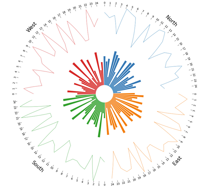
太好了!现在,让我们为各区添加缺失的标题。也就是说,城市中已经存在于扇区字典中的区域。
# Plot sector name for identification sector.text(sector.name, r=110, size=15)
r=110 表示文字应呈现在第 110 个像素上,这就为折线图留出了 10 个像素。size 控制字体大小。
None
如果我们希望将图表括在扇形中,可以调用 .axis() 函数来实现。
# Add enclosed axis of the charts in the sectors line_track.axis() bar_track.axis()

为方便起见,下面是完整的代码片段。它将准确生成上述图表。
from pycirclize import Circos import numpy as np np.random.seed(0) # Sectors represent different areas in a city, with the x-axis representing 24 hours of the day sectors = {"North": 24, "East": 24, "South": 24, "West": 24} circos = Circos(sectors, space=5) for sector in circos.sectors: # Simulate x (24 hours) and y (number of vehicles) x = np.linspace(0, 24, 24) y = np.random.randint(10, 1000, 24) # Simulated hourly vehicle numbers # Plot bars for the number of vehicles passed the intersection bar_track = sector.add_track((10, 50)) bar_track.bar(x, y) # Plot a line chart showing traffic volume trends throughout the day line_track = sector.add_track((60, 100)) line_track.xticks_by_interval(1) line_track.line(x, y) # Plot sector name for identification sector.text(sector.name, r=110, size=15) # Add enclosed axis of the charts in the sectors line_track.axis() bar_track.axis() fig = circos.plotfig()
摘要

图片由 Foundry Co 提供,来自 Pixabay
在本文中,我演示了 PyCirclize 库的表面功能。基本上,我介绍了什么是 Circos 图表,以及为什么我们有时要使用它。我还模拟了一个真实世界中的用例,即十字路口不同方向的交通流量可视化,以演示使用该库在 Python 中生成这样的图表是多么容易。
我们已经看到了该库如何通过几行代码将数据集渲染成具有吸引力的洞察图表,但这只是其功能的一小部分。因此,我将在下周的下一篇文章中再次深入介绍这个库。届时会有更精彩的图表,当然也会模拟和演示现实世界中的例子。请考虑订阅我的更新并接收电子邮件,这样您将来就不会错过类似的文章!
点击下方安全链接前往获取
CSDN大礼包:《Python入门&进阶学习资源包》免费分享
👉Python实战案例👈
光学理论是没用的,要学会跟着一起敲,要动手实操,才能将自己的所学运用到实际当中去,这时候可以搞点实战案例来学习。


👉Python书籍和视频合集👈
观看零基础学习视频,看视频学习是最快捷也是最有效果的方式,跟着视频中老师的思路,从基础到深入,还是很容易入门的。

👉Python副业创收路线👈

这些资料都是非常不错的,朋友们如果有需要《Python学习路线&学习资料》,点击下方安全链接前往获取
CSDN大礼包:《Python入门&进阶学习资源包》免费分享
本文转自网络,如有侵权,请联系删除。


 691
691


 被折叠的 条评论
为什么被折叠?
被折叠的 条评论
为什么被折叠?
 到【灌水乐园】发言


