


 本文详细介绍如何使用Echarts设置不同元素的颜色,包括标题、柱形图、坐标轴、图例、折线图及油表盘等,并提供具体代码示例。
这篇文章主要讲述Echarts设置字体和线条的颜色相关操作笔记,希望文章对你有所帮助,主要是自己的在线笔记吧。我在前面先放各种修改前后图片颜色的对照,后面再详细介绍代码。这样更方便阅读及读者知道,是否对自己有所帮助,其重点是如何在模板动态网页或JSP网站中插入Echarts图片。
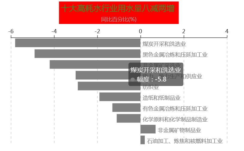
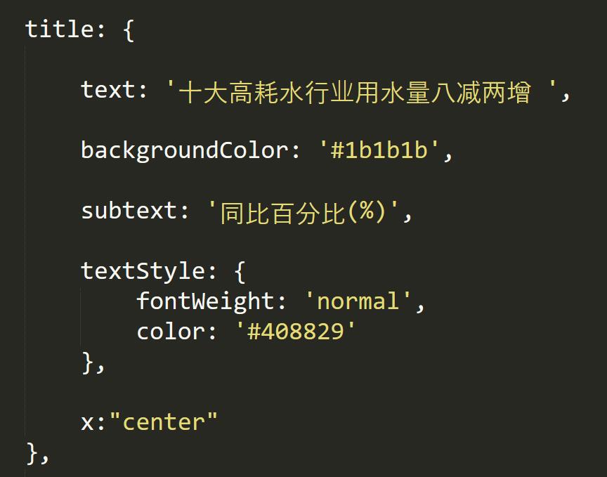
1.修改标题及背景颜色
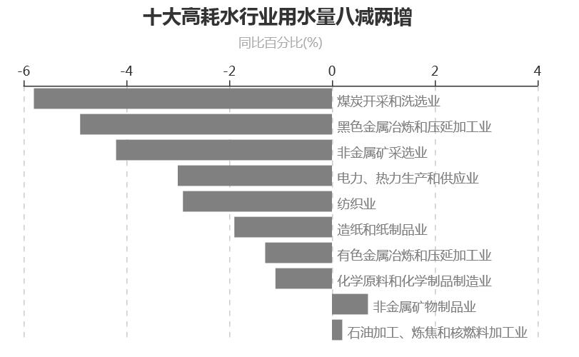
2.设置柱形图颜色
3.修改坐标轴字体颜色
4.设置Legend颜色
5.修改折线颜色
7.柱状图文本鼠标浮动上的颜色设置
推荐文章:
http://echarts.baidu.com/echarts2/doc/example/bar14.html
http://echarts.baidu.com/echarts2/doc/example/bar15.html
官方文档:
http://echarts.baidu.com/echarts2/doc/example.html
http://echarts.baidu.com/demo.html#gauge-car
ECharts系列 - 柱状图(条形图)实例一 JSP
1.修改标题的颜色及背景
Echarts绘制柱状图及修改标题颜色的代码如下所示:
<!DOCTYPE html>
<html>
<head>
    <meta charset="utf-8">
    <title>ECharts</title>
    <script src="echarts.min.js"></script>
</head>

<body>
    <div id="main" style="width: 600px;height:400px;"></div>
    <script type="text/javascript">
	var myChart = echarts.init(document.getElementById('main'));

    var labelRight = {
        normal: { position: 'right' }
	};

    var labelRight = {
        normal: { position: 'right' }
	};

    var option = {

    	title: {
        	text: '十大高耗水行业用水量八减两增 ',    //标题
      		backgroundColor: '#ff0000',            //背景
			subtext: '同比百分比(%)',               //子标题

	        textStyle: {
	        	fontWeight: 'normal',              //标题颜色
	        	color: '#408829'
	      	},

       		x:"center"
       	},

    legend: {
        data:['蒸发量','降水量','最低气温','最高气温']
    },

   	tooltip : {
  		trigger: 'axis',
     	axisPointer : {
        	// 坐标轴指示器,坐标轴触发有效
        	type : 'shadow'
    		// 默认为直线,可选为:'line' | 'shadow'
        }
    },

  	grid: {
     	top: 80,
     	bottom: 80
    },

  	xAxis: {    //设置x轴

    	type : 'value',
   		position: 'top',
    	splitLine: {lineStyle:{type:'dashed'}},
     	max:'4',
    },

 	yAxis: {

     	type : 'category',
       	axisLine: {show: false},
     	axisLabel: {show: false},
	    axisTick: {show: false},
	   	splitLine: {show: false},

       	data : ['石油加工、炼焦和核燃料加工业' ,
 				'非金属矿物制品业',
  				'化学原料和化学制品制造业',
 				'有色金属冶炼和压延加工业',
 				'造纸和纸制品业', '纺织业',
				'电力、热力生产和供应业',
 				'非金属矿采选业',
 				'黑色金属冶炼和压延加工业',
 				'煤炭开采和洗选业'
 			]
    	},

    	series : [
        {
  			name: '幅度 ',
        	type: 'bar',
        	stack: '总量',
          	label: {
         		normal: {
          			show: true,
           			formatter: '{b}'
  	            }
            },

         data:[
			{value: 0.2, label: labelRight,itemStyle:{ normal:{color:'gray'} } },

 			{value: 0.7, label: labelRight,itemStyle:{ normal:{color:'gray'} }},

			{value: -1.1, label: labelRight,itemStyle:{ normal:{color:'gray'} }},

			{value: -1.3, label: labelRight,itemStyle:{ normal:{color:'gray'} }},

			{value: -1.9, label: labelRight,itemStyle:{ normal:{color:'gray'} }},

  			{value: -2.9, label: labelRight,itemStyle:{ normal:{color:'gray'} }},

   			{value: -3.0, label: labelRight,itemStyle:{ normal:{color:'gray'} }},

			{value: -4.2, label: labelRight,itemStyle:{ normal:{color:'gray'} }},

			{value: -4.9, label: labelRight,itemStyle:{ normal:{color:'gray'} }},

			{value: -5.8, label: labelRight,itemStyle:{ normal:{color:'gray'} }},
            ]
        }
    	]
	};


	myChart.setOption(option);
	window.addEventListener("resize",function() {
	    myChart.resize();
	});

    </script>

	<div id="main2" style="width: 600px;height:400px;">
	</div>

</body>
</html>
title: {
	text: '十大高耗水行业用水量八减两增 ',    //标题
		backgroundColor: '#ff0000',            //背景
	subtext: '同比百分比(%)',               //子标题

    textStyle: {
    	fontWeight: 'normal',              //标题颜色
    	color: '#408829'
  	},

		x:"center"
},
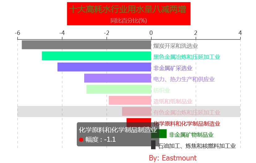
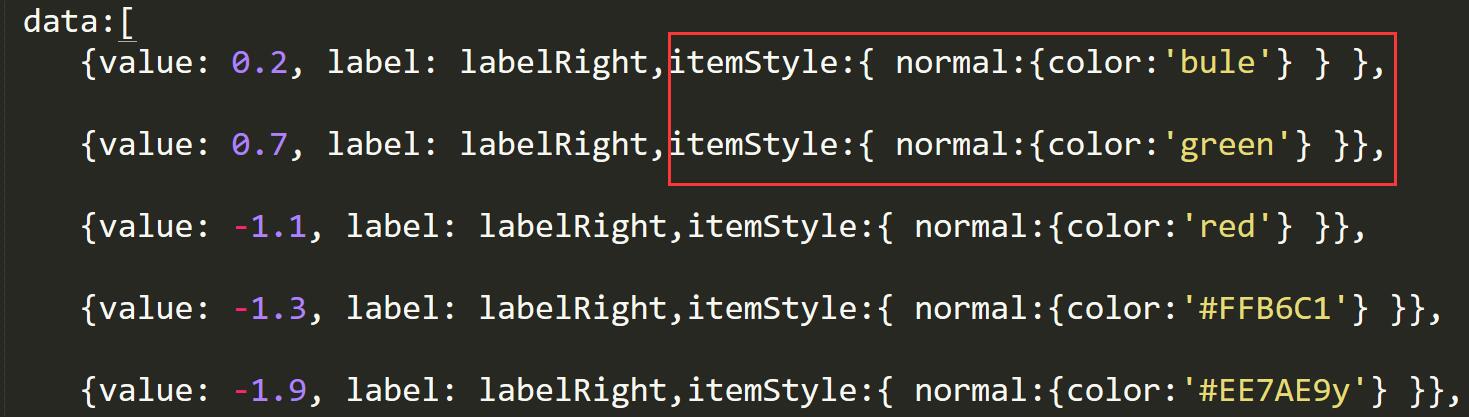
2.设置柱形图颜色
设置柱形图颜色代码如下所示,其中颜色表参考:RGB颜色查询对照表
series : [
{
		name: '幅度 ',
	type: 'bar',
	stack: '总量',
  	label: {
 		normal: {
  			show: true,
   			formatter: '{b}'
            }
    },

 data:[
	{value: 0.2, label: labelRight,itemStyle:{ normal:{color:'bule'} } },

		{value: 0.7, label: labelRight,itemStyle:{ normal:{color:'green'} }},

	{value: -1.1, label: labelRight,itemStyle:{ normal:{color:'red'} }},

	{value: -1.3, label: labelRight,itemStyle:{ normal:{color:'#FFB6C1'} }},

	{value: -1.9, label: labelRight,itemStyle:{ normal:{color:'#EE7AE9y'} }},

		{value: -2.9, label: labelRight,itemStyle:{ normal:{color:'#C1FFC1'} }},

		{value: -3.0, label: labelRight,itemStyle:{ normal:{color:'#AB82FF'} }},

	{value: -4.2, label: labelRight,itemStyle:{ normal:{color:'#836FFF'} }},

	{value: -4.9, label: labelRight,itemStyle:{ normal:{color:'#00FA9A'} }},

	{value: -5.8, label: labelRight,itemStyle:{ normal:{color:'#CD00CD'} }},
    ]
}
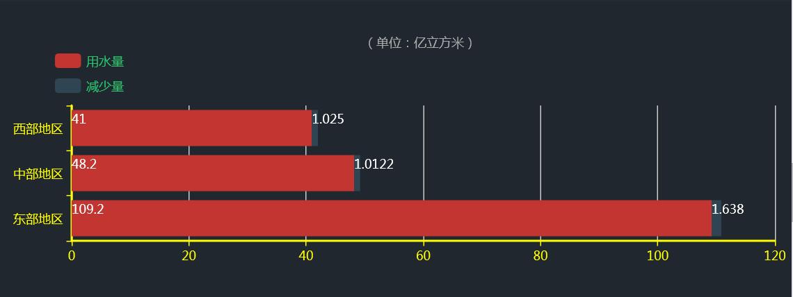
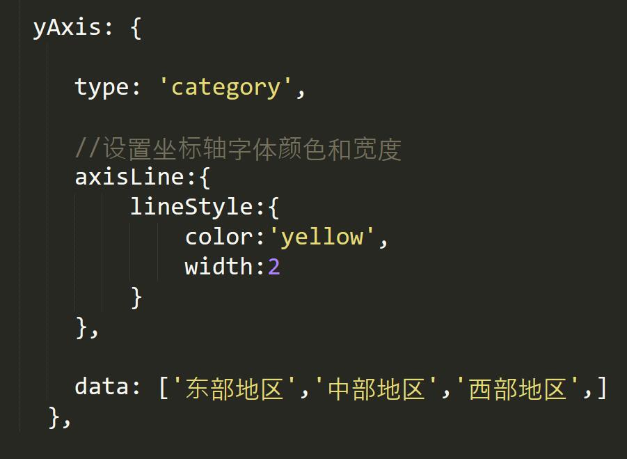
3.修改坐标字体颜色
完整代码:
<!DOCTYPE html>
<html>
<head>
<meta charset="utf-8">
<title>ECharts</title>
<!-- 引入 echarts.js -->
<script src="echarts.min.js"></script>
</head>
<body>
<!-- 为ECharts准备一个具备大小(宽高)的Dom -->
<div align="left" id="main" style="width: 900px;height:500px;"></div>
<script type="text/javascript">
// 基于准备好的dom,初始化echarts实例
var myChart = echarts.init(document.getElementById('main'));
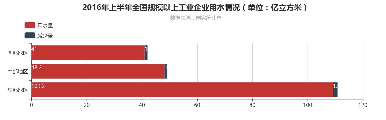
option = {
title: {
text: '2016年上半年全国规模以上工业企业用水情况(单位:亿立方米)',
subtext: '数据来源:国家统计局',
x: 'center',
},
tooltip : {
trigger: 'axis',
axisPointer : {
// 坐标轴指示器,坐标轴触发有效
type : 'shadow'
// 默认为直线,可选为:'line' | 'shadow'
}
},
legend: {
orient: 'vertical',
x: 'left',
y:"top",
padding:50,
data: ['用水量', '减少量',]
},
grid: {
left: '10',
right: '60',
bottom: '3%',
height: '30%',
top: '20%',
containLabel: true
},
xAxis: {
type: 'value',
//设置坐标轴字体颜色和宽度
axisLine:{
lineStyle:{
color:'yellow',
width:2
}
},
},
yAxis: {
type: 'category',
//设置坐标轴字体颜色和宽度
axisLine:{
lineStyle:{
color:'yellow',
width:2
}
},
data: ['东部地区','中部地区','西部地区',]
},
series: [
{
name: '用水量',
type: 'bar',
stack: '总量',
label: {
normal: {
show: true,
position: 'insidelift'
}
},
data: [109.2, 48.2, 41 ]
},
{
name: '减少量',
type: 'bar',
stack: '总量',
label: {
normal: {
show: true,
position: 'insidelift'
}
},
data: [1.638, 1.0122, 1.025]
},
]
};
myChart.setOption(option);
</script>
</body>
</html>yAxis: {
type: 'category',
//设置坐标轴字体颜色和宽度
axisLine:{
lineStyle:{
color:'yellow',
width:2
}
},
data: ['东部地区','中部地区','西部地区',]
},
4.设置了legend颜色
核心代码代码如下:
legend: {

      orient: 'vertical',

      //data:['用水量','减少量'],

      data:[ {name: '用水量',
             textStyle:{color:"#25c36c"}
               },
              {name:'减少量',
              textStyle:{color:"#25c36c"}}
          ],

      x: 'left',
      y:"top",
      padding:50,

},5.修改折现颜色
代码如下所示:
<!DOCTYPE html>
<html>
<head>
    <meta charset="utf-8">
    <title>ECharts</title>
    <!-- 引入 echarts.js -->
    <script src="echarts.min.js"></script>
</head>

<body>
    <!-- 为ECharts准备一个具备大小(宽高)的Dom -->
    <div id="main" style="width: 600px;height:400px;"></div>
    <script type="text/javascript">
        // 基于准备好的dom,初始化echarts实例
        var myChart = echarts.init(document.getElementById('main'));
		var timeData = [
		    '海水','陆地苦咸水','矿井水',
		    '雨水','再生水','海水淡化水'];

		timeData = timeData.map(function (str) {
		    return str.replace('2016/', '');
		});

		option = {
		    title: {
		        text: '2016年上半年全国工业用水增长率',
		         x: 'center'
		    },
		    tooltip: {
		        trigger: 'axis',
		        axisPointer: {
		            animation: false
		        }
		    },

		    legend: {
		        data:['常规用水量','非常规用水量'],
		         x:"right",
		         y:"top",
		         padding: 50
		           },
		 	grid: [{
		        left: 100,
		        right: 100,
		        height: '20%',
		        top: '25%'
		    },
		    {
		        left: 100,
		        right: 100,
		        top: '65%',
		        height: '25%'
		    }],

    		xAxis : [
        	{
	            type : 'category',
	            boundaryGap : false,
	            axisLine: {onZero: true},
	            data:['地表淡水','地下淡水','自来水','其他水']

        	},
        	{
	            gridIndex: 1,
	            type : 'category',
	            boundaryGap : false,
	            axisLine: {onZero: true},
	            data: timeData,
           		position: 'top'
        	}
    		],
		    yAxis : [
		        {
		            name : '常规用水量(%)',
		            type : 'value',
		            max : 5
		        },
        		{
		            gridIndex: 1,
		            name : '非常规用水量(%)',
		            type : 'value',
		            inverse: true

        		}
    		],

    		series : [
        	{
	            name:'常规用水量',
	            type:'line',
	            symbolSize: 8,
	            //设置折线图颜色
	            itemStyle : {
                	normal : {
                    	lineStyle:{
                        	color:'#ff0000'
                   		}
                	}
            	},
	            hoverAnimation: false,
	            data:[-3.8,-9.0,0.0,4.5 ]
        	},
	        {
	            name:'非常规用水量',
	            type:'line',
	            xAxisIndex: 1,
	            yAxisIndex: 1,
	            symbolSize: 8,
	            //设置折线图颜色
	            itemStyle : {
                	normal : {
                    	lineStyle:{
                        	color:'#0000ff'
                   		}
                	}
            	},
	            hoverAnimation: false,
	            data: [-5.8,-2.5,6.2,50.3,3.5,-3.3 ]
	        }
    		]
	};
 	myChart.setOption(option);
    </script>
</body>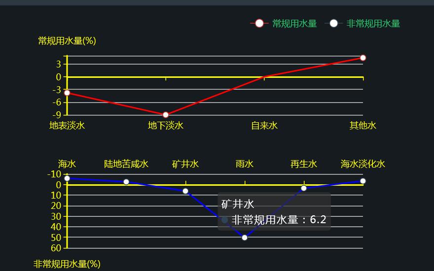
</html>series : [
{
name:'常规用水量',
type:'line',
symbolSize: 8,
itemStyle : {
normal : {
lineStyle:{
color:'#ff0000'
}
}
},
hoverAnimation: false,
data:[-3.8,-9.0,0.0,4.5 ]
},
{
name:'非常规用水量',
type:'line',
xAxisIndex: 1,
yAxisIndex: 1,
itemStyle : {
normal : {
lineStyle:{
color:'#ff0000'
}
}
},
symbolSize: 8,
hoverAnimation: false,
data: [-5.8,-2.5,6.2,50.3,3.5,-3.3 ]
}
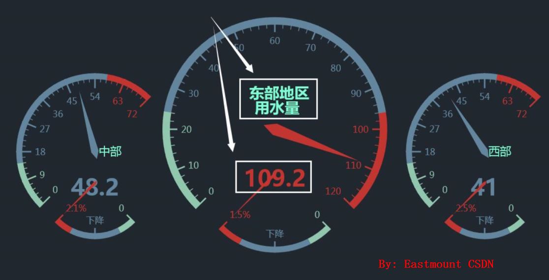
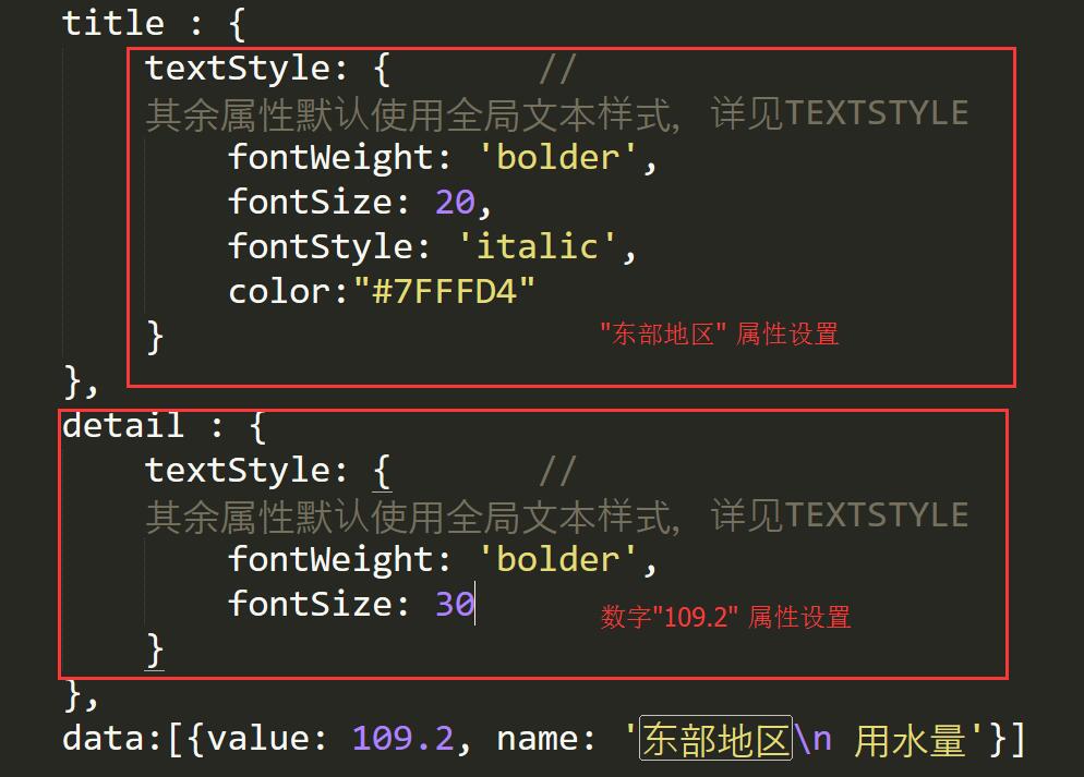
]6.修改油表盘字体大小及颜色
核心代码如下所示:
<!DOCTYPE html>
<html>
<head>
<meta charset="utf-8">
<title>ECharts</title>
<!-- 引入 echarts.js -->
<script src="echarts.min.js"></script>
</head>
<body>
<!-- 为ECharts准备一个具备大小(宽高)的Dom -->
<div id="main" style="width: 800px;height:600px;"></div>
<script type="text/javascript">
// 基于准备好的dom,初始化echarts实例
var myChart = echarts.init(document.getElementById('main'));
option = {
tooltip : {
formatter: "{a} <br/>{c}{b}"
},
toolbox: {
show: true,
feature: {
restore: {show: true},
saveAsImage: {show: true}
}
},
series : [
{
name: '东部地区',
type: 'gauge',
z: 3,
min: 0,
max: 120,
splitNumber: 12,
radius: '50%',
axisLine: { // 坐标轴线
lineStyle: { // 属性lineStyle控制线条样式
width: 10
}
},
axisTick: { // 坐标轴小标记
length: 15, // 属性length控制线长
lineStyle: { // 属性lineStyle控制线条样式
color: 'auto'
}
},
splitLine: { // 分隔线
length: 20, // 属性length控制线长
lineStyle: { // 属性lineStyle(详见lineStyle)控制线条样式
color: 'auto'
}
},
title : {
textStyle: { // 其余属性默认使用全局文本样式,详见TEXTSTYLE
fontWeight: 'bolder',
fontSize: 20,
fontStyle: 'italic',
color:"#25c36c"
}
},
detail : {
textStyle: { // 其余属性默认使用全局文本样式,详见TEXTSTYLE
fontWeight: 'bolder'
}
},
data:[{value: 109.2, textStyle:{color:"#25c36c"}, name: ' 东部地区\n 用水量'}]
},
{
name: '下降',
type: 'gauge',
center : ['50%', '65%'], // 默认全局居中
radius : '25%',
min: 0,
max: 2,
startAngle: 315,
endAngle: 225,
splitNumber: 2,
axisLine: { // 坐标轴线
lineStyle: { // 属性lineStyle控制线条样式
width: 8
}
},
axisTick: { // 坐标轴小标记
show: false
},
axisLabel: {
formatter:function(v){
switch (v + '') {
case '0' : return '0';
case '1' : return '下降';
case '2' : return '1.5%';
}
}
},
splitLine: { // 分隔线
length: 15, // 属性length控制线长
lineStyle: { // 属性lineStyle(详见lineStyle)控制线条样式
color: 'auto'
}
},
pointer: {
width:2
},
title: {
show: false
},
detail: {
show: false
},
data:[{value: 2, name: '下降'}]
},
{
name: '中部地区',
type: 'gauge',
center: ['20%', '55%'], // 默认全局居中
radius: '35%',
min:0,
max:72,
endAngle:45,
splitNumber:8,
axisLine: { // 坐标轴线
lineStyle: { // 属性lineStyle控制线条样式
width: 8
}
},
axisTick: { // 坐标轴小标记
length:12, // 属性length控制线长
lineStyle: { // 属性lineStyle控制线条样式
color: 'auto'
}
},
splitLine: { // 分隔线
length:20, // 属性length控制线长
lineStyle: { // 属性lineStyle(详见lineStyle)控制线条样式
color: 'auto'
}
},
pointer: {
width:5
},
title: {
offsetCenter: [0, '-30%'], // x, y,单位px
},
detail: {
textStyle: { // 其余属性默认使用全局文本样式,详见TEXTSTYLE
fontWeight: 'bolder'
}
},
data:[{value: 48.2, name: ' 中部地区ddd',textStyle:{color:"#ffff00"} }]
},
{
name: '下降',
type: 'gauge',
center : ['20%', '62%'], // 默认全局居中
radius : '25%',
min: 0,
max: 2,
startAngle: 315,
endAngle: 225,
splitNumber: 2,
axisLine: { // 坐标轴线
lineStyle: { // 属性lineStyle控制线条样式
width: 8
}
},
axisTick: { // 坐标轴小标记
show: false
},
axisLabel: {
formatter:function(v){
switch (v + '') {
case '0' : return '0';
case '1' : return '下降';
case '2' : return '2.1%';
}
}
},
splitLine: { // 分隔线
length: 15, // 属性length控制线长
lineStyle: { // 属性lineStyle(详见lineStyle)控制线条样式
color: 'auto'
}
},
pointer: {
width:2
},
title: {
show: false
},
detail: {
show: false
},
data:[{value: 2, name: '下降'}]
},
{
name: '西部地区',
type: 'gauge',
center: ['85%', '55%'], // 默认全局居中
radius: '35%',
min:0,
max:72,
endAngle:45,
splitNumber:8,
axisLine: { // 坐标轴线
lineStyle: { // 属性lineStyle控制线条样式
width: 8
}
},
axisTick: { // 坐标轴小标记
length:12, // 属性length控制线长
lineStyle: { // 属性lineStyle控制线条样式
color: 'auto'
}
},
splitLine: { // 分隔线
length:20, // 属性length控制线长
lineStyle: { // 属性lineStyle(详见lineStyle)控制线条样式
color: 'auto'
}
},
pointer: {
width:5
},
title: {
offsetCenter: [0, '-30%'], // x, y,单位px
},
detail: {
textStyle: { // 其余属性默认使用全局文本样式,详见TEXTSTYLE
fontWeight: 'bolder'
}
},
data:[{value: 41, name: ' 西部地区\n 用水量',
textStyle:{color:"#ffff00"} }]
},
{
name: '下降',
type: 'gauge',
center : ['85%', '62%'], // 默认全局居中
radius : '25%',
min: 0,
max: 2,
startAngle: 315,
endAngle: 225,
splitNumber: 2,
axisLine: { // 坐标轴线
lineStyle: { // 属性lineStyle控制线条样式
width: 8
}
},
axisTick: { // 坐标轴小标记
show: false
},
axisLabel: {
formatter:function(v){
switch (v + '') {
case '0' : return '0';
case '1' : return '下降';
case '2' : return '2.5%';
}
}
},
splitLine: { // 分隔线
length: 15, // 属性length控制线长
lineStyle: { // 属性lineStyle(详见lineStyle)控制线条样式
color: 'auto'
}
},
pointer: {
width:2
},
title: {
show: false
},
detail: {
show: false
},
data:[{value: 2, name: '下降'}]
}
]
};
/*
app.timeTicket = setInterval(function (){
myChart.setOption(option,true);
},2000);
*/
myChart.setOption(option);
</script>
</body>
</html>title : {
textStyle: {
// 其余属性默认使用全局文本样式,详见TEXTSTYLE
fontWeight: 'bolder',
fontSize: 20,
color:"#7FFFD4"
}
},
detail : {
textStyle: {
// 其余属性默认使用全局文本样式,详见TEXTSTYLE
fontWeight: 'bolder'
}
},
data: {
value: 109.2,
name: '\n\n 东部地区\n 用水量'}]
},
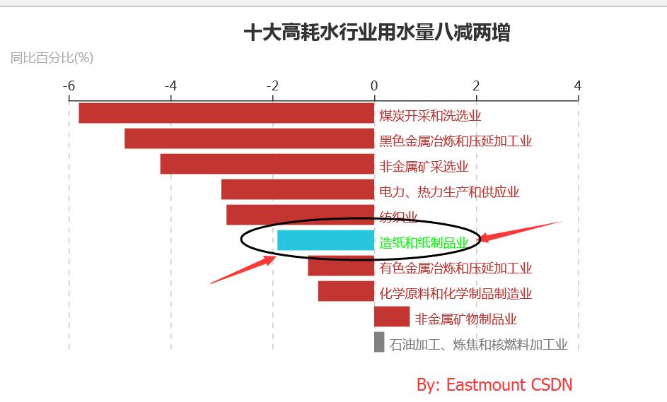
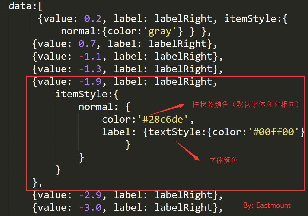
7.柱状图文本鼠标浮动上的颜色设置
需要修改的内容如下图所示:
代码如下所示:
<!DOCTYPE html>
<html>
<head>
    <meta charset="utf-8">
    <title>ECharts</title>
    <script src="echarts.min.js"></script>
</head>
<body>
    <div id="main" style="width: 600px;height:400px;"></div>
    <script type="text/javascript">
 var myChart = echarts.init(document.getElementById('main'));
     var labelRight = {
    normal: {
        position: 'right'
    }
};
 var labelRight = {
    normal: {
        position: 'right'
    }
};
 var option = {
    title: {

        text: '                                         十大高耗水行业用水量八减两增 ',
       subtext: '同比百分比(%)',
    },
    tooltip : {
        trigger: 'axis',
        axisPointer : {            // 坐标轴指示器,坐标轴触发有效
            type : 'shadow'        // 默认为直线,可选为:'line' | 'shadow'
        }
    },
    grid: {
        top: 80,
        bottom: 80
    },
    xAxis: {
        type : 'value',
        position: 'top',
        splitLine: {lineStyle:{type:'dashed'}},
        max:'4',
    },
    yAxis: {
        type : 'category',
        axisLine: {show: false},
        axisLabel: {show: false},
        axisTick: {show: false},
        splitLine: {show: false},
        data : ['石油加工、炼焦和核燃料加工业' , '非金属矿物制品业',
        '化学原料和化学制品制造业', '有色金属冶炼和压延加工业', '造纸和纸制品业', '纺织业',
        '电力、热力生产和供应业', '非金属矿采选业', '黑色金属冶炼和压延加工业', '煤炭开采和洗选业']
    },
    series : [
        {
            name:'幅度 ',
            type:'bar',
            stack: '总量',
            label: {
                normal: {
                    show: true,
                    formatter: '{b}'
                }
            },
            data:[
                 {value: 0.2, label: labelRight, itemStyle:{ normal:{color:'gray'} } },
                {value: 0.7, label: labelRight},
                {value: -1.1, label: labelRight},
                {value: -1.3, label: labelRight},
                {value: -1.9, label: labelRight,
                    itemStyle:{
                        normal: {
                            color:'#28c6de',
                            label: {textStyle:{color:'#00ff00'}}
                        }
                    }
                },
                {value: -2.9, label: labelRight},
                {value: -3.0, label: labelRight},
                {value: -4.2, label: labelRight},
                {value: -4.9, label: labelRight},
                {value: -5.8, label: labelRight},
            ]
        }
    ]
};


myChart.setOption(option);
    </script>
</body>
</html>data:[
{value: 0.2, label: labelRight, itemStyle:{ normal:{color:'gray'} } },
{value: 0.7, label: labelRight},
{value: -1.1, label: labelRight},
{value: -1.3, label: labelRight},
{value: -1.9, label: labelRight,
itemStyle:{
normal: {
color:'#28c6de',
label: {textStyle:{color:'#00ff00'}}
}
}
},
{value: -2.9, label: labelRight},
{value: -3.0, label: labelRight},
{value: -4.2, label: labelRight},
{value: -4.9, label: labelRight},
{value: -5.8, label: labelRight},
]输出结果:
自适应大小,添加如下代码:
// 为echarts对象加载数据
myChart.setOption(option);
// 加上这一句即可
window.onresize = myChart.resize;
或者:
window.addEventListener("resize",function(){
        option.chart.resize();
});
最后文章对你有所帮助,和学生相处就是不错,但enjoy myself~
(By:Eastmount 2016-10-17 中午1点半 http://blog.csdn.net/eastmount/ )


 1608
1608

 被折叠的 条评论
为什么被折叠?
被折叠的 条评论
为什么被折叠?
 到【灌水乐园】发言


