


import pandas as pd
import pywt
import matplotlib.pyplot as plt
import numpy as np
from scipy.special import factorial # Import factorial function
# Function for noise estimation
def estimate_noise_std(coefficients, scales):
low_activity_scales = scales[:5]
noise_region = coefficients[:5, :]
noise_std = np.std(noise_region)
return noise_std, noise_region
# Function for Morse wavelet
def morse_wavelet(t, beta, gamma):
return (2**(beta/gamma)) * (gamma**(beta)) * t**(beta - 1) * \
np.exp(-gamma * t) * np.exp(-0.5 * t**2) / factorial(beta - 1)
# Function for maxima detection
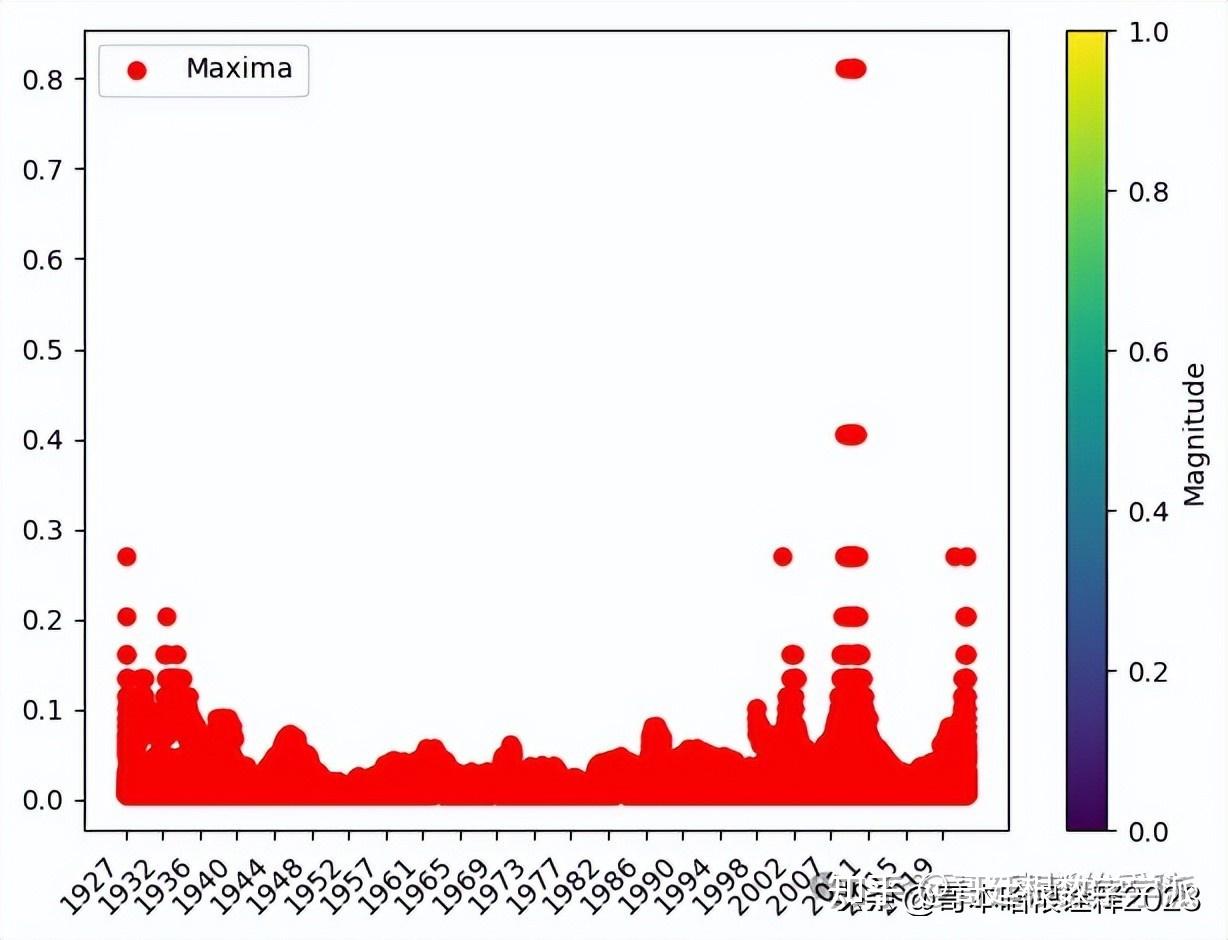
def find_maxima(coefficients, scales, noise_std=None, percentile_threshold=None):
maxima_points = []
if noise_std:
threshold = noise_std * 3
maxima_points = np.where(np.abs(coefficients) > threshold)
elif percentile_threshold:
threshold = np.percentile(np.abs(coefficients), percentile_threshold)
maxima_points = np.where(np.abs(coefficients) > threshold)
else:
print("Error: Specify either a noise_std or percentile_threshold")
return maxima_points
# Step 1: Read Excel data into a DataFrame
file_path = 'sp_500.xlsx' # Replace with your file path
df = pd.read_excel(file_path)
# Step 2: Specify the wavelet function
wavelet = 'morl' # Use the Morlet wavelet
# Step 3: Extract data for the entire dataset
pe_ratio_values = df['value'].tolist()
years = pd.to_datetime(df['Date']).dt.year.tolist()
# Perform wavelet analysis
coeffs, freqs = pywt.cwt(pe_ratio_values, scales=np.arange(1, 128), wavelet=wavelet)
# Noise estimation
noise_std, noise_region = estimate_noise_std(coeffs, freqs)
# Maxima detection
maxima_points = find_maxima(coeffs, freqs, noise_std=noise_std)
# Create common x-values for plotting
x_values = np.arange(len(pe_ratio_values))
# Plot the wavelet analysis results
plt.figure(figsize=(12, 8))
# Plot the original PE ratio with years on the x-axis
plt.subplot(3, 1, 1)
plt.plot(x_values, pe_ratio_values, color='blue')
plt.title('Value - S&P 500')
plt.xlabel('Year')
plt.ylabel('Value')
plt.xticks(x_values[::50], years[::50], rotation=45, ha='right') # Show every 50th year for better visibility
# Plot the wavelet coefficients
plt.subplot(3, 1, 2)
plt.imshow(np.abs(coeffs), aspect='auto', extent=[0, len(pe_ratio_values), freqs[-1], freqs[0]], cmap='viridis', interpolation='bilinear')
plt.title('Wavelet Analysis - Value')
plt.xlabel('Year')
plt.ylabel('Frequency (Hz)')
# Plot the estimated noise region
plt.subplot(3, 1, 3)
plt.imshow(np.abs(noise_region), aspect='auto', extent=[0, len(pe_ratio_values), freqs[4], freqs[0]], cmap='viridis', interpolation='bilinear')
plt.title('Estimated Noise Region')
plt.xlabel('Year')
plt.ylabel('Frequency (Hz)')
plt.colorbar(label='Magnitude')
plt.xticks(x_values[::50], years[::50], rotation=45, ha='right') # Show every 50th year for better visibility
plt.tight_layout()
plt.show()
# Mark maxima points on the plot if any are found
if maxima_points:
plt.scatter(maxima_points[1], freqs[maxima_points[0]], color='red', marker='o', label='Maxima')
# Adjust x-axis ticks and labels
plt.xticks(x_values[::50], years[::50], rotation=45, ha='right')
plt.colorbar(label='Magnitude')
plt.legend()
plt.tight_layout()
plt.show()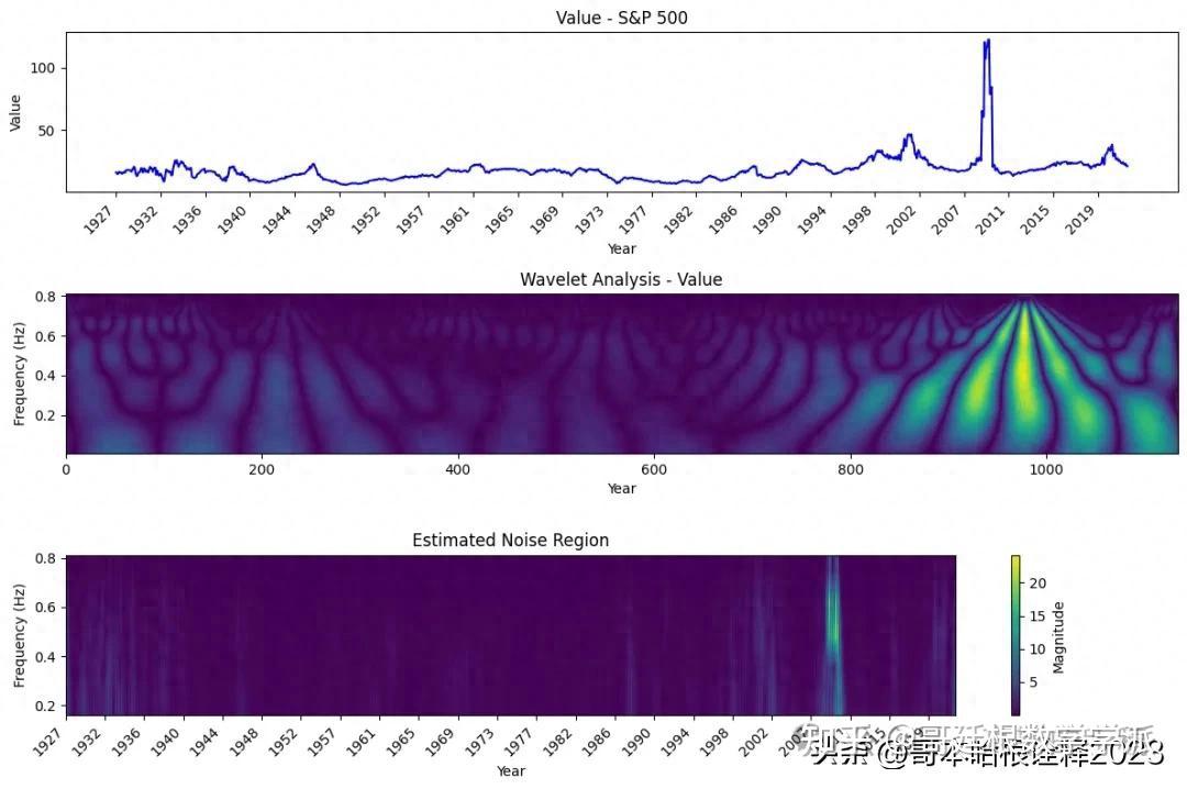
import pandas as pd
import pywt
import matplotlib.pyplot as plt
import numpy as np


# Step 1: Read Excel data into a DataFrame
file_path = 'sp_500.xlsx'  # Replace with your file path
df = pd.read_excel(file_path)


# Step 2: Specify the wavelet function
wavelet = 'morl'  # Use the Morlet wavelet


# Step 3: Extract data for the entire dataset
pe_ratio_values = df['value'].tolist()
years = pd.to_datetime(df['date']).dt.year.tolist()


# Perform wavelet analysis
coeffs, freqs = pywt.cwt(pe_ratio_values, scales=np.arange(1, 128), wavelet=wavelet)


# Create common x-values for plotting
x_values = np.arange(len(pe_ratio_values))


# Plot the wavelet analysis results
plt.figure(figsize=(12, 8))


# Plot the original PE ratio with years on the x-axis
plt.subplot(2, 1, 1)
plt.plot(x_values, pe_ratio_values, color='blue')
plt.title('Value - S&P 500')
plt.xlabel('Year')
plt.ylabel('Value')
plt.xticks(x_values[::50], years[::50], rotation=45, ha='right')  # Show every 50th year for better visibility


# Plot the wavelet coefficients
plt.subplot(2, 1, 2)
plt.imshow(np.abs(coeffs), aspect='auto', extent=[0, len(pe_ratio_values), freqs[-1], freqs[0]], cmap='viridis', interpolation='bilinear')
plt.title('Wavelet Analysis - Value')
plt.xlabel('Year')
plt.ylabel('Frequency (Hz)')


# Adjust x-axis ticks and labels
plt.xticks(x_values[::50], years[::50], rotation=45, ha='right')


plt.colorbar(label='Magnitude')


plt.tight_layout()
plt.show()
import pandas as pd
import pywt
import matplotlib.pyplot as plt
import numpy as np


# Step 1: Read Excel data into a DataFrame
file_path = 'nifty50.xlsx'
df = pd.read_excel(file_path, sheet_name=0)  # Assuming data is in the first sheet


# Step 2: Specify the wavelet function
wavelet = 'morl'  # Use the Morlet wavelet


# Step 3: Extract data for the entire dataset
last_price_values = df['LastPrice'].tolist()
years = pd.to_datetime(df['Date']).dt.year.tolist()


# Determine the length of the dataset
data_length = len(last_price_values)


# Determine the range of scales based on the length of the dataset
max_scale = min(128, data_length)  # Limit the maximum scale to avoid exceeding the length of the dataset
scales = np.arange(1, max_scale)


# Perform wavelet analysis
coeffs, freqs = pywt.cwt(last_price_values, scales=scales, wavelet=wavelet)


# Create common x-values for plotting
x_values = np.arange(data_length)


# Plot the wavelet analysis results
plt.figure(figsize=(12, 10))


# Plot the original LastPrice with years on the x-axis
plt.subplot(3, 1, 1)
plt.plot(x_values, last_price_values, color='blue')
plt.title('LastPrice - Nifty 50')
plt.xlabel('Date')
plt.ylabel('LastPrice')
plt.xticks(np.arange(0, len(x_values), 500), [years[idx] for idx in range(0, len(x_values), 500)], rotation=45, ha='right')  # Show every 500th year for better visibility


# Plot the wavelet coefficients
plt.subplot(3, 1, 2)
plt.imshow(np.abs(coeffs), aspect='auto', extent=[0, data_length, freqs[0], freqs[-1]], cmap='viridis', interpolation='bilinear')
plt.title('Wavelet Analysis - LastPrice')
plt.xlabel('Date')
plt.ylabel('Frequency (Hz)')
plt.xticks(np.arange(0, len(x_values), 500), [years[idx] for idx in range(0, len(x_values), 500)], rotation=45, ha='right')  # Show every 500th year for better visibility


# Plot the scaleogram
plt.subplot(3, 1, 3)
plt.imshow(abs(coeffs)**2, aspect='auto', origin='lower',
           extent=[0, data_length, scales[-1], scales[0]], cmap='jet')
plt.title('Scaleogram - LastPrice')
plt.xlabel('Date')
plt.ylabel('Scale')
plt.xticks(np.arange(0, len(x_values), 500), [years[idx] for idx in range(0, len(x_values), 500)], rotation=45, ha='right')
plt.colorbar(label='Magnitude')


plt.tight_layout()
plt.show()


# Perform wavelet analysis
coeffs, freqs = pywt.cwt(last_price_values, scales=scales, wavelet=wavelet)
print("Shape of coeffs:", coeffs.shape)  # Debugging
print("Shape of freqs:", freqs.shape)  # Debugging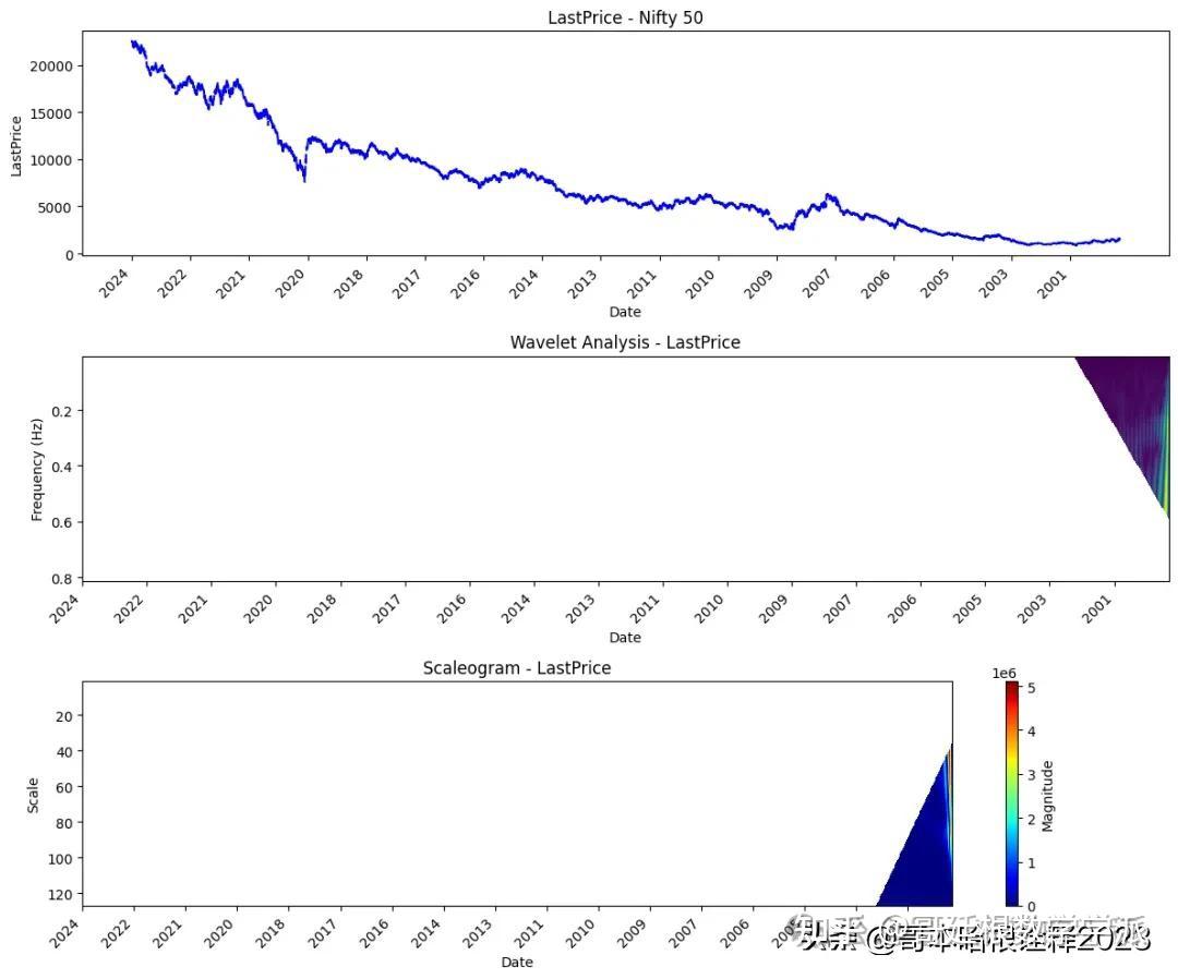
学术咨询:

基于小波分析的时间序列降噪(Python,ipynb文件)
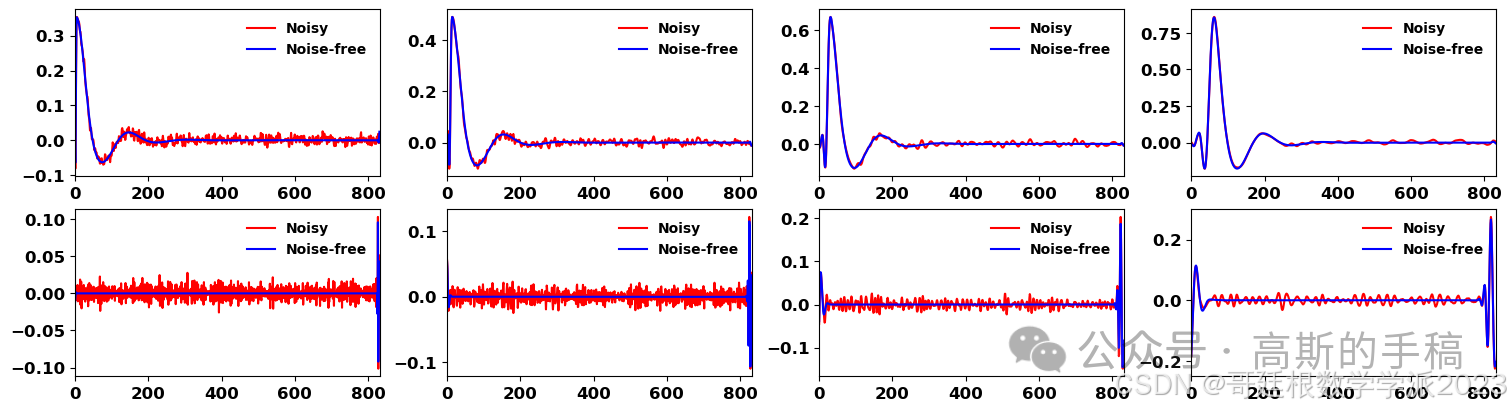
信号降噪与时频分析(Python,ipynb文件)
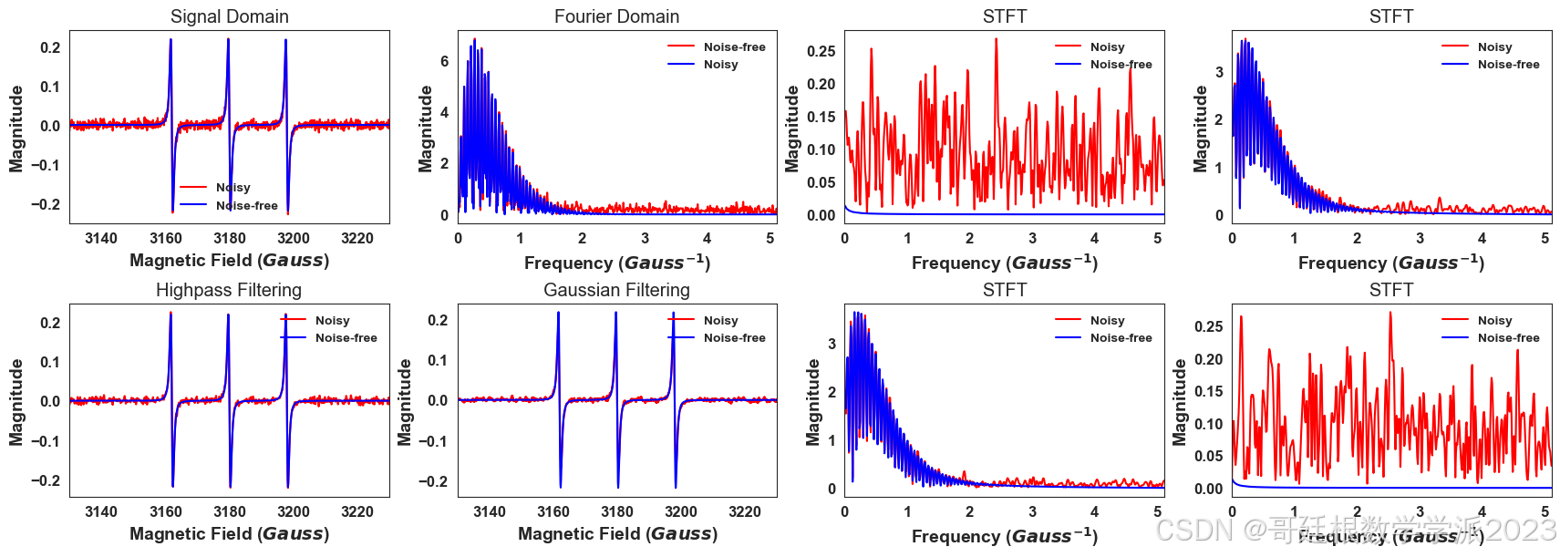
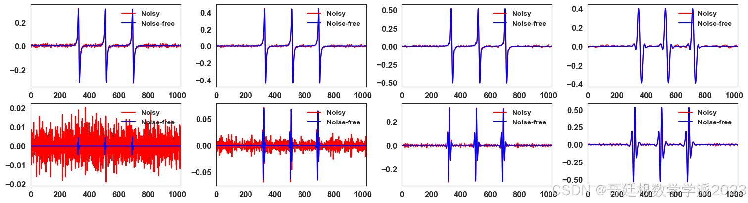
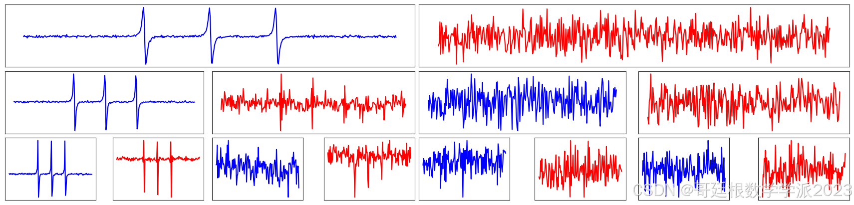
基于连续小波变换的信号滤波方法(Python,ipynb文件)
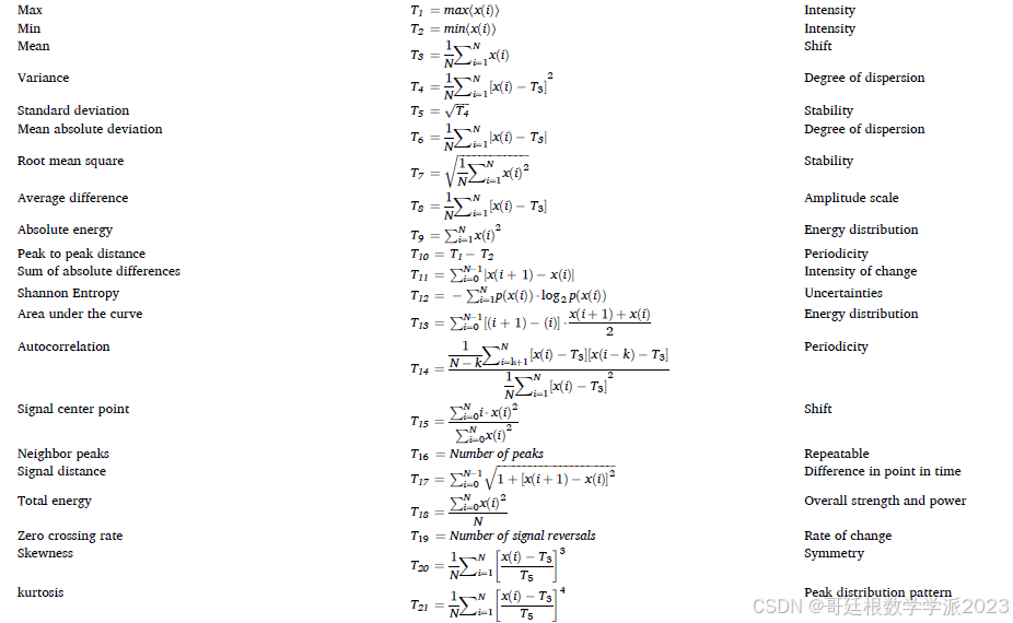
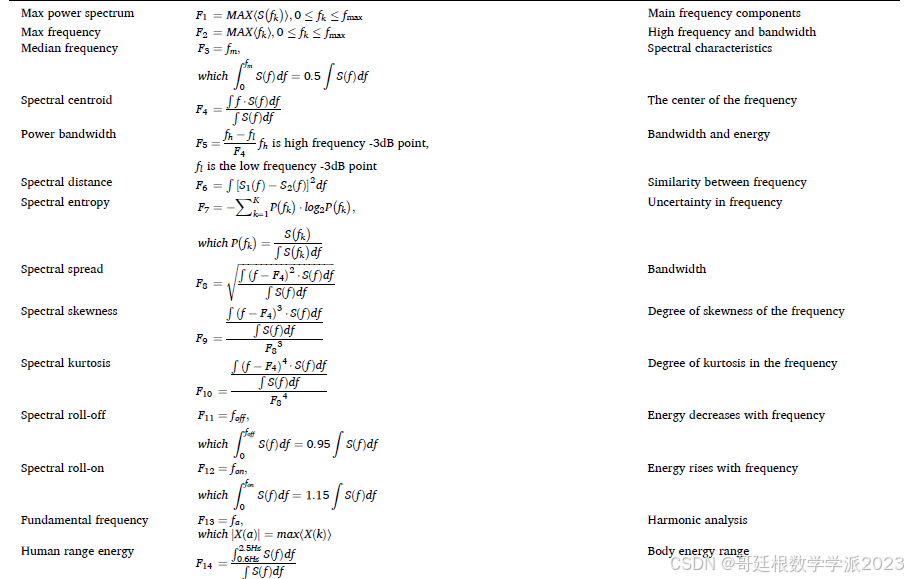
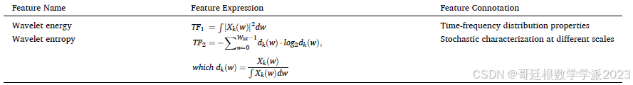
信号的时域、频域和时频域特征提取(Python)


 被折叠的 条评论
为什么被折叠?
被折叠的 条评论
为什么被折叠?
 到【灌水乐园】发言


