


1、创建文件夹,快速生成结构。

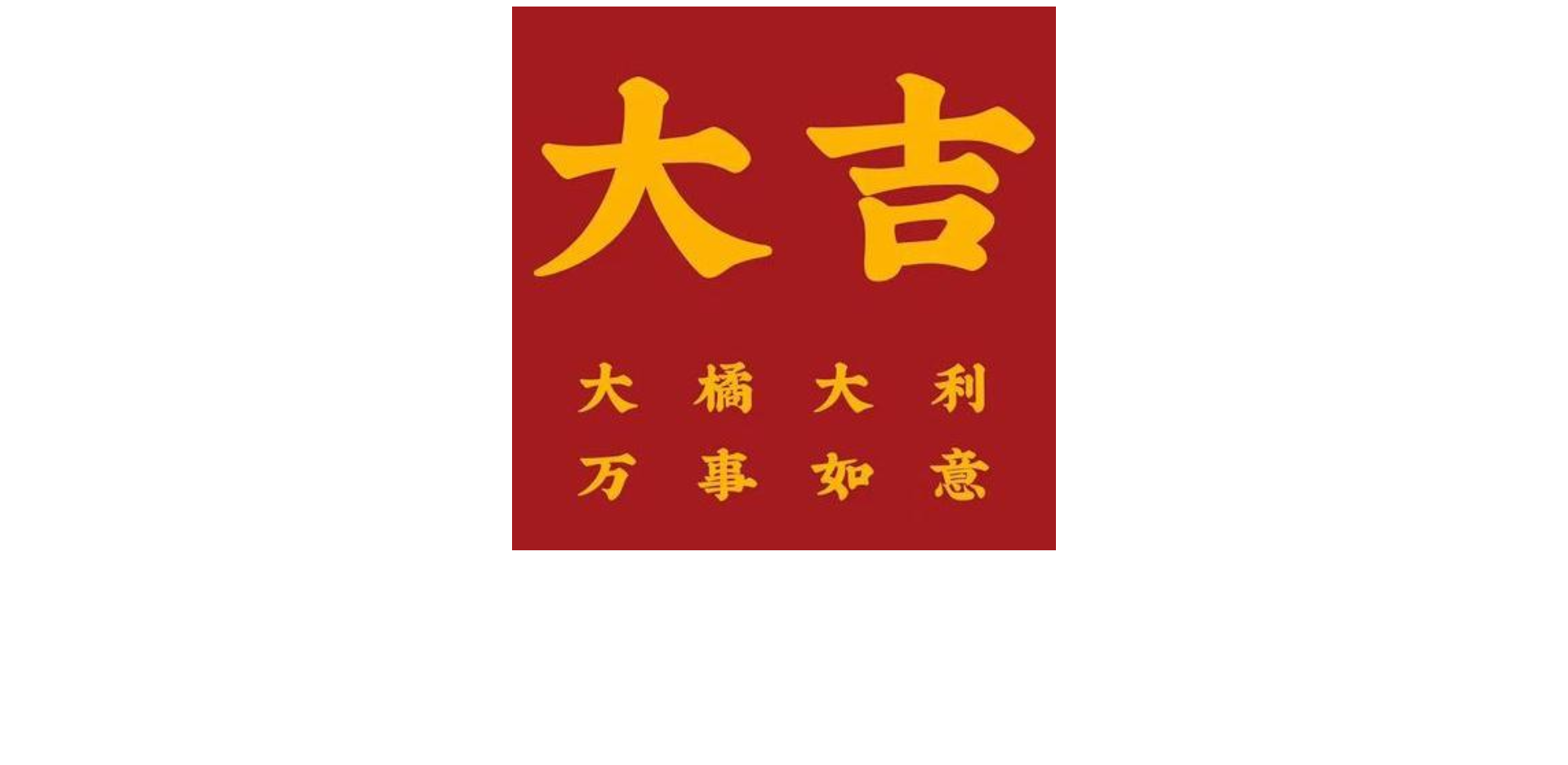
 2、给大盒子添加宽高、背景图片、背景大小,并让其居中。
.box {
            width: 666px;
            height: 666px;
            background: url(./images/6729-16403826ce116674d831c7ad8c7379b7\(1\)\(1\).png) no-repeat;
            background-size: 666px 666px;
            margin: 0 auto;
        }
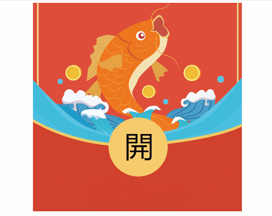
3、设置两个子盒子背景格式
 .box .left {
            background: url(./images/df64fee3-481f-4396-aeb2-f58efea2a1c7\(1\)\(1\).png) no-repeat left 0px;
            background-size: 666px 666px;
        }
.box .right {
background: url(./images/df64fee3-481f-4396-aeb2-f58efea2a1c7\(1\)\(1\).png) no-repeat right 0px;
background-size: 666px 666px;
}4、两个子盒子共用一张背景图,设置宽度各占一半,使用浮动,一左一右。
.box .left,
        .box .right {
            width: 333px;
            height: 666px;
        }
float: left; float: right;5、给父盒子设置溢出隐藏+移入动画(鼠标移入父盒子时子盒子生成动画效果)。
 .box:hover .left {
            transform: translateX(-100%);
        }
.box:hover .right {
transform: translateX(100%);
}transition: all 1s;overflow: hidden;6、完整代码
<!DOCTYPE html>
<html lang="en">
<head>
<meta charset="UTF-8">
<meta http-equiv="X-UA-Compatible" content="IE=edge">
<meta name="viewport" content="width=device-width, initial-scale=1.0">
<title>Document</title>
<style>
.box {
width: 666px;
height: 666px;
background: url(./images/6729-16403826ce116674d831c7ad8c7379b7\(1\)\(1\).png) no-repeat;
background-size: 666px 666px;
margin: 0 auto;
overflow: hidden;
}
.box .left,
.box .right {
width: 333px;
height: 666px;
transition: all 1s;
}
.box .left {
float: left;
background: url(./images/df64fee3-481f-4396-aeb2-f58efea2a1c7\(1\)\(1\).png) no-repeat left 0px;
background-size: 666px 666px;
}
.box .right {
float: right;
background: url(./images/df64fee3-481f-4396-aeb2-f58efea2a1c7\(1\)\(1\).png) no-repeat right 0px;
background-size: 666px 666px;
}
.box:hover .left {
transform: translateX(-100%);
}
.box:hover .right {
            transform: translateX(100%);
        }
</style>
</head>
<body>
<div class="box">
<div class="left">
</div>
<div class="right">
</div>
</div>
</body>
</html>7、完成啦~

8、图片素材


 扫一扫
扫一扫


 1593
1593

 被折叠的 条评论
为什么被折叠?
被折叠的 条评论
为什么被折叠?
 到【灌水乐园】发言


