


前言:3d坐标系
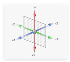
X 轴 往右为正值, 否则反之
Y 轴 往下为正值,否则反之
Z轴 指向我们为正值,否则反之
3d位移
1、X轴正值位移(向右):
transform: translateX(100px);
示例:
设置一个宽高都为300px的父盒子和一个宽高都为100px的子盒子,父盒子加上背景颜色。
.box {
            width: 300px;
            height: 300px;
            background-color: skyblue;
        }
.box1 {
width: 200px;
height: 200px;
}子盒子放进图片,图片设置成等比例。
<body>
    <div class="box">
        <div class="box1">
            <img src="./4be8a787507e5df.jpeg" alt="">
        </div>
    </div>
</body>
.box1 img {
width: 100%;
height: 100%;
}给父盒子添加hover使鼠标移入父盒子时子盒子向X轴正方向移动100px,并给子盒子加上过渡(谁要过渡给谁加)。
.box:hover .box1 {
transform: translateX(100px);
} .box1 {
width: 200px;
height: 200px;
background-color: red;
transition: all 1s;
}完整代码:
<!DOCTYPE html>
<html lang="en">
<head>
<meta charset="UTF-8">
<meta http-equiv="X-UA-Compatible" content="IE=edge">
<meta name="viewport" content="width=device-width, initial-scale=1.0">
<title>Document</title>
<style>
.box {
width: 300px;
height: 300px;
background-color: skyblue;
}
.box1 {
width: 200px;
height: 200px;
transition: all 1s;
}
 .box1 img {
            width: 100%;
            height: 100%;
        }
 .box:hover .box1 {
            transform: translateY(100px);
        }
</style>
</head>
<body>
<div class="box">
<div class="box1">
<img src="./4be8a787507e5df.jpeg" alt="">
</div>
</div>
</body>
</html>动画效果 :

2、Y轴正值位移(向下):
transform: translateY(100px);
使用相同案例,改为Y轴正方向位移100px。
.box:hover .box1 {
transform: translateY(100px);
}动画效果 :

3、Z轴正值位移(向我们):
transform: translateZ(100px);
 .box:hover .box1 {
            transform: translateZ(100px);
        }
透视的作用: 空间转换时,为元素添加近大远小、近实远虚的视觉效果。
语法:
perspective: 800px;透视注意事项:
1、取值范围经常在 800px ~ 1200px 之间。
2、一定给父亲添加
3、透视距离也称为视距,所谓的视距就是人的眼睛到屏幕的距离。
其中 d 为透视的距离
z 是
translateZ的距离, 这个距离靠近我们,盒子越大

设置视距
为了更好的展示Z轴效果,先把子盒子放在中心位置。
(定位+方向)设置盒子水平垂直居中:
.box {
            position: relative;
            width: 300px;
            height: 300px;
            background-color: skyblue;
            margin: 100px auto;
            perspective: 800px;
        }
.box1 {
position: absolute;
left: 0;
top: 0;
right: 0;
bottom: 0;
margin: auto;
width: 200px;
height: 200px;
transition: all 1s;
}

完整代码:
<!DOCTYPE html>
<html lang="en">
<head>
<meta charset="UTF-8">
<meta http-equiv="X-UA-Compatible" content="IE=edge">
<meta name="viewport" content="width=device-width, initial-scale=1.0">
<title>Document</title>
<style>
.box {
position: relative;
width: 300px;
height: 300px;
margin: 100px auto;
background-color: skyblue;
perspective: 800px;
}
.box1 {
            position: absolute;
            left: 0;
            top: 0;
            right: 0;
            bottom: 0;
            margin: auto;
            width: 200px;
            height: 200px;
            transition: all 1s;
        }
.box1 img {
width: 100%;
height: 100%;
}
.box:hover .box1 {
transform:translateZ(300px);
}
</style>
</head>
<body>
<div class="box">
<div class="box1">
<img src="./4be8a787507e5df.jpeg" alt="">
</div>
</div>
</body>
</html>动画效果:

完整写法:
transform: translate3d(x, y, z);(注意3d为小写)
transform:translate3d(100px,100px,300px);动画效果:


 860
860


 被折叠的 条评论
为什么被折叠?
被折叠的 条评论
为什么被折叠?
 到【灌水乐园】发言


