


数据分析服务请访问以下链接:

数据和代码获取:请查看主页个人信息
大家好,今天我将介绍如何使用R语言ggplot2包绘制个性化误差棒图和森林图。
1 误差棒图(Error Bar Plot):用于表示测量数据的中心趋势和误差范围。它通常包括一个表示中心趋势(如均值或中位数)的点,以及表示误差范围的线段或区域。误差范围可以表示标准差、标准误差、置信区间等。
2 森林图(Forest Plot):用于可视化多个研究结果或效应估计及其置信区间。它通常以垂直线段表示每个效应估计的置信区间,并根据效应估计的大小进行排序。森林图常用于荟萃分析和医学研究中。

图片样式灵感来源于Nature杂志的一篇文章:

接下来我们用文章的实例数据来进行可视化展示:
Step1:数据载入
rm(list=ls())
library(tidyverse)
library(cowplot)

load('dnds.comp1.rda')
load('dnds.comp2.rda')
load('ALL_plot.rda')
load('shading.rda')

head(All_plot)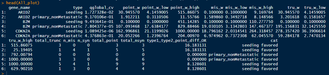
Step2:定义绘图元素
type1 <- "seeding"
type2 <- "primary_nonMetastatic"

col.palette  <- setNames(c("#762a83", "#5aae61"), c(type1, type2))
fill.palette <- setNames(adjustcolor(c("#762a83", "#c2a5cf", "#5aae61"), alpha.f = 0.75), c(paste0(type1, " favored"), paste0(type2, " and ", type1), paste0(type2, " favored")))
cols <- paste( "point", c( 'w', 'w_low', 'w_high'), sep = '_' )
Step3:绘制误差棒图
ggplot(All_plot) +
  geom_point(aes(x = gene_name, y = get(cols[1]), colour = type), position = position_dodge(0.5), size = 2) +
  geom_errorbar(aes(x = gene_name, y = get(cols[1]), ymin = get(cols[2]),
                    ymax = get(cols[3]), colour = type), position = position_dodge(0.5), size = 0.75, width = 0.5) +
  scale_y_continuous(trans = 'log10', limits = c(0.1, 1300),
                     breaks = 10^(-1:3), labels = c('<0.1',10^(0:2), '>1000')) +
  geom_hline(yintercept = 1) +
  labs(x = "",
       y = paste0("dNdS point mutations")) +
  theme_cowplot(font_size = 16) +
  theme(legend.title = element_blank(),
        legend.position = "none") +
  coord_flip() +
  ggsci::scale_color_aaas() +
  ggsci::scale_fill_aaas()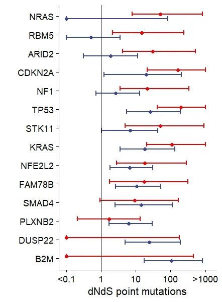
Step4:绘制森林图
ggplot(All_plot) +
  geom_pointrange(aes(x = gene_name, y = get(cols[1]), ymin = get(cols[2]),
                      ymax = get(cols[3]), colour = type), position = position_dodge(0.5)) +
  geom_rect(data = shading, aes(xmin=x1, xmax=x2, ymin=y1, ymax=y2, fill=cat), alpha = 0.3) +
  geom_pointrange(aes(x = gene_name, y = get(cols[1]), ymin = get(cols[2]),
                      ymax = get(cols[3]), colour = type), position = position_dodge(0.5), size = 0.75) +
  scale_color_manual(values = col.palette) +
  scale_fill_manual(values = fill.palette) +
  scale_y_continuous(trans = 'log10', limits = c(0.1, 1300),
                     breaks = 10^(-1:3), labels = c('<0.1',10^(0:2), '>1000')) +
  geom_hline(yintercept = 1) +
  labs(x = "",
       y = paste0("dNdS point mutations")) +
  theme_cowplot(font_size = 16) +
  theme(axis.text.x = element_text( angle = 45, hjust = 1),legend.title = element_blank())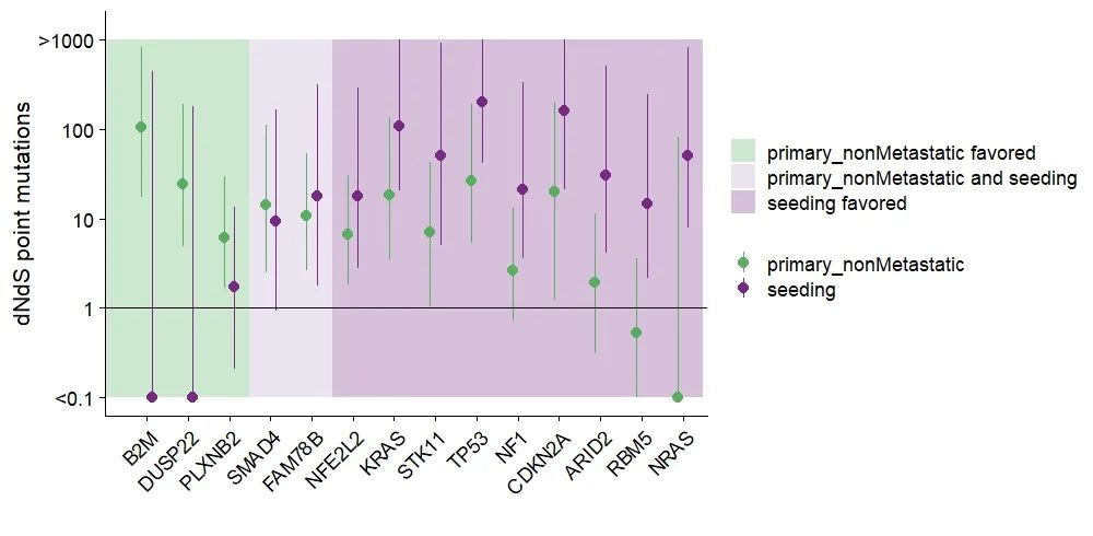
划重点:上述代码【geom_pointrange】函数用来绘制森林图;【geom_errorbar】函数用于绘制误差棒图。【geom_rect】函数增加图层,用来映射三种不同的绘图背景,这也是一个不错的绘图技巧~
Step5:个性化:改变横坐标轴字体颜色
# 定义横坐标轴颜色
color = ifelse(as.character(All_plot %>%
                              arrange(gene_name) %>%
                              pull(gene_name) %>%
                              unique()) %in% as.character(dnds.comp1 %>%
                                                            mutate(qvec = p.adjust(pvec, "fdr")) %>%
                                                            filter(qvec < 0.05) %>%
                                                            pull(genestotest)),
               col.palette[type1], ifelse(as.character(All_plot %>%
                                                         arrange(gene_name) %>%
                                                         pull(gene_name) %>%
                                                         unique()) %in% as.character(dnds.comp2 %>%
                                                                                       mutate(qvec = p.adjust(pvec,"fdr")) %>%
                                                                                       filter(qvec < 0.05) %>%
                                                                                       pull(genestotest)), col.palette[type2], "black"))
ggplot(All_plot) +
  geom_pointrange(aes(x = gene_name, y = get(cols[1]), ymin = get(cols[2]),
                      ymax = get(cols[3]), colour = type), position = position_dodge(0.5)) +
  geom_rect(data = shading, aes(xmin=x1, xmax=x2, ymin=y1, ymax=y2, fill=cat), alpha = 0.3) +
  geom_pointrange(aes(x = gene_name, y = get(cols[1]), ymin = get(cols[2]),
                      ymax = get(cols[3]), colour = type), position = position_dodge(0.5), size = 0.75) +
  scale_color_manual(values = col.palette) +
  scale_fill_manual(values = fill.palette) +
  scale_y_continuous(trans = 'log10', limits = c(0.1, 1300),
                     breaks = 10^(-1:3), labels = c('<0.1',10^(0:2), '>1000')) +
  geom_hline(yintercept = 1) +
  labs(x = "",
       y = paste0("dNdS point mutations")) +
  theme_cowplot(font_size = 16) +
  theme(axis.text.x = element_text( angle = 45, hjust = 1,color = color), legend.title = element_blank(), legend.position = "none")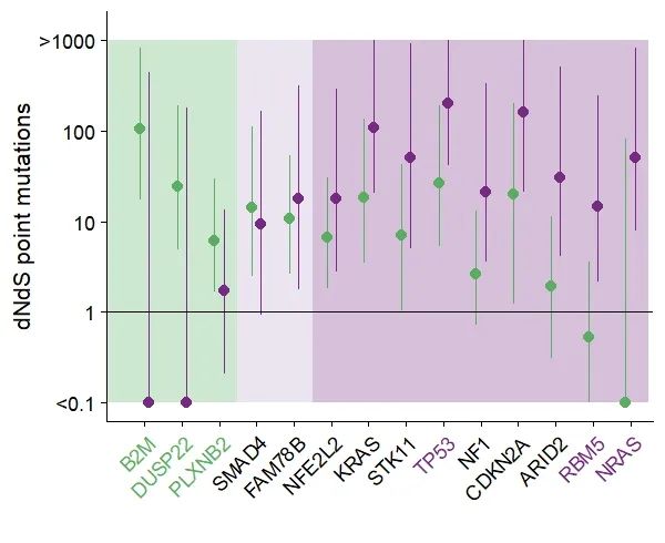


“森林图”获得本期代码和数据


 1800
1800


 被折叠的 条评论
为什么被折叠?
被折叠的 条评论
为什么被折叠?
 到【灌水乐园】发言


