


 本文介绍了一次金融时序预测竞赛的数据预处理过程,包括数据导入、缺失值检查、时间特征工程、数据可视化分析等内容,通过图表展示了购买与赎回量的时间序列变化,以及不同工作日的购买赎回分布。
本次组队学习数据来自阿里天池 金融时序预测竞赛 课程内容 https://github.com/KakaWanYifan/The-Purchase-and-Redemption-Forecasts 数据在github上可以找到,也可以访问比赛链接 https://tianchi.aliyun.com/competition/entrance/231573/information
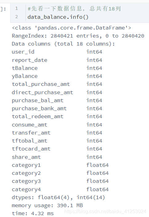
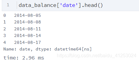
先来导入用户申购赎回表,这个表单包含了用户的操作时间,操作记录,其中操作记录包含申购赎回两部分,时间单位精确到天,金额精确到分,即0.01 元 先来看一下数据信息
1 .1数据总体信息
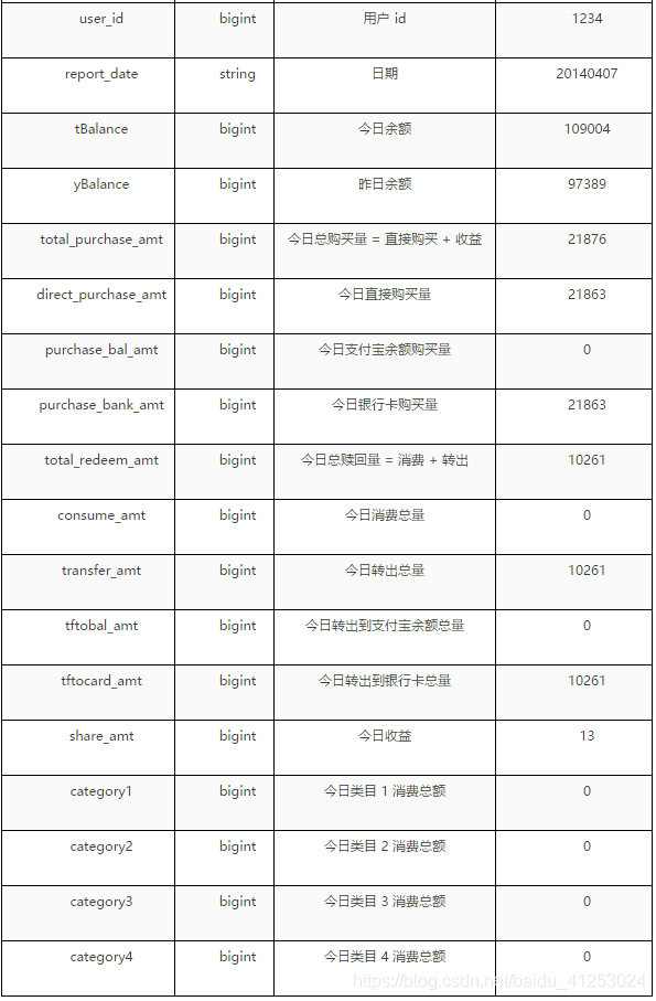
每一个特征对应的含义如下
1.2 查看数据是否有缺失值
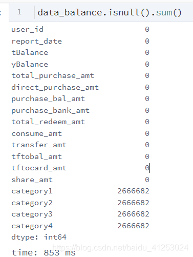
发现本次数据除了category1-4全部缺失外无其他特征均无缺失值
2 时间处理
# 为数据集添加时间戳

data_balance['date'] = pd.to_datetime(data_balance['report_date'], format= "%Y%m%d")
data_balance['day'] = data_balance['date'].dt.day
data_balance['month'] = data_balance['date'].dt.month
data_balance['year'] = data_balance['date'].dt.year
data_balance['week'] = data_balance['date'].dt.week
data_balance['weekday'] = data_balance['date'].dt.weekday
在这一步中,我们为数据打上时间戳,时间戳有什么用呢?我们先来看一下原始数据中reportdate这一特征
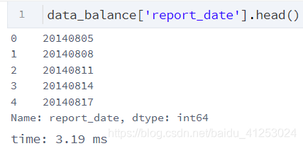
可以发现这个特征里的时期么有分开,因此我们需要将报告时期转为年日月分明的格式 即
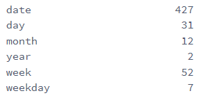
这种格式,同时,我们也需要将年日月分开,以便逐个分析,因此利用了dt函数,将日期分为日,月,星期,周末等
同时再用nunique函数查看我们新设的这些特征的唯一值
3 数据可视化
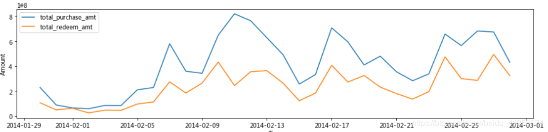
3.1 每日总购买与赎回量的时间序列图
# 画出每日总购买与赎回量的时间序列图

fig = plt.figure(figsize=(20,6))
plt.plot(total_balance['date'], total_balance['total_purchase_amt'],label='purchase')
plt.plot(total_balance['date'], total_balance['total_redeem_amt'],label='redeem')

plt.legend(loc='best')
plt.title("The lineplot of total amount of Purchase and Redeem from July.13 to Sep.14")
plt.xlabel("Time")
plt.ylabel("Amount")
plt.show()
从图像中可以看出,在2014年2月1日左右,总购买与赎回量出现断崖式下跌,但是这种下跌有两种情况,一个是在这个月总购买与赎回量确实很少,还有可能是在这个月交易的日期较少或记录较少,因此单独将month提出来绘制直方图
plt.figure(figsize=(30, 8))
plt.subplot(1,2,1)
sns.countplot(x='month', data=total_balance, color='steelblue')
plt.title("Count Of Different month")
plt.subplot(1,2,2)
sns.countplot(x='day', data=total_balance, color='steelblue')
plt.title("Count Of Different Days")
plt.show()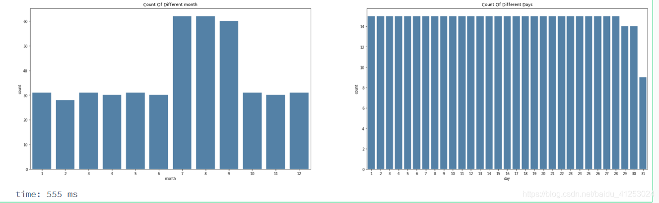
发现在2月份记录的数据并不少,789记录的较多,可能是因为记录日期从2013年7月到2014年9月,789三个月份记录了两次,如果除以2,可以发现每一天都是被正常记录的,因此出现的情况确实为在2014年2月的交易金额较小。再对二月单独绘制折线图
1月29到9月5日的成交量确实较低,后面在预测时,我们会试试将这部分数据删除,做为异常数据,并与正常预测进行比较。
3.2翌日特征分析
这个分析模块主要针对周末相对于总特征进行分析
# 画出每个翌日的数据分布于整体数据的分布图

a = plt.figure(figsize=(10,10))
scatter_para = {'marker':'.', 's':3, 'alpha':0.3}
line_kws = {'color':'k'}
plt.subplot(2,2,1)
plt.title('The distrubution of total purchase')
sns.violinplot(x='weekday', y='total_purchase_amt', data = total_balance_1, scatter_kws=scatter_para, line_kws=line_kws)
plt.subplot(2,2,2)
plt.title('The distrubution of total purchase')
sns.distplot(total_balance_1['total_purchase_amt'].dropna())
plt.subplot(2,2,3)
plt.title('The distrubution of total redeem')
sns.violinplot(x='weekday', y='total_redeem_amt', data = total_balance_1, scatter_kws=scatter_para, line_kws=line_kws)
plt.subplot(2,2,4)
plt.title('The distrubution of total redeem')
sns.distplot(total_balance_1['total_redeem_amt'].dropna())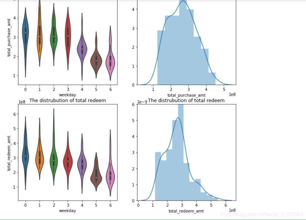
从图像可以看出总收购等数据在每一天的分布情况和总体分布情况
每个月total_purchase_amt均值的比率
plt.figure(figsize=(15, 8))
total_balance.groupby(['month'])['total_purchase_amt'].plot.bar()
plt.title('Risk Ratio Of Different date')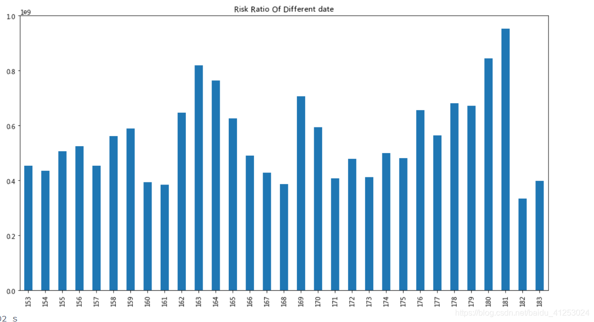
# 分析翌日的中位数特征

plt.figure(figsize=(12, 5))
ax = plt.subplot(1,2,1)
plt.title('The barplot of average total purchase with each weekday')
ax = sns.barplot(x="weekday", y="total_purchase_amt", data=week_sta, label='Purchase')
ax.legend()
ax = plt.subplot(1,2,2)
plt.title('The barplot of average total redeem with each weekday')
ax = sns.barplot(x="weekday", y="total_redeem_amt", data=week_sta, label='Redeem')
ax.legend()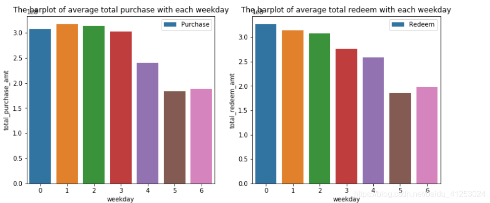


 353
353

 被折叠的 条评论
为什么被折叠?
被折叠的 条评论
为什么被折叠?
 到【灌水乐园】发言


