


如何获得更好的交互体验
According to a study by Missouri University of Science and Technology, over 94 percent of users’ first impression of a website are design-related. Research also shows that a whopping 88 percent of people do not return to websites due to usability issues.
根据密苏里科技大学的一项研究, 超过94%的用户对网站的第一印象与设计有关。 研究还显示,由于可用性问题, 高达88%的人不会返回网站。
If you think all it takes to design a website is having good technical and aesthetics skills, think again. While aesthetics is important (this is 2016!), it isn’t the only thing that makes a website – in fact, it isn’t even the most important. Usability matters a great deal, and designing a website with the following rules of psychology in mind will always result in a more powerful website.
如果您认为设计网站所需的一切都具有良好的技术和美学技能,请再考虑一下。 尽管美学很重要(这是2016年!),但它并不是构成网站的唯一要素–实际上,它甚至不是最重要的。 可用性非常重要,设计一个遵循以下心理学规则的网站将始终带来一个功能更强大的网站。
规则#1:上下文是UX中的一切 ( Rule #1: Context is Everything in UX)
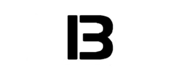
What do you see above? A number or a letter? 13 or B?
您在上方看到了什么? 数字还是字母? 13还是B ?
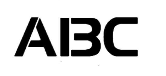
Take a careful look at the above image. What do you see? A B C, right? Okay, take a look at the below image:
请仔细查看以上图片。 你看到了什么? ABC ,对不对? 好吧,看看下面的图片:

You’re probably seeing 12, 13, 14, right?
您可能会看到12, 13, 14 ,对吧?
Below is the original image where the above two images were extracted from:
下面是从上面的两个图像中提取的原始图像:

In the first example, you’re either going to see 13 or B depending on your previous experiences or preconceived notions. In the second example, you’re highly unlikely to see A 13 C because the A preceding the controversial B and the C succeeding it have influenced your perception of it. In other words, you’re most definitely certain that it is B, not 13.
在第一个示例中,根据您以前的经验或先入为主的概念,您将看到13或B 在第二个例子中,你不大可能看到A 13 C ,因为A有争议的前B和C随后它影响了你对它的看法。 换句话说,您绝对可以确定它是B ,而不是13 。
In the third example, however, you’re highly unlikely to see 12 B 14 because 12 and 14 have influenced your perception of things – if 12 comes first and 14 comes last, of course, the controversial “thing” in the middle must be 13 and not B, right?
但是,在第三个示例中,您极不可能看到12 B 14因为12和14影响了您对事物的感知–如果首先出现12 ,最后出现14 ,那么中间必定是有争议的“事物” 13不是B ,对吧?
While the above example is a bit more direct, here’s a more subtle one:
虽然上面的示例更直接一些,但下面是一个更微妙的示例:

Are you seeing two faces or a vase in the above image?
您在上图中看到两个脸还是一个花瓶?
Chance are you’ll see two faces if your most recent experience is with humans, and you’re more likely to see a vase if you just spent a lot of time with vases.
如果您最近一次与人接触的经历,您可能会看到两张面Kong,如果您只是花大量时间在花瓶上,那么您更有可能看到花瓶。
The examples used in this section explain the perceptual set theory.
本节中使用的示例说明了感知集理论 。
In psychology, perceptual set theory is our tendency to perceive information in a certain way based on expectations and information we may already have. Perceptual set is usually influenced by culture, background or other information/situations we were previously exposed to.
在心理学中,知觉集合论是我们趋向于基于期望和我们已经拥有的信息以某种方式感知信息的趋势。 知觉集合通常受我们以前接触过的文化,背景或其他信息/情况的影响。
The good thing about perceptual set is that it can be influenced; with the second image shown in this section, if you were shown just 12 and 14, you automatically assume that the controversial “number” is 13. If you were shown A and B, you automatically assume that the controversial “letter” is B. If you were shown the controversial number/letter alone, though, you’ll see a number or letter depending on your experience and existing preconceptions.
知觉集合的好处是它可以受到影响。 对于本节中显示的第二张图像,如果只显示12和14,则自动假设有争议的“数字”为13。如果显示A和B,则自动假设有争议的“字母”为B。但是,如果仅显示有争议的数字/字母,您将看到一个数字或字母,具体取决于您的经验和现有的偏见。
So, how does this apply to your website design?
那么,这如何适用于您的网站设计?
UX原则:不要仅仅为了新鲜,酷炫或有趣就破坏已建立的UX模式 ( The UX Principle: Don’t Break Established UX Patterns Just to be Fresh or Cool or Fun)
It’s common for creative people to want to innovate and change things dramatically from what is common in your niche. But that innovation can kill conversions from your web design. When people visit a website, they expect certain elements to be in certain places or orders.
有创造力的人通常希望创新和改变自己的利基市场中的事物。 但是,这种创新会扼杀您的网页设计带来的转化。 人们访问网站时,期望某些元素位于某些位置或顺序中。
For instance, when you design a form that asks for their name and email, they expect the name to be asked first and email later. These are preconceived ideas in their mind due to repeated exposure to these things, and it is important not to tamper with these notions (or certainly not without a very good reason).
例如,当您设计一个要求其名称和电子邮件的表单时,他们希望该名称首先被询问,然后再通过电子邮件发送。 由于反复接触这些东西,它们在脑海中是先入为主的观念,因此重要的是不要篡改这些观念(或者一定没有很好的理由)。
When you do decide to innovate, be sure to include clues and guides that make it easy for people to know exactly what the new elements represent – this is UX101.
当你决定要创新,一定要包括线索和指南,很容易让人们究竟有哪些新的元素表示知道-这是UX101。
规则2:图片定位可能会分散用户注意力 ( Rule #2: Image Positioning Can Have Split User Attention)
No web design is complete without visuals, but – whether you’re using stock photos or real images – using images in web design isn’t as simple as most people think.
没有视觉效果,没有任何网页设计是完整的,但是-无论您使用的是照片还是真实图片-在网页设计中使用图片并不像大多数人想象的那么简单。
Take a look at the below example:
看下面的例子:

Then take a look at this one:
然后看看这个:

Both images include the same copy and advertise the same product. The only thing that changed is the positioning of the image of the baby; in the original example, the baby was made to look forward. As a result, more people focused on the baby’s gaze. In the second example, however, the baby was made to look sideways; in return, a significant number of people directed their gaze sideways – exactly where the baby’s gaze was directed.
这两个图像都包含相同的副本并宣传相同的产品。 唯一改变的是婴儿形象的定位。 在最初的例子中,婴儿被期待着。 结果,更多的人开始关注婴儿的目光。 但是,在第二个示例中,使婴儿侧身看。 作为回报,大量的人将目光转向侧面-正是婴儿的目光指向的地方。
Here are two more examples that validate the same principle:
这是另外两个验证相同原理的示例:
The below image shows the lady in the picture directing her gaze at you:
下图显示了图片中的女士将她的目光对准您:

The below image shows the lady in the picture directing her gaze at the product:
下图显示了图片中的女士将目光对准产品:

How does this apply to your website design?
这如何适用于您的网站设计?
UX原则:确保图像使用具有战略意义 ( The UX Principle: Make Sure Your Use of Images is Strategic)
The wrong image use can distract people from the message you’re trying to get them to notice – significantly reducing your conversions in the process.
错误使用图片会分散人们对您试图引起他们注意的消息的注意力,从而极大地减少了您在此过程中的转化。
When using images in your web design, it is important to realize the power of positioning; an image of a person that focuses on the copy on a page directs people to focus on the copy. An arrow on a landing page that points to a signup form tells people to pay attention to that signup form. Instead of simply using images, make sure the images you use direct people to focus exactly on what you want them to focus on.
在网页设计中使用图像时,重要的是要实现定位的功能。 在页面上聚焦于副本的人的图像会引导人们将注意力集中在副本上。 到达页面上的箭头指向注册表单,指示人们注意该注册表单。 确保使用的图像可以使人们准确地聚焦在您希望他们聚焦的对象上,而不是简单地使用图像。
规则3:避免进行彻底的重新设计–使用渐进和微妙的方法 ( Rule #3: Avoid Drastic Redesigns – Use a Gradual and Subtle Approach)
Why is it that the biggest, most successful websites very rarely do major redesigns? And why is it that whenever major websites do a redesign there is almost always a massive blacklash?
为什么最大,最成功的网站很少进行重大重新设计 ? 为何每当主要网站进行重新设计时,几乎总会出现巨大的睫毛 ?
This is explained by Weber’s Law of Just Noticeable Difference. Weber’s law states that “the size of just noticeable difference is a constant proportion of the original stimulus value,” where just noticeable difference is “the minimum amount by which stimulus intensity must be changed in order to produce a noticeable variation in sensory experience.”
韦伯的“明显差异定律”对此进行了解释。 韦伯定律指出“明显差异的大小是原始刺激值的恒定比例”,其中明显差异是“必须改变刺激强度以产生明显的感官体验的最小量”。
More simply put, Weber’s law states that you won’t always notice a difference to things at the slightest change; for example, if you’re lifting an object that weighs 10kg, you won’t easily notice a difference if you add an extra 0.1kg of weight. If, however, you add an extra 1kg, the difference will be easily apparent. In this instance, the extra weight added (1kg) to make the person lifting the object notice a difference is called the difference threshold.
简而言之,韦伯定律指出,即使有丝毫变化,您也不会总是注意到事物的差异。 例如,如果要举起一个重10公斤的物体,则增加0.1公斤的重量将不会轻易引起注意。 但是,如果增加1公斤,则差异很容易看出。 在这种情况下,为使举起物体的人注意差异而增加的额外重量(1千克)称为差异阈值。
This same principle can be used for effective web design; when Facebook, Twitter, Google or some other major websites make a massive redesign, there is usually backlash.
同样的原理可以用于有效的网页设计。 当Facebook,Twitter,Google或其他一些主要网站进行大规模重新设计时, 通常会引起强烈反对 。
It’s been psychologically proven that we don’t like change – especially drastic ones. A study published in 2010 found that we tend of have a strong preference for things that have been around for long; the study found that students preferred an old course requirement that has been in place for long even when a new course requirement could mean less course work for them. The study also found that the longer something has been in place, the better. Our strong resistance to change can be linked to evolution and our survival instincts; we’ve evolved to find safety in consistency, so we resist anything else.
从心理上已经证明我们不喜欢变化,特别是剧烈变化。 2010年发表的一项研究发现,我们倾向于对已经存在很长时间的事物有强烈的偏好。 该研究发现,即使新的课程要求可能意味着对他们来说较少的课程工作,学生还是喜欢已经存在很长时间的旧课程要求。 研究还发现,存在的时间越长越好。 我们对变革的强烈抵制可以与进化和生存本能联系在一起; 我们不断发展以找到一致的安全性,因此我们拒绝其他任何事情。
How does this apply to your website design?
这如何适用于您的网站设计?
UX原则:使重新设计逐渐而细微。 ( The UX Principle: Make Redesigns Gradual and Subtle.)
Like Google, Facebook and other major websites have found out (some, the hard way!), change is better when it is subtle and gradual.
像Google,Facebook和其他主要网站一样,发现( 有些 困难 !),变化是细微而渐进的,更好。
Don’t introduce a complete website redesign too soon; gradually change various elements, actively gathering feedback in the process. If you want to introduce a redesign that is too drastic, split test it to a small portion of your users first. Watch their reaction, and let that influence how you roll out the design to your general users.
不要过早引入完整的网站重新设计; 逐步改变各种要素,在此过程中积极收集反馈。 如果您要进行过于激烈的重新设计,请先对一小部分用户进行拆分测试。 观察他们的React,并让其影响您将设计推广到普通用户的方式。
规则4:使用字体减轻读者的情绪 ( Rule #4: Use Fonts to Lighten Readers’ Moods)
What, if anything, does psychology say about font size? Is smaller or bigger font better?
心理学对字体大小有什么说呢? 较小或较大的字体更好吗?
A 2012 study found that font size matters and that larger fonts elicit stronger emotional connections in the reader. Interestingly, experts advise not going with a font size lesser than 16px for content.
2012年的一项研究发现,字体大小很重要,较大的字体会引起读者更强烈的情感联系。 有趣的是, 专家建议不要使用小于16像素的字体。
That said, research hasn’t found any difference in reading comprehension between font sizes, but legible and simple fonts (and aren’t bigger fonts more legible?) have been found to make instructions appear easier to carry out and also improve the mood of people reading them.
就是说,研究并未发现字体大小之间在阅读理解上有任何区别,但是已经发现清晰易懂的字体(难道不是大字体更清晰吗?)可以使指令看起来更易于执行,并且还改善了字体的使用感觉 。人们阅读它们。
It is also important to understand the concept of a “Scan Path,” which explains the natural way our brain reads and process information: When we read content, on the web or elsewhere, our eyes follow a natural pattern called a “Scan Path.” In essence, our eyes read content in tiny jumps – during which everything is blurred – and then pauses so that our brain can take a snapshot of the letters we’re reading, arrange them into words and interpret the meanings. All these happens in a split second, so it is impossible to notice. These jumps are called saccades while the pauses are called fixations, and both make up a Scan Path.
理解“扫描路径”的概念也很重要,它解释了我们的大脑读取和处理信息的自然方式:当我们在网络上或其他地方读取内容时,我们的眼睛会遵循一种称为“扫描路径”的自然模式。 ” 本质上,我们的眼睛以微小的跳跃来阅读内容,在此过程中一切都变得模糊不清,然后停下来,以便我们的大脑可以对正在阅读的字母进行快照,将它们排列成单词并解释含义。 所有这些都是在一瞬间发生的,因此不可能注意到。 这些跳跃称为扫视,而这些暂停称为注视, 两者都构成了Scan Path 。
It is important to understand this natural process of reading content to understand how to effectively design for readers. Scan Paths follow a Z-shaped pattern, and we’re mostly not fully “conscious” until there’s a “pattern interrupt.” In short, if you want readers to pay more attention to certain text elements in your web design, it mustn’t be in the same font size as everything else.
重要的是要理解阅读内容的这种自然过程,以了解如何有效地为读者设计。 扫描路径遵循Z形图案,并且在出现“图案中断”之前,我们大多不完全“有意识”。 简而言之,如果您希望读者更多地关注Web设计中的某些文本元素,则其字体大小不得与其他所有字体相同。
How does this apply to your website design?
这如何适用于您的网站设计?
UX原理:使用字体时,简单和大字体总是更好 ( The UX Principle: When Using Fonts, Simple and Large is Always Better)
Here are a few tips for better font usage in your design:
以下是在设计中更好地使用字体的一些技巧:
- Use simple fonts; anything too fancy and you make things overcomplicated. 使用简单的字体; 任何花哨的东西都会使事情变得过于复杂。
- Use larger fonts; not only do they make it easier to read your content, but they also improve the mood of the readers. 使用较大的字体; 它们不仅使阅读您的内容更加容易,而且还改善了读者的情绪。
- Introduce a bigger/different font to make important elements stand out; font consistency throughout the page, especially for key elements in your design that you want people to notice, can kill conversions. 引入更大/不同的字体以使重要元素脱颖而出; 整个页面的字体一致性,尤其是您希望人们注意到的设计中的关键元素,可能会导致转化中断。
翻译自: https://www.sitepoint.com/4-clever-psychology-rules-for-making-better-ux-decisions/
如何获得更好的交互体验


 2万+
2万+


 被折叠的 条评论
为什么被折叠?
被折叠的 条评论
为什么被折叠?
 到【灌水乐园】发言


