


 本文通过视频和步骤说明如何在Excel数据透视图中对比两年的每日数据,包括创建数据透视表,添加订单计数和工作日期,按月和年分组,更改图表类型以显示逐年变化,以及数据透视图的格式调整。
If you have a couple of years of daily data in Excel, you can use a pivot chart to quickly compare that data, month by month, year over year. This short video shows how to compare annual data in Excel pivot chart.
如果您在Excel中有几年的每日数据,则可以使用数据透视图逐年,逐年快速比较该数据。 这个简短的视频演示了如何在Excel数据透视图中比较年度数据。
视频:在数据透视图中比较年份 (Video: Compare Years in Pivot Chart)
This video shows how to create a pivot table, and make a pivot chart that lets you compare two years of data.
该视频显示了如何创建数据透视表,以及如何创建数据透视表以比较两年的数据。
Depending on your version of Excel, and your option settings, the dates might be grouped automatically, or they might not be.
根据您的Excel版本和选项设置,日期可能会自动分组,也可能不会自动分组。
There are written instructions below the video that show how to group, if necessary, and how to change your option settings.
视频下方有书面说明,说明了如何分组(如有必要)以及如何更改选项设置。
创建数据透视表和数据透视图 (Create a Pivot Table and Pivot Chart)
In this example, there is a named Excel table with 2 years of data from service calls.
在此示例中,有一个名为Excel的表格,其中包含来自服务调用的2年数据。
We'd like to compare the number of work orders completed each month, year over year.
我们想比较每年每个月完成的工单数量。
To create a pivot table and pivot chart,
要创建数据透视表和数据透视图,
- Select any cell in the work orders table 选择工作单表中的任何单元格
- On the Excel Ribbon, click the Insert tab 在Excel功能区上,单击“插入”选项卡
- In the Charts group, click Pivot Chart 在“图表”组中,单击“数据透视图”
- In the Create PivotChart window, the table name (WorkOrders) should automatically appear in the Table/Range box 在“创建数据透视图”窗口中,表名称(WorkOrders)应自动出现在“表/范围”框中
- Select a location for the pivot table 选择数据透视表的位置
- You don't need to check the box for "Add this data to the Data Model" 您无需选中“将数据添加到数据模型”框
- Click OK 点击确定
将订单计数添加到数据透视图 (Add Order Count to Pivot Chart)
After you click OK, an empty pivot table and pivot chart are added to your workbook.
单击确定后,一个空的数据透视表和数据透视图将添加到您的工作簿。
At the right, in the PivotChart Fields list, right-click on WO, and add it to the Values area
在右侧的“数据透视图字段”列表中,右键单击WO,并将其添加到“值”区域
Because the Work Order codes are text, the value is summarized with a count of the orders. The WO count is also added to the pivot table
因为工作单代码是文本,所以该值将与订单计数一起汇总 。 WO计数也添加到数据透视表中
将工作日期添加到数据透视图 (Add Work Date to Pivot Chart)
Next, add a check mark to the WorkDate field, to add it to the pivot chart layout.
接下来,在“工作日期”字段中添加一个复选标记,以将其添加到数据透视图布局中。
Excel will automatically add this date field to the Axis fields (Categories).
Excel将自动将此日期字段添加到“轴”字段(“类别”)中。
Depending on your Excel version, and your option settings, you might see
根据您的Excel版本和选项设置,您可能会看到
- all the dates listed individually (as shown in the video) 单独列出的所有日期(如视频所示)
- OR just the years listed (in the screen shot below) 或者只是列出的年份(在下面的屏幕截图中)
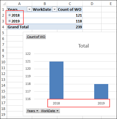
In Excel for Office 365, and the default option settings, my pivot chart shows the total work order count for each year.
在Excel for Office 365和默认选项设置中,我的数据透视图显示了每年的总工单计数。
There are instructions further down, that explain how to change that date grouping option.
后面还有说明,说明了如何更改该日期分组选项。
It also looks like this is a big difference between the years, but that's because the vertical axis starts at 116, instead of zero. We can fix that later, if necessary.
看起来这几年之间存在很大差异,但这是因为垂直轴从116开始,而不是零。 如有必要,我们可以稍后进行修复。
显示月份 (Show the Months)
If your pivot chart is showing the years, the next step is to show the months. (If all dates are showing, go to the next section)
如果您的数据透视图显示年份 ,则下一步是显示月份。 (如果显示所有日期,请转到下一部分)
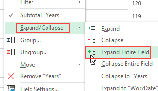
- In the pivot table (not the pivot chart), right-click on one of the years 在数据透视表(不是数据透视图)中,右键单击年份之一
- Point to the Expand/Collapse command 指向“展开/折叠”命令
- Click on the Expand Entire Field command 单击扩展整个字段命令
按月和年分组日期 (Group Dates by Month and Year)
If your pivot chart is showing individual dates, the next step is to fix the date grouping.
如果数据透视图显示各个日期 ,则下一步是修复日期分组。
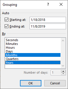
- In the pivot table (not the pivot chart), right-click on one of the dates 在数据透视表(不是数据透视表)中,右键单击日期之一
- Click the Group command 单击组命令
- In the Grouping window, the Starting at and Ending at boxes will show the first and last dates from the WorkDate field 在“分组”窗口中,“开始于”和“结束于”框将显示“工作日期”字段中的开始日期和结束日期
- In the "By" list, click on Months and Years, then click OK 在“按”列表中,单击“月份和年份”,然后单击“确定”。
更改图表类型 (Change the Chart Type)
The pivot chart now shows a bar for each month, from January 2018 to November 2019.
数据透视图现在显示了从2018年1月到2019年11月每个月的条形图。
To compare year over year, we'll change it to a line chart.
为了逐年比较,我们将其更改为折线图。
- Right-click on the pivot chart, and click the Change Chart Type command 右键单击数据透视图,然后单击“更改图表类型”命令
- In the list of chart types, click on Line 在图表类型列表中,单击“线”
- Choose the first line chart option – Line, and click OK 选择第一个折线图选项–折线,然后单击确定
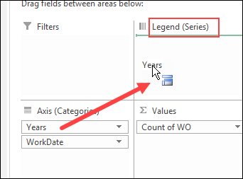
逐年更改 (Change to Year Over Year)
The pivot chart now shows a line, but we want a separate line for each year, not a single line for the two-year time period.
现在,数据透视图显示了一条线,但我们希望每年有一条单独的线,而不是两年时间段的一条线。
You can do the next step in the Pivot Chart, or in the Pivot Table.
您可以在“数据透视表”或“数据透视表”中进行下一步。
Pivot Chart
枢轴图表
- Click on the pivot chart to select it 单击数据透视图以将其选中
- In the PivotChart Fields List, drag the Years field into the Legend (Series) area. 在数据透视图字段列表中,将“年份”字段拖到“图例(系列)”区域中。
Pivot Table
数据透视表
- Click on any cell in the pivot table 单击数据透视表中的任何单元格
In the PivotTable Fields List, drag the Years field into the Columns area.
在“数据透视表字段列表”中 ,将“年”字段拖到“列”区域。
数据透视图中的两条单独的线 (Two Separate Lines in Pivot Chart)
After you move the Years field, the pivot chart will show two separate lines – one for each year.
移动“年份”字段后,数据透视图将显示两条单独的线-每年一条。
The pivot table layout also changes, with the years as column headings, across the top.
数据透视表的布局也随着顶部列的年份而改变。
You can't change a pivot chart, without affecting the pivot table that it's based on.
您不能更改数据透视表,而不会影响它所基于的数据透视表 。
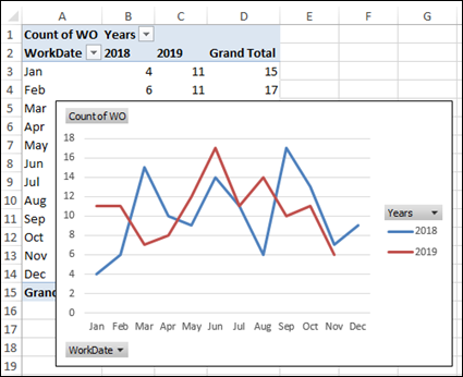
数据透视图格式 (Pivot Chart Formatting)
After you have the pivot chart set up to show a separate line for each year, you can clean up the formatting, if you'd like to.
设置数据透视图以显示每年单独的折线后,可以根据需要清理格式。
Here are a few suggestions:
这里有一些建议:
Value Button: In the pivot table, change "Count of WO" to "Work Orders", in the top left cell. That will change the label at the top left of the pivot chart.
值按钮 :在数据透视表中,将左上方单元格中的“ WO的计数”更改为“工单”。 这将更改数据透视图左上方的标签。
Legend: In the pivot chart, right-click the Legend, and click Format Legend
图例 :在数据透视图中,右键单击图例,然后单击设置图例格式
- For the Legend position, choose Top, and uncheck the option to Show the legend without overlapping the chart 对于图例位置,选择顶部,然后取消选中显示图例而不重叠图表的选项
- Right-click on the Legend button, and click Hide Legend Field buttons on Chart 用鼠标右键单击图例按钮,然后单击图表上的隐藏图例字段按钮
- Then, point to the Legend's border, and drag the Legend to a new position, if necessary, so it doesn't cover the lines 然后,指向图例的边框,并在必要时将图例拖动到新位置,以免覆盖线
Axis Button: Right-click on the WorkDate button, and click Hide Axis Field buttons on Chart
轴按钮 :右键单击“工作日期”按钮,然后单击“图表”上的“隐藏轴字段”按钮。
Here's the pivot chart, after making those changes.
进行这些更改后,这是数据透视图。
自动数据透视表日期分组 (Automatic Pivot Table Date Grouping)
In Excel 2016 and later versions, when you create a Pivot Table, Excel automatically groups the dates into years and months.
在Excel 2016和更高版本中,当您创建数据透视表时,Excel会自动将日期分为年份和月份。
If you'd prefer to see individual dates, follow these steps to change your Excel options.
如果您希望查看各个日期,请按照以下步骤更改Excel选项。
NOTE: This is an application-level setting, and will affect all your Excel workbooks.
注意:这是应用程序级别的设置 ,并且会影响您所有的Excel工作簿。
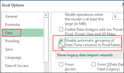
- On the Ribbon, click the File tab, then click Options 在功能区上,单击“文件”选项卡,然后单击“选项”。
- Click the Data category, and at the end of the Data options section, add a check mark to "Disable automatic grouping of Date/Time columns in PivotTables" 单击“数据”类别,然后在“数据选项”部分的末尾,向“在数据透视表中禁用日期/时间列的自动分组”中添加一个复选标记。
- Click OK to apply the new settings. 单击确定以应用新设置。
获取数据透视图示例文件 (Get the Pivot Chart Sample File)
To get the workbook with the Work Order data, go to the Pivot Chart Compare Years page on my Contextures website.
若要获取带有工作单数据的工作簿,请转到Contextures网站上的“数据透视图比较年份”页面 。
The zipped file is in xlsx format, and does not contain any macros.
压缩文件为xlsx格式,不包含任何宏。
翻译自: https://contexturesblog.com/archives/2019/11/07/compare-annual-data-in-excel-pivot-chart/


 3万+
3万+

 被折叠的 条评论
为什么被折叠?
被折叠的 条评论
为什么被折叠?
 到【灌水乐园】发言


