


文章目录
一、关于 Plotly Express
Plotly Express 是一个简洁、一致、高级的用于创建图形的 API。
plotly.express模块(通常作为 导入px)包含可以一次创建整个图形的函数,称为 Plotly Express 或 PX。
Plotly Express 是库的内置部分plotly,是创建最常见图形的推荐起点。
每个 Plotly Express 函数在内部都使用 graph object 并返回一个plotly.graph_objects.Figure实例。
在整个plotly文档中,您将在任何适用页面的顶部 找到构建图形的 Plotly Express 方法,后面是有关如何使用图形对象构建类似图形的部分。
使用 Plotly Express 在单个函数调用中创建的任何图形都可以单独使用图形对象来创建,但代码要多 5 到 100 倍。
Plotly Express 提供了30 多个用于创建不同类型图形的函数。这些函数的 API 经过精心设计,尽可能保持一致且易于学习,从而可以在整个数据探索会话中轻松地从散点图切换到条形图、直方图、旭日图。
向下滚动查看 Plotly Express 绘图库,每个绘图都是在单个函数调用中生成的。
以下是SciPy 2021 会议的演讲,很好地介绍了 Plotly Express 和Dash:
Plotly Express 目前包含以下功能:
- 基本:
scatter,line,area,bar,funnel,timeline - 部分整体:
pie,sunburst,treemap,icicle,funnel_area - 一维分布:
histogram,box,violin,strip,ecdf - 二维分布:
density_heatmap,density_contour - 矩阵或图像输入:
imshow - 3维:
scatter_3d,line_3d - 多维:
scatter_matrix,parallel_coordinates,parallel_categories - 平铺地图:
scatter_mapbox,line_mapbox,choropleth_mapbox,density_mapbox - 轮廓图:
scatter_geo,line_geo,choropleth - 极坐标图:
scatter_polar,line_polar,bar_polar - 三元图表:
scatter_ternary,line_ternary
高级功能
Plotly Express API 一般提供以下功能:
- 单一入口点
plotly:只需要import plotly.express as px,访问所有绘图功能,以及在px.data下的内置演示数据集 和px.color下的内置色标和序列。
每个 PX 函数都会返回一个plotly.graph_objects.Figure对象,因此您可以使用所有相同的方法(例如update_layout和add_trace)来编辑它。 - 合理的、可重写的默认值:PX 函数将尽可能推断合理的默认值,并且始终允许您重写它们。
- 灵活的输入格式:PX 函数接受各种格式的输入,从
lists 和dicts 到长格式或宽格式DataFrames ,再到numpy数组xarrays和 GeoPandasGeoDataFrames。 - 自动跟踪和布局配置:PX 函数将为映射到离散颜色、符号、虚线、面行和/或面列的数据值的每个唯一组合的每个动画帧创建一个跟踪。设置迹线
legendgroup和showlegend属性,使得每个离散颜色、符号和/或虚线的唯一组合仅出现一个图例项。跟踪会自动链接到正确配置的适当类型的子图。 - 自动图形标签:PX 函数根据输入或来标记轴、图例和颜色条,并通过参数提供额外的控制。
DataFrame``xarraylabels - 自动悬停标签:PX 函数使用上述标签填充悬停标签,并通过
hover_name和hover_data参数提供额外的控制。 - 样式控制:PX 函数从默认图形模板中读取样式信息,并支持常用的修饰控件,例如
category_orders和color_discrete_map来精确控制分类变量。 - 统一颜色处理:PX 功能根据输入类型自动在连续颜色和分类颜色之间切换。
- 分面:2D 笛卡尔绘图函数支持行、列和带有
facet_row、facet_col和facet_col_wrap参数的包装分面。 - 边际图:二维笛卡尔绘图函数支持使用、和参数绘制边际分布图。
marginal``marginal_x``marginal_y - Pandas 后端:2D 笛卡尔绘图函数可用作Pandas 绘图后端,因此您可以通过 调用它们
df.plot()。 - 趋势线:
px.scatter支持具有可访问模型输出的内置趋势线。 - 动画:许多 PX 函数通过和参数支持简单的动画
animation_frame``animation_group。 - 自动WebGL切换:对于足够大的散点图,PX将自动使用WebGL进行硬件加速渲染。
Dash 中的 Plotly Express
Dash是使用 Plotly 数字在 Python 中构建分析应用程序的最佳方式。
要运行下面的应用程序,请运行pip install dash,单击“下载”以获取代码并运行python app.py。
开始使用Dash 官方文档,了解如何使用Dash Enterprise 轻松设计和部署此类应用程序。
app = Dash(__name__)

app.layout = html.Div([
    html.H4('Analysis of Iris data using scatter matrix'),
    dcc.Dropdown(
        id="dropdown",
        options=['sepal_length', 'sepal_width', 'petal_length', 'petal_width'],
        value=['sepal_length', 'sepal_width'],
        multi=True
    ),
    dcc.Graph(id="graph"),
])


@app.callback(
    Output("graph", "figure"),
    Input("dropdown", "value"))
def update_bar_chart(dims):
    df = px.data.iris() # replace with your own data source
    fig = px.scatter_matrix(
        df, dimensions=dims, color="species")
    return fig


app.run_server(debug=True)
关于 Dash
Dash是一个用于构建分析应用程序的开源框架,不需要 JavaScript,并且与 Plotly 图形库紧密集成。
了解如何安装 Dash,请访问https://dash.plot.ly/installation。
在此页面中您看到的任何地方,您都可以通过将内置包中的组件参数fig.show()传递给 Dash 应用程序来显示相同的图形,如下所示:figureGraphdash_core_components
import plotly.graph_objects as go # or plotly.express as px
fig = go.Figure() # or any Plotly Express function e.g. px.bar(...)
# fig.add_trace( ... )
# fig.update_layout( ... )

from dash import Dash, dcc, html

app = Dash()
app.layout = html.Div([
    dcc.Graph(figure=fig)
])

app.run_server(debug=True, use_reloader=False)  # Turn off reloader if inside Jupyter
安装
pip install plotly==5.22.0
二、画廊
下面的一组图只是 Plotly Express 可以完成的工作的一个示例。
1、Scatter, Line, Area and Bar Charts
import plotly.express as px
df = px.data.iris()
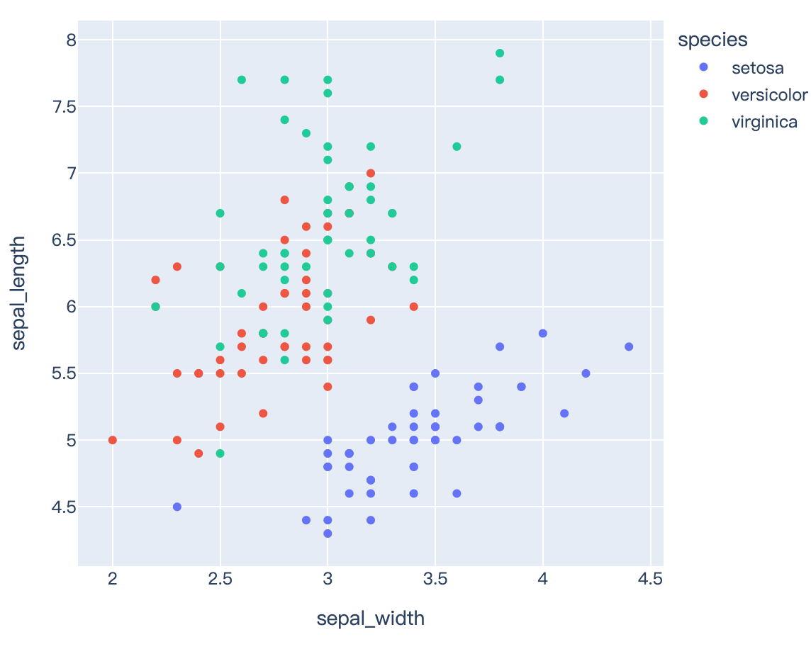
fig = px.scatter(df, x="sepal_width", y="sepal_length", color="species")
fig.show()
Read more about trendlines and templates and marginal distribution plots.
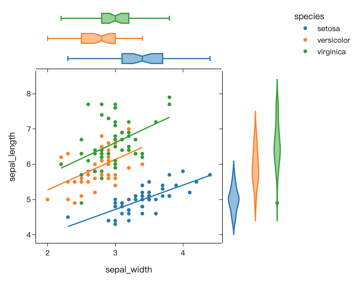
import plotly.express as px
df = px.data.iris()
fig = px.scatter(df, x="sepal_width", y="sepal_length", color="species", marginal_y="violin",
           marginal_x="box", trendline="ols", template="simple_white")
fig.show()
Read more about error bars.
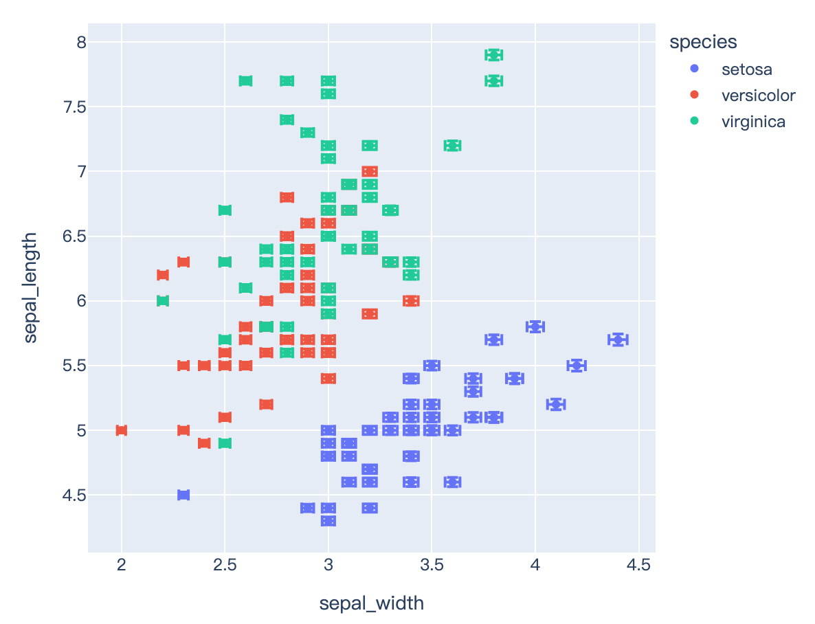
import plotly.express as px
df = px.data.iris()
df["e"] = df["sepal_width"]/100
fig = px.scatter(df, x="sepal_width", y="sepal_length", color="species", error_x="e", error_y="e")
fig.show()
Read more about bar charts.
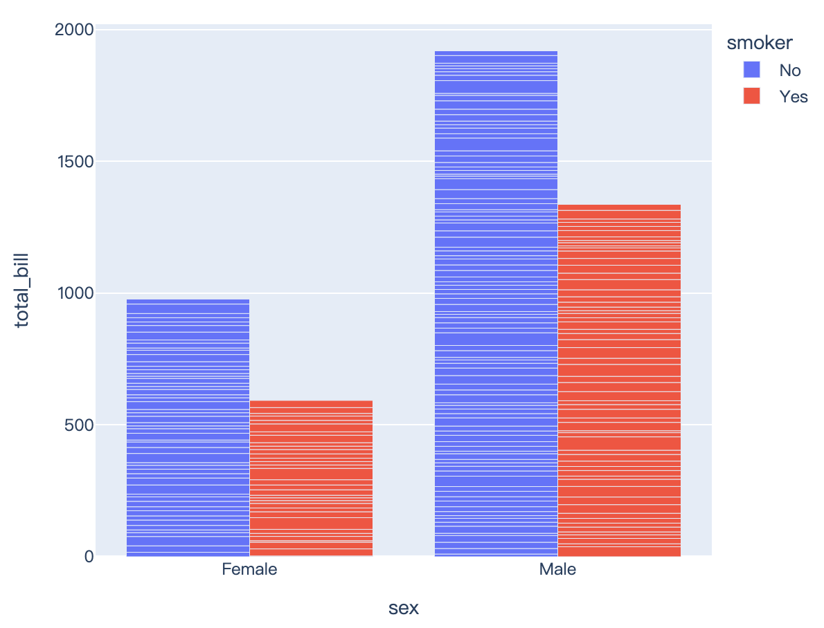
import plotly.express as px
df = px.data.tips()
fig = px.bar(df, x="sex", y="total_bill", color="smoker", barmode="group")
fig.show()
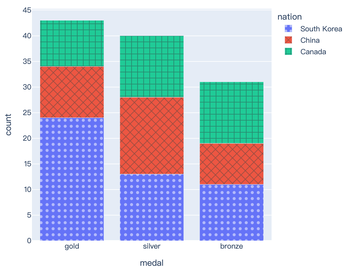
import plotly.express as px
df = px.data.medals_long()
fig = px.bar(df, x="medal", y="count", color="nation",
pattern_shape="nation", pattern_shape_sequence=[".", "x", "+"])
fig.show()
import plotly.express as px
df = px.data.medals_long()

fig = px.bar(df, x="medal", y="count", color="nation",
             pattern_shape="nation", pattern_shape_sequence=[".", "x", "+"])
fig.show()
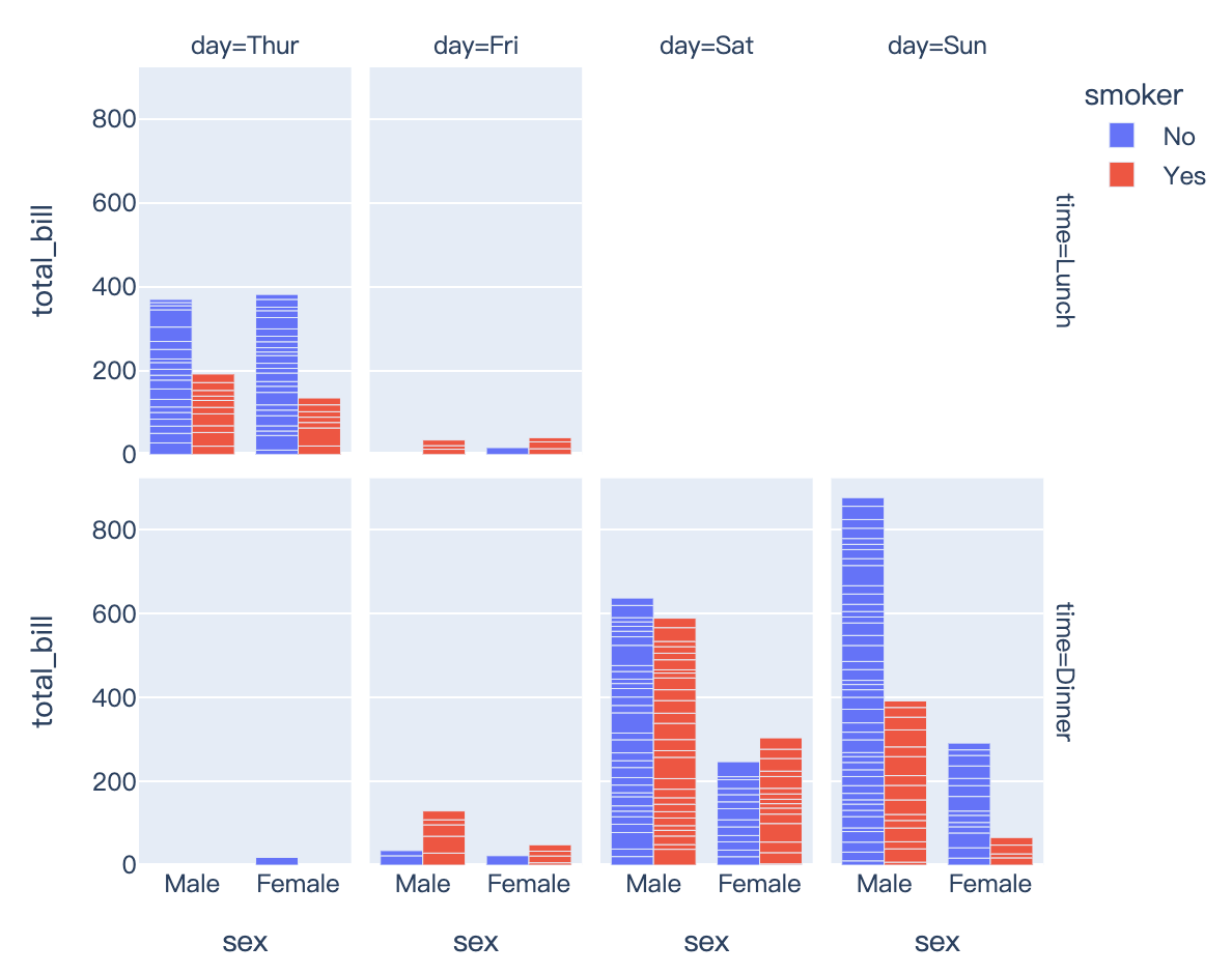
Read more about facet plots.
import plotly.express as px
df = px.data.tips()
fig = px.bar(df, x="sex", y="total_bill", color="smoker", barmode="group", facet_row="time", facet_col="day",
       category_orders={"day": ["Thur", "Fri", "Sat", "Sun"], "time": ["Lunch", "Dinner"]})
fig.show()
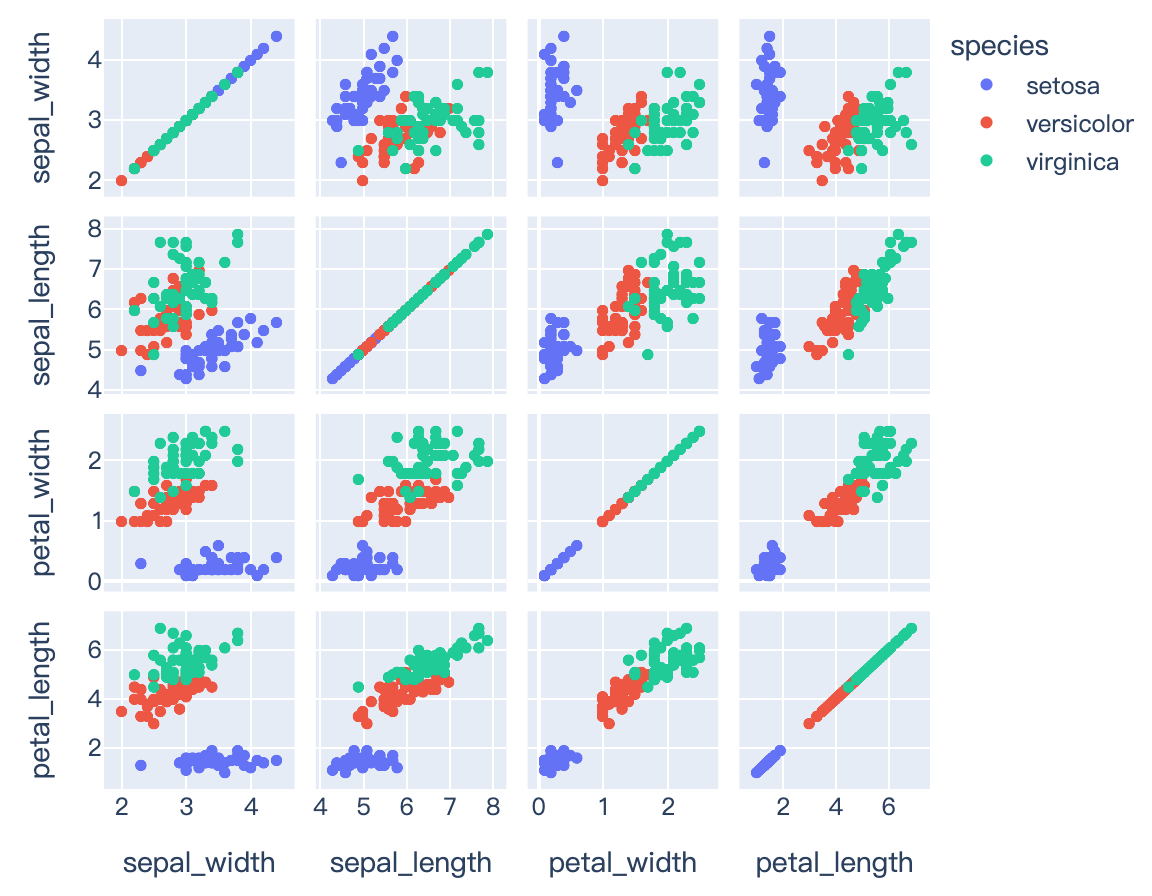
Read more about scatterplot matrices (SPLOMs).
import plotly.express as px
df = px.data.iris()
fig = px.scatter_matrix(df, dimensions=["sepal_width", "sepal_length", "petal_width", "petal_length"], color="species")
fig.show()
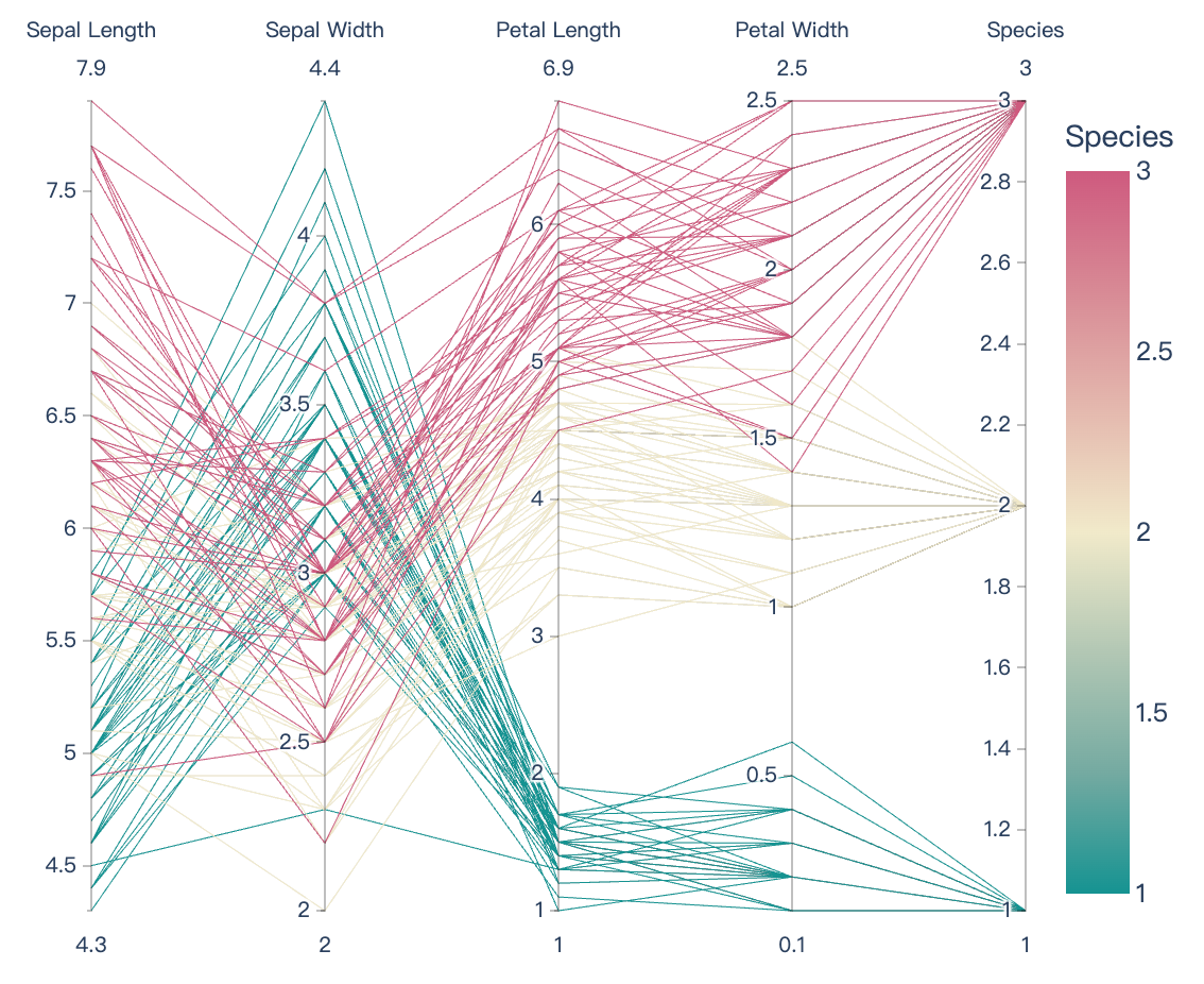
Read more about parallel coordinates and parallel categories, as well as continuous color.
import plotly.express as px
df = px.data.iris()
fig = px.parallel_coordinates(df, color="species_id", labels={"species_id": "Species",
"sepal_width": "Sepal Width", "sepal_length": "Sepal Length",
"petal_width": "Petal Width", "petal_length": "Petal Length", },
color_continuous_scale=px.colors.diverging.Tealrose, color_continuous_midpoint=2)
fig.show()
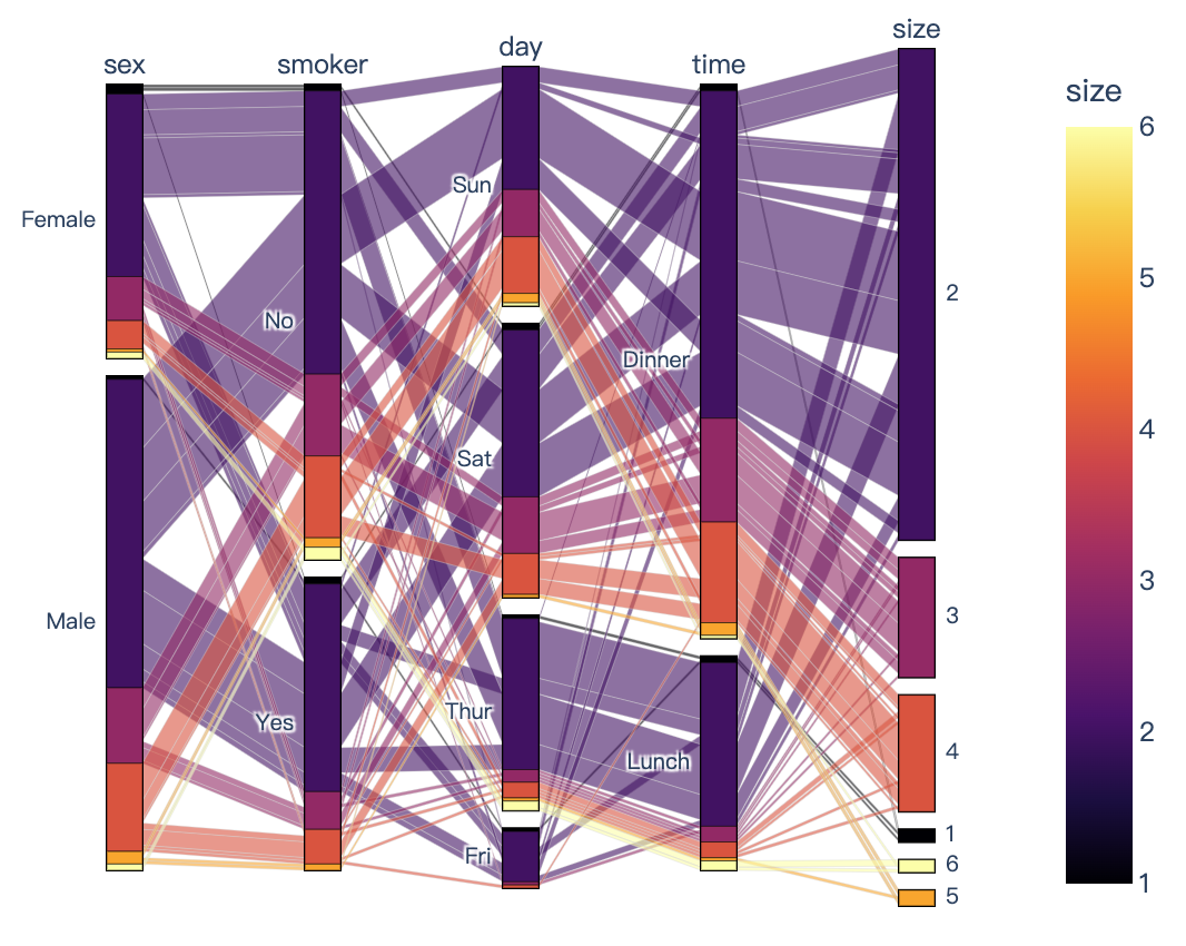
import plotly.express as px
df = px.data.tips()
fig = px.parallel_categories(df, color="size", color_continuous_scale=px.colors.sequential.Inferno)
fig.show()
import plotly.express as px
df = px.data.tips()
fig = px.parallel_categories(df, color="size", color_continuous_scale=px.colors.sequential.Inferno)
fig.show()
Read more about hover labels.
import plotly.express as px
df = px.data.gapminder()
fig = px.scatter(df.query("year==2007"), x="gdpPercap", y="lifeExp", size="pop", color="continent",
           hover_name="country", log_x=True, size_max=60)
fig.show()
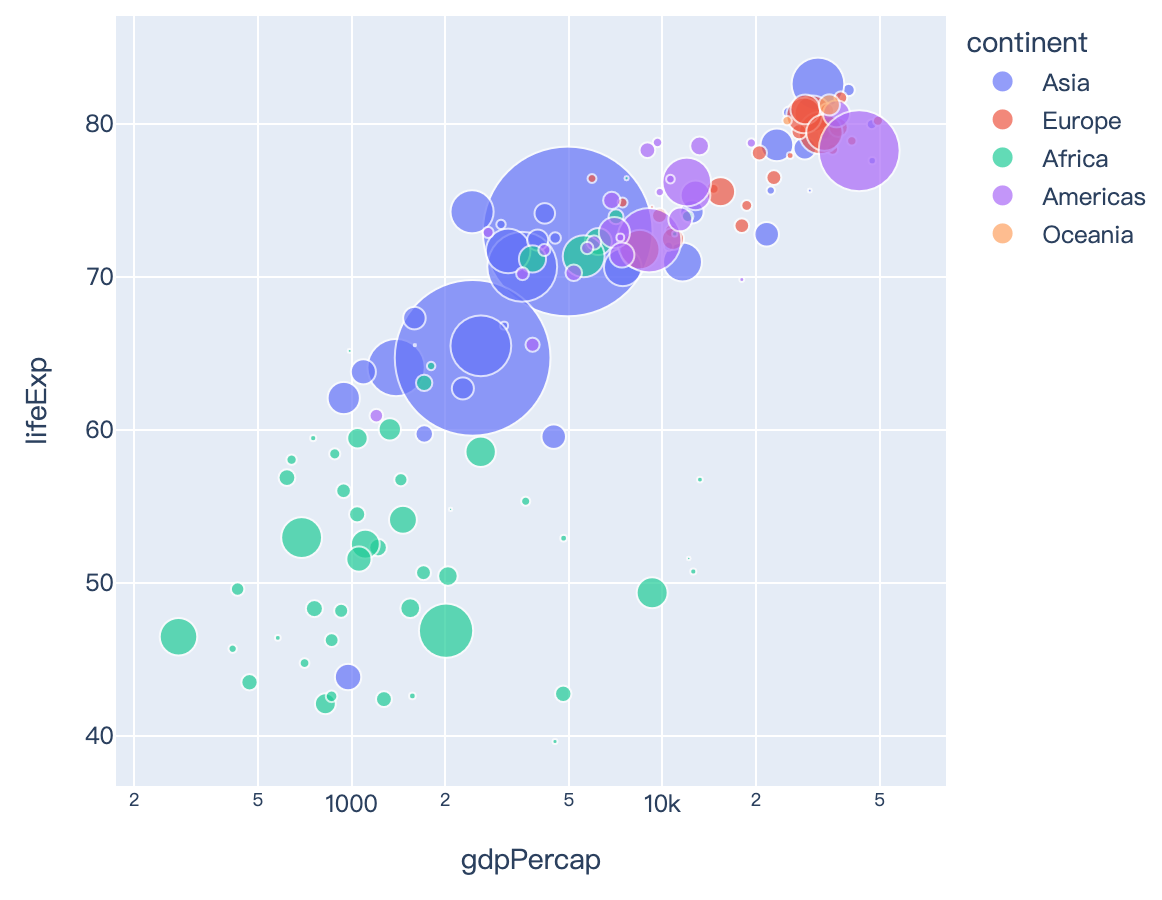
Read more about animations.
import plotly.express as px
df = px.data.gapminder()
fig = px.scatter(df, x="gdpPercap", y="lifeExp", animation_frame="year", animation_group="country",
           size="pop", color="continent", hover_name="country", facet_col="continent",
           log_x=True, size_max=45, range_x=[100,100000], range_y=[25,90])
fig.show()
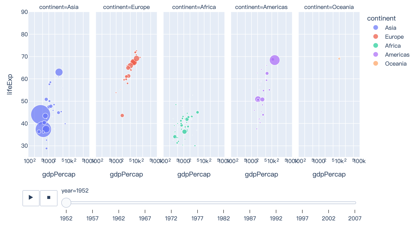
Read more about line charts.
import plotly.express as px
df = px.data.gapminder()
fig = px.line(df, x="year", y="lifeExp", color="continent", line_group="country", hover_name="country",
        line_shape="spline", render_mode="svg")
fig.show()

Read more about area charts.
import plotly.express as px
df = px.data.gapminder()
fig = px.area(df, x="year", y="pop", color="continent", line_group="country")
fig.show()
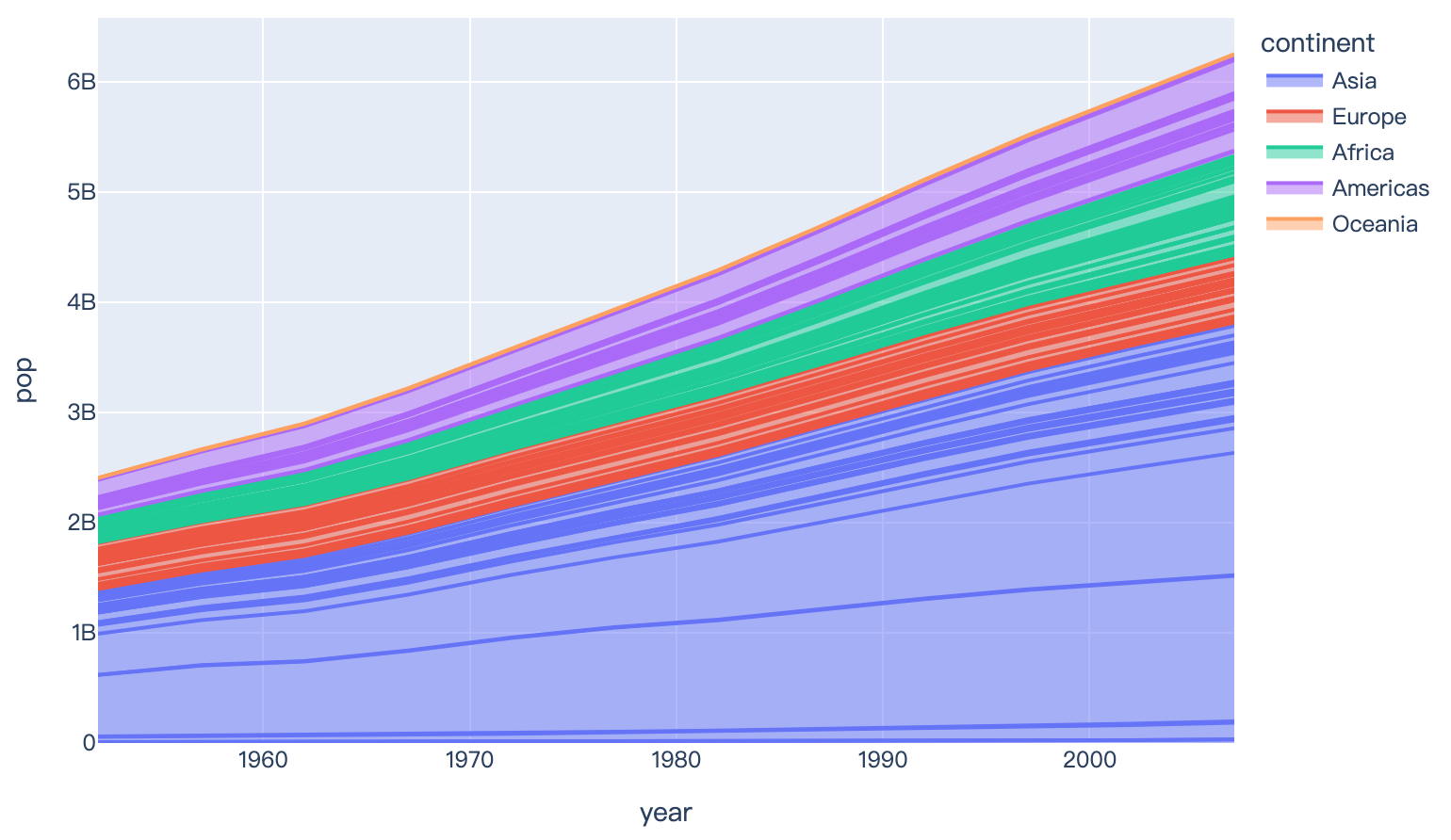
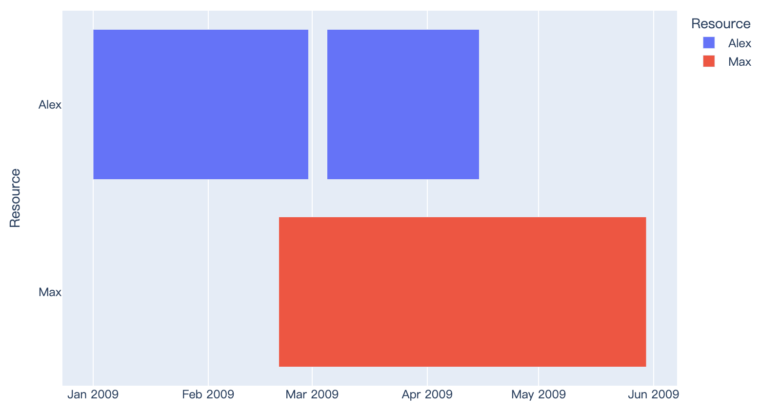
Read more about timeline/Gantt charts.
import plotly.express as px
import pandas as pd

df = pd.DataFrame([
    dict(Task="Job A", Start='2009-01-01', Finish='2009-02-28', Resource="Alex"),
    dict(Task="Job B", Start='2009-03-05', Finish='2009-04-15', Resource="Alex"),
    dict(Task="Job C", Start='2009-02-20', Finish='2009-05-30', Resource="Max")
])

fig = px.timeline(df, x_start="Start", x_end="Finish", y="Resource", color="Resource")
fig.show()
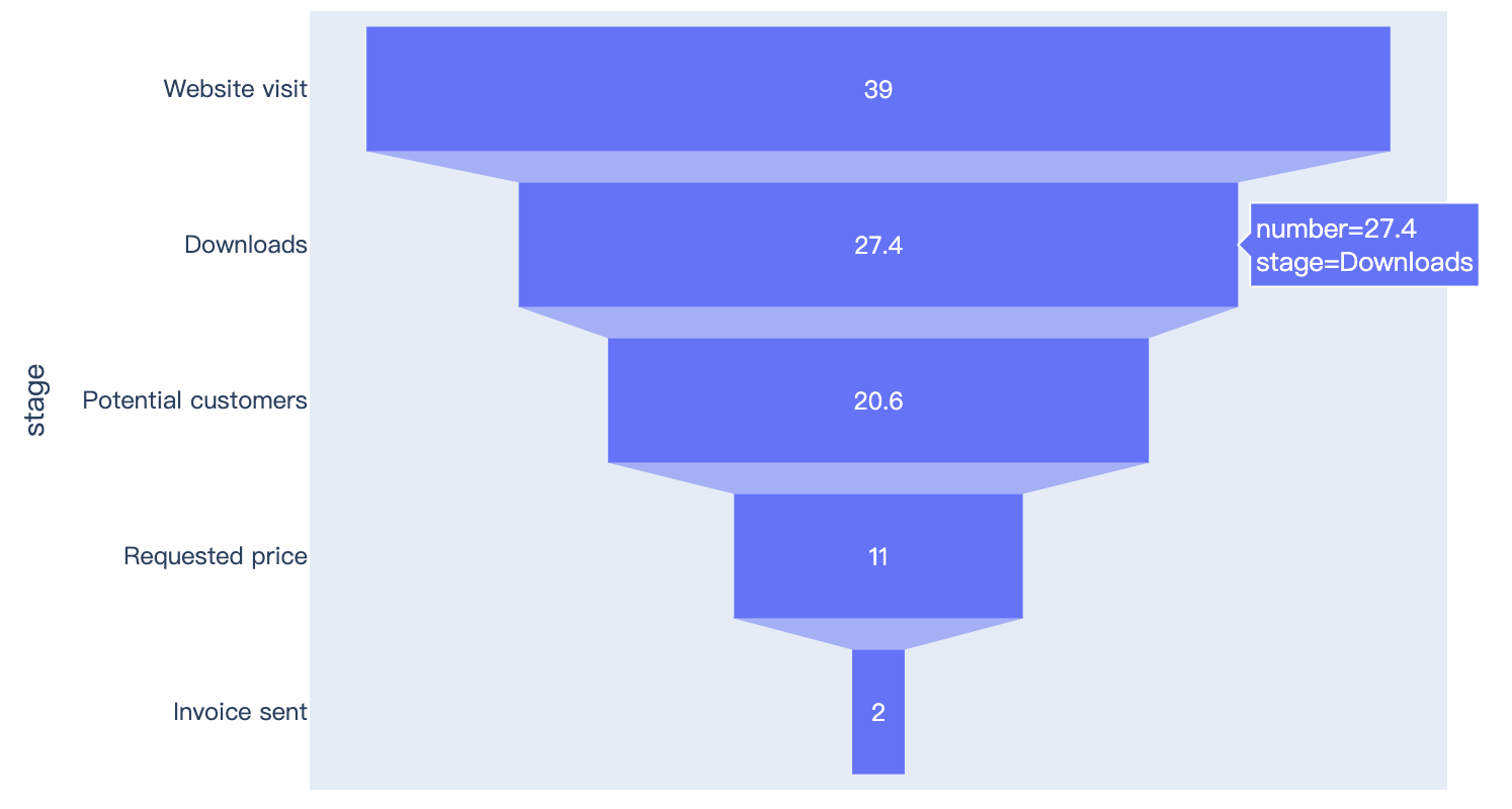
Read more about funnel charts.
import plotly.express as px
data = dict(
    number=[39, 27.4, 20.6, 11, 2],
    stage=["Website visit", "Downloads", "Potential customers", "Requested price", "Invoice sent"])
fig = px.funnel(data, x='number', y='stage')
fig.show()
2、Part to Whole Charts
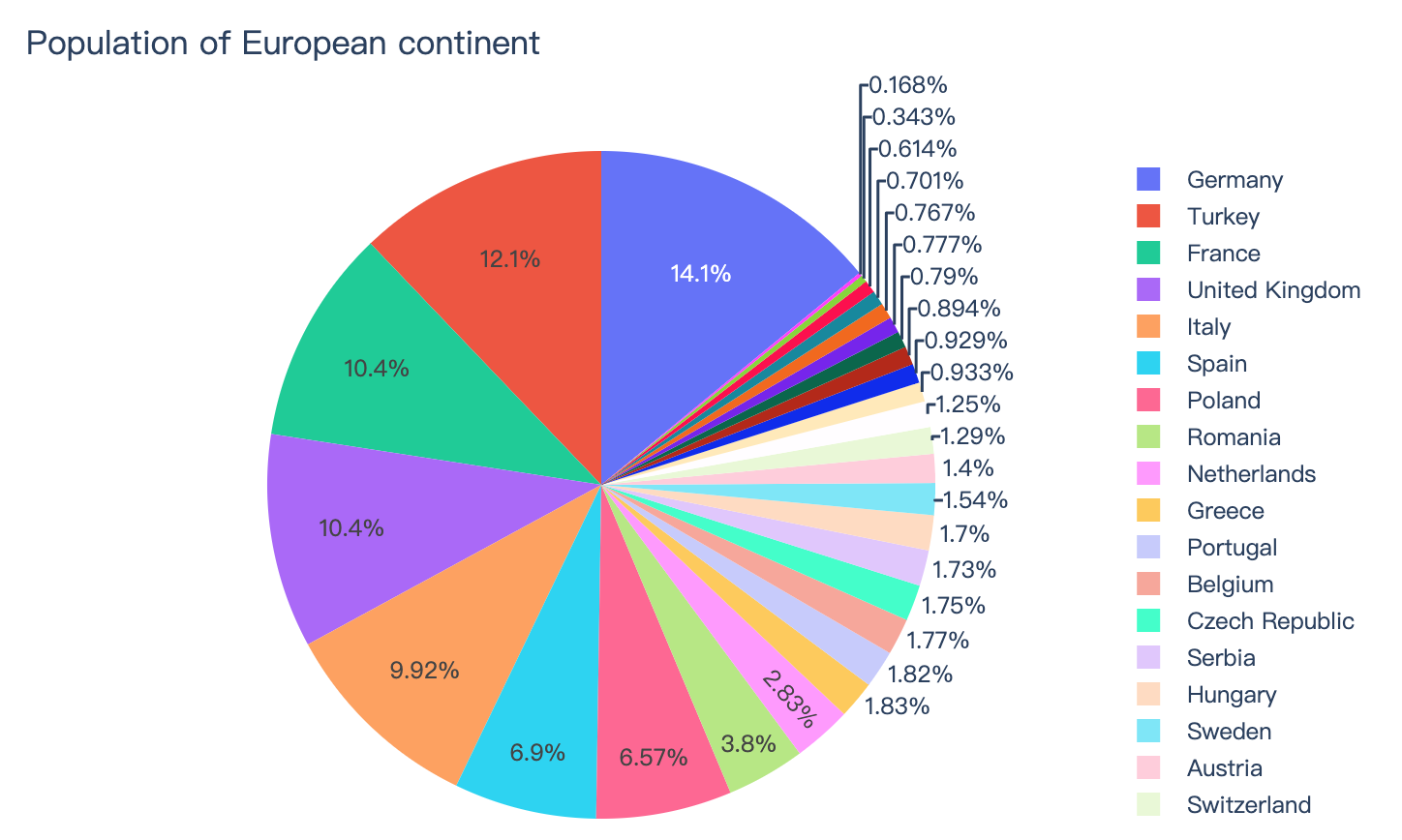
Read more about pie charts.
import plotly.express as px
df = px.data.gapminder().query("year == 2007").query("continent == 'Europe'")
df.loc[df['pop'] < 2.e6, 'country'] = 'Other countries' # Represent only large countries
fig = px.pie(df, values='pop', names='country', title='Population of European continent')
fig.show()
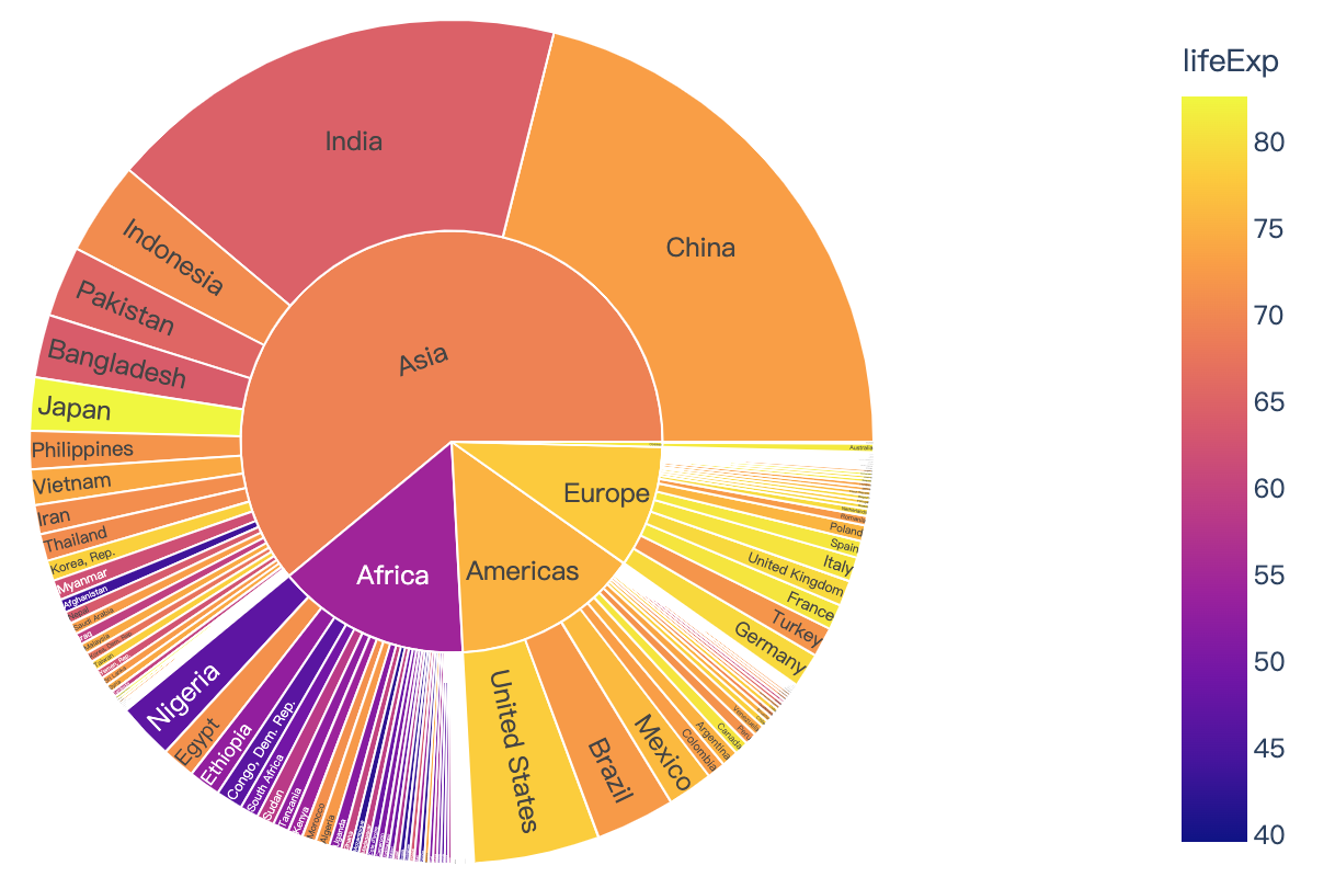
Read more about sunburst charts.
import plotly.express as px

df = px.data.gapminder().query("year == 2007")
fig = px.sunburst(df, path=['continent', 'country'], values='pop',
                  color='lifeExp', hover_data=['iso_alpha'])
fig.show()
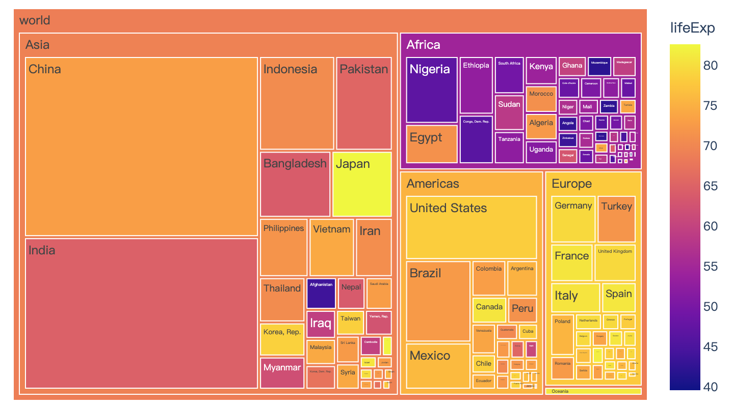
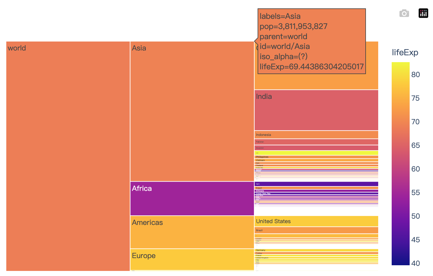
Read more about treemaps.
import plotly.express as px
import numpy as np
df = px.data.gapminder().query("year == 2007")
fig = px.treemap(df, path=[px.Constant('world'), 'continent', 'country'], values='pop',
                  color='lifeExp', hover_data=['iso_alpha'])
fig.show()
Read more about icicle charts.
import plotly.express as px
import numpy as np
df = px.data.gapminder().query("year == 2007")
fig = px.icicle(df, path=[px.Constant('world'), 'continent', 'country'], values='pop',
                  color='lifeExp', hover_data=['iso_alpha'])
fig.show()
3、Distributions
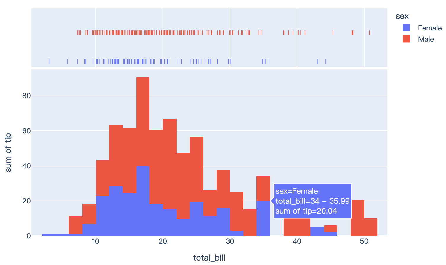
Read more about histograms.
import plotly.express as px
df = px.data.tips()
fig = px.histogram(df, x="total_bill", y="tip", color="sex", marginal="rug", hover_data=df.columns)
fig.show()
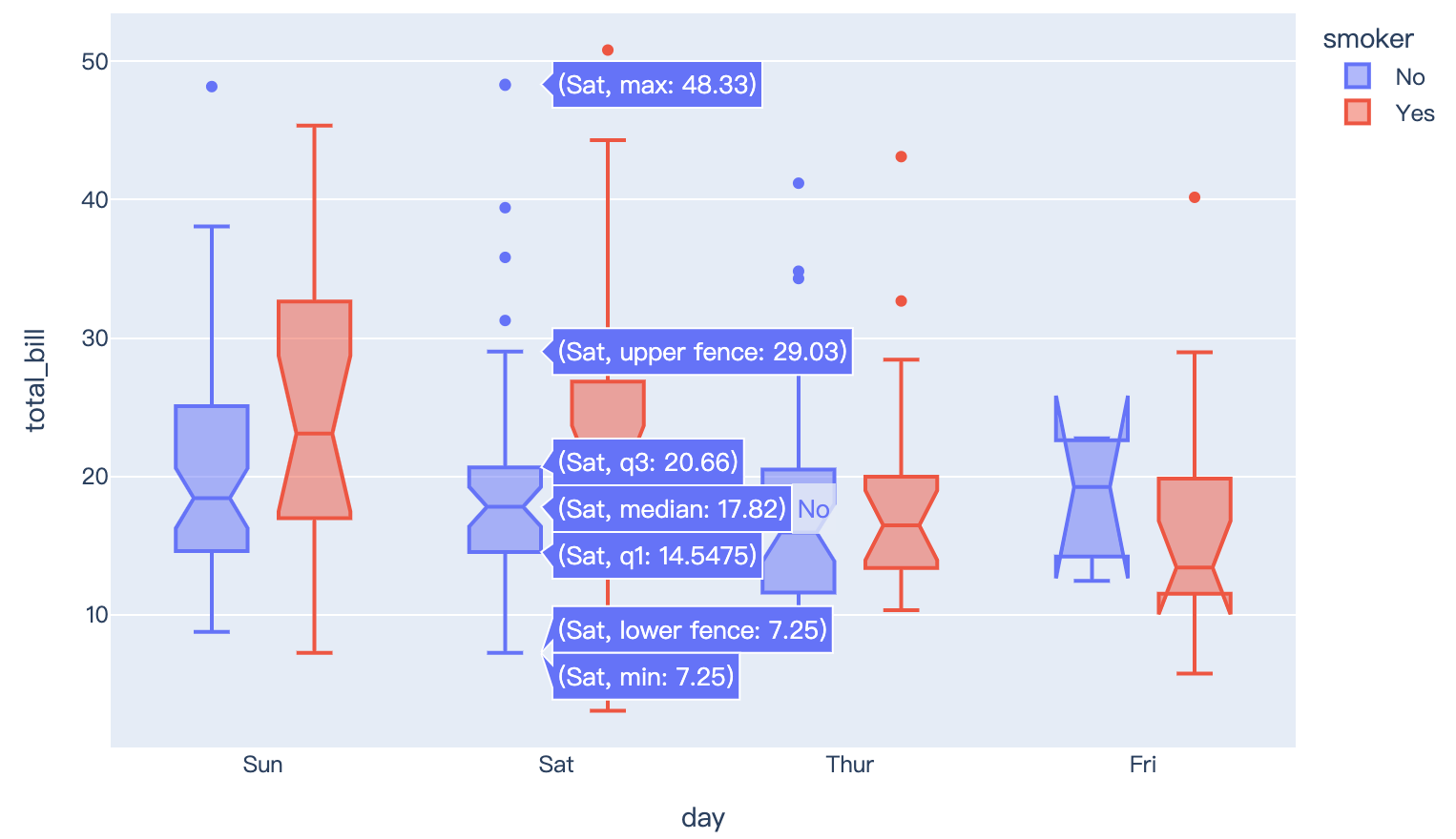
Read more about box plots.
import plotly.express as px
df = px.data.tips()
fig = px.box(df, x="day", y="total_bill", color="smoker", notched=True)
fig.show()
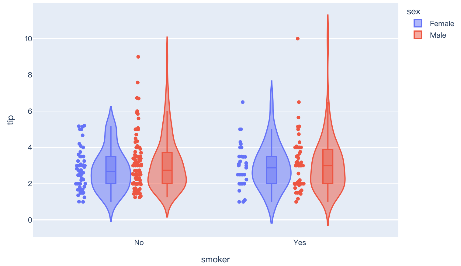
Read more about violin plots.
import plotly.express as px
df = px.data.tips()
fig = px.violin(df, y="tip", x="smoker", color="sex", box=True, points="all", hover_data=df.columns)
fig.show()
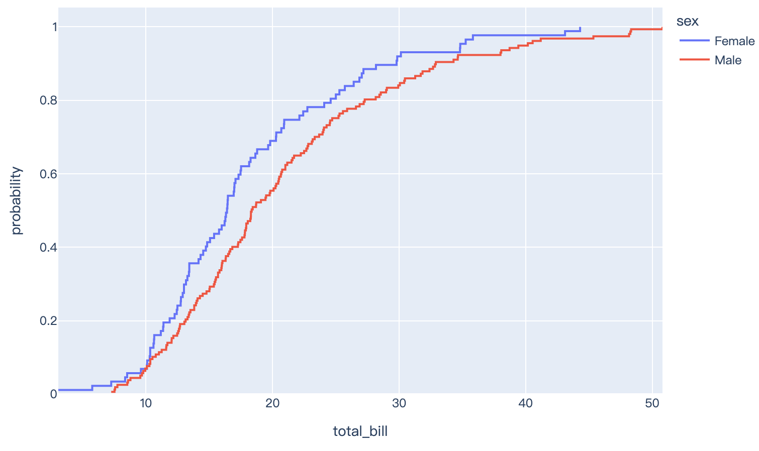
Read more about Empirical Cumulative Distribution Function (ECDF) charts.
import plotly.express as px
df = px.data.tips()
fig = px.ecdf(df, x="total_bill", color="sex")
fig.show()
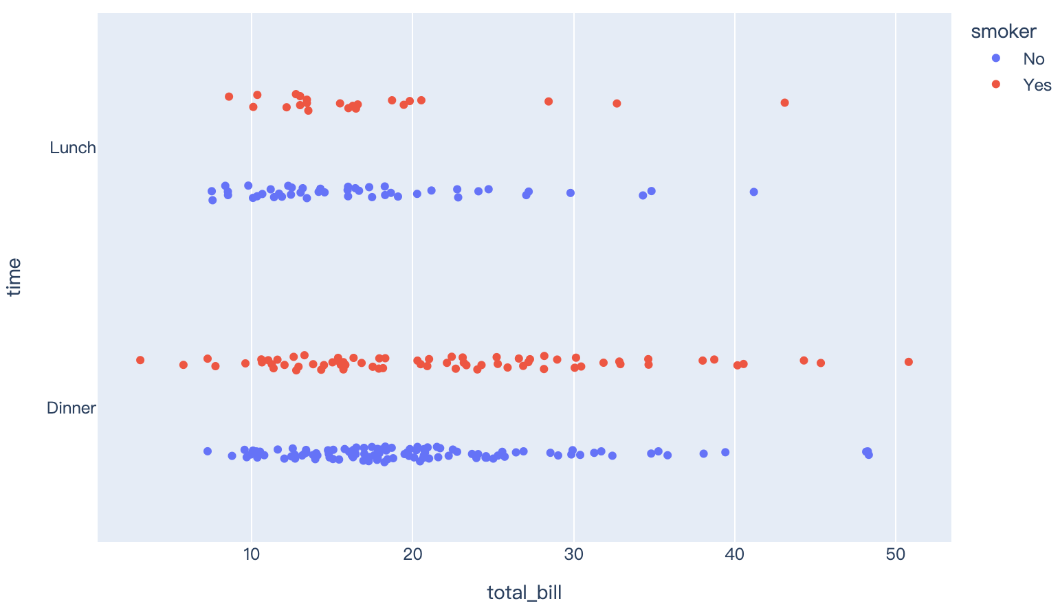
Read more about strip charts.
import plotly.express as px
df = px.data.tips()
fig = px.strip(df, x="total_bill", y="time", orientation="h", color="smoker")
fig.show()
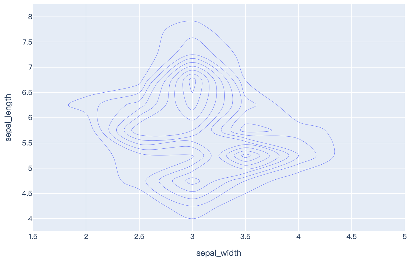
Read more about density contours, also known as 2D histogram contours.
import plotly.express as px
df = px.data.iris()
fig = px.density_contour(df, x="sepal_width", y="sepal_length")
fig.show()
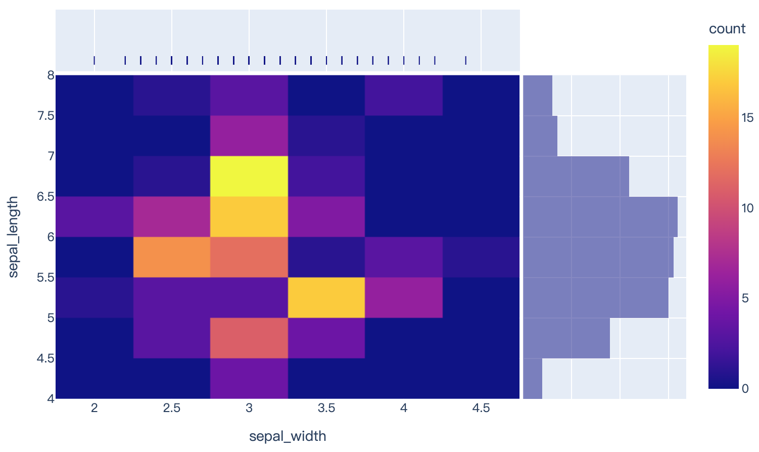
Read more about density heatmaps, also known as 2D histograms.
import plotly.express as px
df = px.data.iris()
fig = px.density_heatmap(df, x="sepal_width", y="sepal_length", marginal_x="rug", marginal_y="histogram")
fig.show()
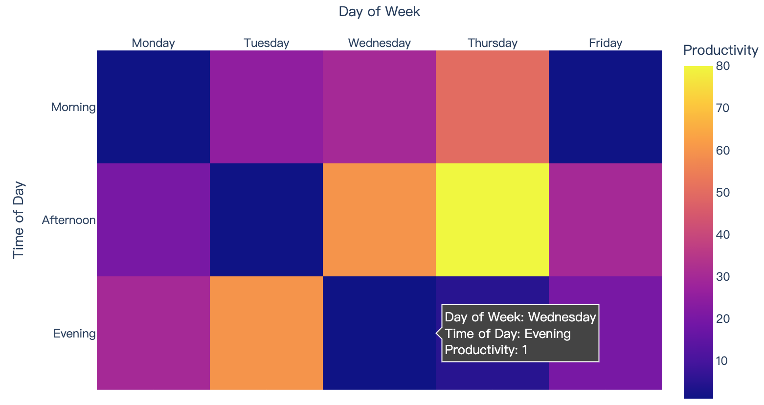
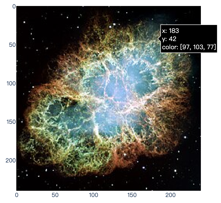
4、Images and Heatmaps
Read more about heatmaps and images.
import plotly.express as px
data=[[1, 25, 30, 50, 1], [20, 1, 60, 80, 30], [30, 60, 1, 5, 20]]
fig = px.imshow(data,
                labels=dict(x="Day of Week", y="Time of Day", color="Productivity"),
                x=['Monday', 'Tuesday', 'Wednesday', 'Thursday', 'Friday'],
                y=['Morning', 'Afternoon', 'Evening']
               )
fig.update_xaxes(side="top")
fig.show()
import plotly.express as px
from skimage import io
img = io.imread('https://upload.wikimedia.org/wikipedia/commons/thumb/0/00/Crab_Nebula.jpg/240px-Crab_Nebula.jpg')
fig = px.imshow(img)
fig.show()
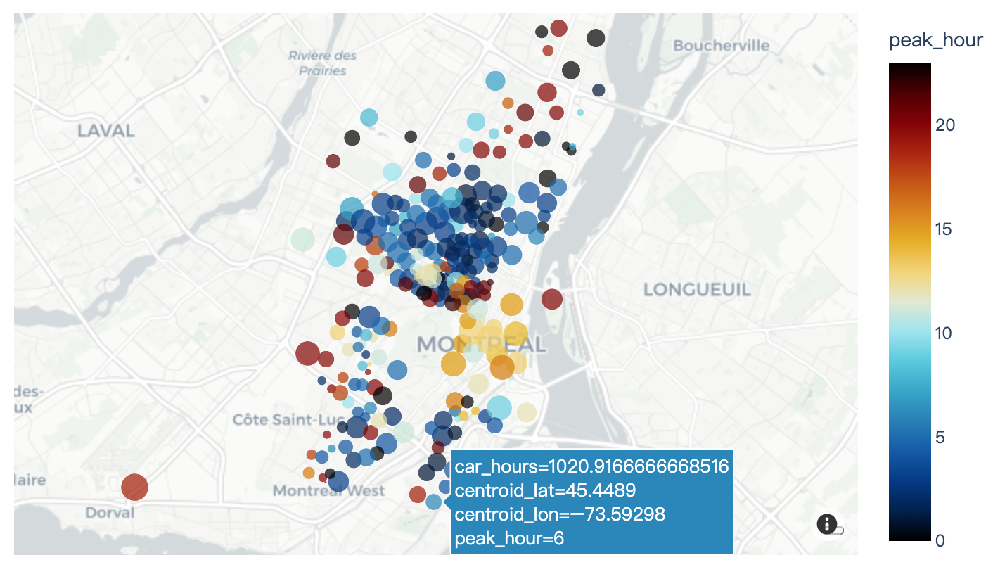
5、Tile Maps
Read more about tile maps and point on tile maps.
import plotly.express as px
df = px.data.carshare()
fig = px.scatter_mapbox(df, lat="centroid_lat", lon="centroid_lon", color="peak_hour", size="car_hours",
                  color_continuous_scale=px.colors.cyclical.IceFire, size_max=15, zoom=10,
                  mapbox_style="carto-positron")
fig.show()
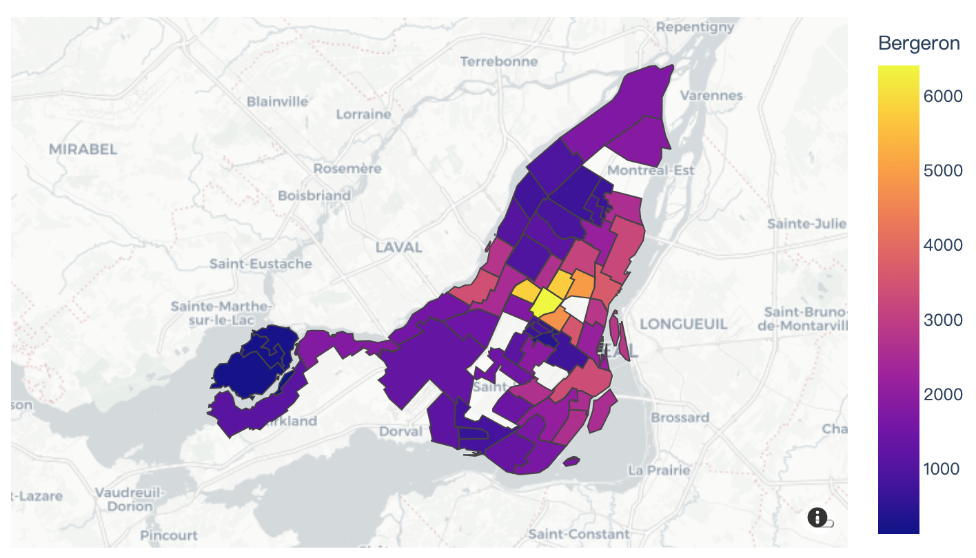
Read more about tile map GeoJSON choropleths.
import plotly.express as px

df = px.data.election()
geojson = px.data.election_geojson()

fig = px.choropleth_mapbox(df, geojson=geojson, color="Bergeron",
                           locations="district", featureidkey="properties.district",
                           center={"lat": 45.5517, "lon": -73.7073},
                           mapbox_style="carto-positron", zoom=9)
fig.show()
6、Outline Maps
Read more about outline symbol maps.
import plotly.express as px
df = px.data.gapminder()
fig = px.scatter_geo(df, locations="iso_alpha", color="continent", hover_name="country", size="pop",
               animation_frame="year", projection="natural earth")
fig.show()
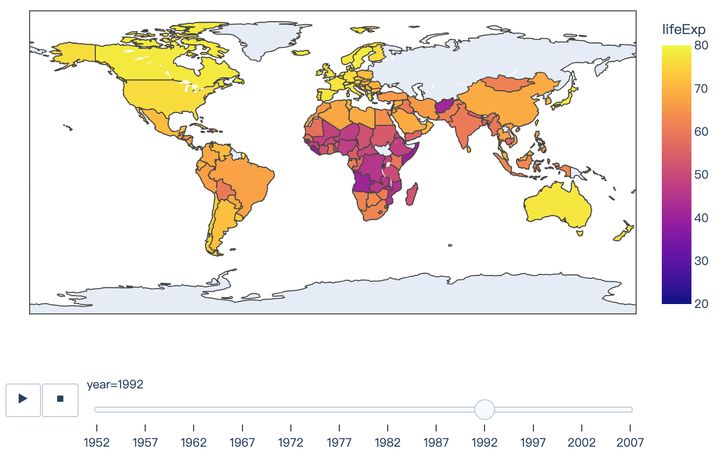
Read more about choropleth maps.
import plotly.express as px
df = px.data.gapminder()
fig = px.choropleth(df, locations="iso_alpha", color="lifeExp", hover_name="country", animation_frame="year", range_color=[20,80])
fig.show()
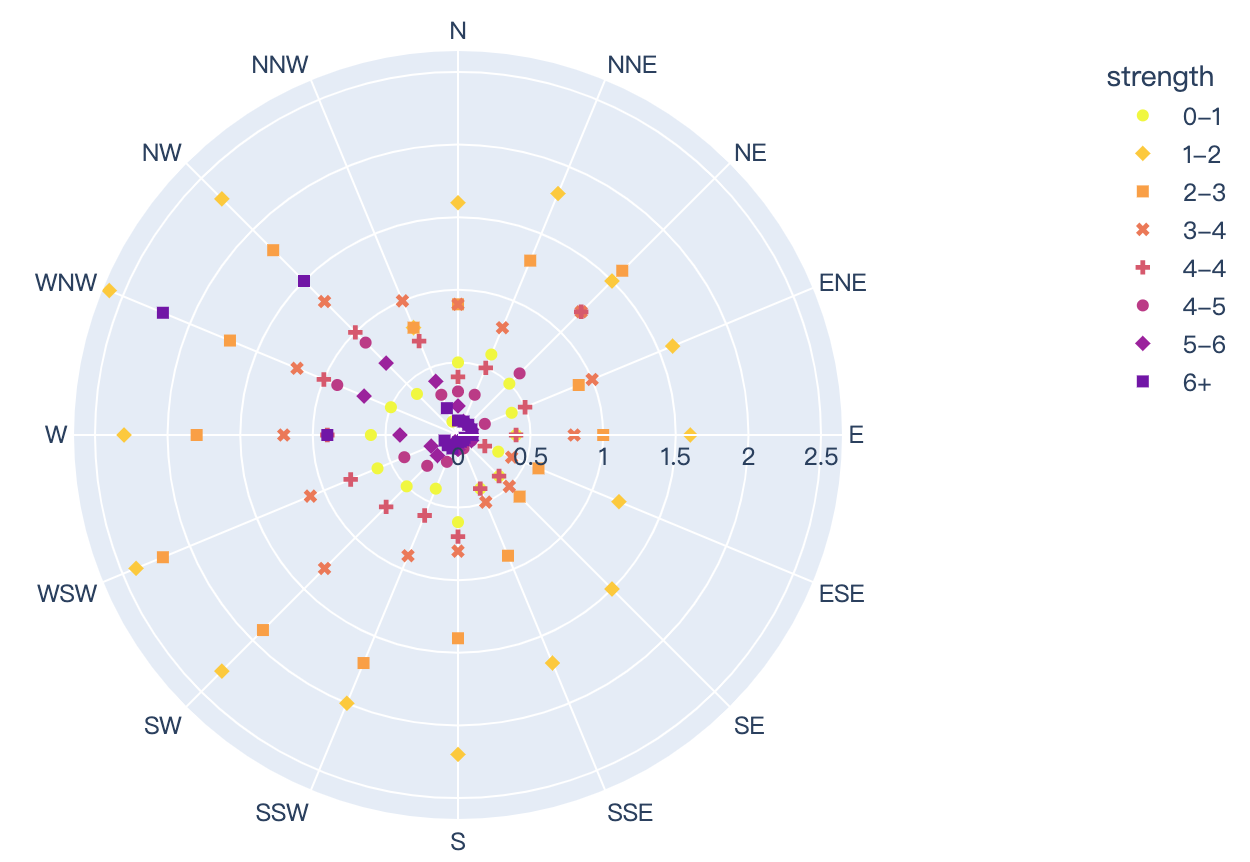
7、Polar Coordinates
Read more about polar plots.
import plotly.express as px
df = px.data.wind()
fig = px.scatter_polar(df, r="frequency", theta="direction", color="strength", symbol="strength",
            color_discrete_sequence=px.colors.sequential.Plasma_r)
fig.show()
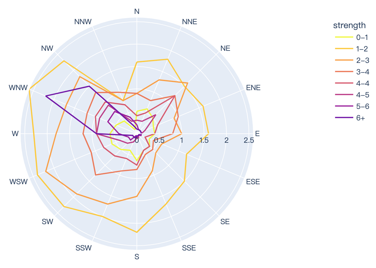
Read more about radar charts.
import plotly.express as px
df = px.data.wind()
fig = px.line_polar(df, r="frequency", theta="direction", color="strength", line_close=True,
            color_discrete_sequence=px.colors.sequential.Plasma_r)
fig.show()
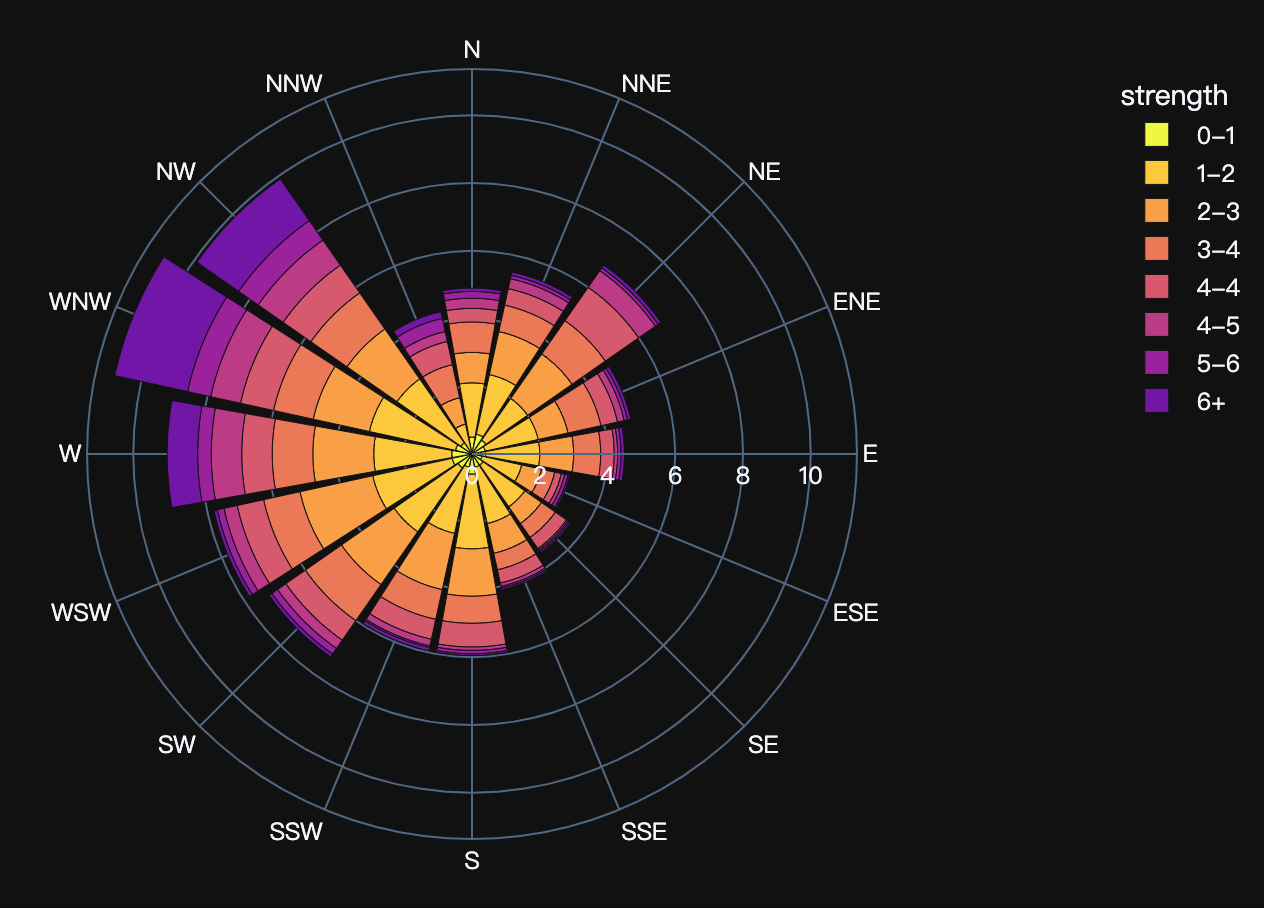
Read more about polar bar charts.
import plotly.express as px
df = px.data.wind()
fig = px.bar_polar(df, r="frequency", theta="direction", color="strength", template="plotly_dark",
            color_discrete_sequence= px.colors.sequential.Plasma_r)
fig.show()
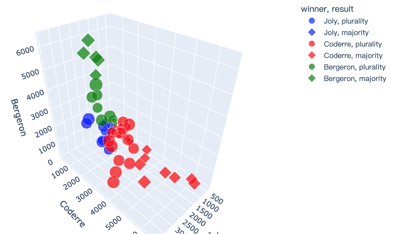
8、3D Coordinates
Read more about 3D scatter plots.
import plotly.express as px
df = px.data.election()
fig = px.scatter_3d(df, x="Joly", y="Coderre", z="Bergeron", color="winner", size="total", hover_name="district",
                  symbol="result", color_discrete_map = {"Joly": "blue", "Bergeron": "green", "Coderre":"red"})
fig.show()
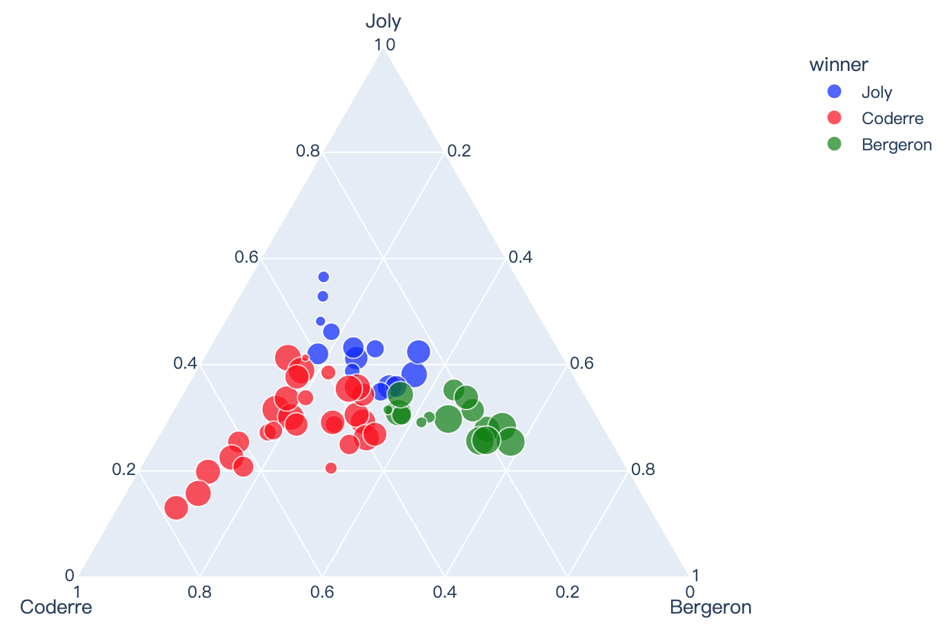
9、Ternary Coordinates
Read more about ternary charts.
import plotly.express as px
df = px.data.election()
fig = px.scatter_ternary(df, a="Joly", b="Coderre", c="Bergeron", color="winner", size="total", hover_name="district",
                   size_max=15, color_discrete_map = {"Joly": "blue", "Bergeron": "green", "Coderre":"red"} )
fig.show()
2024-05-16(四)


 9545
9545

 被折叠的 条评论
为什么被折叠?
被折叠的 条评论
为什么被折叠?
 到【灌水乐园】发言


