


其实非常简单,先看一下实例图网页请点击访问 https://www.pmcainiao.cn/practice/main.html
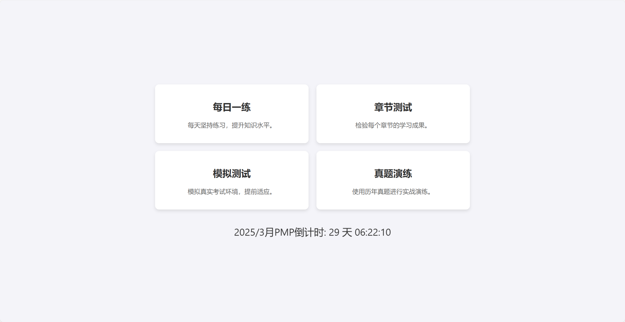
网页主页面
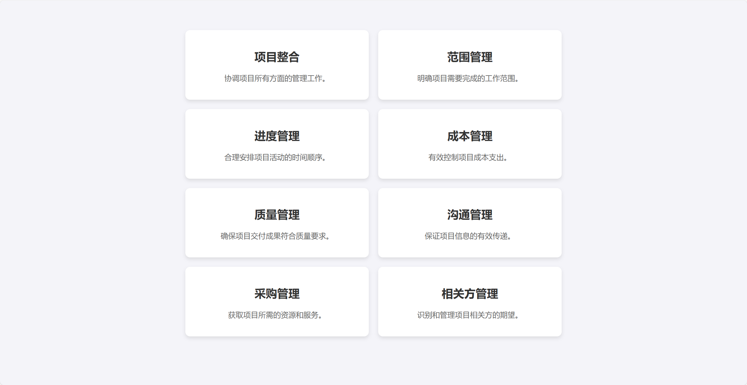
章节测试页面
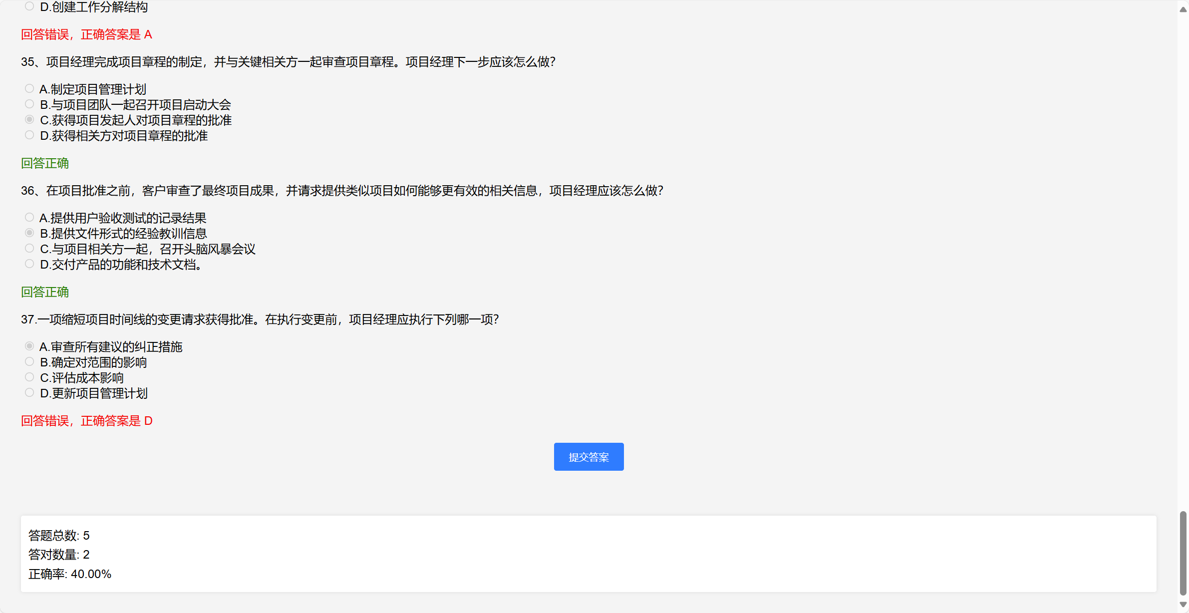
答题页面
其实老生常谈,主要包含有三个部分,那就是Html+Css+JavaScript啦!
html部分:就是网站的主页面
<!DOCTYPE html>
<html lang="en">
<head>
    <meta charset="UTF-8">
    <meta name="viewport" content="width=device-width, initial-scale=1.0">
    <title>学习测试平台</title>
    <link rel="stylesheet" href="main.css">
</head>
<body>
    <div class="container">
        <div class="module" id="daily-practice">
            <h2>每日一练</h2>
            <p>每天坚持练习,提升知识水平。</p>
        </div>
        <div class="module" id="chapter-test" onclick="window.location.href='section.html'">
            <h2>章节测试</h2>
            <p>检验每个章节的学习成果。</p>
        </div>
        <div class="module" id="simulation-test">
            <h2>模拟测试</h2>
            <p>模拟真实考试环境,提前适应。</p>
        </div>
        <div class="module" id="real-exam">
            <h2>真题演练</h2>
            <p>使用历年真题进行实战演练。</p>
        </div>
    </div>
    <div class="countdown" id="countdown">2025/3月PMP倒计时: <span id="timer">00:00:00</span></div>
    <script src="main.js"></script>
</body>
</html>
Css部分:主要包含了网页内各个答题按钮的样式,后面会多加一些炫酷的效果哈哈
body {
    font-family: Arial, sans-serif;
    margin: 0;
    padding: 0;
    display: flex;
    flex-direction: column;
    align-items: center;
    justify-content: center;
    height: 100vh;
    background-color: #f4f4f9;
}

.container {
    display: grid;
    grid-template-columns: repeat(2, 1fr);
    gap: 20px;
    max-width: 800px;
    width: 90%;
}

.module {
    background-color: #fff;
    border-radius: 10px;
    box-shadow: 0 4px 8px rgba(0, 0, 0, 0.1);
    padding: 20px;
    text-align: center;
    transition: transform 0.3s ease-in-out;
}

.module:hover {
    transform: scale(1.05);
}

.module h2 {
    color: #333;
}

.module p {
    color: #666;
}

.countdown {
    margin-top: 40px;
    font-size: 24px;
    color: #333;
    animation: pulse 1.5s infinite;
}

@keyframes pulse {
    0% {
        transform: scale(1);
    }
    50% {
        transform: scale(1.1);
    }
    100% {
        transform: scale(1);
    }
}
JavaScript部分:因为目前的需求不多,仅添加了一个考试倒计时的功能
function startCountdown() {
    // 设置目标日期为 2025 年 3 月 15 日
    const targetDate = new Date("2025-03-15T00:00:00");

    const timer = setInterval(() => {
        const now = new Date().getTime();
        const distance = targetDate - now;

        if (distance < 0) {
            clearInterval(timer);
            document.getElementById('timer').innerHTML = "时间到!";
            return;
        }

        const days = Math.floor(distance / (1000 * 60 * 60 * 24));
        const hours = Math.floor((distance % (1000 * 60 * 60 * 24)) / (1000 * 60 * 60));
        const minutes = Math.floor((distance % (1000 * 60 * 60)) / (1000 * 60));
        const seconds = Math.floor((distance % (1000 * 60)) / 1000);

        const timerElement = document.getElementById('timer');
        timerElement.innerHTML = `${days.toString().padStart(2, '0')} 天 ${hours.toString().padStart(2, '0')}:${minutes.toString().padStart(2, '0')}:${seconds.toString().padStart(2, '0')}`;
    }, 1000);
}

// 页面加载完成后启动倒计时
window.onload = startCountdown;
目前总的来说肯定还是有很多的不完善啦,希望就是抛砖引玉,能够有一个直接可运行的例子引起小伙伴们的学习兴趣,后面会在下班后继续完善的,不说了朋友们,继续沟通(吵架)项目过点去了。


 扫一扫
扫一扫


 608
608

 被折叠的 条评论
为什么被折叠?
被折叠的 条评论
为什么被折叠?
 到【灌水乐园】发言


