


学习视频:b站同济子豪兄
学习代码:需要可留言
目录
前言
这几天用回了Kaggle,它也可以直接显示结果,在流程比较少的时候蛮好用的
今天学的评价指标在各类数据竞赛经常用到
【A】安装配置环境
##直接运行
!pip install numpy pandas scikit-learn matplotlib seaborn requests tqdm opencv-python pillow kaleido -i https://pypi.tuna.tsinghua.edu.cn/simple
##下载安装Pytorch
!pip3 install torch torchvision torchaudio --extra-index-url https://download.pytorch.org/whl/cu113
##下载中文字体文件
# !wget https://zihao-openmmlab.obs.cn-east-3.myhuaweicloud.com/20220716-mmclassification/dataset/SimHei.ttf
##设置matplotlib中文字体
# Linux操作系统,例如 云GPU平台:https://featurize.cn/?s=d7ce99f842414bfcaea5662a97581bd1
# 如果报错 Unable to establish SSL connection.,重新运行本代码块即可
!wget https://zihao-openmmlab.obs.cn-east-3.myhuaweicloud.com/20220716-mmclassification/dataset/SimHei.ttf -O /environment/miniconda3/lib/python3.7/site-packages/matplotlib/mpl-data/fonts/ttf/SimHei.ttf
!rm -rf /home/featurize/.cache/matplotlib
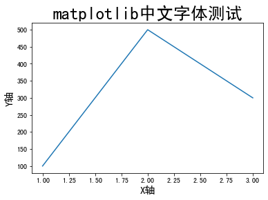
import matplotlib
import matplotlib.pyplot as plt
%matplotlib inline
matplotlib.rc("font",family='SimHei') # 中文字体
plt.rcParams['axes.unicode_minus']=False # 用来正常显示负号
plt.plot([1,2,3], [100,500,300])
plt.title('matplotlib中文字体测试', fontsize=25)
plt.xlabel('X轴', fontsize=15)
plt.ylabel('Y轴', fontsize=15)
plt.show()
【B】准备图像分类数据集
##下载样例数据集
# 下载数据集压缩包
!wget https://zihao-openmmlab.obs.cn-east-3.myhuaweicloud.com/20220716-mmclassification/dataset/fruit30/fruit30_split.zip

# 解压
!unzip fruit30_split.zip >> /dev/null
# 删除压缩包
!rm fruit30_split.zip

# 下载 类别名称 和 ID索引号 的映射字典
!wget https://zihao-openmmlab.obs.cn-east-3.myhuaweicloud.com/20220716-mmclassification/dataset/fruit30/idx_to_labels.npy

##查看数据集目录结构
!sudo snap install tree

!tree fruit30_split -L 2
fruit30_split
├── train
│ ├── 哈密瓜
│ ├── 圣女果
│ ├── 山竹
│ ├── 杨梅
│ ├── 柚子
│ ├── 柠檬
│ ├── 桂圆
│ ├── 梨
│ ├── 椰子
│ ├── 榴莲
│ ├── 火龙果
│ ├── 猕猴桃
│ ├── 石榴
│ ├── 砂糖橘
│ ├── 胡萝卜
│ ├── 脐橙
│ ├── 芒果
│ ├── 苦瓜
│ ├── 苹果-红
│ ├── 苹果-青
│ ├── 草莓
│ ├── 荔枝
│ ├── 菠萝
│ ├── 葡萄-白
│ ├── 葡萄-红
│ ├── 西瓜
│ ├── 西红柿
│ ├── 车厘子
│ ├── 香蕉
│ └── 黄瓜
└── val
├── 哈密瓜
├── 圣女果
├── 山竹
├── 杨梅
├── 柚子
├── 柠檬
├── 桂圆
├── 梨
├── 椰子
├── 榴莲
├── 火龙果
├── 猕猴桃
├── 石榴
├── 砂糖橘
├── 胡萝卜
├── 脐橙
├── 芒果
├── 苦瓜
├── 苹果-红
├── 苹果-青
├── 草莓
├── 荔枝
├── 菠萝
├── 葡萄-白
├── 葡萄-红
├── 西瓜
├── 西红柿
├── 车厘子
├── 香蕉
└── 黄瓜
##训练好的模型文件
# 下载样例模型文件
!wget https://zihao-openmmlab.obs.cn-east-3.myhuaweicloud.com/20220716-mmclassification/checkpoints/fruit30_pytorch_20220814.pth -P checkpoints
【C】测试集图像分类预测结果
使用训练好的图像分类模型,预测测试集的所有图像,得到预测结果表格。
##导入工具包
import os
from tqdm import tqdm

import numpy as np
import pandas as pd

from PIL import Image

import torch
import torch.nn.functional as F

# 有 GPU 就用 GPU,没有就用 CPU
device = torch.device('cuda:0' if torch.cuda.is_available() else 'cpu')
print('device', device)

##图像预处理
from torchvision import transforms

# # 训练集图像预处理:缩放裁剪、图像增强、转 Tensor、归一化
# train_transform = transforms.Compose([transforms.RandomResizedCrop(224),
#                                       transforms.RandomHorizontalFlip(),
#                                       transforms.ToTensor(),
#                                       transforms.Normalize([0.485, 0.456, 0.406], [0.229, 0.224, 0.225])
#                                      ])

# 测试集图像预处理-RCTN:缩放、裁剪、转 Tensor、归一化
test_transform = transforms.Compose([transforms.Resize(256),
                                     transforms.CenterCrop(224),
                                     transforms.ToTensor(),
                                     transforms.Normalize(
                                         mean=[0.485, 0.456, 0.406],
                                         std=[0.229, 0.224, 0.225])
                                    ])

##载入测试集(和训练代码教程相同)
# 数据集文件夹路径
dataset_dir = 'fruit30_split'
test_path = os.path.join(dataset_dir, 'val')
from torchvision import datasets
# 载入测试集
test_dataset = datasets.ImageFolder(test_path, test_transform)
print('测试集图像数量', len(test_dataset))
print('类别个数', len(test_dataset.classes))
print('各类别名称', test_dataset.classes)
# 载入类别名称 和 ID索引号 的映射字典
idx_to_labels = np.load('idx_to_labels.npy', allow_pickle=True).item()
# 获得类别名称
classes = list(idx_to_labels.values())
print(classes)
测试集图像数量 1079
类别个数 30
各类别名称 [‘哈密瓜’, ‘圣女果’, ‘山竹’, ‘杨梅’, ‘柚子’, ‘柠檬’, ‘桂圆’, ‘梨’, ‘椰子’, ‘榴莲’, ‘火龙果’, ‘猕猴桃’, ‘石榴’, ‘砂糖橘’, ‘胡萝卜’, ‘脐橙’, ‘芒果’, ‘苦瓜’, ‘苹果-红’, ‘苹果-青’, ‘草莓’, ‘荔枝’, ‘菠萝’, ‘葡萄-白’, ‘葡萄-红’, ‘西瓜’, ‘西红柿’, ‘车厘子’, ‘香蕉’, ‘黄瓜’]
[‘哈密瓜’, ‘圣女果’, ‘山竹’, ‘杨梅’, ‘柚子’, ‘柠檬’, ‘桂圆’, ‘梨’, ‘椰子’, ‘榴莲’, ‘火龙果’, ‘猕猴桃’, ‘石榴’, ‘砂糖橘’, ‘胡萝卜’, ‘脐橙’, ‘芒果’, ‘苦瓜’, ‘苹果-红’, ‘苹果-青’, ‘草莓’, ‘荔枝’, ‘菠萝’, ‘葡萄-白’, ‘葡萄-红’, ‘西瓜’, ‘西红柿’, ‘车厘子’, ‘香蕉’, ‘黄瓜’]
##导入训练好的模型
model = torch.load('checkpoints/fruit30_pytorch_20220814.pth')
model = model.eval().to(device)
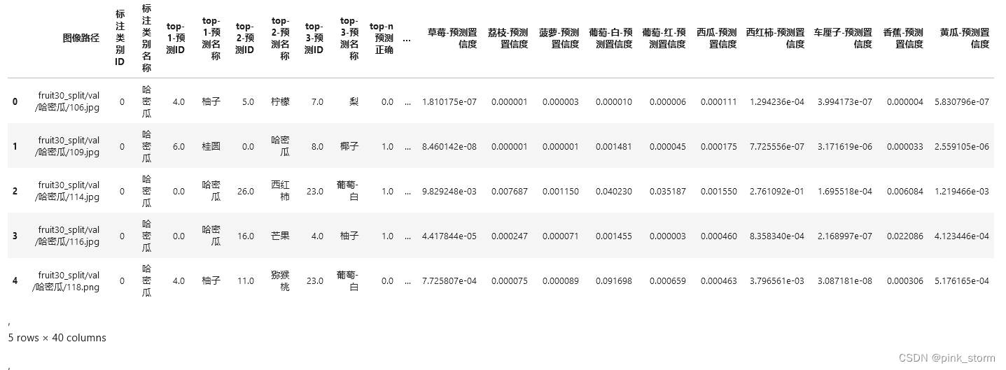
##表格A-测试集图像路径及标注
test_dataset.imgs[:10]
img_paths = [each[0] for each in test_dataset.imgs]
print(df)
| 图像路径 | 标注类别ID | 标注类别 | 名称 |
|---|---|---|---|
| 0 | fruit30_split/val/哈密瓜/106.jpg | 0 | 哈密瓜 |
| 1 | fruit30_split/val/哈密瓜/109.jpg | 0 | 哈密瓜 |
| 2 | fruit30_split/val/哈密瓜/114.jpg | 0 | 哈密瓜 |
| 3 | fruit30_split/val/哈密瓜/116.jpg | 0 | 哈密瓜 |
| 4 | fruit30_split/val/哈密瓜/118.png | 0 | 哈密瓜 |
| … | … | … | … |
| 1074 | fruit30_split/val/黄瓜/87.jpg | 29 | 黄瓜 |
| 1075 | fruit30_split/val/黄瓜/9.jpg | 29 | 黄瓜 |
| 1076 | fruit30_split/val/黄瓜/91.png | 29 | 黄瓜 |
| 1077 | fruit30_split/val/黄瓜/94.jpg | 29 | 黄瓜 |
| 1078 | fruit30_split/val/黄瓜/97.jpg | 29 | 黄瓜 |
1079 rows × 3 columns
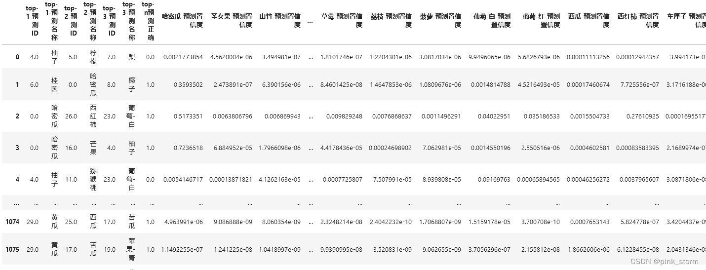
##表格B-测试集每张图像的图像分类预测结果,以及各类别置信度
# 记录 top-n 预测结果
n = 3

df_pred = pd.DataFrame()
for idx, row in tqdm(df.iterrows()):
    img_path = row['图像路径']
    img_pil = Image.open(img_path).convert('RGB')
    input_img = test_transform(img_pil).unsqueeze(0).to(device) # 预处理
    pred_logits = model(input_img) # 执行前向预测,得到所有类别的 logit 预测分数
    pred_softmax = F.softmax(pred_logits, dim=1) # 对 logit 分数做 softmax 运算

    pred_dict = {}

    top_n = torch.topk(pred_softmax, n) # 取置信度最大的 n 个结果
    pred_ids = top_n[1].cpu().detach().numpy().squeeze() # 解析出类别

    # top-n 预测结果
    for i in range(1, n+1):
        pred_dict['top-{}-预测ID'.format(i)] = pred_ids[i-1]
        pred_dict['top-{}-预测名称'.format(i)] = idx_to_labels[pred_ids[i-1]]
    pred_dict['top-n预测正确'] = row['标注类别ID'] in pred_ids
    # 每个类别的预测置信度
    for idx, each in enumerate(classes):
        pred_dict['{}-预测置信度'.format(each)] = pred_softmax[0][idx].cpu().detach().numpy()

    df_pred = df_pred.append(pred_dict, ignore_index=True)

print(df_pred)
##拼接AB两张表格
df = pd.concat([df, df_pred], axis=1)

##导出完整表格
df.to_csv('测试集预测结果.csv', index=False)
【D】测试集总体准确率评估指标
分析测试集预测结果表格,计算总体准确率评估指标和各类别准确率评估指标。
##导入工具包
import pandas as pd
import numpy as np
from tqdm import tqdm

##载入类别名称和ID
idx_to_labels = np.load('idx_to_labels.npy', allow_pickle=True).item()
# 获得类别名称
classes = list(idx_to_labels.values())
print(classes)
[‘哈密瓜’, ‘圣女果’, ‘山竹’, ‘杨梅’, ‘柚子’, ‘柠檬’, ‘桂圆’, ‘梨’, ‘椰子’, ‘榴莲’, ‘火龙果’, ‘猕猴桃’, ‘石榴’, ‘砂糖橘’, ‘胡萝卜’, ‘脐橙’, ‘芒果’, ‘苦瓜’, ‘苹果-红’, ‘苹果-青’, ‘草莓’, ‘荔枝’, ‘菠萝’, ‘葡萄-白’, ‘葡萄-红’, ‘西瓜’, ‘西红柿’, ‘车厘子’, ‘香蕉’, ‘黄瓜’]
##载入测试集预测结果表格
df = pd.read_csv('测试集预测结果.csv')

##准确率
sum(df['标注类别名称'] == df['top-1-预测名称']) / len(df)
#0.8665430954587581

##top-n准确率
sum(df['top-n预测正确']) / len(df)
#0.9629286376274329

##各类别其它评估指标
#macro avg 宏平均:直接将每一类的评估指标求和取平均(算数平均值)

#weighted avg 加权平均:按样本数量(support)加权计算评估指标的平均值

from sklearn.metrics import classification_report

print(classification_report(df['标注类别名称'], df['top-1-预测名称'], target_names=classes))

report = classification_report(df['标注类别名称'], df['top-1-预测名称'], target_names=classes, output_dict=True)
del report['accuracy']
df_report = pd.DataFrame(report).transpose() #一个转置函数

print(df_report )
| fruits | precision | recall | f1-score | support |
|---|---|---|---|---|
| 哈密瓜 | 0.909091 | 0.789474 | 0.845070 | 38.0 |
| 圣女果 | 0.928571 | 0.684211 | 0.787879 | 38.0 |
| 山竹 | 1.000000 | 0.828571 | 0.906250 | 35.0 |
| 杨梅 | 0.864865 | 0.864865 | 0.864865 | 37.0 |
| 柚子 | 0.756757 | 0.756757 | 0.756757 | 37.0 |
| 柠檬 | 0.774194 | 0.827586 | 0.800000 | 29.0 |
| 桂圆 | 0.760000 | 1.000000 | 0.863636 | 38.0 |
| 梨 | 0.852941 | 0.783784 | 0.816901 | 37.0 |
| 椰子 | 0.944444 | 0.894737 | 0.918919 | 38.0 |
| 榴莲 | 0.935484 | 0.805556 | 0.865672 | 36.0 |
| 火龙果 | 1.000000 | 0.916667 | 0.956522 | 36.0 |
| 猕猴桃 | 0.969697 | 0.864865 | 0.914286 | 37.0 |
| 石榴 | 0.868421 | 0.891892 | 0.880000 | 37.0 |
| 砂糖橘 | 0.810811 | 0.857143 | 0.833333 | 35.0 |
| 胡萝卜 | 0.941176 | 0.888889 | 0.914286 | 36.0 |
| 脐橙 | 0.794118 | 0.729730 | 0.760563 | 37.0 |
| 芒果 | 0.750000 | 0.818182 | 0.782609 | 33.0 |
| 苦瓜 | 1.000000 | 0.742857 | 0.852459 | 35.0 |
| 苹果-红 | 0.911765 | 0.885714 | 0.898551 | 35.0 |
| 苹果-青 | 0.822222 | 1.000000 | 0.902439 | 37.0 |
| 草莓 | 0.921053 | 0.921053 | 0.921053 | 38.0 |
| 荔枝 | 0.875000 | 0.921053 | 0.897436 | 38.0 |
| 菠萝 | 0.937500 | 0.810811 | 0.869565 | 37.0 |
| 葡萄-白 | 0.935484 | 0.935484 | 0.935484 | 31.0 |
| 葡萄-红 | 0.765957 | 0.947368 | 0.847059 | 38.0 |
| 西瓜 | 0.853659 | 0.945946 | 0.897436 | 37.0 |
| 西红柿 | 0.702128 | 0.916667 | 0.795181 | 36.0 |
| 车厘子 | 1.000000 | 0.843750 | 0.915254 | 32.0 |
| 香蕉 | 0.970588 | 0.916667 | 0.942857 | 36.0 |
| 黄瓜 | 0.760870 | 1.000000 | 0.864198 | 35.0 |
| macro avg | 0.877226 | 0.866343 | 0.866884 | 1079.0 |
| weighted avg | 0.877204 | 0.866543 | 0.866931 | 1079.0 |
##补充:各类别准确率(其实就是recall)
accuracy_list = []
for fruit in tqdm(classes):
    df_temp = df[df['标注类别名称']==fruit]
    accuracy = sum(df_temp['标注类别名称'] == df_temp['top-1-预测名称']) / len(df_temp)
    accuracy_list.append(accuracy)

# 计算 宏平均准确率 和 加权平均准确率
acc_macro = np.mean(accuracy_list)
acc_weighted = sum(accuracy_list * df_report.iloc[:-2]['support'] / len(df))

accuracy_list.append(acc_macro)
accuracy_list.append(acc_weighted)

df_report['accuracy'] = accuracy_list

print(df_report)
这里结果先不放入了,markdown输入还没整明白
df_report.to_csv('各类别准确率评估指标.csv', index_label='类别')
【E】混淆矩阵
通过测试集所有图像预测结果,生成多类别混淆矩阵,评估模型准确度。
##设置Matplotlib中文字体
# Linux操作系统,例如 云GPU平台:https://featurize.cn/?s=d7ce99f842414bfcaea5662a97581bd1
# 如果遇到 SSL 相关报错,重新运行本代码块即可
!wget https://zihao-openmmlab.obs.cn-east-3.myhuaweicloud.com/20220716-mmclassification/dataset/SimHei.ttf -O /environment/miniconda3/lib/python3.7/site-packages/matplotlib/mpl-data/fonts/ttf/SimHei.ttf
!rm -rf /home/featurize/.cache/matplotlib

import matplotlib
matplotlib.rc("font",family='SimHei') # 中文字体

##导入工具包
import pandas as pd
import numpy as np
from tqdm import tqdm

import math
import cv2

import matplotlib.pyplot as plt
%matplotlib inline

##载入类别名称和ID
idx_to_labels = np.load('idx_to_labels.npy', allow_pickle=True).item()
# 获得类别名称
classes = list(idx_to_labels.values())
print(classes)
[‘哈密瓜’, ‘圣女果’, ‘山竹’, ‘杨梅’, ‘柚子’, ‘柠檬’, ‘桂圆’, ‘梨’, ‘椰子’, ‘榴莲’, ‘火龙果’, ‘猕猴桃’, ‘石榴’, ‘砂糖橘’, ‘胡萝卜’, ‘脐橙’, ‘芒果’, ‘苦瓜’, ‘苹果-红’, ‘苹果-青’, ‘草莓’, ‘荔枝’, ‘菠萝’, ‘葡萄-白’, ‘葡萄-红’, ‘西瓜’, ‘西红柿’, ‘车厘子’, ‘香蕉’, ‘黄瓜’]
##载入测试集预测结果表格
df = pd.read_csv('测试集预测结果.csv')

print(df)
##生成混淆矩阵
from sklearn.metrics import confusion_matrix

confusion_matrix_model = confusion_matrix(df['标注类别名称'], df['top-1-预测名称'])

confusion_matrix_model.shape ##(30, 30)

##可视化混淆矩阵
import itertools
def cnf_matrix_plotter(cm, classes, cmap=plt.cm.Blues):
    """
    传入混淆矩阵和标签名称列表,绘制混淆矩阵
    """
    plt.figure(figsize=(10, 10))

    plt.imshow(cm, interpolation='nearest', cmap=cmap)
    # plt.colorbar() # 色条
    tick_marks = np.arange(len(classes))

    plt.title('混淆矩阵', fontsize=30)
    plt.xlabel('预测类别', fontsize=25, c='r')
    plt.ylabel('真实类别', fontsize=25, c='r')
    plt.tick_params(labelsize=16) # 设置类别文字大小
    plt.xticks(tick_marks, classes, rotation=90) # 横轴文字旋转
    plt.yticks(tick_marks, classes)

    # 写数字
    threshold = cm.max() / 2.
    for i, j in itertools.product(range(cm.shape[0]), range(cm.shape[1])):
        plt.text(j, i, cm[i, j],
                 horizontalalignment="center",
                 color="white" if cm[i, j] > threshold else "black",
                 fontsize=12)

    plt.tight_layout()

    plt.savefig('混淆矩阵.pdf', dpi=300) # 保存图像
    plt.show()

# 查看所有配色方案
# dir(plt.cm)

# 子豪兄精选配色方案
# Blues
# BuGn
# Reds
# Greens
# Greys
# binary
# Oranges
# Purples
# BuPu
# GnBu
# OrRd
# RdPu

cnf_matrix_plotter(confusion_matrix_model, classes, cmap='Blues')

##筛选出测试集中,真实为A类,但被误判为B类的图像
true_A = '荔枝'
pred_B = '杨梅'

wrong_df = df[(df['标注类别名称']==true_A)&(df['top-1-预测名称']==pred_B)]

print(wrong_df)
| 序号 | 图像路径 | 标注类别ID | 标注类别名称 | top-1-预测ID | top-1-预测名称 | top-2-预测ID | top-2-预测名称 | top-3-预测ID | top-3-预测名称 | top-n预测正确 | … | 草莓-预测置信度 | 荔枝-预测置信度 | 菠萝-预测置信度 | 葡萄-白-预测置信度 | 葡萄-红-预测置信度 | 西瓜-预测置信度 | 西红柿-预测置信度 | 车厘子-预测置信度 | 香蕉-预测置信度 | 黄瓜-预测置信度 |
|---|---|---|---|---|---|---|---|---|---|---|---|---|---|---|---|---|---|---|---|---|---|
| 763 | fruit30_split/val/荔枝/113.jpg | 21 | 荔枝 | 3.0 | 杨梅 | 21.0 | 荔枝 | 24.0 | 葡萄-红 | 1.0 | … | 0.000809 | 0.176763 | 0.000001 | 0.000081 | 0.121157 | 0.000144 | 0.008242 | 0.002269 | 0.000062 | 1.642306e-05 |
| 796 | fruit30_split/val/荔枝/91.jpeg | 21 | 荔枝 | 3.0 | 杨梅 | 21.0 | 荔枝 | 20.0 | 草莓 | 1.0 | … | 0.037945 | 0.258566 | 0.000021 | 0.000068 | 0.003939 | 0.000234 | 0.002416 | 0.000018 | 0.000002 | 2.074321e-07 |
可以根据图像序号找到具体的图片就可以明白误判是情有可原的,人肉眼也难以区分
##可视化上表中所有被误判的图像
for idx, row in wrong_df.iterrows():
    img_path = row['图像路径']
    img_bgr = cv2.imread(img_path)
    img_rgb = cv2.cvtColor(img_bgr, cv2.COLOR_BGR2RGB)
    plt.imshow(img_rgb)
    title_str = img_path + '\nTrue:' + row['标注类别名称'] + ' Pred:' + row['top-1-预测名称']
    plt.title(title_str)
    plt.show()


【F1】PR曲线
绘制每个类别的PR曲线,计算AP值。
##设置Matplotlib中文字体
# Linux操作系统,例如 云GPU平台:https://featurize.cn/?s=d7ce99f842414bfcaea5662a97581bd1
# 如果遇到 SSL 相关报错,重新运行本代码块即可
!wget https://zihao-openmmlab.obs.cn-east-3.myhuaweicloud.com/20220716-mmclassification/dataset/SimHei.ttf -O /environment/miniconda3/lib/python3.7/site-packages/matplotlib/mpl-data/fonts/ttf/SimHei.ttf
!rm -rf /home/featurize/.cache/matplotlib

import matplotlib
matplotlib.rc("font",family='SimHei') # 中文字体

##导入工具包
import pandas as pd
import numpy as np

import matplotlib.pyplot as plt
%matplotlib inline

##载入类别名称和ID
idx_to_labels = np.load('idx_to_labels.npy', allow_pickle=True).item()
# 获得类别名称
classes = list(idx_to_labels.values())
print(classes)

##载入测试集预测结果表格
df = pd.read_csv('测试集预测结果.csv')
##绘制某一类别的PR曲线
specific_class = '荔枝'

# 二分类标注
y_test = (df['标注类别名称'] == specific_class)

# 二分类预测置信度
y_score = df['荔枝-预测置信度']

from sklearn.metrics import precision_recall_curve
from sklearn.metrics import average_precision_score
precision, recall, thresholds = precision_recall_curve(y_test, y_score)
AP = average_precision_score(y_test, y_score, average='weighted')

print(AP) #0.969438279482231

plt.figure(figsize=(12, 8))
# 绘制 PR 曲线
plt.plot(recall, precision, linewidth=5, label=specific_class)

# 随机二分类模型
# 阈值小,所有样本都被预测为正类,recall为1,precision为正样本百分比
# 阈值大,所有样本都被预测为负类,recall为0,precision波动较大
plt.plot([0, 0], [0, 1], ls="--", c='.3', linewidth=3, label='随机模型')
plt.plot([0, 1], [0.5, sum(y_test==1)/len(df)], ls="--", c='.3', linewidth=3)

plt.xlim([-0.01, 1.0])
plt.ylim([0.0, 1.01])
plt.rcParams['font.size'] = 22
plt.title('{} PR曲线  AP:{:.3f}'.format(specific_class, AP))
plt.xlabel('Recall')
plt.ylabel('Precision')
plt.legend()
plt.grid(True)
plt.savefig('{}-PR曲线.pdf'.format(specific_class), dpi=120, bbox_inches='tight')
plt.show()

##绘制所有类别的ROC曲线
from matplotlib import colors as mcolors
import random
random.seed(124)
colors = ['b', 'g', 'r', 'c', 'm', 'y', 'k', 'tab:blue', 'tab:orange', 'tab:green', 'tab:red', 'tab:purple', 'tab:brown', 'tab:pink', 'tab:gray', 'tab:olive', 'tab:cyan', 'black', 'indianred', 'brown', 'firebrick', 'maroon', 'darkred', 'red', 'sienna', 'chocolate', 'yellow', 'olivedrab', 'yellowgreen', 'darkolivegreen', 'forestgreen', 'limegreen', 'darkgreen', 'green', 'lime', 'seagreen', 'mediumseagreen', 'darkslategray', 'darkslategrey', 'teal', 'darkcyan', 'dodgerblue', 'navy', 'darkblue', 'mediumblue', 'blue', 'slateblue', 'darkslateblue', 'mediumslateblue', 'mediumpurple', 'rebeccapurple', 'blueviolet', 'indigo', 'darkorchid', 'darkviolet', 'mediumorchid', 'purple', 'darkmagenta', 'fuchsia', 'magenta', 'orchid', 'mediumvioletred', 'deeppink', 'hotpink']
markers = [".",",","o","v","^","<",">","1","2","3","4","8","s","p","P","*","h","H","+","x","X","D","d","|","_",0,1,2,3,4,5,6,7,8,9,10,11]
linestyle = ['--', '-.', '-']

def get_line_arg():
    '''
    随机产生一种绘图线型
    '''
    line_arg = {}
    line_arg['color'] = random.choice(colors)
    # line_arg['marker'] = random.choice(markers)
    line_arg['linestyle'] = random.choice(linestyle)
    line_arg['linewidth'] = random.randint(1, 4)
    # line_arg['markersize'] = random.randint(3, 5)
    return line_arg

print(get_line_arg())
{‘color’: ‘seagreen’, ‘linestyle’: ‘-’, ‘linewidth’: 1}
plt.figure(figsize=(14, 10))
plt.xlim([-0.01, 1.0])
plt.ylim([0.0, 1.01])
# plt.plot([0, 1], [0, 1],ls="--", c='.3', linewidth=3, label='随机模型')
plt.xlabel('Recall')
plt.ylabel('Precision')
plt.rcParams['font.size'] = 22
plt.grid(True)

ap_list = []
for each_class in classes:
    y_test = list((df['标注类别名称'] == each_class))
    y_score = list(df['{}-预测置信度'.format(each_class)])
    precision, recall, thresholds = precision_recall_curve(y_test, y_score)
    AP = average_precision_score(y_test, y_score, average='weighted')
    plt.plot(recall, precision, **get_line_arg(), label=each_class)
    plt.legend()
    ap_list.append(AP)

plt.legend(loc='best', fontsize=12)
plt.savefig('各类别PR曲线.pdf'.format(specific_class), dpi=120, bbox_inches='tight')
plt.show()

越靠近右上角正确率越高
##将AP增加至各类别准确率评估指标表格中
df_report = pd.read_csv('各类别准确率评估指标.csv')

# 计算 AUC值 的 宏平均 和 加权平均
macro_avg_auc = np.mean(ap_list)
weighted_avg_auc = sum(ap_list * df_report.iloc[:-2]['support'] / len(df))

ap_list.append(macro_avg_auc)
ap_list.append(weighted_avg_auc)

df_report['AP'] = ap_list

df_report.to_csv('各类别准确率评估指标.csv', index=False)
【F2] ROC曲线
绘制每个类别的ROC曲线,计算AUC值。
##设置Matplotlib中文字体
# Linux操作系统,例如 云GPU平台:https://featurize.cn/?s=d7ce99f842414bfcaea5662a97581bd1
# 如果遇到 SSL 相关报错,重新运行本代码块即可
!wget https://zihao-openmmlab.obs.cn-east-3.myhuaweicloud.com/20220716-mmclassification/dataset/SimHei.ttf -O /environment/miniconda3/lib/python3.7/site-packages/matplotlib/mpl-data/fonts/ttf/SimHei.ttf
!rm -rf /home/featurize/.cache/matplotlib

import matplotlib
matplotlib.rc("font",family='SimHei') # 中文字体

##导入工具包
import pandas as pd
import numpy as np

import matplotlib.pyplot as plt
%matplotlib inline

##载入类别名称和ID
idx_to_labels = np.load('idx_to_labels.npy', allow_pickle=True).item()
# 获得类别名称
classes = list(idx_to_labels.values())
print(classes)

##载入测试集预测结果表格
df = pd.read_csv('测试集预测结果.csv')

##绘制某一类别的ROC曲线
specific_class = '荔枝'

# 二分类标注
y_test = (df['标注类别名称'] == specific_class)

print(y_test)
0 False
,1 False
,2 False
,3 False
,4 False
, …
,1074 False
,1075 False
,1076 False
,1077 False
,1078 False
,Name: 标注类别名称, Length: 1079, dtype: bool
# 二分类置信度
y_score = df['荔枝-预测置信度']
print(y_score)
0 1.220430e-06
,1 1.464785e-06
,2 7.686864e-03
,3 2.469890e-04
,4 7.507991e-05
, …
,1074 2.404223e-10
,1075 3.520831e-09
,1076 5.867719e-04
,1077 1.798972e-06
,1078 5.098998e-08
,Name: 荔枝-预测置信度, Length: 1079, dtype: float64
from sklearn.metrics import roc_curve, auc
fpr, tpr, threshold = roc_curve(y_test, y_score)

plt.figure(figsize=(12, 8))
plt.plot(fpr, tpr, linewidth=5, label=specific_class)
plt.plot([0, 1], [0, 1],ls="--", c='.3', linewidth=3, label='随机模型')
plt.xlim([-0.01, 1.0])
plt.ylim([0.0, 1.01])
plt.rcParams['font.size'] = 22
plt.title('{} ROC曲线  AUC:{:.3f}'.format(specific_class, auc(fpr, tpr)))
plt.xlabel('False Positive Rate (1 - Specificity)')
plt.ylabel('True Positive Rate (Sensitivity)')
plt.legend()
plt.grid(True)

plt.savefig('{}-ROC曲线.pdf'.format(specific_class), dpi=120, bbox_inches='tight')
plt.show()

# yticks = ax.yaxis.get_major_ticks()
# yticks[0].label1.set_visible(False)

peint(auc(fpr, tpr))
0.9979523737297132
##会制所有类别的ROC曲线
from matplotlib import colors as mcolors
import random
random.seed(124)
colors = ['b', 'g', 'r', 'c', 'm', 'y', 'k', 'tab:blue', 'tab:orange', 'tab:green', 'tab:red', 'tab:purple', 'tab:brown', 'tab:pink', 'tab:gray', 'tab:olive', 'tab:cyan', 'black', 'indianred', 'brown', 'firebrick', 'maroon', 'darkred', 'red', 'sienna', 'chocolate', 'yellow', 'olivedrab', 'yellowgreen', 'darkolivegreen', 'forestgreen', 'limegreen', 'darkgreen', 'green', 'lime', 'seagreen', 'mediumseagreen', 'darkslategray', 'darkslategrey', 'teal', 'darkcyan', 'dodgerblue', 'navy', 'darkblue', 'mediumblue', 'blue', 'slateblue', 'darkslateblue', 'mediumslateblue', 'mediumpurple', 'rebeccapurple', 'blueviolet', 'indigo', 'darkorchid', 'darkviolet', 'mediumorchid', 'purple', 'darkmagenta', 'fuchsia', 'magenta', 'orchid', 'mediumvioletred', 'deeppink', 'hotpink']
markers = [".",",","o","v","^","<",">","1","2","3","4","8","s","p","P","*","h","H","+","x","X","D","d","|","_",0,1,2,3,4,5,6,7,8,9,10,11]
linestyle = ['--', '-.', '-']

def get_line_arg():
    '''
    随机产生一种绘图线型
    '''
    line_arg = {}
    line_arg['color'] = random.choice(colors)
    # line_arg['marker'] = random.choice(markers)
    line_arg['linestyle'] = random.choice(linestyle)
    line_arg['linewidth'] = random.randint(1, 4)
    # line_arg['markersize'] = random.randint(3, 5)
    return line_arg

print(get_line_arg())
{'color': 'seagreen', 'linestyle': '-', 'linewidth': 1}
plt.figure(figsize=(14, 10))
plt.xlim([-0.01, 1.0])
plt.ylim([0.0, 1.01])
plt.plot([0, 1], [0, 1],ls="--", c='.3', linewidth=3, label='随机模型')
plt.xlabel('False Positive Rate (1 - Specificity)')
plt.ylabel('True Positive Rate (Sensitivity)')
plt.rcParams['font.size'] = 22
plt.grid(True)

auc_list = []
for each_class in classes:
    y_test = list((df['标注类别名称'] == each_class))
    y_score = list(df['{}-预测置信度'.format(each_class)])
    fpr, tpr, threshold = roc_curve(y_test, y_score)
    plt.plot(fpr, tpr, **get_line_arg(), label=each_class)
    plt.legend()
    auc_list.append(auc(fpr, tpr))

plt.legend(loc='best', fontsize=12)
plt.savefig('各类别ROC曲线.pdf'.format(specific_class), dpi=120, bbox_inches='tight')
plt.show()

##将AUC增加至各类别准确率评估指标表格中
df_report = pd.read_csv('各类别准确率评估指标.csv')

# 计算 AUC值 的 宏平均 和 加权平均
macro_avg_auc = np.mean(auc_list)
weighted_avg_auc = sum(auc_list * df_report.iloc[:-2]['support'] / len(df))

auc_list.append(macro_avg_auc)
auc_list.append(weighted_avg_auc)

df_report['AUC'] = auc_list

df_report.to_csv('各类别准确率评估指标.csv', index=False)
【G】绘制各类别准确率评估指标柱状图
##设置Matplotlib中文字体
# Linux操作系统,例如 云GPU平台:https://featurize.cn/?s=d7ce99f842414bfcaea5662a97581bd1
# 如果遇到 SSL 相关报错,重新运行本代码块即可
!wget https://zihao-openmmlab.obs.cn-east-3.myhuaweicloud.com/20220716-mmclassification/dataset/SimHei.ttf -O /environment/miniconda3/lib/python3.7/site-packages/matplotlib/mpl-data/fonts/ttf/SimHei.ttf
!rm -rf /home/featurize/.cache/matplotlib

import matplotlib
matplotlib.rc("font",family='SimHei') # 中文字体

##导入工具包
import pandas as pd
import matplotlib.pyplot as plt
%matplotlib inline

##导入各类别准确率评估指标表格
df = pd.read_csv('各类别准确率评估指标.csv')

##选择评估指标
# feature = 'precision'
# feature = 'recall'
# feature = 'f1-score'
feature = 'accuracy'
# feature = 'AP'
# feature = 'AUC'

##绘制柱状图
df_plot = df.sort_values(by=feature, ascending=False)

plt.figure(figsize=(22, 7))

x = df_plot['类别']
y = df_plot[feature]

ax = plt.bar(x, y, width=0.6, facecolor='#1f77b4', edgecolor='k')
plt.bar_label(ax, fmt='%.2f', fontsize=15) # 置信度数值

plt.xticks(rotation=45)
plt.tick_params(labelsize=15)
# plt.xlabel('类别', fontsize=20)
plt.ylabel(feature, fontsize=20)
plt.title('准确率评估指标 {}'.format(feature), fontsize=25)

plt.savefig('各类别准确率评估指标柱状图-{}.pdf'.format(feature), dpi=120, bbox_inches='tight')

plt.show()

【H1】计算测试集图像语义特征
抽取Pytorch训练得到的图像分类模型中间层的输出特征,作为输入图像的语义特征。
计算测试集所有图像的语义特征,使用t-SNE和UMAP两种降维方法降维至二维和三维,可视化。
分析不同类别的语义距离、异常数据、细粒度分类、高维数据结构。
##导入工具包
from tqdm import tqdm

import pandas as pd
import numpy as np

import torch

import cv2
from PIL import Image

# 忽略烦人的红色提示
import warnings
warnings.filterwarnings("ignore")

# 有 GPU 就用 GPU,没有就用 CPU
device = torch.device('cuda:0' if torch.cuda.is_available() else 'cpu')
print('device', device)

##图像预处理
from torchvision import transforms

# # 训练集图像预处理:缩放裁剪、图像增强、转 Tensor、归一化
# train_transform = transforms.Compose([transforms.RandomResizedCrop(224),
#                                       transforms.RandomHorizontalFlip(),
#                                       transforms.ToTensor(),
#                                       transforms.Normalize([0.485, 0.456, 0.406], [0.229, 0.224, 0.225])
#                                      ])

# 测试集图像预处理-RCTN:缩放、裁剪、转 Tensor、归一化
test_transform = transforms.Compose([transforms.Resize(256),
                                     transforms.CenterCrop(224),
                                     transforms.ToTensor(),
                                     transforms.Normalize(
                                         mean=[0.485, 0.456, 0.406],
                                         std=[0.229, 0.224, 0.225])
                                    ])

##导入训练好的模型
model = torch.load('checkpoints/fruit30_pytorch_20220814.pth')
model = model.eval().to(device)

##抽取模型中间层输出结果作为语义特征
from torchvision.models.feature_extraction import create_feature_extractor

model_trunc = create_feature_extractor(model, return_nodes={'avgpool': 'semantic_feature'})

##计算单张图像的语义特征
img_path = 'fruit30_split/val/菠萝/105.jpg'
img_pil = Image.open(img_path)
input_img = test_transform(img_pil) # 预处理
input_img = input_img.unsqueeze(0).to(device)
# 执行前向预测,得到指定中间层的输出
pred_logits = model_trunc(input_img)

pred_logits['semantic_feature'].squeeze().detach().cpu().numpy().shape
#(512,)

##载入测试集图像分类结果
df = pd.read_csv('测试集预测结果.csv')

##计算测试集每张图像的语义特征
encoding_array = []
img_path_list = []

for img_path in tqdm(df['图像路径']):
    img_path_list.append(img_path)
    img_pil = Image.open(img_path).convert('RGB')
    input_img = test_transform(img_pil).unsqueeze(0).to(device) # 预处理
    feature = model_trunc(input_img)['semantic_feature'].squeeze().detach().cpu().numpy() # 执行前向预测,得到 avgpool 层输出的语义特征
    encoding_array.append(feature)
encoding_array = np.array(encoding_array)

encoding_array.shape
#(1079, 512)

##保存为本地的.npy文件
# 保存为本地的 npy 文件
np.save('测试集语义特征.npy', encoding_array)
【H2】测试集语义特征t-SNE降维可视化抽取Pytorch训练得到的图像分类模型中间层的输出特征,作为输入图像的语义特征。
计算测试集所有图像的语义特征,使用t-SNE和UMAP两种降维方法降维至二维和三维,可视化。
分析不同类别的语义距离、异常数据、细粒度分类、高维数据结构。
这里好像不包括在今日范围内。
##设置matplotlib中文字体
# Linux操作系统,例如 云GPU平台:https://featurize.cn/?s=d7ce99f842414bfcaea5662a97581bd1
# 如果遇到 SSL 相关报错,重新运行本代码块即可
!wget https://zihao-openmmlab.obs.cn-east-3.myhuaweicloud.com/20220716-mmclassification/dataset/SimHei.ttf -O /environment/miniconda3/lib/python3.7/site-packages/matplotlib/mpl-data/fonts/ttf/SimHei.ttf
!rm -rf /home/featurize/.cache/matplotlib

import matplotlib
import matplotlib.pyplot as plt
matplotlib.rc("font",family='SimHei') # 中文字体
plt.rcParams['axes.unicode_minus']=False  # 用来正常显示负号

##导入工具包
import numpy as np
import pandas as pd
import cv2

##载入测试集图像语义特征
encoding_array = np.load('测试集语义特征.npy', allow_pickle=True)

encoding_array.shape
#(1079, 512)

##载入测试集图像分类结果
df = pd.read_csv('测试集预测结果.csv')

classes = df['标注类别名称'].unique()
print(classes)
[‘哈密瓜’ ‘圣女果’ ‘山竹’ ‘杨梅’ ‘柚子’ ‘柠檬’ ‘桂圆’ ‘梨’ ‘椰子’ ‘榴莲’ ‘火龙果’ ‘猕猴桃’ ‘石榴’ ‘砂糖橘’
‘胡萝卜’ ‘脐橙’ ‘芒果’ ‘苦瓜’ ‘苹果-红’ ‘苹果-青’ ‘草莓’ ‘荔枝’ ‘菠萝’ ‘葡萄-白’ ‘葡萄-红’ ‘西瓜’
‘西红柿’ ‘车厘子’ ‘香蕉’ ‘黄瓜’]
##可视化配置
import seaborn as sns
marker_list = ['.', ',', 'o', 'v', '^', '<', '>', '1', '2', '3', '4', '8', 's', 'p', 'P', '*', 'h', 'H', '+', 'x', 'X', 'D', 'd', '|', '_', 0, 1, 2, 3, 4, 5, 6, 7, 8, 9, 10, 11]

class_list = np.unique(df['标注类别名称'])

print(class_list)
array([‘哈密瓜’, ‘圣女果’, ‘山竹’, ‘杨梅’, ‘柚子’, ‘柠檬’, ‘桂圆’, ‘梨’, ‘椰子’, ‘榴莲’, ‘火龙果’,
, ‘猕猴桃’, ‘石榴’, ‘砂糖橘’, ‘胡萝卜’, ‘脐橙’, ‘芒果’, ‘苦瓜’, ‘苹果-红’, ‘苹果-青’, ‘草莓’,
, ‘荔枝’, ‘菠萝’, ‘葡萄-白’, ‘葡萄-红’, ‘西瓜’, ‘西红柿’, ‘车厘子’, ‘香蕉’, ‘黄瓜’],
, dtype=object)
n_class = len(class_list) # 测试集标签类别数
palette = sns.hls_palette(n_class) # 配色方案
sns.palplot(palette)

# 随机打乱颜色列表和点型列表
import random
random.seed(1234)
random.shuffle(marker_list)
random.shuffle(palette)
##t-SNE降维至二维
# 降维到二维和三维
from sklearn.manifold import TSNE

tsne = TSNE(n_components=2, n_iter=20000)
X_tsne_2d = tsne.fit_transform(encoding_array)

print(X_tsne_2d.shape)
#(1079, 2)

##可视化展示
# 不同的 符号 表示 不同的 标注类别
show_feature = '标注类别名称'

plt.figure(figsize=(14, 14))
for idx, fruit in enumerate(class_list): # 遍历每个类别
    # 获取颜色和点型
    color = palette[idx]
    marker = marker_list[idx%len(marker_list)]

    # 找到所有标注类别为当前类别的图像索引号
    indices = np.where(df[show_feature]==fruit)
    plt.scatter(X_tsne_2d[indices, 0], X_tsne_2d[indices, 1], color=color, marker=marker, label=fruit, s=150)

plt.legend(fontsize=16, markerscale=1, bbox_to_anchor=(1, 1))
plt.xticks([])
plt.yticks([])
plt.savefig('语义特征t-SNE二维降维可视化.pdf', dpi=300) # 保存图像
plt.show()

##plotply交互式可视化
import plotly.express as px

df_2d = pd.DataFrame()
df_2d['X'] = list(X_tsne_2d[:, 0].squeeze())
df_2d['Y'] = list(X_tsne_2d[:, 1].squeeze())
df_2d['标注类别名称'] = df['标注类别名称']
df_2d['预测类别'] = df['top-1-预测名称']
df_2d['图像路径'] = df['图像路径']
df_2d.to_csv('t-SNE-2D.csv', index=False)

fig = px.scatter(df_2d,
                 x='X',
                 y='Y',
                 color=show_feature,
                 labels=show_feature,
                 symbol=show_feature,
                 hover_name='图像路径',
                 opacity=0.8,
                 width=1000,
                 height=600
                )
# 设置排版
fig.update_layout(margin=dict(l=0, r=0, b=0, t=0))
fig.show()
fig.write_html('语义特征t-SNE二维降维plotly可视化.html')
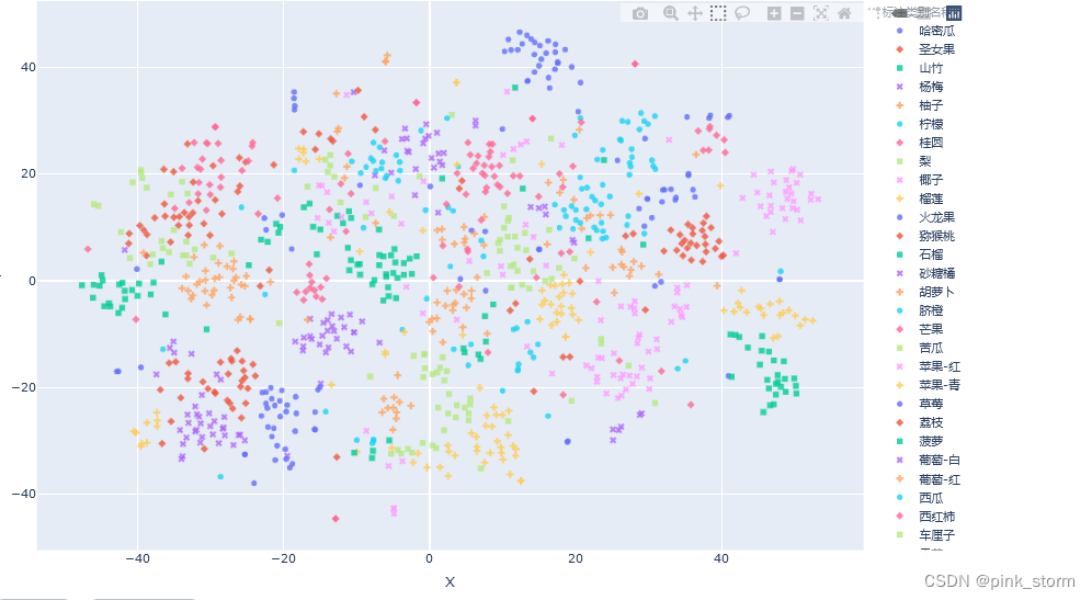
可自行移动调整,放大缩小之类
# 查看图像
img_path_temp = 'fruit30_split/val/火龙果/3.jpg'
img_bgr = cv2.imread(img_path_temp)
img_rgb = cv2.cvtColor(img_bgr, cv2.COLOR_BGR2RGB)
plt.imshow(img_rgb)
temp_df = df[df['图像路径'] == img_path_temp]
title_str = img_path_temp + '\nTrue:' + temp_df['标注类别名称'].item() + ' Pred:' + temp_df['top-1-预测名称'].item()
plt.title(title_str)
plt.show()

##t-SNE降维至三维,并可视化
# 降维到三维
from sklearn.manifold import TSNE
tsne = TSNE(n_components=3, n_iter=10000)
X_tsne_3d = tsne.fit_transform(encoding_array)

X_tsne_3d.shape
#(1079, 3)

show_feature = '标注类别名称'
# show_feature = '预测类别'

df_3d = pd.DataFrame()
df_3d['X'] = list(X_tsne_3d[:, 0].squeeze())
df_3d['Y'] = list(X_tsne_3d[:, 1].squeeze())
df_3d['Z'] = list(X_tsne_3d[:, 2].squeeze())
df_3d['标注类别名称'] = df['标注类别名称']
df_3d['预测类别'] = df['top-1-预测名称']
df_3d['图像路径'] = df['图像路径']
df_3d.to_csv('t-SNE-3D.csv', index=False)

fig = px.scatter_3d(df_3d,
                    x='X',
                    y='Y',
                    z='Z',
                    color=show_feature,
                    labels=show_feature,
                    symbol=show_feature,
                    hover_name='图像路径',
                    opacity=0.6,
                    width=1000,
                    height=800)

# 设置排版
fig.update_layout(margin=dict(l=0, r=0, b=0, t=0))
fig.show()
fig.write_html('语义特征t-SNE三维降维plotly可视化.html')
可以自行调整,很高级
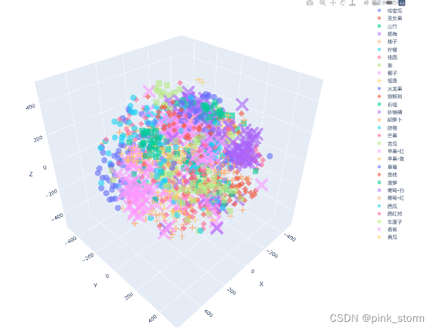
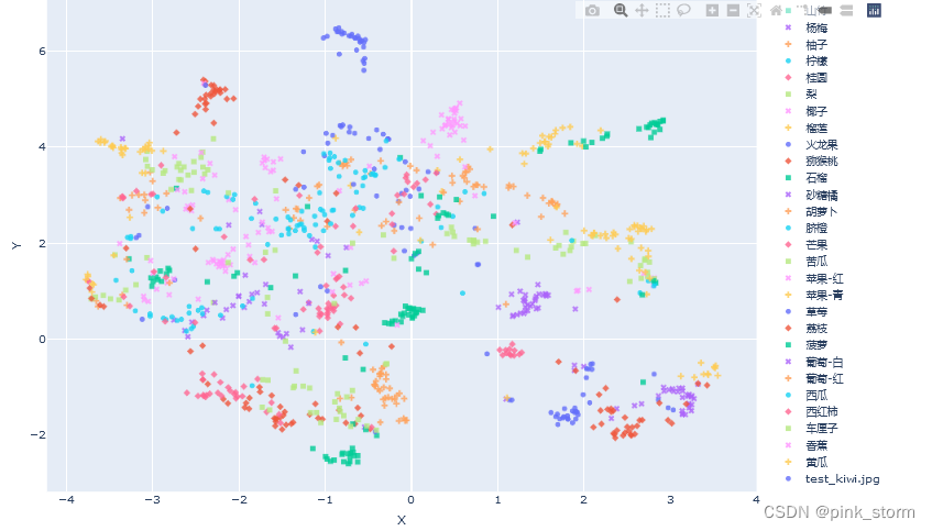
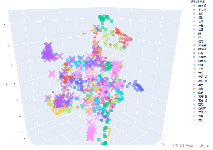
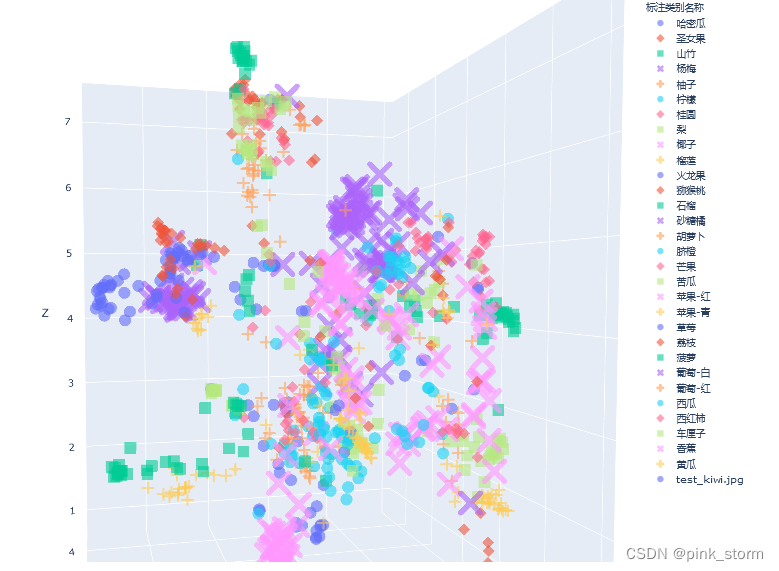
【H3】测试集语义特征UMAP降维可视化
抽取Pytorch训练得到的图像分类模型中间层的输出特征,作为输入图像的语义特征。
计算测试集所有图像的语义特征,使用t-SNE和UMAP两种降维方法降维至二维和三维,可视化。
分析不同类别的语义距离、异常数据、细粒度分类、高维数据结构。
##安装UMAP
# 官方文档:https://umap-learn.readthedocs.io/en/latest/index.html
!pip install umap-learn datashader bokeh holoviews scikit-image colorcet

##设置matplotlib中文字体
# Linux操作系统,例如 云GPU平台:https://featurize.cn/?s=d7ce99f842414bfcaea5662a97581bd1
# 如果遇到 SSL 相关报错,重新运行本代码块即可
!wget https://zihao-openmmlab.obs.cn-east-3.myhuaweicloud.com/20220716-mmclassification/dataset/SimHei.ttf -O /environment/miniconda3/lib/python3.7/site-packages/matplotlib/mpl-data/fonts/ttf/SimHei.ttf
!rm -rf /home/featurize/.cache/matplotlib

import matplotlib
import matplotlib.pyplot as plt
matplotlib.rc("font",family='SimHei') # 中文字体
plt.rcParams['axes.unicode_minus']=False  # 用来正常显示负号

##导入工具包
import numpy as np
import pandas as pd
import cv2

##载入测试集图像语义特征
encoding_array = np.load('测试集语义特征.npy', allow_pickle=True)

encoding_array.shape
#(1079, 512)

##载入测试集图像分类结果
df = pd.read_csv('测试集预测结果.csv')

classes = df['标注类别名称'].unique()
print(classes)
[‘哈密瓜’ ‘圣女果’ ‘山竹’ ‘杨梅’ ‘柚子’ ‘柠檬’ ‘桂圆’ ‘梨’ ‘椰子’ ‘榴莲’ ‘火龙果’ ‘猕猴桃’ ‘石榴’ ‘砂糖橘’
‘胡萝卜’ ‘脐橙’ ‘芒果’ ‘苦瓜’ ‘苹果-红’ ‘苹果-青’ ‘草莓’ ‘荔枝’ ‘菠萝’ ‘葡萄-白’ ‘葡萄-红’ ‘西瓜’
‘西红柿’ ‘车厘子’ ‘香蕉’ ‘黄瓜’]
##可视化配置
import seaborn as sns
marker_list = ['.', ',', 'o', 'v', '^', '<', '>', '1', '2', '3', '4', '8', 's', 'p', 'P', '*', 'h', 'H', '+', 'x', 'X', 'D', 'd', '|', '_', 0, 1, 2, 3, 4, 5, 6, 7, 8, 9, 10, 11]

class_list = np.unique(df['标注类别名称'])

n_class = len(class_list) # 测试集标签类别数
palette = sns.hls_palette(n_class) # 配色方案
sns.palplot(palette)

# 随机打乱颜色列表和点型列表
import random
random.seed(1234)
random.shuffle(marker_list)
random.shuffle(palette)
##UMAP降维至二维可视化
import umap
import umap.plot

mapper = umap.UMAP(n_neighbors=10, n_components=2, random_state=12).fit(encoding_array)

mapper.embedding_.shape
#(1079, 2)

X_umap_2d = mapper.embedding_

X_umap_2d.shape
#(1079, 2)

# 不同的 符号 表示 不同的 标注类别
show_feature = '标注类别名称'

plt.figure(figsize=(14, 14))
for idx, fruit in enumerate(class_list): # 遍历每个类别
    # 获取颜色和点型
    color = palette[idx]
    marker = marker_list[idx%len(marker_list)]

    # 找到所有标注类别为当前类别的图像索引号
    indices = np.where(df[show_feature]==fruit)
    plt.scatter(X_umap_2d[indices, 0], X_umap_2d[indices, 1], color=color, marker=marker, label=fruit, s=150)

plt.legend(fontsize=16, markerscale=1, bbox_to_anchor=(1, 1))
plt.xticks([])
plt.yticks([])
plt.savefig('语义特征UMAP二维降维可视化.pdf', dpi=300) # 保存图像
plt.show()

##来了一张新图像,可视化语义特征
!wget https://zihao-openmmlab.obs.cn-east-3.myhuaweicloud.com/20220716-mmclassification/test/0818/test_kiwi.jpg

##导入模型、预处理
import cv2
import torch
from PIL import Image
from torchvision import transforms

# 有 GPU 就用 GPU,没有就用 CPU
device = torch.device('cuda:0' if torch.cuda.is_available() else 'cpu')

model = torch.load('checkpoints/fruit30_pytorch_20220814.pth')
model = model.eval().to(device)

from torchvision.models.feature_extraction import create_feature_extractor
model_trunc = create_feature_extractor(model, return_nodes={'avgpool': 'semantic_feature'})

# 测试集图像预处理-RCTN:缩放、裁剪、转 Tensor、归一化
test_transform = transforms.Compose([transforms.Resize(256),
                                     transforms.CenterCrop(224),
                                     transforms.ToTensor(),
                                     transforms.Normalize(
                                         mean=[0.485, 0.456, 0.406],
                                         std=[0.229, 0.224, 0.225])
                                    ])

##计算新图像的语义特征
img_path = 'test_kiwi.jpg'
img_pil = Image.open(img_path)
input_img = test_transform(img_pil) # 预处理
input_img = input_img.unsqueeze(0).to(device)
# 执行前向预测,得到指定中间层的输出
pred_logits = model_trunc(input_img)
semantic_feature = pred_logits['semantic_feature'].squeeze().detach().cpu().numpy().reshape(1,-1)

semantic_feature.shape
#(1, 512)

##对新图像语义特征降维
# umap降维
new_embedding = mapper.transform(semantic_feature)[0]

new_embedding
#array([-2.3873112,  5.287105 ], dtype=float32)

plt.figure(figsize=(14, 14))
for idx, fruit in enumerate(class_list): # 遍历每个类别
    # 获取颜色和点型
    color = palette[idx]
    marker = marker_list[idx%len(marker_list)]

    # 找到所有标注类别为当前类别的图像索引号
    indices = np.where(df[show_feature]==fruit)
    plt.scatter(X_umap_2d[indices, 0], X_umap_2d[indices, 1], color=color, marker=marker, label=fruit, s=150)

plt.scatter(new_embedding[0], new_embedding[1], color='r', marker='X', label=img_path, s=1000)

plt.legend(fontsize=16, markerscale=1, bbox_to_anchor=(1, 1))
plt.xticks([])
plt.yticks([])
plt.savefig('语义特征UMAP二维降维可视化-新图像.pdf', dpi=300) # 保存图像
plt.show()

##plotply交互式可视化
import plotly.express as px

df_2d = pd.DataFrame()
df_2d['X'] = list(X_umap_2d[:, 0].squeeze())
df_2d['Y'] = list(X_umap_2d[:, 1].squeeze())
df_2d['标注类别名称'] = df['标注类别名称']
df_2d['预测类别'] = df['top-1-预测名称']
df_2d['图像路径'] = df['图像路径']
df_2d.to_csv('UMAP-2D.csv', index=False)

# 增加新图像的一行
new_img_row = {
    'X':new_embedding[0],
    'Y':new_embedding[1],
    '标注类别名称':img_path,
    '图像路径':img_path
}

df_2d = df_2d.append(new_img_row, ignore_index=True)

fig = px.scatter(df_2d,
                 x='X',
                 y='Y',
                 color=show_feature,
                 labels=show_feature,
                 symbol=show_feature,
                 hover_name='图像路径',
                 opacity=0.8,
                 width=1000,
                 height=600
                )
# 设置排版
fig.update_layout(margin=dict(l=0, r=0, b=0, t=0))
fig.show()
fig.write_html('语义特征UMAP二维降维plotly可视化.html')
# 查看图像
img_path_temp = 'fruit30_split/val/火龙果/3.jpg'
img_bgr = cv2.imread(img_path_temp)
img_rgb = cv2.cvtColor(img_bgr, cv2.COLOR_BGR2RGB)
plt.imshow(img_rgb)
temp_df = df[df['图像路径'] == img_path_temp]
title_str = img_path_temp + '\nTrue:' + temp_df['标注类别名称'].item() + ' Pred:' + temp_df['top-1-预测名称'].item()
plt.title(title_str)
plt.show()

##UMAP降维至三维,并可视化
mapper = umap.UMAP(n_neighbors=10, n_components=3, random_state=12).fit(encoding_array)

X_umap_3d = mapper.embedding_

X_umap_3d.shape
#(1079, 3)

show_feature = '标注类别名称'
# show_feature = '预测类别'

df_3d = pd.DataFrame()
df_3d['X'] = list(X_umap_3d[:, 0].squeeze())
df_3d['Y'] = list(X_umap_3d[:, 1].squeeze())
df_3d['Z'] = list(X_umap_3d[:, 2].squeeze())
df_3d['标注类别名称'] = df['标注类别名称']
df_3d['预测类别'] = df['top-1-预测名称']
df_3d['图像路径'] = df['图像路径']
df_3d.to_csv('UMAP-3D.csv', index=False)

fig = px.scatter_3d(df_3d,
                    x='X',
                    y='Y',
                    z='Z',
                    color=show_feature,
                    labels=show_feature,
                    symbol=show_feature,
                    hover_name='图像路径',
                    opacity=0.6,
                    width=1000,
                    height=800)

# 设置排版
fig.update_layout(margin=dict(l=0, r=0, b=0, t=0))
fig.show()
fig.write_html('语义特征UMAP三维降维plotly可视化.html')
##来了一张新图像,可视化语义特征
# umap降维
new_embedding = mapper.transform(semantic_feature)[0]

# 增加新图像的一行
new_img_row = {
    'X':new_embedding[0],
    'Y':new_embedding[1],
    'Z':new_embedding[2],
    '标注类别名称':img_path,
    '图像路径':img_path
}

df_3d = df_3d.append(new_img_row, ignore_index=True)

fig = px.scatter_3d(df_3d,
                    x='X',
                    y='Y',
                    z='Z',
                    color=show_feature,
                    labels=show_feature,
                    symbol=show_feature,
                    hover_name='图像路径',
                    opacity=0.6,
                    width=1000,
                    height=800)

# 设置排版
fig.update_layout(margin=dict(l=0, r=0, b=0, t=0))
fig.show()
fig.write_html('语义特征UMAP三维降维plotly可视化.html')
【Z】总结与扩展
这里不想复述,复述了没太大意义,看完里面推荐的东西意义更大,需要可留言
总结:
1.使用Pytorch迁移学习训练得到的30类水果图像分类模型,对测试集图像运行图像分类预测,在测试集上评估模型准确率性能。计算各类别评估指标,绘制混淆矩阵、PR曲线、ROC曲线。
2.抽取Pytorch训练得到的图像分类模型中间层的输出特征,作为输入图像的语义特征。
计算测试集所有图像的语义特征,使用t-SNE和UMAP两种降维方法降维至二维和三维,可视化。
分析不同类别的语义距离、异常数据、细粒度分类、高维数据结构。


 5061
5061

 被折叠的 条评论
为什么被折叠?
被折叠的 条评论
为什么被折叠?
 到【灌水乐园】发言


