


概述
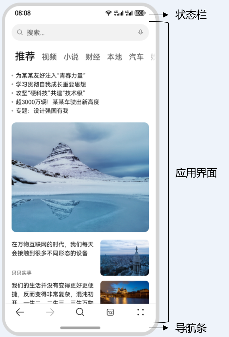
典型应用全屏窗口UI元素包括状态栏、应用界面和底部导航条。开发应用沉浸式效果主要指通过调整状态栏、应用界面和导航条的显示效果来减少状态栏导航条等系统界面的突兀感,从而使用户获得最佳的UI体验。
图1 界面元素示意图
开发应用沉浸式效果主要要考虑如下几个设计要素:
- UI元素避让处理:导航条底部区域可以响应点击事件,除此之外的可交互UI元素和应用关键信息不建议放到导航条区域。
- 沉浸式效果处理:将状态栏和导航条颜色与界面元素颜色相匹配,不出现明显的突兀感。
针对上面的设计要求,可以通过如下两种方式实现应用沉浸式效果:
- 窗口全屏布局方案:调整布局系统为全屏布局,界面元素延伸到状态栏和导航条区域实现沉浸式效果,然后通过接口查询状态栏和导航条区域进行可交互元素避让处理。
- 组件安全区方案:布局系统保持安全区内布局(安全区:界面上排除状态栏和导航条区域),然后通过接口延伸绘制内容(如背景色,背景图)到状态栏和导航条区域实现沉浸式效果。
该方案下,界面元素仅做绘制延伸,无法单独布局到状态栏和导航条区域,针对需要单独布局UI元素到状态栏和导航条区域的场景建议使用窗口全屏布局方案处理。
窗口全屏布局方案
窗口全屏布局方案主要涉及以下应用扩展布局,全屏显示和应用扩展布局,隐藏避让区两个应用场景。
应用扩展布局,全屏显示
可以通过调用窗口强制全屏布局接口(setWindowLayoutFullScreen())实现界面元素覆盖到状态栏和导航条,获取到状态栏和导航条高度后进行避让处理。
该布局方案相对灵活,开发者可以通过获取到状态栏和导航条的区域,从而进行避让处理。
- 调用setWindowLayoutFullScreen()接口设置窗口全屏。
// EntryAbility.ets import { AbilityConstant, UIAbility, Want } from '@kit.AbilityKit'; import { window } from '@kit.ArkUI'; import { BusinessError } from '@kit.BasicServicesKit'; export default class EntryAbility extends UIAbility { // ... onWindowStageCreate(windowStage: window.WindowStage): void { windowStage.loadContent('pages/Index', (err, data) => { if (err.code) { return; } let windowClass: window.Window = windowStage.getMainWindowSync(); // 获取应用主窗口 // 1. 设置窗口全屏 let isLayoutFullScreen = true; windowClass.setWindowLayoutFullScreen(isLayoutFullScreen) .then(() => { console.info('Succeeded in setting the window layout to full-screen mode.'); }) .catch((err: BusinessError) => { console.error('Failed to set the window layout to full-screen mode. Cause:' + JSON.stringify(err)); }); }); } } - 使用getWindowAvoidArea()接口获取布局遮挡区域(例如状态栏、导航条)。
// EntryAbility.ets import { AbilityConstant, UIAbility, Want } from '@kit.AbilityKit'; import { window } from '@kit.ArkUI'; export default class EntryAbility extends UIAbility { // ... onWindowStageCreate(windowStage: window.WindowStage): void { windowStage.loadContent('pages/Index', (err, data) => { if (err.code) { return; } let windowClass: window.Window = windowStage.getMainWindowSync(); // 获取应用主窗口 // 1. 设置窗口全屏 // ... // 2. 获取布局避让遮挡的区域 let type = window.AvoidAreaType.TYPE_NAVIGATION_INDICATOR; // 以导航条避让为例 let avoidArea = windowClass.getWindowAvoidArea(type); let bottomRectHeight = avoidArea.bottomRect.height; // 获取到导航条区域的高度 AppStorage.setOrCreate('bottomRectHeight', bottomRectHeight); }); } } - 在布局中对具体控件布局避让遮挡的区域。例如对底部Tab组件增加对应高度或设置margin边距,底部若是List组件可增加一个空节点。
let storage = LocalStorage.getShared();

@Entry(storage)
@Component
struct Index {
  bottomRectHeight: string = AppStorage.get<number>('bottomRectHeight') + 'px';

  build() {
    Row() {
      Column() {
        Row() {
          Text('ROW1').fontSize(40)
        }.backgroundColor(Color.Orange).padding(20)

        Row() {
          Text('ROW2').fontSize(40)
        }.backgroundColor(Color.Orange).padding(20)

        Row() {
          Text('ROW3').fontSize(40)
        }.backgroundColor(Color.Orange).padding(20)

        Row() {
          Text('ROW4').fontSize(40)
        }.backgroundColor(Color.Orange).padding(20)

        Row() {
          Text('ROW5').fontSize(40)
        }.backgroundColor(Color.Orange).padding(20)

        Row() {
          Text('ROW6').fontSize(40)
        }.backgroundColor(Color.Orange).padding(20)
      }
      .width('100%')
      .height('100%')
      .alignItems(HorizontalAlign.Center)
      .justifyContent(FlexAlign.SpaceBetween)
      .backgroundColor('#008000')
    }
    .margin({ bottom: this.bottomRectHeight }) // 此处margin具体数值在实际中应与导航条区域高度保持一致
  }
}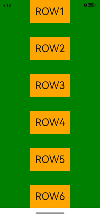
应用扩展布局,隐藏避让区
此场景下导航条会自动隐藏,适用于游戏、电影等应用场景。可以通过从底部上滑唤出导航条。
- 调用setWindowLayoutFullScreen()接口设置窗口全屏。
import { AbilityConstant, UIAbility, Want } from '@kit.AbilityKit'; import { window } from '@kit.ArkUI'; import { BusinessError } from '@kit.BasicServicesKit'; export default class EntryAbility extends UIAbility { // ... onWindowStageCreate(windowStage: window.WindowStage): void { windowStage.loadContent('pages/Index', (err, data) => { if (err.code) { return; } let windowClass: window.Window = windowStage.getMainWindowSync(); // 获取应用主窗口 // 1. 设置窗口全屏 let isLayoutFullScreen = true; windowClass.setWindowLayoutFullScreen(isLayoutFullScreen) .then(() => { console.info('Succeeded in setting the window layout to full-screen mode.'); }) .catch((err: BusinessError) => { console.error(`Failed to set the window layout to full-screen mode. Code is ${err.code}, message is ${err.message}`); }); }); } } - 调用setSpecificSystemBarEnabled()接口设置状态栏和导航条的具体显示/隐藏状态,此场景下将其设置为隐藏。
import { AbilityConstant, UIAbility, Want } from '@kit.AbilityKit'; import { window } from '@kit.ArkUI'; import { BusinessError } from '@kit.BasicServicesKit'; export default class EntryAbility extends UIAbility { // ... onWindowStageCreate(windowStage: window.WindowStage): void { windowStage.loadContent('pages/Index', (err, data) => { if (err.code) { return; } let windowClass: window.Window = windowStage.getMainWindowSync(); // 获取应用主窗口 // 1. 设置窗口全屏 // ... // 2. 设置状态栏和导航条隐藏 windowClass.setSpecificSystemBarEnabled('status', false) .then(() => { console.info('Succeeded in setting the status bar to be invisible.'); }) .catch((err: BusinessError) => { console.error(`Failed to set the status bar to be invisible. Code is ${err.code}, message is ${err.message}`); }); }); } } - 在界面中无需进行导航条避让操作。
@Entry()
@Component
struct Index {
  build() {
    Row() {
      Column() {
        Row() {
          Text('ROW1').fontSize(40)
        }.backgroundColor(Color.Orange).padding(20)

        Row() {
          Text('ROW2').fontSize(40)
        }.backgroundColor(Color.Orange).padding(20)

        Row() {
          Text('ROW3').fontSize(40)
        }.backgroundColor(Color.Orange).padding(20)

        Row() {
          Text('ROW4').fontSize(40)
        }.backgroundColor(Color.Orange).padding(20)

        Row() {
          Text('ROW5').fontSize(40)
        }.backgroundColor(Color.Orange).padding(20)

        Row() {
          Text('ROW6').fontSize(40)
        }.backgroundColor(Color.Orange).padding(20)
      }
      .width('100%')
      .height('100%')
      .alignItems(HorizontalAlign.Center)
      .justifyContent(FlexAlign.SpaceBetween)
      .backgroundColor('#008000')
    }
  }
}
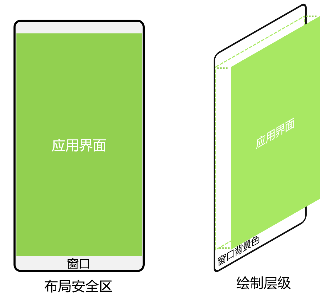
组件安全区方案
应用未使用setWindowLayoutFullScreen()接口设置窗口全屏布局时,默认使能组件安全区布局。
应用在默认情况下窗口背景绘制范围是全屏,但UI元素被限制在安全区内(自动排除状态栏和导航条)进行布局,来避免界面元素被状态栏和导航条遮盖。
图2 界面元素自动避让状态栏和导航条示意图
针对状态栏和导航条颜色与界面元素颜色不匹配问题,可以通过如下两种方式实现沉浸式效果:
- 状态栏和导航条颜色相同场景,可以通过设置窗口的背景色来实现沉浸式效果。窗口背景色可通过setWindowBackgroundColor()进行设置。
import { AbilityConstant, UIAbility, Want } from '@kit.AbilityKit';
import { window } from '@kit.ArkUI';

export default class EntryAbility extends UIAbility {
  // ...

  onWindowStageCreate(windowStage: window.WindowStage): void {
    windowStage.loadContent('pages/Index', (err, data) => {
      if (err.code) {
        return;
      }

      // 设置全窗颜色和应用元素颜色一致
      windowStage.getMainWindowSync().setWindowBackgroundColor('#008000');
    });
  }
}
界面状态栏和导航条颜色相同场景。
// xxx.ets
@Entry
@Component
struct Example {
  build() {
    Column() {
      Row() {
        Text('ROW1').fontSize(40)
      }.backgroundColor(Color.Orange).padding(20)

      Row() {
        Text('ROW2').fontSize(40)
      }.backgroundColor(Color.Orange).padding(20)

      Row() {
        Text('ROW3').fontSize(40)
      }.backgroundColor(Color.Orange).padding(20)

      Row() {
        Text('ROW4').fontSize(40)
      }.backgroundColor(Color.Orange).padding(20)

      Row() {
        Text('ROW5').fontSize(40)
      }.backgroundColor(Color.Orange).padding(20)

      Row() {
        Text('ROW6').fontSize(40)
      }.backgroundColor(Color.Orange).padding(20)
    }
    .width('100%')
    .height('100%')
    .alignItems(HorizontalAlign.Center)
    .justifyContent(FlexAlign.SpaceBetween)
    .backgroundColor('#008000')
  }
}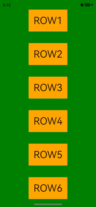
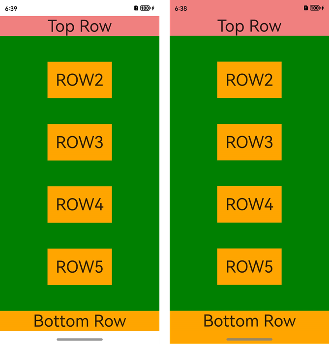
- 状态栏和导航条颜色不同时,可以使用expandSafeArea属性扩展安全区域属性进行调整。
// xxx.ets
@Entry
@Component
struct Example {
  build() {
    Column() {
      Row() {
        Text('Top Row').fontSize(40).textAlign(TextAlign.Center).width('100%')
      }
      .backgroundColor('#F08080')
      // 设置顶部绘制延伸到状态栏
      .expandSafeArea([SafeAreaType.SYSTEM], [SafeAreaEdge.TOP])

      Row() {
        Text('ROW2').fontSize(40)
      }.backgroundColor(Color.Orange).padding(20)

      Row() {
        Text('ROW3').fontSize(40)
      }.backgroundColor(Color.Orange).padding(20)

      Row() {
        Text('ROW4').fontSize(40)
      }.backgroundColor(Color.Orange).padding(20)

      Row() {
        Text('ROW5').fontSize(40)
      }.backgroundColor(Color.Orange).padding(20)

      Row() {
        Text('Bottom Row').fontSize(40).textAlign(TextAlign.Center).width('100%')
      }
      .backgroundColor(Color.Orange)
      // 设置底部绘制延伸到导航条
      .expandSafeArea([SafeAreaType.SYSTEM], [SafeAreaEdge.BOTTOM])
    }
    .width('100%').height('100%').alignItems(HorizontalAlign.Center)
    .backgroundColor('#008000')
    .justifyContent(FlexAlign.SpaceBetween)
  }
}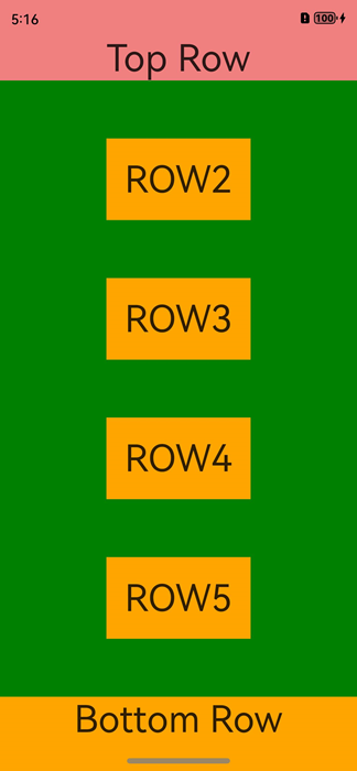
扩展安全区域属性原理
- 布局阶段按照安全区范围大小进行UI元素布局。
- 布局完成后查看设置了expandSafeArea的组件边界(不包括margin)是否和安全区边界相交。
- 如果设置了expandSafeArea的组件和安全区边界相交,根据expandSafeArea传递的属性则进一步扩大组件绘制区域大小覆盖状态栏、导航条这些非安全区域。
- 上述过程仅改变组件自身绘制大小,不进行二次布局,不影响子节点和兄弟节点的大小和位置。
- 子节点可以单独设置该属性,只需要自身边界和安全区域重合就可以延伸自身大小至非安全区域内,需要确保父组件未设置clip等裁切属性。
- 配置expandSafeArea属性组件进行绘制扩展时,需要关注组件不能配置固定宽高尺寸,百分比除外。
背景图和视频场景
设置背景图、视频控件大小为安全区域大小并配置expandSafeArea属性。
// xxx.ets
@Entry
@Component
struct SafeAreaExample1 {
  build() {
    Stack() {
      Image($r('app.media.bg'))
        .height('100%').width('100%')
        .expandSafeArea([SafeAreaType.SYSTEM], [SafeAreaEdge.TOP, SafeAreaEdge.BOTTOM]) // 图片组件的绘制区域扩展至状态栏和导航条。
    }.height('100%').width('100%')
  }
}
滚动类场景
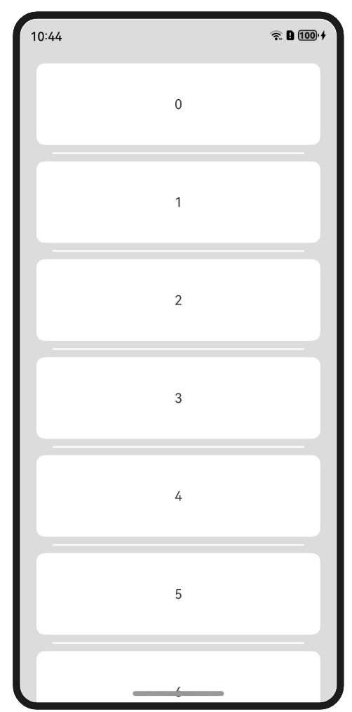
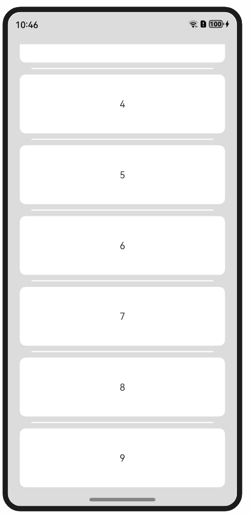
要求需要List滚动类组件滚动过程中元素可以和导航条重合,滚动至底部时,元素在导航条上面需要避让。
由于expandSafeArea不改变子节点布局,故List等滚动类控件可以调用expandSafeArea特性延伸List组件视图窗口大小而不改变ListItem内在布局,实现ListItem在滑动过程中显示在导航条下,但滚动至最后一个时显示在导航条上,示意图如下:
图3 未适配时列表下方被导航条遮盖
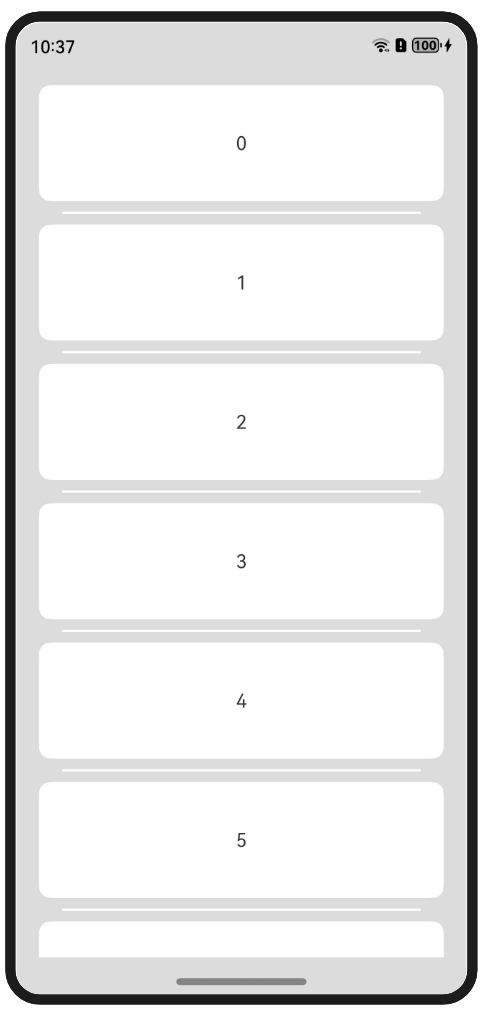
图4 List配置expandSafeArea属性后的效果
仅扩展底部导航条。
- 配置窗口整体底色。
import { AbilityConstant, UIAbility, Want } from '@kit.AbilityKit'; import { window } from '@kit.ArkUI'; export default class EntryAbility extends UIAbility { // ... onWindowStageCreate(windowStage: window.WindowStage): void { windowStage.loadContent('pages/Index', (err, data) => { if (err.code) { return; } windowStage.getMainWindowSync().setWindowBackgroundColor('#DCDCDC'); // 配置窗口整体底色 }); } } - 界面代码展示。
// xxx.ets
@Entry
@Component
struct ListExample {
  private arr: number[] = [0, 1, 2, 3, 4, 5, 6, 7, 8, 9]

  build() {
    Column() {
      List({ space: 20, initialIndex: 0 }) {
        ForEach(this.arr, (item: number) => {
          ListItem() {
            Text('' + item)
              .width('100%')
              .height(100)
              .fontSize(16)
              .textAlign(TextAlign.Center)
              .borderRadius(10)
              .backgroundColor(0xFFFFFF)
          }
        }, (item: string) => item)
      }
      .listDirection(Axis.Vertical) // 排列方向
      .scrollBar(BarState.Off)
      .friction(0.6)
      .divider({ strokeWidth: 2, color: 0xFFFFFF, startMargin: 20, endMargin: 20 }) // 每行之间的分界线
      .edgeEffect(EdgeEffect.Spring) // 边缘效果设置为Spring
      .width('90%')
      // List组件的视窗范围扩展至导航条。
      .expandSafeArea([SafeAreaType.SYSTEM], [SafeAreaEdge.TOP, SafeAreaEdge.BOTTOM])
    }
    .width('100%')
    .height('100%')
    .padding({ top: 15 })
  }
}
底部页签场景
要求页签背景色能够延伸到导航条区域,但页签内部可操作元素需要在导航条之上。
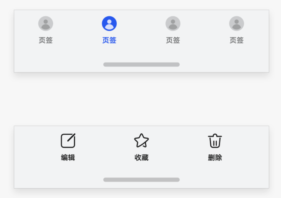
针对底部的页签部分,Navigation组件和Tabs组件默认实现了页签的延伸处理,开发者只需要保证Navigation和Tabs组件的底部边界和底部导航条重合即可。若开发者显式调用expandSafeArea接口,则安全区效果由expandSafeArea参数指定。
如果未使用上述组件而是采用自定义方式实现页签的场景,可以针对底部元素设置expandSafeArea属性实现底部元素的背景扩展。
图5 顶部和底部UI元素未设置和设置expandSafeArea属性效果对比
// xxx.ets
@Entry
@Component
struct VideoCreateComponent {
  build() {
    Column() {
      Row() {
        Text('Top Row').fontSize(40).textAlign(TextAlign.Center).width('100%')
      }
      .backgroundColor('#F08080')
      // 设置顶部绘制延伸到状态栏
      .expandSafeArea([SafeAreaType.SYSTEM], [SafeAreaEdge.TOP])

      Row() {
        Text('ROW2').fontSize(40)
      }.backgroundColor(Color.Orange).padding(20)

      Row() {
        Text('ROW3').fontSize(40)
      }.backgroundColor(Color.Orange).padding(20)

      Row() {
        Text('ROW4').fontSize(40)
      }.backgroundColor(Color.Orange).padding(20)

      Row() {
        Text('ROW5').fontSize(40)
      }.backgroundColor(Color.Orange).padding(20)

      Row() {
        Text('Bottom Row').fontSize(40).textAlign(TextAlign.Center).width('100%')
      }
      .backgroundColor(Color.Orange)
      // 设置底部绘制延伸到导航条
      .expandSafeArea([SafeAreaType.SYSTEM], [SafeAreaEdge.BOTTOM])
    }
    .width('100%').height('100%').alignItems(HorizontalAlign.Center)
    .justifyContent(FlexAlign.SpaceBetween)
    .backgroundColor(Color.Green)
  }
}
图文场景
当状态栏元素和底部导航条元素不同时,无法单纯通过窗口背景色或者背景图组件延伸实现,此时需要对顶部元素和底部元素分别配置expandSafeArea属性,顶部元素配置expandSafeArea([SafeAreaType.SYSTEM],[SafeAreaEdge.TOP]),底部元素配置expandSafeArea([SafeAreaType.SYSTEM],[SafeAreaEdge.BOTTOM])。
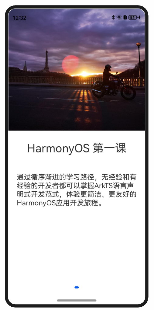
@Entry
@Component
struct Index {
  build() {
    Swiper() {
      Column() {
        Image($r('app.media.start'))
          .height('50%').width('100%')
          // 设置图片延伸到状态栏
          .expandSafeArea([SafeAreaType.SYSTEM], [SafeAreaEdge.TOP])
        Column() {
          Text('HarmonyOS 第一课')
            .fontSize(32)
            .margin(30)
          Text('通过循序渐进的学习路径,无经验和有经验的开发者都可以掌握ArkTS语言声明式开发范式,体验更简洁、更友好的HarmonyOS应用开发旅程。')
            .fontSize(20).margin(20)
        }.height('50%').width('100%')
        .backgroundColor(Color.White)
        // 设置文本内容区背景延伸到导航栏
        .expandSafeArea([SafeAreaType.SYSTEM], [SafeAreaEdge.BOTTOM])
      }
    }
    .width('100%')
    .height('100%')
    // 关闭Swiper组件默认的裁切效果以便子节点可以绘制在Swiper外。
    .clip(false)
  }
}
最后
有很多小伙伴不知道学习哪些鸿蒙开发技术?不知道需要重点掌握哪些鸿蒙应用开发知识点?但是又不知道从哪里下手,而且学习时频繁踩坑,最终浪费大量时间。所以本人整理了一些比较合适的鸿蒙(HarmonyOS NEXT)学习路径和一些资料的整理供小伙伴学习
点击领取→纯血鸿蒙Next全套最新学习资料(安全链接,放心点击)
希望这一份鸿蒙学习资料能够给大家带来帮助,有需要的小伙伴自行领取,限时开源,先到先得~无套路领取!!
一、鸿蒙(HarmonyOS NEXT)最新学习路线
有了路线图,怎么能没有学习资料呢,小编也准备了一份联合鸿蒙官方发布笔记整理收纳的一套系统性的鸿蒙(OpenHarmony )学习手册(共计1236页)与鸿蒙(OpenHarmony )开发入门教学视频,内容包含:(ArkTS、ArkUI开发组件、Stage模型、多端部署、分布式应用开发、音频、视频、WebGL、OpenHarmony多媒体技术、Napi组件、OpenHarmony内核、Harmony南向开发、鸿蒙项目实战等等)鸿蒙(HarmonyOS NEXT)…等技术知识点。
获取以上完整版高清学习路线,请点击→纯血版全套鸿蒙HarmonyOS学习资料
二、HarmonyOS Next 最新全套视频教程
三、《鸿蒙 (OpenHarmony)开发基础到实战手册》
OpenHarmony北向、南向开发环境搭建
《鸿蒙开发基础》
- ArkTS语言
- 安装DevEco Studio
- 运用你的第一个ArkTS应用
- ArkUI声明式UI开发
- .……

《鸿蒙开发进阶》
- Stage模型入门
- 网络管理
- 数据管理
- 电话服务
- 分布式应用开发
- 通知与窗口管理
- 多媒体技术
- 安全技能
- 任务管理
- WebGL
- 国际化开发
- 应用测试
- DFX面向未来设计
- 鸿蒙系统移植和裁剪定制
- ……
《鸿蒙进阶实战》
- ArkTS实践
- UIAbility应用
- 网络案例
- ……
四、大厂面试必问面试题
五、鸿蒙南向开发技术
六、鸿蒙APP开发必备
七、鸿蒙生态应用开发白皮书V2.0PDF
完整鸿蒙HarmonyOS学习资料,请点击→纯血版全套鸿蒙HarmonyOS学习资料
总结
总的来说,华为鸿蒙不再兼容安卓,对中年程序员来说是一个挑战,也是一个机会。只有积极应对变化,不断学习和提升自己,他们才能在这个变革的时代中立于不败之地。


 319
319

 被折叠的 条评论
为什么被折叠?
被折叠的 条评论
为什么被折叠?
 到【灌水乐园】发言


