


关于数据
该数据集提供了消费者购物趋势的全面视图,旨在揭示零售购买的模式和行为。它包含各种产品类别、客户人口统计和购买渠道的详细交易数据。主要功能可能包括:
- 交易详情:购买日期、交易价值、产品类别和付款方式。
- 客户信息:年龄组、性别、位置和忠诚度状态。
- 购物行为:购买频率、每笔交易的平均支出和季节性趋势。
这个数据集对于数据科学家、分析师和营销人员来说是理想的选择:
- 随着时间的推移分析消费者的购买模式。
- 确定流行的产品类别和高绩效细分市场。
- 制定客户细分和个性化策略。
- 为销售预测或客户保留建立预测模型。
在执行探索性数据分析、创建可视化还是训练机器学习模型,该数据集都能提供有价值的见解,以支持零售业的数据驱动决策。
数据预处理
import pandas as pd
import numpy as np
import seaborn as sns
import matplotlib.pyplot as plt
import warnings

warnings.filterwarnings('ignore')
df = pd.read_csv("./shopping_trends.csv")
df.head()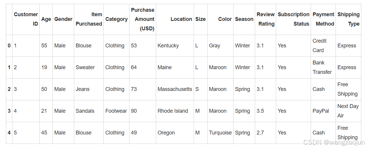
df.info() 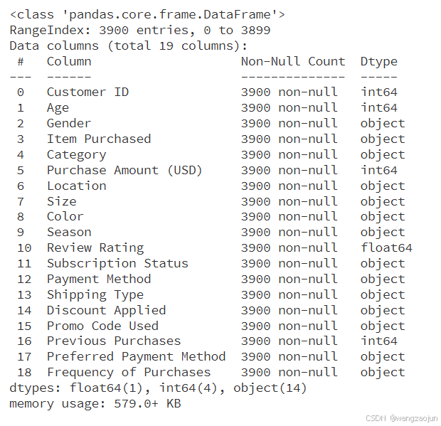
各属性的数值类型正确,即数值型数据均为对应数值类型,其他为object类型
df.isnull().sum() 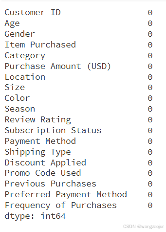
无缺失值
数据分析
1.简单统计分析
(1)描述性统计
df.describe().drop('Customer ID', axis=1)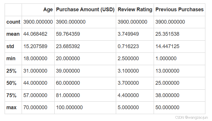
对除'Customer ID'之外的数值型属性进行描述性分析:
- 年龄分布:客户年龄分布较广,但主要集中在31岁到57岁之间,平均数与中位数均为44岁,说明中年人群是主要客户群体。
- 购买金额:购买金额的波动较大,可能与购买的商品种类、数量或促销活动有关。
- 评价评分:客户的评价普遍较高,评分集中在3.1分到4.4分之间,表明客户满意度较好。
- 购买频率:客户的购买频率差异较大,中位数与平均数均为25次,说明频繁购买客户较多。
df
(2)数值型数据的相关性分析
# 数值型数据相关性
corr = df[['Age', 'Purchase Amount (USD)','Review Rating', 'Previous Purchases']].corr()

plt.figure(figsize=(8, 6))
sns.heatmap(corr, annot=True, cmap='Purples', fmt='.2f', linewidths=0.5)
plt.title('Correlation Heatmap')
plt.show()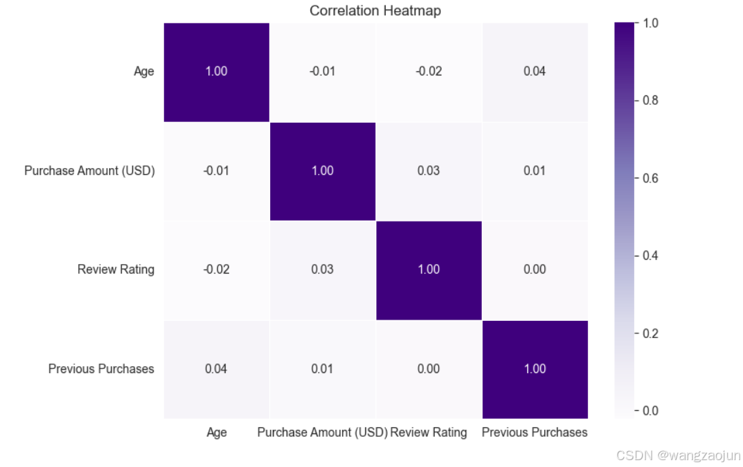
根据热力图结果可以发现,其中数值型数据之间并不存在明显相关性,即Age,Purchase Amount (USD),Review Rating,Previous Purchase之间无明显相关性
2.商品类别
(1)各项商品与金额
plt.figure(figsize=(18, 9))
sns.barplot(x='Item Purchased', y='Purchase Amount (USD)', data=df, palette='coolwarm')
plt.title('Purchase Amount by Item Purchased')
plt.show()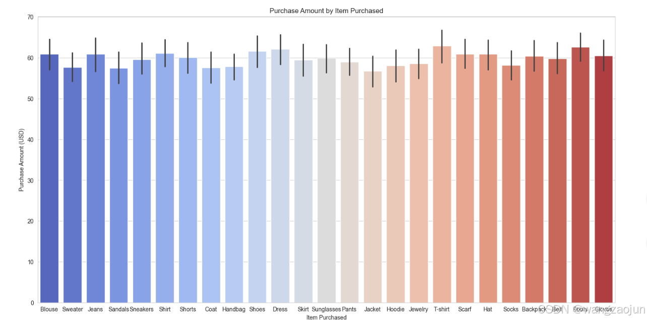
(2)商品类别与金额——箱型图
sns.catplot(data=df, x='Category', y='Purchase Amount (USD)', kind='box', height=6, aspect=2)
plt.title("Purchase Amount Distribution by Category")
plt.show() 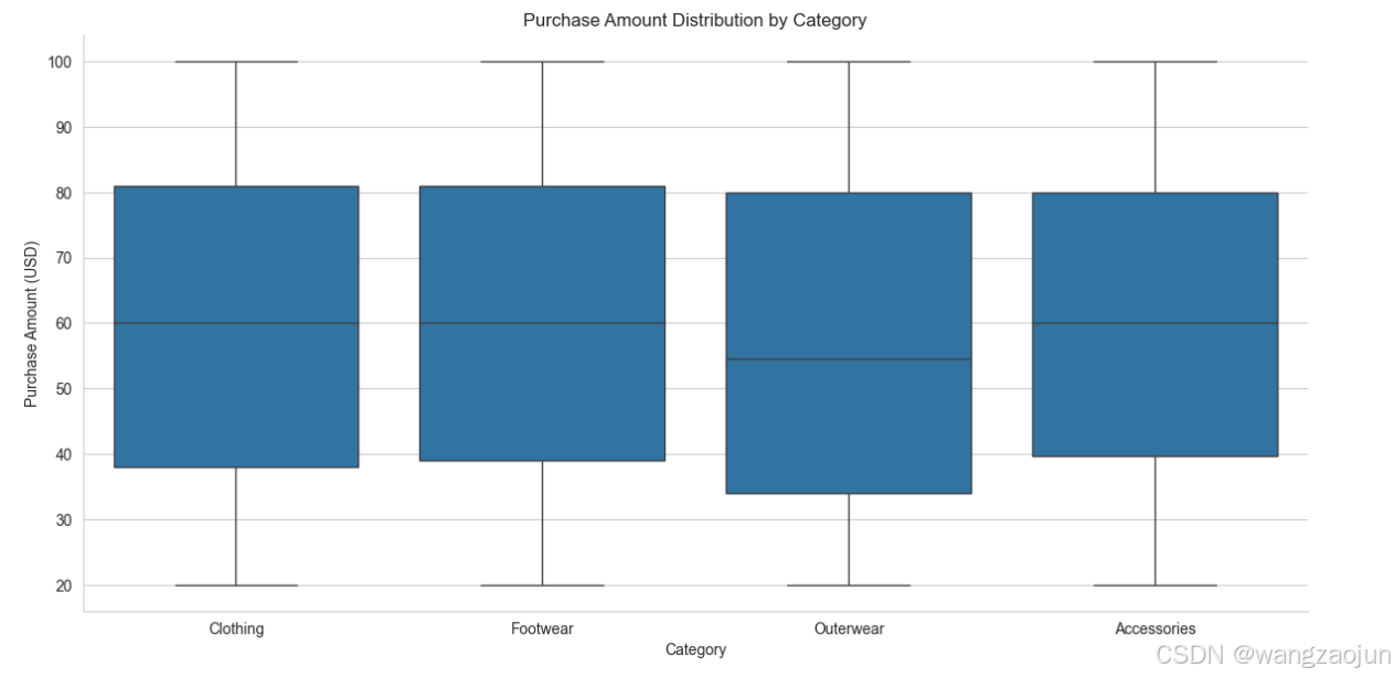
(3)商品类别与金额——小提琴图
plt.figure(figsize=(10, 6))
sns.violinplot(x='Category', y='Purchase Amount (USD)', data=df, inner='quart')
plt.title("Violin Plot: Purchase Amount by Category")
plt.show() 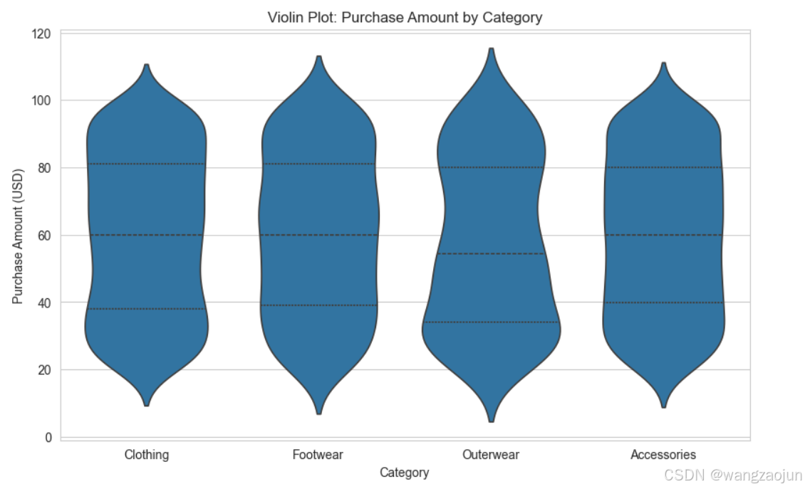
(4)商品类别与数量
plt.figure(figsize=(10, 6))
sns.countplot(x='Category', data=df)
plt.title('Count of Items Purchased by Category')
plt.show()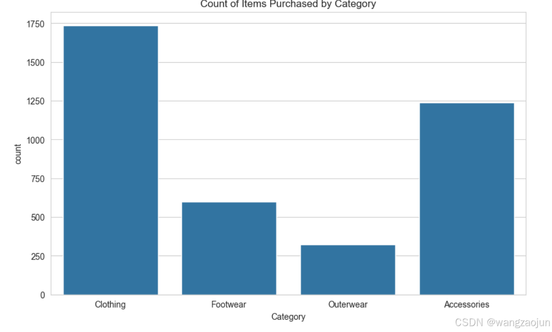
(5)购买频率占比
plt.figure(figsize=(6, 4))
counts = df['Category'].value_counts()
explode = (0, 0.1, 0.2, 0.3)

colors = ['#A85CF9', '#FF4949', '#BDF2D5', '#FF06B7', '#4B7BE5', '#FF5D5D', '#FAC213', '#37E2D5', '#6D8B74', '#E9D5CA']

counts.plot(kind='pie', fontsize=12, colors=colors, explode=explode, autopct='%1.1f%%')
plt.axis('equal')
plt.legend(labels=counts.index, loc='best')
plt.show()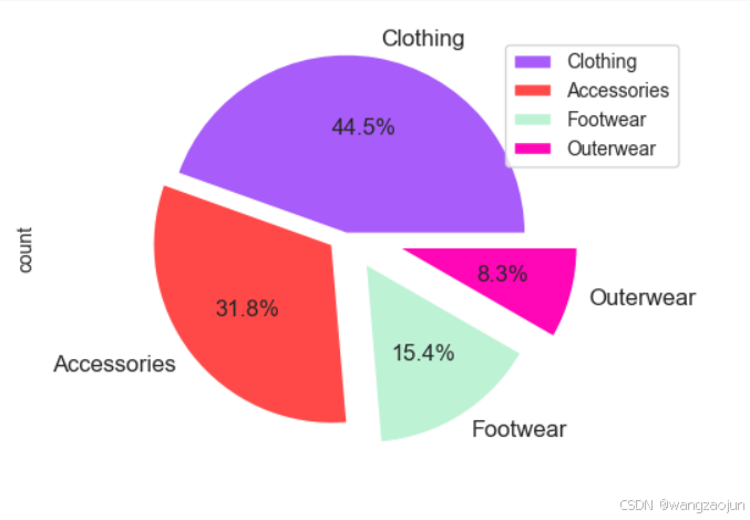
(6)各产品销量
def barw(ax):
    for p in ax.patches:
        val = p.get_width()
        x = p.get_x() + p.get_width()
        y = p.get_y() + p.get_height() / 2
        ax.annotate(int(val), (x, y))


plt.figure(figsize=(16, 9))
# 获取不同商品的数量
item_counts = df['Item Purchased'].value_counts()
# 生成颜色列表
colors = sns.color_palette("hls", len(item_counts))
ax0 = sns.countplot(data=df, y='Item Purchased', order=df['Item Purchased'].value_counts().index, palette=colors)

# 计算购买次数均值
mean_count = df['Item Purchased'].value_counts().mean()
# 添加红色虚线表示均值
line = ax0.axvline(mean_count, color='r', linestyle='--')
barw(ax0)
# 添加图例
ax0.legend([line], [f'avg_count={mean_count:.2f}'])

plt.show()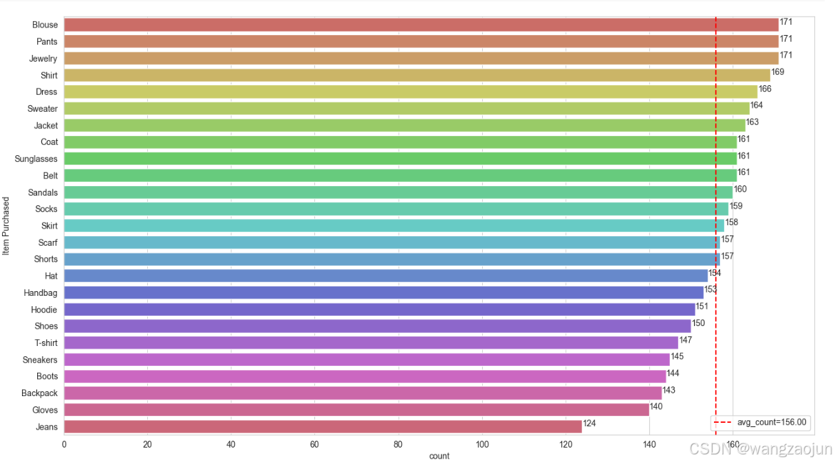
# 筛选出购买次数大于均值的商品,并按照购买次数降序排列
above_mean_items = item_counts[item_counts > mean_count].sort_values(ascending=False).reset_index()
above_mean_items.columns = ['Item Purchased', 'Purchase Times']
# 按照指定格式输出
result = above_mean_items.apply(lambda x: f"{x['Item Purchased']}({x['Purchase Times']})", axis=1)
result.tolist()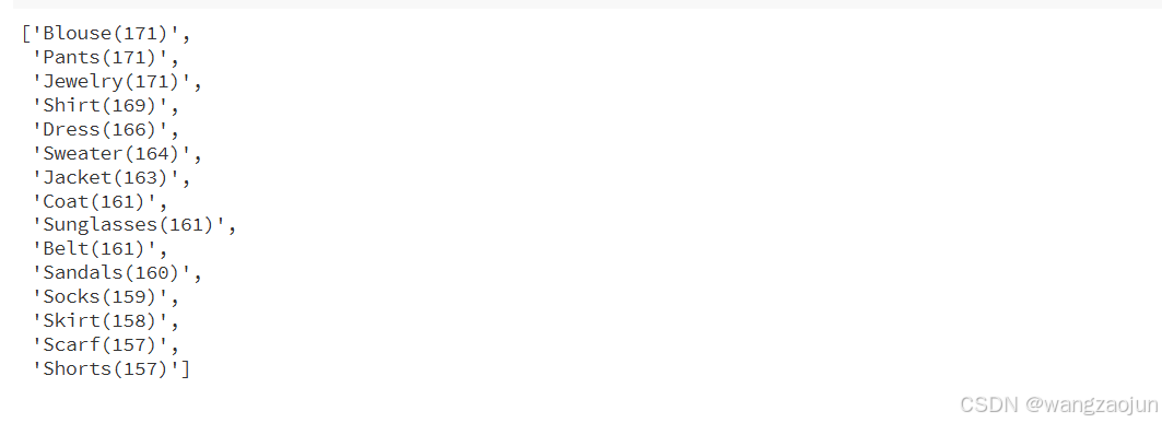
3.位置信息
# 统计Location列每个值出现的次数
location_counts = df['Location'].value_counts()

# 取前十个最常见的值及其计数
top_10_locations = location_counts[:10]

# 计算每个位置的占比
total_count = top_10_locations.sum()
ratios = top_10_locations / total_count

# 创建包含地理位置和比例的数据框
pd.DataFrame({'Location': top_10_locations.index, 'Ratio': ratios}) 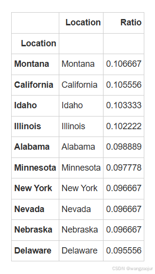
可以看出各个地方占比十分接近
my_circle = plt.Circle((0, 0), 0.9, color='white')

plt.pie(df['Location'].value_counts()[:10].values,
        labels=df['Location'].value_counts()[:10].index)

p = plt.gcf()
p.gca().add_artist(my_circle)
plt.show() 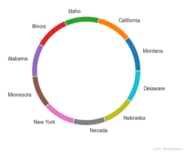
4.性别对比
(1)男女购买金额对比
plt.figure(figsize=(11, 5))
plt.gcf().text(0.55, 0.95, "Box Plot", fontsize=40, color='Red', ha='center', va='center')

sns.boxenplot(x=df['Gender'], y=df['Purchase Amount (USD)'], palette="Set1")

plt.show()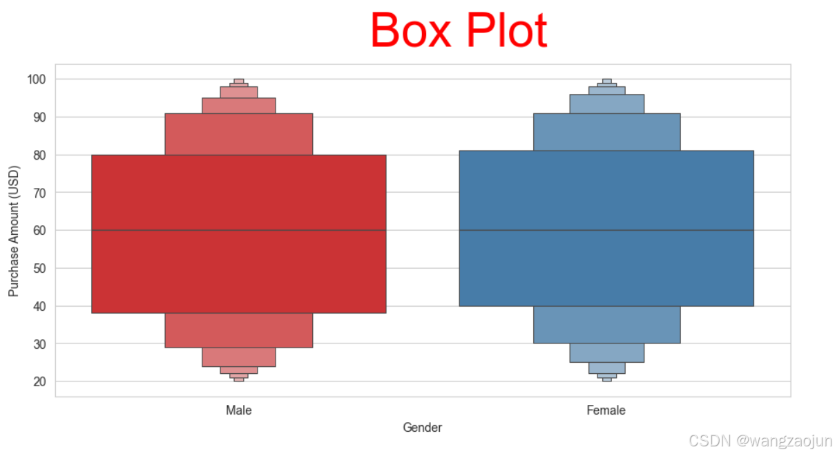
(2)男女定量数据分布对比
import math
# 统计符合条件的列的数量
count = sum(1 for col in df.columns if df[col].dtype in ['int64', 'float64'])
# 计算行数和列数
cols = math.ceil(math.sqrt(count))
rows = math.ceil(count / cols)

plt.figure(figsize=(20, 12))

i = 1
for column in df.columns:
    if df[column].dtype in ['int64', 'float64']:
        plt.subplot(rows, cols, i)
        df[df['Gender'] == 'Male'][column].hist(bins=35, color='blue', label='Male', alpha=0.9)
        df[df['Gender'] == 'Female'][column].hist(bins=35, color='red', label='Female', alpha=0.5)

        plt.legend()
        plt.xlabel(column)
        i += 1

plt.tight_layout()
plt.show()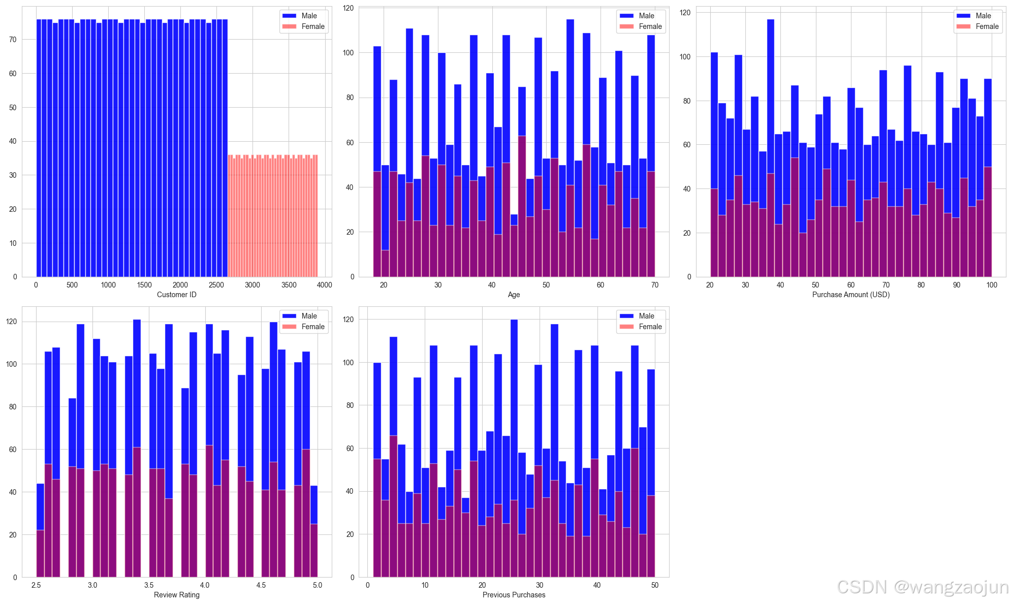
df 
(3)购买频率与性别、支付方式
cat = ['Gender', 'Payment Method']

fig, ax = plt.subplots(1, 2, figsize=(16, 8))

for indx, (column, axes) in list(enumerate(list(zip(cat, ax.flatten())))):
    sns.countplot(ax=axes, x=df[column], hue=df['Frequency of Purchases'], palette='magma', alpha=0.8)
    axes.set_title(f'Count of {column} by Frequency of Purchases')

if len(cat) < len(ax.flatten()):
    [axes.set_visible(False) for axes in ax.flatten()[len(cat):]]

plt.tight_layout()
plt.show()
cat = ['Gender', 'Payment Method']

fig, ax = plt.subplots(1, 2, figsize=(16, 8))

for indx, (column, axes) in enumerate(zip(cat, ax.flatten())):
    if column == 'Gender':
        # 按性别分组并计算各购买频率的比例
        gender_counts = df.groupby(['Gender', 'Frequency of Purchases']).size().reset_index(name='count')
        total_per_gender = df.groupby('Gender').size().reset_index(name='total')
        gender_merged = gender_counts.merge(total_per_gender, on='Gender')
        gender_merged['frequency'] = gender_merged['count'] / gender_merged['total']

        sns.barplot(ax=axes, x='Gender', y='frequency', hue='Frequency of Purchases', data=gender_merged, palette='magma', alpha=0.8)
        axes.set_title(f'Frequency of Purchases by {column}')
        axes.set_ylabel('Frequency')
    else:
        sns.countplot(ax=axes, x=df[column], hue=df['Frequency of Purchases'], palette='magma', alpha=0.8)
        axes.set_title(f'Count of {column} by Frequency of Purchases')
    # 将图例放在右下角
    axes.legend(loc='lower right')

if len(cat) < len(ax.flatten()):
    [axes.set_visible(False) for axes in ax.flatten()[len(cat):]]

plt.tight_layout()
plt.show() 
(4)不同季节男女消费金额
sns.catplot(x="Gender", y="Purchase Amount (USD)", col="Season",
            kind="boxen", palette="Set2", height=5, aspect=1, data=df, col_wrap=2)
plt.show()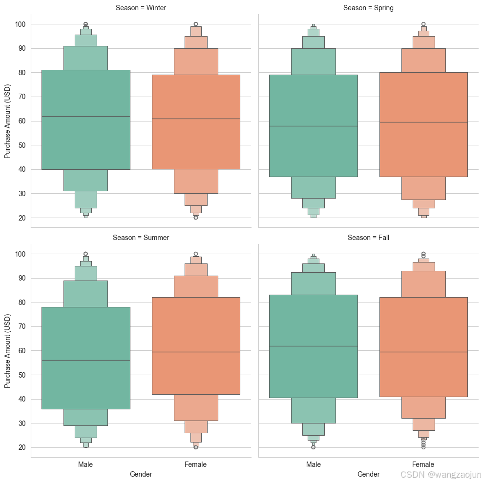
(5)对不同产品的消费金额对比
plt.figure(figsize=(16, 9))
params = dict(data=df, x='Category', y='Purchase Amount (USD)', hue='Gender', dodge=True)

# 散点图
sns.stripplot(**params, size=8, jitter=0.35, palette=['#33FF66', '#FF6600'], edgecolor='black', linewidth=1)
# 箱型图
sns.boxplot(**params, palette=['#BDBDBD', '#E0E0E0'], linewidth=6)

plt.show()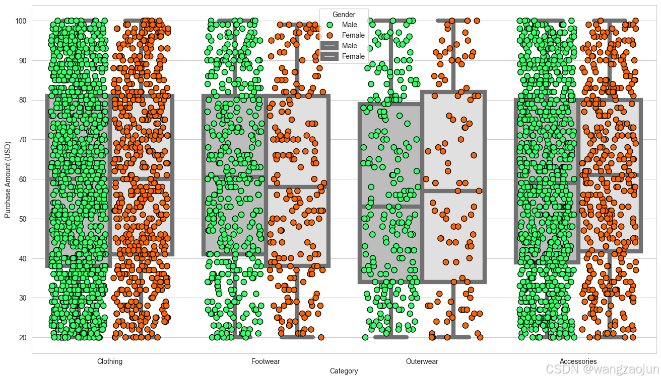
(6)不同性别不同年龄购买频率
y = df['Gender']

plt.figure(figsize=(10, 6))
g = sns.kdeplot(df["Age"][(y == 'Male') & (df["Age"].notnull())], color="Red", shade=True)
g = sns.kdeplot(df["Age"][(y == 'Female') & (df["Age"].notnull())], ax=g, color="Blue", shade=True)
g.set_xlabel("Age")
g.set_ylabel("Frequency")
g = g.legend(["Male", "Female"])

plt.show() 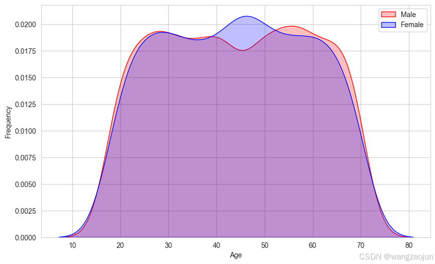
5.用户画像分析
# 年龄区间划分函数,将年龄划分到不同阶段,方便后续统计分析
def categorize_age(age):
    if age < 25:
        return '青年'
    elif age < 45:
        return '中年'
    return '老年'

# 在数据框中新增年龄区间列
df['Age_Group'] = df['Age'].apply(categorize_age)

# 消费金额区间划分函数,这里简单划分高低两个档次,可按需细化调整
def categorize_amount(amount):
    if amount < 50:
        return '低消费'
    return '高消费'

# 在数据框中新增消费金额区间列
df['Amount_Group'] = df['Purchase Amount (USD)'].apply(categorize_amount)

#  综合考虑多维度交叉分析,以年龄区间和消费金额区间交叉为例
cross_analysis = df.groupby(['Age_Group', 'Amount_Group']).agg({
    'Frequency of Purchases': lambda x: x.mode()[0],
    'Payment Method': lambda x: x.mode()[0],
    'Item Purchased': lambda x: x.mode()[0]
}).reset_index()

print("多维度交叉(年龄区间与消费金额区间)的用户画像分析:")
cross_analysis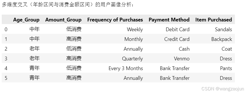
随机森林模型训练
数据集划分
from sklearn.model_selection import train_test_split
from sklearn.preprocessing import LabelEncoder, StandardScaler
from sklearn.ensemble import RandomForestClassifier
from sklearn.metrics import classification_report, accuracy_score, confusion_matrix

categorical_cols = ['Gender', 'Item Purchased', 'Category', 'Location', 'Size', 'Color',
                    'Season', 'Subscription Status', 'Payment Method', 'Shipping Type',
                    'Promo Code Used', 'Preferred Payment Method', 'Frequency of Purchases']

encoder = LabelEncoder()

for col in categorical_cols:
    df[col] = encoder.fit_transform(df[col])

df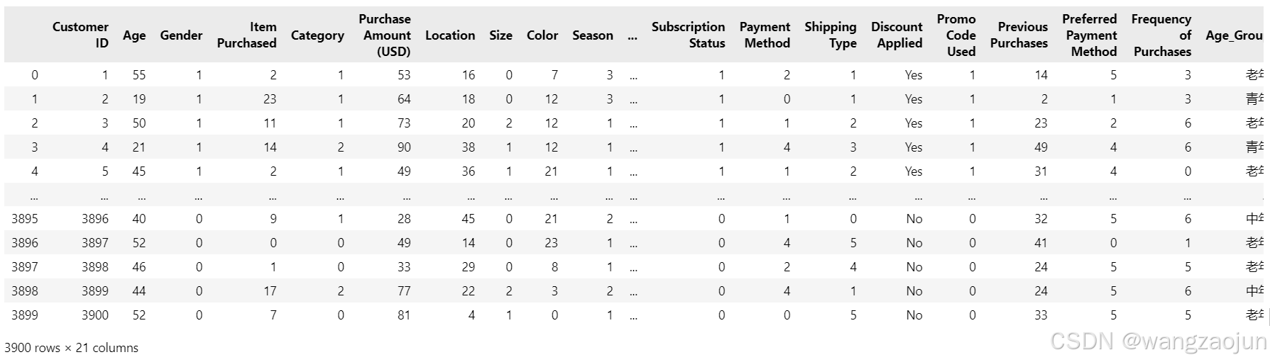
# Features (X) and Label (y)
X = df.drop(columns=['Customer ID', 'Subscription Status'])  # 将ID与label给去掉
y = df['Subscription Status']  # label
numerical_cols = ['Age', 'Purchase Amount (USD)', 'Review Rating', 'Previous Purchases']

scaler = StandardScaler()
X[numerical_cols] = scaler.fit_transform(X[numerical_cols])

X.head()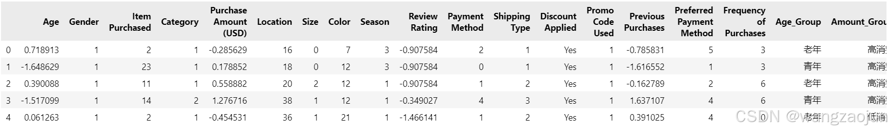
# 将标签编码应用于剩余的对象类型列
for col in X.select_dtypes(include='object').columns:
    X[col] = encoder.fit_transform(X[col])


#划分为 train and test 数据集
X_train, X_test, y_train, y_test = train_test_split(X, y, test_size=0.2, random_state=42, stratify=y)

from sklearn import preprocessing

label_encoder = preprocessing.LabelEncoder()

df['Discount Applied']= label_encoder.fit_transform(df['Discount Applied'])
模型训练
model_RF = RandomForestClassifier(random_state=42, n_estimators=100)
model_RF.fit(X_train, y_train)

y_pred = model_RF.predict(X_test)
评估模型
print("Accuracy Score:", accuracy_score(y_test, y_pred))
print("\nClassification Report:\n", classification_report(y_test, y_pred))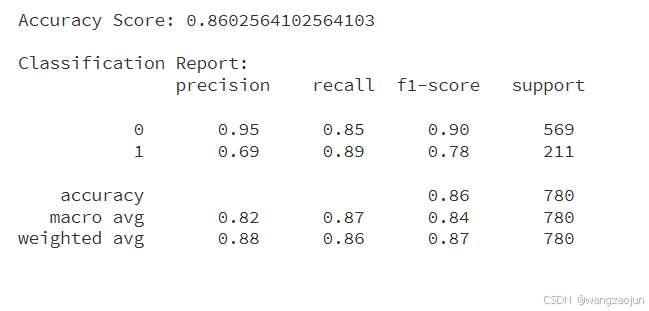
#  混淆矩阵可视化
plt.figure(figsize=(6, 4))
sns.heatmap(confusion_matrix(y_test, y_pred), annot=True, fmt='d', cmap='Blues')
plt.title("Confusion Matrix")
plt.xlabel("Predicted")
plt.ylabel("Actual")
plt.show()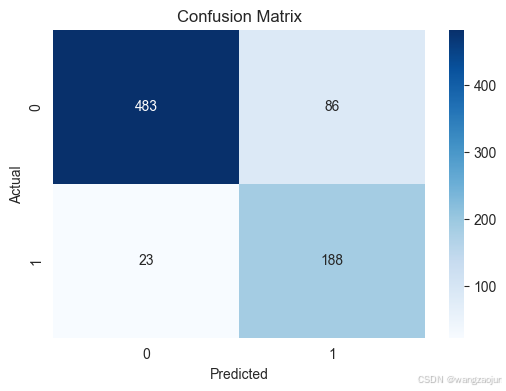
重要性排序
importances = model_RF.feature_importances_
features = X.columns

# 将特征重要性和特征名称组合在一起,并按照重要性进行降序排序
feature_importance_data = sorted(zip(importances, features), reverse=True)
importances_sorted, features_sorted = zip(*feature_importance_data)

plt.figure(figsize=(12, 8))
# 绘制柱状图,按照降序排列的顺序绘制
sns.barplot(x=importances_sorted, y=features_sorted, palette='viridis')

# 计算重要性的均值
avg_importance = np.mean(importances_sorted)

# 添加红色竖立的虚线表示重要性均值
plt.axvline(x=avg_importance, color='r', linestyle='--', label=f'avg_importance={avg_importance:.2f}')

plt.title("Feature Importance")
plt.xlabel("Importance Score")
plt.ylabel("Features")
# 添加图例,设置图例位置等属性让其显示更合理
plt.legend(fontsize='medium')
plt.show()
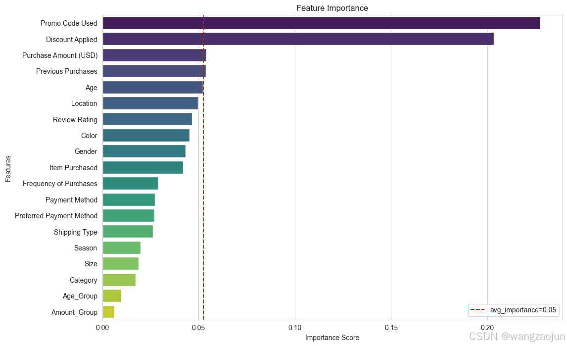
higher_than_avg_features = [(feature, importance) for importance, feature in zip(importances_sorted, features_sorted) if importance > avg_importance]
print("高于平均值的属性:")
for feature, importance in higher_than_avg_features:
print(f"{feature}({importance:.3f})") 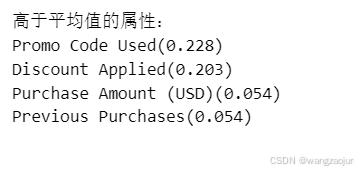
神经网络
模型训练
from sklearn.neural_network import MLPClassifier
model_bp = MLPClassifier(hidden_layer_sizes=(5, 3))
model_bp.fit(X_train, y_train)

y_pred = model_bp.predict(X_test)
评估模型
print("Accuracy Score:", accuracy_score(y_test, y_pred))
print("\nClassification Report:\n", classification_report(y_test, y_pred))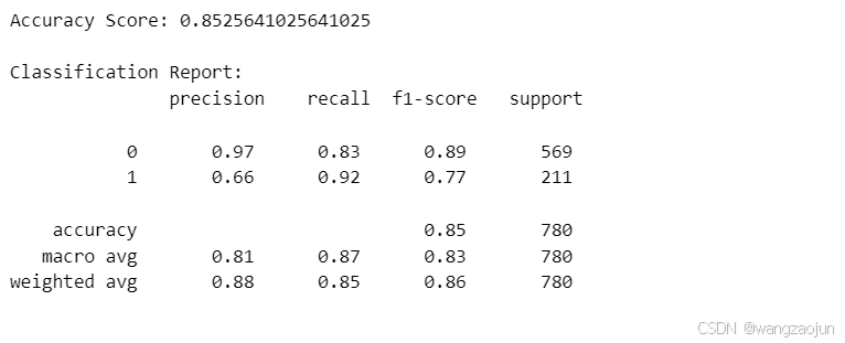
#  混淆矩阵可视化
plt.figure(figsize=(6, 4))
sns.heatmap(confusion_matrix(y_test, y_pred), annot=True, fmt='d', cmap='Blues')
plt.title("Confusion Matrix")
plt.xlabel("Predicted")
plt.ylabel("Actual")
plt.show()
机器学习模型对比分析
具体分析:
- 在准确率方面:随机森林与神经网络模型的十分接近,准确率基本一致。
- 在类别 1 识别:首先,在召回率方面神经网络(95%)相比于随机森林的(89%)有优势。但是二者的准确率都较低,神经网络为66%,随机森林为69%。
- 在类别 0 识别:二者的精确率与找回率都较高。其中神经网络分别为(99%、82%),随机森林分别为(95%、85%),二者之间差距不明显。
总结对比可以得知,在准确率、类别0识别的差距都不明显的情况下,神经网络在类别1的识别效果更佳。
但是,神经网络在类别1的识别优势不是特别大,在考虑随机森林具有较强解释性(例如给出的重要性排序图)的情况下,这点优势可以忽略,所以综合对比分析可以得到,两个模型中,随机森林是更优的一个选择。


 785
785

 被折叠的 条评论
为什么被折叠?
被折叠的 条评论
为什么被折叠?
 到【灌水乐园】发言


