import pandas as pd
from pyecharts.charts import Bar
from pyecharts.charts import Map
from pyecharts.charts import WordCloud
from pyecharts.charts import Timeline
from pyecharts.charts import Grid
from pyecharts.globalsimport SymbolType
from pyecharts import options as opts
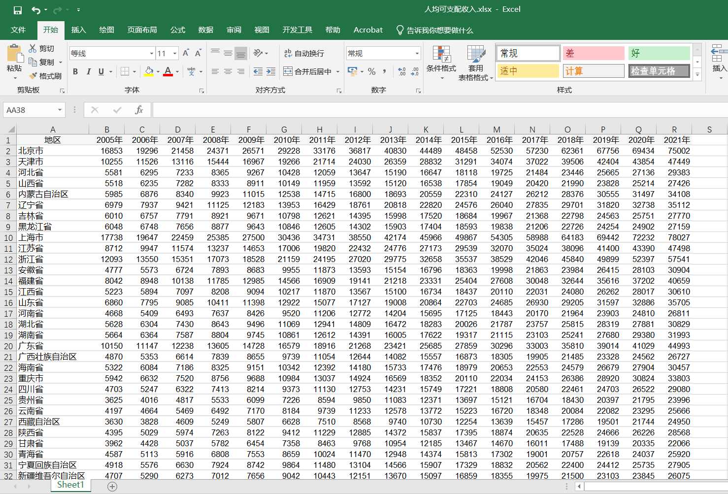
data=pd.read_excel('人均可支配收入.xlsx',sheet_name='Sheet1',index_col=0)
x=data.index.tolist()
y=data.values.T.tolist()
year=data.columns.tolist()
y_max=max([max(row)for row in y])
timeline=Timeline(init_opts=opts.InitOpts(width="1500px",height='600px'))for i inrange(len(year)):
xy=list(zip(x,y[i]))
xy.sort(key=lambda x:x[1],reverse=False)
xy_top=xy[-10:]
bar=Bar()
bar.add_xaxis(xaxis_data=[i[0]for i in xy])
bar.add_yaxis('',y_axis=[i[1]for i in xy])
bar.set_global_opts(xaxis_opts=opts.AxisOpts(axislabel_opts=opts.LabelOpts(rotate=-90)),yaxis_opts=opts.AxisOpts(max_=y_max))
bar.set_series_opts(label_opts=opts.LabelOpts(is_show=True,position='top',rotate=-90))map=Map()map.add(year[i]+'地区人均可支配收入',data_pair=xy,maptype='china',is_map_symbol_show=False,aspect_scale=0.65)map.set_global_opts(title_opts=opts.TitleOpts(title='2005~2021年地区人均可支配收入',subtitle='数据来源:国家统计局'),visualmap_opts=opts.VisualMapOpts(max_=y_max,is_piecewise=True,range_color=['lightskyblue','yellow','orangered']))
wordcloud=WordCloud()
wordcloud.add('',xy,word_size_range=[5,45],shape=SymbolType.DIAMOND,is_draw_out_of_bound=False,width='600px',height='180px',pos_left='10px',pos_top='300px')
grid=Grid()
grid.add(bar,grid_opts=opts.GridOpts(pos_left='50px',pos_top='80px',width='500px',height='120px'))
grid.add(map,grid_opts=opts.GridOpts(height='500px'))
grid.add(wordcloud,grid_opts=opts.GridOpts(height='180px'))
timeline.add(grid,year[i]).add_schema(is_auto_play=True,pos_left='10%',pos_right='35%')
timeline.render('人均可支配收入.html')


 831
831


 被折叠的 条评论
为什么被折叠?
被折叠的 条评论
为什么被折叠?
 到【灌水乐园】发言


