


Visualization | Pandas (pypandas.cn)
Pandas是一个强大的数据分析库,它内置了基于matplotlib的数据可视化功能,使得直接在DataFrame和Series上进行绘图变得非常方便。在pandas中,.plot()方法允许用户通过kind参数灵活地选择多种图表类型。
导库
import numpy as np
import pandas as pd
import matplotlib.pyplot as plt
基本绘图-画线图(Basic plotting): plot
基础时间序列折线图
ts = pd.Series(np.random.randn(1000), index=pd.date_range('1/1/2000', periods=1000))
ts = ts.cumsum()
ts.plot()
plt.show()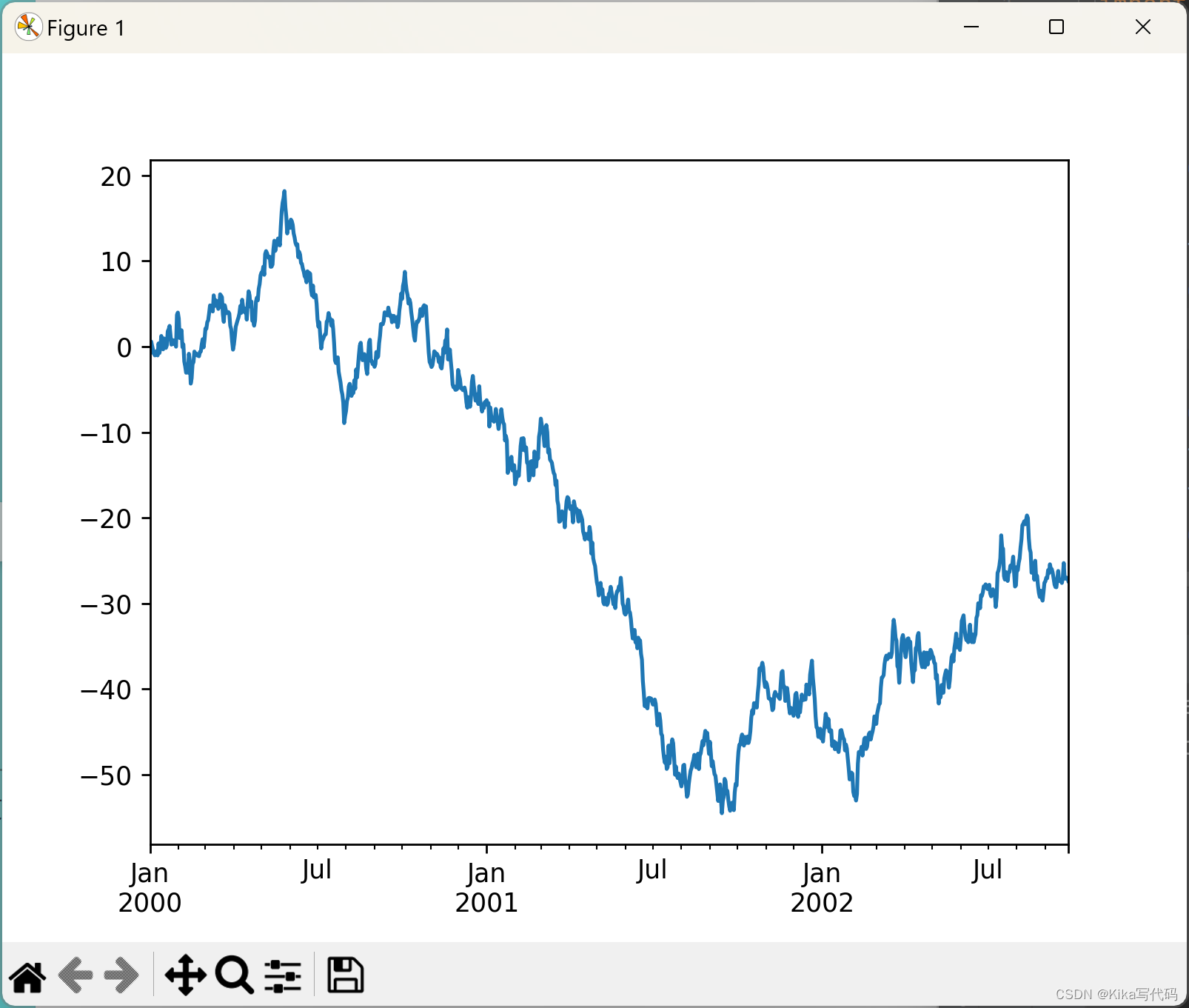
多列
ts = pd.Series(np.random.randn(1000), index=pd.date_range('1/1/2000', periods=1000))
df = pd.DataFrame(np.random.randn(1000, 4), index=ts.index, columns=list('ABCD'))
df = df.cumsum()
df.plot()
plt.show()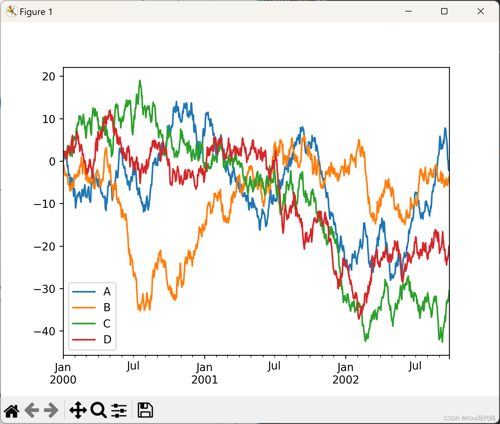
自定义x-y轴绘图
df3 = pd.DataFrame(np.random.randn(1000, 2), columns=['B', 'C']).cumsum()
df3['A'] = pd.Series(list(range(len(df))))
df3.plot(x='A', y='B')
plt.show()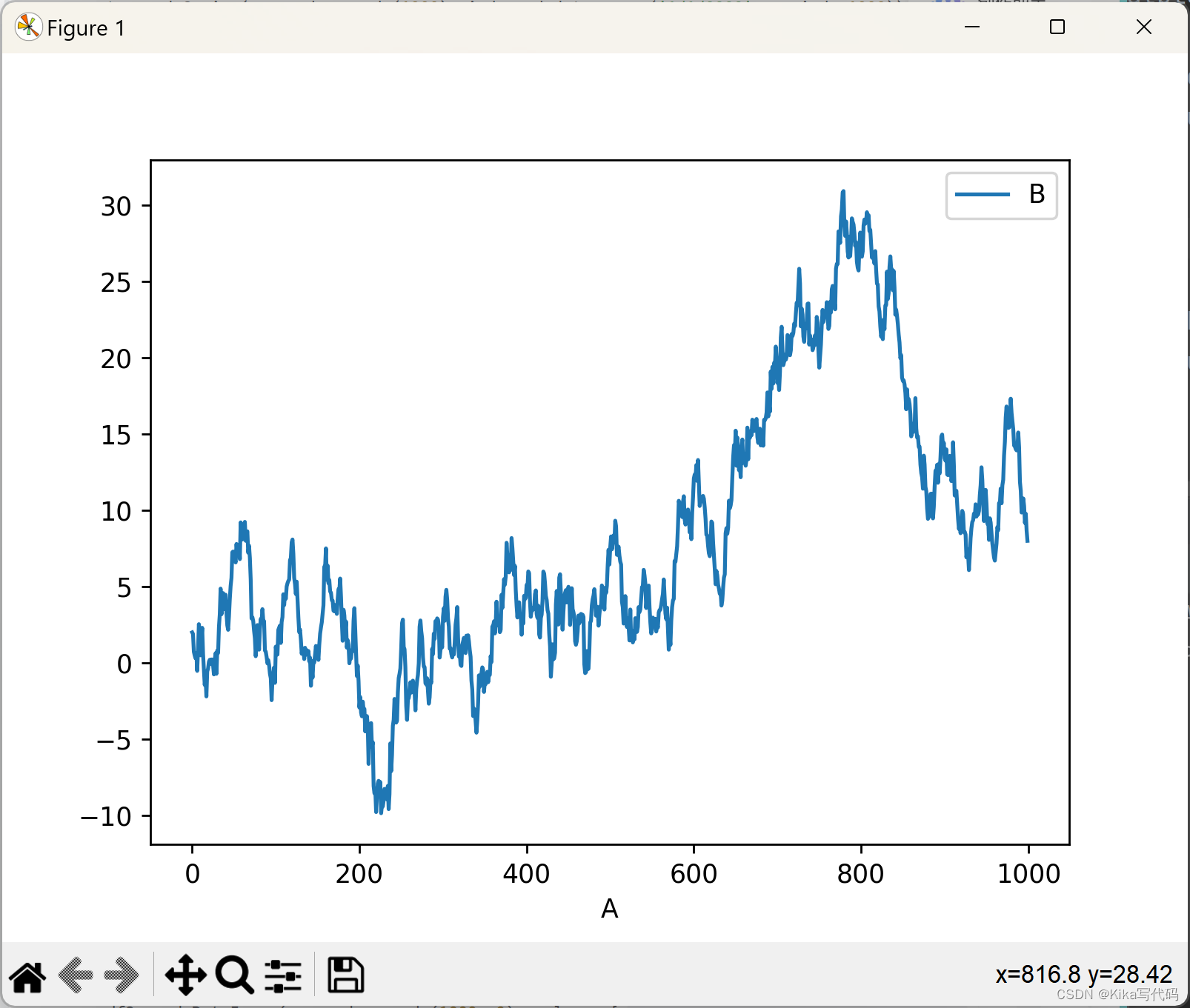
其它图类型(Other plots)
- 条形图:使用
kind='bar'或kind='barh'创建水平或垂直条形图。 - 直方图:使用
kind='hist'绘制数据分布的直方图。 - 箱型图:使用
kind='box'可视化数据分布和异常值。 - 密度图:使用
kind='kde'或kind='density'绘制。 - 面积图:使用
kind='area'绘制,类似于折线图,但区域会被填充。 - 散点图:使用
kind='scatter'展示两个变量之间的关系。 - 六边形分布图:使用
kind='hexbin'绘制。 - 饼图:使用
kind='pie'展示各部分占总体的比例。
当然了,您也可以使用DataFrame.plot.方法创建这些其他绘图。而不是提供kind关键字参数。这样可以更容易地发现绘图方法及其使用的特定参数:
df.plot.area     df.plot.barh     df.plot.density  df.plot.hist
df.plot.line     df.plot.scatter  df.plot.bar      df.plot.box
df.plot.hexbin   df.plot.kde      df.plot.pie
除了这些类型之外,还有使用单独接口的DataFrame.hist()直方图和DataFrame.boxplot()箱线图方法。
最后再扩展一下,pandas.plotting中有几个以Series或DataFrame为参数的绘图函数。其中包括:
- 散点矩阵图Scatter Matrix:使用
scatter_matrix方法创建。 - Andrews曲线Andrews Curves:使用
andrews_curves方法展示多变量数据。 - 平行坐标图Parallel Coordinates:使用
parallel_coordinates方法展示。 - 滞后图Lag Plot:使用
lag_plot方法检查数据集是否随机。 - 自相关图Autocorrelation Plot:使用
autocorrelation_plot检查时间序列的随机性。 - Bootstrap图:使用
bootstrap_plot评估统计量的不确定性。 - RadViz图:使用
radviz方法可视化多变量数据。
绘图也可以用错误条errorbars或表格tables进行装饰。在创建图表(如线图、柱状图、散点图等)时,除了基本的图表元素(如线条、点、柱子等)外,还可以添加额外的元素来增强图表的信息量和可读性。这里提到的“错误条”和“表格”是两种常见的装饰元素。
bar plots条形图
df.iloc[5].plot.bar()  # 绘制第5行的条形图
# plt.axhline(0, color='k')  # 绘制水平参考线
plt.show()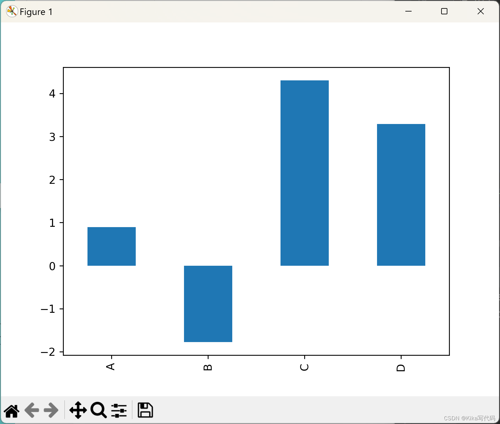
调用DataFrame的plot.bar()方法会生成一个多条形图:
df2 = pd.DataFrame(np.random.rand(10, 4), columns=['a', 'b', 'c', 'd'])
df2.plot.bar()
plt.show()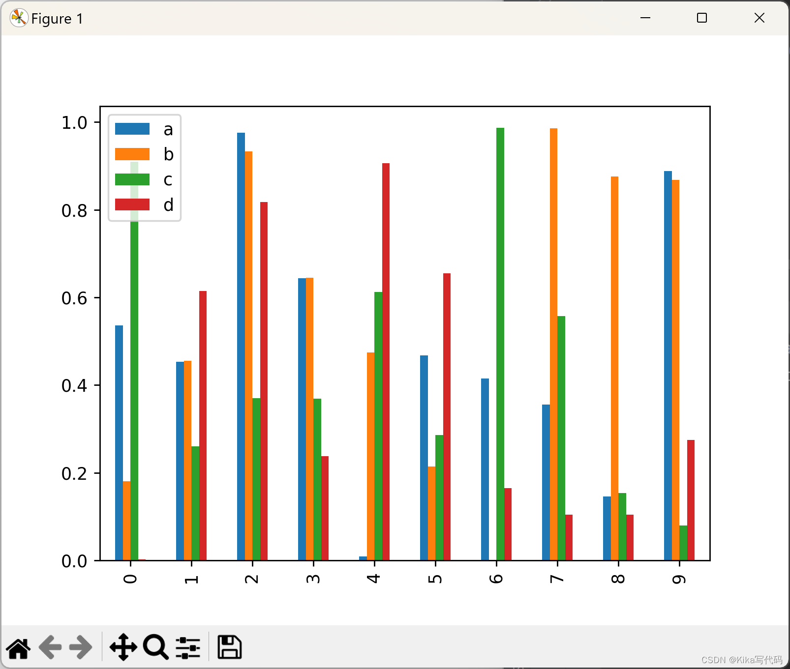
想要生成堆叠条形图,可以传参:stacked=True
df2 = pd.DataFrame(np.random.rand(10, 4), columns=['a', 'b', 'c', 'd'])
df2.plot.bar(stacked=True)
plt.show()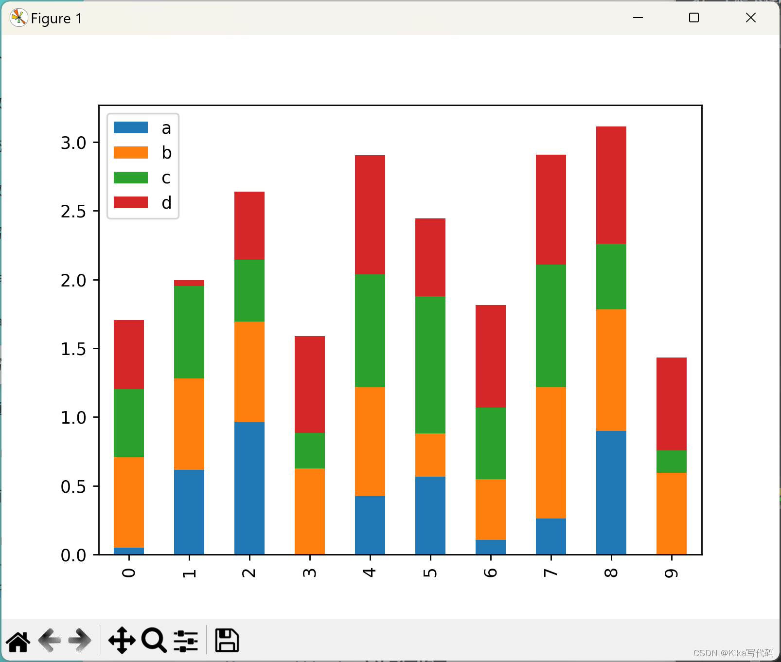
想要获得水平条形图,就改用barh()方法:
df2 = pd.DataFrame(np.random.rand(10, 4), columns=['a', 'b', 'c' 最低0.47元/天 解锁文章


 2528
2528

 被折叠的 条评论
为什么被折叠?
被折叠的 条评论
为什么被折叠?
 到【灌水乐园】发言


