


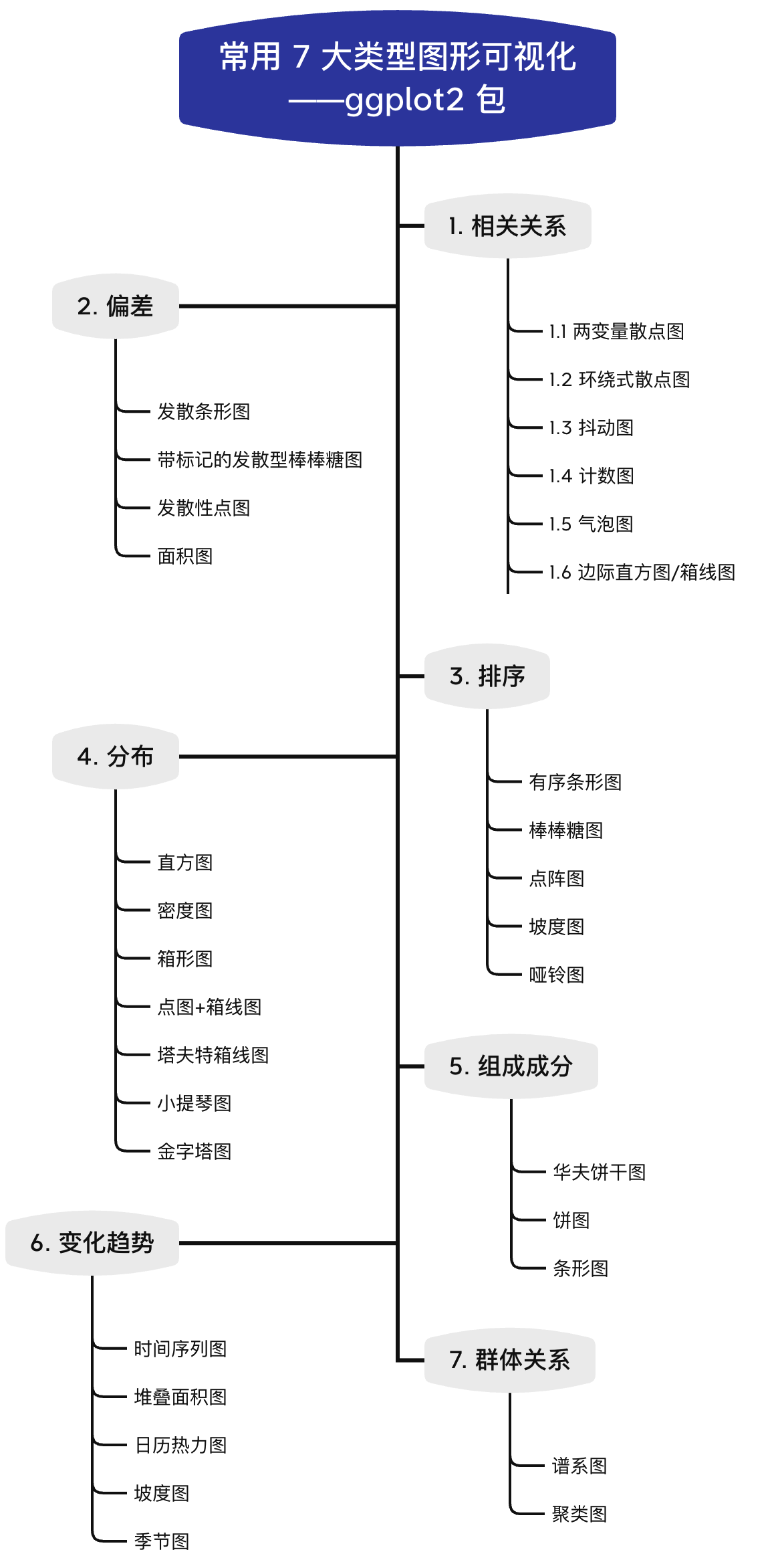
引言
在进行数据分析时,免不了对结果进行可视化。那么,什么样的图形才最适合自己的数据呢?一个有效的图形应具备以下特点:
- 能正确传递信息,而不会产生歧义;
- 样式简单,但是易于理解;
- 添加的图形美学应辅助理解信息;
- 图形上不应出现冗余无用的信息。
本系列推文,小编将汇总可视化中常用 7 大类型图形,供读者参考。每类制作成一篇推文,主要参考资料为:Top 50 ggplot2 Visualizations。其他类似功能网站,资料包括:
系列目录
本文主要介绍第三部分:排序关系图形。
3 排序
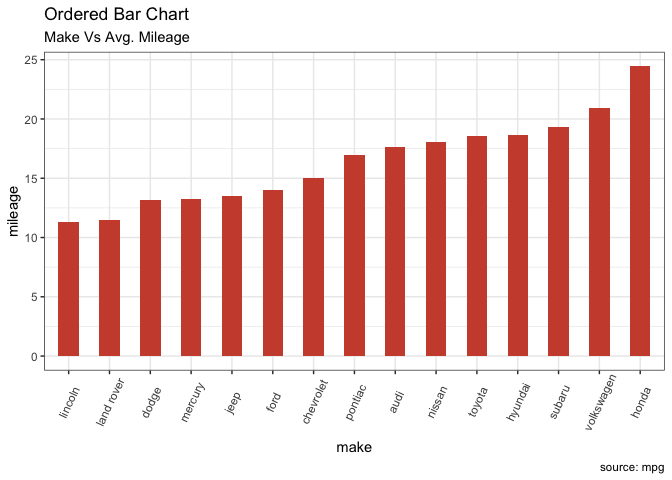
3.1 有序条形图
有序条形图是按 Y 轴变量排序的条形图,X 轴变量必须转换为因子型(使用 factor() 函数),有序的处理:利用函数 order()。
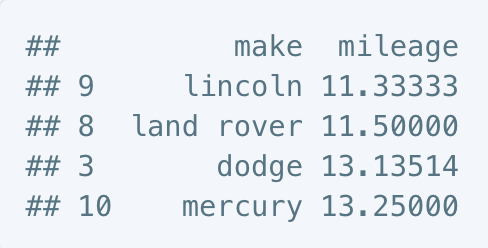
# 准备数据:按厂商分组计算平均城市里程。
cty_mpg <- aggregate(mpg$cty, by=list(mpg$manufacturer), FUN=mean)  # aggregate
colnames(cty_mpg) <- c("make", "mileage")  # change column names
cty_mpg <- cty_mpg[order(cty_mpg$mileage), ]  # sort
cty_mpg$make <- factor(cty_mpg$make, levels = cty_mpg$make)  # to retain the order in plot.
head(cty_mpg, 4)
ggplot(cty_mpg, aes(x=make, y=mileage)) +
  geom_bar(stat="identity", width=.5, fill="tomato3") +
  labs(title="Ordered Bar Chart",
       subtitle="Make Vs Avg. Mileage",
       caption="source: mpg") +
  theme(axis.text.x = element_text(angle=65, vjust=0.6))
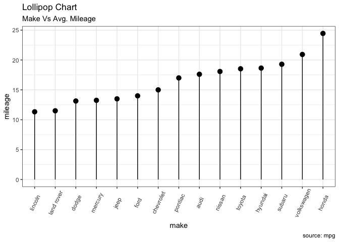
3.2 棒棒糖图
棒棒糖图传达的信息与柱状图相同。通过将粗条转变为细线,减少了杂乱,使图形看起来更美观。主要利用 geom_point() 与 geom_segment() 函数。## 引言
在进行数据分析时,免不了对结果进行可视化。那么,什么样的图形才最适合自己的数据呢?一个有效的图形应具备以下特点:
- 能正确传递信息,而不会产生歧义;
- 样式简单,但是易于理解;
- 添加的图形美学应辅助理解信息;
- 图形上不应出现冗余无用的信息。
本系列推文,小编将汇总可视化中常用 7 大类型图形,供读者参考。每类制作成一篇推文,主要参考资料为:Top 50 ggplot2 Visualizations。其他类似功能网站,资料包括:
系列目录

本文主要介绍第四部分:分布相关图形。前几部分可见:
这一部分也是小编最常使用的图形。写过的相关推文如:
加载数据集
使用 ggplot2 包中自带数据集作为示例数据集。
library(ggplot2)
library(plotrix)
data("midwest", package = "ggplot2") #加载数据集
全局主题设置
全局配色、主题设置。注意,本文使用离散色阶,如果需要使用连续色阶,则需要重写。
options(scipen=999)  # 关掉像 1e+48 这样的科学符号
# 颜色设置(灰色系列)
cbp1 <- c("#999999", "#E69F00", "#56B4E9", "#009E73",
          "#F0E442", "#0072B2", "#D55E00", "#CC79A7")

# 颜色设置(黑色系列)
cbp2 <- c("#000000", "#E69F00", "#56B4E9", "#009E73",
          "#F0E442", "#0072B2", "#D55E00", "#CC79A7")


ggplot <- function(...) ggplot2::ggplot(...) +
  scale_color_manual(values = cbp1) +
  scale_fill_manual(values = cbp1) + # 注意: 使用连续色阶时需要重写
  theme_bw()
4 分布
4.1 直方图
4.4.1 连续变量的直方图
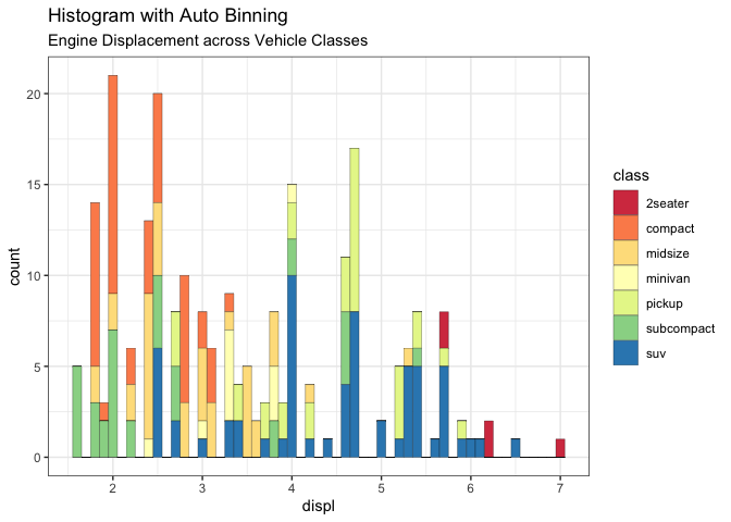
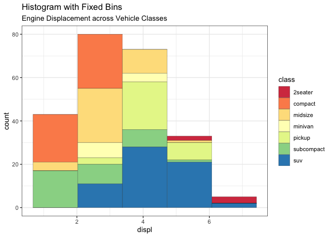
连续变量的直方图可以使用 geom_bar() 或 geom_histogram() 来完成。当使用 geom_histogram() 时,可以使用 bins 参数来控制分箱的数量。也可以使用 binwidth 设置每个分箱覆盖的范围。 binwidth 的值与建立直方图的连续变量在同一个尺度上。
# 连续(数值)变量的直方图
g <- ggplot(mpg, aes(displ)) + scale_fill_brewer(palette = "Spectral")

g + geom_histogram(aes(fill=class),
                   binwidth = .1,
                   col="black",
                   size=.1) +  # change binwidth
  labs(title="Histogram with Auto Binning",
       subtitle="Engine Displacement across Vehicle Classes")
g + geom_histogram(aes(fill=class),
                   bins=5,
                   col="black",
                   size=.1) +   # change number of bins
  labs(title="Histogram with Fixed Bins",
       subtitle="Engine Displacement across Vehicle Classes")
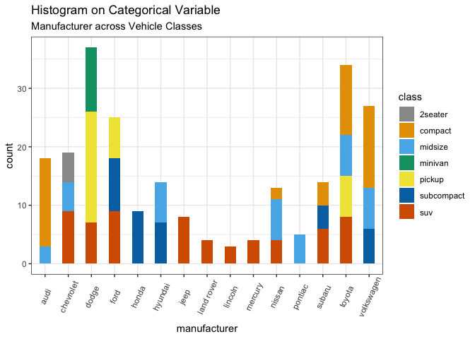
4.1.2 分类变量的直方图
分类变量的直方图实际上是根据每个类别的频率绘制的条形图。
library(ggplot2)
theme_set(theme_classic())

# Histogram on a Categorical variable
g <- ggplot(mpg, aes(manufacturer))
g + geom_bar(aes(fill=class), width = 0.5) +
  theme(axis.text.x = element_text(angle=65, vjust=0.6)) +
  labs(title="Histogram on Categorical Variable",
       subtitle="Manufacturer across Vehicle Classes")
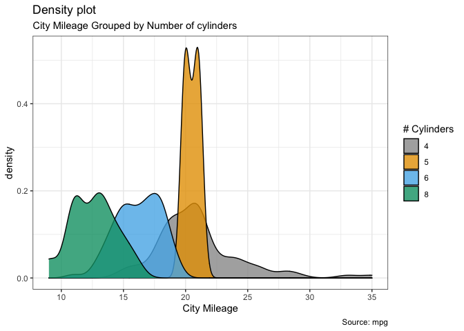
4.2 密度图
g <- ggplot(mpg, aes(cty))
g + geom_density(aes(fill=factor(cyl)), alpha=0.8) +
    labs(title="Density plot",
         subtitle="City Mileage Grouped by Number of cylinders",
         caption="Source: mpg",
         x="City Mileage",
         fill="# Cylinders")
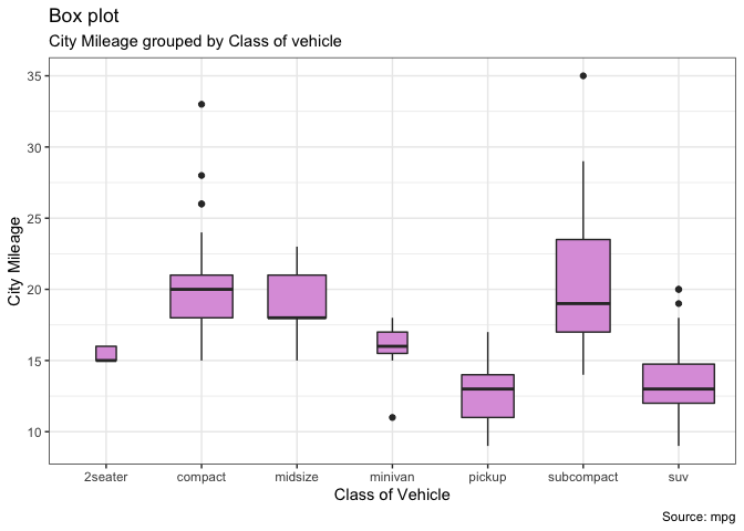
4.3 箱线图
箱形图是研究数据分布的一个有用工具。它还可以显示多个组内的分布,以及中值、范围和异常值。箱子内的黑线表示中位数。箱顶是 75% 分位数,箱底是 25% 分位数。线的端点(又称晶须)距离为1.5*IQR,其中 IQR (四分位差)是 25% 到 75% 分位数之间距离。须外的点通常被认为是极值点。设置 varwidth=T将调整盒子的宽度,使其与观察的数量成比例。
g <- ggplot(mpg, aes(class, cty))
g + geom_boxplot(varwidth=T, fill="plum") +
    labs(title="Box plot",
         subtitle="City Mileage grouped by Class of vehicle",
         caption="Source: mpg",
         x="Class of Vehicle",
         y="City Mileage")
g <- ggplot(mpg, aes(class, cty))
g + geom_boxplot(aes(fill=factor(cyl))) +
  theme(axis.text.x = element_text(angle=65, vjust=0.6)) +
  labs(title="Box plot",
       subtitle="City Mileage grouped by Class of vehicle",
       caption="Source: mpg",
       x="Class of Vehicle",
       y="City Mileage")
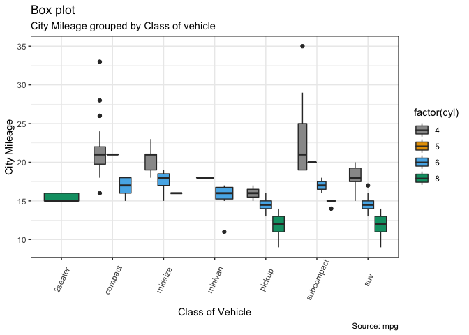
这个部分小编在科技论文中常常会使用,具体推文可见:
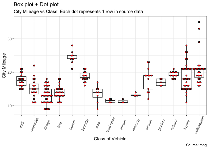
4.4 点图+箱线图
在箱线图的基础上,添加点图可以提供更清晰的信息。这些点交错排列,每个点代表一次观测。
g <- ggplot(mpg, aes(manufacturer, cty))
g + geom_boxplot() +
  geom_dotplot(binaxis='y',
               stackdir='center',
               dotsize = .5,
               fill="red") +
  theme(axis.text.x = element_text(angle=65, vjust=0.6)) +
  labs(title="Box plot + Dot plot",
       subtitle="City Mileage vs Class: Each dot represents 1 row in source data",
       caption="Source: mpg",
       x="Class of Vehicle",
       y="City Mileage")
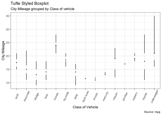
4.5 塔夫特箱线图
这是一个简化版的箱线图。
library(ggthemes)
library(ggplot2)
theme_set(theme_tufte())  # from ggthemes

# plot
g <- ggplot(mpg, aes(manufacturer, cty))
g + geom_tufteboxplot() +
      theme(axis.text.x = element_text(angle=65, vjust=0.6)) +
      labs(title="Tufte Styled Boxplot",
           subtitle="City Mileage grouped by Class of vehicle",
           caption="Source: mpg",
           x="Class of Vehicle",
           y="City Mileage")
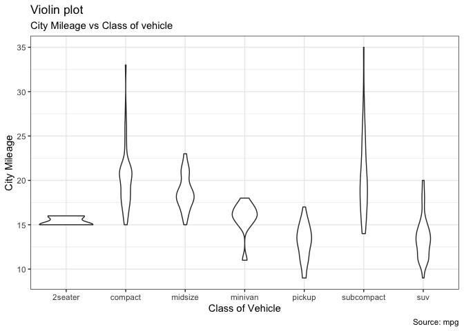
4.6 小提琴图
小提琴图类似于箱线图,但显示了组内的密度。
g <- ggplot(mpg, aes(class, cty))
g + geom_violin() +
  labs(title="Violin plot",
       subtitle="City Mileage vs Class of vehicle",
       caption="Source: mpg",
       x="Class of Vehicle",
       y="City Mileage")
绘制箱线图及小提琴图也可以参考ggstance和ggpubr,或者去网站搜索相关 ggplot 拓展的 R 包。我写过的相关类型可见推文:xxx。
4.7 金字塔图
金字塔图提供了一种独特的方式来可视化每个类别包含的样本比例。下面的金字塔是一个很好的例子,说明了在一个营销活动中每个阶段的用户留存率。
library(ggplot2)
library(ggthemes)
options(scipen = 999)  # turns of scientific notations like 1e+40

# Read data
email_campaign_funnel <- read.csv("https://raw.githubusercontent.com/selva86/datasets/master/email_campaign_funnel.csv")

# X Axis Breaks and Labels
brks <- seq(-15000000, 15000000, 5000000)
lbls = paste0(as.character(c(seq(15, 0, -5), seq(5, 15, 5))), "m")

# Plot
ggplot(email_campaign_funnel, aes(x = Stage, y = Users, fill = Gender)) +   # Fill column
                              geom_bar(stat = "identity", width = .6) +   # draw the bars
                              scale_y_continuous(breaks = brks,   # Breaks
                                                 labels = lbls) + # Labels
                              coord_flip() +  # Flip axes
                              labs(title="Email Campaign Funnel") +
                              theme_tufte() +  # Tufte theme from ggfortify
                              theme(plot.title = element_text(hjust = .5),
                                    axis.ticks = element_blank()) +   # Centre plot title
                              scale_fill_brewer(palette = "Dark2")  # Color palette
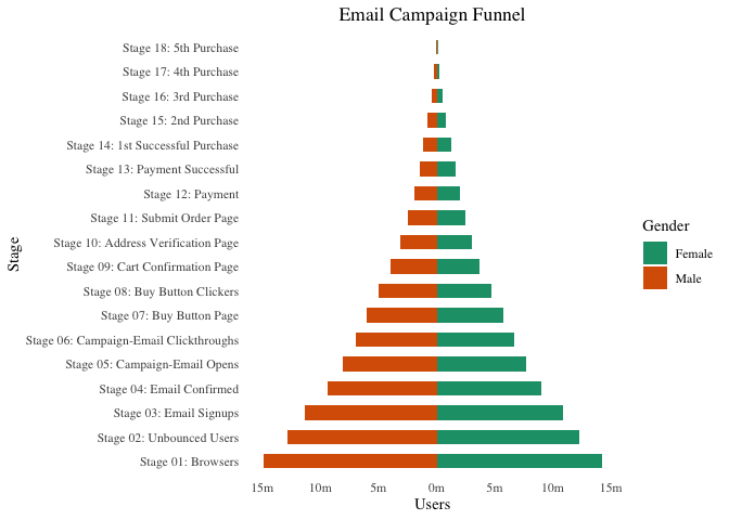
这个图经常有人在群里问,很多是横向的(只需要去除
coord_flip()),如果需要添加误差限,可以使用geom_errorbar()。
ggplot(cty_mpg, aes(x=make, y=mileage)) +
  geom_point(size=3) +
  geom_segment(aes(x=make,
                   xend=make,
                   y=0,
                   yend=mileage)) +
  labs(title="Lollipop Chart",
       subtitle="Make Vs Avg. Mileage",
       caption="source: mpg") +
  theme(axis.text.x = element_text(angle=65, vjust=0.6))
3.3 点图
点图非常类似于棒棒糖图,但没有线条,并且各标签都在水平位置上。它更强调项目的顺序与实际值有关。
注意代码中的 geom_segment() 内的 x 和 xend 的设置。以及最后使用了 coord_flip() 反转坐标轴。
ggplot(cty_mpg, aes(x=make, y=mileage)) +
  geom_point(col="tomato2", size=3) +   # Draw points
  geom_segment(aes(x=make,
                   xend=make,
                   y=min(mileage),
                   yend=max(mileage)),
               linetype="dashed",
               size=0.1) +   # Draw dashed lines
  labs(title="Dot Plot",
       subtitle="Make Vs Avg. Mileage",
       caption="source: mpg") +
  coord_flip()

3.4 坡度图
坡度图是比较两点之间差异的绝佳方法。目前,还没有内置函数来构建这个图形。下面的代码可以作为一个示例框架,告诉您如何绘制这个图形。
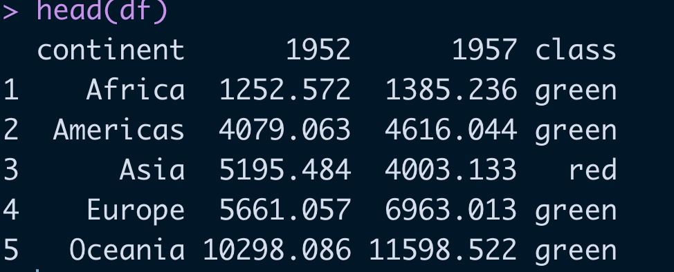
先展示下数据:
library(scales)
# 数据准备
df <- read.csv("https://raw.githubusercontent.com/selva86/datasets/master/gdppercap.csv")
colnames(df) <- c("continent", "1952", "1957")
left_label <- paste(df$continent, round(df$'1952'),sep=", ")
right_label <- paste(df$continent, round(df$'1957'),sep=", ")
df$class <- ifelse((df$'1957' - df$'1952') < 0, "red", "green")
head(df)
library(ggplot2)
p <- ggplot(df) + geom_segment(aes(x=1, xend=2, y=`1952`, yend=`1957`, col=class), size=.75, show.legend=F) +
                  geom_vline(xintercept=1, linetype="dashed", size=.1) +
                  geom_vline(xintercept=2, linetype="dashed", size=.1) +
                  scale_color_manual(labels = c("Up", "Down"),
                                     values = c("green"="#00ba38", "red"="#f8766d")) +  # color of lines
                  labs(x="", y="Mean GdpPerCap") +  # Axis labels
                  xlim(.5, 2.5) + ylim(0,(1.1*(max(df$`1952`, df$`1957`))))  # X and Y axis limits

# Add texts
p <- p + geom_text(label=left_label, y=df$`1952`, x=rep(1, NROW(df)), hjust=1.1, size=3.5)
p <- p + geom_text(label=right_label, y=df$`1957`, x=rep(2, NROW(df)), hjust=-0.1, size=3.5)
p <- p + geom_text(label="Time 1", x=1, y=1.1*(max(df$`1952`, df$`1957`)), hjust=1.2, size=5)  # title
p <- p + geom_text(label="Time 2", x=2, y=1.1*(max(df$`1952`, df$`1957`)), hjust=-0.1, size=5)  # title


#设置主题
p + theme(panel.background = element_blank(),
           panel.grid = element_blank(),
           axis.ticks = element_blank(),
           axis.text.x = element_blank(),
           panel.border = element_blank(),
           plot.margin = unit(c(1,2,1,2), "cm"))
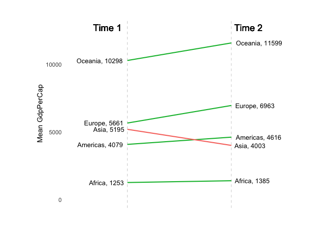
图形是通过线段,竖线构成,之后添加文字。这是纯 ggplot 码出来的图形。当然现在也有现成的包可以完成。例如:CGPfunctions。它可以得到的结果实例如下:
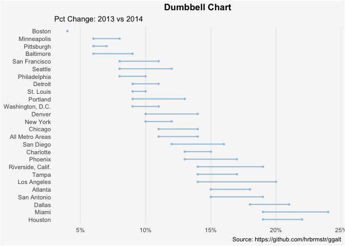
3.5 哑铃图
哑铃图作用:
- 比较两个时间点之间的相对位置(比如增长和下降);
- 比较两类之间的距离。
为了得到哑铃的正确顺序,Y 变量应该是一个因子,因子变量的水平应该与它在图中出现的顺序相同。
数据如下:
health <- read.csv("https://raw.githubusercontent.com/selva86/datasets/master/health.csv")
health$Area <- factor(health$Area, levels=as.character(health$Area))  # for right ordering of the dumbells
# health$Area <- factor(health$Area)
head(health)
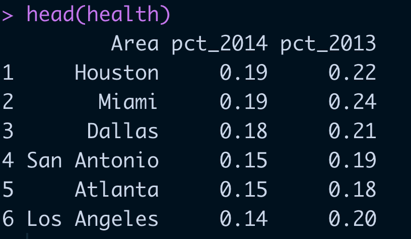
直接使用 geom_dumbbel() 绘制哑铃图。之后就是一些细节的调整。
gg <- ggplot(health, aes(x=pct_2013, xend=pct_2014, y=Area, group=Area)) +
        geom_dumbbell(color="#a3c4dc",
                      size=0.75,
                      point.colour.l="#0e668b") +
        scale_x_continuous(label=percent) +
        labs(x=NULL,
             y=NULL,
             title="Dumbbell Chart",
             subtitle="Pct Change: 2013 vs 2014",
             caption="Source: https://github.com/hrbrmstr/ggalt") +
        theme(plot.title = element_text(hjust=0.5, face="bold"),
              plot.background=element_rect(fill="#f7f7f7"),
              panel.background=element_rect(fill="#f7f7f7"),
              panel.grid.minor=element_blank(),
              panel.grid.major.y=element_blank(),
              panel.grid.major.x=element_line(),
              axis.ticks=element_blank(),
              legend.position="top",
              panel.border=element_blank())
plot(gg)
拓展的哑铃图可以参考这个链接,得到的示意图如下。这里代码就不贴出来了,需要的读者自行去网站下载。主要是在基础版本上,加入阴影(geom_rect())、线段(geom_segment),竖线(geom_vline)。


小编有话说
这个系列的推文,只是给出了最简约的图形,并没有在美观上进行设计。主要让读者了解,绘制什么图形,应该使用什么函数/包。具体的美观设计,暂时不做设计,可以在主题、配色上做文章。类似的推文小编整理了些,可供参考:


 4331
4331

 被折叠的 条评论
为什么被折叠?
被折叠的 条评论
为什么被折叠?
 到【灌水乐园】发言


