


Quick控件--2.icon button
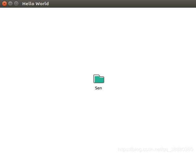
1 效果
2 简介
button按键最常用,control2中对button做了固定封装,为了更灵活使用,自定义icon button组件。
3 控件代码
3.1 SenIconBtn.qml
import QtQuick 2.12

Rectangle {
    // my feature
    property string btnMsg: ""
    property string btnText: ""

    property color textColor: "#ff000000"
    property string pressedTextColor: textColor
    property string releaseTextColor: textColor

    property real fontSize: 20

    property string btnColor: "#00000000"
    property string pressedColor: btnColor
    property string releaseColor: btnColor

    property string btnIcon: "#00000000"
    property string pressedIcon: btnIcon
    property string releaseIcon: btnIcon

    property string borderColor: textColor
    property string pressedBorderColor: pressedTextColor

    property alias wrapMode: textId.wrapMode
    property alias elide: textId.elide

    width: 80; height: 60
    color: mouseArea.pressed ? pressedColor : releaseColor
    border.width: 0
    border.color: mouseArea.pressed ? pressedBorderColor : borderColor
    focus: true
    signal clicked()
//    signal clickedWithMsg(String msg)
    signal pressed()
    signal release()

    Image {
        id: image
        anchors.horizontalCenter: parent.horizontalCenter
        anchors.top: parent.top
        anchors.topMargin: (parent.height - height - textId.height - 5) / 2
        source: mouseArea.pressed ? pressedIcon : releaseIcon
    }
    Text {
        id: textId
        anchors.top: image.bottom
        anchors.horizontalCenter: parent.horizontalCenter
        horizontalAlignment: Text.AlignHCenter
        wrapMode: Text.WordWrap
        width: parent.width
        text: btnText
        color: mouseArea.pressed ? pressedTextColor : releaseTextColor
        font.pixelSize: fontSize
    }
    MouseArea {
        id: mouseArea
        hoverEnabled: true
        anchors.fill: parent
        onClicked: {
            parent.clicked()
            // parent.clickedWithMsg(btnMsg)
        }
        onPressed: {
            parent.pressed(btnMsg)
        }
        onReleased: {
            parent.release()
        }
    }
}
3.2 main.qml
import QtQuick 2.12
import QtQuick.Window 2.12
import "./common" as SenCom

Window {
    visible: true
    width: 640
    height: 480
    title: qsTr("Hello World")

    SenCom.SenIconBtn {
        id: fileBtn
        anchors.centerIn: parent
        width: 80
        height: 80
        btnText: "Sen"
        btnIcon: "qrc:/img/iconFiles.png"
        fontSize: 12
    }
}


 489
489


 被折叠的 条评论
为什么被折叠?
被折叠的 条评论
为什么被折叠?
 到【灌水乐园】发言


