


在一篇《nature communication》文章上看到这个图表,乍一看,这不就是云雨图嘛,所以准备复现一下。这个图的特点是:1、云雨图但是连中间的箱线图都是一半(这个一般云雨图包办不到)。2、配对连线。
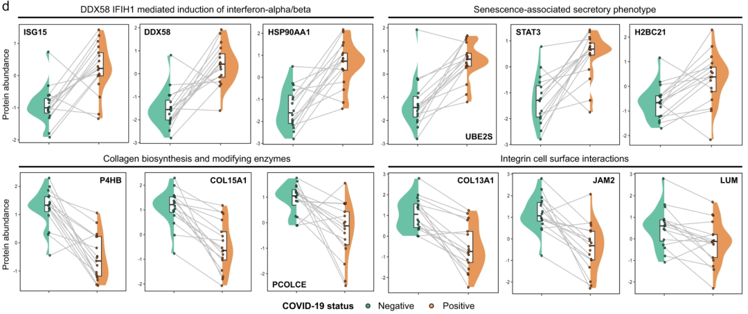
(reference:Multi-omics identify falling LRRC15 as a COVID-19 severity marker and persistent pro-thrombotic signals in convalescence)
本着我看图是拿显微镜的优秀品质,我找到了这篇文章当初上传在预印本上的版本,发现这个图其实很拙劣,之所以小提琴图和箱线图都是一半,是因为作者在中间加入了一个很明显没有p掉的矩阵。这瞬间让我有了思路。我们常规作图,只需要在适当位置加入分面即可。示例数据及代码已上传群文件!
说干就干,上图:效果杠杠的
setwd('D:/KS项目/公众号文章/配对云雨图')
df <- read.csv('df.csv', header = T)
library(ggplot2)

df$Family.ID <- as.factor(df$Family.ID)
ggplot(df,aes(x=Disease.state,y=Richness,fill=Disease.state))+
  geom_violin(width =0.8, color=NA)+
  geom_boxplot(alpha =0.5,size=1,outlier.shape = NA,width=0.2)+
  geom_rect(aes(xmin = 0.98,
                ymin = -Inf,
                xmax = 2.02,
                ymax = Inf),
            fill = "white",
            size =1.5)+
  geom_jitter(aes(group=Family.ID,color=Disease.state),
              size = 2,
              shape=16,
              stroke = 0.15,
              show.legend = FALSE,
              position = position_dodge(0.05))+
  geom_line(aes(group = Family.ID),
            color = 'grey40',
            lwd = 0.5,
            position = position_dodge(0.05))+
  theme_bw() +
  theme(text = element_text(size=10, colour = "black")) +
  theme(panel.grid =element_blank(),
        axis.text.x = element_text(colour = "black", size = 14),
        axis.text.y = element_text(colour = "black", size = 14),
        axis.title.y = element_text(color = 'black', size = 14),
        axis.title.x = element_blank(),
        legend.position = 'none')+
  labs(title = "", y = "Expression", x=" ")+
  scale_fill_manual(values = c('#E69F00', "#009E73"))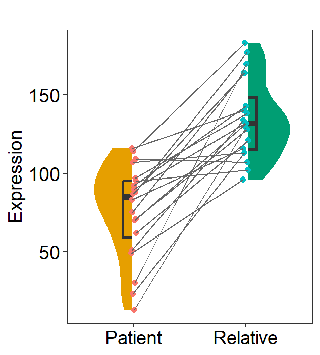
后来发现有个R包,可以将很多ggplot图做成半个,一样的效果:
library(gghalves)
ggplot(df,aes(x=Disease.state,y=Richness,fill=Disease.state))+
  geom_half_violin(data=subset(df, Disease.state=='Patient'),
                   position = position_nudge(x = 0),side="l",color=NA)+
  geom_half_boxplot(data=subset(df, Disease.state=='Patient'),
                    position = position_nudge(x = 0),side='l', width=0.2)+
  geom_half_violin(data=subset(df, Disease.state=='Relative'),
                   position = position_nudge(x = 0),side="r",color=NA)+
  geom_half_boxplot(data=subset(df, Disease.state=='Relative'),
                    position = position_nudge(x = 0),side='r', width=0.2)+
  geom_jitter(aes(group=Family.ID,color=Disease.state),
              size = 2,
              shape=16,
              stroke = 0.15,
              show.legend = FALSE,
              position = position_dodge(0.05))+
  geom_line(aes(group = Family.ID),
            color = 'grey40',
            lwd = 0.5,
            position = position_dodge(0.05))+
  theme_bw() +
  theme(text = element_text(size=10, colour = "black")) +
  theme(panel.grid =element_blank(),
        axis.text.x = element_text(colour = "black", size = 14),
        axis.text.y = element_text(colour = "black", size = 14),
        axis.title.y = element_text(color = 'black', size = 14),
        axis.title.x = element_blank(),
        legend.position = 'none')+
  labs(title = "", y = "Expression", x=" ")+
  scale_fill_manual(values = c('#E69F00', "#009E73"))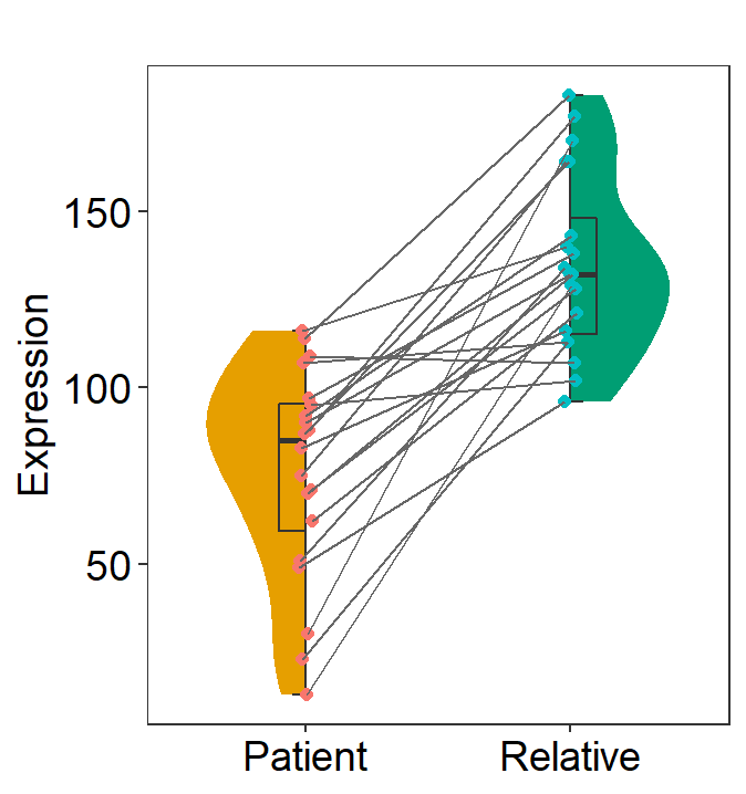
至于云雨图啥的,百度一下,有X种做法,感兴趣的可以学习。觉得小编内容有用的、有意思的,点赞、分享、关注一下呗


 521
521

 被折叠的 条评论
为什么被折叠?
被折叠的 条评论
为什么被折叠?
 到【灌水乐园】发言


