


数据和代码获取:请查看主页个人信息!!!
关键词“配对图”
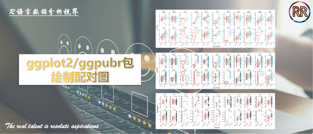
大家好,今天我将介绍如何使用R语言ggplot2包和ggpubr包绘制分组/分面配对图的方法。
配对图最大的优点在于可以展示相同样本处理前后对应关系:
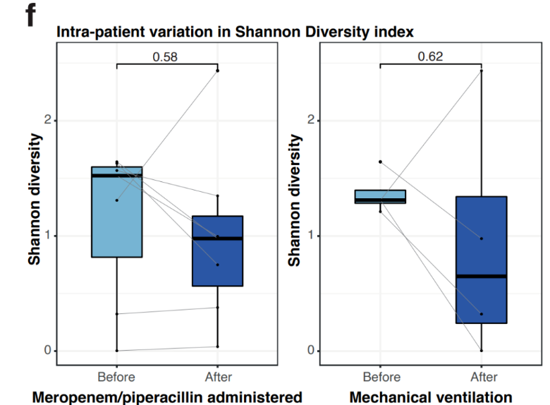
图片来源:Nat Commun:Clinical practices underlie COVID-19 patient respiratory microbiome composition and its interactions with the host
Step1:载入数据
rm(list=ls())pacman::p_load(tidyverse,reshape2,ggpubr)# 实战data <- read.csv('data.csv')head(data)
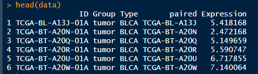
数据信息:ID是TCGA的barcode,Group是肿瘤与对照样本,paired是配对的barcode信息,Expression则是目标基因的表达量。
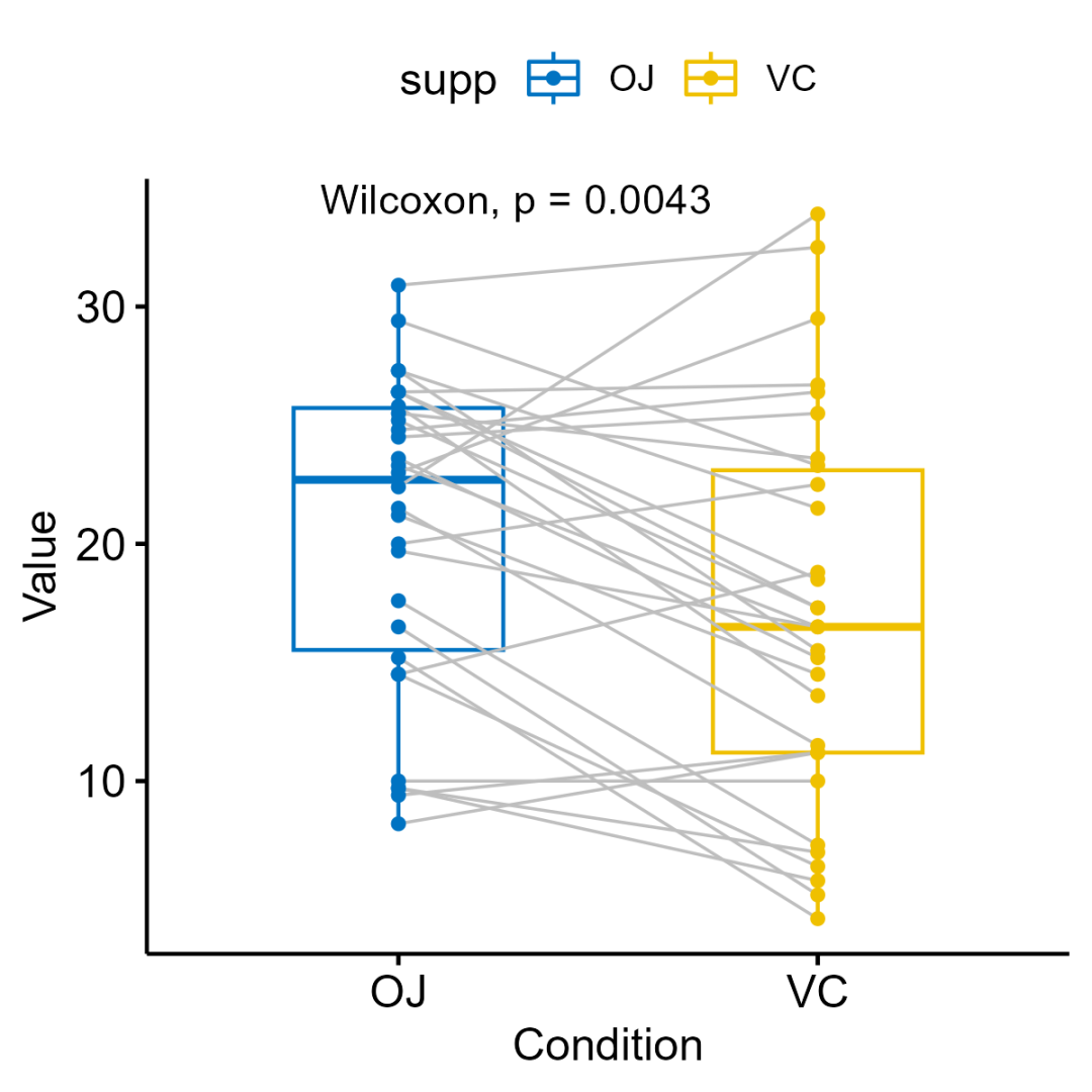
Step2:ggpubr包简单示例
# ggpubr绘图示例ggpaired(ToothGrowth,x = "supp",y = "len",color = "supp",line.color = "gray",line.size = 0.4,palette = "jco") +stat_compare_means(paired = TRUE)
绘图实战:
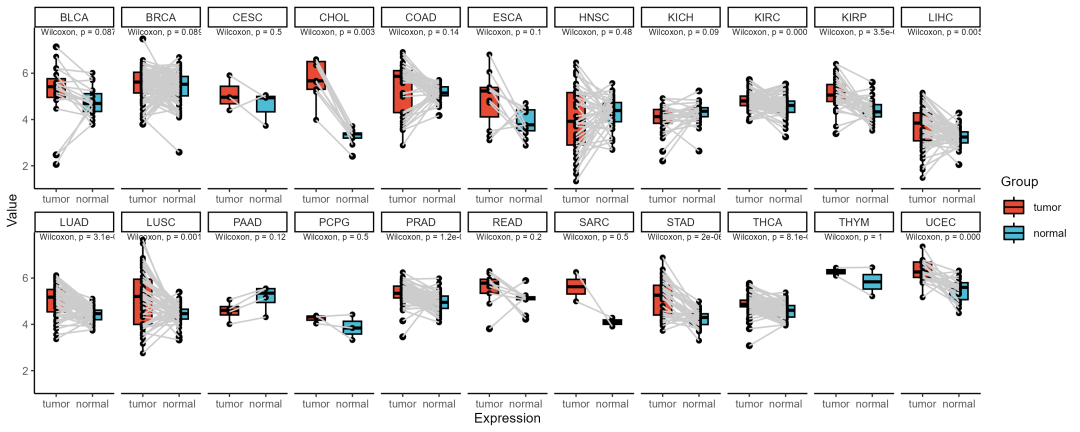
Step3:ggpubr包绘制配对箱线图
ggpaired(data, x = "Group", y = "Expression", color = "black", fill = "Group", line.size = 0.5) +geom_line(aes(group = paired), color = "grey80") +stat_compare_means(paired = TRUE, size = 2) +facet_wrap(~ Type, scales = 'free_x', nrow = 2) +ggsci::scale_fill_npg() +ggsci::scale_color_npg() +theme_classic2(base_size = 9) +xlab('Expression')ggsave('pic1.png', width = 10, height = 4)
Step4:ggplot2绘制配对箱线图
facet_theme <- theme(strip.background = element_blank(),panel.spacing.x = unit(0, "cm"), #x轴分面距离panel.spacing.y = unit(0, "cm"),#y轴分面距离strip.text.x = element_text(size=7),strip.text.y = element_text(size=7, face="bold"),axis.text.x=element_text(angle=45,vjust=1, hjust=1),legend.position = 'none')ggplot(data, aes(x = Group, y = Expression, color = Group)) +geom_boxplot(outlier.size = 0.5) +geom_line(aes(group = paired), color = "grey80", size = 0.5) +geom_point(size = 0.5) +stat_compare_means(comparisons = list(c("tumor", "normal")),paired = T, size = 2,label = "p.format",tip.length = 0) +facet_wrap(~ Type, scales = 'free_y', nrow = 2) +ggsci::scale_color_npg() +theme_classic2(base_size = 9) +facet_theme +xlab('Expression')ggsave('pic2.png', width = 10, height = 4)
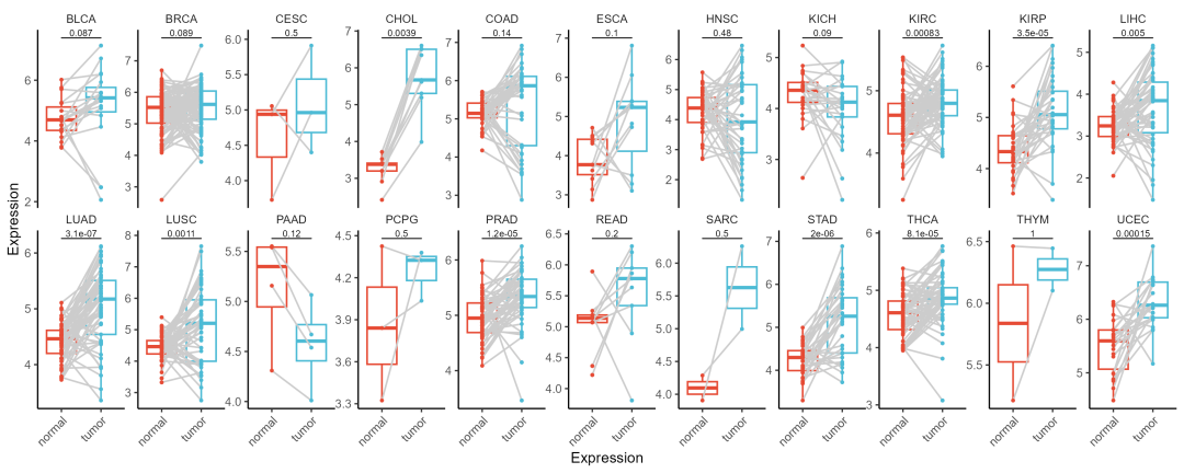
这里优化了分面绘图主题,此外需要注意添加图层的顺序:
geom_boxplot → geom_line → geom_point;
geom_boxplot(outlier.size = 0.5) 和 geom_point(size = 0.5)
这两个函数中散点大小需要保持一致。
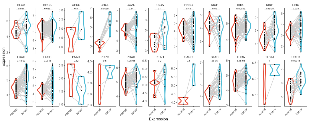
Step5:配对小提琴图
ggplot(data, aes(x = Group, y = Expression, color = Group)) +geom_violin(size = 1) +geom_line(aes(group = paired), color = "grey80", size = 0.5) +geom_point(size = 0.5, color = 'black') +stat_compare_means(comparisons = list(c("tumor", "normal")),paired = T, size = 2,label = "p.format",tip.length = 0) +facet_wrap(~ Type, scales = 'free_y', nrow = 2) +ggsci::scale_color_npg() +theme_classic2(base_size = 9) +facet_theme +xlab('Expression')ggsave('pic3.png', width = 10, height = 4)
这里的分组差异展示方式为p值:
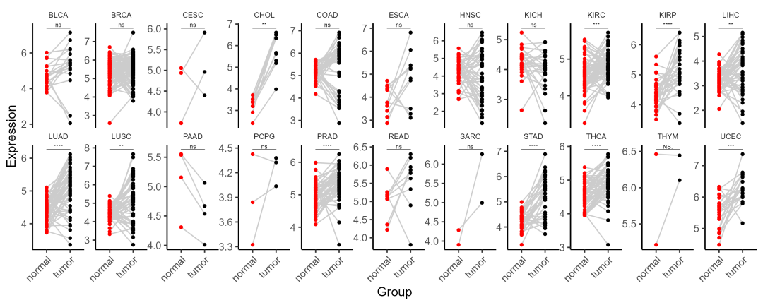
Step6:配对点图
ggplot(data, aes(x = Group, y = Expression, fill = Group, color = Group)) +geom_line(aes(group = paired), color = "grey80", size = 0.5) +geom_point(size = 1) +stat_compare_means(comparisons = list(c("tumor", "normal")),paired = T, size = 2,label = "p.signif",tip.length = 0) +facet_wrap(~ Type, scales = 'free_y', nrow = 2) +scale_color_manual(values = c('red', 'black')) +theme_classic2(base_size = 12) +facet_themeggsave('pic4.png', width = 10, height = 4)
这里的分组差异展示方式为*号
-
ns: p > 0.05 *: p <= 0.05 **: p <= 0.01 ***: p <= 0.001 ****: p <= 0.0001
数据和代码获取:请查看主页个人信息!!!
关键词“配对图”


 1758
1758

 被折叠的 条评论
为什么被折叠?
被折叠的 条评论
为什么被折叠?
 到【灌水乐园】发言


